
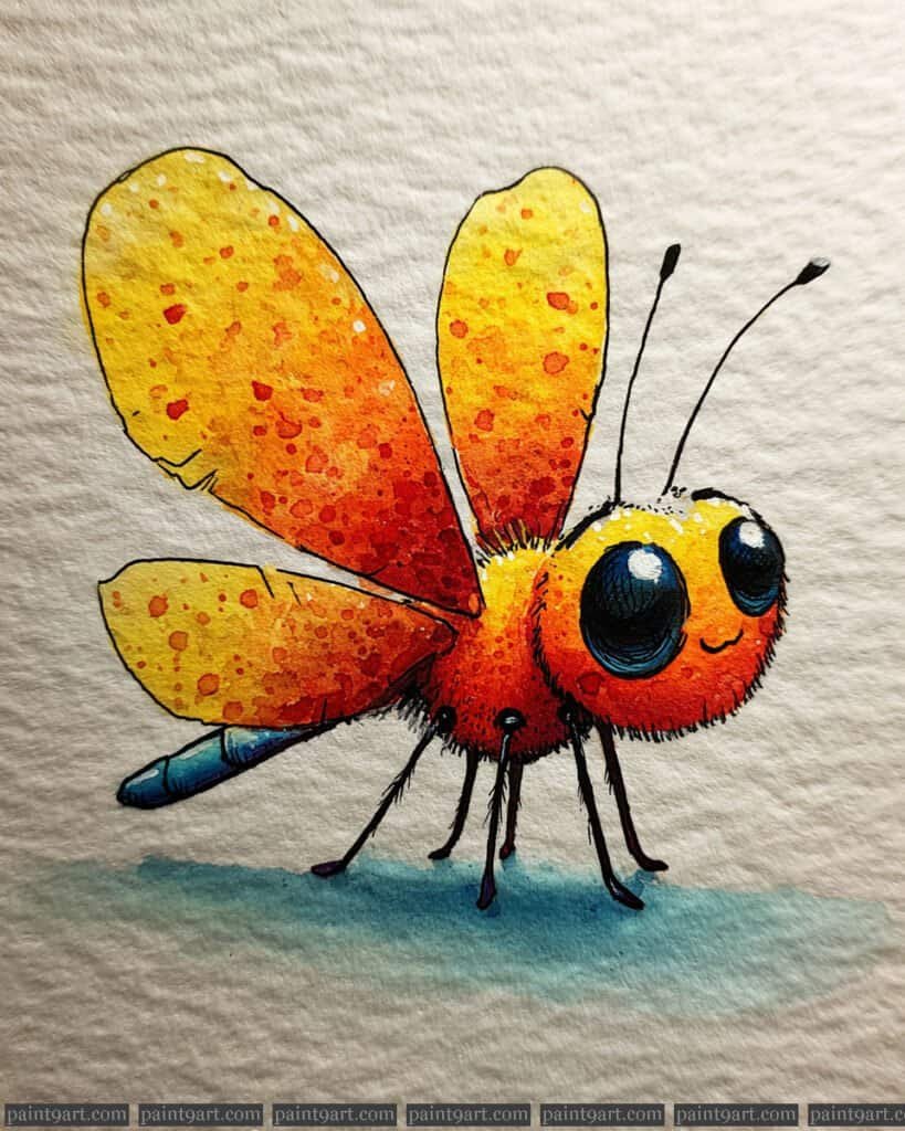
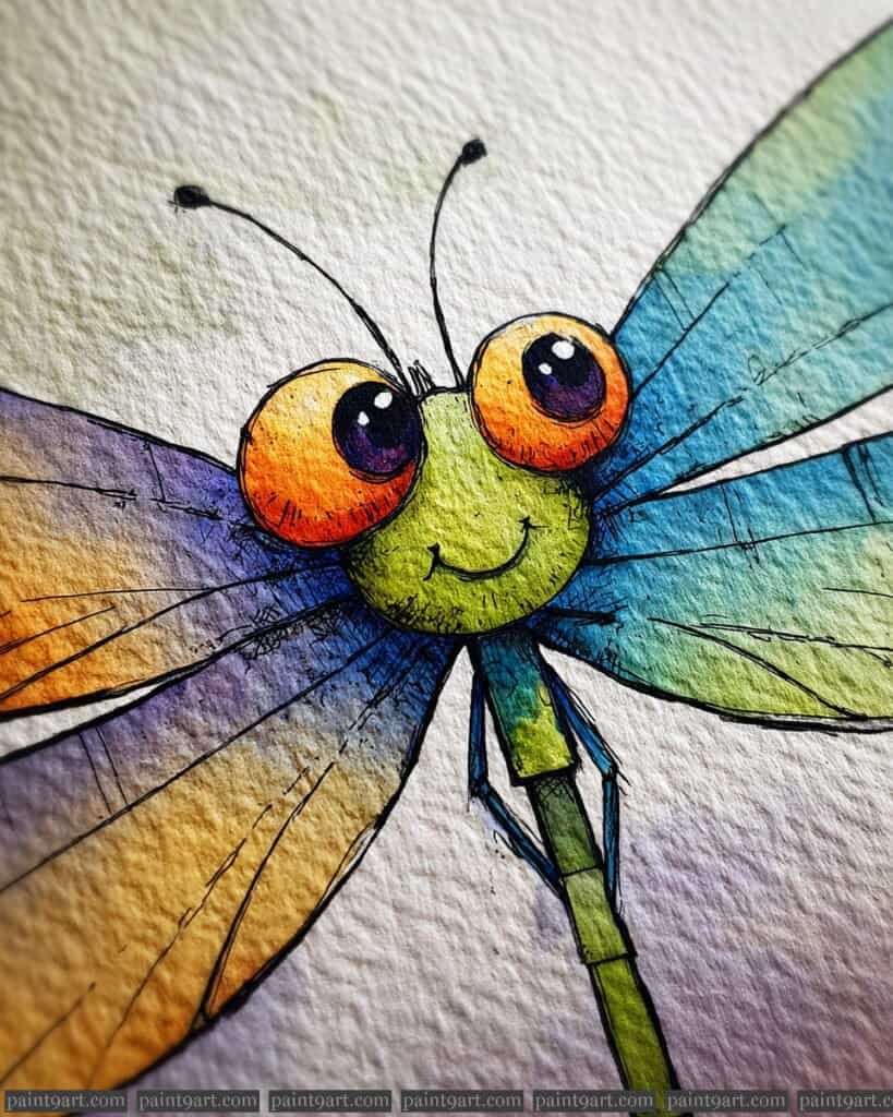
Nature’s smallest inhabitants have a way of bringing a huge amount of character to the canvas, especially when we lean into their silliness. I’ve found that blending vibrant watercolor washes with quirky insect personalities is the perfect recipe for a relaxing afternoon in the studio.
In this post, I’m sharing 29 Watercolor Funny Insect Ideas to spark your creativity and help you embrace a more whimsical style. If you want to dive straight into the color, I’ve also made these designs available as printable coloring pages for you to enjoy.
Contents
- 1 29 Watercolor Funny Insects Ideas
- 1.1 Vibrant Cicada
- 1.2 Curious Golden Glow-Worm
- 1.3 Ruby-Eyed Fly
- 1.4 The Cheerful Grasshopper Scout
- 1.5 The Determined Dung Roller
- 1.6 The Grasshopper Violinist
- 1.7 The Lantern-Bearing Firefly
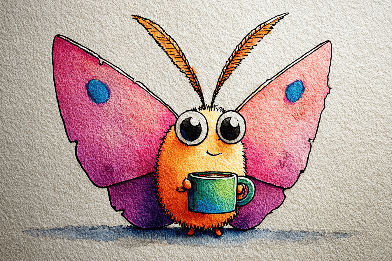
- 1.8 The Radiant Butterfly Gardener
- 1.9 The Dapper Gentleman Beetle
- 1.10 The Rainbow Proboscis Mosquito
- 1.11 The Crimson-Eyed Fly
- 1.12 The Midnight Stag Beetle
- 1.13 The Iridescent Jewel Beetle
- 1.14 The Golden Ember Dragonfly
- 1.15 The Wide-Eyed Dragonfly
- 1.16 The Smiling Cricket
- 1.17 The Serene Emerald Mantis
- 1.18 The magical dragonfly
- 1.19 The Wise Scholar
- 1.20 The Dreamy Firefly
- 1.21 The Playful Spider
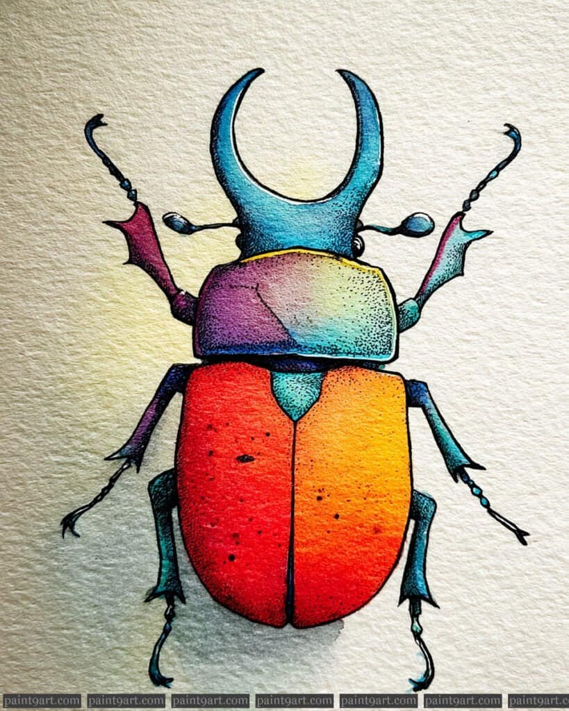
- 1.22 The Rainbow Rhinoceros Beetle
- 1.23 The Proud Rhinoceros Beetle
- 1.24 The Mischievous Mosquito
- 1.25 The Wide-Eyed Ladybug
- 1.26 The Stylish Cockroach
- 1.27 The Grumpy Bumblebee
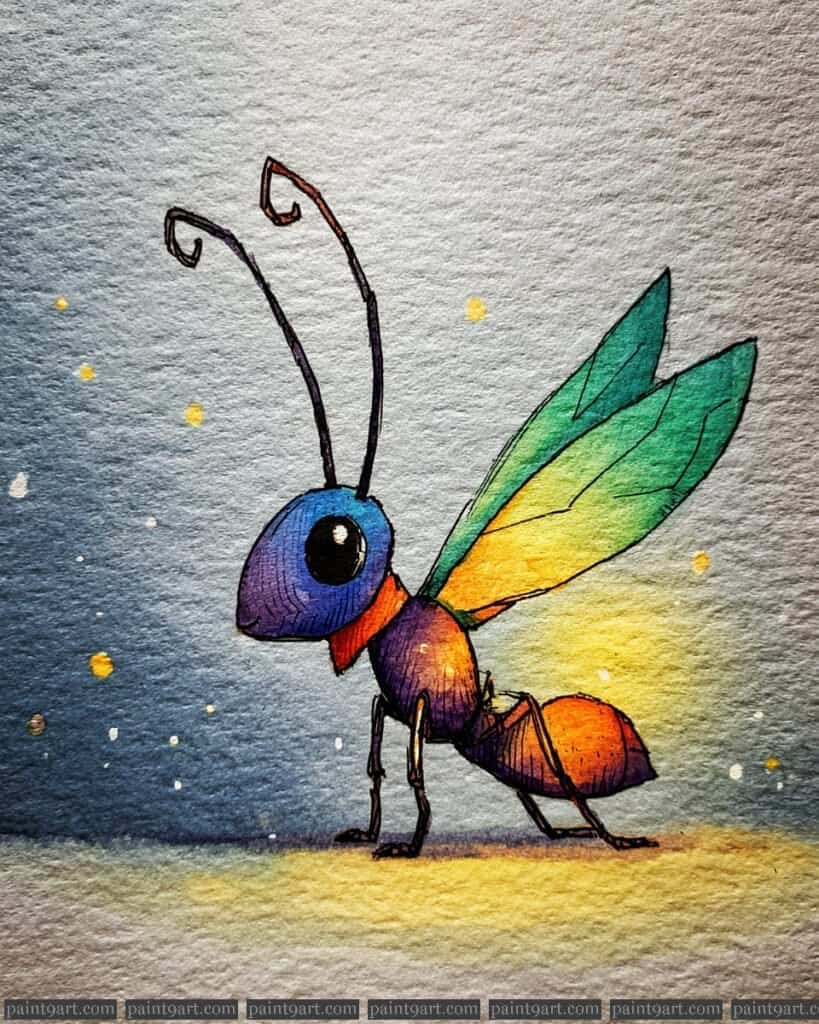
- 1.28 The Little Fire Ant
- 1.29 The Scholarly Bookworm
- 2 Conclusion
29 Watercolor Funny Insects Ideas
Vibrant Cicada
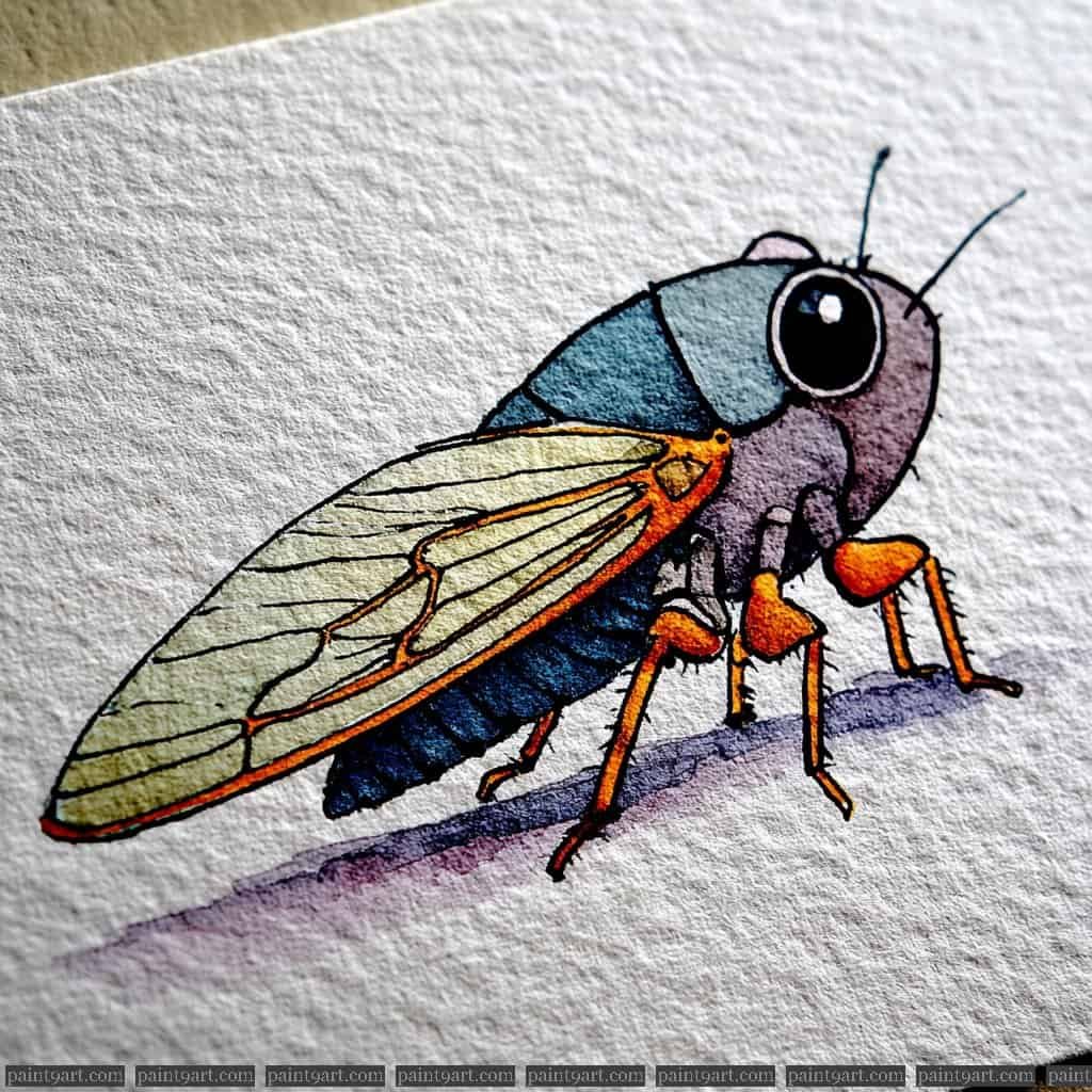
Begin with a clean, detailed sketch focusing on the heavy, segmented body and the long, sloping wings that define the cicada’s silhouette. For the underpainting, apply a muted purple-grey wash to the head and a deep, saturated teal to the main body segments using a controlled wet-on-dry method to keep the colors from muddying. The wings should be approached with a very pale, transparent wash of ochre, leaving the paper’s texture to suggest the delicate, papery quality of the insect’s flight membranes.
Once the primary forms are dry, shift to detail painting by using a fine-tipped synthetic brush to render the orange legs with a punchy, opaque pigment. Use a rich, dark ink or concentrated black watercolor to define the large, glossy eye, making sure to leave a tiny sliver of white paper for a sharp reflection. Finally, use a very steady hand to draw the intricate, dark veins on the wings and the tiny hairs on the legs, then pull a soft violet shadow horizontally beneath the feet to give the piece a sense of weight and place.
Recommended Palette
To capture the earthy yet bold tones of this cicada, I suggest using these professional pigments:
- Indanthrone Blue: For the deep, midnight-teal of the body segments.
- Dioxazine Violet: Diluted for the head and used more thickly for the shadow.
- Pyrrol Orange: To provide that high-contrast pop on the legs and wing joints.
- Yellow Ochre: Diluted heavily for the base tint of the wings.
- Payne’s Gray: For the deep, solid black of the eyes and the fine line work.
- Burnt Umber: To add subtle, warm definition to the segments and wing veins.
Curious Golden Glow-Worm
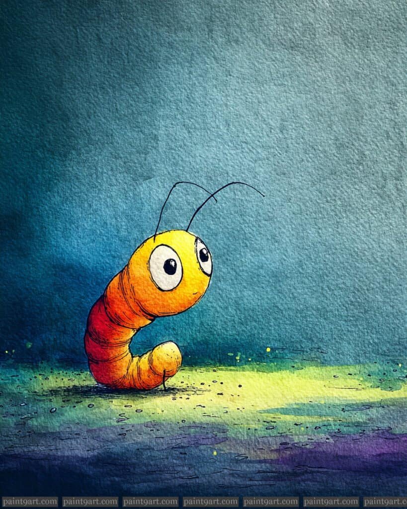
To bring this luminous character to life, begin with a light pencil outline of the “C” shaped body and the oversized, tilted eyes. For the underpainting, execute a high-contrast wet-on-wet wash for the background, blending deep indigo at the top into a bright, acidic yellow-green around the worm to create a bioluminescent halo effect. On the body itself, layer a gradient from bright yellow at the head to a deep, saturated orange-red at the tail, keeping the transitions smooth to imply a soft, fleshy texture.
Once the background and body are dry, use the dry-brush technique to add fine, horizontal segments along the worm’s torso to give it form and movement. To achieve the dramatic lighting, use a damp brush to lift a bit of color from the top of the head for a highlight, and apply a very dark, concentrated blue-black for the shadow directly beneath the worm. Finalize the piece with a steady hand to ink the thin antennae and the small, dark pupils, ensuring the eyes look upward to enhance its curious expression.
Recommended Palette
To capture the glowing atmosphere and warm gradients of this scene, I suggest using these professional pigments:
- Hansa Yellow Light: For the primary glow around the worm and its face.
- New Gamboge: For the transition areas on the body segments.
- Pyrrol Scarlet: To create the deep, warm tones at the curve of the tail.
- Indanthrone Blue: For the moody, atmospheric background and deep shadows.
- Phthalo Green (Yellow Shade): To mix with yellow for the bright ground glow.
- Lunar Black: For the precise pupils and the delicate, wiry antennae.
Ruby-Eyed Fly
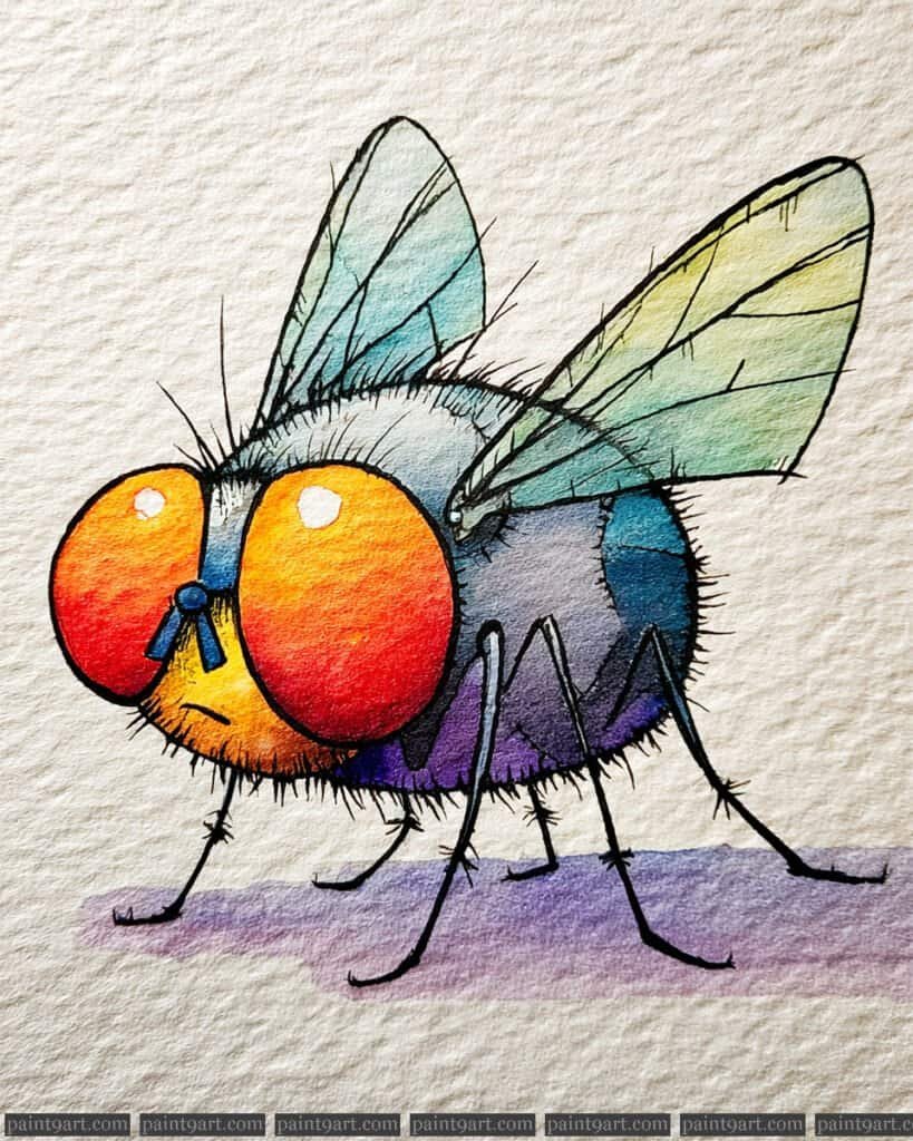
Start your sketch by prioritizing the massive, elliptical eyes and the stout, rounded body, ensuring you leave enough room for the translucent wings. For the underpainting, use a vibrant wet-on-wet technique on the eyes, bleeding a bright yellow into a rich scarlet to create that glowing, iridescent effect. For the body, apply a variegated wash of cool blues and deep purples, letting the colors mingle on the paper to mimic the natural sheen of an insect’s exoskeleton.
Once the body is dry, use a highly diluted pale green wash for the wings, keeping the application very light to maintain transparency. Transition to detail work using a fine-tipped brush or a technical pen to ink the sharp, spindly legs and the delicate veining within the wings. Finally, add the character-defining “fuzzy” texture by flicking short, tapered strokes of concentrated dark pigment along the silhouette of the head and thorax.
Recommended Palette
To capture the bold and jewel-toned palette of this curious fly, I recommend these professional watercolor pigments:
- Cadmium Red Deep: For the intense, outer edges of the eyes.
- Hansa Yellow Medium: To create the bright, inner glow of the eye centers.
- Ultramarine Blue: To serve as the primary base for the cool-toned body.
- Dioxazine Violet: For the deep shadows and transitions on the lower abdomen.
- Viridian: Lightly diluted for the translucent tint on the wings.
- Neutral Tint: Perfect for the fine leg details and the bristly hair textures.
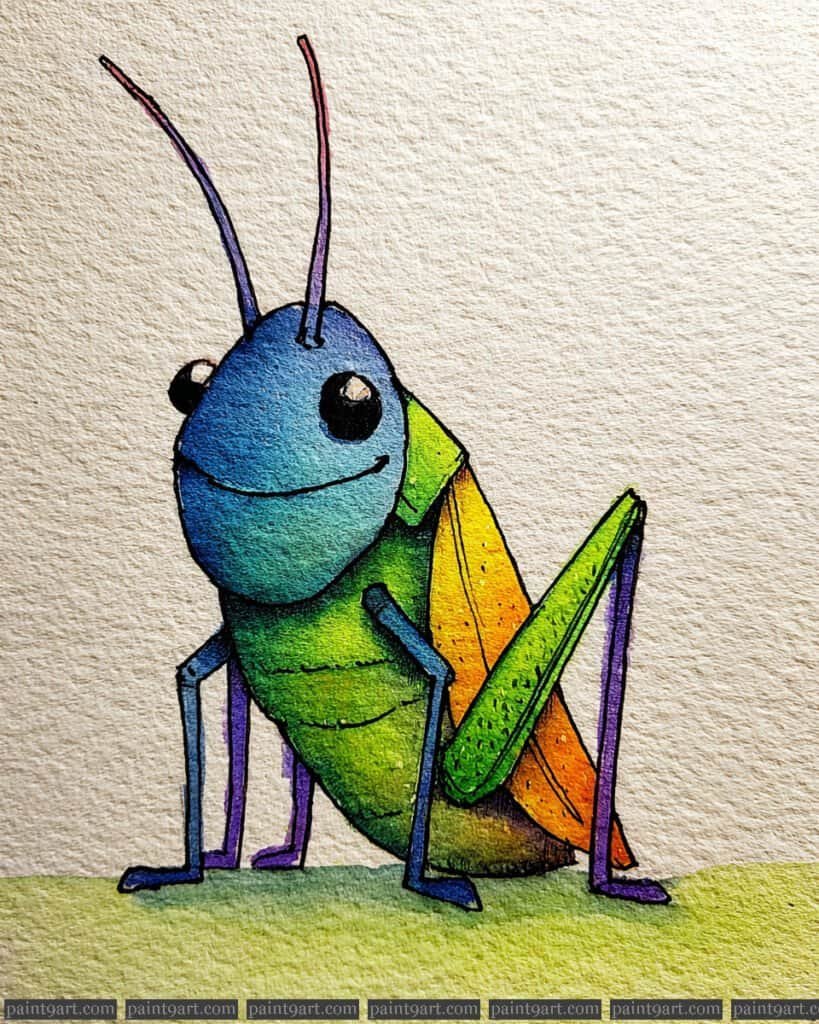
The Cheerful Grasshopper Scout
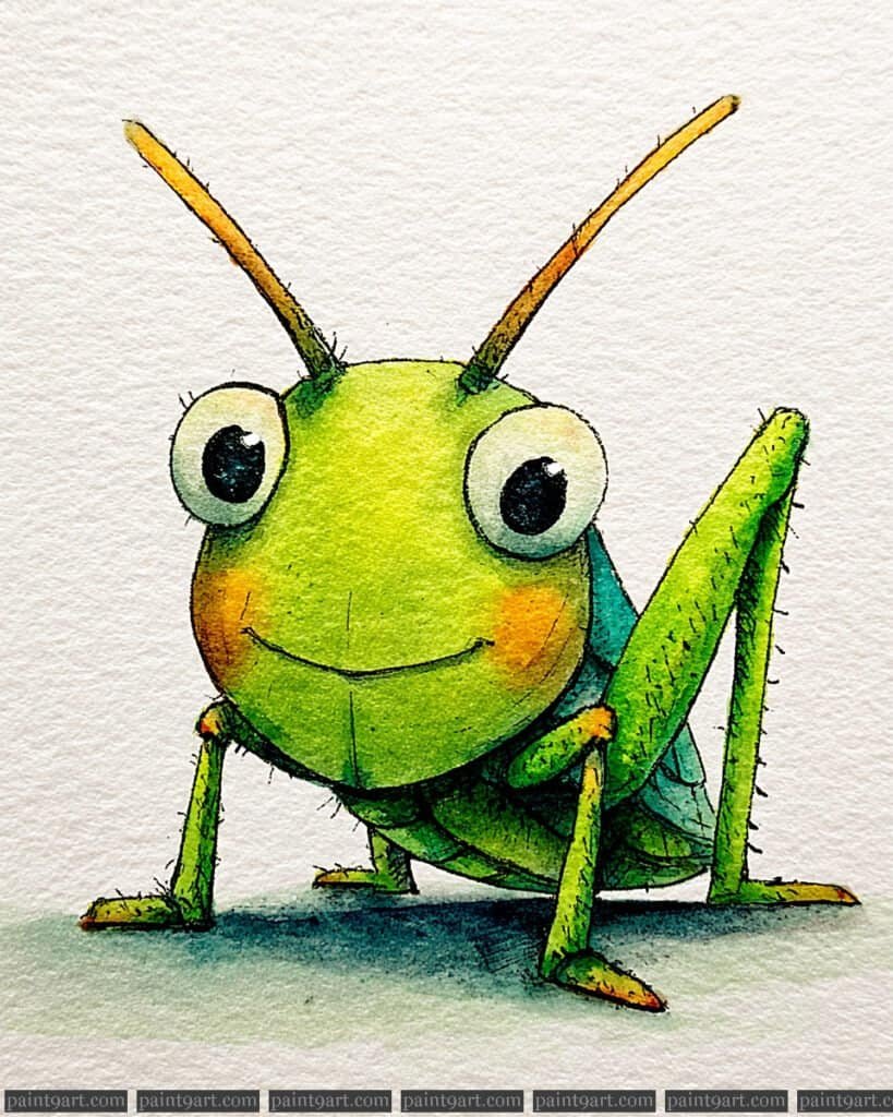
To capture the whimsical essence of this character, start with a precise graphite sketch on cold-pressed paper, focusing on the large, expressive eyes and the tapering antennae. Begin the underpainting with a soft wet-on-wet application of light green for the head, allowing the pigment to settle naturally to create a rounded, 3D effect. While the surface is still slightly damp, drop in a touch of warm orange onto the cheeks to achieve a soft, diffused glow without harsh edges.
Once the base layers are completely bone-dry, use a fine-liner brush or a small round brush with a wet-on-dry technique to define the sharp segments of the legs and the subtle wing patterns. Focus on the contrast in the eyes by building deep, dark layers around a crisp white paper highlight to make them pop. Finally, add the minute, bristly hairs along the limbs with quick, light strokes and use a cool shadow tone beneath the body to ground the subject firmly on the surface.
Recommended Palette
To recreate the vibrant and textured look of this illustration, I recommend the following professional pigments:
- Sap Green: For the primary body color.
- Azo Yellow: To mix for the brighter, sunlit highlights on the head.
- Quinacridone Gold: For the warm tones in the antennae and cheeks.
- Phthalo Blue: Mixed with green for the deeper, shaded crevices of the thorax.
- Payne’s Gray: For the intense darks in the eyes and the soft cast shadow.
- Burnt Sienna: To add a touch of earthy realism to the tips of the feet and antennae.
The Determined Dung Roller
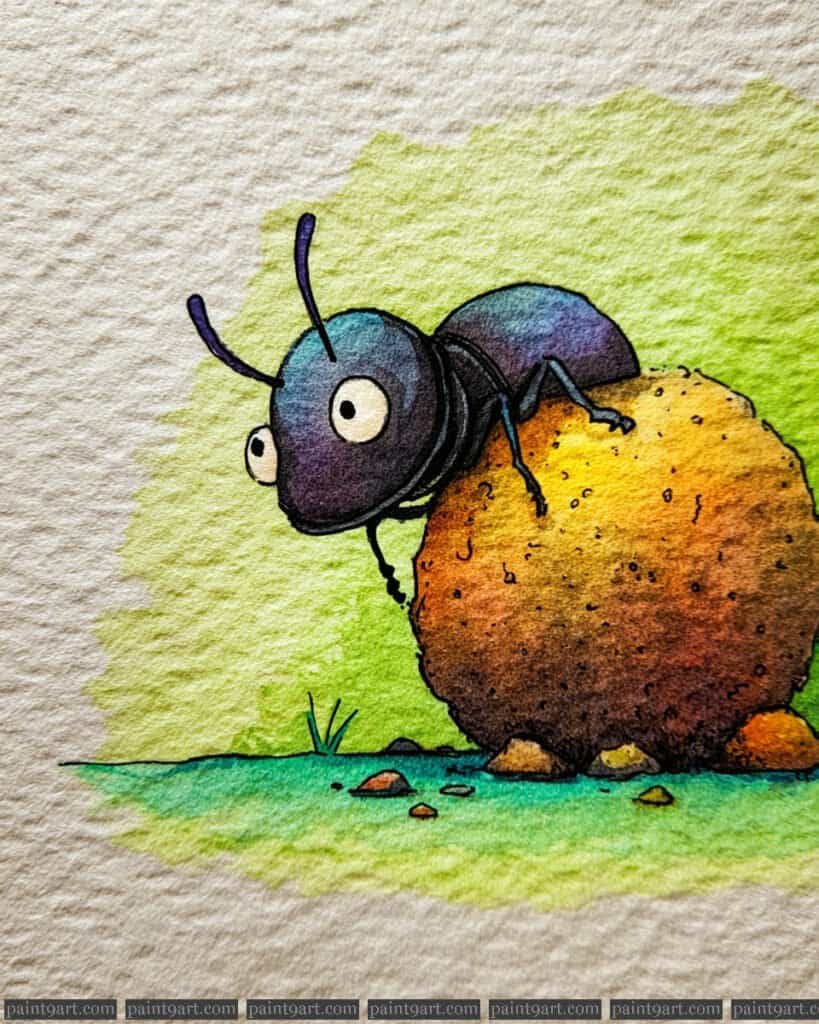
Begin with a simple pencil sketch of the dung beetle in a dynamic pushing pose, making sure to render the dung ball as a large, textured sphere that dominates the composition. Use a wet-on-wet technique for the green grassy background, blending a bright lime green into a softer yellow to create a fresh, sunlit environment. For the beetle’s body, apply a dark violet and blue wash, leaving a few small areas untouched to represent the natural sheen of its chitinous shell.
Once the background is dry, focus on the dung ball using a stippling and layering technique to build up its earthy texture. Start with a light ochre base and layer in burnt umber and sienna, using small, irregular dots to suggest the rough, organic material of the ball. Finish the piece by using a fine-liner to define the beetle’s wide, focused eyes and spindly legs, and add a few small pebbles and blades of grass at the base to ground the action within the scene.
Recommended Palette
To capture the earthy and industrious spirit of this little beetle, I recommend these professional pigments:
- Yellow Ochre: For the sun-bleached base of the dung ball.
- Burnt Umber: To add deep, rich texture and shadows to the sphere.
- Hansa Yellow Light: For the luminous highlights in the grassy background.
- Phthalo Green (Yellow Shade): For the vibrant, saturated patches of grass.
- Dioxazine Purple: To provide the deep, iridescent base for the beetle’s body.
- Indigo: For the sharpest outlines and the intense pupils of the eyes.
The Grasshopper Violinist
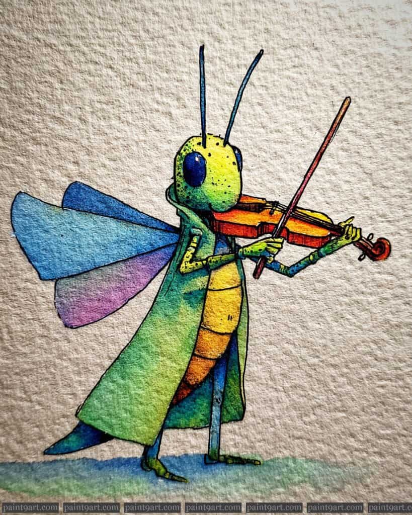
Begin with a light pencil sketch of the grasshopper in a standing pose, paying close attention to the positioning of the arms to realistically hold the violin and bow. Use a wet-on-wet technique for the long coat and head, dropping in a bright lemon yellow and charging it with a vibrant emerald green to create a smooth, glowing transition that suggests a soft, organic texture. The wings should be painted with a very diluted wash of cerulean and lavender, keeping the pigment light to maintain a sense of delicate transparency.
Once the initial washes have dried, use a dry brush technique with a warm burnt sienna to add the wood-grain texture to the violin and the segmented details of the abdomen. To make the character pop, use a fine-liner or a size 0 round brush to define the long antennae and the small, dark eyes with a tiny white highlight for a touch of life. Finally, apply a soft, variegated blue shadow at the feet using a wet-on-dry stroke to ground the musician on the textured paper.
Recommended Palette
To capture the harmonic colors of this musical grasshopper, I recommend these professional pigments:
- Hansa Yellow Light: For the bright highlights on the head and the underside of the body.
- Phthalo Green (Yellow Shade): To create the rich, saturated green of the grasshopper’s coat.
- Cerulean Blue: Diluted for the airy, top layers of the wings and the ground shadow.
- Quinacridone Violet: For the soft purple gradients at the base of the wings.
- Burnt Sienna: Perfect for the warm, wooden tones of the violin and bow.
- Indanthrone Blue: A deep blue for the precise details of the eyes and fine linework.
The Lantern-Bearing Firefly
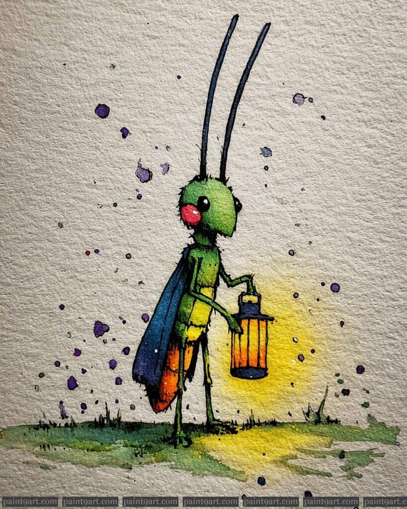
Start with a slender pencil sketch of the firefly, focusing on the upright posture and the delicate hand holding the lantern. For the underpainting, use a wet-on-dry wash for the green body and blue wings, then immediately apply a glowing wet-on-wet halo of bright yellow around the lantern to simulate light radiating into the cool gray background. This contrast between the warm lantern light and the cool body tones is essential for establishing the evening atmosphere.
Once the initial layers are dry, use a fine round brush and a stippling technique to add the purple and dark gray splatters across the background, which adds a sense of magical energy to the air. Detail the lantern with deep oranges and blacks to give it structure, and use a fine-liner to sharpen the antennae and the firefly’s simple, expressive features. Finally, add a touch of opaque white or pale yellow to the very center of the lantern for the “hottest” point of light, making the glow feel truly luminous.
Recommended Palette
To capture the magical, nocturnal glow of this illustration, I recommend these professional pigments:
- Hansa Yellow Light: For the primary glow of the lantern and the light reflecting on the grass.
- Sap Green: To create the natural, leafy green of the firefly’s head and body.
- Indanthrone Blue: For the deep, midnight tone of the wings and dark splatters.
- Pyrrol Orange: To add warmth and depth to the interior of the lantern.
- Dioxazine Purple: Used for the whimsical background splatters and deepening shadows.
- Bleed Proof White: For the sharpest highlights on the lantern glass and eyes.
The Radiant Butterfly Gardener
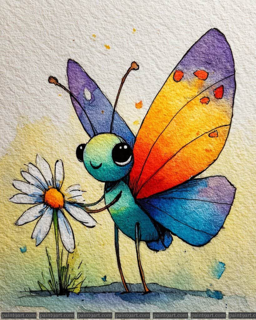
Begin with a light pencil sketch of the butterfly, focusing on the whimsical, rounded proportions of the head and the sweeping curves of the wings as it interacts with the daisy. For the underpainting, use a wet-on-wet technique on the wings to create a vibrant gradient, dropping in a bright yellow at the top and blending into a warm orange and deep red towards the base. The body and the back wing should be painted with a soft wash of turquoise and violet, allowing the colors to bleed naturally to suggest a soft, ethereal texture.
Once the initial washes are dry, utilize a stippling technique with a fine-liner or a size 0 round brush to add the decorative orange spots on the upper wing tips. For the daisy, use a very diluted gray for the petal shadows to maintain a clean, white appearance, and apply a concentrated yellow-orange for the center. Finally, add the fine details like the delicate antennae and the tiny, smiling mouth with a steady hand, and use a dry brush method to add texture to the grass at the butterfly’s feet.
Recommended Palette
To capture this joyful and colorful scene, I recommend using the following professional pigments:
- Hansa Yellow Medium: For the bright, sun-filled sections of the wings and the daisy center.
- Pyrrol Orange: To create the rich mid-tones in the wing gradient and the spots.
- Cobalt Turquoise: For the luminous, friendly teal of the butterfly’s body.
- Ultramarine Violet: To provide the soft, cool contrast on the back wing and shadows.
- Hooker’s Green: Diluted for the soft grassy base and the daisy stem.
- Payne’s Gray: For the delicate linework and the subtle shadows on the white petals.
The Dapper Gentleman Beetle
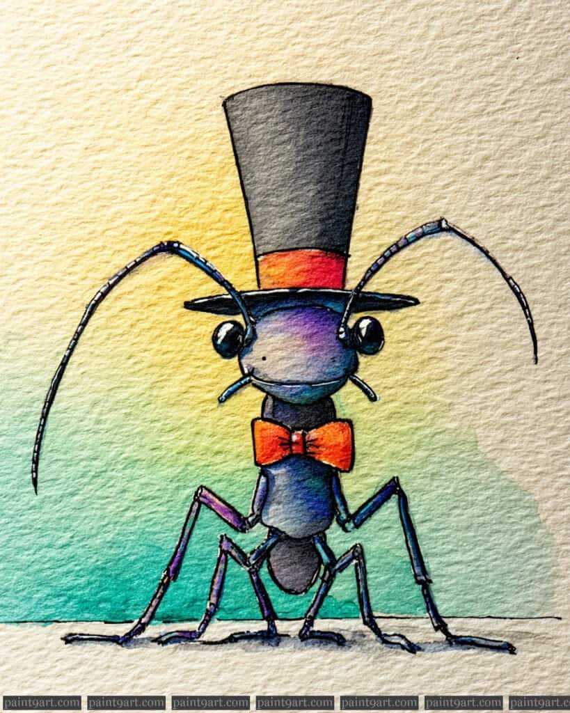
Begin your masterpiece with a whimsical pencil sketch of this sophisticated beetle, making sure to perfectly align the tall top hat and the charming bow tie. Use a wet-on-wet technique for the background, blending a soft pale yellow into a refreshing seafoam green to create a clean, luminous atmosphere that makes the character pop. For the beetle’s body, apply a variegated wash of deep indigo and violet, allowing the colors to bleed into one another to suggest a smooth, iridescent shell.
Once your base is dry, move on to the finer details using a dry brush technique to add subtle texture to the top hat and the beetle’s sleek exoskeleton. Use a highly saturated orange for the bow tie and hat band, applying a tiny bit of lifting to create a soft highlight in the center of the bow. Finally, define the thin, elegant antennae and the glossy black eyes with a fine-liner pen, ensuring the highlights in the eyes remain crisp white to give our gentleman a spark of life.
Recommended Palette
To capture the sophisticated charm of this dapper fellow, I recommend the following professional pigments:
- Indanthrone Blue: For the deep, dark base of the beetle’s body and top hat.
- Dioxazine Purple: To add those royal purple shifts within the body’s iridescence.
- Pyrrol Orange: For the vibrant, eye-catching bow tie and decorative hat band.
- Phthalo Green (Yellow Shade): Diluted for the soft, airy background gradient.
- Aureolin (Cobalt Yellow): For the warm, glowing light at the top of the background.
- Lamp Black: For the final high-contrast details and the sharp pupils of the eyes.
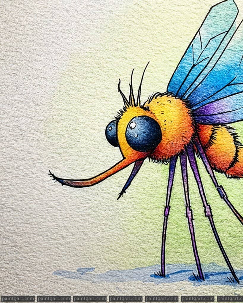
The Rainbow Proboscis Mosquito
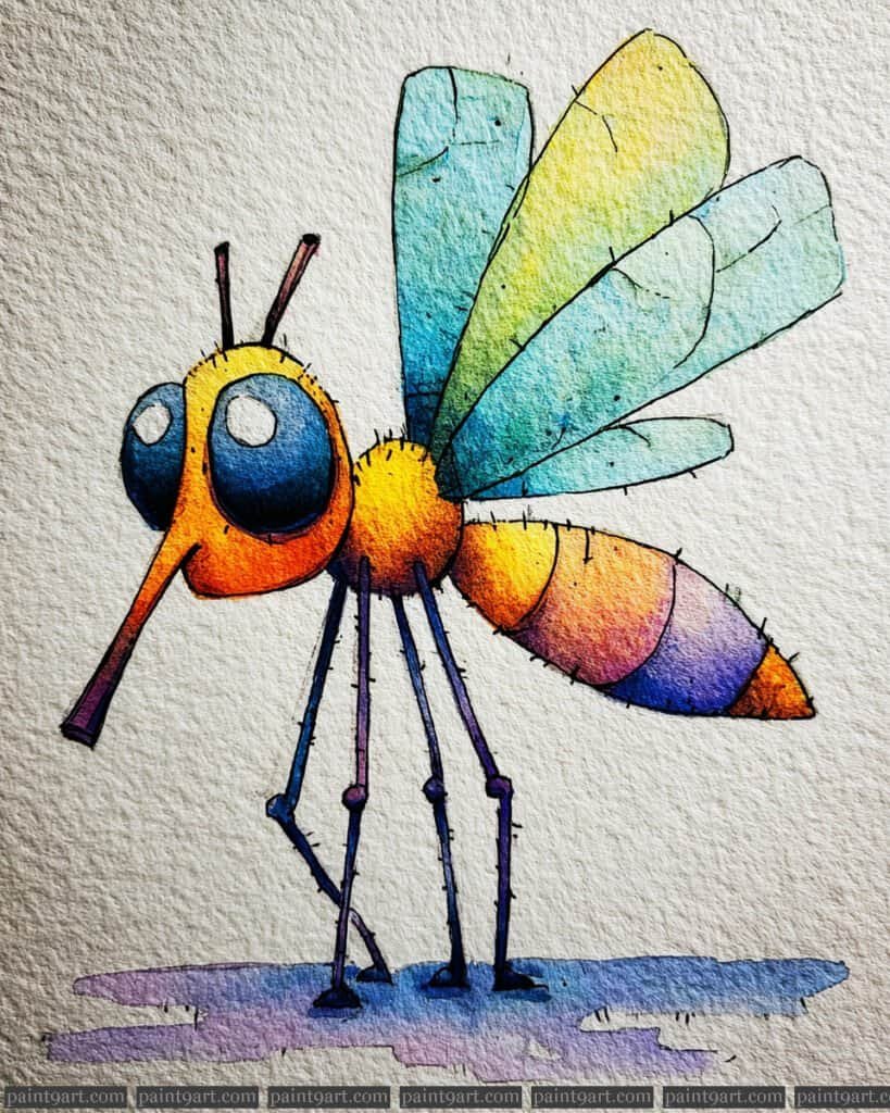
Begin with a playful pencil sketch, emphasizing the elongated proboscis and the segmented, tapering abdomen to establish the character’s whimsical silhouette. For the underpainting, apply a vibrant wet-on-wet wash across the abdomen and head, transitioning smoothly from a warm orange to a soft violet and deep blue to create a glowing, multi-colored effect. The wings should be treated with a very light, transparent wash of turquoise and lime green, allowing the heavy texture of the watercolor paper to show through.
Once the base layers are completely dry, use a fine-liner or a size 0 round brush to add the “hairy” texture along the legs and the perimeter of the body segments. To give the oversized eyes their depth, layer a deep indigo wash at the bottom while leaving the pre-planned white circles of the paper untouched for a crisp, natural highlight. Finally, add a soft, variegated violet shadow at the feet to ground the mosquito and provide a professional, finished look.
Recommended Palette
To capture this vibrant, illustrative spectrum, I recommend using the following professional pigments:
- New Gamboge: For the bright, sunny yellow on the head and thorax.
- Pyrrol Orange: To create the warm transition at the start of the abdomen.
- Quinacridone Violet: For the rich, glowing purple segments of the tail.
- Ultramarine Blue: To provide deep contrast in the eyes and the tip of the abdomen.
- Phthalo Turquoise: Diluted for the airy, ethereal quality of the wings.
- Shadow Violet: A pre-mixed convenience gray or violet for the soft ground shadow.
The Crimson-Eyed Fly
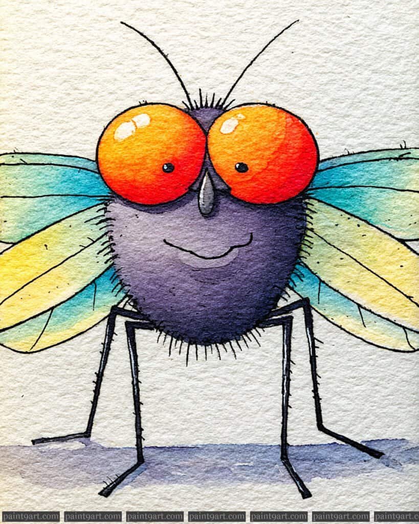
Begin with a soft pencil sketch focusing on the exaggerated, circular eyes and the plump, fuzzy body to capture the playful character of this illustration. For the underpainting, use a wet-on-wet technique on the eyes, dropping in a bright orange and charging the lower edges with a deep red to create a sense of spherical volume. The wings should be painted with a very diluted, pale turquoise wash, allowing the texture of the paper to suggest transparency.
After the base layers have dried, use a small round brush with a dry brush technique to create the fine, bristly hairs along the perimeter of the body. For the eyes, apply a thick, opaque white gouache or a gel pen to place the “hot” highlights at the top, which immediately gives them a glossy, glass-like finish. Finally, use a steady hand and a fine-liner to define the thin legs and the charming smile, adding a soft violet shadow beneath the character to ground it on the page.
Recommended Palette
To bring this whimsical fly to life, I recommend the following professional pigments:
- Cadmium Orange: For the bright, energetic base of the oversized eyes.
- Pyrrol Red: To add depth and shadow to the curvature of the eyes.
- Dioxazine Purple: A rich, dark purple for the fuzzy body and subtle shading.
- Cobalt Turquoise Light: Diluted heavily for the airy, translucent wings.
- Neutral Tint or Ivory Black: For the precise linework of the legs and antennae.
- Permanent White Gouache: Essential for creating the bold, reflective eye highlights.
The Midnight Stag Beetle
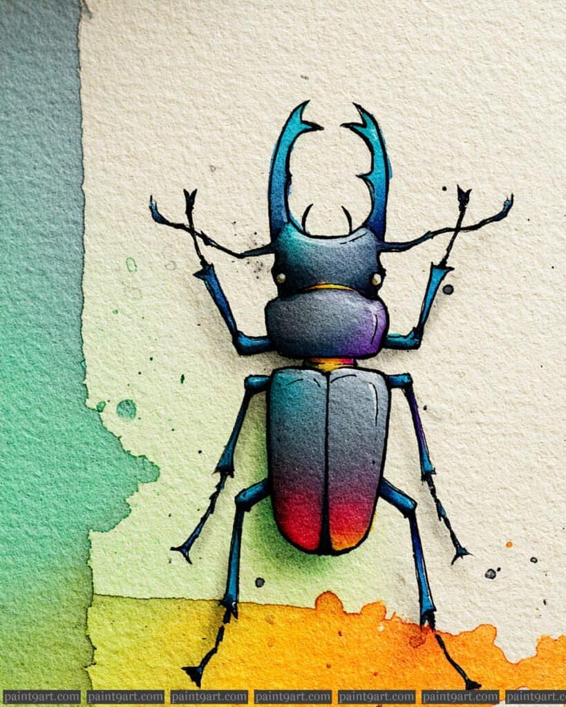
Begin with a precise pencil sketch of the stag beetle, paying close attention to the sharp, multi-pointed mandibles and the elongated body segments. Apply a controlled wet-on-dry wash to the individual plates of the exoskeleton, using a gradient that transitions from a deep, velvety indigo at the top to a vibrant, glowing crimson at the base of the wing covers. This technique ensures the colors remain saturated while allowing for clean edges between the segments.
Once the primary color transitions are set, utilize stippling with a very fine-tipped pen or a size 00 brush to create the subtle grain and texture of the shell. To achieve the metallic, iridescent look, layer thin glazes of a cool turquoise over the darker areas and use a lifting technique or opaque white ink to place sharp, bright highlights on the curved surfaces of the mandibles and thorax. These high-contrast points will give the beetle a polished, three-dimensional appearance against the textured paper.
Recommended Palette
To capture the moody and metallic essence of this specimen, I recommend these professional pigments:
- Indanthrone Blue: For the deep, near-black shadows and the primary body tone.
- Phthalo Turquoise: To create the shimmering, cool highlights on the shell and legs.
- Quinacridone Magenta: For the rich, glowing transition into the red zones.
- Pyrrol Scarlet: To provide the intense, warm pop of color at the tail end.
- Payne’s Gray: Perfect for building depth in the joints and providing a soft shadow.
- Bleed Proof White: For those essential, tiny “specular” highlights that define the metallic texture.
The Iridescent Jewel Beetle
Begin by sketching the beetle’s symmetrical form with a light pencil, focusing on the distinct segments of the head, thorax, and elytra. Apply a wet-on-wet underpainting to each section independently, dropping in primary hues like cyan, magenta, and yellow to allow them to mingle naturally on the paper, creating the base for the iridescent effect.
Once the initial layers are bone-dry, use a fine-liner or a size 0 round brush to introduce stippling and cross-hatching for texture and anatomical detail. Focus your darkest values—using a mix of deep blues and purples—along the edges and joints to provide a sense of three-dimensional weight and metallic sheen.
Recommended Palette
To recreate this striking spectrum, I recommend the following professional-grade pigments:
- Phthalo Blue (Green Shade): For the intense, cool teal found on the head and legs.
- Quinacridone Magenta: To achieve those luminous, transparent purple and pink transitions.
- Pyrrol Scarlet: For the fiery, saturated red at the base of the wing covers.
- Hansa Yellow Deep: To blend with the reds for that glowing orange mid-section.
- Indanthrone Blue: A deep, moody blue for the darkest shadows and outlines.
- Titanium White: For adding sharp, specular highlights that mimic a hard, reflective shell.
The Golden Ember Dragonfly
Start by lightly sketching the dragonfly’s rounded proportions on cold-pressed paper, ensuring the large eyes and fuzzy body are well-defined. Begin with a wet-on-wet technique for the wings and body, dropping in a bright yellow wash and immediately charging it with orange and red at the base to create a seamless, glowing gradient. Allow this layer to dry completely before moving forward to ensure the colors remain vibrant and don’t muddy.
Once the base is dry, use a small round brush and a dry brush technique to add the fine, fuzzy textures around the head and thorax. For the wings, use a “splatter” method with a stiff brush to create those organic, spotted patterns that give the character its charm. Finally, switch to a fine-liner or a very thin brush with deep indigo to define the legs, antennae, and the high-contrast highlights in the eyes for a glassy, lifelike depth.
Recommended Palette
To capture the warmth and vibrance of this piece, I recommend using the following professional pigments:
- Hansa Yellow Medium: For the bright, sun-kissed tops of the wings.
- Pyrrol Orange: To create the rich, saturated mid-tones in the body and wing transition.
- Quinacridone Coral or Rose: For the deep reddish-pink flecks and shadows.
- Phthalo Blue (Green Shade): For the cool, contrasting tail and the soft ground shadow.
- Indanthrone Blue: A deep, near-black blue for the pupils and fine linework.
- Bleed Proof White (Opaque): Essential for those crisp, reflective “sparkles” in the eyes.
The Wide-Eyed Dragonfly
Begin by focusing your pencil sketch on the large, circular eyes and the centered, smiling face to establish the character’s friendly personality. For the underpainting, use a wet-on-wet technique on the eyes, dropping in a warm Cadmium Orange and allowing it to bleed into a deep Dioxazine Violet at the edges to create a sense of spherical depth. While the eyes dry, apply a variegated wash to the wings, starting with a bright Hansa Yellow near the body and transitioning into a cool Phthalo Blue and Emerald Green at the tips, letting the pigments settle naturally into the paper’s deep grain.
Once the base layers are bone-dry, use glazing to add a transparent layer of Ultramarine Blue to the shadowed areas of the wings to enhance their three-dimensional appearance. For the final details, use a fine size 00 round brush with highly concentrated Neutral Tint to add the sharp outlines of the face, the delicate leg segments, and the tiny “stippling” marks along the thorax. This contrast between the soft, luminous washes and the crisp, dark line work is essential for giving the dragonfly its illustrative, storybook charm.
Recommended Palette
To recreate this high-contrast and luminous effect, I suggest the following professional pigments:
- Hansa Yellow Medium: For the bright, glowing highlights on the face and wing bases.
- Cadmium Orange: To create the vibrant, warm core of the oversized eyes.
- Emerald Green: For the lush mid-tones in the upper wing sections.
- Phthalo Blue (Green Shade): To achieve the brilliant blue transitions at the wing tips.
- Dioxazine Violet: For the deep, rich shadows in the eyes and wing joints.
- Neutral Tint or Indigo: Perfect for the sharp detail work and the tiny, expressive pupils.
The Smiling Cricket
Begin with a light pencil sketch, focusing on the large, rounded head and the long, powerful jumping legs that give the cricket its characteristic silhouette. For the underpainting, employ a wet-on-wet variegated wash; drop in a saturated Ultramarine Blue at the top of the head, bleeding it into a bright Phthalo Green for the thorax and a warm Cadmium Yellow for the wings. This method allows the pigments to mingle and settle into the valleys of the cold-pressed paper, creating a natural, pebbled texture that brings the character to life.
Once the initial washes are bone-dry, use a glazing technique to add depth to the segments using a transparent layer of Dioxazine Violet. For the fine details, use a size 0 round brush or a fine-liner with highly concentrated pigment to add stippling along the back and legs, emphasizing the rough, insectoid texture. Finish the piece by painting the large, glossy eyes with a dense Indigo, leaving a crisp white highlight for a friendly expression, and add the thin, elegant antennae with a single, confident stroke.
Recommended Palette
To capture the vibrant and textured look of this cricket, I suggest the following professional pigments:
- Ultramarine Blue: For the deep, cool tones of the head and the primary leg joints.
- Phthalo Green (Yellow Shade): To create the lush, vibrant mid-tones of the body segments.
- Cadmium Yellow: For the bright, glowing highlights on the wings.
- Dioxazine Violet: To provide the rich purple hues for the shadows and leg details.
- Indigo: Perfect for the solid, dark pupils of the eyes.
- Yellow Ochre: A light wash of this for the grounded shadow to provide a warm, earthy base.
The Serene Emerald Mantis
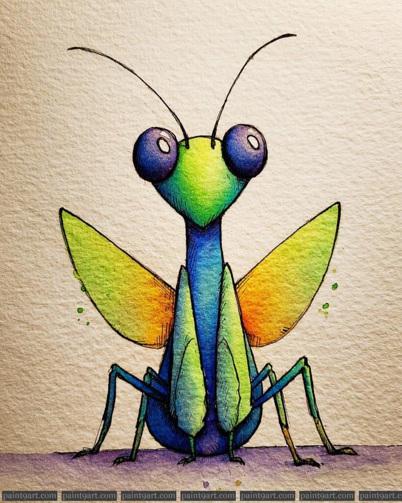
Begin with a precise, symmetrical pencil sketch, focusing on the elongated thorax and the large, perfectly round eyes. For the underpainting, apply a wet-on-wet technique to the head and thorax, dropping in a bright Lemon Yellow at the crown and bleeding it into a lush Emerald Green and a deep Cobalt Blue toward the base. This method allows for a smooth transition of colors while maintaining the luminosity essential for a watercolor insect. While the main body is drying, use a variegated wash on the wings, starting with a pale green at the tips and blending into a warm, glowing Cadmium Orange near the body.
Once the initial layers are completely dry, use a glazing technique to add depth to the eyes with a transparent layer of Dioxazine Violet, leaving small, crisp white highlights to ensure they look glossy and expressive. For the fine details, use a size 0 round brush with highly concentrated pigment to add sharp, dark outlines and delicate cross-hatching on the shadowed underside of the wings and legs. This contrast between the soft, bleeding washes of the underpainting and the crisp, dark lines of the final layer is what gives the mantis its illustrative, storybook appeal.
Recommended Palette
To replicate the vibrant and diverse color story of this mantis, I recommend the following professional pigments:
- Lemon Yellow: For the bright, sun-kissed highlights on the head and wing centers.
- Emerald Green: To create the lush, primary mid-tones of the face and wings.
- Cobalt Blue: For the deep, cool transitions in the center of the thorax and head.
- Cadmium Orange: To achieve the warm, glowing contrast on the inner wings.
- Dioxazine Violet: Specifically for the rich, deep tones of the eyes and ground shadow.
- Payne’s Gray: The perfect choice for the fine-line leg details and sharp pupils.
The magical dragonfly
Begin with a light pencil sketch, focusing on the spherical head and the long, segmented abdomen that tapers elegantly. For the underpainting, use a wet-on-wet technique on the head and body, dropping in a warm Lemon Yellow at the center and bleeding it into a saturated Cadmium Orange at the edges to create a soft, internal glow. While the body is drying, apply a variegated wash to the wings, transitioning from a deep Ultramarine at the base to a bright Emerald Green and finally a pale Yellow at the tips, allowing the colors to intermingle naturally on the textured paper.
Once the initial layers are bone-dry, use glazing to build intensity in the lower wings with a transparent layer of Dioxazine Violet. For the intricate details, use a size 0 round brush or a fine-liner to add stippling—tiny dots of concentrated pigment—along the back and head to simulate a fuzzy, organic texture. Finish the piece by adding the delicate, spindly legs with sharp, dark strokes and use a white gel pen or opaque gouache to add the tiny “star” speckles on the wings, enhancing the magical, celestial theme.
Recommended Palette
To capture the vibrant luminosity of this dragonfly, I recommend these professional pigments:
- Lemon Yellow: For the bright, glowing core of the head and the tips of the upper wings.
- Cadmium Orange: To create the rich, warm mid-tones of the body segments.
- Ultramarine Blue: For the deep, celestial base of the wings and the large eyes.
- Emerald Green: For the vibrant transition area in the upper wings.
- Dioxazine Violet: To provide the rich purple hues in the lower wings and the darkest shadows.
- Payne’s Gray: Perfect for the fine-line leg details and the deep pupils of the eyes.
The Wise Scholar
Begin with a light pencil sketch of the caterpillar’s rounded segments and the delicate stack of books, ensuring the wizard hat sits firmly atop its head. For the underpainting, apply a wet-on-wet technique to each body segment individually, dropping in Hansa Yellow at the top and bleeding it into a cool Phthalo Green at the bottom to create a seamless, glowing transition. This initial wash should be transparent enough to let the heavy grain of the cold-pressed paper provide natural highlights and organic texture.
Once the initial washes are bone-dry, use glazing—layering thin, transparent coats of pigment—to deepen the saturation on the shadowed undersides of the books and the caterpillar’s belly. Use a size 0 round brush with highly concentrated Burnt Umber or a technical pen to add the sharp “stippling” and fine outlines that give the character its storybook charm. Finally, add a soft violet-blue wash beneath the caterpillar to create a grounded shadow, which helps the character feel integrated into the page.
Recommended Palette
To replicate the luminosity and depth found in this illustration, I recommend these professional pigments:
- Hansa Yellow Light: For the brightest highlights on the face and segments.
- Phthalo Green (Yellow Shade): To create the lush, vibrant mid-tones of the body.
- Cobalt Turquoise: Ideal for the transitions into the cooler, darker areas of the skin.
- Pyrrol Scarlet: For the intense, warm reds found in the book stack.
- Dioxazine Violet: Specifically for the wizard’s hat and the soft ground shadow.
- Burnt Umber: The perfect earthy tone for the glasses and delicate line work.
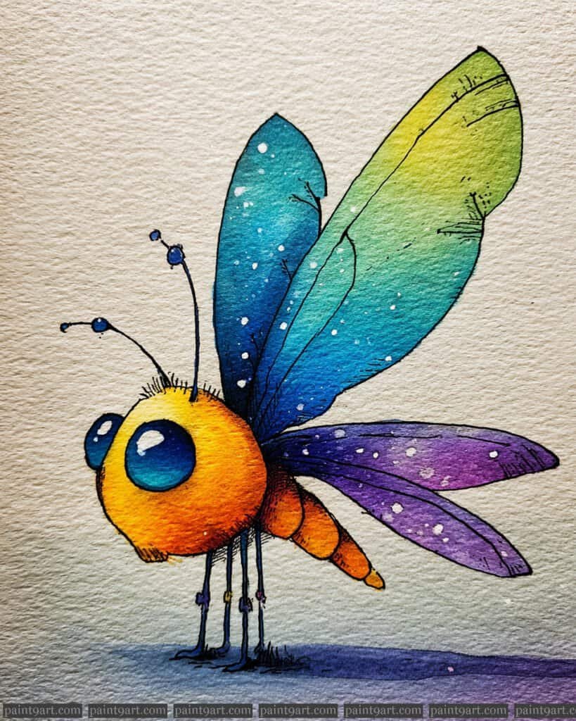
The Dreamy Firefly
Begin with a soft pencil sketch, focusing on the slender limbs and the distinctive upward tilt of the wings. For the underpainting, use a wet-on-wet technique for the background, dropping in a deep Indigo and Ultramarine while leaving a “halo” of clean paper around the tail to preserve the glow. While the background is damp, charge in a brilliant Lemon Yellow into that halo, allowing it to softly bleed outward to create the illusion of radiating light.
Once the background is bone-dry, apply the mid-tones to the body using a graduated wash, transitioning from a cool violet on the head to a warm, fiery orange on the tail. Use a glazing technique on the wings with a thin mix of Phthalo Green and Yellow, keeping the layers transparent to mimic their delicate, paper-thin nature. Finalize the piece with sharp dry brush details for the antennae and fine-liner hatching to emphasize the segments, ensuring the “glow” remains the focal point by avoiding any dark pigments in the luminous tail section.
Recommended Palette
To capture this luminous, dreamlike quality, I suggest these professional pigments:
- Lemon Yellow: Essential for the primary light source of the tail and the radiating halo.
- Quinacridone Gold: To bridge the transition between the bright yellow glow and the orange body.
- Pyrrol Orange: For the saturated, warm tones of the firefly’s mid-section.
- Dioxazine Violet: To create the cool, shadowed tones of the head and the transition to the night sky.
- Phthalo Green (Yellow Shade): For the vibrant, translucent wings.
- Indigo: The perfect deep, atmospheric blue for the twilight background.
The Playful Spider
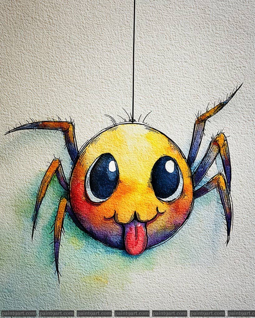
Begin with a perfectly circular pencil sketch for the body, adding large, symmetrical ovals for the eyes and a cheeky tongue sticking out. For the underpainting, apply a variegated wash using a wet-on-wet technique; drop in a bright Lemon Yellow at the crown of the head and bleed it into a warm Cadmium Orange and a deep Alizarin Crimson toward the bottom. This creates a brilliant, sun-drenched glow that transitions into a cool, shadowed violet at the base, giving the spider a solid, three-dimensional form on the textured paper.
Once the body is dry, focus on the legs using a dry brush technique to capture the spindly, hairy texture. Use a highly concentrated mix of Dioxazine Violet and Indigo for the dark parts of the legs, alternating with strokes of orange to suggest light reflecting off the joints. To finish, paint the large pupils with a dense Indigo, leaving two distinct “sparkles” of white paper to ensure the character looks lively and mischievous. Finally, use a very steady hand or a technical pen to draw the single, thin vertical line of silk that anchors the composition.
Recommended Palette
To capture this vibrant, high-contrast look, I suggest using these professional pigments:
- Hansa Yellow Light: For the bright highlight on the top of the spider’s head.
- Cadmium Orange: To create the rich, warm mid-tones of the face.
- Quinacridone Rose or Alizarin Crimson: For the transition into the deeper reds and the tongue.
- Dioxazine Violet: To provide the cool, deep shadows at the bottom of the body and on the legs.
- Indigo: For the solid, dark pupils and the darkest details of the joints.
- Sap Green: A very diluted wash of this for the soft background glow to complement the warm reds.
The Rainbow Rhinoceros Beetle
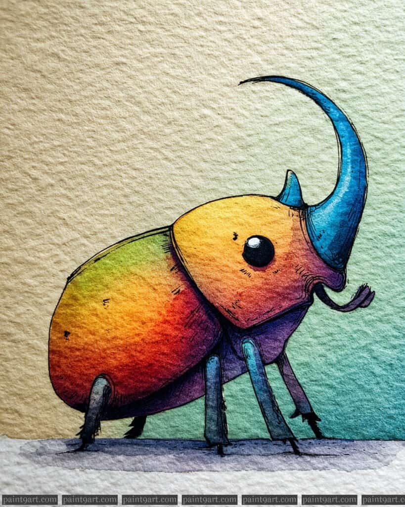
Begin with a fluid pencil sketch to capture the majestic sweep of the horn and the heavy, rounded proportions of the abdomen. For the underpainting, employ a variegated wash using a wet-on-wet technique; drop in Hansa Yellow on the upper back, bleeding it into a fiery Pyrrol Red in the center, and finally into a deep Dioxazine Violet at the base. This initial layer should be applied with plenty of water to allow the pigments to mingle naturally on the textured paper, creating the seamless spectrum seen on the shell.
Once the body is dry, use a wet-on-dry approach to paint the horn with a saturated Cerulean Blue, deepening the shadows with a touch of Indigo to give it a solid, crystalline appearance. To add character and depth, use a size 0 detail brush with concentrated neutral tint to define the “segment lines” and the tiny, expressive eye, leaving a pinpoint of white paper for a lifelike sparkle. Finish by adding a soft, horizontal wash of Phthalo Green in the background to provide a cool contrast that makes the warm tones of the beetle’s shell vibrate with intensity.
Recommended Palette
To recreate this high-vibrancy, spectrum-defying look, I recommend these professional pigments:
- Hansa Yellow Deep: For the glowing, sun-drenched highlight on the upper shell.
- Pyrrol Red: To create the intense, saturated transition in the middle of the body.
- Dioxazine Violet: For the deep, regal purple at the base of the beetle and the leg segments.
- Cerulean Blue Chromium: To capture the bright, clean blue of the prominent horn.
- Indigo: Perfect for the darkest shadows and the solid, round pupil.
- Phthalo Green (Blue Shade): For the soft, out-of-focus background wash.
The Proud Rhinoceros Beetle
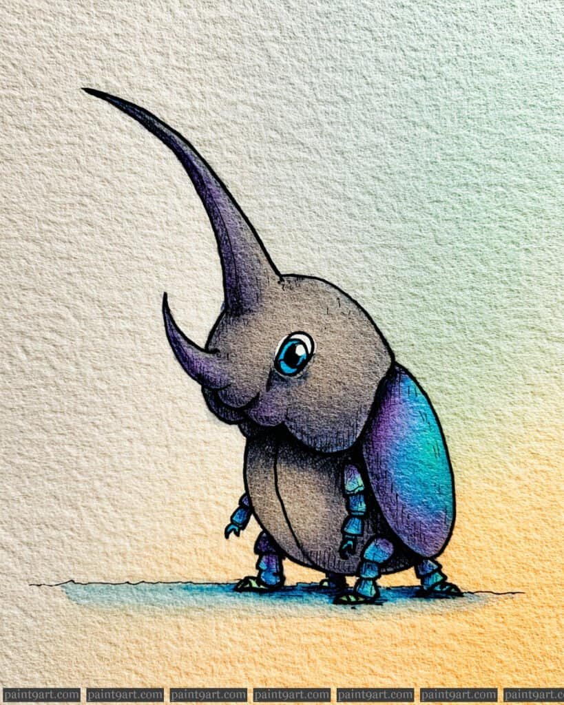
Begin by sketching the dramatic, curved horn and the heavy, segmented body, ensuring the beetle’s stance feels weighted and sturdy. For the underpainting, apply a variegated wash of Burnt Umber and Neutral Tint on the head and horn, while using a wet-on-wet technique on the wing covers (elytra) with Cobalt Teal and Quinacridone Magenta. This base layer creates a luminous, iridescent foundation that mimics the natural chitinous sheen of a beetle’s shell.
Once dry, focus on building depth through glazing; apply a thin layer of Indigo to the underside of the body and the base of the horn to establish strong shadows. Use a fine-liner or a size 0 round brush with highly concentrated pigment to add the “pitted” texture on the head and the sharp, segmented details on the legs. Finally, add a soft, warm horizontal wash of Yellow Ochre in the background to contrast with the cool blues of the shell, making the character feel like it’s standing in the golden hour light.
Recommended Palette
To capture the earthy yet iridescent nature of this beetle, I recommend these professional pigments:
- Burnt Umber: For the rich, chocolatey base of the head and thorax.
- Cobalt Teal: To achieve that brilliant, jewel-toned highlight on the shell.
- Quinacridone Magenta: For the subtle purple shifts within the iridescent wing covers.
- Indigo: For deep, atmospheric shadows and the dark pupil of the eye.
- Yellow Ochre: To create the warm background glow and highlight the legs.
- Neutral Tint: Perfect for mixing with the earthy tones to create the heaviest shadows without looking “flat.”
The Mischievous Mosquito
Start with a profile sketch, emphasizing the large, bulbous eyes and the elegant, downward-curving proboscis. For the underpainting, apply a wet-on-wet wash of Hansa Yellow on the fuzzy thorax and head, dropping in a saturated Pyrrol Orange around the edges to create a sense of internal light and volume. Keep the wing area separate, using a very dilute flat wash of Cerulean Blue to establish a base transparency while the body layers dry.
Once the initial layers are set, use a dry brush technique with a dark mix of Dioxazine Violet and Payne’s Gray to create the “fuzz” along the back and head, making the texture look soft and tactile. For the wings, layer a more concentrated glaze of Phthalo Blue at the base, letting it fade out to clear paper at the tips to simulate a delicate, iridescent sheen. Finish by detailing the segmented, stilt-like legs with a fine size 00 brush and add a sharp “sparkle” to the eye using a tiny dot of white gouache or by leaving the paper bare.
Recommended Palette
To capture the vibrant glow and delicate wings of this mosquito, I recommend the following professional pigments:
- Hansa Yellow Medium: For the bright, glowing core of the head and thorax.
- Pyrrol Orange: To provide the rich, warm transition on the fuzzy body parts.
- Cerulean Blue Chromium: For the initial, soft transparent wash of the wings.
- Phthalo Blue (Green Shade): To add depth and iridescence to the wing veins and base.
- Dioxazine Violet: Mixed with orange to create the deep, warm shadows in the fuzz.
- Payne’s Gray: Perfect for the spindly legs and the sharp, dark pupils.
The Wide-Eyed Ladybug
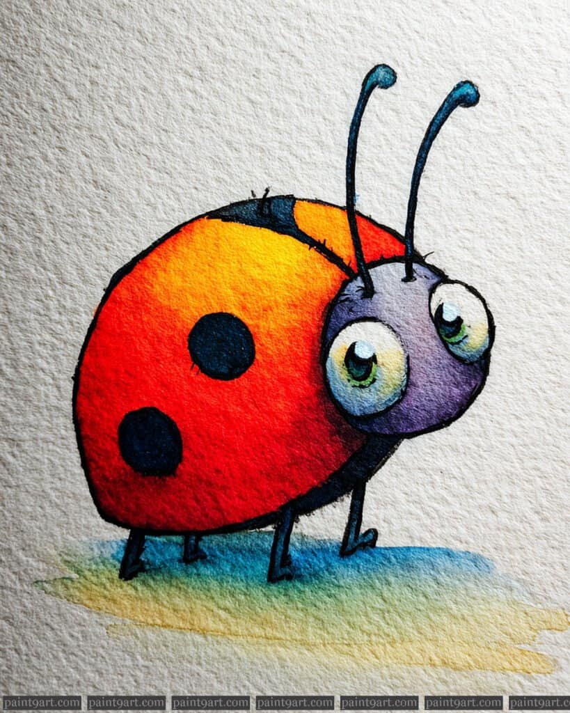
Start by drawing a large, slightly asymmetrical oval for the shell and two overlapping circles for the head and prominent eyes. For the underpainting, apply a wet-on-wet variegated wash to the shell, dropping in Hansa Yellow at the top center and bleeding it into a saturated Cadmium Red towards the edges to create a 3D spherical effect. Keep the head area separate, using a soft wash of Dioxazine Violet mixed with a touch of Ultramarine to establish a cool, recessed tone that contrasts with the warm shell.
Once the shell is dry, use a dry brush or a highly concentrated wet-on-dry stroke to paint the characteristic black spots, ensuring they follow the curve of the body to maintain the sense of volume. For the eyes, use a very pale yellow wash at the base and a concentrated Indigo for the pupils, being careful to leave a crisp “sparkle” of white paper for an endearing expression. Finish with fine, tapered lines for the antennae and thin legs, and add a multi-colored grounded shadow using a mix of Cobalt Teal and Yellow Ochre to pull the whole character into the environment.
Recommended Palette
To capture the punchy colors and soft transitions of this ladybug, use these professional pigments:
- Hansa Yellow Deep: For the brilliant highlight at the apex of the shell.
- Cadmium Red Medium: To provide the classic, opaque vibrance of the ladybug’s wings.
- Dioxazine Violet: For the cool purple tones of the head and shadowed segments.
- Indigo: For the deep, non-flat black of the spots and pupils.
- Cobalt Teal: To create the refreshing, cool contrast in the ground shadow.
- Payne’s Gray: For the fine-line details of the legs and antennae.
The Stylish Cockroach
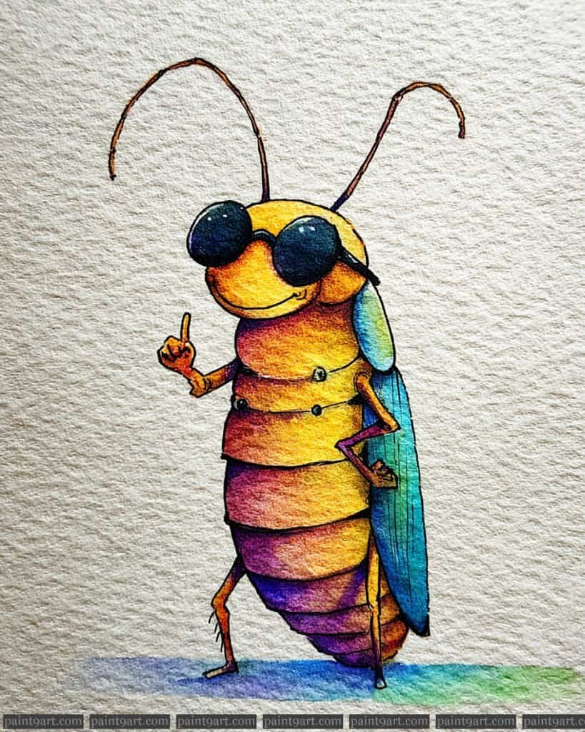
Begin by mapping out the upright posture, paying close attention to the segmented abdomen and the placement of the oversized sunglasses. For the underpainting, employ a variegated wash using a wet-on-wet approach; start with a punchy Yellow Ochre at the head and transition into warm Cadmium Orange and deep Quinacridone Magenta toward the lower segments. This creates a vibrant, glowing core that mimics the warmth of a setting sun reflected off a glossy shell.
Once the base is dry, use a dry brush technique with a highly concentrated mix of Neutral Tint and Indigo to fill in the sunglasses, leaving two crisp white circles for the lens reflections. To create depth in the wings, layer a transparent glaze of Phthalo Blue over a touch of Emerald Green, allowing the underlying paper texture to simulate the iridescent quality of insect wings. Finally, add the delicate antennae and spindly legs with a size 0 detail brush, and anchor the figure with a soft, multi-colored shadow on the ground to mirror the character’s palette.
Recommended Palette
To recreate this high-energy, colorful look, I suggest using these specific professional pigments:
- Yellow Ochre: For the sun-drenched upper segments and face.
- Cadmium Orange: To create the rich, mid-tone transitions in the torso.
- Quinacridone Magenta: For the deep, reddish-pink tones at the base of the segments.
- Phthalo Blue (Green Shade): Perfect for the cool, iridescent wing details.
- Indigo: Mixed with a touch of black for the solid, dark sunglasses.
- Dioxazine Violet: To add depth to the darkest crevices of the segments and the ground shadow.
The Grumpy Bumblebee
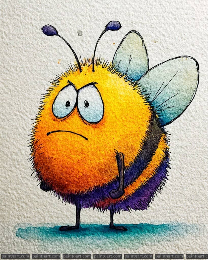
Start with a light, circular pencil sketch, focusing on the roundness of the body and the placement of the large, drooping eyes to establish the grumpy expression. Use a wet-on-wet technique for the primary yellow body, dropping in a warm orange near the edges to create a soft, rounded volume. While the paper is still damp, lightly lift some color with a thirsty brush to create the “glow” in the center, which emphasizes the fuzzy texture of the bee’s coat.
Once the body is dry, apply the dark stripes using a dry brush technique to simulate the appearance of individual hairs protruding from the body. For the wings, use a very diluted pale blue wash, leaving plenty of white space to suggest transparency and lightness. Finish the piece by adding fine, rhythmic ink lines or concentrated pigment for the “fuzz” around the perimeter, and use a deep violet-black for the pupils to make the downward-staring gaze feel heavy and expressive.
Recommended Palette
To achieve this vibrant yet fuzzy look, these professional pigments would be your best allies:
- New Gamboge: For the rich, golden-yellow base of the bee’s body.
- Transparent Pyrrol Orange: To add warmth and depth to the outer curves of the fluff.
- Dioxazine Violet + Ultramarine Blue: Mixed together to create the deep, rich purple-black for the stripes.
- Cerulean Blue (highly diluted): Perfect for the delicate, transparent wings.
- Payne’s Gray: For the spindly legs and the grounding shadow beneath the bee.
- Phthalo Turquoise: A touch of this in the shadow wash to add a cool, professional contrast to the warm body.
The Little Fire Ant
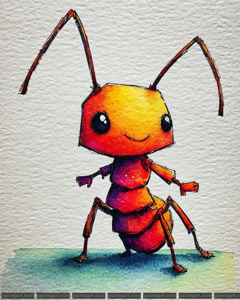
Begin by sketching the ant’s geometric segments, focusing on the large, rounded head and the sharp angles of the legs. For the underpainting, apply a graduated wash using a wet-on-wet technique; start with a bright yellow-orange at the top of the head and bleed it into a rich crimson and then a deep purple toward the bottom of each body segment. This creates a luminous, internal glow that makes the character pop against the neutral background of the cold-pressed paper.
Once the initial layers are dry, focus on creating depth and structure by applying glazing in the shadow areas, particularly where the body segments overlap. Use a high-pigment load with a small detail brush to define the large, expressive eyes, leaving a tiny dot of white paper for the “catchlight” to ensure they look lively. Finish the piece with precise dry brush strokes or a fine-liner to add the thin antennae and the textured ground shadow, which anchors the character to the surface.
Recommended Palette
To capture this specific warmth and intensity, I recommend these professional watercolor pigments:
- New Gamboge or Indian Yellow: For the bright, sun-kissed top of the head.
- Quinacridone Coral or Pyrrol Orange: To create the vibrant mid-tones of the body.
- Permanent Alizarin Crimson: For the deep, reddish transitions in the shadows.
- Carbazole Violet or Ultramarine Blue: To mix those deep, “bruised” purples at the base of the segments.
- Payne’s Gray or Sepia: For the intense darks of the eyes and the delicate leg details.
- Cobalt Teal or Phthalo Green: A touch of this for the grounded shadow to provide a complementary contrast to the orange body.
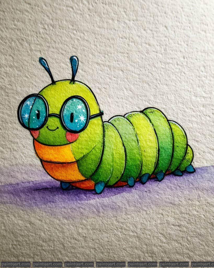
The Scholarly Bookworm
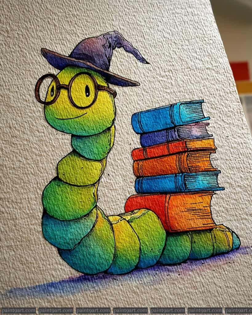
Begin with a precise pencil sketch to define the caterpillar’s rounded segments and the vertical alignment of the book stack. For the underpainting, apply a wet-on-wet technique on each body segment individually, dropping in Hansa Yellow at the top and bleeding it into a cool Phthalo Green at the bottom to create a seamless, glowing transition. This foundation should be transparent enough to let the heavy grain of the watercolor paper provide natural highlights and organic texture.
Once the initial washes are bone-dry, use glazing—layering thin, transparent coats of pigment—to deepen the saturation on the shadowed undersides of the books and the caterpillar’s belly. Use a fine-liner or a size 0 round brush with a highly concentrated mixture of Burnt Umber and Indigo to add the “stippling” and cross-hatching details. These tiny rhythmic marks and sharp outlines are essential for defining the character’s whimsical personality and giving the objects a sense of weight.
Recommended Palette
To replicate the luminosity and depth found in this illustration, I recommend the following professional pigments:
- Hansa Yellow Light: For the brightest highlights on the face and body segments.
- Phthalo Green (Yellow Shade): To create the lush, vibrant mid-tones of the caterpillar.
- Cobalt Turquoise: Ideal for the transitions into the darker, cooler areas of the skin and the blue book covers.
- Pyrrol Scarlet: For the intense, warm reds and oranges found in the central books.
- Dioxazine Violet: Specifically for the wizard’s hat and the soft, granulated ground shadow.
- Burnt Umber: The perfect earthy tone for the glasses and the delicate “ink” detailing.
Conclusion
I hope these lighthearted little critters inspire you to pick up your brushes and find the humor in every brushstroke. It’s always a joy to see how a simple splash of color can turn a tiny bug into a character with a story all its own.
Don’t forget to grab the printable coloring pages if you’re looking for a stress-free way to practice your watercolor techniques today. I can’t wait to see the vibrant, funny personalities you bring to life with your unique artistic touch!