
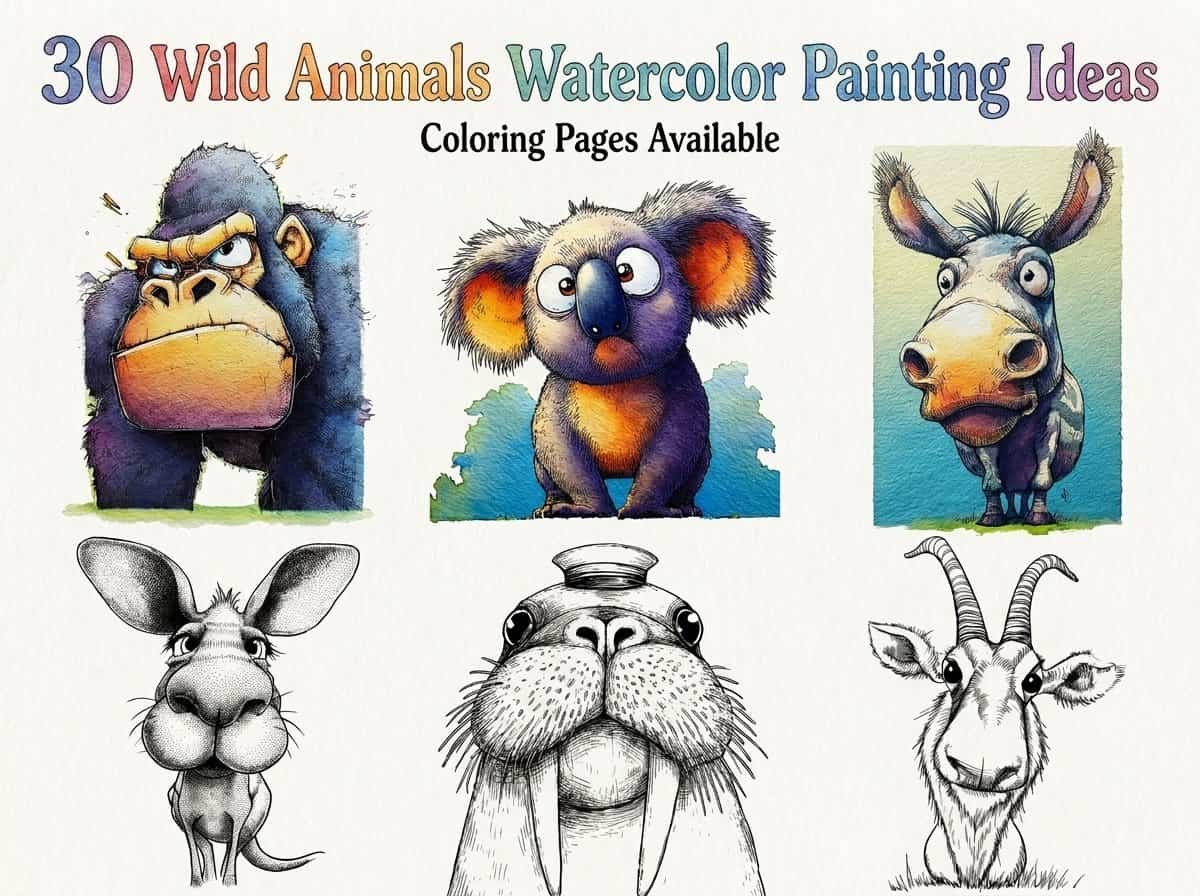
Welcome to a world where vibrant colors meet the untamed beauty of the wilderness. I have curated this collection of 30 wild animal ideas to help you bring the majesty of nature onto your paper.
Whether you are looking to capture a lion’s gaze or the delicate wings of a butterfly, these prompts are designed to spark your creative flow. Grab your favorite brushes and let’s explore these enchanting subjects together.
Contents
- 1 30 Wild Animals Watercolor Painting Ideas
- 1.1 Baboon
- 1.2 Red Highland Cow
- 1.3 Zebra Back View
- 1.4 Snake
- 1.5 Lemur
- 1.6 Giraffe
- 1.7 Rhino
- 1.8 Vulture
- 1.9 Kudu
- 1.10 Bison
- 1.11 Fruit Bat
- 1.12 Zebra Front View
- 1.13 Black Panther
- 1.14 Squirrel
- 1.15 Koala
- 1.16 The Playful Seal
- 1.17 Gazelle
- 1.18 Bear
- 1.19 Warthog
- 1.20 Seal in water
- 1.21 Meerkat
- 1.22 Kangaroo
- 1.23 Capybara
- 1.24 Lion Front View
- 1.25 Penguin
- 1.26 Tarsier
- 1.27 Raccoon
- 1.28 Gang-gang Cockatoo
- 1.29 Gorilla
- 1.30 Lion tail
- 2 Conclusion
30 Wild Animals Watercolor Painting Ideas
Baboon
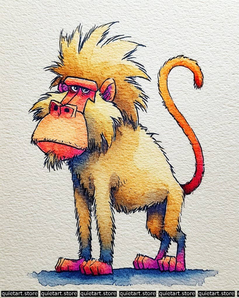
To replicate or refine this style, start with a loose wet-on-dry technique for the body. Lay down a variegated wash of warm ocher, allowing it to transition naturally into cooler shadows near the limbs. While the paper is still slightly damp (damp-glow stage), drop in the more saturated magentas and oranges on the face and feet. This allows the colors to bleed softly without losing their shape, maintaining that “glow” against the neutral tan of the fur.
Once the initial layers are bone-dry, move into the line work and detailing. Use a fine-liner or a small rigger brush with a highly concentrated “tea” consistency of neutral tint or sepia. Focus on the jagged, rhythmic strokes for the mane and the hatched lines on the muzzle to emphasize the form. The final touch involves a very dry brush to add the subtle cast shadow on the ground, ensuring the character feels anchored rather than floating.
Professional Palette
To achieve these specific, punchy transitions, I recommend the following professional-grade pigments:
| Feature | Recommended Pigment | Why It Works |
| Primary Fur | Quinachridone Gold | Provides that rich, glowing warmth in the mane. |
| Vibrant Accents | Opera Pink / Quin. Rose | Essential for the high-intensity pinks on the face and feet. |
| Deep Shadows | Indanthrone Blue | A deep, non-granulating blue to mix with reds for those cool leg shadows. |
| Warm Muzzle | Pyrrol Orange | Offers high opacity and punch for the snout and tail tip. |
| Neutral Tones | Raw Sienna | Perfect for the desaturated, earthy underbelly and chest. |
Our 60 Wild Animals Watercolor Coloring Pages (PDF Download) are made for pure enjoyment. Ready to let your creativity run wild? Download, print, and start today.
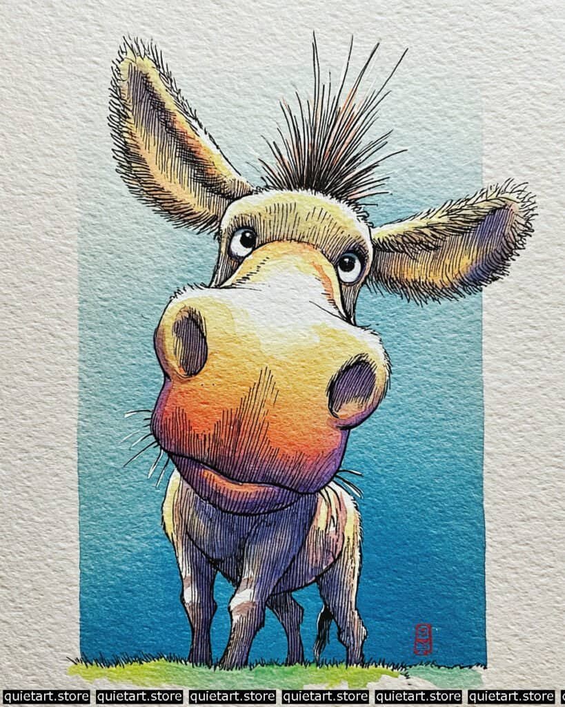
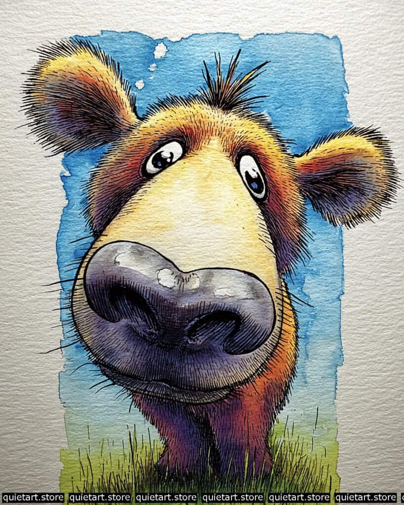
Red Highland Cow
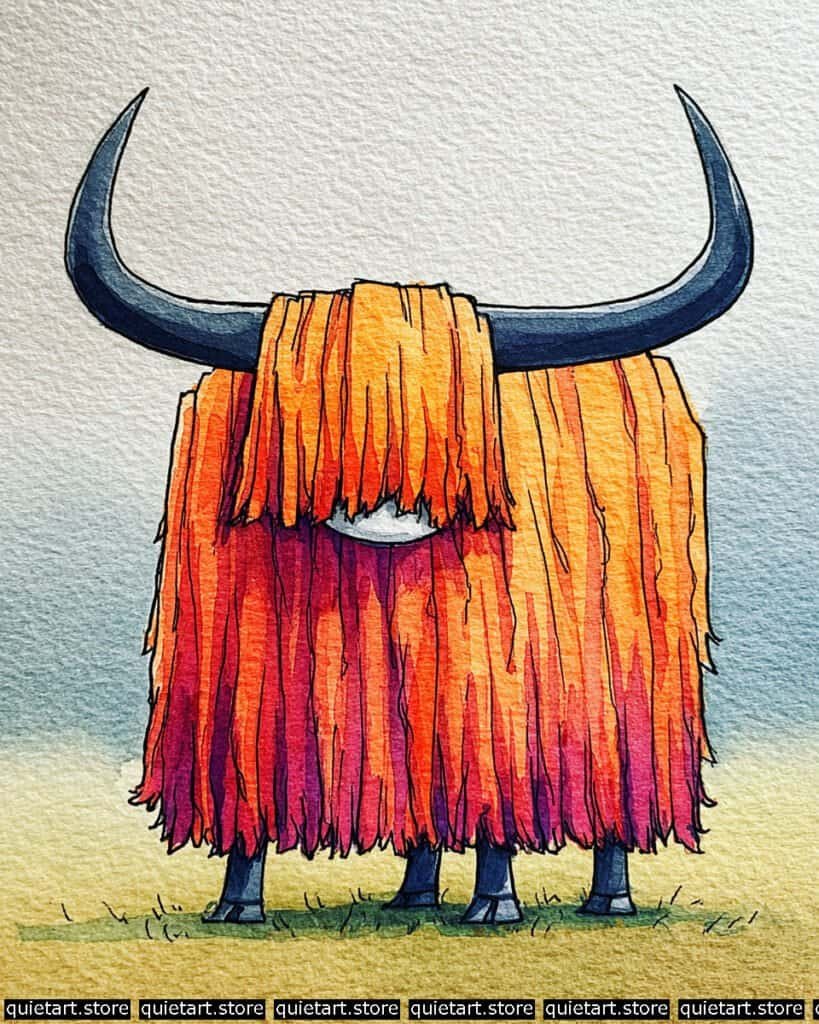
For this piece, the magic lies in the controlled vertical wash. Begin by masking the horns or simply painting around them with a steady hand. Apply a wet-on-dry gradient starting with a saturated orange at the top, tilting your board slightly to encourage the pigment to flow downward. As you move toward the bottom, “charge” the damp wash with concentrated magentas and purples. This creates that seamless color transition without the need for excessive blending, which keeps the colors looking fresh rather than overworked.
The textural definition is added once the base layer is completely dry. Use a fine-point round brush or a technical pen to pull long, rhythmic vertical strokes downward. Vary the pressure to mimic the natural separation of thick, matted fur. For the horns, use a “glazing” technique—layering thin, transparent washes of cool blue and gray to build up the rounded volume, leaving a sliver of paper white (or a very pale tint) along the upper edge to represent a clean highlight.
Professional Palette
These pigments will help you capture the fiery warmth and the cool, heavy contrast of the horns:
| Feature | Recommended Pigment | Why It Works |
| Upper Coat | New Gamboge | A warm, deep yellow that transitions beautifully into oranges. |
| Mid-Coat | Transparent Orange | Provides a glowing, stained-glass effect for the shaggy layers. |
| Shadow Hem | Perylene Violet | A moody, granulating purple that adds depth to the bottom fringe. |
| Horns & Hooves | Payne’s Gray | A classic cool blue-gray that provides excellent value contrast. |
| Background Sky | Cobalt Teal Blue | Granulates slightly to create a soft, atmospheric distance. |
Our 60 Wild Animals Watercolor Coloring Pages (PDF Download) are made for pure enjoyment. Ready to let your creativity run wild? Download, print, and start today.
Zebra Back View
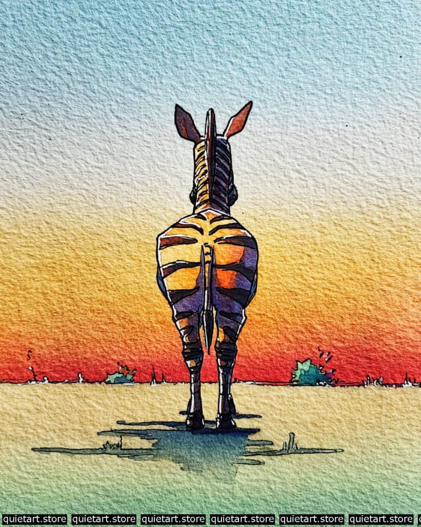
The foundation of this piece is a large-scale variegated wash for the background. To get that smooth transition from sky blue to fiery red and down into the dusty green of the plains, use the wet-on-wet technique. Wet the entire paper first, then drop in your pigments horizontally, allowing them to mingle on the paper. The key is to work quickly and avoid “scrubbing” the paper, which preserves the beautiful texture of the cold-pressed surface you see in the highlight areas.
For the zebra’s form, you’ll notice that the stripes aren’t just black—they are deep purples and oranges that reflect the sunset. After your background is dry, sketch the silhouette and apply a pale yellow glaze over the body. Once dry, use a “juicy” brush to paint the dark stripes. By using a dark violet instead of a flat black, you maintain the luminosity of the piece. Finish with the fine-liner ink work to define the spine, ears, and those sharp, stylized shadows on the ground to ground the character in the scene.
Professional Palette
This composition relies on high-chroma colors to simulate the intense light of a “Golden Hour” sunset:
| Feature | Recommended Pigment | Why It Works |
| Sky & Grass | Cerulean Blue Chromium | Provides a heavy, opaque blue that granulates beautifully against the yellow. |
| Horizon Heat | Pyrrol Scarlet | A very powerful, clean red that creates that “burning” effect at the horizon. |
| Stripes (Dark) | Carbazole Violet | A deep, transparent purple that looks “blacker than black” when layered. |
| Stripes (Light) | Indian Yellow | A warm, glowing yellow-orange that mimics the sun hitting the fur. |
| Cast Shadow | Phthalo Blue (GS) | When mixed with a touch of red, it creates a vibrant, transparent shadow. |
Our 60 Wild Animals Watercolor Coloring Pages (PDF Download) are made for pure enjoyment. Ready to let your creativity run wild? Download, print, and start today.
Snake
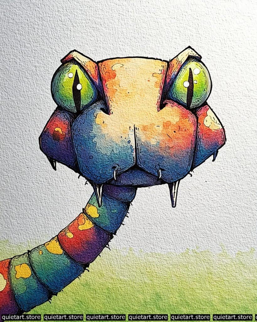
The complexity of this piece lies in the multi-stage glazing. Begin with a light “underpainting” of pale yellow across the brow and nose. While that is drying, use a wet-on-wet technique for the lower jaw and neck, dropping in Phthalo Blue and Quinacridone Magenta to create those deep, bruised purples. The trick here is “charging” the damp paper with pigment so the colors mix themselves, creating that mottled, skin-like texture without hard edges.
For the eyes, you want to achieve a luminosity effect. Paint the iris with a bright chartreuse, and while it’s still wet, drop a darker forest green around the edges. Once bone-dry, use a highly opaque white (like Bleed Proof White or white gouache) for the tiny specular highlights. Finally, the heavy ink work defines the geometric “plates” of the snake’s head. Use varying line weights—thicker for the outer silhouette and thinner for the internal scales—to give the character a 3D, sculptural feel.
Professional Palette
To recreate this vibrant, almost neon spectrum, you’ll need staining pigments that maintain their “punch” even when layered:
| Feature | Recommended Pigment | Why It Works |
| High Brows | Hansa Yellow Light | A cool, bright yellow that stays clean when it meets blues. |
| Deep Shadows | Ultramarine Blue | Provides the granulating, “textured” look seen on the chin. |
| Vibrant Spots | Cadmium Orange | Opaque enough to sit on top of lighter washes for those bright scales. |
| Luminous Eyes | Azo Green (Py129) | A “glowing” yellow-green that looks radioactive against dark lines. |
| Muted Skin | Cobalt Violet | Perfect for the soft, hazy transitions on the sides of the face. |
Our 60 Wild Animals Watercolor Coloring Pages (PDF Download) are made for pure enjoyment. Ready to let your creativity run wild? Download, print, and start today.
Lemur
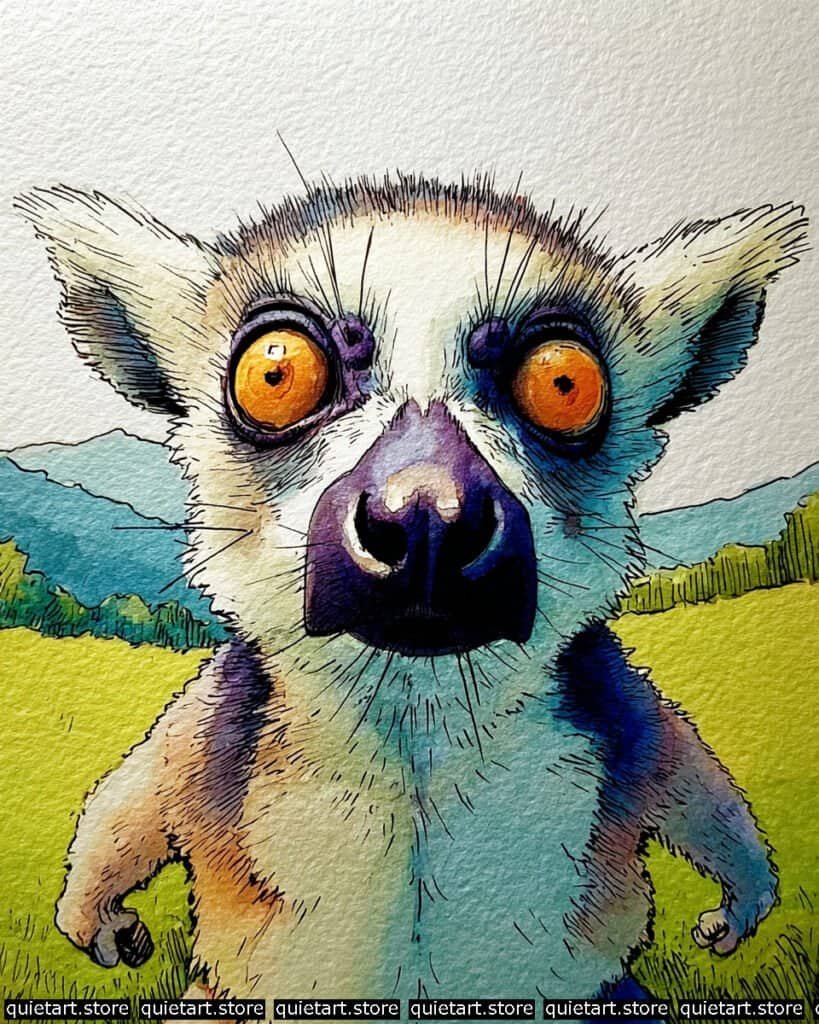
The secret to the lemur’s soft appearance is a “lost edge” wet-on-wet wash. Start by pre-wetting the torso and face (avoiding the eyes). While the paper is damp, drop in a very diluted Cobalt Turquoise on the right side and a warm Raw Sienna on the left. This mimics ambient light reflecting off the grass and sun. Let these colors mingle naturally on the paper to create that “fuzzy” transition before any fur details are added.
Once the base is dry, focus on the intense focal point: the eyes. Use a highly concentrated, “syrup” consistency of orange, leaving a tiny crescent of lighter yellow at the bottom for a “glow” effect. After that is dry, the final layer is the intricate linework. Use a 0.05 technical pen for the microscopic fur around the ears and the long, frantic whiskers. The heavy, dark bridge of the nose should be painted with a deep indigo glaze over the lines to give it that leathery, solid texture.
Professional Palette
This piece balances high-contrast “pop” with soft, naturalistic under-tones:
| Feature | Recommended Pigment | Why It Works |
| Hypnotic Eyes | Transparent Pyrrol Orange | Offers a clean, glass-like depth that catches the “light.” |
| Cool Fur Shadow | Cobalt Turquoise | Provides a punchy, artificial cool tone that makes the fur look luminous. |
| The Nose | Indanthrone Blue + Madder Lake | Mix these to get a near-black, velvety purple for the snout. |
| Lush Meadows | Azo Yellow + Phthalo Green | Creates that electric, “acid green” look of the sunlit grass. |
| Distant Hills | Cerulean Blue | A granulating blue that naturally recedes into the background. |
Our 60 Wild Animals Watercolor Coloring Pages (PDF Download) are made for pure enjoyment. Ready to let your creativity run wild? Download, print, and start today.
Giraffe
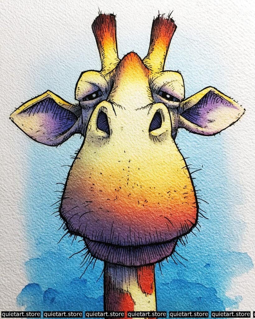
This piece is a masterclass in wet-on-wet color transitions within a defined shape. To achieve that smooth snout, begin by pre-wetting the central face area with clean water. Drop in a pale yellow at the top, then “charge” the damp area with orange in the middle, and finally a cool violet at the chin. By letting these colors bleed together on the paper while it’s still wet, you create a soft gradient that mimics the way light wraps around a curved surface.
For the structural definition, wait for the base wash to dry completely. The “ossicones” (horns) and ears require a dry-brush technique to create that rough, leathery texture. Use a brush with very little water and a high concentration of pigment to “drag” the color across the tooth of the paper. This leaves tiny white gaps that suggest texture. Finally, use a fine-liner for the cross-hatching in the shadows and the “scruffy” hairs along the neck to provide a sharp contrast against the soft background wash.
Professional Palette
To replicate these rich, sunset-toned transitions, I recommend these high-performance pigments:
| Feature | Recommended Pigment | Why It Works |
| Bridge of Nose | Aureolin (Cobalt Yellow) | A transparent yellow that provides a clean, glowing highlight. |
| Lower Snout | Quinacridone Violet | A cool, powerful purple that blends cleanly with orange. |
| Ears & Horns | Burnt Sienna | An earthy reddish-brown that creates great texture when dry-brushed. |
| Background Sky | Phthalo Blue (RS) | A bright, “tropical” blue that pops against the giraffe’s orange tones. |
| Shadow Details | Payne’s Gray | Use a thin wash of this for the eyelids and nostrils to add depth. |
Our 60 Wild Animals Watercolor Coloring Pages (PDF Download) are made for pure enjoyment. Ready to let your creativity run wild? Download, print, and start today.
Rhino
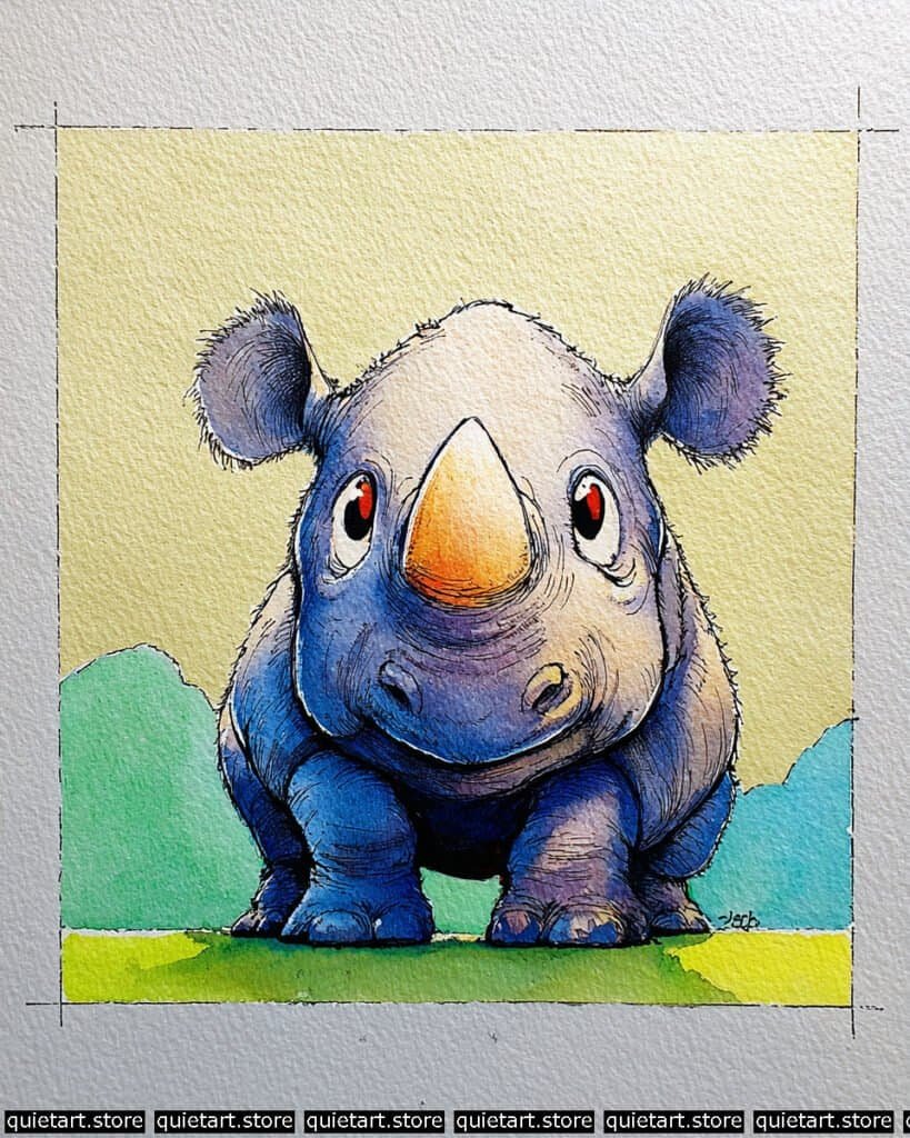
The key to this piece is managing the “negative space” and the soft light. Start with a very pale, buttery yellow wash over the background and the upper-facing parts of the rhino. While that’s drying, prepare a variegated wash of blues and purples. Apply this to the lower body, using the “lifting” technique—where you use a clean, damp brush to soak up pigment—along the bridge of the nose and the tops of the ears. This creates those soft, glowing highlights that suggest a rounded, 3D form.
For the skin’s texture, you’ve used a great combination of glazing and line work. Once your base washes are dry, layer a more saturated blue into the deepest shadows (like under the belly and between the legs). Then, use a fine technical pen to add the “wrinkle” lines around the snout and eyes. To get those fuzzy ears, use a scumbling technique with your pen—short, irregular, overlapping strokes that break the silhouette and give the impression of coarse hair.
Professional Palette
To replicate these specific cool-to-warm transitions and the vibrant greens of the background, try this selection:
| Feature | Recommended Pigment | Why It Works |
| Warm Highlight | Naples Yellow | A semi-opaque yellow that gives a soft, creamy sunlight effect. |
| Main Body Skin | French Ultramarine | A classic granulating blue that adds natural “stone” texture to the skin. |
| Deepest Shadows | Dioxazine Purple | When glazed over blue, it creates a rich, velvety dark without being flat. |
| The Horn | Raw Sienna + Orange | Provides a nice earthy contrast to the predominantly blue body. |
| Background Greens | Sap Green + Lemon Yellow | Creates a fresh, “springtime” green that feels bright and clean. |
Our 60 Wild Animals Watercolor Coloring Pages (PDF Download) are made for pure enjoyment. Ready to let your creativity run wild? Download, print, and start today.
Vulture
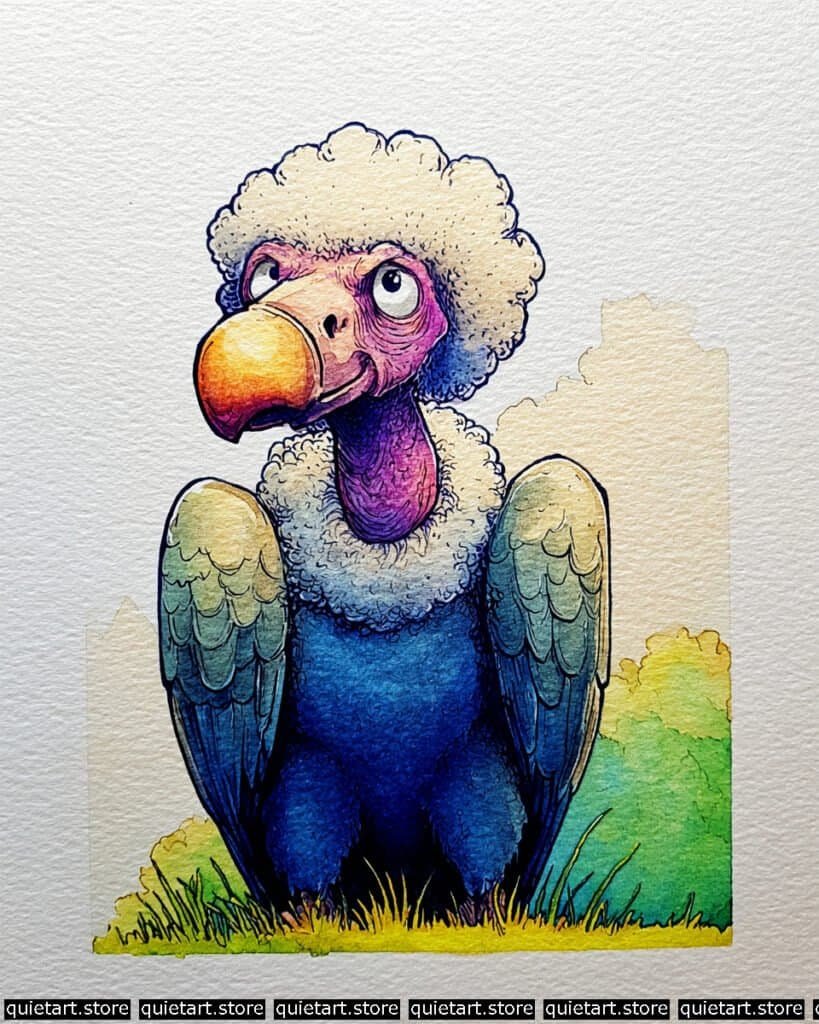
To capture the soft volume of the vulture’s “fluff,” use a soft-edge glazing technique. Begin by applying a very light, warm-grey wash to the shadowed areas of the white ruff and crown, leaving the highlights as pure paper white. While this is damp, use a “thirsty brush” (a damp, clean brush) to soften the edges so the transition looks cloud-like. This provides a soft foundation for the intricate ink curls you’ll add later to define the individual clumps of down.
For the vibrant neck and beak, work with a “wet-on-dry” approach to keep the colors saturated. Layer a brilliant magenta on the neck, then glaze a deep violet over the bottom to create a rounded effect. For the beak, start with a bright yellow and drop in a touch of orange-red at the tip while it’s still wet to get that smooth, “beak-to-sun” gradient. The dark body should be painted with a heavily concentrated blue wash, allowing the pigment to settle into the grain of the paper to create that rich, velvety texture seen in the chest area.
Professional Palette
These pigments will help you achieve the high-contrast look of the fleshy head against the dark feathers:
| Feature | Recommended Pigment | Why It Works |
| Fleshy Neck | Quinacridone Magenta | Provides a vivid, transparent pink that layers perfectly with blues. |
| Beak Highlight | Hansa Yellow Deep | A warm, sunny yellow that feels solid and “hard” like a beak. |
| Main Body | Phthalo Blue (GS) | An intense, staining blue that gives the feathers their deep “glow.” |
| Fluff Shadows | Buff Titanium | A creamy, off-white that adds depth to the white down without looking “dirty.” |
| Deepest Voids | Neutral Tint | Perfect for the darkest shadows under the wings and in the nostrils. |
Our 60 Wild Animals Watercolor Coloring Pages (PDF Download) are made for pure enjoyment. Ready to let your creativity run wild? Download, print, and start today.
Kudu
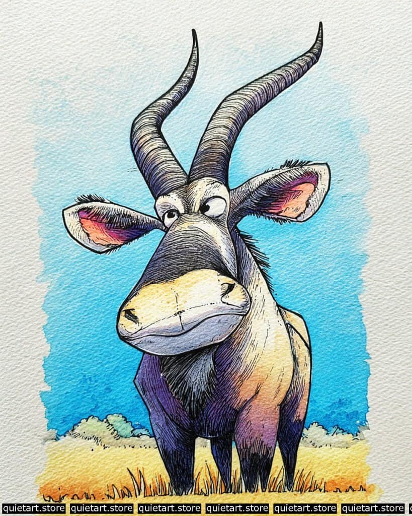
To master those spiraling horns, utilize a curved hatching technique. After applying a light grey base wash, use your fine-liner to follow the natural wrap of the horn. These lines shouldn’t just be straight; they should curve around the form to describe its cylindrical volume. In the shadowed “valleys” of the spirals, increase the density of your lines (cross-hatching) to deepen the value without needing to rely on heavy black paint, which can sometimes “kill” the transparency of the watercolor.
For the inner ears and underbelly, you’ve used a beautiful transition from warm orange to deep violet. To achieve this, use a limited-water variegated wash. Since these are small areas, too much water will cause the pigment to fly everywhere. Use a “damp-on-damp” approach: apply the orange, then immediately touch the edge with a concentrated violet. This creates a sharp but blended transition that defines the “pocket” of the ear. The sky background is a classic flat wash with deckled edges, where you purposefully let the brush run out of juice at the perimeter to showcase the cold-press paper grain.
Professional Palette
This palette focuses on the “bruised” purples and high-noon yellows typical of African wildlife illustrations:
| Feature | Recommended Pigment | Why It Works |
| Muzzle & Grass | Yellow Ochre | A natural, earthy yellow that feels “dusty” and authentic. |
| Shadowed Limbs | Imperial Purple | A deep, granulating purple that mimics the natural shadows on hide. |
| Ear Glow | Permanent Alizarin Crimson | Provides that “blood-filled” warmth inside the ear leather. |
| Sky Halo | Manganese Blue Hue | A weak-staining blue that is easy to manipulate for those soft edges. |
| Horn Texture | Sepia | A very dark, warm brown that is softer than black for ink-like details. |
Our 60 Wild Animals Watercolor Coloring Pages (PDF Download) are made for pure enjoyment. Ready to let your creativity run wild? Download, print, and start today.
Bison
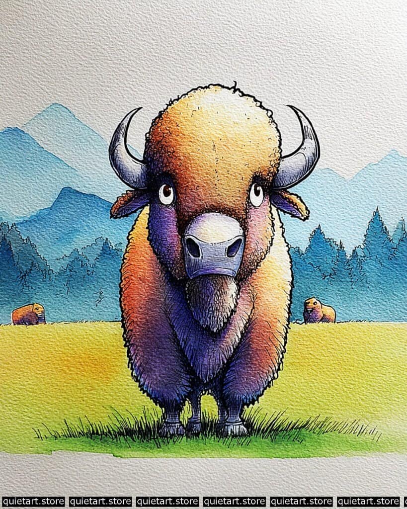
To achieve the dense, woolly texture of the bison’s coat, utilize a stippling and charging technique. Begin with a very light, warm yellow wash on the top of the head. While the paper is still quite wet, “charge” the lower halves of the body with concentrated purples and magentas. Instead of smoothing them out, let the pigments settle into the pits of the cold-pressed paper. This naturally mimics the uneven, thick texture of bison fur without you having to paint every single hair.
For the background and distance, use a gradated wash for the mountains. Paint the furthest peak with a very diluted, pale blue. As you move to the closer hills and treeline, increase the pigment concentration (more blue, less water). This is known as aerial perspective, where objects become cooler and lighter as they recede into the distance. Once dry, the sharp “inked” grass in the foreground provides a tactile anchor, making the soft, hazy background feel even further away.
Professional Palette
This composition relies on a “temperature split” to separate the warm subject from the cool environment:
| Feature | Recommended Pigment | Why It Works |
| Crown & Meadow | Azo Yellow | A bright, transparent yellow that keeps the “sunlight” looking clean. |
| Chest & Shadows | Ultramarine Violet | A granulating purple that perfectly mimics the heavy shadow on wool. |
| Mountains | Cerulean Blue | Naturally opaque and cool; perfect for creating atmospheric distance. |
| Treeline | Phthalo Green (BS) | Mix with blue for those deep, dark evergreen tones in the distance. |
| Muzzle | Neutral Tint | Provides a soft, leathery grey that doesn’t overwhelm the colorful face. |
Our 60 Wild Animals Watercolor Coloring Pages (PDF Download) are made for pure enjoyment. Ready to let your creativity run wild? Download, print, and start today.
Fruit Bat
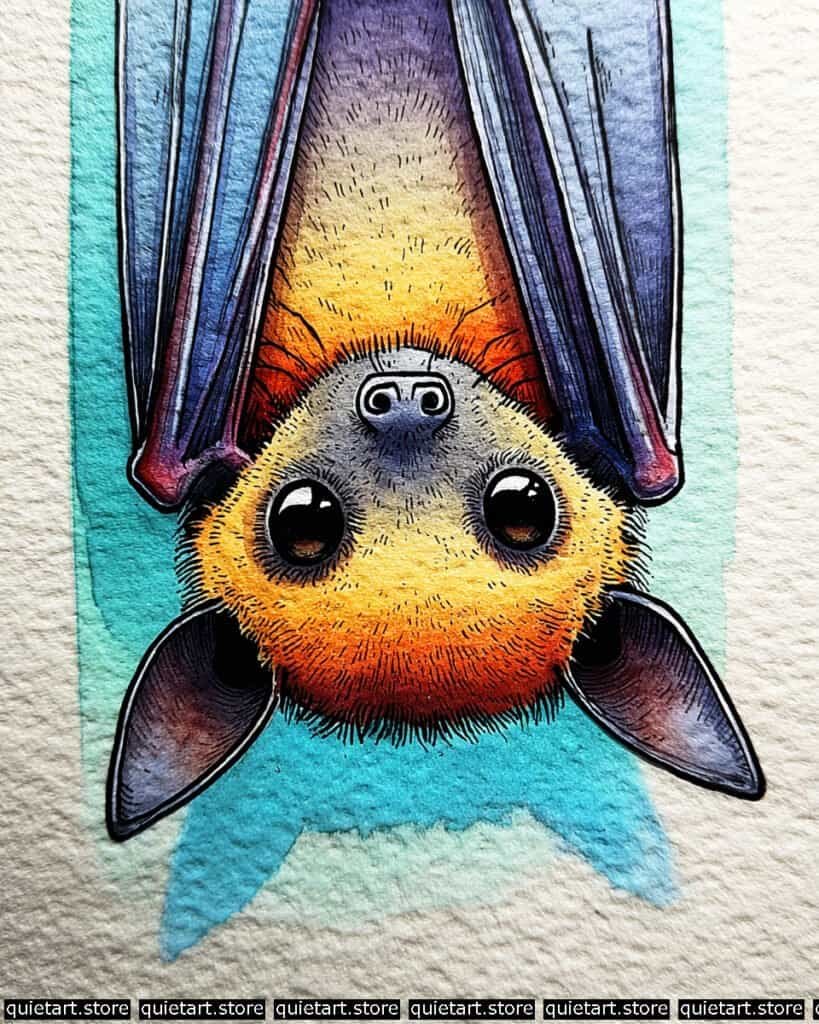
To achieve the velvety texture of the bat’s fur, use a soft-edged variegated wash. Start with a light yellow at the crown of the head (the bottom, in this orientation), and while wet, drop in a saturated orange and a touch of burnt sienna toward the neck. The key is to let the water do the work, creating a smooth transition that mimics soft downy hair. For the leathery wings, use a glazing technique: apply thin, transparent layers of cool blue and violet over your initial ink lines to build up the “skin” without obscuring the structural detail of the wing bones.
The depth in the eyes is created through careful value management. Paint the iris with a deep brownish-orange, leaving a tiny crescent of lighter color at the bottom for “reflected light.” Once dry, add the pupils using the darkest black possible. Finally, use a white gouache or gel pen for the sharp, circular highlights. These highlights should “cut” through the black and orange to simulate the reflection of a bright light source, which immediately gives the character a “cute” and polished look.
Professional Palette
To replicate these punchy, vibrant tones, I recommend using pigments with high transparency and staining power:
| Feature | Recommended Pigment | Why It Works |
| Glow Fur | New Gamboge | A warm, deep yellow that acts as a perfect base for orange transitions. |
| Vibrant Cheeks | Pyrrol Orange | Provides that intense, fiery warmth at the edges of the face. |
| Leathery Wings | Indanthrone Blue | A deep, non-granulating blue that creates smooth, leathery shadows. |
| Shadowed Ears | Perylene Maroon | A moody red-brown that adds depth to the ear folds without looking muddy. |
| Background | Cobalt Turquoise | Creates a clean, tropical contrast that makes the oranges “sing.” |
Our 60 Wild Animals Watercolor Coloring Pages (PDF Download) are made for pure enjoyment. Ready to let your creativity run wild? Download, print, and start today.
Zebra Front View
To master this extreme perspective, you must prioritize value scaling. Start with a very light, sun-bleached yellow wash on the bridge of the nose, expanding into a saturated orange and finally a deep, cool violet on the chin. Because the snout is “closer” to the viewer, you want those colors to be the most vivid and have the highest contrast. Use a soft-edge transition by pre-wetting the snout area, ensuring that the colors blend seamlessly to suggest the smooth, rounded form of the muzzle.
The structural details are what really sell the perspective. Use a fine-liner to create dense, vertical hatching on the chest and legs, which are “further away” and cast in shadow. This pushes the lower body back visually. For the ears, use a dry-brush technique over a light purple wash to create that fuzzy, tactile texture. Finally, the “halo” background is a classic vignette wash—paint the blue most intensely near the Zebra’s head and let it fade out into the paper white as you move toward the edges. This frames the character and forces the viewer’s eye right onto that big, colorful nose.
Professional Palette
This palette uses temperature shifts to create three-dimensional depth in a stylized way:
| Feature | Recommended Pigment | Why It Works |
| Nose Highlight | Lemon Yellow | A cool, bright yellow that stays vibrant even when layered. |
| Middle Muzzle | Cadmium Red Light | Provides a punchy, opaque orange-red for the “closest” point. |
| Lower Chin/Legs | Ultramarine Blue | A granulating blue that mixes with red for those deep, textured purples. |
| Inner Ears | Potter’s Pink | A granulating, earthy pink that perfectly mimics soft ear skin. |
| Background | Phthalo Blue (GS) | A staining blue that creates a smooth, flat sky transition. |
Our 60 Wild Animals Watercolor Coloring Pages (PDF Download) are made for pure enjoyment. Ready to let your creativity run wild? Download, print, and start today.
Black Panther
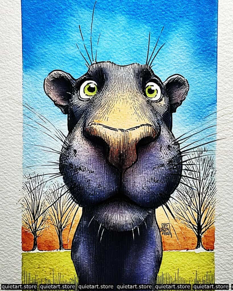
The core challenge here is painting a “black” subject without losing the underlying form. To achieve this, use a selective glazing process. Start with a warm, pale yellow under-wash on the top of the nose and forehead. Once dry, apply a very diluted wash of cool violet across the entire panther. Gradually build up your darks by layering thin, transparent glazes of indigo and sepia into the shadows (like the jowls and the underside of the chin). By leaving the bridge of the nose with fewer layers, the original yellow “glow” is preserved, giving the head a rounded, three-dimensional feel.
The background landscape uses a beautiful “triadic” color scheme (Blue, Orange/Red, Green). To get that smooth sky, use a wet-on-wet graduated wash, starting with a saturated blue at the top and pulling it down with more water as you approach the horizon. For the trees, use a dry-brush technique or a very fine technical pen to create those skeletal branches. The sharp, vertical pen lines on the body (cross-hatching) follow the contour of the panther’s neck and face, which adds a sense of “rough” texture to the otherwise soft watercolor washes.
Professional Palette
To keep your darks from looking “dead” or flat, I recommend these high-pigment options:
| Feature | Recommended Pigment | Why It Works |
| Deep Skin | Payne’s Gray + Quin. Violet | Creates a “living” dark that is much more interesting than plain black. |
| Nose Glow | Raw Sienna | A muted, natural yellow that feels like warm sunlight on hide. |
| Piercing Eyes | Phthalo Green (YS) | A bright, “yellow-shade” green that offers maximum transparency. |
| Horizon Heat | Transparent Pyrrol Orange | Provides a sharp, glowing line between the sky and the trees. |
| Lush Foreground | Green Gold | A vibrant, slightly olive-toned green that mimics sunlit grass perfectly. |
Our 60 Wild Animals Watercolor Coloring Pages (PDF Download) are made for pure enjoyment. Ready to let your creativity run wild? Download, print, and start today.
Squirrel
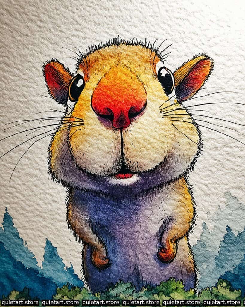
To achieve the soft, voluminous look of the cheeks, use a damp-on-damp softening technique. Lay down your base ochre wash, and while it’s still damp (not soaking), touch the lower jawline with a diluted violet. Because the paper isn’t overly wet, the pigment will spread just enough to create a shadow without losing the roundness of the face. The “fuzzy” perimeter is created by using a dry-brush flick with your pen or a tiny detail brush, pulling the lines away from the body into the white space of the paper.
For the glowing nose, use a charging technique. Start with a bright yellow circle, and while it’s wet, “drop” a concentrated orange into the center. This creates a natural radial gradient that makes the nose look like it’s glowing from within. The background trees are handled with a stippling watercolor effect—using the tip of a round brush to dab various shades of teal and blue—which creates a soft, out-of-focus forest that allows the sharp, detailed character to remain the undisputed star of the show.
Professional Palette
This palette focuses on “temperature contrast” to separate the warm animal from the cold mountain air:
| Feature | Recommended Pigment | Why It Works |
| Upper Fur | Quin. Gold Deep | Provides a rich, toasted-sugar warmth to the forehead and ears. |
| Glowing Nose | Pyrrol Orange | A very high-chroma orange that commands immediate attention. |
| Shadowed Belly | Ultramarine Violet | A granulating purple that mimics the shadow on dense, soft fur. |
| Distant Forest | Prussian Blue | A cool, moody blue that creates a sense of vast, chilly distance. |
| Foreground Grass | Sap Green | A natural, warm green that grounds the character in the meadow. |
Our 60 Wild Animals Watercolor Coloring Pages (PDF Download) are made for pure enjoyment. Ready to let your creativity run wild? Download, print, and start today.
Koala
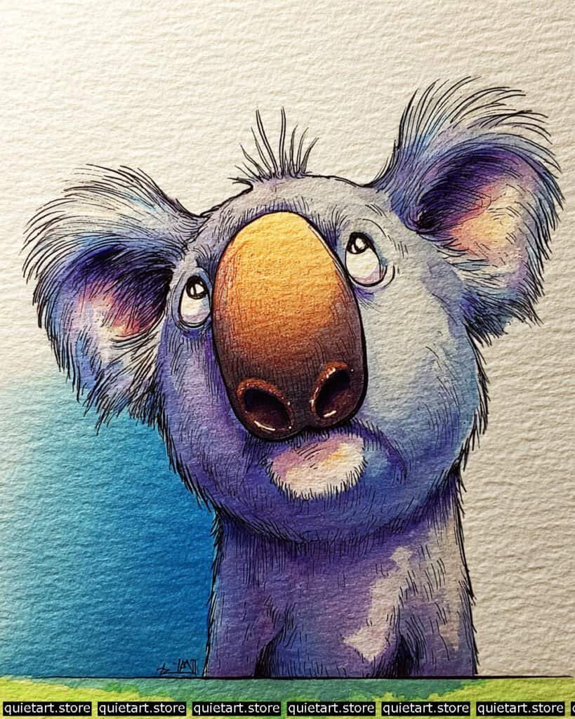
To achieve the soft, woolly texture of the koala, focus on wet-on-wet granulation. Apply a base wash of cool blue and violet to the body, and while it’s still quite wet, drop in a more concentrated pigment like Ultramarine or a dedicated granulating gray. As the water evaporates, the heavy pigment particles will settle into the valleys of your cold-pressed paper, naturally mimicking the dense, “clumpy” texture of koala fur without the need for meticulous detail work.
The leathery nose requires a different approach: controlled glazing. Start with a warm sienna or ochre as the base to give it that “lit from within” glow. Once dry, layer a transparent brown or neutral tint over the bottom and sides, carefully leaving the top center lighter. This creates the rounded, bulbous volume that defines the koala’s silhouette. Finally, use a fine-liner to add the “tufted” hair at the tips of the ears, using quick, radiating strokes to break up the hard watercolor edges and give it that soft, air-dried look.
Professional Palette
This palette uses “bruised” purples and earthy oranges to bring warmth to the cool gray fur:
| Feature | Recommended Pigment | Why It Works |
| Main Fur | Lunar Blue | A stunningly granulating blue-gray that does the “fur work” for you. |
| Ear Accents | Quinacridone Rose | Adds that delicate, glowing pink in the inner ear and shadows. |
| The Nose | Burnt Umber | A reliable, transparent brown for building leathery depth. |
| Shadow Cast | Carbazole Violet | A deep, staining purple that adds weight to the neck and jowls. |
| Background Sky | Phthalo Blue (GS) | A crisp, clean blue that provides a sharp backdrop for the fuzzy ears. |
Our 60 Wild Animals Watercolor Coloring Pages (PDF Download) are made for pure enjoyment. Ready to let your creativity run wild? Download, print, and start today.
The Playful Seal
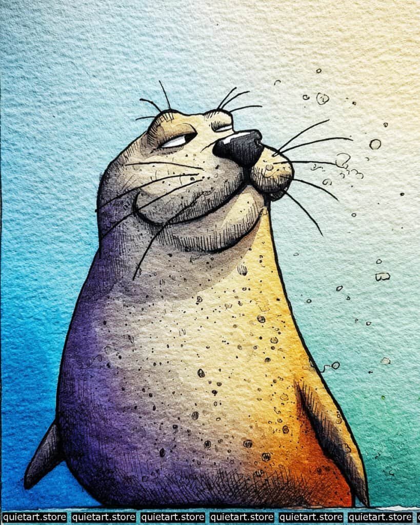
To capture the sleek, wet look of a seal’s skin, use a variegated wet-on-wet wash. Wet the body of the seal with clean water first, then drop in your warm ocher on the right and your deep violet on the left. Let them meet in the middle to create a soft, desaturated transition zone. Because seal skin is reflective, keep your colors saturated; the high contrast between the warm and cool sides is what creates the illusion of a curved, slick surface under the water.
The textural details here are a mix of splatter and hatching. Once your base wash is bone-dry, use a toothbrush or a stiff brush to “flick” some dark pigment onto the lower body to create those organic-looking spots. For the face, use a fine-liner with a contour-hatching technique—curving your lines around the chin and muzzle to emphasize the “pudge” and volume of the face. The whiskers should be the very last addition; use a long-haired rigger brush or a steady pen stroke to pull them out with confidence, as these long, sharp lines provide a perfect contrast to the soft watercolor background.
Professional Palette
This palette focuses on the interaction between underwater shadows and golden-hour light:
| Feature | Recommended Pigment | Why It Works |
| Warm Side | Indian Yellow | A deep, glowing yellow that transitions perfectly into orange. |
| Cool Side | Cobalt Violet | A granulating purple that mimics the “haze” of deep water. |
| Muzzle/Spots | Sepia | A dark, earthy brown that feels more natural than black for animal markings. |
| Background Water | Phthalo Turquoise | An intense, staining blue-green that creates a vibrant “tropical” sea feel. |
| Sky Glow | Naples Yellow | Use this for the top right corner to suggest sunlight breaking the surface. |
Our 60 Wild Animals Watercolor Coloring Pages (PDF Download) are made for pure enjoyment. Ready to let your creativity run wild? Download, print, and start today.
Gazelle
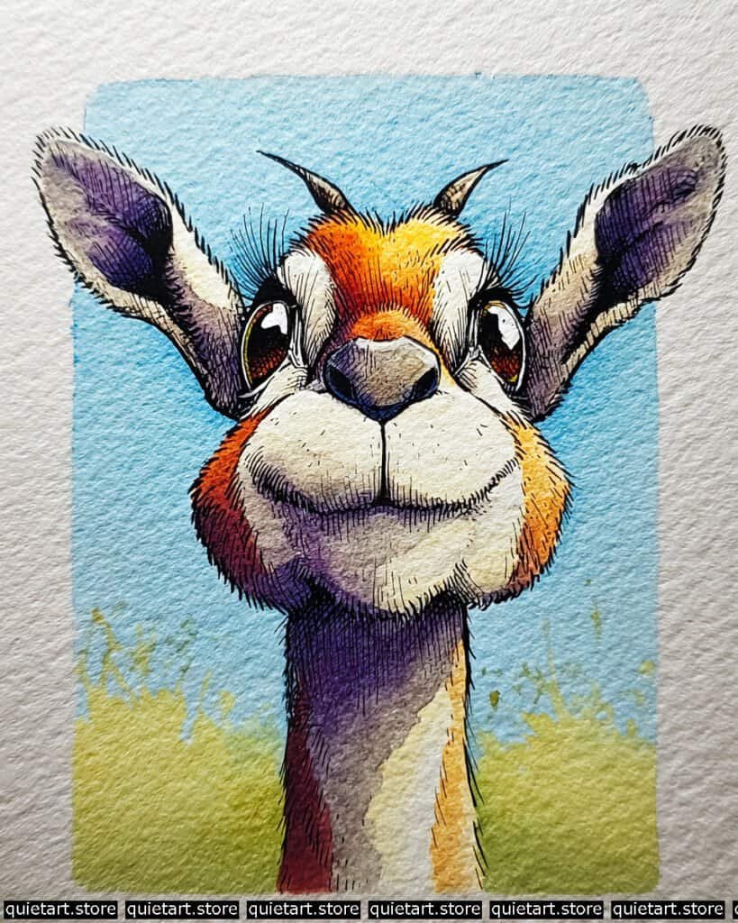
To capture the warmth of the face, use a variegated wash with “charging” colors. Start by wetting the central forehead and muzzle area. Drop in a bright yellow at the top, then “charge” the damp area with a saturated orange, moving toward a deep magenta or plum at the cheeks. This allows the colors to blend softly on the paper, mimicking the natural transitions of light on short fur. For the neck, notice the sharp-edged shadow—this is achieved using a wet-on-dry glaze. Wait for the first layer of the neck to dry completely, then paint the purple shadow shape over it to create that crisp, professional “hard” shadow.
The textural contrast is handled with a mix of pen work and dry-brushing. Use a fine-liner for the rhythmic hatching on the muzzle and the long, delicate eyelashes. For the “fuzzy” ears, use a very dry brush with a dark violet pigment and “scumble” it over the tooth of the paper to suggest the soft inner down. The background uses a vignette wash technique: keep your blue most concentrated near the character’s head and use more water as you move toward the edges of the “frame,” allowing the paper’s natural texture to show through.
Professional Palette
This selection balances the high-intensity face with a calming, atmospheric background:
| Feature | Recommended Pigment | Why It Works |
| Forehead/Cheeks | Pyrrol Orange | A vibrant, clean orange that stays bright even when mixing with yellows. |
| Shadowed Neck | Cobalt Violet | A granulating, transparent purple that adds depth without looking heavy. |
| Amber Eyes | Quinachridone Gold | Provides a deep, resin-like glow that makes the eyes “sparkle.” |
| Muzzle/Chin | Buff Titanium | An off-white that feels more natural and “creamy” than pure paper white. |
| Sky Frame | Cerulean Blue | A classic sky blue that granulates against the paper texture. |
Our 60 Wild Animals Watercolor Coloring Pages (PDF Download) are made for pure enjoyment. Ready to let your creativity run wild? Download, print, and start today.
Bear
To capture the incredible texture of the snout, you’ve used a multi-layered glazing and lifting technique. Start with a base of pale violet. Once dry, layer a darker neutral tint or indigo over the top, but before it dries, use a crumpled paper towel or a dry sponge to “dab” away some pigment. This creates the mottled, uneven skin texture seen on the bridge of the nose. The fine highlights on the nostrils can be added at the very end with a tiny touch of white gouache to simulate the sheen of a wet nose.
For the radiating fur texture, the secret is in the order of operations. Apply your vibrant orange and magenta washes first, letting them bleed together. Once the paper is bone-dry, use a fine technical pen or a very small rigger brush to pull short, frantic strokes from the center of the face outward. By varying the length and thickness of these lines, you create the “scruffy” look. The background uses a “back-run” or “cauliflower” effect—dropping clear water into a damp blue wash—to create those interesting white bloom patterns in the sky that break up the flat color.
Professional Palette
This palette uses high-chroma warm tones to make the “bear” look like it’s bathed in a low, setting sun:
| Feature | Recommended Pigment | Why It Works |
| Forehead Glow | Azo Yellow | Stays bright and transparent, providing the primary light source. |
| Cheek/Body Fur | Quinacridone Coral | A punchy, warm pink-red that blends perfectly into the yellow. |
| Leathery Snout | Neutral Tint + Paynes Gray | Allows for deep, cool values that contrast with the warm fur. |
| Textured Sky | Phthalo Blue (RS) | A strong blue that creates dramatic “blooms” when water is added. |
| Grass Base | Olive Green | A natural, muted green that doesn’t distract from the character. |
Our 60 Wild Animals Watercolor Coloring Pages (PDF Download) are made for pure enjoyment. Ready to let your creativity run wild? Download, print, and start today.
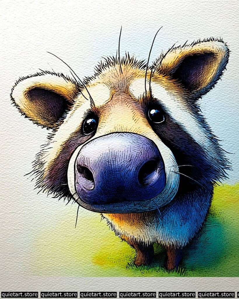
Warthog
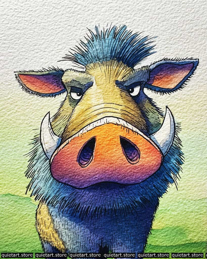
To manage the complex transitions on the snout, you’ve employed a radial variegated wash. Start by pre-wetting the central orange area. While damp, “charge” the lower edges with a concentrated violet-blue. To get that precise, rounded highlight on the top of the nose, you can use the lifting technique with a clean, dry brush to pull away a bit of the orange pigment while it’s still settling. This creates a soft, natural glow that suggests the sun is hitting the highest point of the muzzle.
For the layered fur and tusks, the key is dry-on-dry detailing. Once the blue body wash is completely dry, use a fine-liner to create the jagged, outward-radiating lines for the mane. For the tusks, use a very pale gray glaze on the underside to give them a cylindrical, 3D appearance, leaving the top edge as pure paper white. The background utilizes a horizontal wet-on-dry wash, allowing the green of the grass to meet the pale yellow sky with a soft but defined edge, which keeps the focus entirely on the warthog’s intense gaze.
Professional Palette
This character uses a bold “split-complementary” scheme to create maximum impact:
| Feature | Recommended Pigment | Why It Works |
| Snout/Ears | Pyrrol Orange | A punchy, opaque orange that provides high contrast against the blue. |
| Mane & Body | Phthalo Blue (GS) | An intense, staining blue that gives the bristles a “neon” quality. |
| Deep Shadows | Indanthrone Blue | A dark, moody blue that creates depth in the mane without using black. |
| Tusk Shadows | Payne’s Gray | Diluted heavily, it provides the perfect cool gray for bone and horn. |
| Savanna Grass | Sap Green + Azo Yellow | Creates a fresh, sunlit green that anchors the character. |
Our 60 Wild Animals Watercolor Coloring Pages (PDF Download) are made for pure enjoyment. Ready to let your creativity run wild? Download, print, and start today.
Seal in water
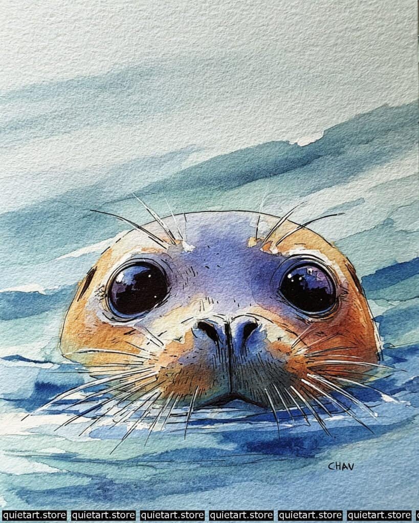
To master the waterline effect, you’ve used a negative space wash. Instead of painting the water around the seal, you likely wet the entire lower half of the paper and dropped in various blues, letting the pigment “pool” right at the edge of the seal’s face. This creates that natural, soft-edged boundary where the fur meets the water. The ripples are then added with a flat brush using a “side-swipe” motion, which allows the brush to skip over the peaks of the paper’s tooth, leaving those sparkling white highlights that look like sunlight on waves.
For the expressive eyes, you’ve employed a multi-layer glazing technique. Start with a deep violet base, and while damp, drop in a touch of indigo at the top for the pupil. The magic happens with the specular highlights: by using a tiny bit of masking fluid or opaque white gouache, you’ve created reflections that look like the sky above. Finally, the whiskers are pulled out using a rigger brush with a very high water-to-pigment ratio, ensuring they look transparent and light against the darker water.
Professional Palette
This composition thrives on the contrast between the chilly Arctic water and the warm life of the animal:
| Feature | Recommended Pigment | Why It Works |
| Water & Shadows | Phthalo Blue (RS) | A vibrant, transparent blue that captures the “depth” of the ocean. |
| Face Highlights | Quinacridone Gold | Provides a luminous, honey-like warmth to the sunlit fur. |
| Eye Depth | Dioxazine Purple | A very dark, transparent purple that keeps the eyes looking “liquid.” |
| Lower Muzzle | Burnt Umber | Adds a grounded, earthy weight to the snout area. |
| Distant Sky | Cobalt Teal Blue | A soft, granulating blue that recedes beautifully into the background. |
Our 60 Wild Animals Watercolor Coloring Pages (PDF Download) are made for pure enjoyment. Ready to let your creativity run wild? Download, print, and start today.
Meerkat
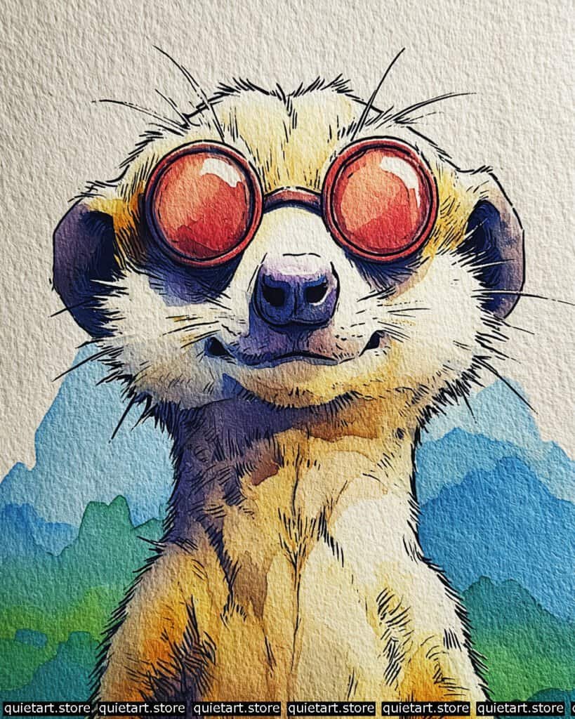
The standout feature here is the reflective glass effect on the sunglasses. To achieve this, use a concentric variegated wash. Start with a light peach or orange in the center of the lens. While wet, drop a highly saturated red around the edges, allowing it to bleed inward. The key is to leave a small, sharp sliver of pure paper white (or a dab of white gouache) at the top of the lens to act as a specular highlight. This high-contrast reflection is what gives the “glass” its hard, polished look.
For the fur and shadow structure, you’ve used a very effective glazing technique. Notice the deep purple shadows under the chin and around the ears; these were likely added as a second layer over a dry, pale yellow wash. This “hard-edged” shadow provides a crispness that mimics strong desert sunlight. To finish, use a fine-liner to create the “scruffy” fur along the neck and the tiny whiskers. By keeping the linework dense in the shadow areas and sparse in the highlights, you emphasize the 3D form of the meerkat’s long neck.
Professional Palette
This palette uses bold primaries to create a high-impact, illustrative feel:
| Feature | Recommended Pigment | Why It Works |
| Sunglasses | Pyrrol Red | An intense, opaque red that provides the perfect “plastic” frame look. |
| Main Fur | New Gamboge | A warm yellow that captures the desert sun hitting the coat. |
| Deep Shadows | Ultramarine Blue + Alizarin Crimson | Mix these to create a rich, transparent purple for the “cool” shadows. |
| Nose & Ears | Payne’s Gray | Diluted for the nose and concentrated for the dark ear tufts. |
| Mountains | Cobalt Blue | A classic, granulating blue that pushes the background far away. |
Our 60 Wild Animals Watercolor Coloring Pages (PDF Download) are made for pure enjoyment. Ready to let your creativity run wild? Download, print, and start today.
Kangaroo
To capture the soft, rounded volume of the kangaroo’s muzzle, you’ve employed a sophisticated wet-on-wet variegated wash. Start by pre-wetting the snout and jowls. While the paper has a “dull shine,” drop in a pale violet at the top of the nose, transitioning into a deeper Phthalo Blue toward the chin. This allows the pigments to mingle on the paper without harsh edges, creating that smooth, leathery look. The warm ocher for the rest of the head should be painted around these cool areas, letting them “kiss” slightly to create a soft, natural blur.
The structural definition is achieved through contour-following pen work. Once your washes are dry, use a 0.05 or 0.1 technical pen to draw the fur. Instead of straight lines, use short, curved strokes that follow the “bulge” of the cheeks and the “slope” of the nose. This reinforces the 3D form you established with your colors. For the ears, use a dry-brush technique—loading a brush with concentrated pigment and very little water—to drag color across the grain of the paper. This creates the “scruffy” hair texture on the ear edges while leaving the inner ear soft and luminous.
Professional Palette
To replicate this specific color harmony, use a mix of granulating and staining pigments:
| Feature | Recommended Pigment | Why It Works |
| Main Fur | Quinachridone Sienna | A vibrant, transparent earth tone that glows against cool shadows. |
| Snout/Chin | Ultramarine Blue | Granulates beautifully to suggest skin texture on the muzzle. |
| Shadow Core | Imperial Purple | Adds a rich, heavy value to the “dip” under the nose. |
| Eye Highlights | Indigo | Provides a deep, near-black that makes the specular highlights pop. |
| Ground Glow | Aureolin Yellow | A cool yellow that mixes with the blue jowls to create a subtle green tint. |
Our 60 Wild Animals Watercolor Coloring Pages (PDF Download) are made for pure enjoyment. Ready to let your creativity run wild? Download, print, and start today.
Capybara
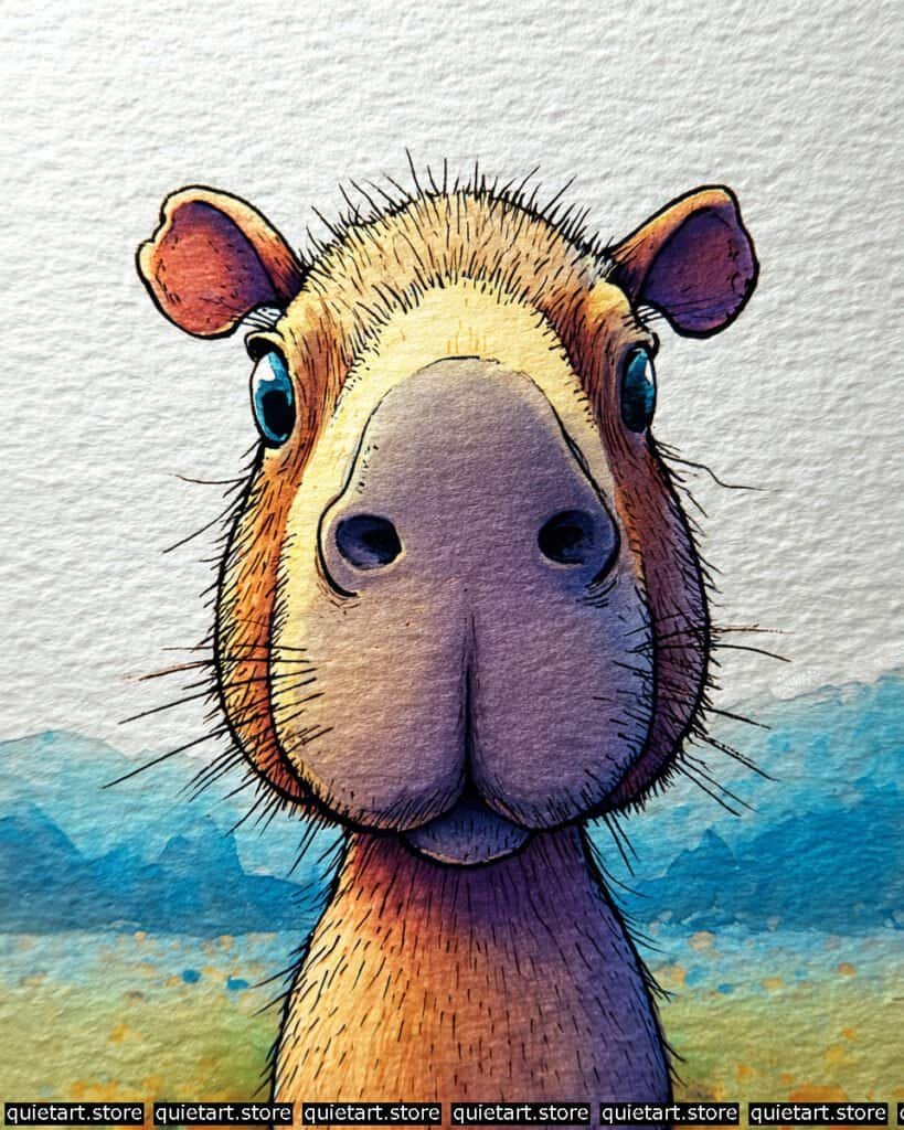
To capture the velvety, rounded volume of the capybara’s snout, use a concentric variegated wash. Start by pre-wetting the central bridge of the nose. Drop in a pale violet or lavender at the tip, then “charge” the damp area with a warm ocher as you move up toward the eyes. By controlling the moisture level, you allow the pigments to blend in a soft gradient that mimics the subtle skin transitions of a capybara’s muzzle. The background is handled with a layered atmospheric wash, where the distant mountains are painted in pale, cool blues to create a sense of vast, open space.
The textural contrast is where the character truly comes to life. Once your base washes are bone-dry, use a fine-liner (0.05 or 0.1) for the radial hatching. Pull short, rhythmic lines from the center of the face outward to represent the coarse, wiry fur. Notice how the lines are denser in the shadow areas of the neck and ears—this is cross-hatching used to build value. For the ears, use a dry-brush technique with a saturated purple to create that “scruffy” edge, leaving the inner ear with a soft, sun-kissed glow.
Professional Palette
This selection of pigments focuses on high-contrast temperature shifts to keep the “gray” areas of the animal looking vibrant:
| Feature | Recommended Pigment | Why It Works |
| Bridge of Nose | Yellow Ochre | A natural, earthy yellow that suggests soft sunlight on short fur. |
| Muzzle Shadows | Cobalt Violet | A granulating purple that mimics the texture of skin and shadow. |
| Cheeks & Neck | Burnt Sienna | Provides a rich, reddish-brown warmth that balances the cool blues. |
| Eyes & Nostrils | Indigo | A deep, transparent blue-black that keeps the features looking “liquid.” |
| Distant Hills | Phthalo Blue (GS) | A staining blue that provides a crisp, atmospheric receding effect. |
Our 60 Wild Animals Watercolor Coloring Pages (PDF Download) are made for pure enjoyment. Ready to let your creativity run wild? Download, print, and start today.
Lion Front View
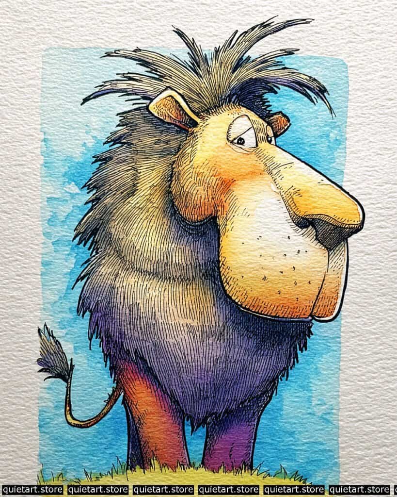
To achieve the massive volume of the lion’s mane, you’ve utilized a large-scale variegated wash. Start by pre-wetting the entire mane area with clean water. Drop in a pale yellow at the crown of the head, and while the paper is at the “damp-glow” stage, “charge” the lower portion with a concentrated mix of blue and red to create those deep purples. This allows the pigment to flow naturally into the “valleys” of your cold-pressed paper, creating a sense of weight and density without any harsh interior edges.
The structural definition is handled with a very confident parallel hatching technique. Once your washes are dry, use a 0.1 technical pen to draw the fur. Instead of chaotic scribbles, use long, vertical strokes that follow the “flow” of the mane downward. For the face, notice the stippling (tiny dots) on the muzzle—this suggests the pores where whiskers grow and adds a different textural language to the piece. The background uses a deckled-edge wash within a rectangle, framing the lion and making the spiky bits of his mane “break the frame,” which adds dynamic energy to the composition.
Professional Palette
This palette uses a classic “complementary split” to make the warm face stand out against the cool mane and sky:
| Feature | Recommended Pigment | Why It Works |
| Crown & Face | New Gamboge | A warm, transparent yellow that glows even when layered with orange. |
| Lower Mane | Carbazole Violet | An intense, staining purple that provides deep value for the shadows. |
| Body/Hindlegs | Pyrrol Orange | A saturated, earthy orange that grounds the character in warmth. |
| Sky Frame | Manganese Blue Hue | A weak-staining blue that is easy to manipulate for textured, “streaky” skies. |
| Nuzzle Dots | Sepia | A dark, warm brown that is softer than black for fine-point detailing. |
Our 60 Wild Animals Watercolor Coloring Pages (PDF Download) are made for pure enjoyment. Ready to let your creativity run wild? Download, print, and start today.
Penguin
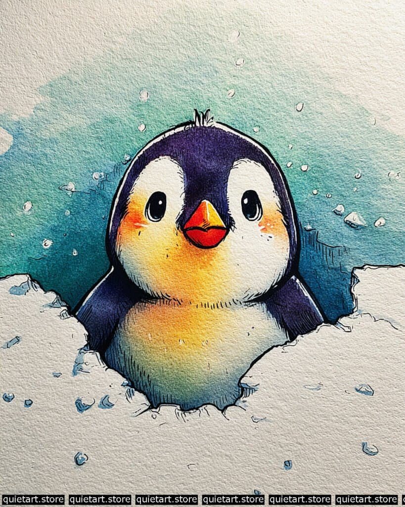
To achieve the glowing effect on the penguin’s belly and face, use a centralized wet-on-wet wash. Begin by wetting the white areas of the penguin with a very pale yellow-orange. While the paper is still damp, drop a more concentrated orange onto the cheeks and the center of the chest. This creates a soft, airbrushed look that suggests a light source coming from within or directly in front of the character. For the dark “hood,” use a controlled variegated wash of deep violet, ensuring you leave the edges crisp against the snow.
The snow and ice texture relies on negative space and lifting. Instead of painting the snow white, you’ve painted the shadows around it. Use a pale blue or teal for the shadows in the snowbank, then use a “thirsty brush” (a clean, damp brush) to lift some pigment from the edges to create soft, rounded mounds. The “bubbles” or snowflakes in the sky can be achieved using masking fluid or by dabbing the wet teal wash with a paper towel. Finally, use a fine-liner for the rhythmic hatching on the flippers and the “pitted” texture of the ice to add a tactile contrast to the soft washes.
Professional Palette
This palette uses high-chroma colors to avoid the “muddy” look that often happens when mixing darks:
| Feature | Recommended Pigment | Why It Works |
| Glow Accents | New Gamboge + Pyrrol Orange | Provides a sunny, warm transition that pops against the cool surroundings. |
| Penguin Hood | Dioxazine Purple | A very dark, cool purple that acts as a lively alternative to black. |
| Icy Shadows | Phthalo Blue (GS) | An intense blue that mimics the deep, filtered light found in ice. |
| Beak & Tongue | Cadmium Red Light | Opaque and punchy; perfect for the tiny, high-contrast focal points. |
| Sky Glow | Cobalt Teal Blue | A soft, granulating teal that feels atmospheric and cold. |
Our 60 Wild Animals Watercolor Coloring Pages (PDF Download) are made for pure enjoyment. Ready to let your creativity run wild? Download, print, and start today.
Tarsier
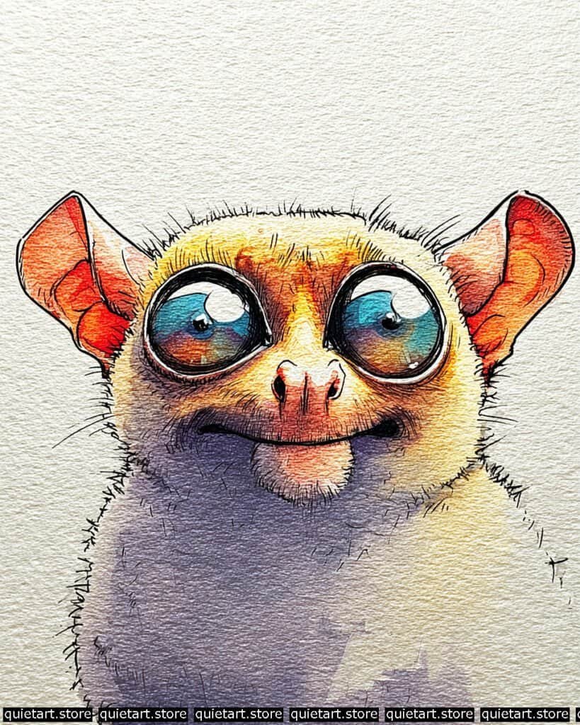
To replicate the “glass marble” effect in the eyes, you’ve used a multi-stage glazing process. Begin by laying down a variegated wash of teal and magenta within the iris circles. Once dry, add a very dark indigo glaze to the upper half of each eye to represent the shadow cast by the brow. The “liquid” look is finalized with specular highlights: by keeping two crisp, circular areas of paper white, you create a mirror-like reflection of the sky, which gives the character an intelligent, life-like spark.
The fur and ear texture is achieved through wet-on-dry detailing. After the initial golden-yellow wash on the face has dried, use a technical pen to add short, rhythmic strokes for the hair. For the ears, notice the subsurface scattering effect—the way the light seems to glow through the thin skin. This is done by using a saturated orange in the center and fading it into a cooler purple at the base. Finally, the “fuzzy” silhouette is created by pulling tiny, hair-like strokes outward into the white space of the paper, breaking the hard paint lines and giving the character its signature “cuddly but wild” feel.
Professional Palette
This selection of lightfast pigments will help you maintain the high-intensity glow and deep, transparent shadows:
| Feature | Recommended Pigment | Why It Works |
| Glow Fur | Azo Yellow | A transparent yellow that provides a clean, sun-drenched base. |
| Ears & Nose | Quinacridone Coral | A punchy red-pink that mimics the look of blood-filled, thin skin. |
| Irises | Phthalo Turquoise | An intense blue-green that offers stunning depth when glazed. |
| Shadow Body | Ultramarine Violet | A granulating purple that mimics the soft shadow on dense fur. |
| Deep Pupil | Indanthrone Blue | A deep, non-granulating blue that looks “blacker than black” in layers. |
Our 60 Wild Animals Watercolor Coloring Pages (PDF Download) are made for pure enjoyment. Ready to let your creativity run wild? Download, print, and start today.
Raccoon
To achieve the rounded, leathery volume of that oversized nose, you’ve used a radial variegated wash. Start by pre-wetting the center of the snout with clean water. Drop in a pale lavender, then “charge” the edges with a concentrated indigo or deep violet while the paper is still damp. This creates a soft, natural transition that mimics the way light curves around a wet surface. To finish the effect, wait for it to dry completely and then add the tiny, sharp “pore” details with a fine-liner to give it a tactile, leathery feel.
The mask and fur texture are where the technical precision shines. For the iconic dark eye mask, use a wet-on-dry glaze of deep purple over your initial warm base. This keeps the edges crisp and prevents the dark pigment from muddying the lighter fur. Once dry, use a 0.05 technical pen for the scruffy linework. Focus on pulling short, energetic strokes from the bridge of the nose outward. Notice how the lines follow the “bulge” of the cheeks—this contour-hatching is essential for maintaining the 3D form under all that fuzzy texture.
Professional Palette
This selection of pigments will help you replicate the “electric” feel of the cool shadows against the warm fur:
| Feature | Recommended Pigment | Why It Works |
| Glow Fur | Yellow Ochre | Provides a soft, earthy glow that looks like natural sunlight. |
| The Big Snout | Ultramarine Violet | A granulating purple that naturally adds a “skin-like” texture. |
| Eye Mask | Indigo + Dioxazine Purple | Creates a “black” that is full of color and depth rather than flat. |
| Deep Pupil | Neutral Tint | Offers a very dark, transparent value for the soulful eyes. |
| Ground Light | Green Gold | A vibrant, transparent green that reflects “up” into the lower fur. |
Our 60 Wild Animals Watercolor Coloring Pages (PDF Download) are made for pure enjoyment. Ready to let your creativity run wild? Download, print, and start today.
Gang-gang Cockatoo
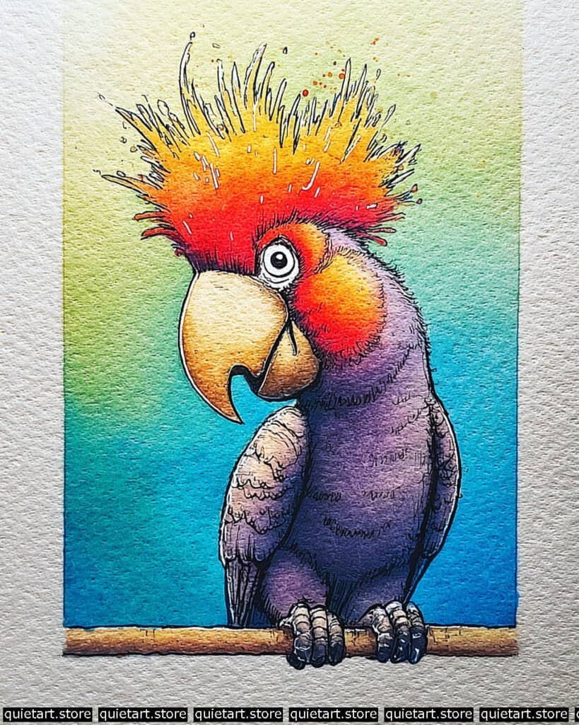
To achieve the “glow” in that crest, use a wet-on-wet graduated wash. Start at the tips of the feathers with a very dilute yellow, and as you work down toward the head, drop in increasingly saturated orange and then a pure, staining red. While it’s still damp, use a splatter technique with a few drops of clean water or concentrated red pigment to create those organic “sparks” flying off the crown. This adds a sense of movement and “heat” to the character.
For the beak and body texture, you’ve used a great combination of glazing and stippling. The beak has a wonderful “weathered” look, likely achieved by a pale ochre wash followed by very fine brown pen dots to suggest pitted keratin. For the body, use a variegated wash of violet and indigo. Once dry, use a fine-liner for the scalloped hatching on the wings—these tiny, U-shaped lines mimic the overlapping layers of feathers without needing to paint each one individually. The background’s smooth vertical gradient provides a calm, atmospheric contrast to the jagged, energetic lines of the parrot.
Professional Palette
To replicate this high-chroma, tropical spectrum, I recommend these vibrant, staining pigments:
| Feature | Recommended Pigment | Why It Works |
| Crest Tips | Hansa Yellow Deep | A transparent, warm yellow that blends into oranges without turning muddy. |
| Lower Crest | Pyrrol Red | Provides a powerful, opaque red for the base of the “flames.” |
| Velvet Body | Imperial Purple | A rich, granulating purple that gives the body a soft, feathered depth. |
| Beak & Perch | Raw Sienna | A natural earth tone that provides a realistic, “hard” texture. |
| Background | Phthalo Turquoise | An electric blue-green that makes the red crest “pop” through color contrast. |
Our 60 Wild Animals Watercolor Coloring Pages (PDF Download) are made for pure enjoyment. Ready to let your creativity run wild? Download, print, and start today.
Gorilla
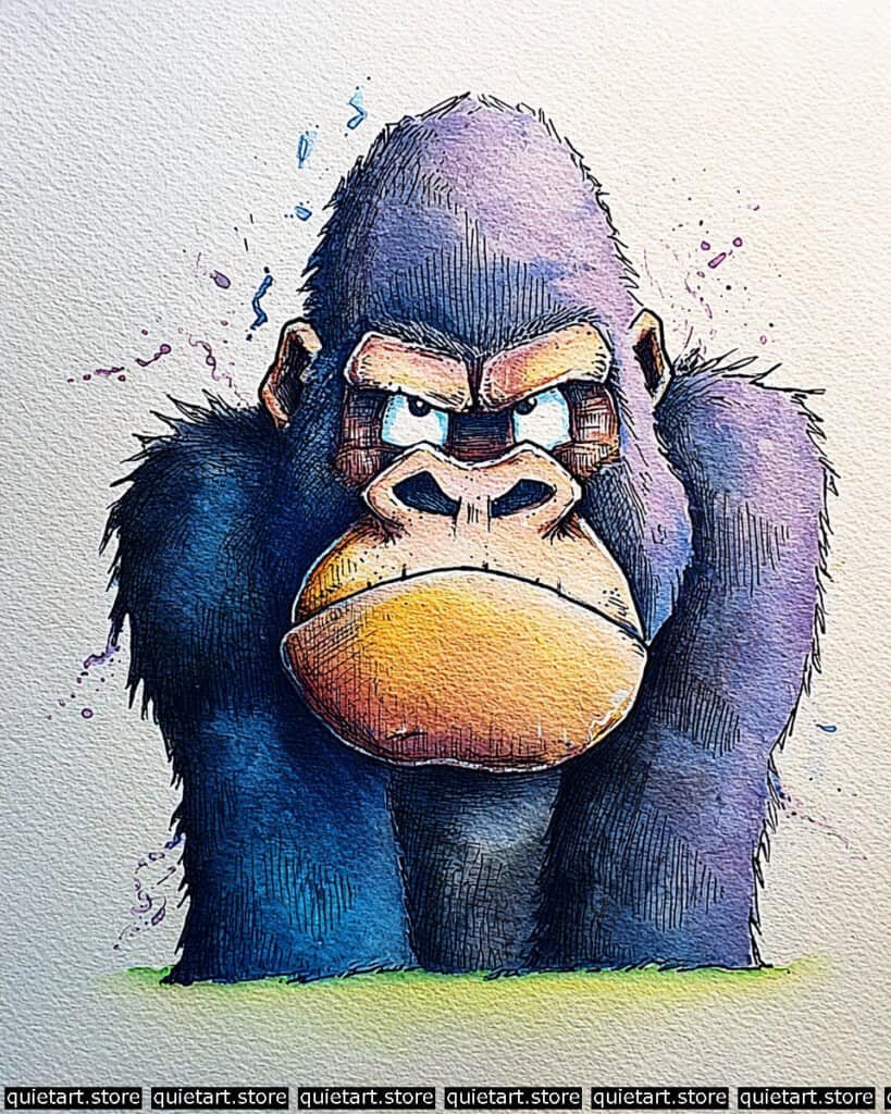
To achieve the dense, powerful volume of the gorilla’s frame, you’ve utilized a heavy variegated wash. Start with a light lavender at the crown of the head, and while the paper is “damp-matt,” charge the sides and chest with a highly concentrated Phthalo Blue. This allows the pigment to settle into the grain of the paper, creating that rich, dark texture without making the character look like a flat silhouette. The muzzle should be handled with a warm-to-cool transition, dropping orange into a damp yellow wash to create that “sun-baked” leathery look.
The structural definition is where the character’s intensity comes from. Once the washes are bone-dry, use a 0.1 technical pen for the cross-hatching. Follow the “downward and outward” flow of the fur on the arms, but switch to a tighter, more rhythmic hatching on the face to define the brow and the bridge of the nose. To finish, use the splatter technique: load a brush with juicy pigment and tap it sharply against a finger or second brush to “throw” those purple and blue droplets onto the paper. This breaks the clean white background and gives the piece a more expressive, “fine art” feel.
Professional Palette
This palette focuses on deep, non-muddy darks to maintain the gorilla’s powerful form:
| Feature | Recommended Pigment | Why It Works |
| Main Body | Phthalo Blue (RS) | An intense, staining blue that provides incredible depth in the shadows. |
| Muzzle Highlight | Indian Yellow | A transparent, glowing yellow that stays vibrant under pen work. |
| Crown & Splatter | Dioxazine Purple | A dark, moody purple that bridges the gap between the blue and the warm face. |
| Deepest Voids | Indigo | Use this for the nostrils and the centers of the eyes for maximum “punch.” |
| Ground Light | Lemon Yellow + Sap Green | A bright, cool green that grounds the character without competing for attention. |
Our 60 Wild Animals Watercolor Coloring Pages (PDF Download) are made for pure enjoyment. Ready to let your creativity run wild? Download, print, and start today.
Lion tail
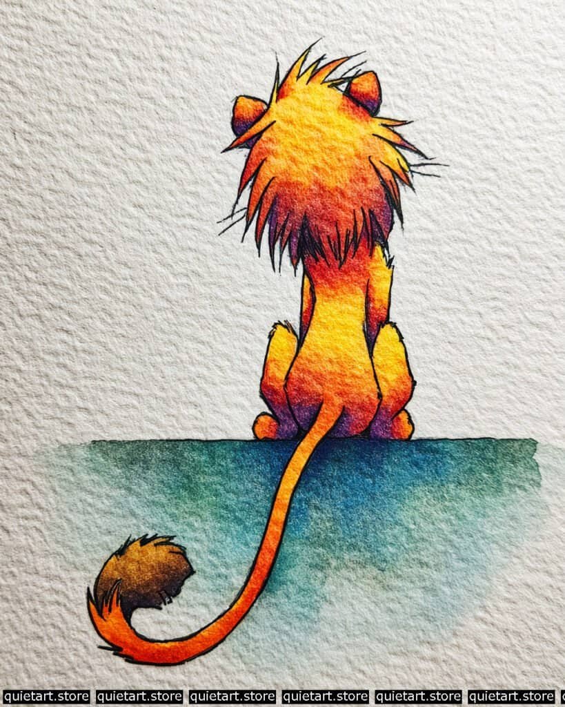
To capture this glowing effect, you used a “wet-into-wet” vertical gradient. Start with a bright yellow wash at the very top of the mane. While the paper is still quite wet, “drop” in orange, then red, and finally a deep purple at the base of the mane and the rump. This allows the colors to bleed naturally into one another, creating that seamless transition from “sunlight” to “shadow.” The tail follows the same logic, moving from a warm red to a dark, toasted sienna at the tufted tip.
The structural anchors are provided by the inked outlines and shadow washes. Once your colorful base layers are bone-dry, use a fine-liner to define the “spiky” texture of the mane and the tuft of the tail. For the ground, use a flat wash of teal, but notice the blooms (the uneven water marks) at the edges—this is achieved by dropping clear water into a damp wash to create texture. Finally, the deep purple “occlusion shadows” where the lion meets the ground help ground the character, making it look heavy and seated rather than floating.
Professional Palette
This palette relies on high-chroma warm tones to create a “golden hour” feel:
| Feature | Recommended Pigment | Why It Works |
| Top of Mane | Azo Yellow | Extremely bright and transparent; keeps the light looking clean. |
| Mid-Body | Pyrrol Orange | A punchy orange that bridges the gap between yellow and red. |
| Shadows/Paws | Carbazole Violet | A deep purple that provides a cool, dramatic contrast to the orange. |
| Tail Tuft | Burnt Umber | Adds a realistic, “furry” brown that grounds the tail. |
| The Ledge | Cobalt Teal Blue | A cool, granulating blue that acts as the perfect complementary floor. |
Our 60 Wild Animals Watercolor Coloring Pages (PDF Download) are made for pure enjoyment. Ready to let your creativity run wild? Download, print, and start today.
Conclusion
I hope these watercolor ideas inspire you to start your next artistic adventure today. Each of these 30 animals offers a unique opportunity to practice new techniques and find your own style.
Don’t forget that printable coloring pages are available if you’d prefer to skip the sketching and jump straight into the painting. I can’t wait to see the beautiful, wild masterpieces you create.