
Seeing your drawing pop off the page is one of the best feelings, right? I know how satisfying it is to take a flat colored pencil piece and make it rich with depth and dimension.
Today, I’ll share five simple steps that help me bring my colored pencil drawings to life using values. Stick with me; together, we’ll get that wow factor into your art.
Contents
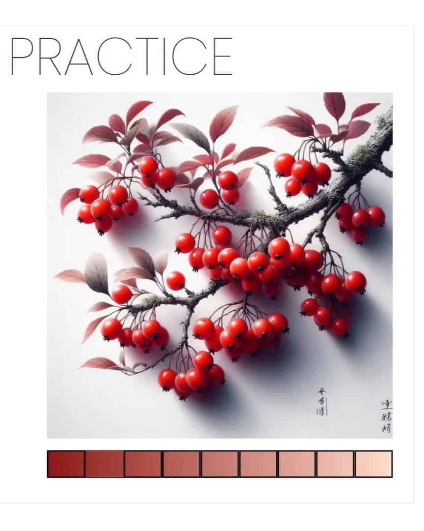
Step 1: Choose a Good Reference Image
Choosing a great reference image is crucial in creating a colored pencil drawing that captures depth, dimension, and life.
Without a strong reference, your drawing will lack the necessary information for realistic light and shadow. I’ll walk you through choosing the right reference image and ensure it works well for your drawing.
High-Resolution Images Make a Big Difference
The first thing I look for when choosing a reference image is the resolution. I want a clear, high-resolution photo. Why? Because a high-res image lets me see all the tiny details that are key to creating realistic values.

If I use a blurry or low-res image, capturing the values correctly is much harder. The finer details — like the lightest highlights and the darkest shadows — become hard to distinguish, which means my shading could look flat.
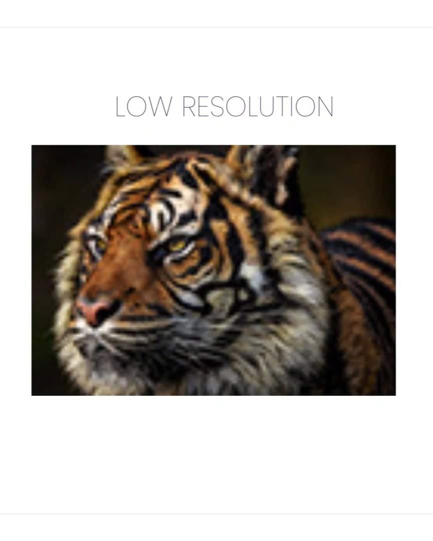
For now, focus on finding a sharp, clear reference. This gives me the most accurate information to work from and allows me to portray the values as realistically as possible.
The reference image I’m working with is clear and gives me plenty of details. This helps me create a drawing with excellent contrast and depth.
Contrast: The Key to Depth and Realism
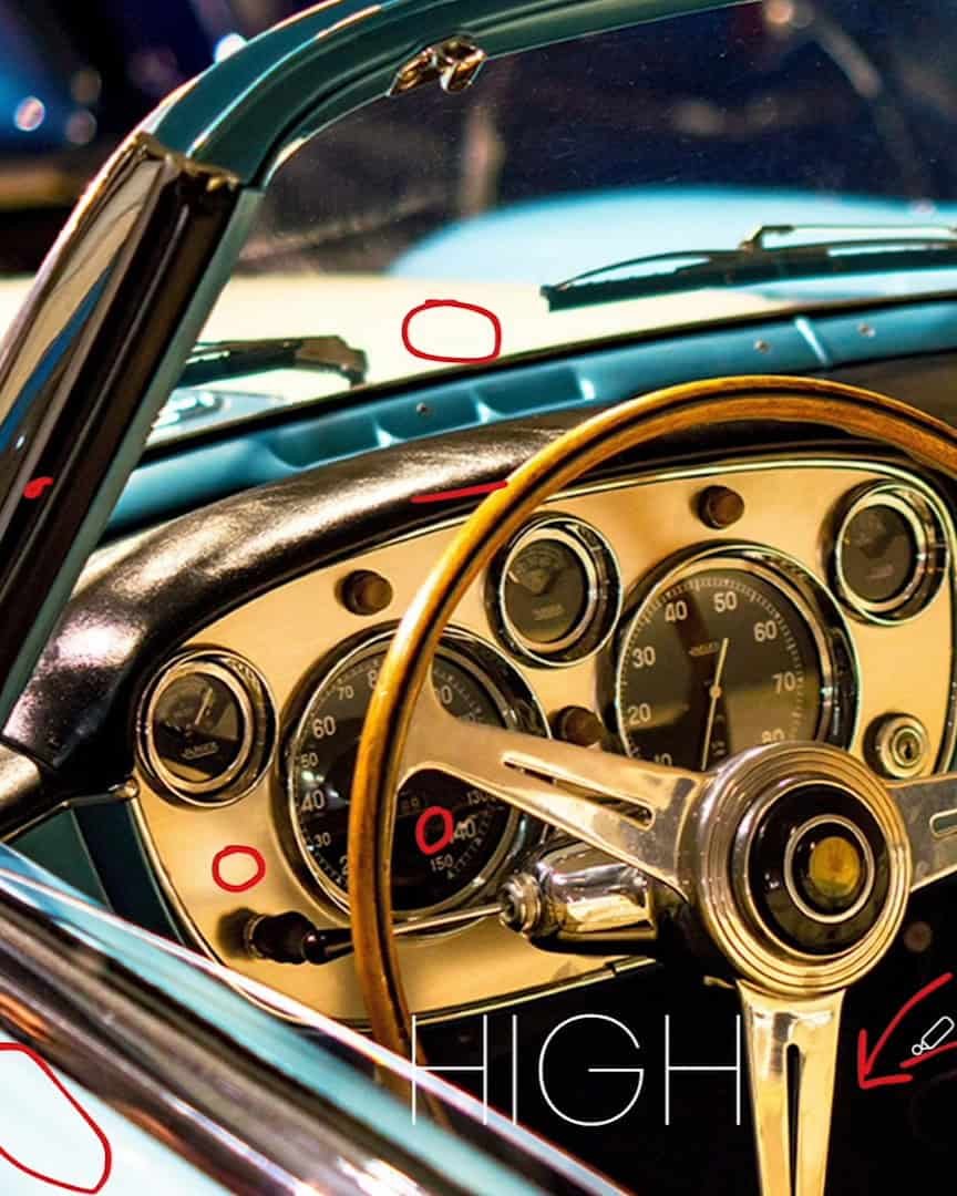
Next up, let’s talk about contrast. When I choose a reference image, I always look for a strong contrast between light and dark areas. Why? Contrast is what gives the drawing life and depth.
In my experience, the difference between light and dark in an image helps me understand how the light interacts with the subject.
Take a car as an example — one side is dark and shadowed, while the other side is brightly lit by the sun. The dark areas help create form, and the bright highlights make the subject pop.
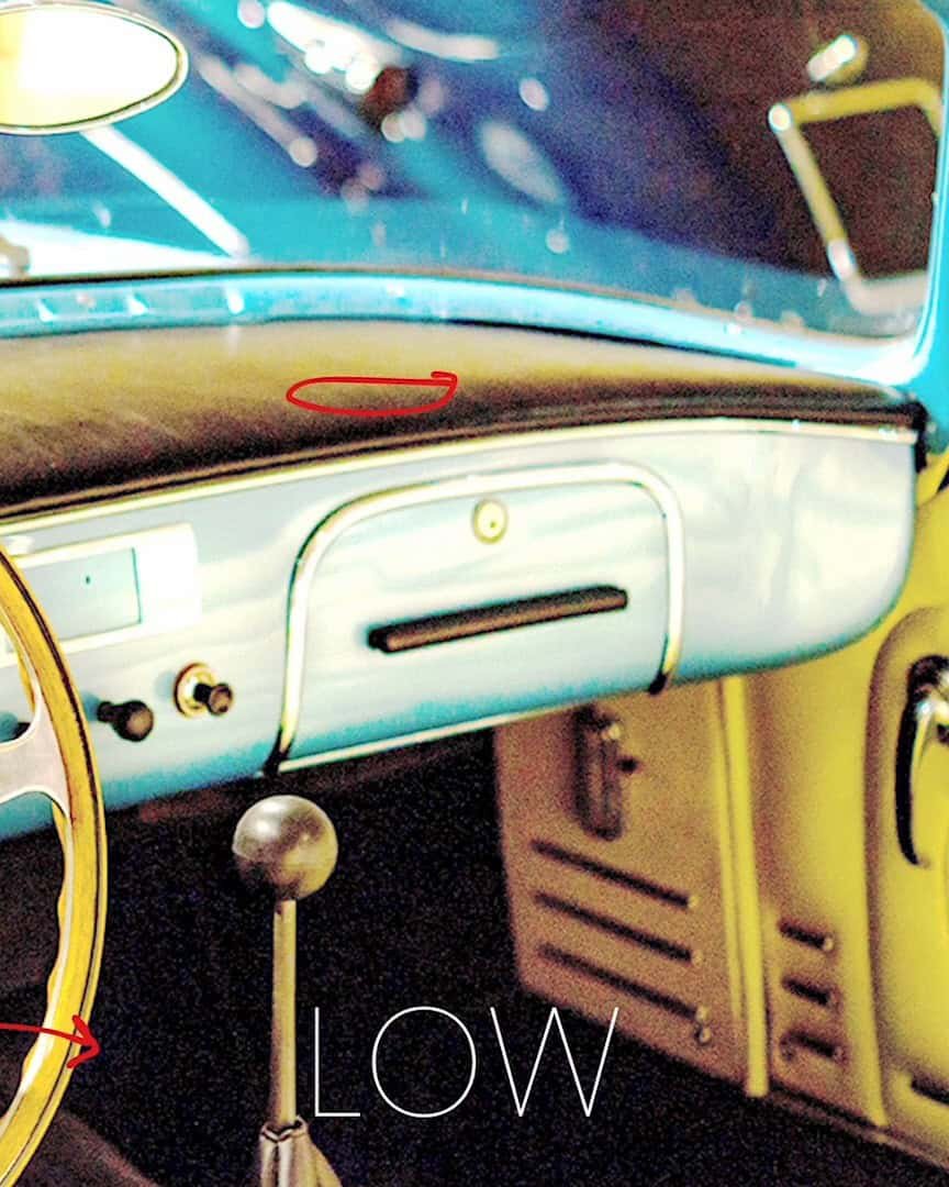
If my reference image lacks contrast, like the one in the corner of my setup, I know it will be harder to create depth. This image has few shadows or dark areas, making it flat and uninteresting.
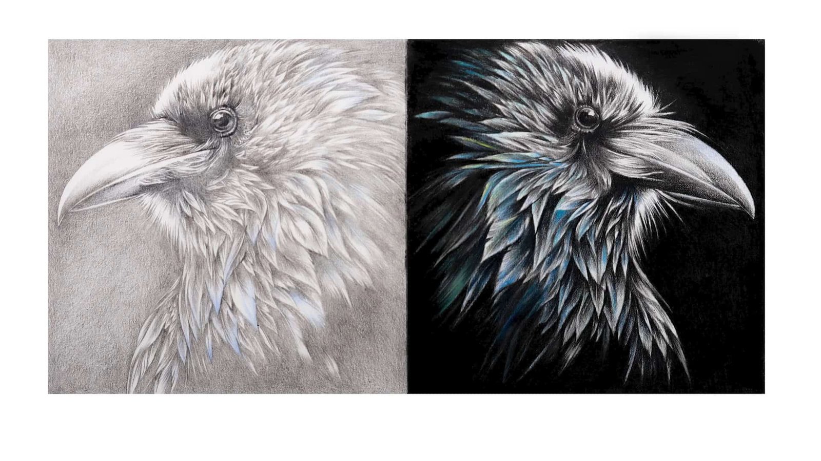
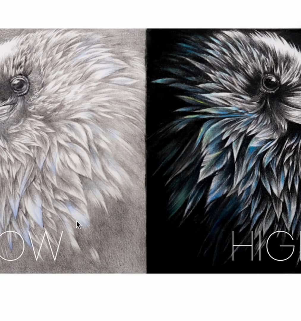
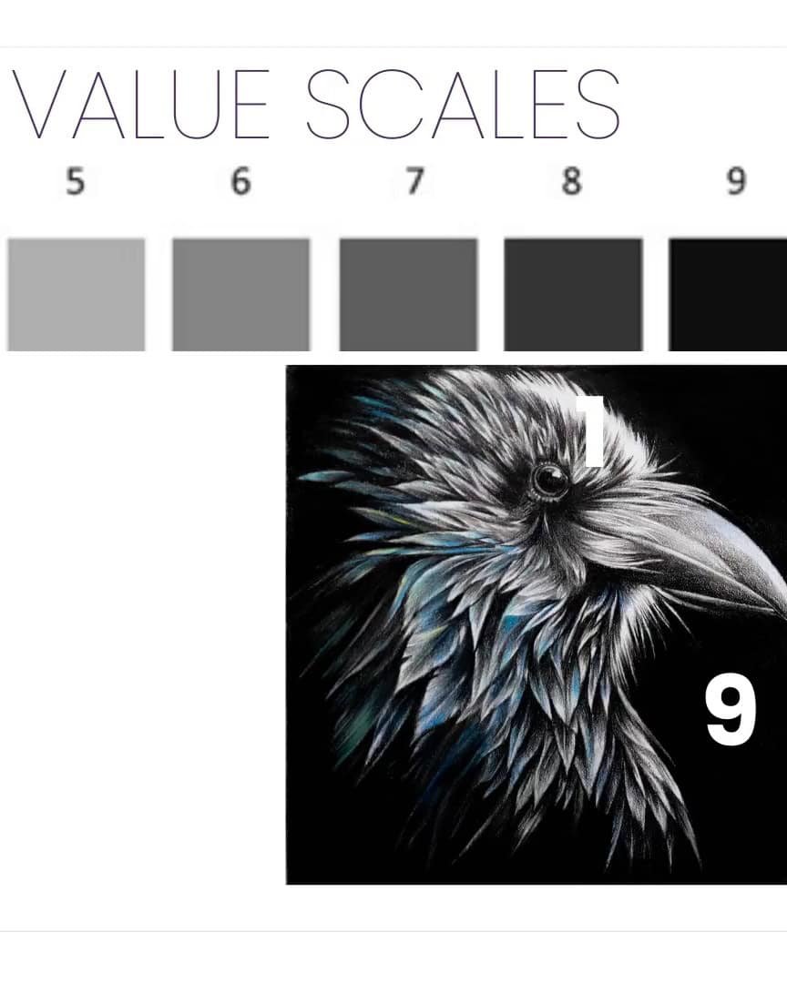
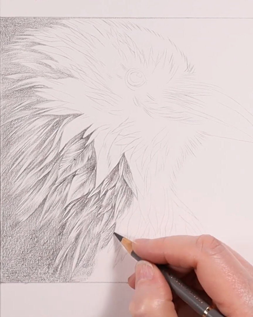
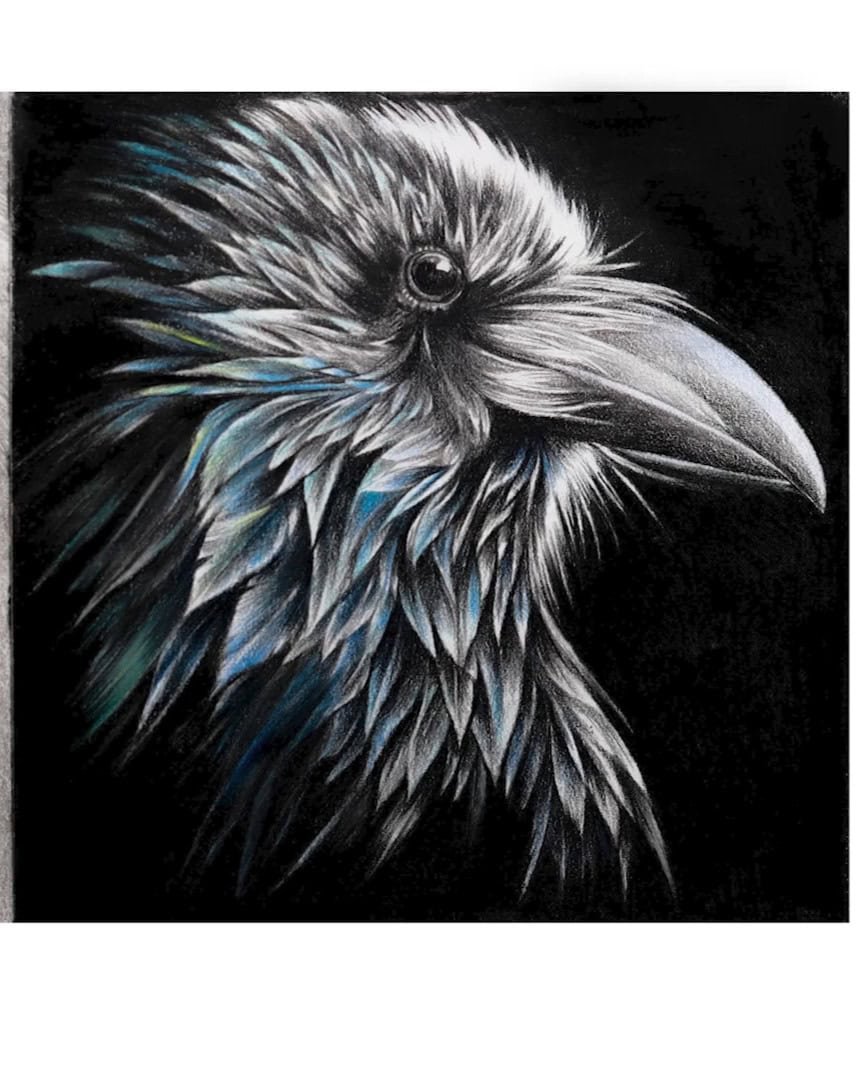
But when there’s contrast, like the high and low contrast in the raven image I’m using, the drawing takes on a new dimension level.
So, when you choose your reference, always look for an image with dark and light areas. This contrast will help create the depth and form that make your drawing feel realistic.
Look for Compelling Composition and Subject Matter
The next thing I pay attention to is the composition and subject matter. A good subject inspires me and challenges my drawing skills.
When I look for a reference, I want to find something that excites me visually. This could be an interesting texture, an intriguing shape, or an unusual perspective.
It’s also important to consider how the different elements of the reference image fit together. Are there objects that reflect light in interesting ways? Are the elements arranged in an eye-catching composition?
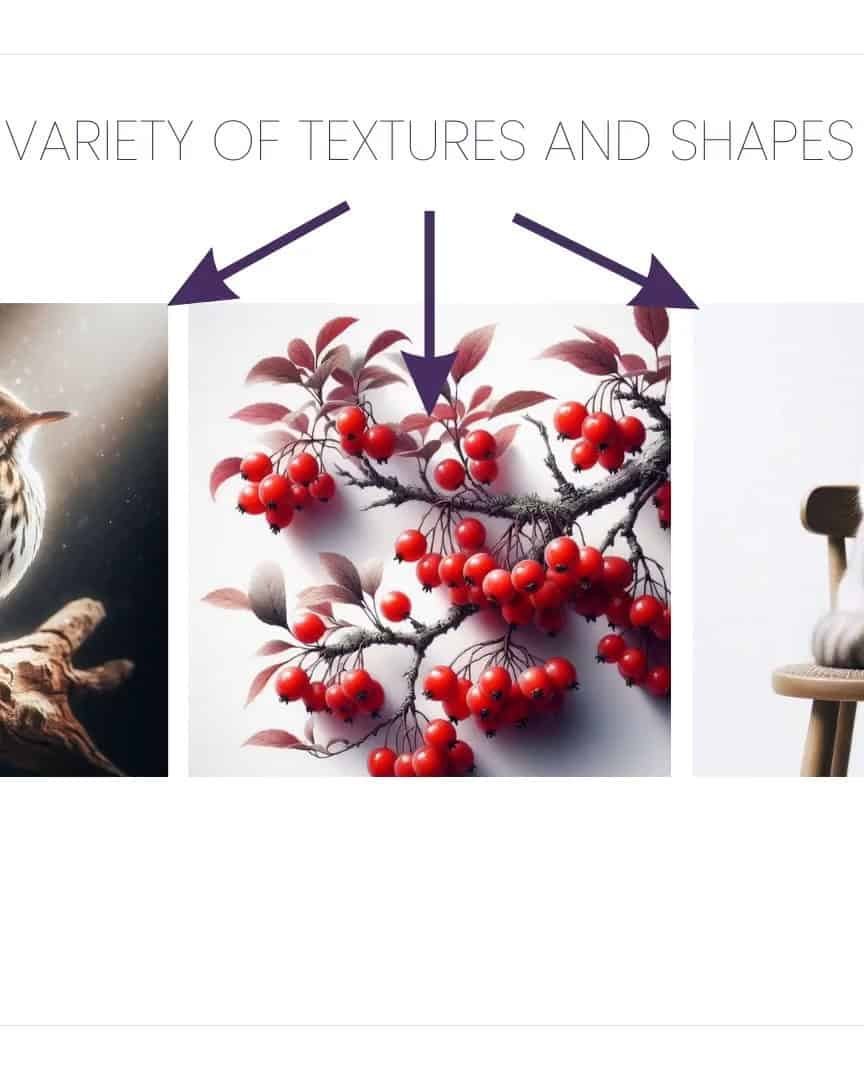
For example, in a still life, I might choose objects with various textures — shiny glass, soft fabric, and reflective metal.
These textures create dynamic lighting and make the drawing process more enjoyable.
I also think about how different subjects interact with one another. Various shapes, textures, and surfaces allow me to push my skills and create something engaging.
Whether it’s a landscape, portrait, or still life, composition greatly makes my drawing interesting.
How to Fix a Blurry or Low-Contrast Image
But what if your reference image is blurry or doesn’t have enough contrast? Don’t worry! There’s an easy fix.
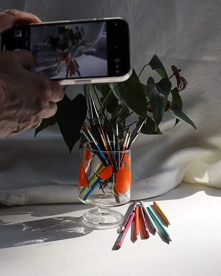
If I’m working from a live subject, I can always take my photo with a phone or tablet. This gives me the chance to adjust the lighting before I start drawing.
If the lighting is too dim or the contrast is low, I move the subject near a window or adjust the light source to get brighter, more defined shadows.
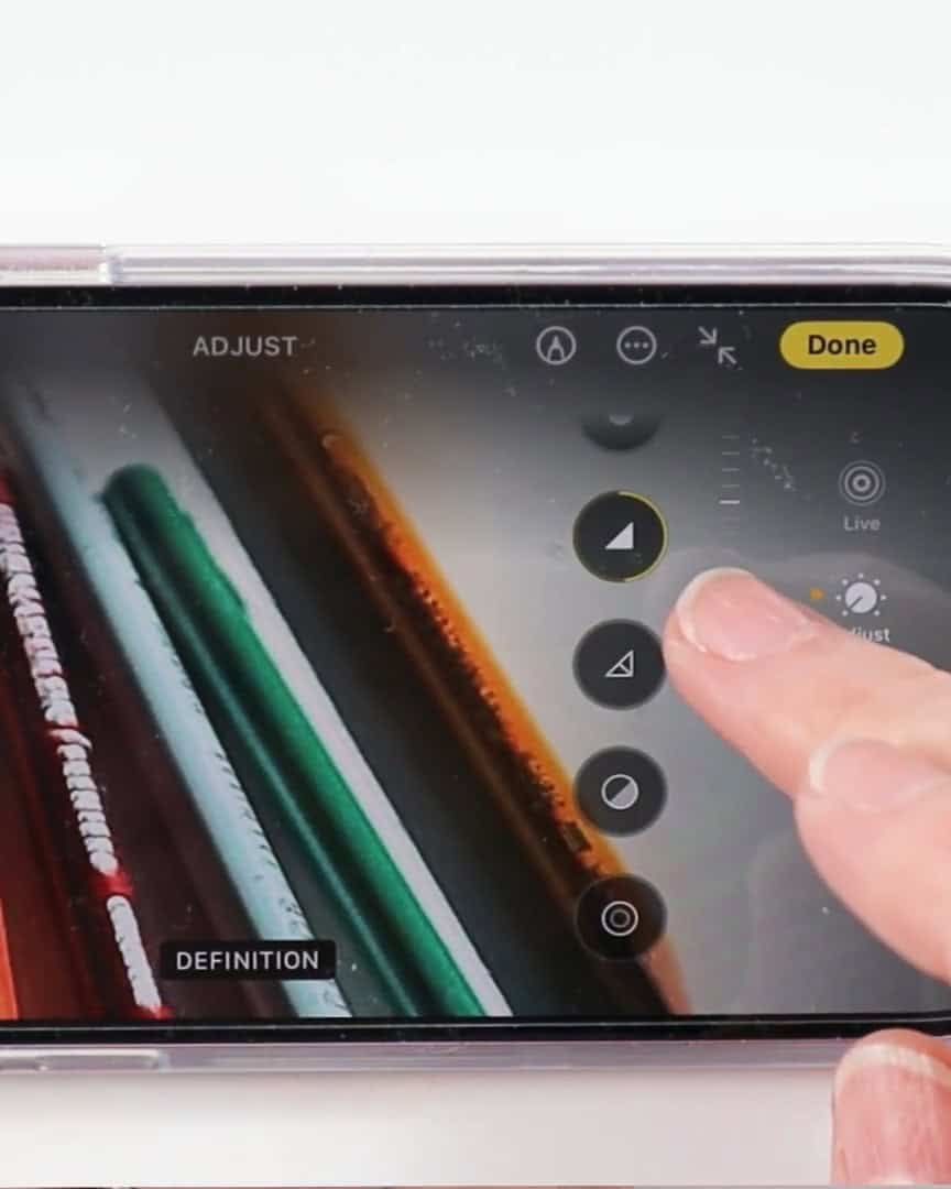
If I’m working with a photo that’s already blurry or low in contrast, I can use simple photo editing tools to improve it. I use Apple Photos on my iPhone for this. It’s easy! I just:
- Tap Edit at the top of the screen
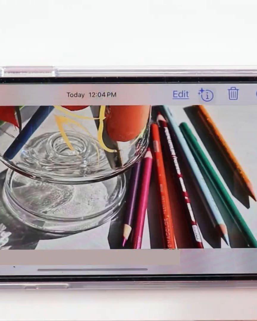
- Scroll down to Sharpness and adjust it
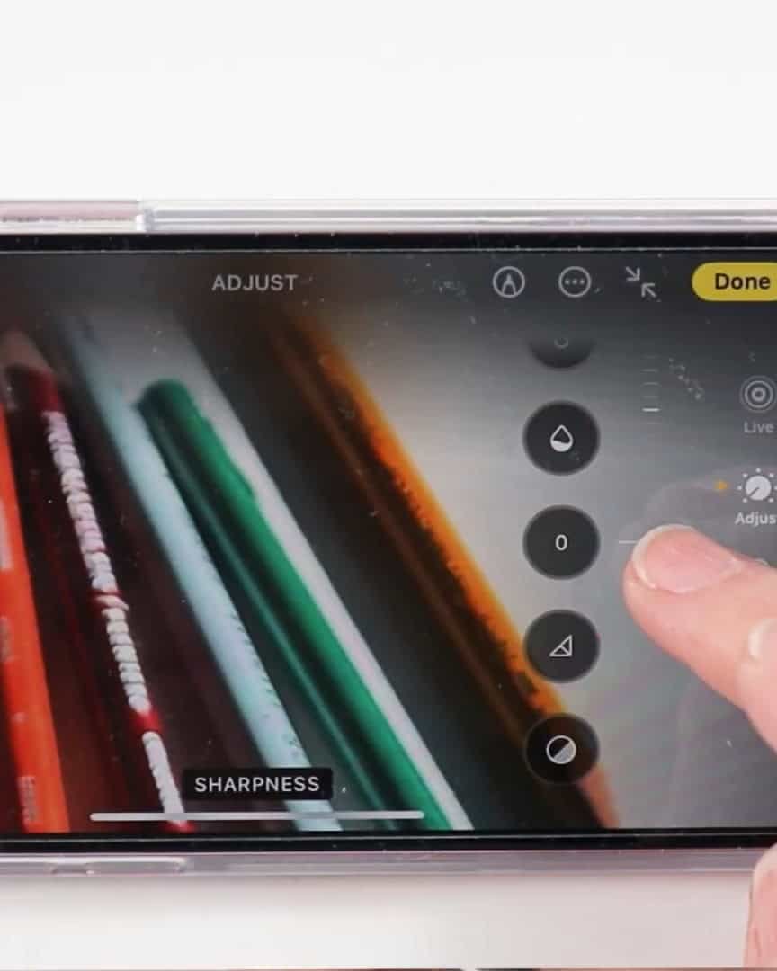
- Then, I adjust the Definition just below Sharpness. Click Done to save changes.
This is a quick and straightforward way to fix a blurry or low-contrast image. You can do the same on Android phones using Google Photos or desktop with other photo editing tools.
With just a few clicks, I can make the image clearer and bring the contrast up, giving me a much better reference from which to draw.
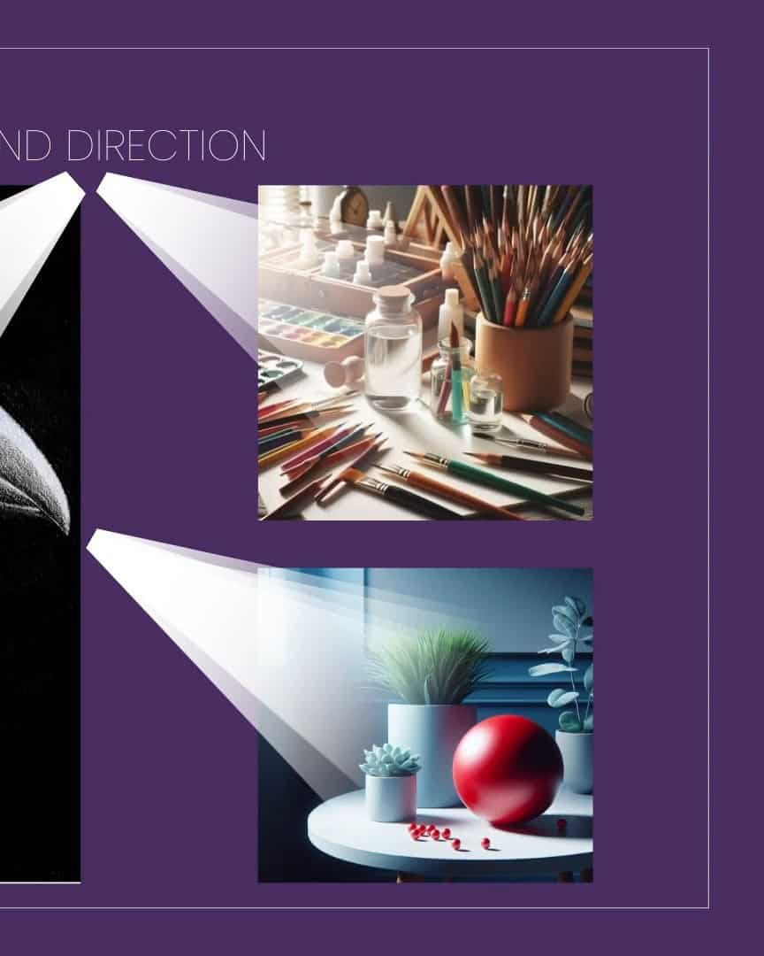
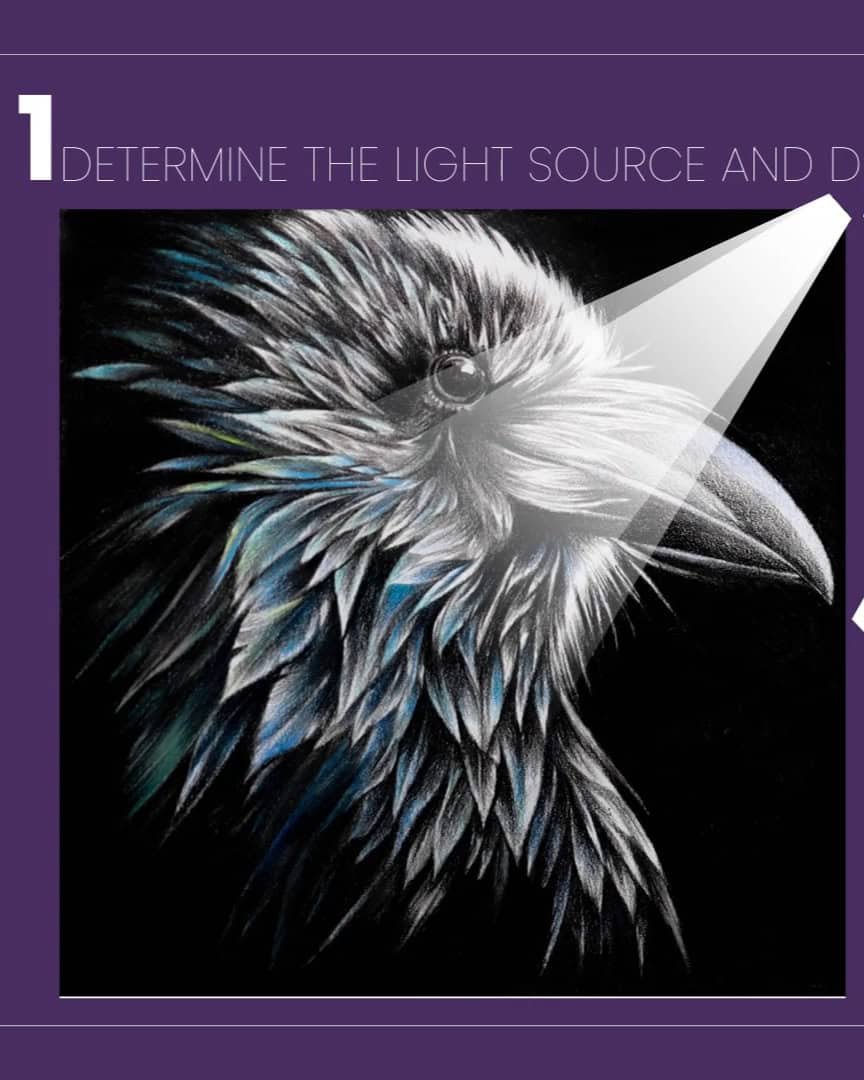
Step 2: Understand Your Light Source and Its Direction
Understanding the light source and its direction is key to creating a drawing that feels alive. Light shapes how we see objects, defines their form and helps create depth.
Let’s dive into how I approach light in my drawings so you can use it effectively in your work.
Identify the Light Source
The first step is identifying the light source in your reference image. Where is the light coming from? Is it natural sunlight or artificial light?
In my case, I look at the raven image and determine the direction of the light. It could be coming from above, from the side, or at an angle.
Knowing this is important because it helps me predict where shadows and highlights will fall on the subject.
This prediction guides my shading, ensuring it matches the direction of light throughout the drawing.
Once I know where the light is coming from, I can apply it consistently, which helps maintain realism in my drawing.
Analyze Light’s Effect on Contrast and Values
Next, I analyze how the light interacts with the subject. Light creates contrast by highlighting some areas while casting shadows on others. This is crucial for creating depth and dimension in a drawing.
When I observe the light on my subject, I break it down into:
- Highlights: The brightest spots where light hits directly.
- Mid-tones: The areas between light and dark.
- Shadows: The darkest areas, where light is blocked.
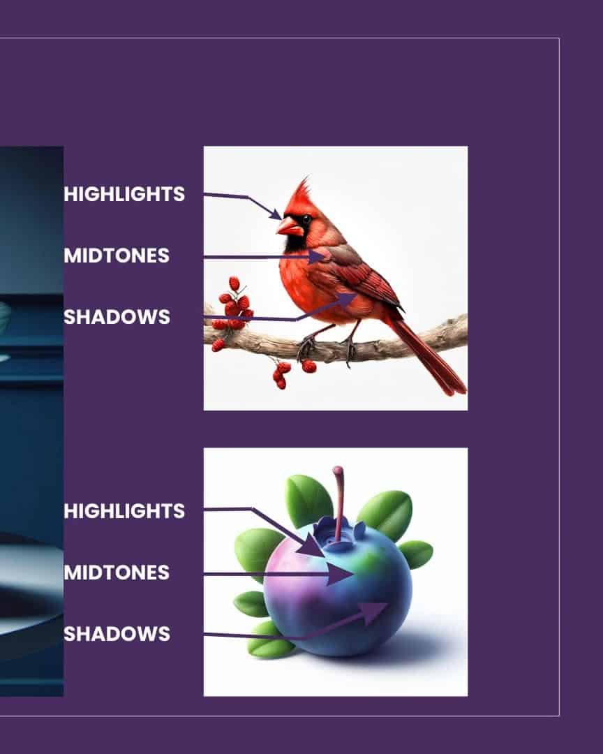
By understanding how light moves across the subject, I can apply these values to my drawing, ensuring that the light direction remains consistent.
Consider the Angle of the Light
The angle of the light also plays a significant role in how shadows form. A light source directly overhead will cast shorter shadows.
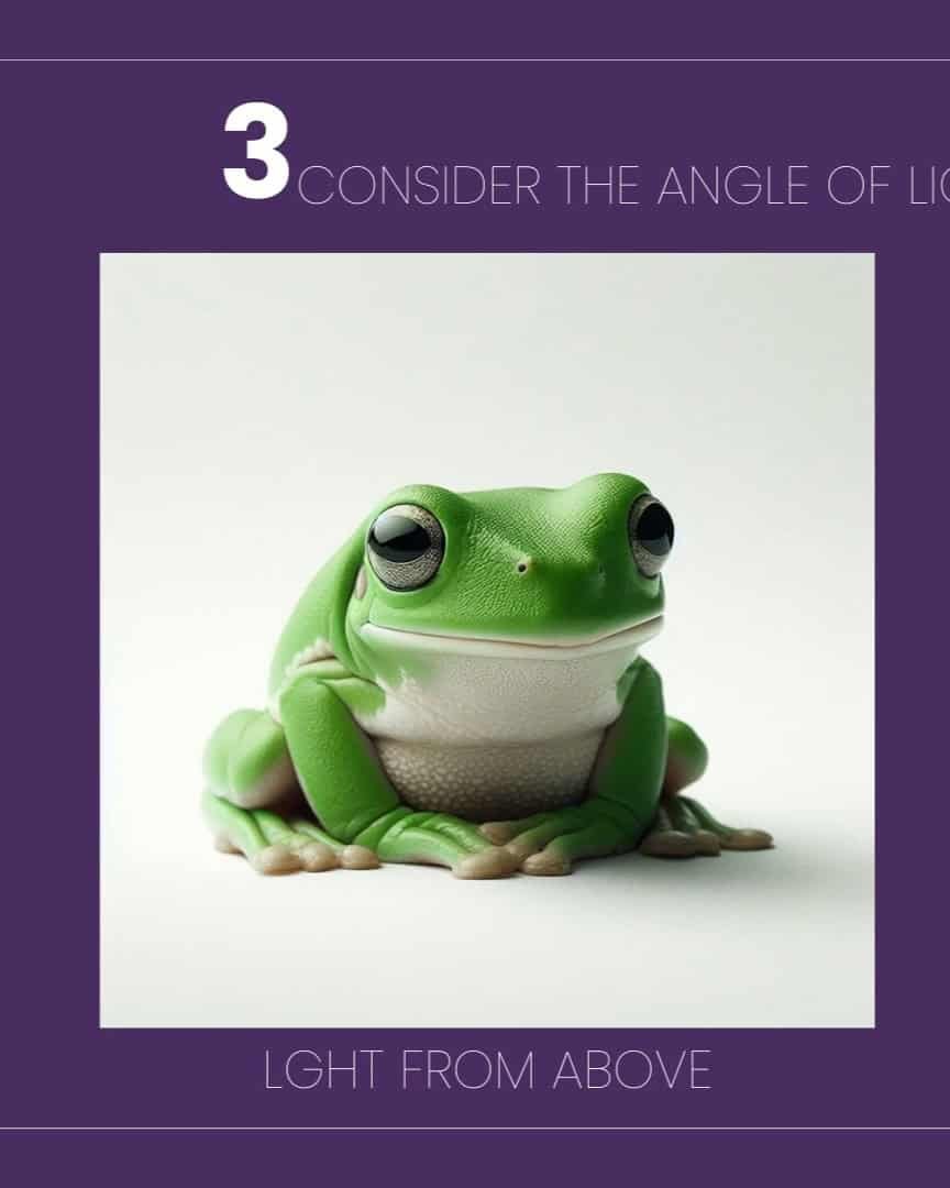
On the other hand, light from an angle will create longer shadows.

For example, if I’m drawing a figure or an object, I consider how the light’s angle affects the shadows on it.
The direction and length of the shadows are crucial to making the drawing appear three-dimensional. It’s essential to stay consistent with the angle throughout the piece for harmony.
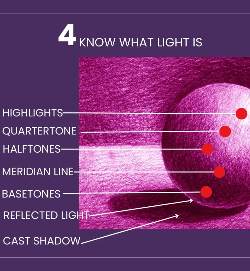
Understand the Basics of Light
Lastly, it helps to know a bit about light and its terminology. Light can be broken down into a few simple categories:
- Highlights
- Quartertone
- Halftones
- Meridian Line
- Basetones
- Reflected Light
- Cast Shadow
I also think about how natural light behaves. For instance, distant objects appear lighter and softer due to atmospheric perspective. This is a great way to create depth in my drawings.

The quality of natural light changes throughout the day, too. Whether it’s early morning, noon, or late afternoon, the lighting affects the color and value of the scene.
When drawing, I think about what time of day I want to depict and adjust the values to match the lighting conditions.

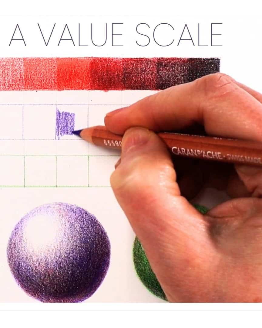
Step 3: Know and Use Value Scales
Now that we’ve covered light and its direction, it’s time to dive into the next crucial step: understanding and using value scales.
Value scales are essential for creating realistic shadows and highlights in your drawing. They help define the light and dark areas, adding depth and dimension to your work.
What is a Value Scale?
A value scale is a range of shades from light to dark. It shows the different values in your drawing and helps you understand how to depict lightness and darkness accurately.
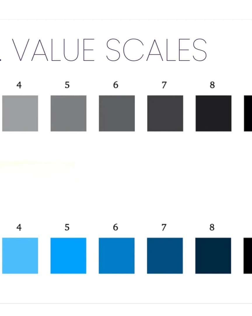
In my process, I always start by creating my value scale. It’s easy to practice controlling light and darkness with my pencils.
How to Create Your Value Scale
Creating a value scale is simple, and it’s a great way to practice your shading. Here’s how I do it:
- Start with nine small rectangles. You can use any pencil or color you want.
- Fill in the boxes, gradually going from light to dark. Try to create a smooth transition from one value to the next.
The goal is to practice creating a smooth gradation from light to dark. This exercise helps you understand how to transition between different values in your drawing.
By using a value scale, you can more accurately depict the lightness or darkness in your drawing. It allows you to create a more realistic and three-dimensional look.
For instance, when drawing, I always aim for at least five value ranges. This helps create more depth and realism.
If I don’t have enough value ranges, my drawing may look flat, like the low-value raven example I shared earlier. It’s a good reminder that more value ranges bring your work to life!
Practice, Practice, Practice
To master the use of value scales, I recommend practicing with different subjects. Start with simple objects like spheres or cubes.
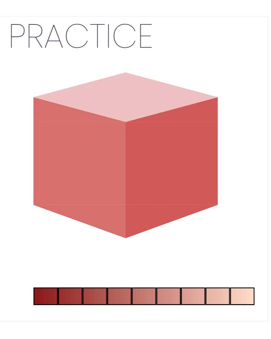
Then, move on to more complex subjects such as portraits or landscapes.
This practice helps me understand how values work in various contexts and improves my drawing skills. It also teaches me how to apply values consistently across different surfaces and shapes.
Using a Value Finder Tool
If you’re struggling to match the values in your drawing, there’s a helpful tool I use: a value finder. It’s a small card or device you can find at art stores.
These tools usually have little holes or cutout areas that allow you to compare the values in your reference image and drawing.
There are also apps like Value Pal and Value Study that can help. These apps let you identify areas in your drawing that need adjustment, ensuring you match the values more accurately.
Step 4: Block in Shadows and Value Shapes
Now that we’ve worked through the basics of light and value scales, it’s time to jump into blocking in the shadows and value shapes.
This step is critical because it lays the foundation for the entire drawing.
Start with a Light Base
I always begin by laying down a light base, usually using gray levels, just like in the first image. This base will help establish the values from the very beginning.
Block in the Values
During this phase, I focus on blocking in the shadows and value shapes. This helps me define where the light is coming from and where the dark areas should go.
The light in my reference image comes from the high right, so I make sure my drawing reflects that.
Blocking in the shadows early on ensures that my drawing has a strong light and dark values foundation.
Step 5: Squint and Flip
Let’s dive into step five: squint and flip. Even though we’re still working on step four, I find these techniques so helpful that I like introducing them early.
Squinting and flipping your reference image are two techniques that simplify complex scenes, helping you focus on capturing accurate values and shapes. They’re surprisingly effective!
Squinting
Squinting is a great way to reduce the details you see, allowing you to focus on the larger shapes and values.
When you squint, your eyes blur the scene, which filters out unnecessary visual information. This makes it easier to focus on your subject’s basic light and dark areas.
- Squint to reduce detail.
- Focus on the large shapes and values.
- Refocus to see the sharp details again.
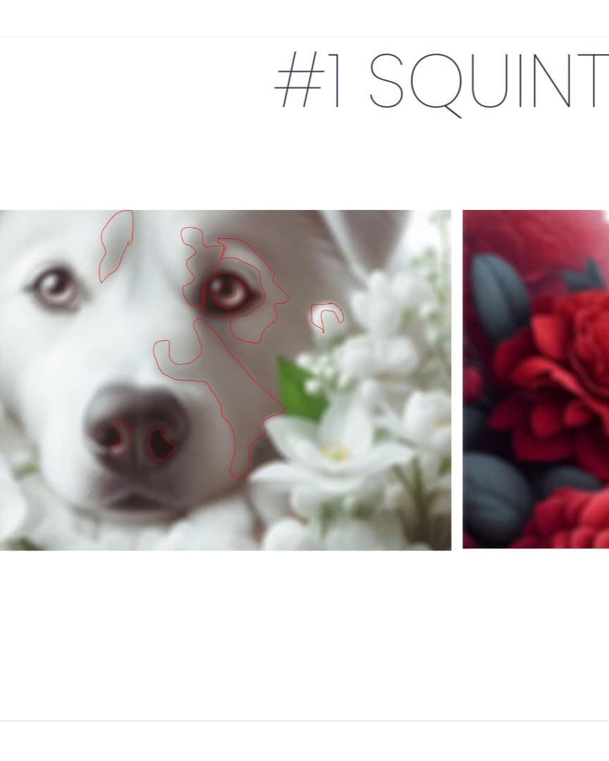
It’s important to note that squinting is different from looking at a blurry image. Squinting is temporary.
Once you refocus, everything becomes clear again. I love using this technique throughout the drawing process. It’s simple yet incredibly effective.
Flipping Your Reference Image
Flipping your reference image—either by turning it upside down or flipping it horizontally—can completely change the way you view your subject.
When you flip the image, you stop seeing familiar objects and instead start seeing abstract shapes. This helps you focus on values and proportions without being distracted by unnecessary details.
- Flip the reference image upside down or horizontally.
- Focus on abstract shapes, not recognizable objects.
- Draw the subject from this new perspective.
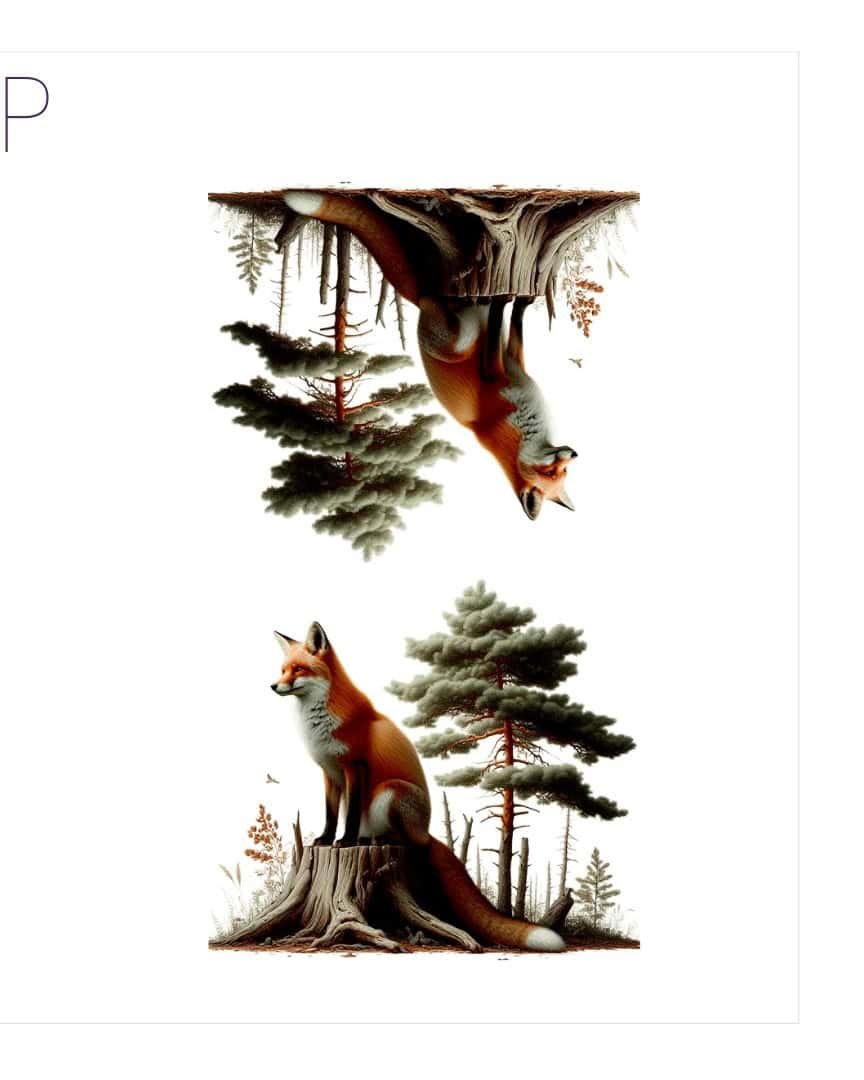
At first, it might feel a little awkward, but I promise it works wonders. Flipping the image allows you to approach your drawing with fresh eyes, leading to a more accurate representation of your subject.
Applying Squinting and Flipping to Your Drawing
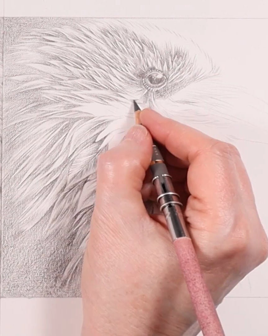
As you can see in my drawing, I’m adding some darker colors. These mid-tones are key to creating depth.
While I’m not yet at the darkest darks, I’m using darker grays and blacks to shade in areas and gradually build up the values.
Squinting and flipping help me focus on the overall values rather than getting caught up in tiny details.
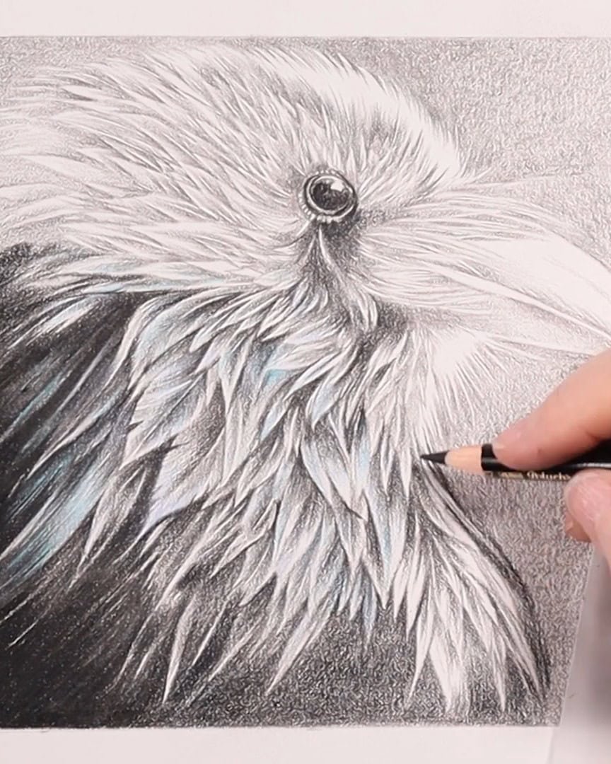
By now, the shadows are becoming more pronounced, and the image is starting to come to life.
Squinting and flipping have been essential in ensuring I’m accurately capturing the values of the Raven.
Wrapping Up
I hope these five steps help you bring your colored pencil drawings to life. You can achieve incredible depth and dimension in your art by focusing on the correct reference, understanding light and values, and using techniques like squinting and flipping.
Ready to try these methods in your work? Grab your pencils and start drawing!