
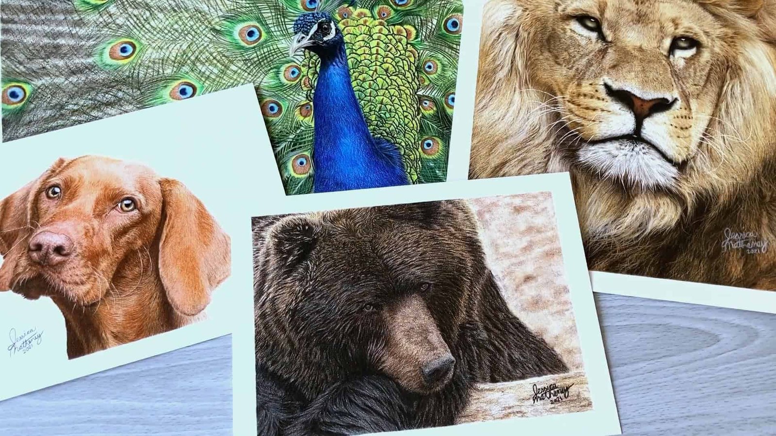
What kind of paper do you use when you draw? I ask because it really changes how your drawing turns out.
I’ve tested tons of paper over the years, and trust me—some make things easier, others just get in the way.
In this guide, I share what I’ve learned about smooth, medium, and textured paper so you can pick the one that helps your drawing shine.
Contents
Understanding the Importance of Paper Choice
I get this question a lot—what’s the right paper for drawing? The truth is, your paper choice can completely change how your drawing turns out.
If you pick the wrong kind, it might make things harder for you.
There are so many paper brands out there, but don’t worry—I’ll help you narrow it down. All paper falls into three main categories: smooth, medium, and textured.
What matters is the texture and how it matches the subject you plan to draw.
Let’s take a closer look.
Smooth Paper: Ideal for Detailed and Fine Work
If you love drawing detailed subjects with many fine lines, then smooth paper might be your perfect match.
I’ll walk you through what makes it great, the best brands to try, and when you might want to be careful using it.
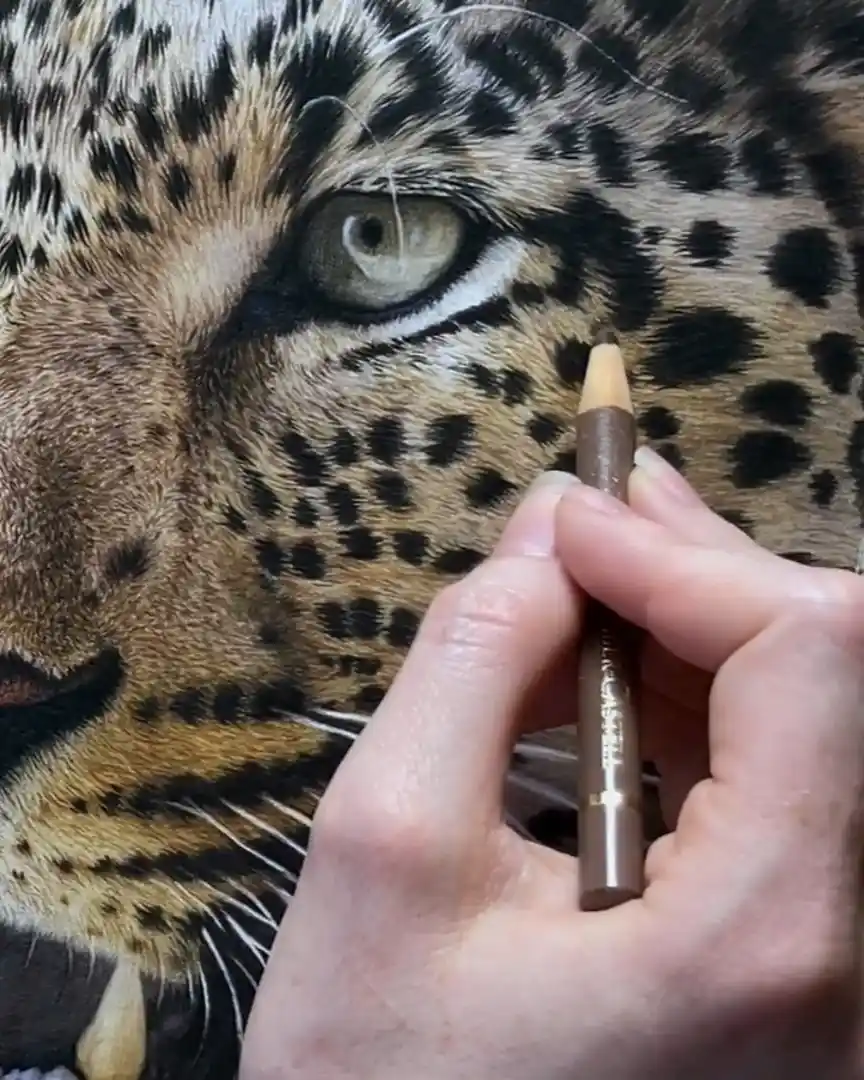
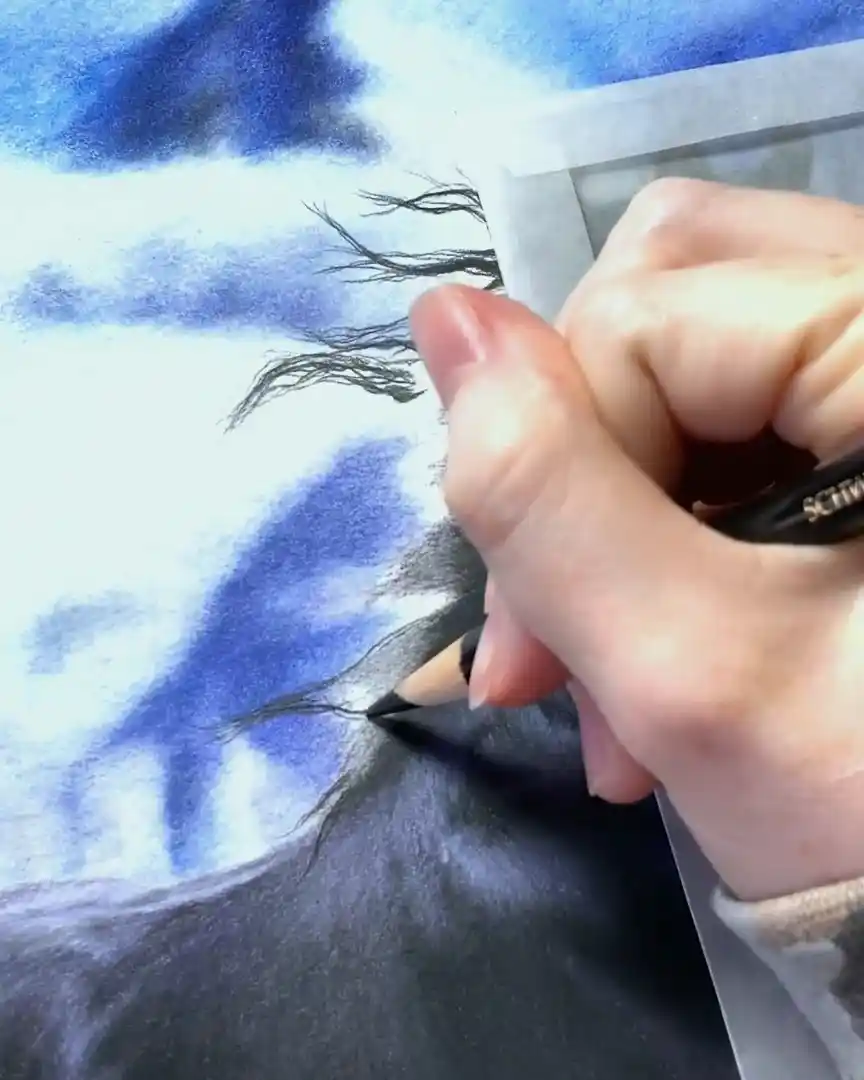
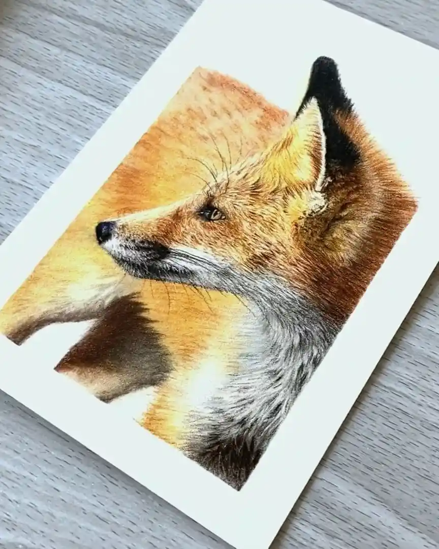
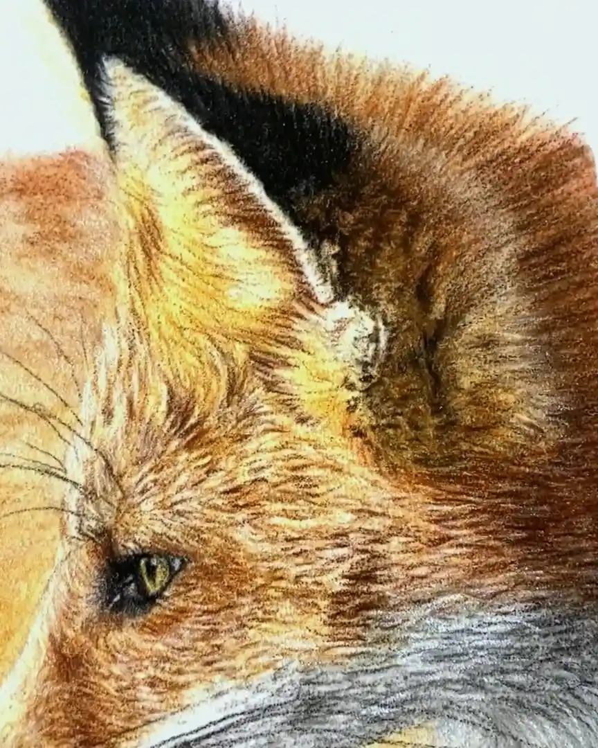
Best for High Detail and Fur
Smooth paper is ideal for drawings that require precision and tiny strokes. I always reach for it when I want clean lines and a polished look, especially for high-detail subjects.
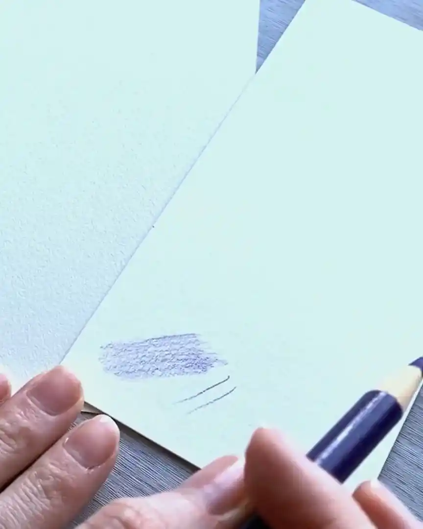
Why smooth paper? It has much less “tooth” compared to medium or textured paper. That means the surface is smoother and doesn’t grip your pencil as much.
The benefit? Your lines glide across the page with ease.
The result is:
- Cleaner, more controlled lines
- Fewer gaps of white showing between strokes
- A faster and more fluid drawing process
If you try to do this kind of detailed work on textured paper, you’ll find white gaps between your lines.
Sure, you can go back and fill them in, but it takes longer, and honestly, it just doesn’t look as smooth.
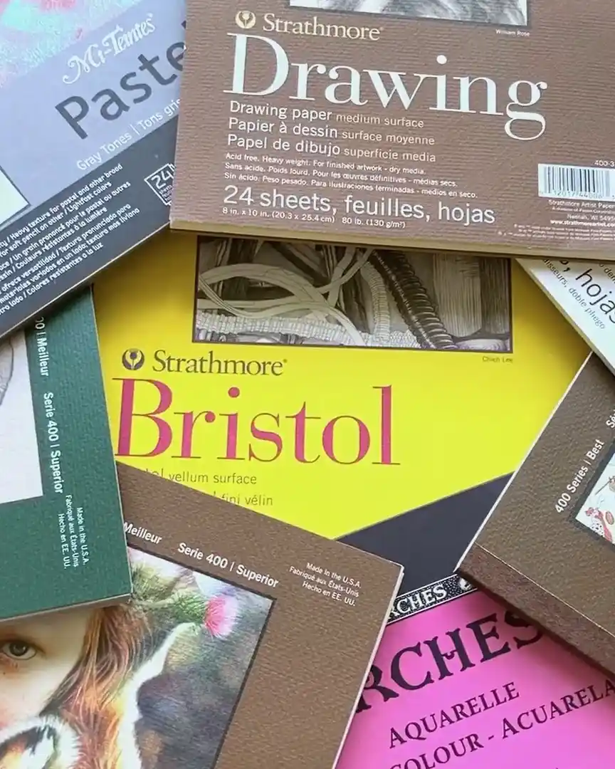
Top Smooth Paper Recommendations
There are a few smooth paper types I’ve used and love. Let me break them down for you.
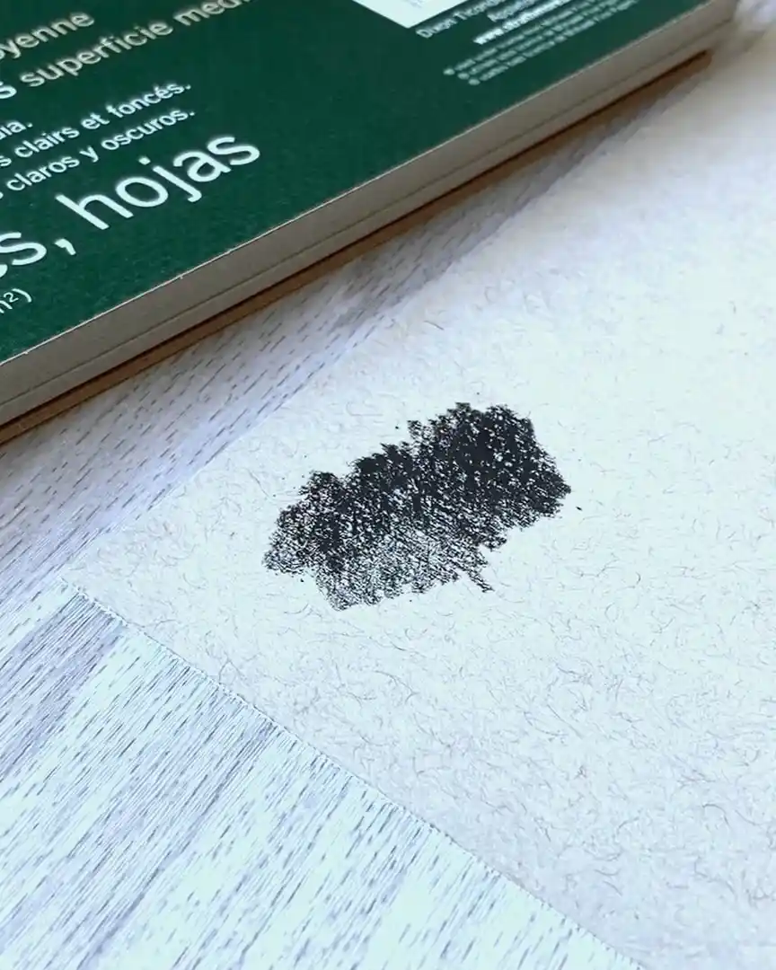
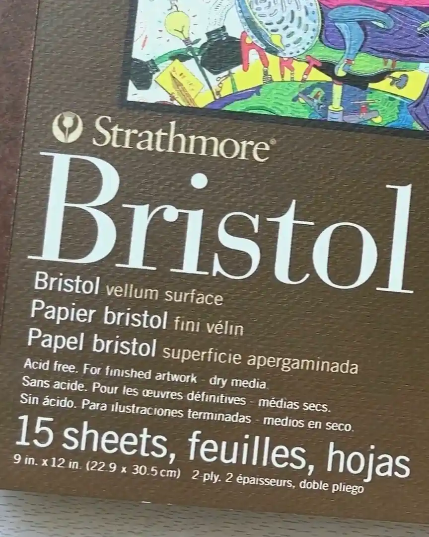
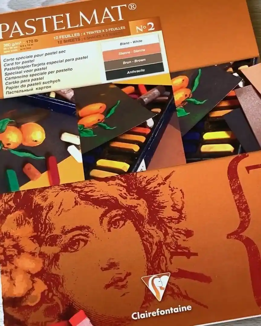
- Strathmore Bristol Vellum
This one comes in several versions:
- 300 series (the yellow pad you’ll often find in stores)
- 400 series
- 500 series
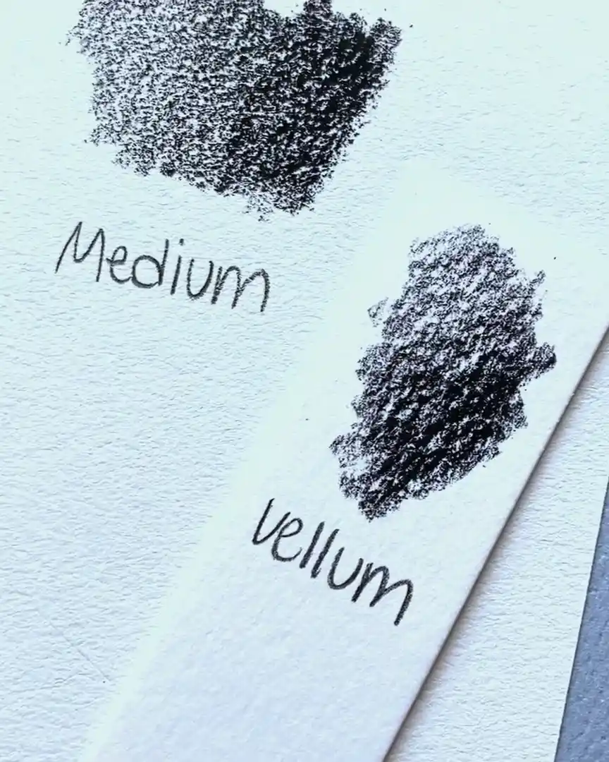
The 300 series is the one most people use, and it’s excellent for all types of drawings. It’s also smoother than the others in the Strathmore lineup.
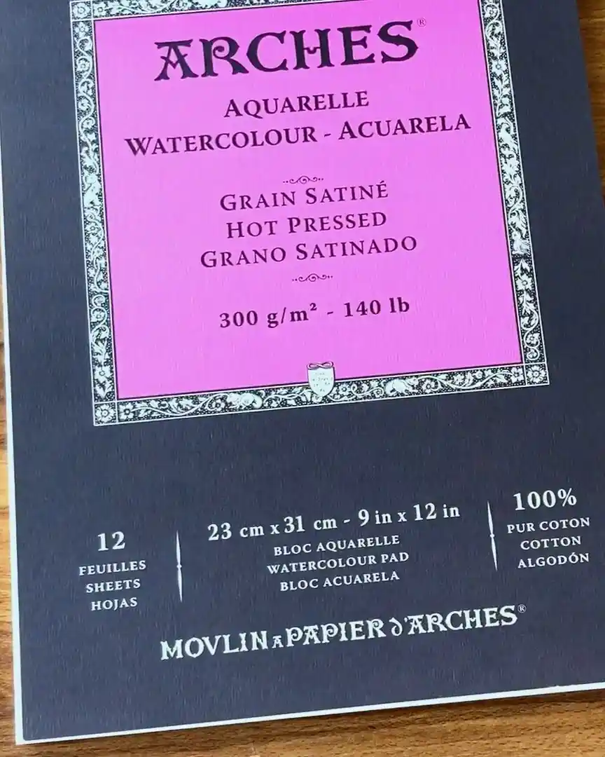
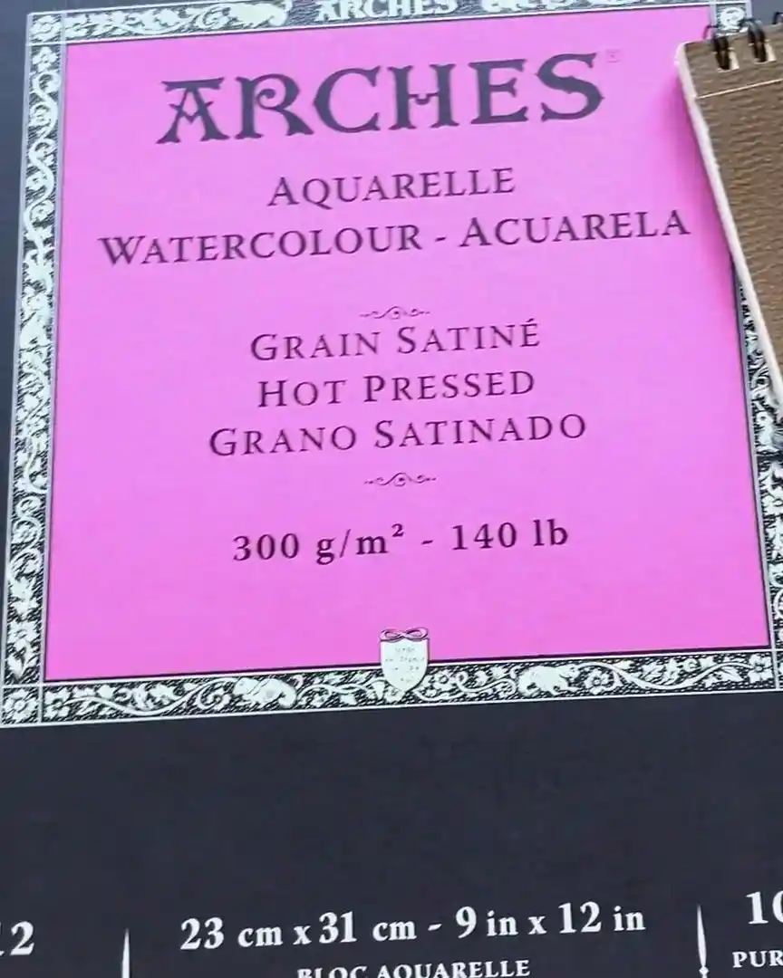
- Arches Hot Pressed Watercolor Paper
Be careful here—not the cold press kind. Go for a hot press, which is made with heat. That heat gives it a much smoother surface.
What’s nice about this paper is that it has two sides:
- A very smooth side (perfect for detailed colored pencil work)
- A slightly textured side (which I would classify as medium texture)
Stick with the smooth side for fine detail work. It’s been amazing for my fur drawings.
Best Subjects for Smooth Paper
So, when should you use smooth paper? Here’s when I always grab it:
- Highly detailed subjects with lots of tiny strokes
- Furry animals like pets or wildlife
- Hair-like fur textures, especially longer hair types
- Drawings where you use a slice tool for scratching in fine lines
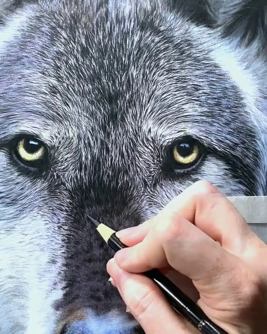
If you’re working on a drawing with lots of hair or long fur, smooth paper makes your life easier. Trying to achieve that same result on textured paper will drive you nuts.
You’ll constantly battle with the surface just to fill in all the little gaps.
Smooth Paper Downsides and When to Be Cautious
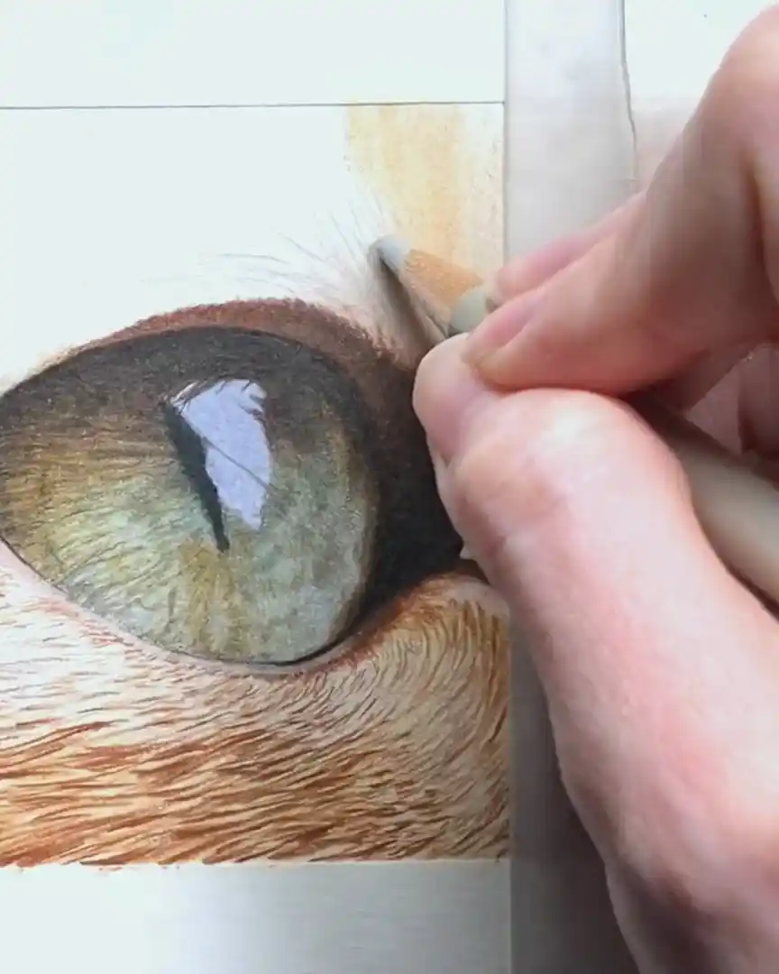
Of course, smooth paper isn’t perfect for every drawing. One situation where I’ve run into problems is when the subject has large, smooth areas, like big eyes on an animal.
For example, if you’re drawing an animal where the eyes take up a significant portion of the paper, you might run into a layering issue.
Unlike fur, eyes require soft blending and a lot of color mixing. Smooth paper doesn’t allow for as many layers, making it harder to build depth.
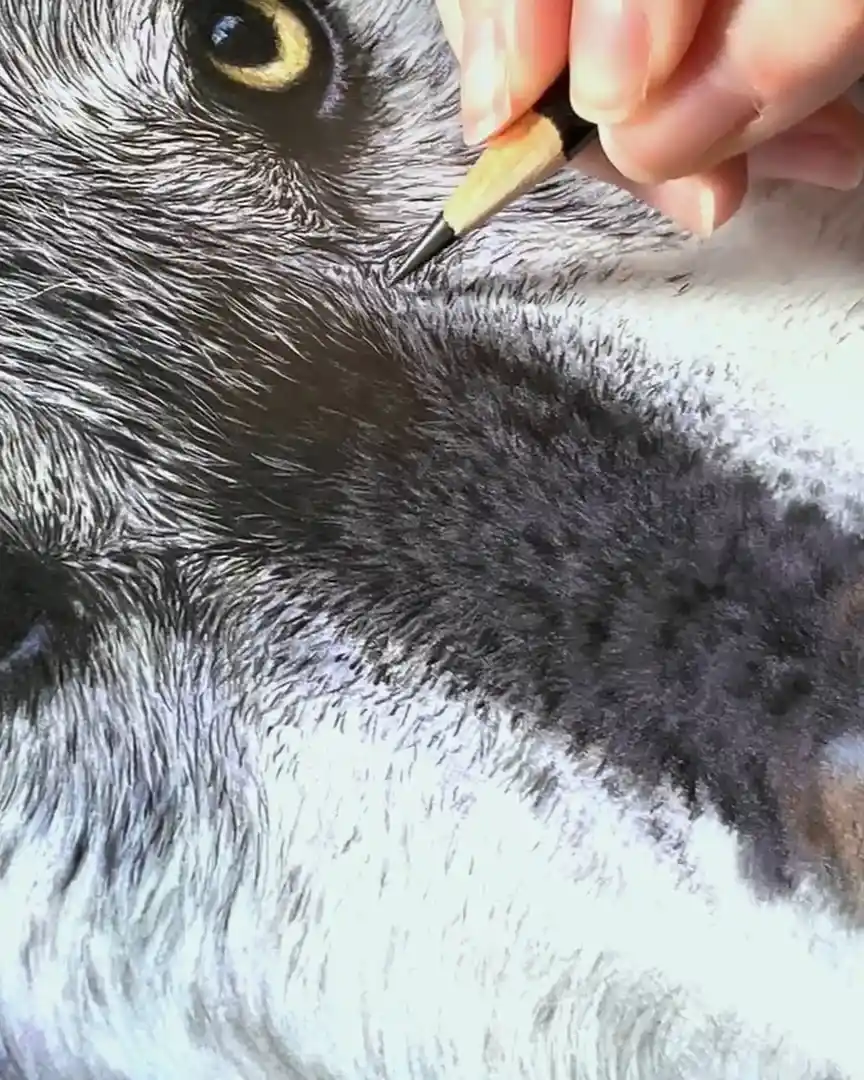
So, what do I do in those cases? I plan and make sure I can finish the eye area in three or four heavier layers.
That way, I don’t max out the paper’s ability to hold pigment before the drawing is done.
You have to be smart with your layering—no light touches here. You want full, confident strokes to lock in the color and still have room to work.
Medium-Textured Paper: Great for Layering and Color Depth
When you must build up rich color and depth in your drawings, medium-textured paper is often the way to go.
It gives you more grip for layering and helps your colored pencils show their full potential. Let me explain when and why I choose this texture, and what kinds of subjects work best on it.
When and Why to Use Medium Texture
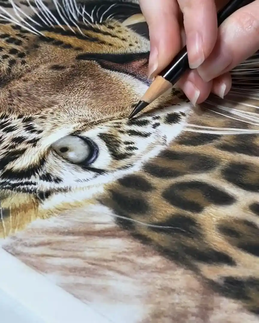
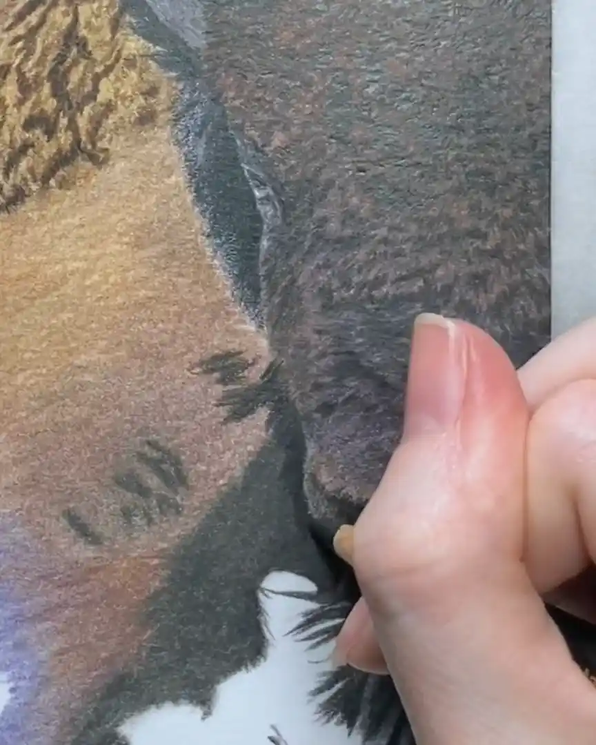
Medium textured paper shines when you want to do a lot of layering and blending.
For example, if you’re drawing smoother subjects like animal eyes or a horse’s coat with many subtle color shifts, medium texture helps you get more layers down without the pencil slipping or saturating too fast.
If you’re using a slice tool, then smooth paper is a must. The slice tool works best when you can gently scrape off the top layers.
On textured paper, that’s harder to do cleanly, and you’re left with rough patches that ruin the effect.
I usually prefer smooth paper for simple-colored horses, like black ones, because it lets me easily create sleek, smooth hair.
But when the subject has complex color mixtures—like bay horses with lots of shades and hues—I switch to medium texture.
This paper holds more pigment, so I can layer colors on top of each other without reaching the paper’s limit too soon.
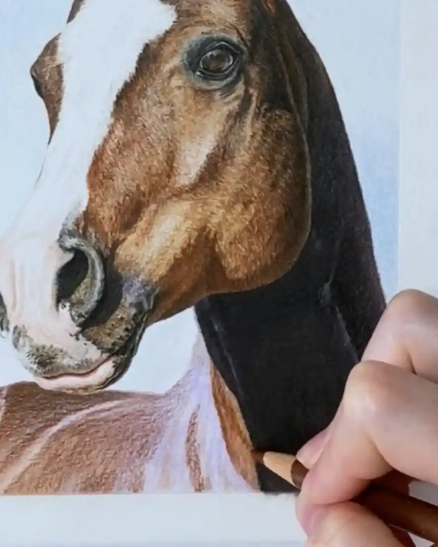
Using medium texture also makes it easier to blend different colors and get a realistic look.
If you don’t use solvents or blending tools with this type of paper, you might find it tricky to get smooth blends since the texture grabs the pencil differently than smooth paper.
Subjects That Work Better on Medium Paper
Medium textured paper is perfect for subjects that need a lot of color depth and layering. Here’s what I use it for most:
- Horses with mixed or complex coat colors
- Animal eyes and smooth areas where layering matters
- Backgrounds with varied textures, like mountains, trees, and shrubs
- Large drawings that require blending many colors
If you’re working on a background with lots of color variation, medium texture allows you to layer and blend different areas well.
You get more “tooth” to hold onto the pigment, which helps when you want a natural, textured look in your scene.
Medium Paper Options to Try
If you want to experiment with medium-texture paper, here are some great options I recommend:
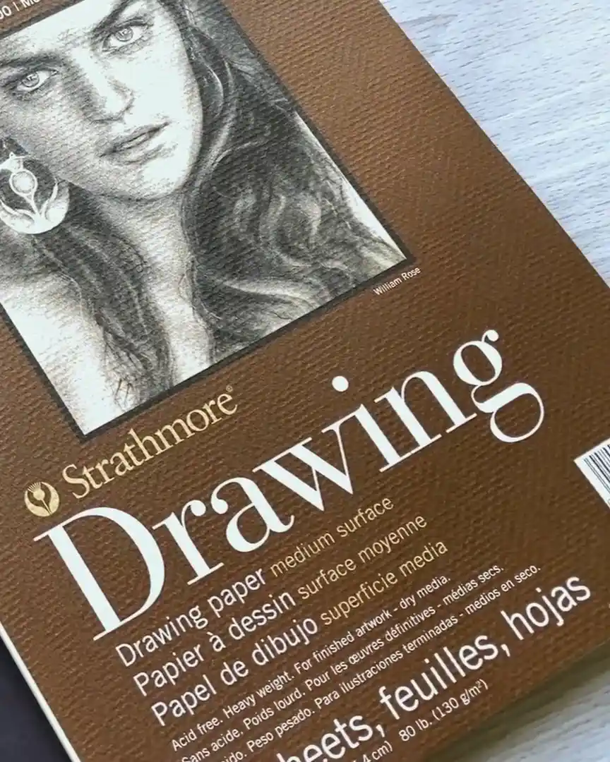
- Strathmore Colored Pencil Paper: Designed specifically for colored pencils with a medium texture that holds layers well.
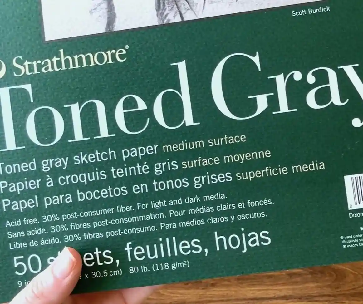
- Strathmore Toned Gray: These papers have a good texture for layering and come in different tones, which can add depth to your artwork.
- Arches Hot Pressed (textured side): This paper has two sides—the smooth side I mentioned earlier and a medium textured side. The textured side is excellent for layering color and adding depth.
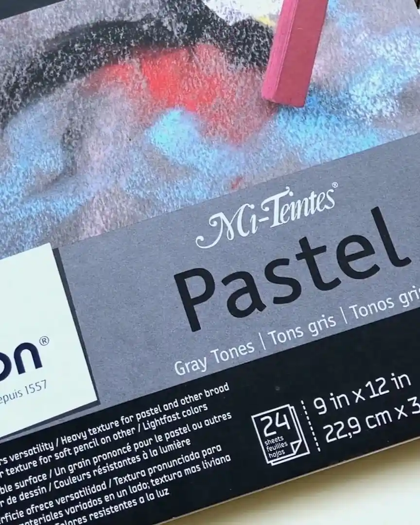
- Pastel Papers: Use the less textured side to get medium texture benefits for layering without being too rough.
Pros and Cons of Medium Texture
Like all paper types, medium textured paper has its upsides and a few things to watch for.
Pros:
- Holds multiple layers of colored pencil without saturating too fast
- Provides texture that helps pigment stick better
- Great for blending colors with solvents or blending tools
- Versatile for various subjects, from animals to backgrounds
Cons:
- Can be tricky to blend smoothly without solvents
- Not ideal for super fine, delicate line work
- May require more effort to get very smooth areas
Textured Paper: Only for Certain Situations
When choosing paper for colored pencil drawings, textured paper isn’t always the best option. I want to share what heavily textured paper is, why I avoid it, and how often it might work well.
Understanding this can help you decide if textured paper fits your style or project.
What Is Heavily Textured Paper?
The heavily textured paper has a rough, grainy surface that grabs onto the colored pencil in a very noticeable way.
Unlike smooth or medium texture paper, it creates a strong pattern on your drawing because of its pronounced “tooth.”
Examples include pastel matte papers or sanded papers, which are often designed for pastel use rather than colored pencils.
This type of paper can be quite tricky to work with. Because of its strong texture, it doesn’t let your pencil lines connect smoothly. Instead, you get a grainy, uneven look.
This can be a significant downside for many artists who like fine detail and smooth blending.
Why It’s Not the First Choice
Personally, I don’t prefer heavily textured paper for most of my colored pencil work. Here’s why:
- Small drawings show graininess more: When your artwork is small, the rough surface stands out. It makes your drawing look coarse instead of detailed.
- Lines don’t connect smoothly: The texture breaks up pencil strokes, which can ruin the smooth lines I like for detailed work.
- Less layering control: It’s harder to build up layers evenly because the texture grabs the pigment in a patchy way.
- Not great for fine detail: This paper isn’t the best fit if your style depends on crisp, clear details.
I usually want smooth, clean lines for my drawings. So even though some pastel papers allow lighter colors over dark areas, like pastels, the graininess tends to bother me more than help.
That said, I realize everyone’s style is different. If you like the textured look or want to experiment, that’s okay! You don’t have to follow my preferences—just use what feels best for you.
Situations Where It Might Work
Even though I don’t use heavily textured paper often, there are situations where it might be helpful:
- Larger drawings (8×10 inches or bigger): Bigger artwork can handle the graininess better. The texture becomes less distracting and can add an interesting effect.
- Subjects without fine detail: If you’re not drawing furry animals or intricate subjects but something simpler, like pots, flowers, or a beach ball, the texture might work fine or add character.
- Artists who like pastel effects: If you enjoy layering lighter colors over darker ones with a pastel-like feel, some heavily textured papers can provide that option.
For animals with curly or matted fur, I’ve sometimes wished I used medium-texture paper instead of smooth because I ran out of layers and detail options.
But heavily textured paper usually isn’t the answer for those cases either.
Suppose you want texture but need more layering and smooth blending. In that case, I’d recommend medium-texture papers like Strathmore Colored Pencil Paper, Strathmore Drawing, Toned Paper, or Arches Hot Pressed (textured side). These give you texture without being too rough.
Tips for Beginners Choosing Paper
If you’re new to colored pencils, picking the right paper can significantly impact your experience. Let me share some simple tips to help you get started.
Why Medium Textured Paper Helps Beginners
When you’re just starting, I recommend using medium-textured paper. This kind of paper gives you more room to practice layering.
It’s forgiving if you make mistakes because you can add more layers to fix colors or blend better.
Limitations of Smooth Paper for Beginners
Smooth paper looks beautiful with clean lines, especially for subjects like furry animals. But as a beginner, you might find it harder to work on smooth paper.
You can only add about three or four layers before the paper won’t take any more color. That can be frustrating when you’re still learning how to layer correctly.
Personal Preference Matters
Of course, what works best depends on you. Some beginners prefer smooth paper because they love the sleek look and feel. If that sounds like you, go ahead and try it! The key is to get comfortable with your materials as you practice.
Final Thoughts
Choosing the right paper makes a big difference in your drawing journey. I’ve learned that each texture has its time and place—and now, so do you.
So next time you start a piece, ask yourself: What kind of surface will help this drawing come to life? Try different papers and see what fits your style best. You might be surprised!