
What makes watercolor leaves look natural and full of life? Emma Lefebvre, a watercolor artist and teacher from Emma Jane Lefebvre, shares her do’s and don’ts for painting leaves and foliage. She explains simple ways to avoid stiff shapes, empty stems, and flat colors.
With her tips, anyone can create leaves that look loose, flowing, and realistic. Let’s explore her best watercolor leaf techniques step by step.
Contents
- 1 Tip 1: How to Avoid Stiff Watercolor Leaves
- 2 Tip 2: Don’t Overuse Long, Bare Watercolor Stems
- 3 Tip 3: Use Watercolor Values to Add Depth to Leaves
- 4 Tip 4: How to Create Movement in Watercolor Stems
- 5 Tip 5: Experiment with Shapes and Sizes of Watercolor Leaves
- 6 Extra Practice Tips for Painting Watercolor Leaves
- 7 In A Nutshell
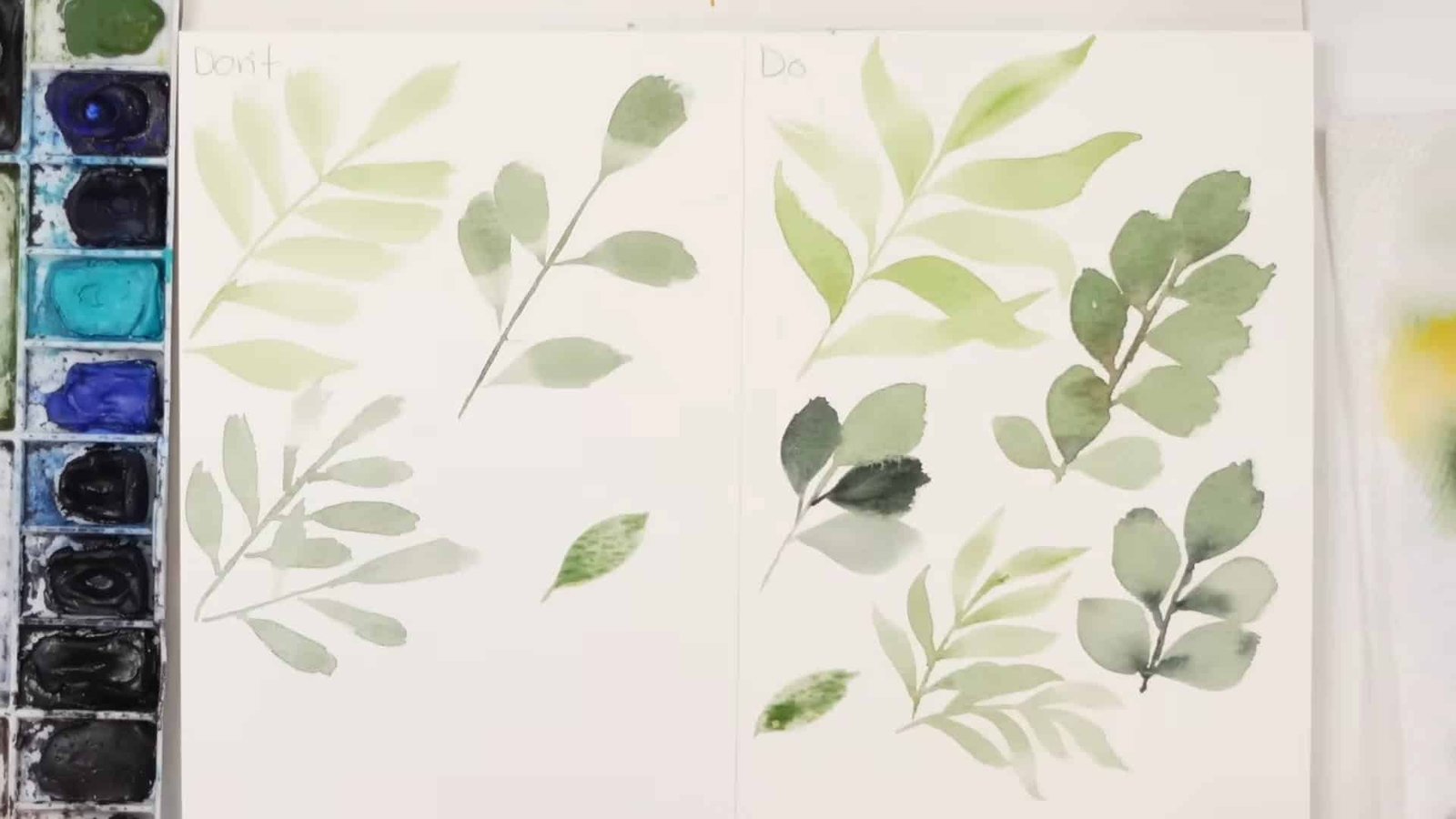
Tip 1: How to Avoid Stiff Watercolor Leaves
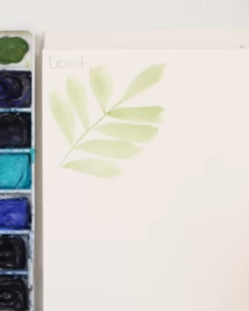
Leaves can look flat if they are too straight or repetitive. Emma points out that many beginners paint leaf shapes that feel stiff because they all go in the same direction.
While this is not always wrong, it may not give you the natural effect you want.
Why Straight Watercolor Leaves Look Unnatural
When all your leaves are straight and evenly spaced, the result is predictable. It misses the organic flow that makes foliage look alive.
Emma shows that leaves in nature rarely grow in the same way, so repeating identical shapes makes the painting less interesting.
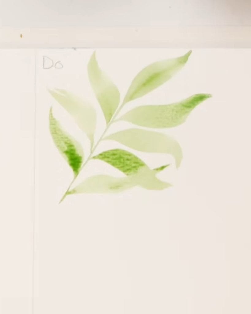
Watercolor Technique: Add Curves and Movement
To fix stiffness, Emma suggests using the light–heavy–light brush stroke. Start with light pressure, press down for a thicker middle, then lift again for a fine end. Add a gentle curve to this stroke to create movement.
- Try S-shaped strokes for variety.
- Change direction so some leaves bend up and others down.
- Let your brush flick at the end for a natural finish.
Embracing Imperfection in Watercolor Leaves
Emma reminds painters not to worry about perfect shapes. Leaves do not need to connect smoothly at the tip.
If one leaf overlaps another or ends unevenly, that adds charm. Overlapping creates depth, and jagged edges can look even more natural than a smooth, perfect line.
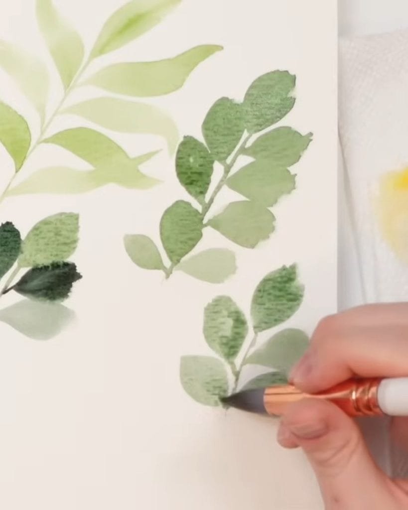
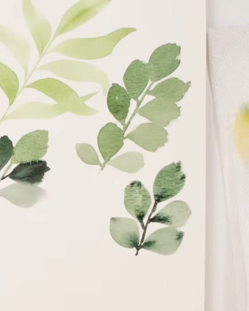
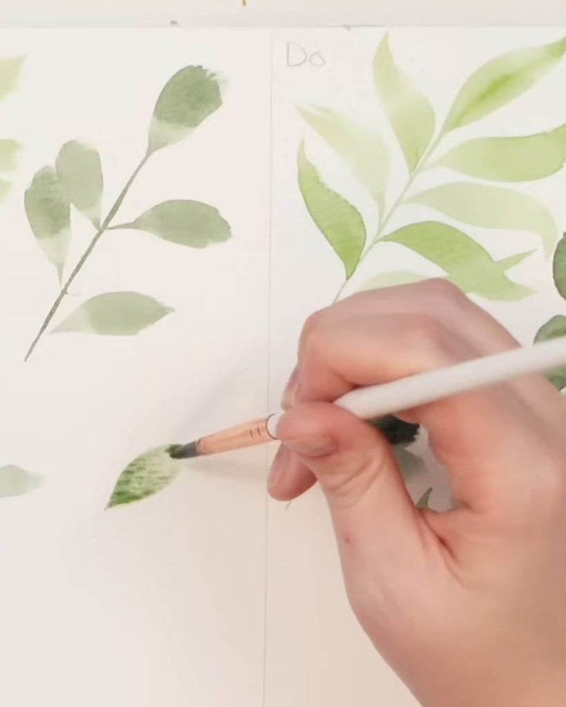
Tip 2: Don’t Overuse Long, Bare Watercolor Stems
The next issue is stems. Emma shows that large, empty stems take away from the fullness of foliage. Let’s see why it happens and how to fix it.
The Problem with Large Empty Stems in Watercolor Foliage
If you paint a straight stem and leave too much space between leaves, your painting looks sparse. The eye focuses on the blank space instead of the greenery.
Too much white paper around stems makes the foliage feel incomplete.
Watercolor Painting Technique: Place Leaves Closer Together
To make foliage look full, keep your leaves closer to the stem. Emma paints her leaves so they overlap slightly, leaving little room for empty space. Shorter connections make the foliage feel denser and more natural.
Staggering Leaves for Realistic Watercolor Foliage
Emma also avoids placing leaves directly opposite each other in a row. Instead, she staggers them along the stem.
Some leaves cover the stem’s base, while others tilt in different directions. It creates a realistic effect, as in nature, leaves grow at different angles.
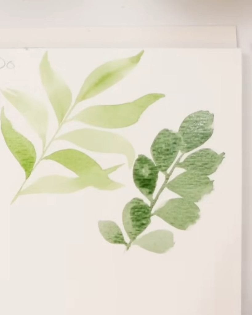
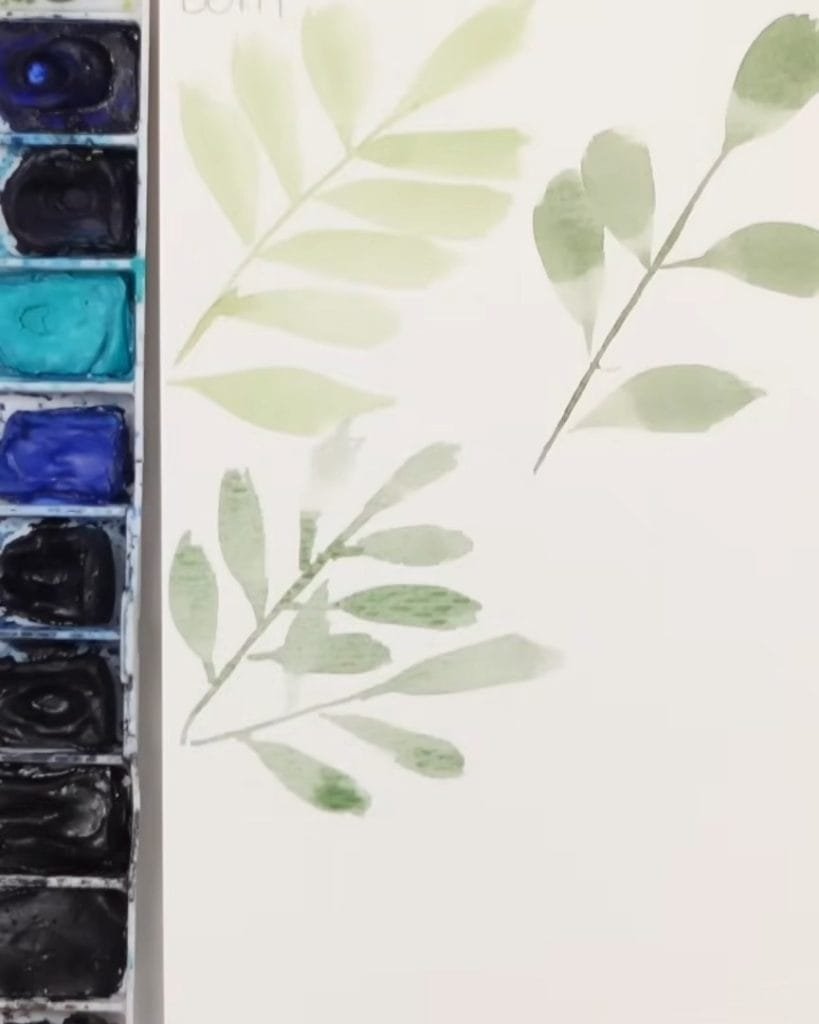
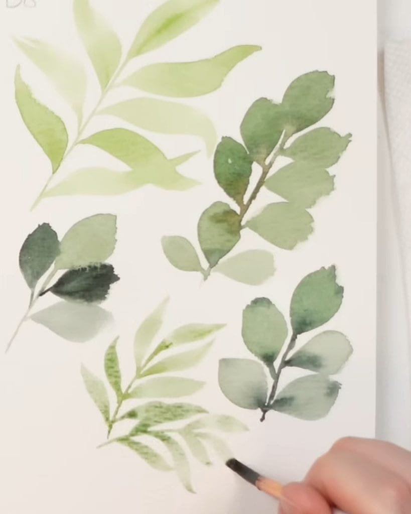
Tip 3: Use Watercolor Values to Add Depth to Leaves
Next, let’s think about values. Emma explains that color value makes a big difference between a flat leaf and one with depth.
Why Flat Colors Weaken Watercolor Leaves
A leaf painted in a single tone looks flat. Even if the shape is correct, the lack of contrast makes the leaf less lively. Without variation, your foliage has no sense of dimension.
Watercolor Painting Tip: Mix Light and Dark Values
Emma paints some leaves lighter and others darker. By switching values, you create contrast and make your leaves more engaging.
- One leaf can be painted in a pale wash.
- The next can use a stronger pigment.
- Adding darker tones at the base or tip makes each leaf stand out.
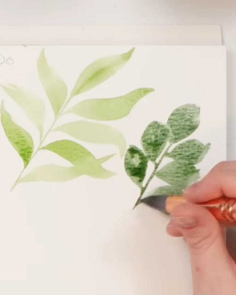
Wet-on-Wet Watercolor Technique for Foliage
Emma often uses the wet-on-wet method. She paints a leaf, then drops in a darker green while it is still wet. The darker pigment blends naturally, creating depth and softness.
She sometimes adds brown tones into the stem for variety. The small touches make the foliage feel rich and layered.
Tip 4: How to Create Movement in Watercolor Stems
After working on leaves, Emma turns back to stems. Just like leaves, stems can also look stiff if not painted carefully.
Why Rigid Watercolor Stems Look Unnatural
Straight stems leave large areas of white space, which makes the bouquet look awkward.
If your foliage sticks out directly from a flower, it can feel unnatural. Real stems curve, bend, and wrap around other plants.
Painting Curved Watercolor Stems for Natural Flow
Emma shows that a curved stem changes everything. Instead of drawing one long straight line, try bending it slightly.
Curves make stems look softer and help them fit around flowers. If you are painting a bouquet, curving stems help them frame the flowers instead of poking out stiffly.
Varying Stem Directions for Realistic Foliage
Not all stems should bend the same way. Some can arch upward, while others curve down.
The variation gives your arrangement harmony. It also prevents the eye from following only one direction, keeping the painting balanced.
Tip 5: Experiment with Shapes and Sizes of Watercolor Leaves
Emma also encourages experimenting with variety. Different shapes and sizes add personality to your foliage.
Why Variety Improves Watercolor Foliage
If every leaf looks the same, the painting becomes flat and predictable. Real foliage contains wide leaves, thin leaves, angled leaves, and more.
By changing shapes, you avoid a uniform look and add more life.
Mixing Large and Small Watercolor Leaves
Emma combines big leaves with small filler leaves. Large leaves work as focal points, while smaller ones fill gaps and add rhythm.
She also paints side-view leaves that appear flat, giving a different perspective.
Adding Natural Imperfections to Watercolor Leaves
Leaves in nature are rarely perfect. Emma suggests leaving jagged edges or uneven tips when painting quickly.
The imperfections feel authentic and often look better than a “perfect” shape. Speed and looseness can bring out unexpected beauty in your leaves.
Extra Practice Tips for Painting Watercolor Leaves
How can you improve your watercolor leaves without worrying about the final result? Practice! According to Emma, drills and playful exercises can help build confidence and control with your brush.
- Watercolor drills to improve leaf strokes: You can repeat the light–heavy–light stroke many times on scrap paper. Try curving it in different directions to practice movement. Overlap leaves as you go to see how spacing changes the look of fullness.
- Focus on creative exploration in watercolor foliage: Emma emphasizes not to focus on perfect leaves. Instead, play with shapes, curves, and different values. The more relaxed your hand becomes, the more natural and beautiful your watercolor foliage will look.
In A Nutshell
Ready to bring your watercolor foliage to life? You can avoid stiff shapes, add depth with values, and paint stems that flow naturally with simple tips from Emma.
Remember, variety and imperfection make leaves feel real. Grab your brush and practice her tips. Let’s watch how your watercolor leaves transform into lively, natural foliage.