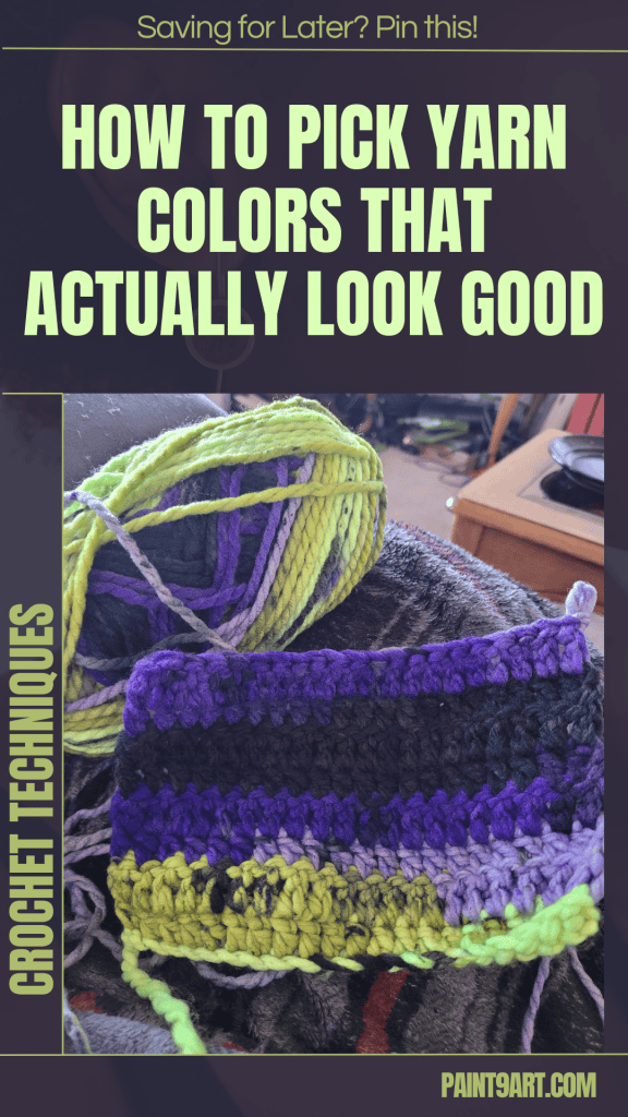
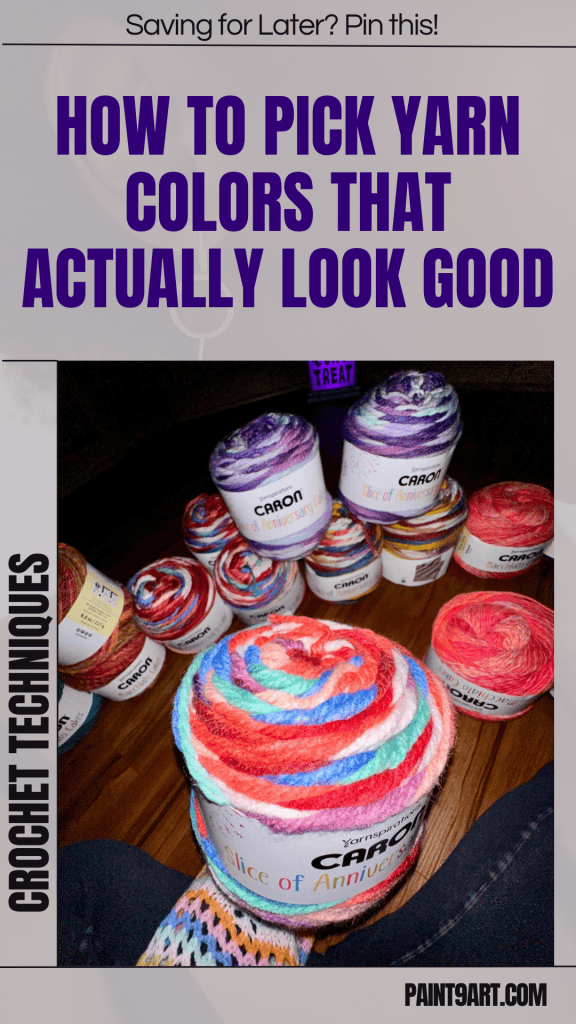
Choosing yarn colors can be one of the most intimidating parts of starting a crochet or knit project—especially if you want your work to look good. Toni from TL Yarn Crafts, known for her bold and beautiful designs, has spent over a decade mastering the art of color.
In this guide, she skips the boring theory and shares 10 easy, foolproof color palette ideas that anyone can use. Whether you’re a beginner or seasoned maker, these tips will help your next project pop.
Contents
- 1 1. Two Neutrals + One Pastel
- 2 2. Two Neutrals + One Bright
- 3 3. Monochrome Pairs
- 4 4. Monochrome Pair + Neutral
- 5 5. Three Shades, One Color Family
- 6 6. Edgy Primary Colors
- 7 7. Variegated Yarn + Solid + Neutral
- 8 8. Complementary Color Pairs (Plus a Neutral)
- 9 9. Gradient / Ombre Palettes
- 10 10. Black + White + Accent
- 11 BONUS: Expert Color Tips from the Pros
- 12 Final Thoughts: Color Is Play
1. Two Neutrals + One Pastel
This simple trio is the perfect starting point. Choose two classic neutrals (like soft cream and mocha brown), and pair them with a light pastel (pink, mint, or baby blue). It creates a palette that feels soft, serene, and perfect for baby items, home decor, or everyday wear.
Don’t like pink? Swap it for another pastel in your stash—any gentle tone will complement the neutral base.
2. Two Neutrals + One Bright
Looking for something a little more grown-up or striking? Take your neutral base and substitute the pastel for a bolder, more saturated color—like magenta, teal, or mustard. This adds depth and gives your project a modern, vibrant edge while maintaining balance with the neutrals.
Pro tip: Combine bright and soft tones together to achieve a stylish, color-rich look.
3. Monochrome Pairs
If you’re overwhelmed by color, go monochrome. Choose two shades from the same color family—a light and a dark version of your favorite hue. Think soft pink + burgundy, lavender + plum, or mint + deep forest green.
This pairing gives cohesion, depth, and elegance to your project without risking a color clash.
4. Monochrome Pair + Neutral
Want more dimension without overpowering color? Just add a neutral to your monochrome pair. A soft tan, rich brown, or classic cream acts as a resting place for the eyes and brings the whole palette together.
This is a great choice for garments and accessories you want to feel sophisticated and wearable.
5. Three Shades, One Color Family
Choose your favorite color and pick three variations from the same hue—light, medium, and bold. This trick builds on monochrome pairs but gives even more personality and vibrancy.
Toni loves using this for greens (mint + grassy green + citron) and blues (icy blue + navy + ultramarine) to create stunning, cohesive gradients.
6. Edgy Primary Colors
Primary colors (red, blue, yellow) are classic—but can feel too “kindergarten.” Toni suggests picking dusty, muted, or deeper versions of primaries to keep things chic.
Try burgundy + mustard + navy, or go bold with hot red, bright yellow, and soft blue. You get contrast and sophistication by adjusting tone and intensity.
7. Variegated Yarn + Solid + Neutral
We all fall for that one gorgeous skein of variegated yarn—but then wonder, “What do I pair it with?”
Toni’s formula:
-
Use the variegated skein as your main color.
-
Pull out one color from the mix as your solid or tonal.
-
Add a neutral to balance it all.
It’s simple, brilliant, and keeps your multicolor yarn from overpowering the project.
8. Complementary Color Pairs (Plus a Neutral)
Complementary colors sit opposite each other on the color wheel—like purple and yellow or orange and blue. These naturally contrast, adding eye-catching pop.
To avoid clashing, Toni recommends softer or toned-down versions of complementary pairs (like lavender + gold, or coral + turquoise), and always adds a neutral (like gray or cream) for balance.
9. Gradient / Ombre Palettes
If you’re feeling fancy, go for a gradient: one color, light to dark. Or use adjacent colors (like reds to oranges) to create a flowing ombre effect. Mini skein sets are perfect for this.
Toni’s tip: Buy gradient sets already curated, or build your own by laying out your stash in value order. Great for shawls, scarves, and blankets.
10. Black + White + Accent
Looking for bold, modern contrast? You can’t go wrong with black and white as your base. Then add a pop color:
-
Soft pastel for a delicate, stylish feel.
-
Bright neon (like hot pink) for a high-impact, fashion-forward look.
This palette is perfect for accessories or statement pieces and gives off a high-contrast, contemporary vibe.
BONUS: Expert Color Tips from the Pros
Toni wrapped up her guide with golden advice from some of the best color minds in yarn:
-
Adella from LolaBean Yarn Co. says color is personal. She chooses colors based on mood and looks to nature for inspiration—like sunsets and flowers. Her bold go-to combo? Teal + hot pink + golden yellow.
-
Nicole from Hu Loco emphasizes contrast and context. Use solids for textured patterns and bright colors for simple designs. Her favorite unexpected pair? Hot pink and rich blue.
-
Ashley from Sorella always starts with a “hero color”—the one that speaks to her—and builds around it with neutrals, contrast tones, or even wildcards (like neon with pastel!).
Final Thoughts: Color Is Play
As Toni beautifully puts it, “No one is born good at color. It’s a skill you build—just like crochet.” So whether you’re matching shades from your closet, copying a sunset, or experimenting with your stash, color is meant to be explored.
Make palettes that excite you. Use websites like Coolors or Canva to test combinations, or simply trust your instincts.
And most importantly: keep creating.