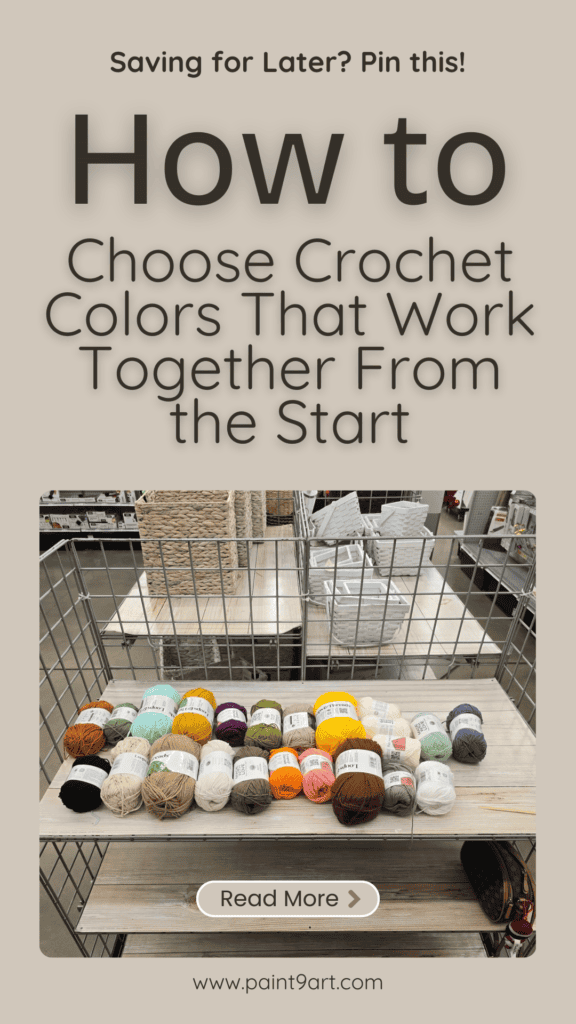
Color can make or break a crochet project—Elise Rose Crochet knows this all too well.
She’s picked beautiful yarns that, when stitched together, just didn’t work. That’s because color theory isn’t just for artists; it’s a game changer for crocheters too.
In this guide, Elise shares common color mistakes she’s made (so you don’t have to), plus practical, beginner-friendly tips to help your next project look as good as it feels.
Contents
- 1 Mistake #1: Choosing Colors in Isolation
- 2 Mistake #2: Ignoring the Color Wheel
- 3 Mistake #3: Overlooking Value Contrast
- 4 Mistake #4: Using Too Many Colors Without a Plan
- 5 Mistake #5: Not Swatching First
- 6 Mistake #6: Choosing Yarns in Bad Lighting
- 7 Mistake #7: Ignoring the Project’s Purpose
- 8 Mistake #8: Forgetting Color Affects Mood
- 9 Mistake #9: Limiting Inspiration to the Crochet World
- 10 Mistake #10: Dismissing Unfamiliar Palettes
- 11 Mistake #11: Forgetting to Twist Before You Stitch
- 12 Mistake #12: Thinking There’s a “Right” Way
- 13 Final Thoughts
Mistake #1: Choosing Colors in Isolation
One of the biggest missteps is picking colors individually without thinking about how they’ll play together.
That yarn aisle is tempting, and those online sales don’t help either—but grabbing skeins you love one-by-one can leave you with a clashing combo.
A good color palette starts with planning.
Mistake #2: Ignoring the Color Wheel
Yes, we’re going there. The color wheel isn’t just for high school art class flashbacks. It’s a super helpful tool for building harmonious palettes.
- Analogous colors (like teal, green, and blue) sit side-by-side and feel calm.
- Complementary colors (like purple and yellow) are bold and high contrast.
- Split complementary schemes use colors on either side of a complement—more subtle but still dynamic.
- Triadic palettes space three colors evenly apart (think orange, green, and purple).
No need for a physical wheel—there are plenty of free online tools to help.
Mistake #3: Overlooking Value Contrast
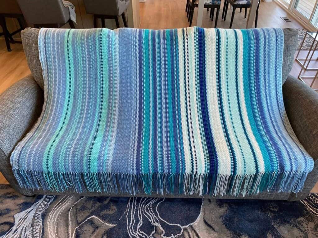
Even if your colors technically match, if they’re all the same value (aka, lightness or darkness), your project can fall flat. A range of lights, mediums, and darks adds depth.
Elise used a vintage sunburst granny square pattern to demonstrate how different pinks and reds—though all in the same family—created eye-catching contrast thanks to value variation.
A simple test? Take a photo of your yarns and convert it to black and white. If everything blends into a gray mush, you need more contrast.
Mistake #4: Using Too Many Colors Without a Plan
Scrap projects are fun, but without a unifying theme, they can look chaotic. Elise credits Jada in Stitches for a great tip: add a strand of black or white yarn to each scrap color, or use a consistent background (like white or cream) to ground everything. It makes even wild color mixes feel intentional.
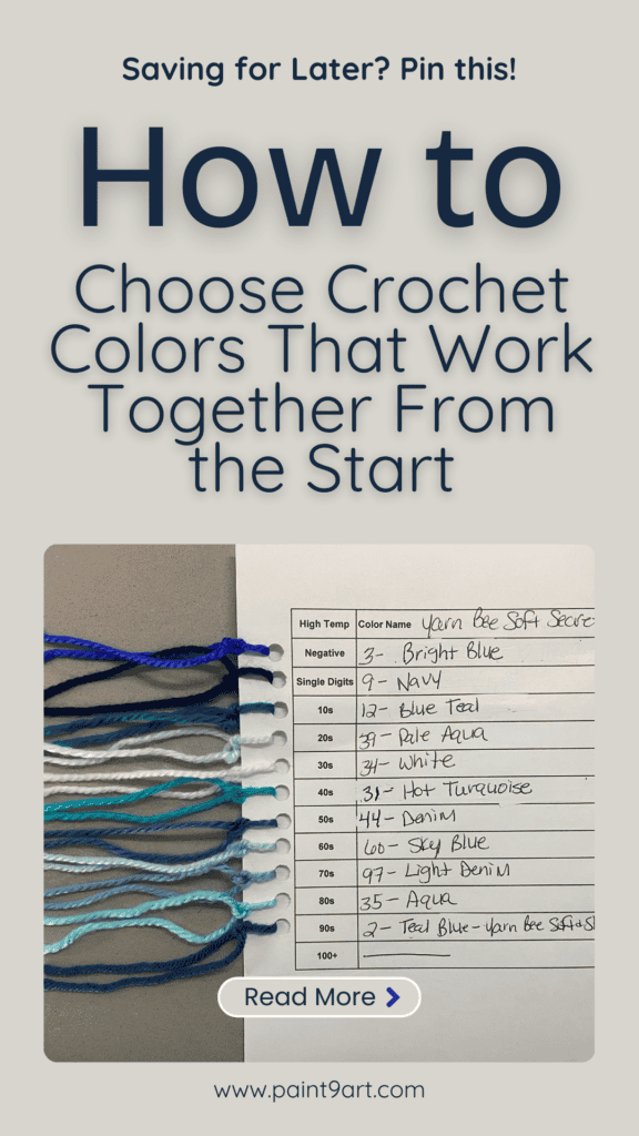
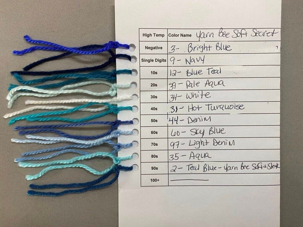
Mistake #5: Not Swatching First
We get it—swatching isn’t the most thrilling step. But it’s a lifesaver. Sometimes yarns look great in the skein, and side-by-side, and then… total clash when stitched together. A small swatch gives you the truth—no surprises.
Mistake #6: Choosing Yarns in Bad Lighting
Store lighting can lie. So can your living room lamp. If possible, check colors in natural daylight, or near a window. If you’re shopping online, look for brands that let you compare colors side-by-side—Premier Yarns does this well.
Mistake #7: Ignoring the Project’s Purpose
Just because you like certain colors doesn’t mean they’re right for your project. Elise learned this the hard way when she made a baby blanket with “ugly” colors she liked—forgetting it was meant for a newborn.
Now, she thinks about who it’s for and where it will live. Bright rainbow colors? Great for her craft room. Not so much for a neutral-toned living room.
Mistake #8: Forgetting Color Affects Mood
Color can make a project feel calm, cheerful, warm, or sophisticated. Thinking about how you want your project to feel can guide your palette:
- Calm: soft blue, sage, dusty lavender, cream
- Cheerful: coral, turquoise, soft peach, yellow
- Cozy: mustard, deep red, oatmeal, chocolate brown
- Elegant: charcoal, navy, dusty rose, ivory
- Playful: lime green, bright pink, aqua, black and white
- Vintage: faded rose, soft mustard, olive green, warm beige
Pick your vibe before your yarn.
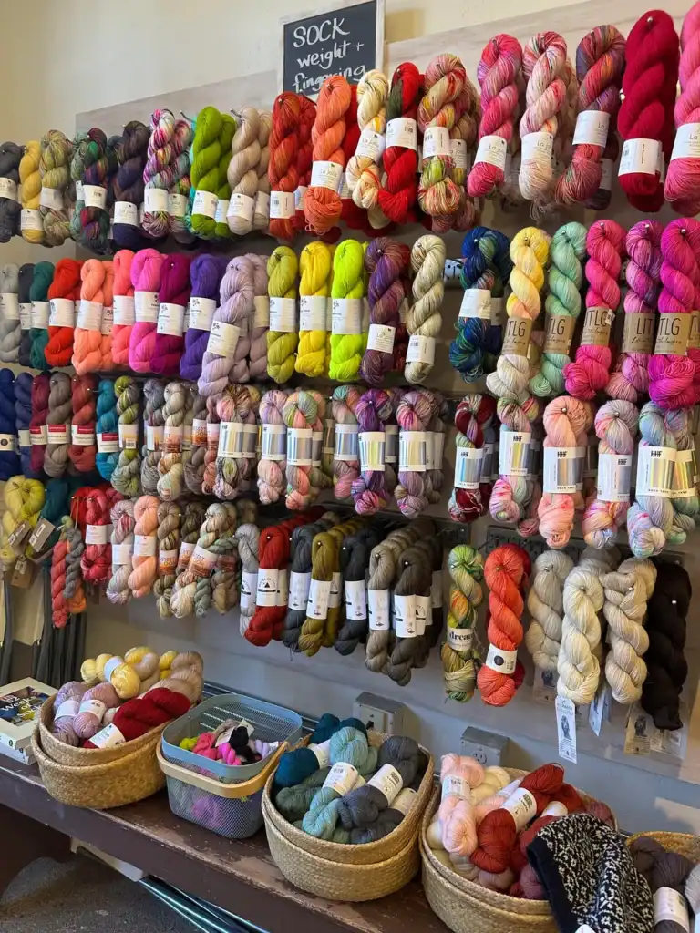
Mistake #9: Limiting Inspiration to the Crochet World
Some of the best color inspiration comes from outside the crochet community. Elise swears by:
- Pinterest (search a color + mood or season, like “dusty rose autumn palette”)
- Color Cubes by Sarah Renae Clark (physical cards with mood-setting images + matching palettes)
- Quilters (seriously, quilters are color geniuses—follow them on Pinterest or Instagram)
- Books (crochet, knitting, quilting, or even color theory titles from your local library)
Mistake #10: Dismissing Unfamiliar Palettes
Elise admits she never would’ve chosen some of the color combos in her color cube decks—but when she tried them? Magic. One of her favorites pairs pink, orange, and maroon—colors she never thought would work together. The takeaway: Don’t be afraid to step out of your color comfort zone.
Mistake #11: Forgetting to Twist Before You Stitch
This quick trick comes from knitted colorwork: twist strands of two (or more) yarns together before starting your project. If they blend into mush? You’ve got a contrast problem. If each color stays distinct, you’re good to go.
Mistake #12: Thinking There’s a “Right” Way
This one’s important: There is no wrong way to crochet. If you love your palette—even if it breaks every color rule—then it’s perfect for you. But if you’ve ever looked at a finished project and thought, “Huh, something feels off,” hopefully these tips help you figure out why and how to make your next piece shine.
Final Thoughts
Color is a tool—one that can turn even the simplest stitch into something truly special. Elise Rose Crochet has made every mistake in the book, but learning from them has only made her projects better. Whether you’re just starting out or trying to level up your crochet game, the right color palette makes all the difference.
So go experiment, play with palettes, and don’t be afraid to try something new. And if you’ve got a tried-and-true color tip? Share it in the comments. The yarn world could always use more inspiration.
Stay safe and happy stitching.