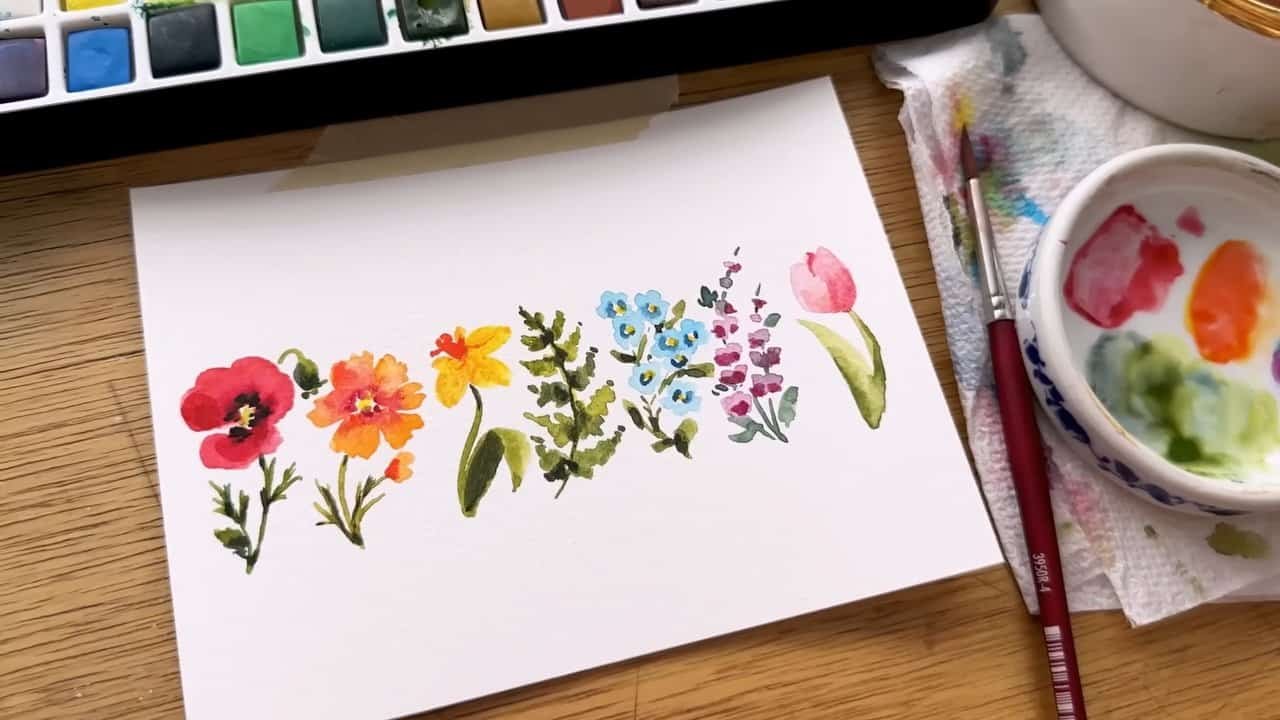
Small watercolor flowers can take shape through a few curves, soft color transitions, and carefully placed details. In her spring floral demonstration, Kristin Van Leuven paints a rainbow-inspired sequence of poppies, cosmos, daffodils, foliage, forget-me-nots, lavender, and a pink tulip.
Her approach keeps brushwork simple while showing how wet color, drying stages, darker accents, and lifting contribute to each subject. The result is a beginner-friendly process with practical observations about color and definition for more experienced painters.
A Small Format and a Simple Selection of Materials
Van Leuven begins with materials she describes as suitable for beginners. Her palette is the Daler-Rowney Graduate Watercolor Set, which she finds creamy and strongly pigmented. She also mentions enjoying these paints for rough sketches.
The paper is Canson XL watercolor paper. She describes its surface as relatively smooth and emphasizes how forgiving it is when lifting paint. That ability to remove color becomes important later, particularly when red spreads too far into the orange cosmos and green enters the pink tulip.
A Size Four Round Brush for Tiny Subjects
Although Van Leuven’s favorite Princeton Velvet Touch brushes include a size four and a size eight long brush, the demonstration uses only the size four round.
Its tip creates narrow stems and small marks. Greater pressure brings the body of the brush into contact with the paper for broader leaves. Across the subjects, changes in pressure allow the same brush to produce both delicate lines and fuller shapes.
She also cuts a sheet of paper into four pieces, each approximately 4½ by 6 inches. This smaller format accompanies her emphasis on keeping marks simple. In the poppy, she demonstrates how only a few additional strokes can introduce noticeable dimension.
The Red Poppy: Curves, Wet Color, and a Dark Center
The rainbow sequence opens with a red poppy. Van Leuven builds its petals from uncomplicated curves, leaving the center open.
Her initial red combines cadmium red with a little alizarin crimson. While that base remains wet, she introduces deeper color around the center, including alizarin crimson and quin magenta taken directly from the palette.
The flower develops through a broad red shape followed by richer accents near its middle. The wet surface allows these additions to move into the initial color rather than forming only separate, sharply defined marks.
Greenery Built with Light Pressure
Sap green supplies the stem and leaf. Van Leuven uses light pressure on the brush tip to keep these marks fine. A curved branch rises from the main stem and ends in a rounded poppy bud.
For the flower’s center, lemon yellow mixed with sap green creates a yellow-green accent. After allowing the paint to dry, she combines ultramarine blue with the green mixture for darker foliage marks.
She uses Payne’s gray around the yellow-green center and extends it into parts of the red flower. In her explanation, its blue tint offers a more dynamic alternative to a black that might appear dull.
An optional additional red wash gives selected petals more variation and character.
The Orange Cosmos: Ruffled Petals and Controlled Bleeding
The cosmos begins with gamboge and cadmium orange, diluted to a light mixture. Van Leuven forms each petal with three brushstrokes, producing the ruffled edge she associates with the flower.
She then brings some of the poppy’s red mixture into the bases of the petals while they remain wet. The red spreads into the orange, creating the bleeding effect that becomes an important part of this flower.
For the greenery, cadmium yellow and sap green make a yellow-green mixture. A curved main stem introduces movement, while another curve branches toward a small bud. Fine, irregular marks suggest the cosmos’s scraggly foliage.
Lifting Color When Red Becomes Too Dominant
A thicker addition of alizarin crimson spreads farther than Van Leuven intends. Because she wants the flower to remain predominantly orange, she removes some of that red.
Her correction begins with rinsing the brush and blotting it on a paper towel. She then lifts color from the petals and restores yellow or orange where needed.
The adjustment preserves the flower’s orange identity without eliminating all the blended variation. Van Leuven still values the dimension created by the spreading colors. The demonstration shows both the appeal of a wet blend and her decision to moderate it when one color becomes too prominent.
The Yellow Daffodil: A Trumpet and Simple Petal Shapes
For the daffodil, Van Leuven starts with the central trumpet. Cadmium orange forms a cylinder-like shape with a ruffled upper edge.
The surrounding petals use lemon yellow mixed with gamboge. She adds them while the trumpet remains wet, allowing some color to bleed between the central form and the petals.
Each prominent petal takes two strokes that extend into a teardrop shape. Three larger petals establish the flower, while two smaller yellow marks suggest petals behind them.
Her description keeps the construction straightforward: a recognizable trumpet, a few clear petal shapes, and limited supporting marks.
A Folded Leaf Defined After Drying
Sap green creates a curved stem. The leaf uses a broader movement: pressure engages the brush’s body, a curve changes its direction, and lifting the brush produces a pointed end.
Van Leuven leaves this initial shape to dry before returning with darker green. She places the shadow beneath the curve, making the leaf appear to fold or flop over.
The leaf’s definition therefore arrives in two stages. Its first shape establishes the bend; the later shadow makes that bend more readable.
The Green Fern: Texture Instead of Individual Leaves
The green position in the sequence belongs to a fern rather than a flower. It gives Van Leuven an opportunity to focus on foliage texture.
She begins with a central line that anchors the branches. Instead of painting every individual leaflet, she treats each branch as a tapering, roughly triangular form with textured edges.
These forms curve and narrow toward their ends. Their overall shape and broken edges carry the fern’s character without requiring each small component to be separately described.
Variation Within a Green Subject
Van Leuven uses yellows and sap green, then brings in ultramarine blue and Payne’s gray for darker mixtures. Lighter yellow-greens and deeper greens create differences within a subject that is predominantly one color.
She concentrates some of the darker color near the central stem to introduce depth. The fern’s texture is accompanied by shifts in color and value rather than relying on a single uniform green.
The remaining dark mixture also serves other subjects. She uses it for the daffodil’s folded-leaf shadow and additional foliage contrast, then adds gamboge to the cosmos center before continuing into the cooler colors.
Blue Forget-Me-Nots: Small Circles Arranged in a Cluster
Cerulean supplies the initial color for the forget-me-nots. Each forward-facing flower consists of five tiny circles touching around an open center.
Van Leuven varies the arrangement by placing partial flowers behind the more complete forms. A few three-circle shapes suggest blooms that are partly hidden, helping the group read as a cluster.
The emphasis shifts from constructing one isolated flower to arranging several small flowers together. Full and partial shapes give the cluster variety while maintaining the same simple visual vocabulary.
Open Centers, Broken Accents, and Connecting Stems
Ultramarine blue adds darker marks around the open centers. Van Leuven deliberately leaves these accents disconnected rather than outlining each center completely.
She notes that the paper dries quickly during this demonstration, allowing the darker blue to remain distinct from the lighter petals at that stage.
Sap green creates the main stem and the smaller connecting stems. Where gaps appear awkward, she presses the brush’s body down to add tiny leaves, including some near the base.
After drying, concentrated gamboge fills the flower centers. Later darker green strokes add further contrast to the foliage.
Purple Lavender: Tapering Groups of Marks
The lavender begins with purple lake mixed into cerulean already on the palette. Added water keeps this first application light.
Van Leuven places a few quick marks near the bottom, leaves a gap, and reduces both their number and size toward the top. The resulting flower groups are broader below and narrower toward the tip.
This construction uses clusters rather than a continuous purple shape. The spaces between them become part of the plant’s structure.
Cooler Greenery and Later Shadow Marks
Ultramarine blue mixed with sap green gives the lavender cooler greenery. Short strokes connect the spaces between flower groups and suggest the stem running through the plant.
Smaller leaves appear higher up, with larger leaves lower down. Additional greenery at the top represents a few buds.
Once the lavender dries, Van Leuven returns with purple lake. A few darker strokes at the bottoms of the flower groups introduce definition and suggest shadow, keeping the finishing stage as economical as the initial construction.
The Pink Tulip: Lifting, Highlights, and Petal Separation
The final flower is a pink tulip made from alizarin crimson diluted with water.
Van Leuven begins with a rounded half-circle shape on the left, then places a similar form on the right. Pointed upper edges suggest the tulip’s petal tips, while the lower portion remains fuller.
Sap green supplies a narrow stem. For the long leaf, she starts with light pressure at the tip, increases pressure to broaden the mark, and brings it down toward the stem.
Correcting Unwanted Green and Restoring Definition
Some green from the stem spreads into the pink more than intended. Van Leuven dries her brush and lifts the unwanted color.
She also works through the balance of highlights, shadows, and separation between petals. After adding pink along a side and indicating a small petal at the top, she removes selected areas of pink and green to restore a highlight.
As the paper begins to dry, deeper alizarin crimson helps distinguish the left and right petals and the forms emerging above them. The flower develops through both adding and removing paint.
Her darker green mixture strengthens the tulip’s stem and leaf, with a few remaining strokes also enriching the forget-me-not foliage.
Simple Shapes with Carefully Chosen Finishing Details
Across Van Leuven’s rainbow sequence, each subject begins with a limited set of shapes: curves for the poppy, short strokes for cosmos petals, circles for forget-me-nots, and tapering groups for lavender.
Wet paint creates selected blends, while drying separates later details from earlier washes. Lifting corrects colors that spread too far and restores highlights where definition becomes difficult.
The finished collection demonstrates her emphasis on simple brushwork at a small scale. Each flower or foliage study receives enough darker color and detail to establish its character, while retaining the uncomplicated construction that makes the demonstration approachable.