

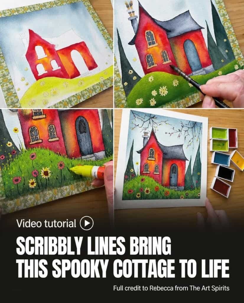
Rebecca from The Art Spirits builds a little spooky cottage with colorful watercolor washes, dark trees, loose black outlines, and bright marker accents. The demonstration combines Gansai Tambi watercolors with black fineliners and Posca markers, moving from broad areas of color to small decorative details.
Along the way, Rebecca adjusts greens, lifts unwanted color, and strengthens shadows when the first layers do not quite work. Those revisions make the process as much about developing the cottage’s character as completing its outline.
A Small Cottage Built in Separate Layers
The painting begins with masking fluid on the small flowers. Rebecca leaves it to dry before starting the watercolor, reserving those shapes while the surrounding areas receive their washes. The flowers return much later, after the house, trees, and grass have developed.
The initial palette separates the scene into clear areas. Grayish blue and pale aqua belong to the sky; rose madder deep, red, and cadmium yellow provide the house colors. Greenish yellow and forest green establish the grass. Rebecca already has reservations about the cool forest green, explaining that a warmer, darker green would suit the scene better.
Working through these areas individually gives the demonstration a readable sequence. The sky comes first, followed by the cottage walls and grass. Trees, the roof, and smaller architectural features complete the initial color layer before Rebecca returns to deepen shadows and reconsider the balance.
A Sky That Moves Across the Paper
Grayish Blue Above, Pale Aqua Below
Using a small size-zero Da Vinci Casaneo mop brush, Rebecca wets the sky while avoiding the house. Water passes over the tree shapes because those areas will eventually be dark. The sky therefore does not need to stop precisely at every tree edge.
Rebecca dabs a fairly strong grayish blue into the upper area, then drops pale aqua into the lower portion. The wash remains loose rather than perfectly even. Some color can run into the trees without disrupting the plan for the later layers.
Tilting the Wash
Rebecca lifts and tilts the page, allowing the paint to travel downward. The demonstration draws attention to the movement and visible granulation in this wash. Instead of continually rearranging it with the brush, Rebecca lets the wet color settle into an irregular base layer.
The sky is dried before work begins on the house. Its soft movement establishes a different kind of surface from the more defined cottage edges that follow.
Warm Walls with Uneven Color
Yellow, Red, and Rose Madder Deep
Rebecca wets one side of the house and drops cadmium yellow into the middle. Red follows around that area, with rose madder deep added toward the outside. The wet surface allows the colors to blend, producing variation across the wall rather than a single flat mixture.
Some lighter patches are lifted out, and concentrated red strengthens the edges. This first section is dried with a heat gun before Rebecca paints the next side. On the second section, more yellow sits toward the left, giving the two walls slightly different distributions of color.
The house remains bright at this stage. Later, Rebecca questions whether that brightness suits the intended atmosphere and adds darker layers. The warm first wash stays part of the painting, but its final appearance depends on the shadows placed over it.
Grass and Trees with Changing Greens
The grass begins on a lightly wetted area. Greenish yellow runs across the upper portion, followed by forest green lower down. Rebecca keeps a lighter strip near the top and blends the lower color with loose strokes, but the green is not yet the shade intended.
For the trees, forest green mixed with rose madder deep creates a color Rebecca prefers. A small pointed size-zero round brush shapes the spindly tops, including slightly crooked points. A larger brush fills the remaining tree areas.
Unlike the sky and cottage walls, the tree paint goes straight onto paper that has not been wetted first. Rebecca leaves one area lighter so the edge of one tree remains distinguishable from the next. Additional darkening is planned for later, allowing the tree shapes to be refined after their first layer.
Revisiting the Ground
The grass receives another wash when Rebecca decides the original green still needs improvement. The area is wetted again, and additional greens tone down the earlier color, with green gray introduced toward the bottom.
Rebecca describes the revised result as suggesting a little sunlight over one portion, while the rest becomes darker. The adjustment changes the distribution of light across the ground as well as the green itself. A first color choice therefore becomes a starting point for another layer, rather than a fixed final decision.
A Dark Roof and Small Architectural Details
Blue gray deep supplies the roof color. Rebecca uses a pointed size-two round brush to reach the corners, then adds clear water in the middle and pushes pigment outward. This creates a blended light patch within the darker roof.
The roof edging receives darker paint. Grayish blue, already used in the sky, colors the door, while a more diluted version of the roof color covers the chimney. The bottom area of the house is painted across the steps before those shapes are defined individually.
Yellow brown outlines the window frames. Rebecca does not try to make these painted edges perfectly tidy because black pen will be added later. A stronger blue gray deep mixture fills the small window panes with a size-zero round brush.
These choices bring the main architectural features into the first layer without requiring every detail to be resolved immediately. The later shadow and pen work gives those areas further definition.
Shadows That Make the Cottage Feel Spooky
Replacing an Unwanted Shadow Color
Rebecca wants one section of the house to appear farther back, so the corners need more darkness. An initial attempt with indigo produces an unwanted green result over the existing wall color. Rebecca lifts some of it with kitchen paper and changes to blue gray deep.
After wetting the area again, Rebecca places the replacement color under the roof and blends it down with a clean brush. More shadow follows beneath the eaves, toward the sides, and near the bottom. The stated aim is a darker, dingier appearance than the first bright wash provided.
The demonstration preserves this correction as part of the process. It shows the particular color being reconsidered in this painting, without presenting every shadow mixture as certain from the beginning.
Doorway, Chimney, and Steps
The doorway is wetted through the middle while a narrow edge remains dry. Blue gray deep is added around the perimeter and blended inward. The chimney receives darker paint underneath and along one side, softened with clear water.
Around the steps, Rebecca paints darker edges and blends them with a clean brush. A line across one section and darkness at the bottom of another help suggest the separate levels. Small dark details above the chimneys and against the roof add further definition.
Rebecca also lifts color along one edge of the house to make it lighter and bring that section forward. The trees receive stronger dark color near their bases, and another shadow layer deepens part of the cottage. Both lifting and added paint contribute to the developing separation between forms.
Flowers and Grass Texture in the Foreground
Once the main areas have developed, Rebecca removes the masking fluid with a rubber cement eraser. The reserved flowers are painted as simple blobs in yellows, pinks, and reds.
Concentrated Payne’s gray creates grass marks in the darker ground and breaks up the hard line across the top. Rebecca extends some blades farther across that edge, then repeats the texture with forest green. Thin stems connect the flowers to the grass.
Yellow brown adds small flower details. Blue gray deep gives some flowers centers intended to suggest poppies, while Indian red in the yellow flowers makes them look more like sunflowers. Rebecca leaves the flowers to dry and considers additional marker touches rather than treating the watercolor shapes as finished.
Scribbly Ink Gives the Cottage Character
Hanging Branches and Small Birds
Rebecca switches to black fineliners in 0.3 and 0.1 sizes. Spindly branches come down from the top, and small birds are drawn sitting on them with simple heads, beaks, bodies, and tails.
These additions extend the scene beyond the building itself. They also introduce the black line work that will soon run around the cottage’s painted features.
Loose Outlines and Crosshatching
Rebecca outlines the chimney, windows, and other features with a deliberately scribbly finish. A few lines inside the windows add darkness. The door receives panels, a handle, linear details, and crosshatched shading.
The pen does not end the painting process. Rebecca adds small leaf marks higher in the trees, places Indian red under the window sills, and repaints the door with blue gray deep. Water in the center pushes pigment toward the edges, and some middle color is lifted to preserve a lighter area.
Posca Highlights and the Last Adjustments
Posca markers add small bright touches to the flowers. A very light greenish yellow supplies decorative dots and a few grass strokes. White follows along the upper parts of the windows and across a little of the roof, suggesting places where light catches the building.
More white dots scatter over the grass. Rebecca considers darkening the door handle and adding a few roof tiles, then strengthens an area that still looks too light. These final marks combine painted shadows, ink structure, and opaque highlights in the same small scene.
Rebecca finishes by removing the tape. The cottage’s character has developed through soft washes, repeated color adjustments, irregular dark outlines, and scattered bright details. The completed painting reflects a sequence of decisions, including revisions, rather than a single uninterrupted application of color.