

What makes a simple pen drawing come alive? According to Sam Gillett Illustrations, it’s all about mastering a few easy steps that build shape, shadow, and texture.
In this tutorial, the artist walks readers through drawing a charming castle with rocks and details, using basic hatching techniques and clever shading to create depth and interest.
This step-by-step guide is designed to help artists gradually bring their pen drawing skills to life, one layer at a time.
Contents
- 1 Practice First: Mastering Basic Hatching Techniques
- 2 Laying the Foundation: Sketching the Castle Base
- 3 Creating Dimension: Drawing the Castle Roof and Arcs
- 4 Building the Environment: Drawing Rocks and Terrain
- 5 Shading with Hatching: Creating Light and Shadow
- 6 Returning to the Castle: Doors, Windows, and Final Touches
- 7 Final Touches and Artistic Freedom
- 8 In A Nutshell
Practice First: Mastering Basic Hatching Techniques
Before the artist draws the castle and its rocky base, the artist likes to warm up with some hatching practice.
It helps get the hand ready and reminds the artist how the pen moves best.
Hatching is a basic but powerful pen technique. It’s all about drawing repeated vertical lines. These lines help show shadows, light, and depth in the viewer’s drawing.
Even though it sounds simple, it takes some practice to control the lines and keep them inside the shape being worked on.
When the artist hatches, the wrist is always kept in a neutral position. It isn’t bent up or down. It rests naturally on the page. The artist moves the fingers to guide the pen, not the wrist. This gives better control over line thickness and direction.
Here’s how the artist usually practices:
- The artist draws a small square or diamond shape
- Then fills it with straight vertical lines
- Some lines might go outside the shape—and that’s okay
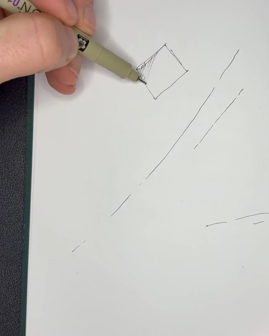
A few lines out of place can make the drawing feel more natural and organic. These little imperfections can even add to the artist’s personal style with more practice.
So there’s no need for worry—just keep practicing and see what works for the viewer.
Laying the Foundation: Sketching the Castle Base
Now that the artist has practiced hatching, it’s time to sketch the castle’s base. The artist starts loose and straightforward—no need for perfection here.
The artist begins by drawing two vertical lines to shape the sides of the castle. These lines stretch up and sit in the top part of the page. It’s fine if they’re a bit wiggly or uneven—they often are.

To help with placement, the artist thinks about the rule of thirds.
This idea says that if the page is divided into nine rectangles, the main subject should sit along those lines.
The artist doesn’t always follow this rule strictly—sometimes it feels limiting. But it’s a helpful starting point for scenes like this.
It helps place the castle in the upper quadrant of the page and creates a more balanced layout.
Once the artist has the two side lines and a sense of the upper placement, the castle’s position is set. This gives a strong base to build from and guides the rest of the drawing.
Creating Dimension: Drawing the Castle Roof and Arcs
Now that the base is in place, it’s time to add dimension by drawing the roof and arcs. Since the castle sits higher on the page, the artist wants it to look like it’s being viewed from below.
Sketching the Arc Between Castle Walls
The artist starts by drawing a soft arc connecting the two vertical lines. A 01 pen is used, but the artist doesn’t fully connect all the lines. This leaves room for adjustments.
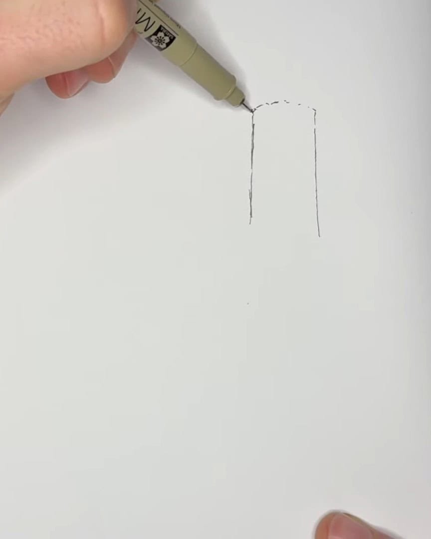
Sometimes, the artist switches to a pencil for this part. It allows easier corrections and experimentation. This step can be tricky, but taking it slow helps.
Visualizing Circular Shapes from Below
Here’s a trick the artist uses: lightly sketching a full circle—almost like a see-through cylinder. This helps visualize the curve from below and gives the illusion that the back of the castle wraps around behind.

Building the Roof Over the Arc
With the arc drawn, the artist adds a second line to suggest the roof’s edge. This small lip extends from the castle’s body.
Next, the artist dots a vertical line in the castle’s center—that marks the midpoint of the roof. From there, two gentle curved lines rise upward to complete the roof shape.
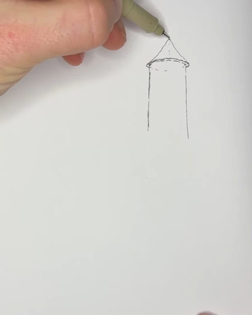
The lines may wobble, and that’s perfectly fine. Wiggly, imperfect lines add charm and personality to pen drawings. More details will be added to the castle later.
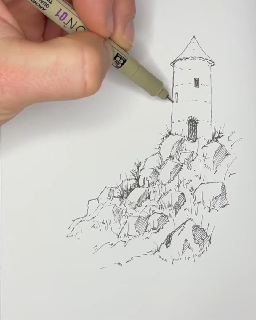
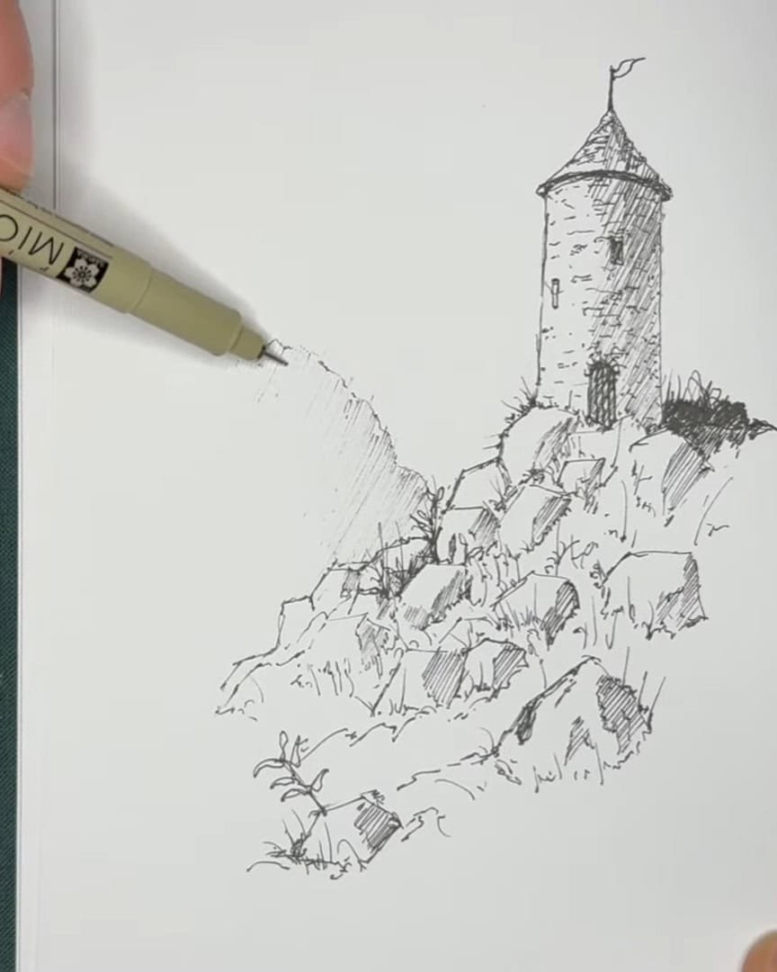
Building the Environment: Drawing Rocks and Terrain
Now that the castle and roof are in place, the artist begins shaping the world around it.
Outlining the Rocky Outcropping
First, lines are extended downward from the castle. With a 01 pen, the artist quickly juts out lines, then angles them sharply down.
Because these shapes are rocks, the lines should be fairly straight. But the artist avoids using a ruler—natural hand movement brings life to the drawing.
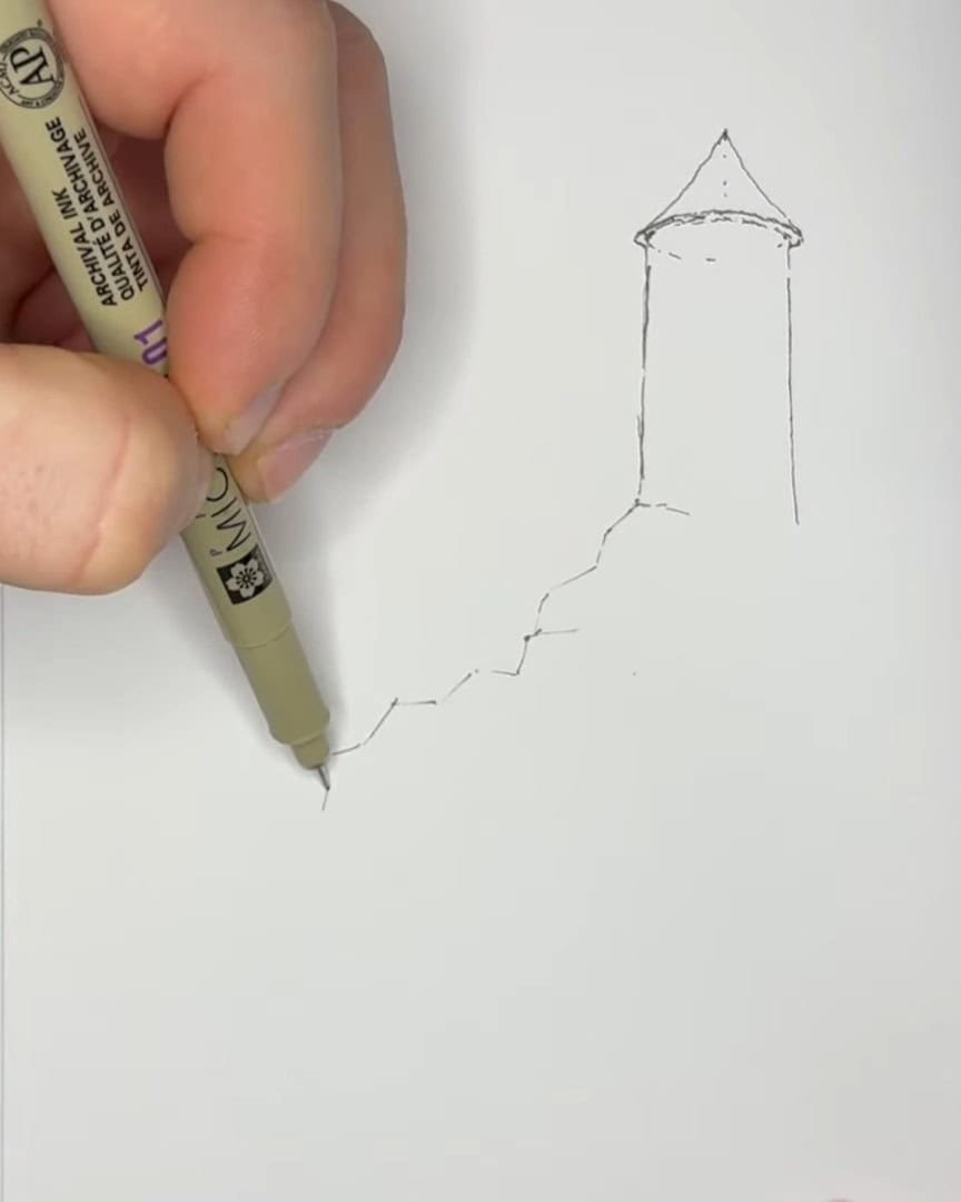
Then, the artist moves inside that shape and mimics the outer lines. These inner lines shift up and down, suggesting rocky layers and depth.

Adding Vegetation for Realism
Before shading, the artist includes some plant life at the castle’s base. This small detail makes the scene feel grounded and natural.

Quick, sharp lines suggest grass or shrubs. Dragging the pen quickly creates thin, tapered strokes—speed makes the line finer.
Shading with Hatching: Creating Light and Shadow
Now that the basic rock shapes are down, it’s time to bring them to life with shading.
Understanding Light Direction and Shadow
First, the artist decides where the sun is coming from—let’s say from the left.
This means the right sides of the rocks fall into shadow. The artist begins adding hatching lines on the shaded side of the middle rock. These short, angled lines bring depth.
- A few wiggly lines near the base hint at vegetation.
- A few lines make the rock look solid, like it’s catching sunlight on top and shadow on the side.

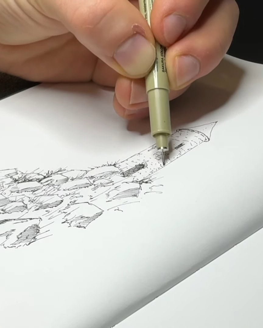
Adding Texture and Depth
The artist repeats this shading on other rocks, sometimes adding cracks and heavier shadow lines. These shapes make the rocks look carved out of the page.
Contrast between shaded rocks and white areas creates the 3D illusion. Vegetation near the rocks helps anchor them in the scene.

Balancing Light and Dark Areas
Ink drawing thrives on contrast between light and dark. Knowing where to place shadows — and where to leave highlights — is crucial. The artist carefully hatches the shadows while leaving parts of the rocks white to show where sunlight hits.
- The artist adds small cracks and darker patches for interest.
- Vegetation between the rocks adds more depth and realism.
- Sometimes, the artist adds leaves or moss to make it more lively.

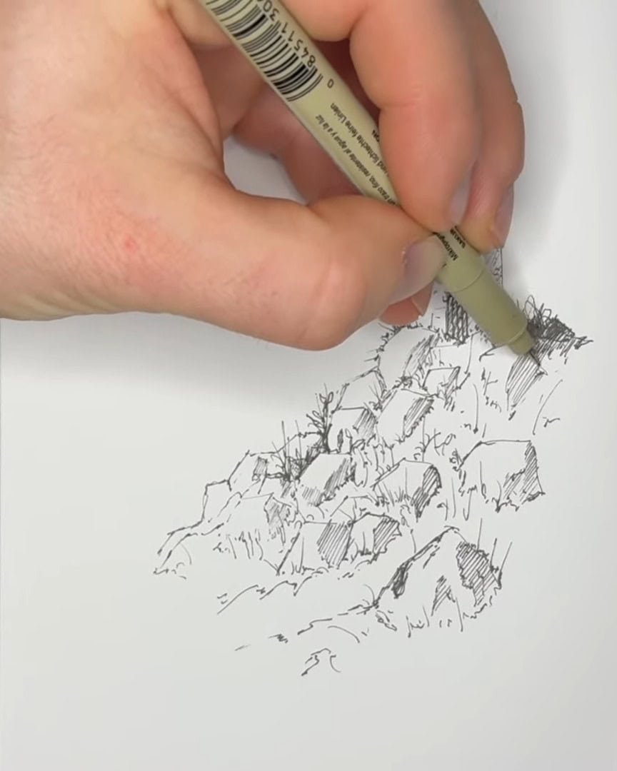
Avoiding Overcrowding
It’s important not to overdo the shading or grass. Too much detail can crowd the scene, making it look heavy or dark.
Keeping some areas light gives the impression of bright sunlight and open space.

This balance makes the rocks stand out naturally without overwhelming the drawing.
Adding Details for Realism
The artist enjoys playing with the shapes of rocks. Any three sides can be drawn, the shaded parts hatched, and some grass added on the sunny side.
To add realism and perspective:
- Make rocks closer to the viewer larger and more detailed.
- Add cracks and uneven, jagged edges to their outlines.
- Use light lines to highlight edges between shaded areas.
These little details draw the viewer in and make the scene believable.

The artist can spend as much time as desired on shading and detailing. Adding more vegetation, moss, or different shadow tones enhances the texture.
This process turns simple shapes into rugged, three-dimensional rocks that balance well with the softer grass around them.
With these hatching techniques, the viewer’s drawing gains volume, contrast, and life.
Returning to the Castle: Doors, Windows, and Final Touches
Let’s dive back into the castle details. Adding these final touches pulls the whole drawing together.
Drawing the Door: Inviting Curiosity
The artist starts with the door because doors feel fun and mysterious. They pull the viewer in, making the viewer wonder what’s inside. First, the artist draws two lines that curve into an arc at the top.

Then, wooden slats are added to the door—these boards give it texture and character.
 dd wooden slats to the door
Since the door is likely made of darker wood than the stone castle, the artist uses hatching to shade it. This contrast helps the door stand out and feel solid.
Adding Windows and Stone Texture
Next, the artist adds a couple of windows. On the left, the window faces slightly away from the viewer because the castle curves around. This means the artist draws it a bit thinner, using perspective to show its angle.
The middle window is wider but matches the same height, giving balance.

Because the viewpoint is looking up at the castle, the artist draws the bottom side of the top part of the windows. The upper window is shaded lightly to show the angle of view.

To show the castle’s stone walls, the artist adds some stone texture around the door and along the walls.

The artist mirrors the arc shape from the top of the castle down the sides using small dotted lines.
This part takes patience since the stone pattern isn’t perfectly even. Some lines are thinner and closer together as they go down, while others don’t line up exactly—and that’s perfectly fine.
These small lines create the illusion of stonework without drawing every brick. A few bricks are added near the front, made smaller toward the edges for perspective.
Shading the Castle: Light, Shadow, and Final Details
Because the sun shines from the left, the underside of the castle is darkened to show shadow.

Hatching is added on the right side, where the castle curves away from the light. On curved surfaces like this, shadows blend gradually.
So the artist hatches in layers—some lines closer together for darker shadow, others spaced out for lighter shading.

The same shading is added to the roof to bring depth and form.

Some shadow shapes are also replicated on nearby rocks and vegetation. This adds cohesion and helps the whole scene feel connected.
Jagged, loose lines may be added on the roof to suggest texture. The artist sometimes draws a little flagpole with a tattered flag for extra personality.
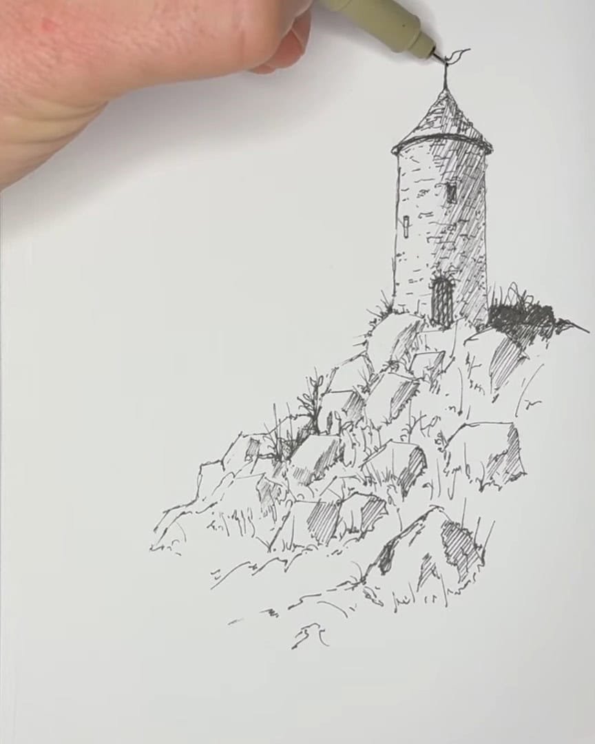
With these final touches, the castle feels alive and ready to tell its story.
Final Touches and Artistic Freedom
Now that the main castle is coming together, it’s time to focus on the final touches and let the artist’s creativity shine.
The artist always remembers that the details in the foreground—the rocks and vegetation—help set the scene. Because these elements are closer, they receive more detail.
The castle, being farther away, gets fewer details. Those small, sketchy lines added on the castle imply texture without crowding the drawing.

Adding Background Elements with Light Detail
An interesting way to finish the background is to repeat some of the shapes already drawn, but mirrored and much lighter.
- The artist draws the outline of rocks in the opposite direction.
- Then adds soft, light hatching with the side of the pen.
- The lines stay light because this area of the scene is farther away.
 Add background elements
- If a rollerball pen is used, this technique may be trickier, but the idea is to keep the lines gentle and soft.
- The artist also likes adding another background shape—perhaps the edge of a mountain—fading it out even more with lighter lines.
 Creating Contrast and Depth
The contrast between darker-hatched background and sunlit foreground rocks adds energy and interest to the scene.
By placing shadows smartly, the artist highlights lighter areas and gives the drawing dynamic contrast.

More detail in the foreground and less detail in the distance tricks the eye into seeing depth. The brain fills in the gaps, turning small marks into rich texture.

In A Nutshell
Drawing a castle with just a pen might seem challenging, but breaking it down into simple steps makes it fun and manageable.
By practicing hatching, adding texture, and balancing light and shadow, the viewer can create depth and personality in their work.
Why not pick up a pen and start experimenting? The viewer might be surprised by what can be created!