
Do your color mixes often turn into dull muddy shades instead of clean, bright tones? Many beginners face this problem and feel confused about why their paints lose vibrancy.
Makoccino shares simple color mixing secrets that help you solve this. With her tips, you learn how to control your palette and create colors that truly shine. Keep reading and discover how to mix with confidence.
Contents
- 1 Keeping Your Colors Clean from the Start
- 2 Color Theory Basics Every Beginner Should Know
- 3 Why Primary Colors Are Not Always Pure
- 4 How to Mix Colors Without Creating Muddy Paint
- 5 Practical Color Mixing Examples for Beginners
- 6 How to Use Muddy Colors in Your Paintings
- 7 Training Your Eye to See Color Bias
- 8 In A Nutshell
Keeping Your Colors Clean from the Start
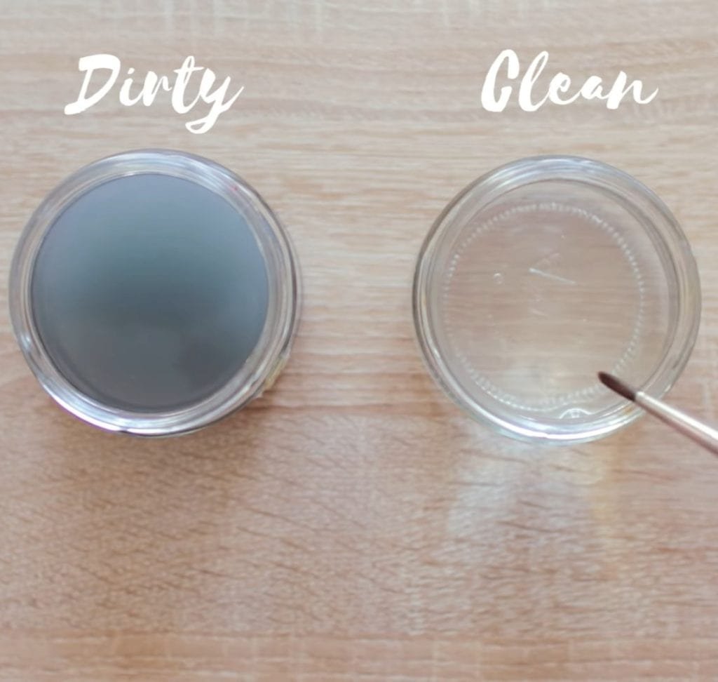
Makoccino explains that you need two jars of water on your desk. One jar is for dirty water where you clean your brushes. The second jar is for clean water only.
When you use just one jar, your clean water becomes cloudy. When you dip your brush back into your paint, the dirty water contaminates your colors. This is one of the fastest ways to lose vibrancy.
With two jars, you keep your brush fresh, and your paints stay pure. This simple habit prevents muddy colors right from the start.
Color Theory Basics Every Beginner Should Know
Once your water setup is ready, the next step is understanding color theory. This foundation helps you see why some mixes work and others fail.
Understanding Primary Colors in Painting
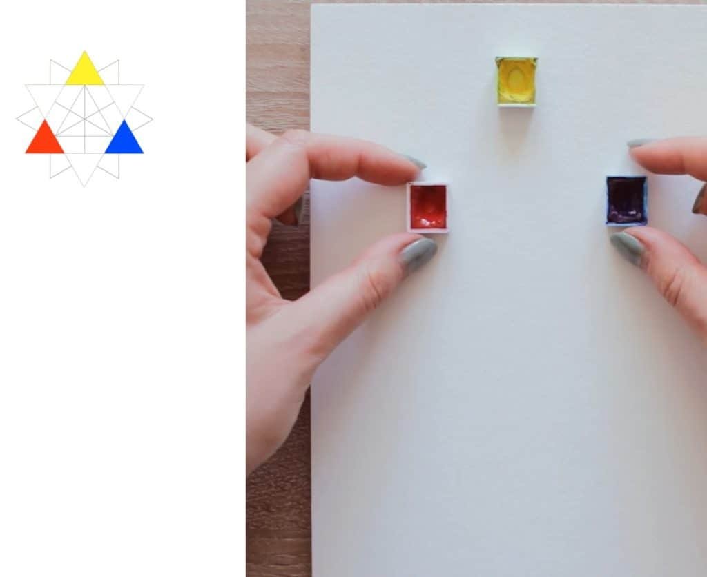
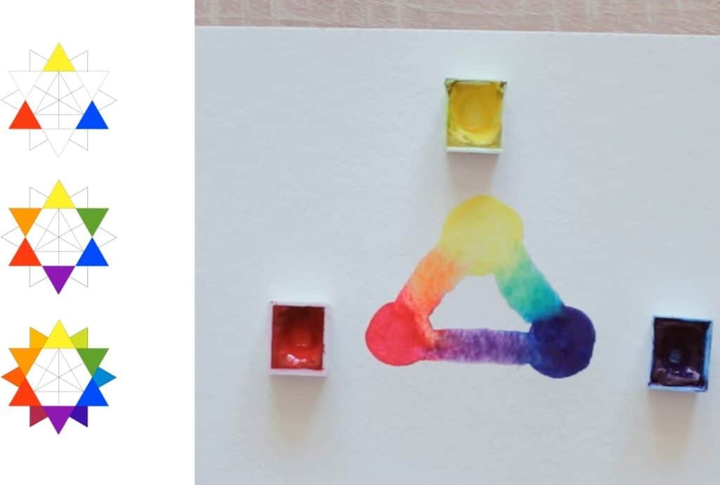
The three primaries are yellow, red, and blue. They are the base of every other color. When you mix all three, you get a dark shade close to black. The reason is that they cancel each other out.
Makoccino stresses that primaries are powerful, but mixing them carelessly creates dull tones. You must use them thoughtfully.
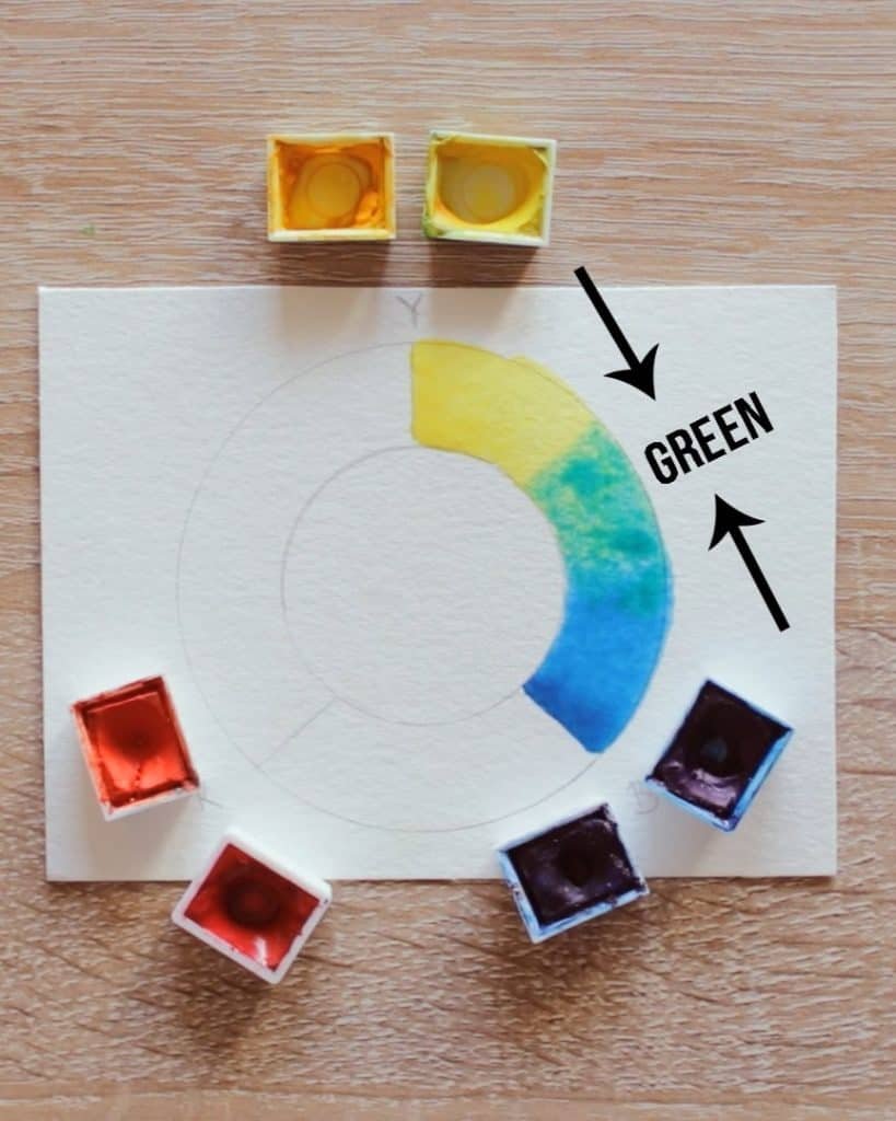
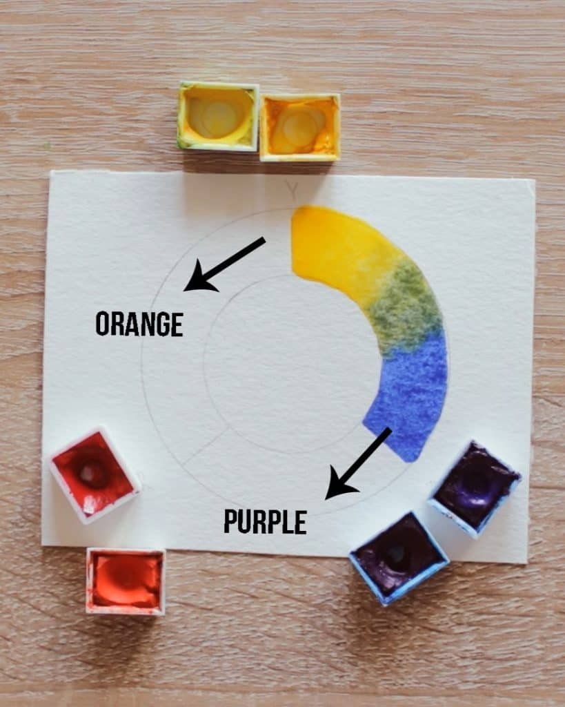
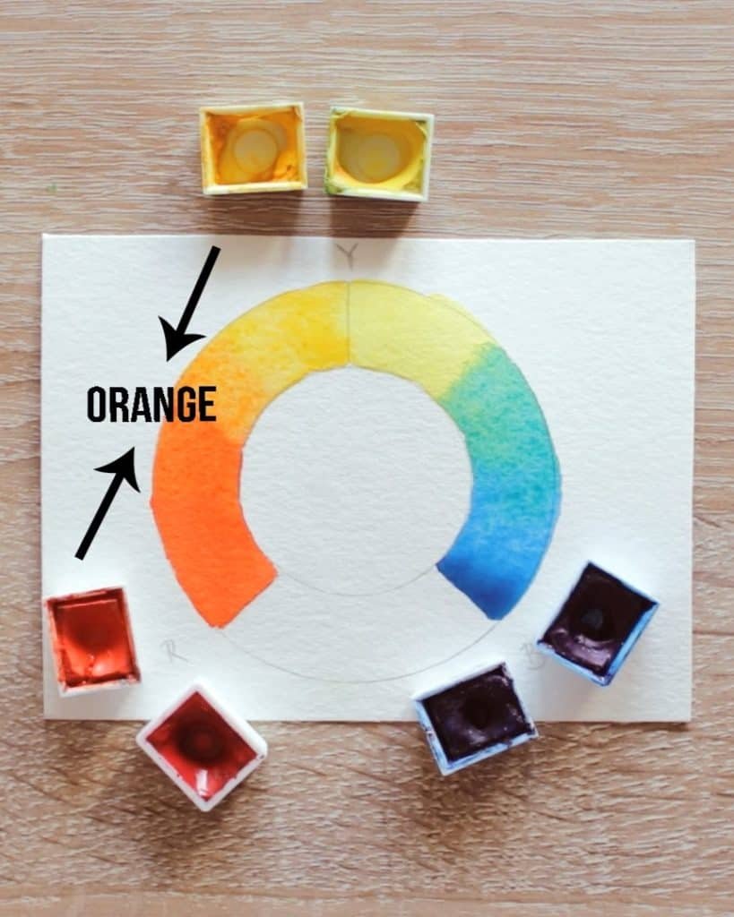
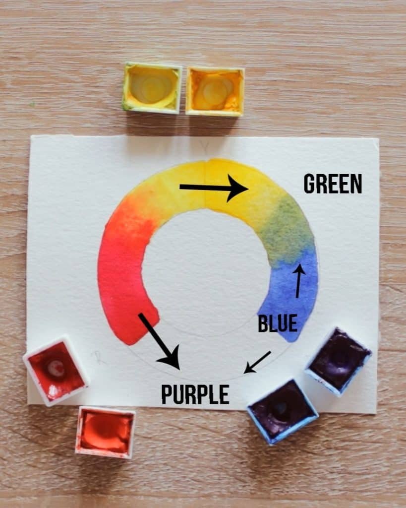
Secondary and Tertiary Colors Explained
When you mix two primaries, you create a secondary:
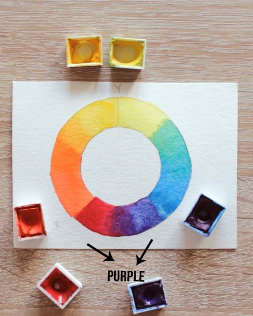
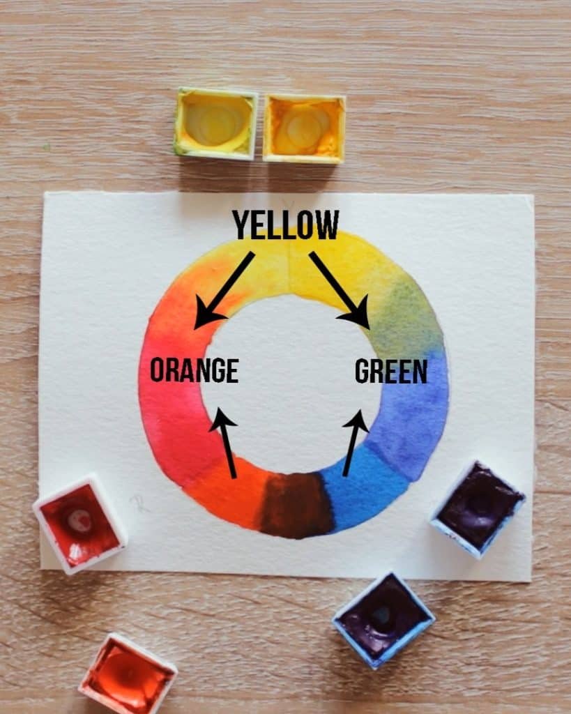
- Yellow + red = orange
- Blue + red = purple
- Yellow + blue = green
If you mix a secondary with a primary, you get tertiary colors. These are variations like yellow-orange or blue-green.
Makoccino explains that tertiaries often lean more toward one side. Some look more red, some more blue, or some more yellow.
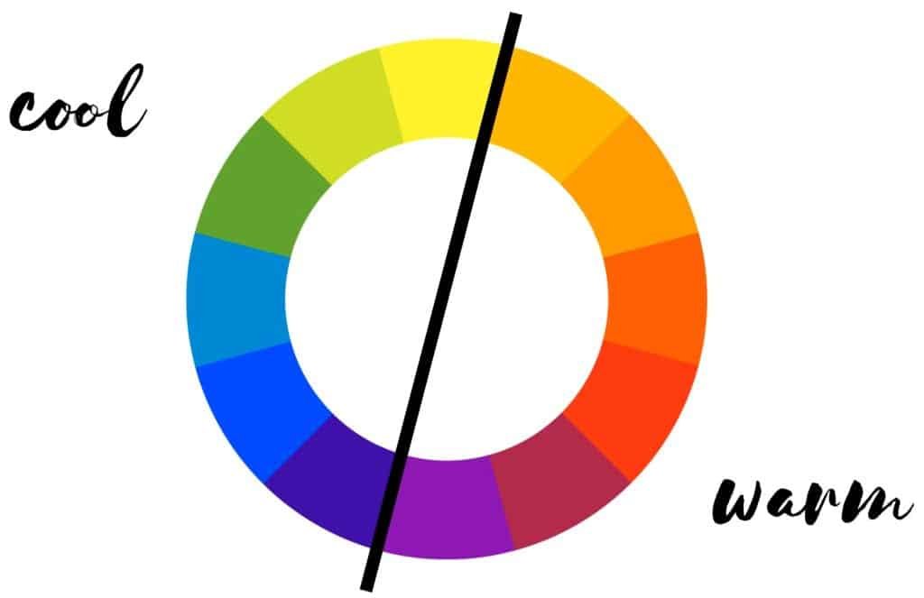
Warm and Cool Colors in Art
Colors also have temperature. Warm colors include reds, oranges, and yellows. Cool colors include blues, greens, and purples. This affects how your painting feels.
According to Makoccino, knowing whether a color is warm or cool helps you control brightness and mood. It also influences whether your mixes turn clean or muddy.
Complementary Colors and Why They Turn Muddy
On the color wheel, complementary colors are positioned directly opposite each other, for example, blue and orange or red and green. Next to each other, they make each other pop. Mixed together, they create muddy browns or grays.
The reason, Makoccino points out, is simple. Each complementary color contains the two primaries missing from the other. When combined, they introduce all three primaries into the mix, dulling the result.
Why Primary Colors Are Not Always Pure
After learning the basics, you may think mixing is easy. But Makoccino shares that not every red, yellow, or blue gives the same result.
The Hidden Bias in Primary Colors
There is no such thing as a perfectly pure primary. Every pigment leans toward one of the other primaries. This is called bias.
A red might lean slightly toward purple or toward orange. The same goes for blue and yellow.
This small difference explains why one mix looks bright while another looks dull. Bias matters.
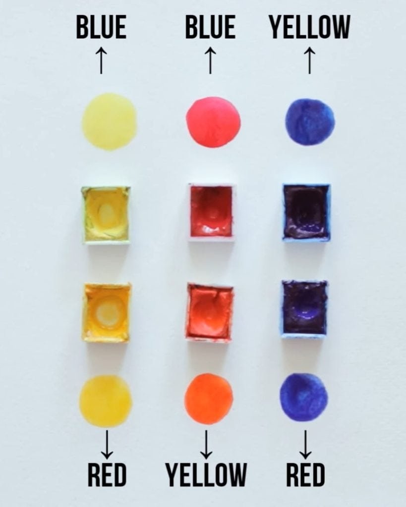
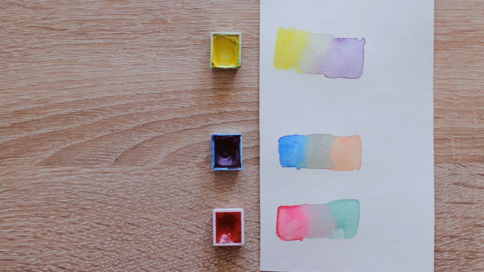
How to Identify Warm and Cool Bias in Paints
You can spot bias by asking simple questions:
- Does the yellow look more greenish or more orange? If it’s greenish, it’s a cool yellow. If it’s orange, it’s a warm yellow.
- Does the red lean more toward purple or orange? Purple means cool red; orange means warm red.
- Does the blue look closer to green or red? Green means cool blue; red means warm blue.
Makoccino suggests holding swatches next to each other. Once you practice, you will see undertones more clearly.
How to Mix Colors Without Creating Muddy Paint
Now that you know about bias, you can avoid muddy results by making better choices.
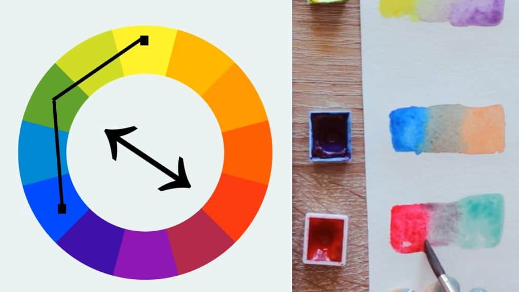
The Secret to Mixing Vibrant Colors
For vibrant colors, mix two primaries that lean toward the same secondary. That way, both paints “want” to create the same result.
For example, a cool yellow and a cool blue both lean toward green. Mixed together, they make a fresh, vibrant green.
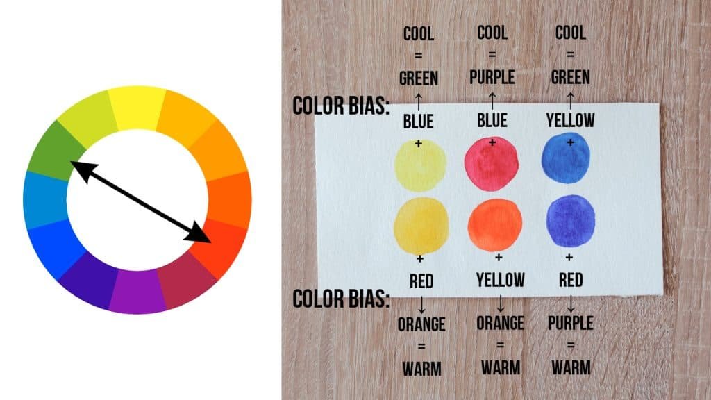
Why Some Color Mixes Turn Muddy
When you mix primaries with different biases, the results change. A warm yellow leans toward orange, while a warm blue leans toward purple. Mixed together, they create green, but it looks dull.
The reason, as Makoccino explains, is that each paint carries hidden red undertones. That means you’re not just mixing yellow and blue. You’re actually mixing all three primaries. That’s why the color turns darker and muddier.
Practical Color Mixing Examples for Beginners
Examples make theory real. Makoccino shows how different mixes create clean or dull colors.
Mixing Yellow and Red for Orange
When you mix a warm yellow with a warm red, both lean toward orange. The result is a bright, clean orange.
If you mix a cool yellow with a cool red, you still get orange, but it looks darker. Both paints lean slightly toward blue, which sneaks into the mix. With all three primaries present, the orange loses vibrancy.
Mixing Red and Blue for Purple
When you combine a cool red and a warm blue, they lean toward purple. The result is a strong, vibrant purple.
But if you mix a warm red with a cool blue, they lean toward other secondaries (orange and green). Since those secondaries include yellow, the mix accidentally adds all three primaries again. The result is a dull, muddy purple.
How a Third Primary Makes Colors Dull
This is the key idea: any time a third primary sneaks into your mix, the color darkens. Even small undertones matter. This is why choosing the right primaries is essential if you want clean, bright results.
How to Use Muddy Colors in Your Paintings
You might think muddy colors are always bad. Makoccino reminds you that they can be helpful.
When Muted Colors Are Helpful in Art
Muddy or muted tones are perfect for:
- Painting shadows
- Creating natural, earthy effects
- Adding contrast to bright colors
Not every painting needs to be full of vibrant tones. Sometimes a dull color makes your bright areas stand out more.
Making Your Own Color Mixing Chart
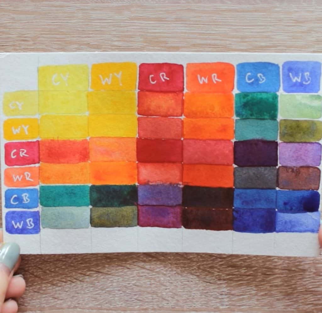
Makoccino suggests creating a chart with your own paints.
- Take your primaries and mix them in pairs.
- Record how each mix looks.
- Notice which combinations look clean and which turn muddy.
This chart becomes a guide that helps you in future paintings.
Training Your Eye to See Color Bias
The more you practice, the more you notice bias. Makoccino encourages you to train your eye every day.
Try comparing different yellows, reds, and blues side by side. Ask yourself which direction they lean.
You can also practice by observing everyday objects. Look at a red apple: does it look cooler or warmer?
When you can see undertones, you can choose the right primaries for your style.
- If you want bright and clean colors, pick primaries that lean toward the same secondary.
- If you need muted tones, use primaries that lean away from each other.
With practice, you control your palette instead of letting it surprise you.
In A Nutshell
The secret to avoiding muddy colors is understanding bias and choosing paints wisely. You can mix vibrant colors with clean water, knowledge of color theory, and practice.
Makoccino shows that dull tones can also be helpful if you use them intentionally. So why not experiment today? Mix, observe, and enjoy the process of creating with confidence.