
Do you want to create beautiful watercolor skies that look smooth and natural? As Julia Lis Art often teaches, you don’t need advanced skills to paint soft gradients and peaceful mountain silhouettes—just a few simple techniques.
In this tutorial, Julia Lis Art shares easy methods to help you paint stunning sky transitions, add realistic mountain details, and build clean layers without overworking your paper.
These tips will help your watercolor landscapes look professional, polished, and full of atmosphere.
Let’s dive in!
Contents
Prepare the Watercolor Paper for a Clean Finish
Before the painting begins, the artist always tapes the borders of the watercolor paper. This simple step helps achieve a clean, tidy look every time.
Even if the painting doesn’t turn out exactly as planned, the taped edges make it look neat and professional.
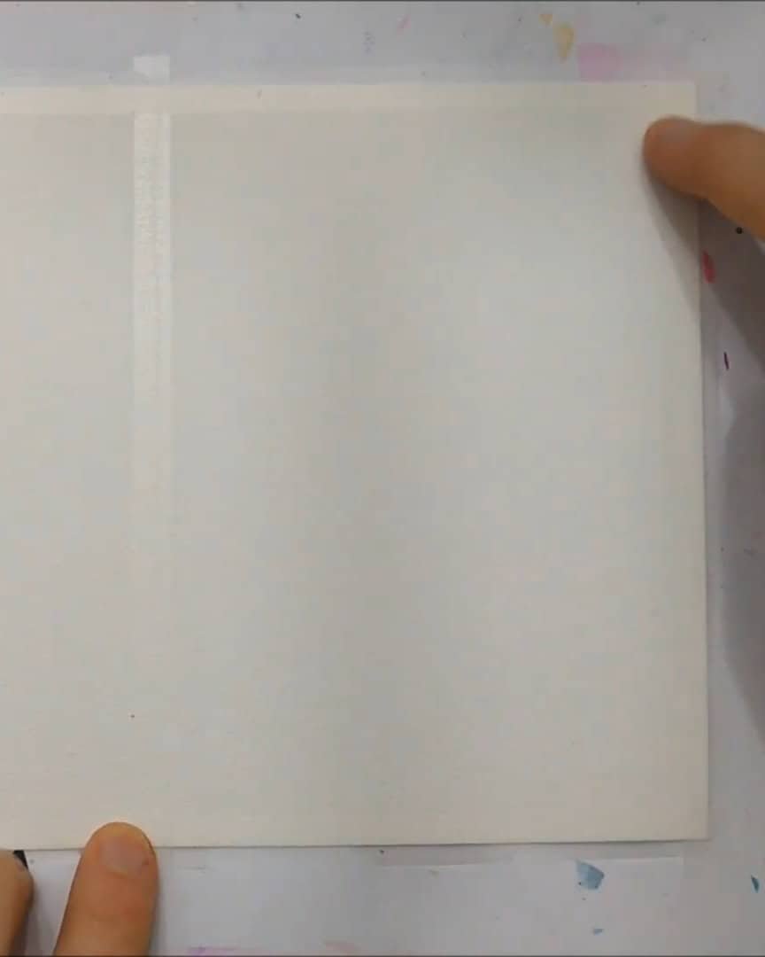 Tape the paper borders
This small habit makes a big difference—here’s why it matters before moving into painting techniques.
Mastering the Wet-on-Wet Technique
Now that the paper is ready, the artist moves on to one of the artist’s favorite watercolor techniques—wet-on-wet.
This technique helps create soft blends and smooth gradients, especially for sky backgrounds.
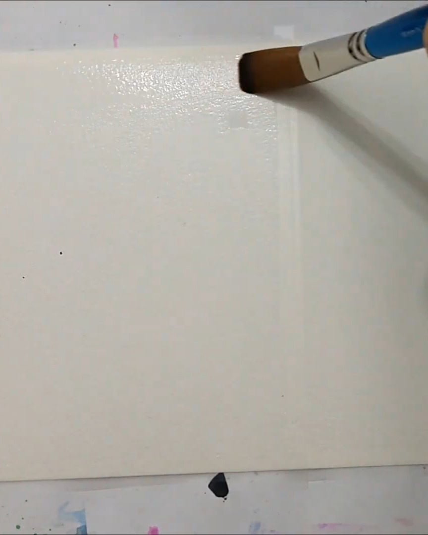
Evenly Wetting the Paper
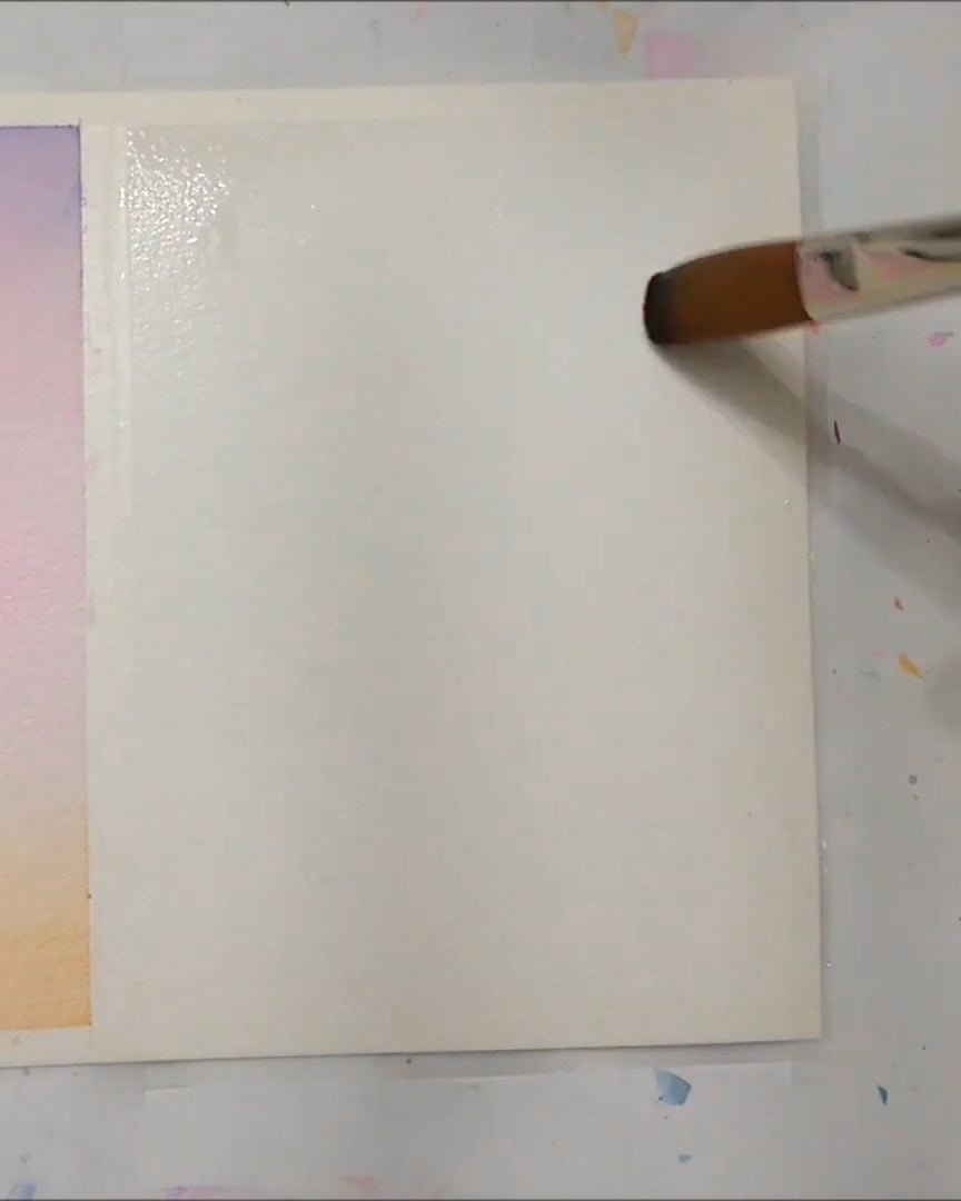
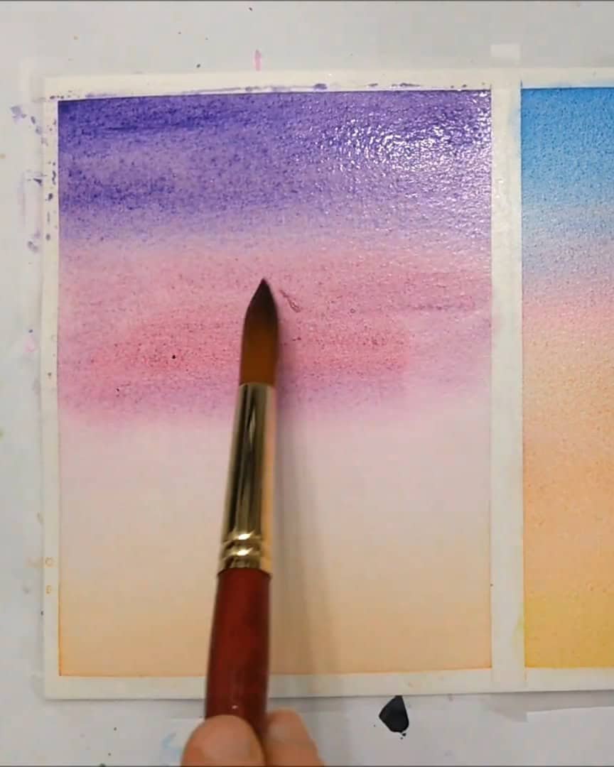
Before adding any color, the artist always wets the paper first. The artist doesn’t just brush water on once and stop—the artist goes over the whole surface several times.
This helps spread the water evenly and avoids those little puddles that sometimes collect in the corners.
To make this easier, the artist uses a good-quality mop brush. It holds a lot of water and gives better control. For artists struggling with water control, investing in a mop brush can make a big difference.
Here’s what the artist does:
- Wet the paper 2–3 times to ensure no area is drier than the rest.
- Pay extra attention to the edges and corners to stop pooling.
- Use the mop brush to spread the water smoothly.
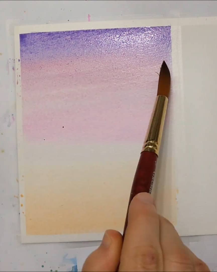
Creating a Gradient with Smooth Color Transitions
Once the paper is nicely wet, the artist begins adding color. The artist usually starts at the top and bottom of the page and then works toward the center. This method helps the colors blend better and creates the smooth transitions the artist aims for.
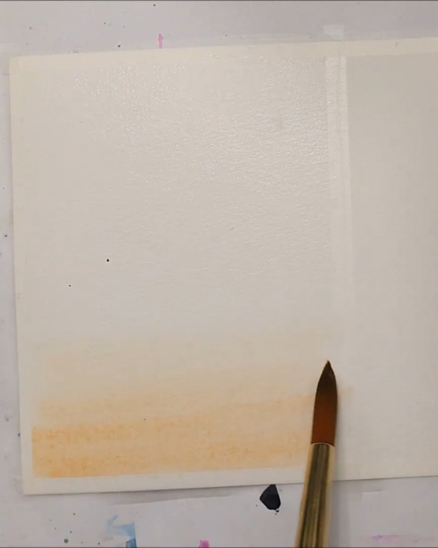
The artist often uses more than two colors for a richer look. But when doing this, the artist always makes sure to:
- Blend each color up to the top or down to the bottom.
- Avoid stopping the blend halfway; the colors might look harsh or patchy.
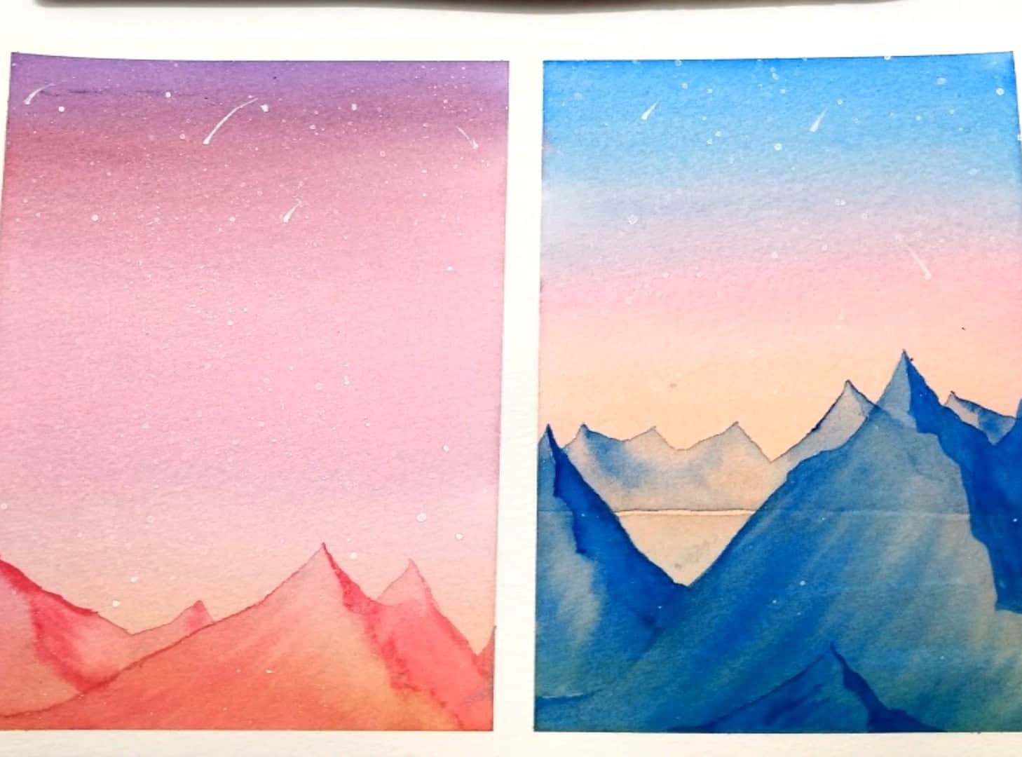
Repeating the Process with Different Colors
While the first piece dries, the artist moves on to the second one. Slightly different colors are used, but the technique stays exactly the same.
The artist still:
- Wet the paper evenly.
- Start at the top and bottom with color.
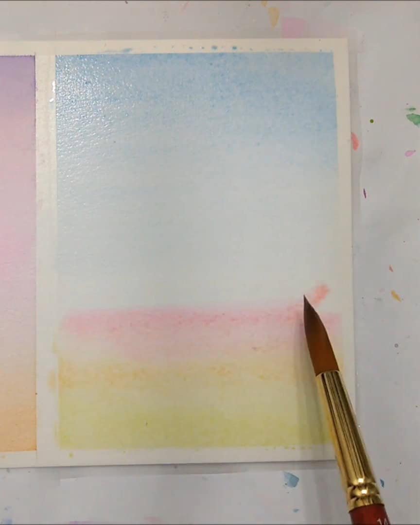
- Blend everything toward the center.
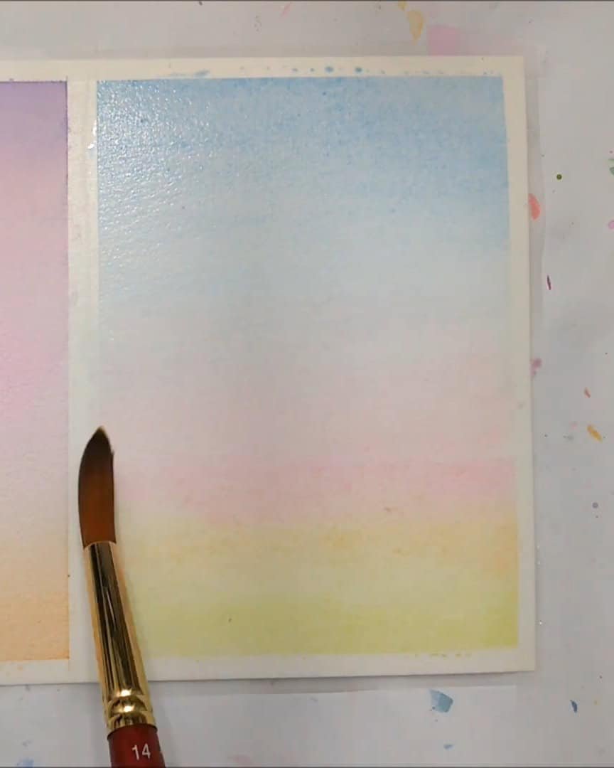
- Make sure the colors stretch from edge to edge.
This keeps the gradient soft and avoids any harsh patches. Intense colors in random areas might work when aiming for a dramatic look.
But for this style, the artist gradually blends from one end to the other. Next comes deepening the colors once the first layer is dry.
Tips for Layering and Intensifying Colors
When the artist wants to make the gradient colors more vibrant, the artist always waits until the paper is completely dry before adding another layer.
This step is crucial to avoid messing up the smooth blend that took effort to create.
Once dry, the artist adds a very thin layer of water over the entire page. This helps the new color layer settle nicely without reactivating the paint underneath.
Reactivating previous layers can spoil the gradient and ruin the smooth transition.
With the background ready, the artist is excited to start adding some details next.
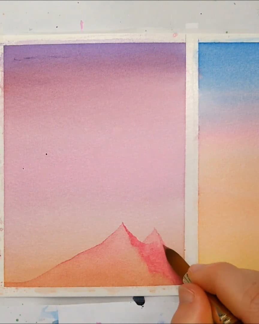
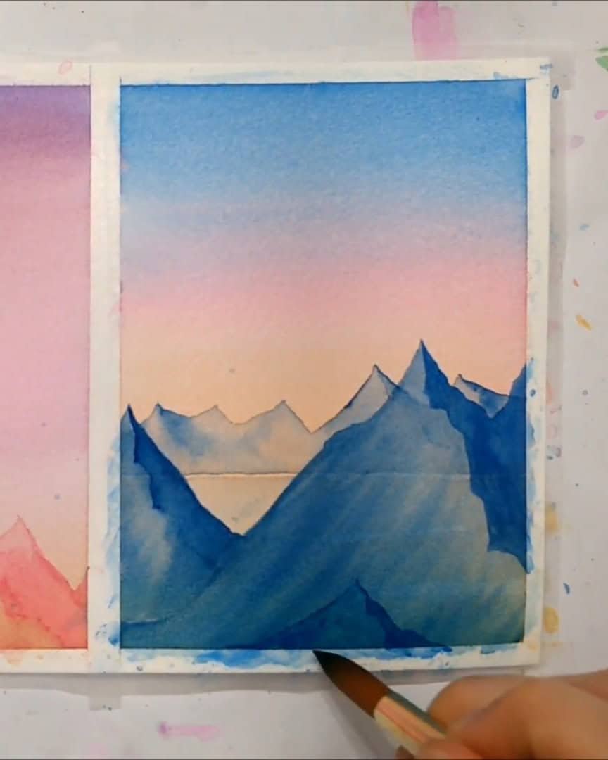
Painting Realistic Mountains Over the Gradient
Now that the gradient background is ready, it’s time to bring in some mountains. The artist loves painting mountains because they add character and depth to a landscape.
Creating the Shaded Side for Depth
The first step the artist takes is to paint the shaded or darker side of the mountain. This represents the part where the sun doesn’t hit directly. Adding this shadow creates a sense of realism and depth.
- The artist starts with a larger mountain shape, defining the dark side clearly.
- Then, the artist paints a slightly smaller mountain next to it to add variety and interest.
To make the mountains even more lifelike, the artist adds brush strokes that swoop toward the shaded part but don’t quite touch it.
These strokes mimic the natural grooves often seen on real mountains, especially those in places like Hawaii. The grooves add texture and dimension, making the painting feel more authentic.
Adjusting and Building Layers
While one mountain dries, the artist works on the next one using the same technique.
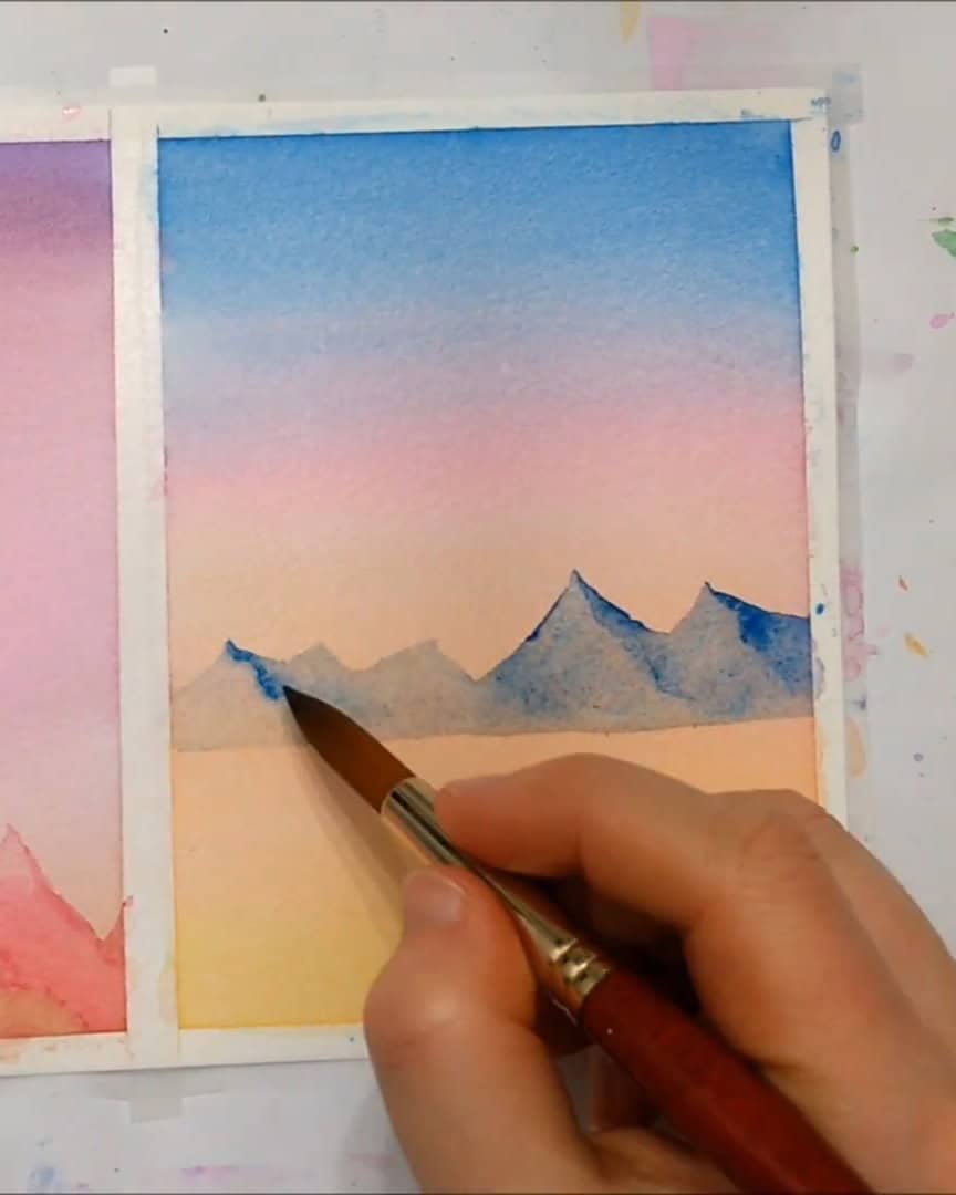
Sometimes, the first attempt doesn’t turn out as imagined, so the artist adjusts by adding more mountains or darker pigments to the front. This makes some mountains appear closer to the viewer.
- The artist creates dark brush strokes from the mountain’s base toward the shaded area to keep the groove effect consistent.
- If a shaded part looks too small or light, the artist goes over it again to deepen the shadow and enhance depth.
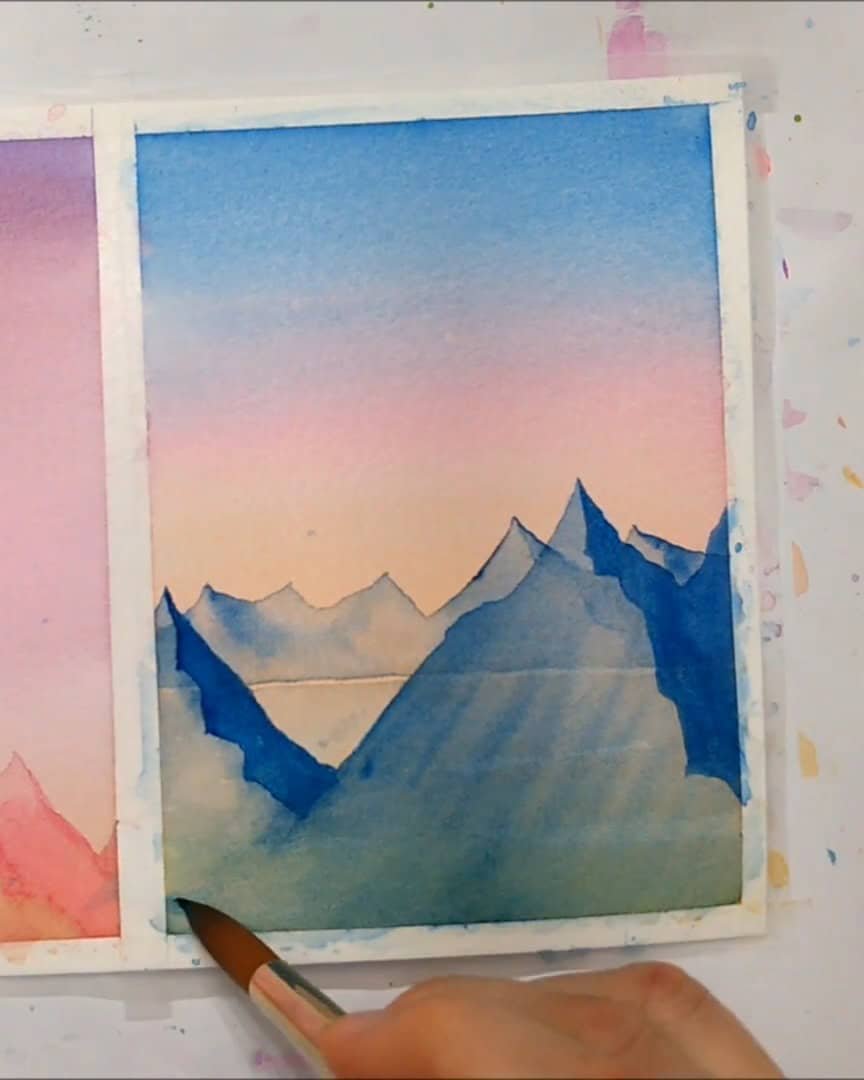
By switching between the two paintings while drying, the artist keeps building layers and adjusting until satisfied with the look. Using personal judgment is key here — add as much shading and groove detail as feels right to bring the mountains to life.
Next, the artist is ready to explore how to add final details that make the scene pop.
Adding Final Details to Enhance the Painting
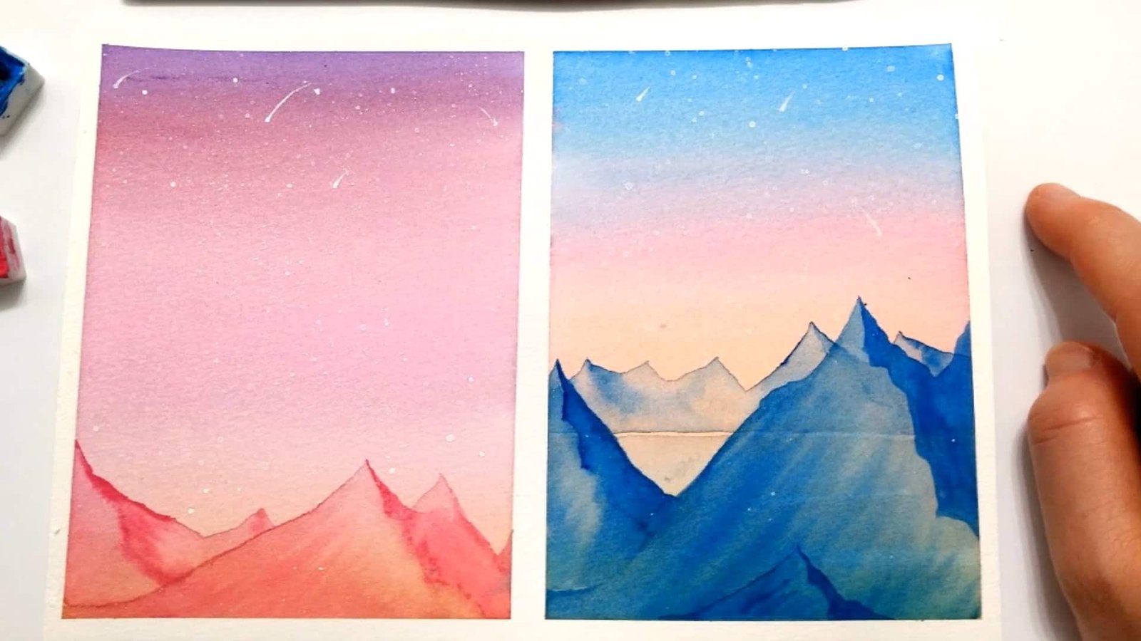
To finish off, the artist likes to flick on some white acrylic paint lightly. This creates a beautiful starry night sky effect that adds life to both paintings.
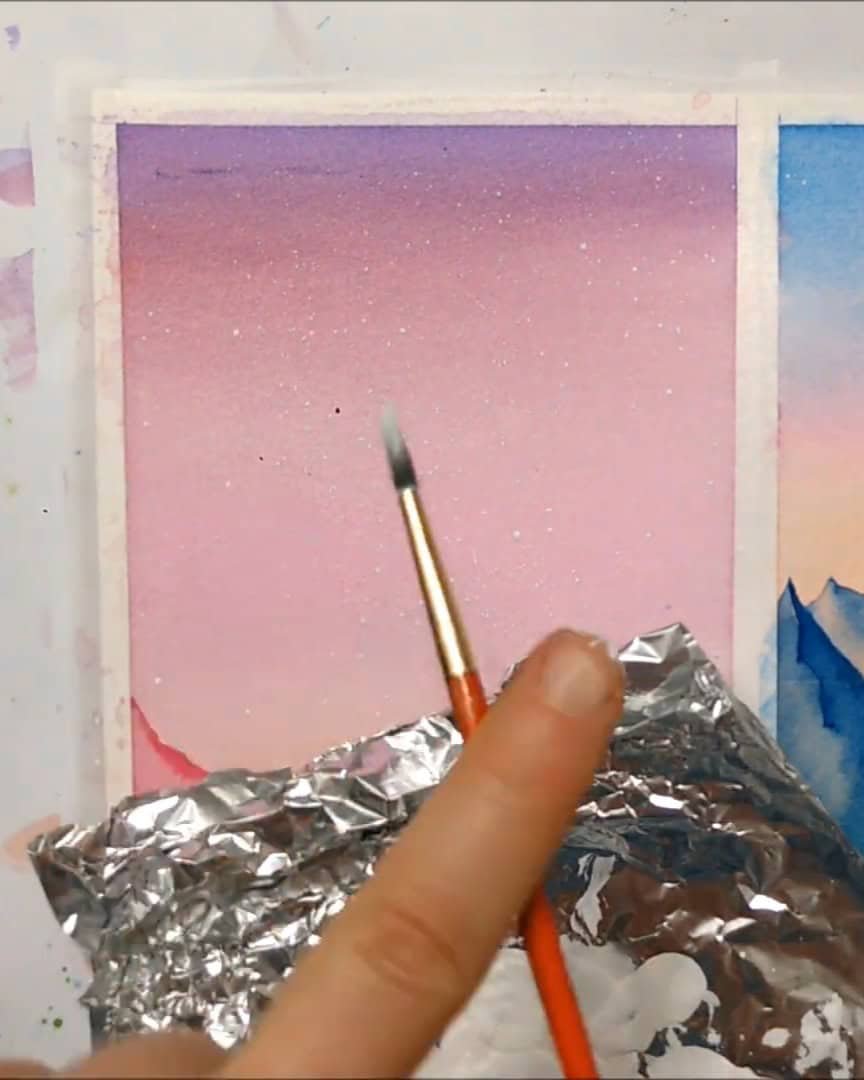
The artist also adds a few shooting stars in random spots to make the sky more interesting and dynamic.
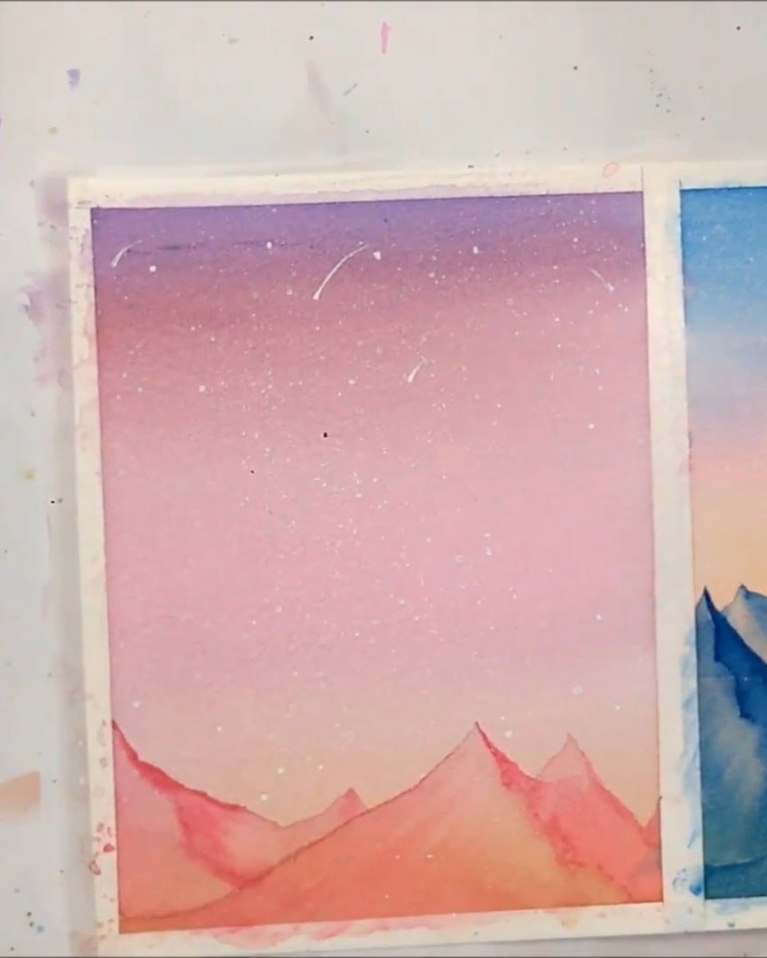
Remember to peel off the tape once all the details are in place. This step gives clean, professional borders. The artist sometimes forgets, but it makes a difference.
Now, the painting is ready to shine!
Final Thoughts
These beginner watercolor techniques help the viewer easily create smooth sky gradients and realistic mountains. Try these tips step by step and watch skills grow.
Ready to give it a go? Share the paintings and keep practicing—the progress will be amazing!