
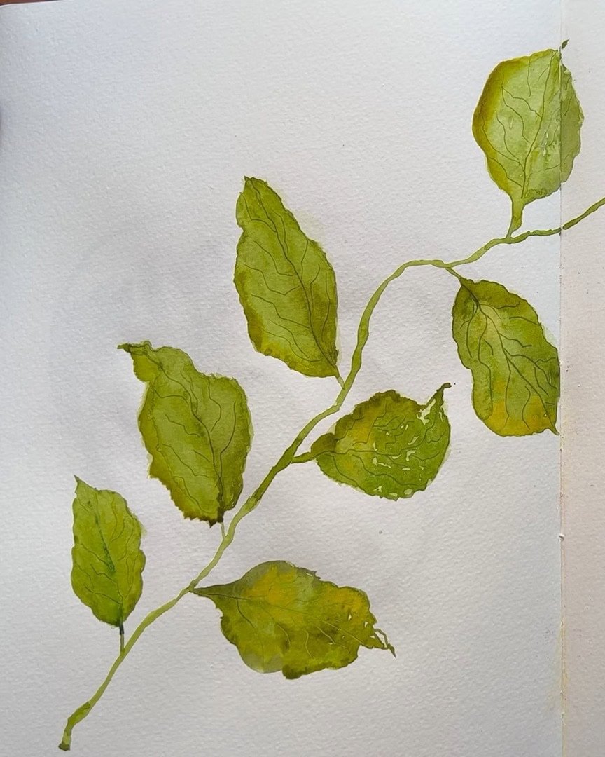
What if painting a realistic leaf could be simple and fun? Beala Art is excited to share how she chooses natural colors, mixes paints, and builds soft layers that blend beautifully on the page.
In this tutorial, Beala Art will show you how easy it is to keep shapes organic and add those small, essential details that make a leaf look truly alive.
Let’s dive in and paint something you’ll be proud of!
Full video: https://www.youtube.com/watch?v=XpSP5icbVGs
Contents
Choosing Colors That Work Together Naturally
Before the artist begins painting, the artist talks about color. Picking the right ones makes the whole process easier—and more fun.
The artist likes to use four favorite colors when painting leaves. These are the ones the artist reaches for all the time because they just work so well together:
- Permanent Sap Green (this is always the base)
- Olive Green
- Greenish Umber
- Green Gold
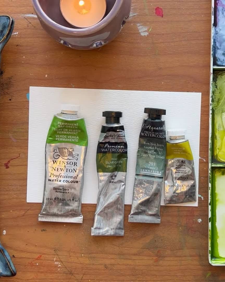
The viewer can use any color—even browns—but sticking to natural tones for today helps achieve that satisfying “wow, this looks real” feeling.
Setting Up for a Natural, Organic Shape
Before painting begins, the artist prepares the paint and the brush. This part sets the tone for how natural and realistic the leaf will look.
Mixing the Paints for Depth and Richness
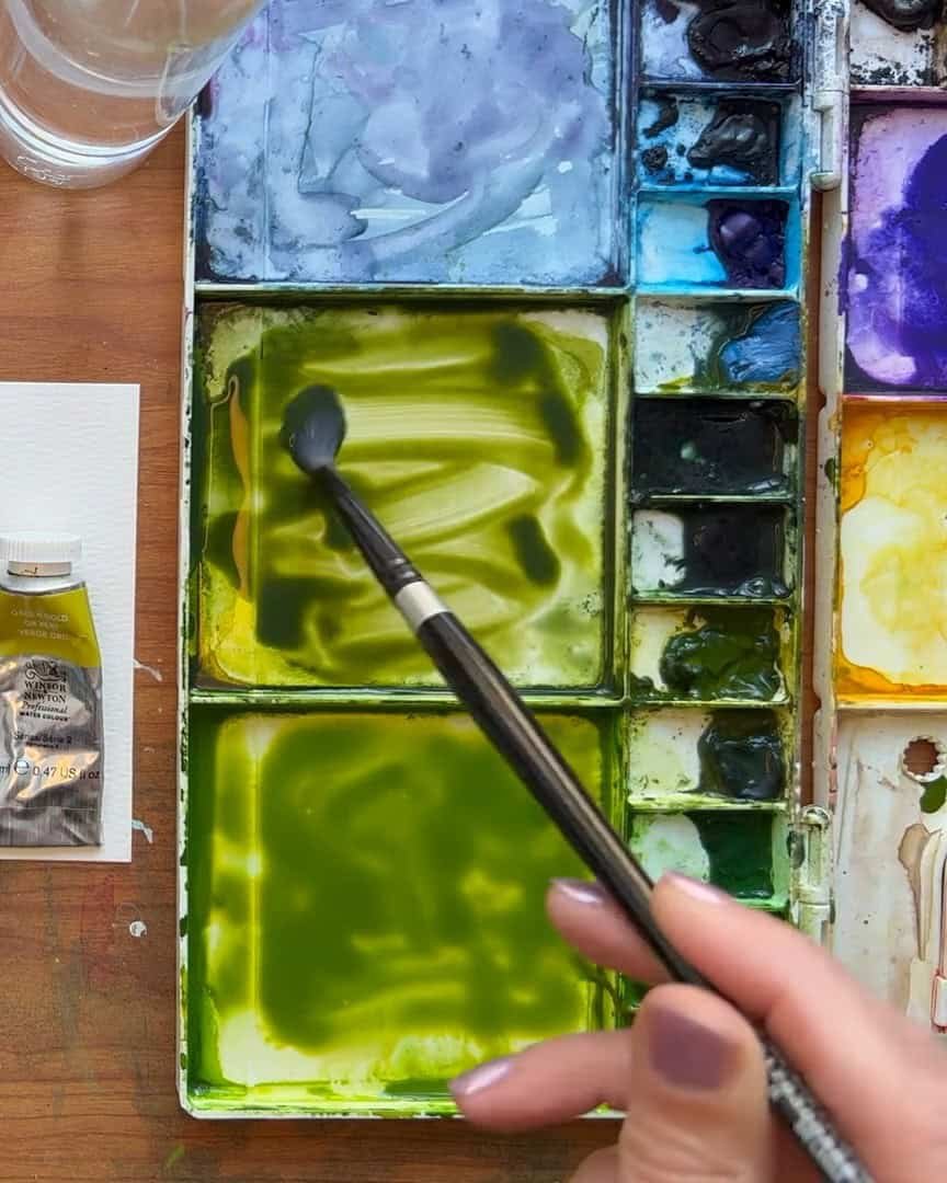
The artist begins by mixing some Permanent Sap Green with a touch of Green Gold in one well on the palette.
Green Gold is a beautiful color—it softens the blue tones in the Sap Green just a little. That gives a more balanced base to work with.
The artist doesn’t just use the mix, but also each color on its own. For now, the artist aims for a nice, thick consistency. Not too watery.
Not too dry. It’s thick enough to hold color but still flows well with water. The viewer will get a feel for the texture that works.
The artist personally likes it medium thick—strong but still smooth on the paper.
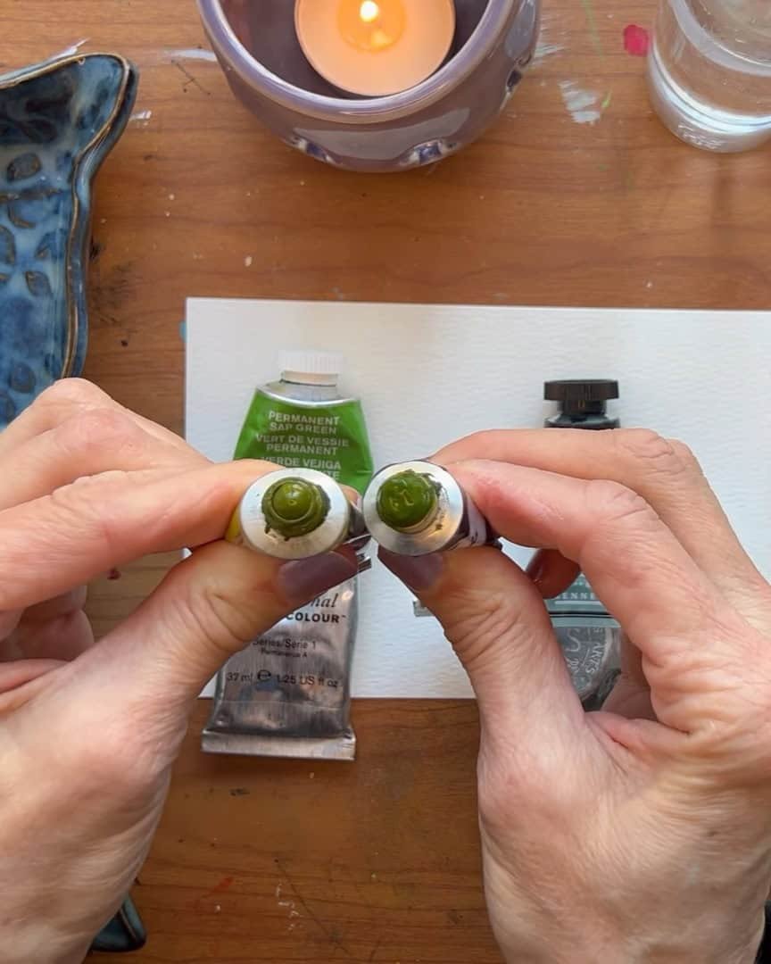
Then the artist mixes up the Greenish Umber. This one’s a deep, rich color that works beautifully with Sap Green.
To that, the artist adds a bit of Olive Green, giving it more of a golden glow. These blends—along with the pure colors—give six options to work with. That brings in all the depth and texture in the final leaf.
Understanding Subtle Color Differences
Green Gold and Olive Green may look almost the same at first. But when squeezed out of the tubes, they reveal slight differences.
The artist likes using both because those subtle differences offer a more layered, realistic feel.
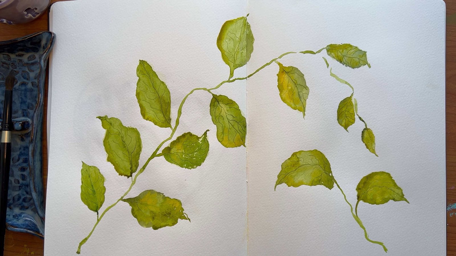
Letting Nature Inspire the Shape
Before painting, the artist takes a quick look through the sketchbook. The artist has practiced many leaves, and none of them look the same. That’s what makes them feel real. No perfect shapes here.
Leaves in nature differ, and the artist keeps that same freedom in the work. That’s why this technique is so fun and relaxing. There’s no pressure to make it perfect—just natural.
 Look at the sketchbook
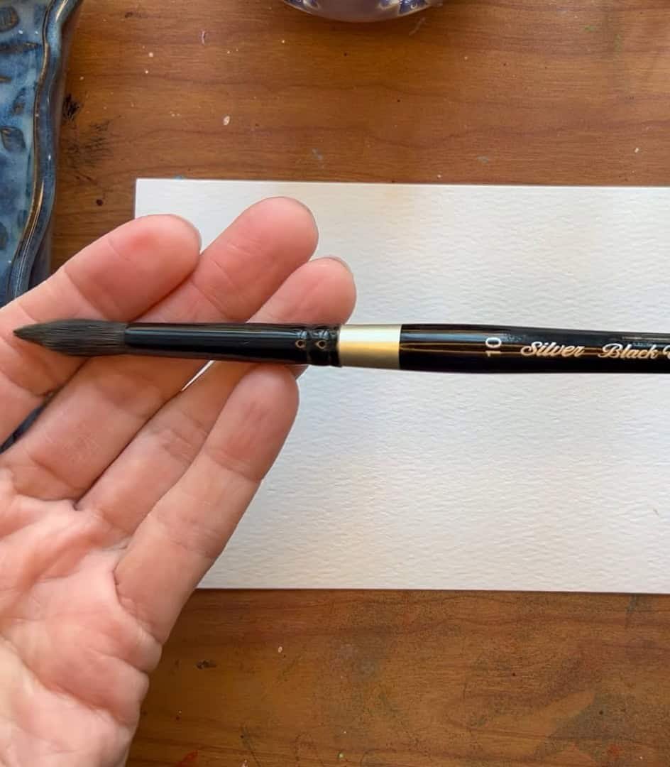
Using a Brush That Matches Your Leaf Size
Now that the paint is ready, the artist chooses a brush. A Black Velvet Silver Brush, size 10, is used—it’s soft and holds water well. But the viewer doesn’t need this exact brush.
Use any brush; just make sure it’s big enough for the desired leaf size. That’s the only rule—pick a brush that fits the shape.
Creating the Base Layer and Initial Wash
Once the paint is ready and the brush is selected, it’s time to create the base wash. This is where the leaf begins to take shape.
Starting with a Light Base Layer
The artist begins by loading the brush with water, but doesn’t use just clear water. It’s hard to see on the paper.
So, instead, a tiny bit of pigment is added to the brush. This slight tint helps the artist see where painting occurs.
The artist isn’t looking for intense color—just a thin base layer. The whole leaf shape is covered evenly. No puddles. No thick patches. Just a smooth, light dampness.
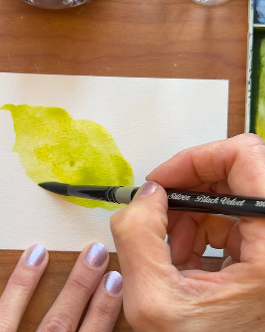
The artist doesn’t stress over the shape. The brush twirls, presses, and flows naturally on the page. This creates an organic shape—loose and alive.
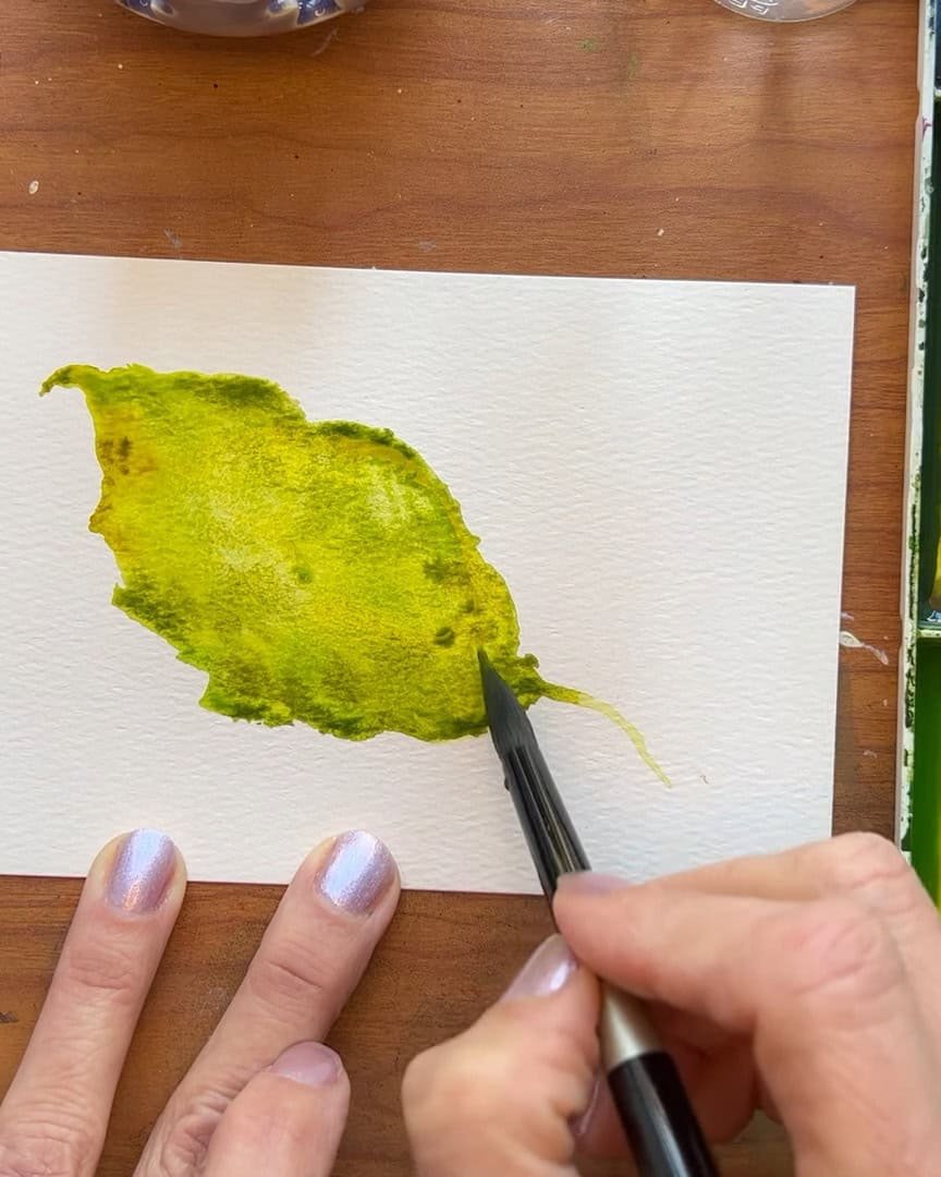
Dropping In Color and Letting It Flow
Once the surface is damp, the artist gently fine-tunes the edges. Then different colors are dropped in—nothing forced or perfect.
A bit of Green Gold is dropped in.
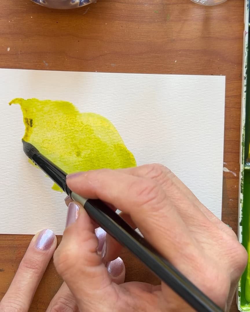
Then deeper tones like Greenish Umber are added, especially along the edges. These darker areas help define the outline and add depth.
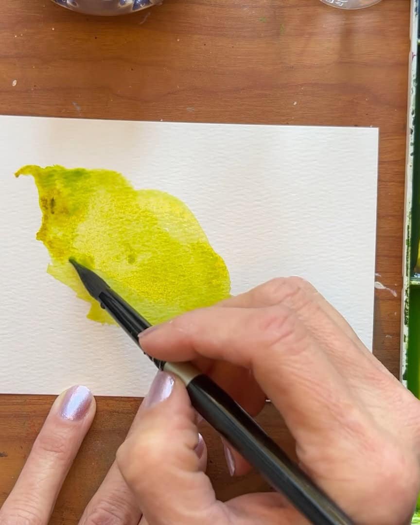
Straight Sap Green is also added in a few places to break up the wash. Nature isn’t flat or even—it’s spotty.
That’s why colors are placed in different spots to mimic natural randomness.
For shadows, the artist uses deeper Greenish Umber wherever shadows might fall. This step give the leaf a bit more dimension without overworking it.
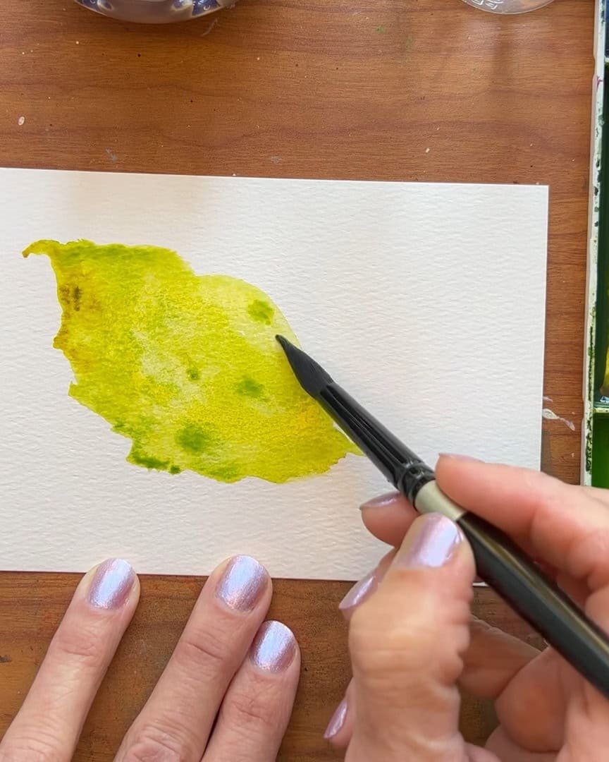
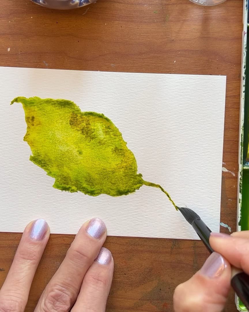
Maintaining Moisture and Layering with Intention
At this stage, it’s all about keeping the paper wet and blending the colors beautifully. If it starts drying, the magic disappears fast.
Keep the Leaf Wet from Start to Finish
The artist doesn’t focus heavily on shadows yet. Instead, different colors are dropped in without letting them pool. The goal is consistent moisture. That’s the secret to soft, natural blending.
If a dry area forms, the artist immediately rewets it with more pigment and water.
That moisture is what keeps the whole piece working together. Without it, the painting loses that smooth, painterly blend.
Here’s something the artist always does: Drop the color in—don’t brush it. Brushing breaks up the natural flow and interferes with the softness. The artist dabs here and there, observing where the colors land and how they move.
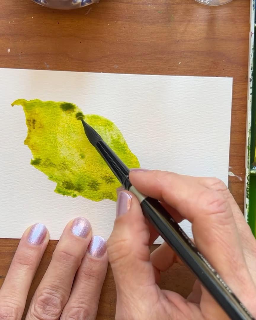
Adjusting the Color and Cleaning Puddles
Watercolors tend to dry lighter, so the artist sometimes goes back in and adds deeper tones, especially where more contrast is needed. For example, the artist likes to darken the stem if it’s fading too much. That gives the piece strength and balance.
The entire process only takes a few minutes. It’s quick, but it makes a noticeable difference.
If the artist sees pooling around the edges, the artist cleans it up by using a dry brush—tapping it gently onto the puddle, then wiping it with a towel. This is repeated carefully:
- Tap once
- Wipe
- Tap again
- Wipe again
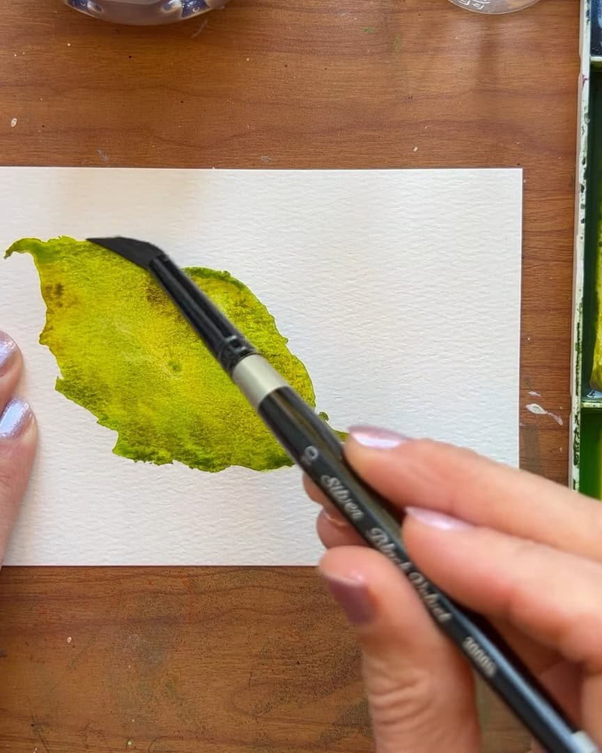
The artist avoids going over it too often, or it simply pushes water around instead of removing it.
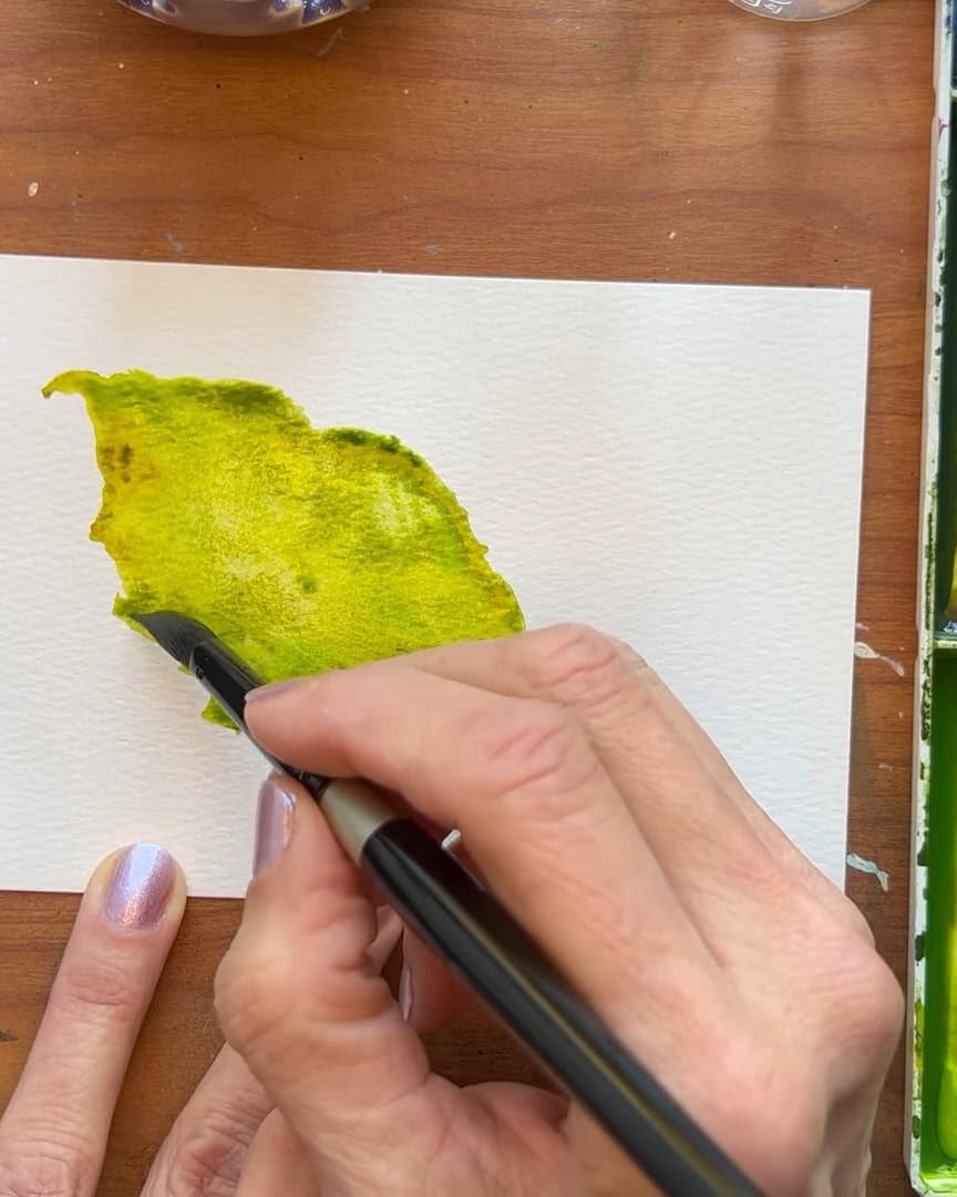
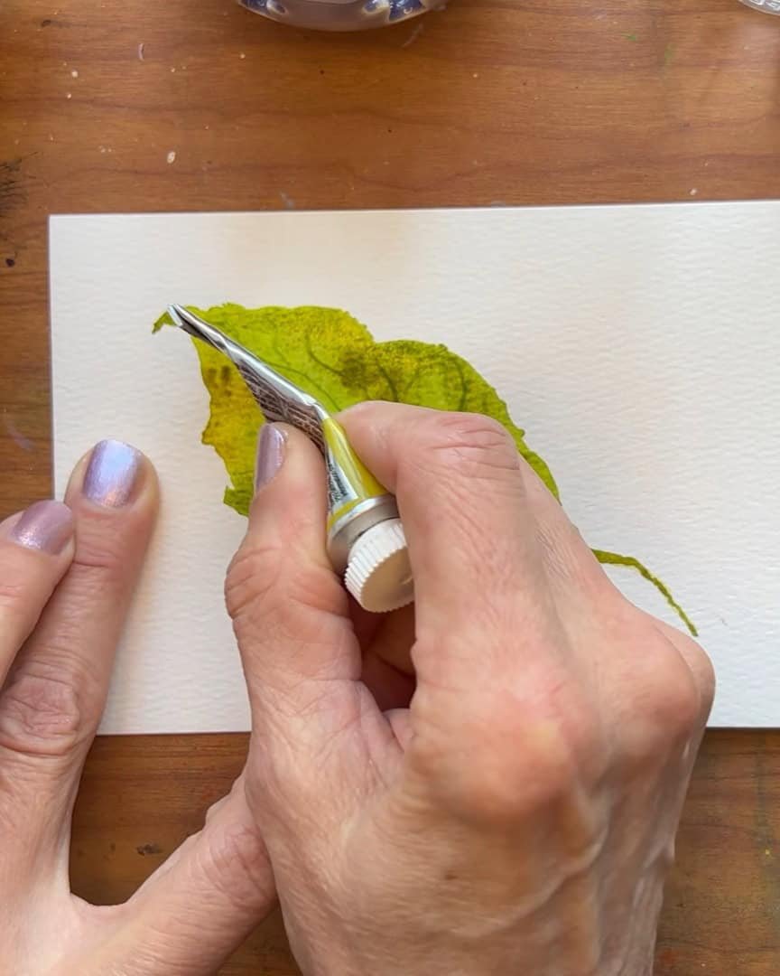
Finishing Touches for Realism
Now it’s time to add those final details that bring the leaf to life. The artist uses the end of a paint tube to draw the center vein. It’s not straight—it’s wavy because the leaf bends and folds naturally.
Then, the artist adds a few smaller veins branching off. Some veins are short, and others connect to different ones, just like a real leaf.
The artist uses light pressure, especially with the tube’s edge, since it’s sharp and can scratch the paper. That’s acceptable, but the artist avoids scratching through the paint because that would leave unwanted white marks.
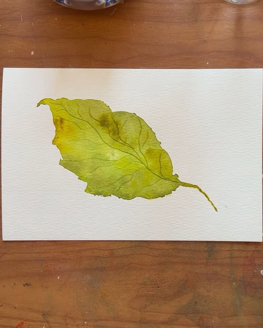
See how quick this process is? The artist is quite happy with how it looks dry now. The colors fade a bit, but that’s normal. The hope is that the viewer enjoyed the process and feels amazed at how well the leaf turned out.
Final Thoughts
The artist has shared a step-by-step process for painting natural, realistic leaves using simple colors and easy techniques. With practice, anyone can capture that beautiful, organic look that feels alive on paper.
How will these leaves be brought to life? The artist is curious to hear about others’ favorite colors and techniques as they explore this fun, creative journey.