
Creating depth in a drawing can sometimes feel like a challenge, but with the proper techniques, you can easily turn a flat-line drawing into something that feels alive and realistic.
In this article, I’ll share with you the essential four-step process for shading a 3D effect with a graphite pencil. If you’re ready to level up your drawing skills, let’s dive right in!
Contents
Understanding the Basics of 3D Shading
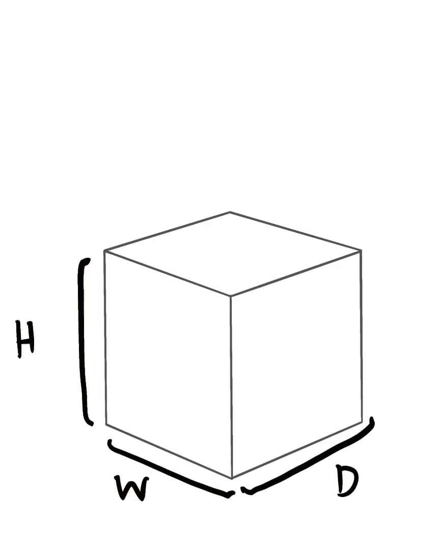
When you think about an object, consider that it has three dimensions—height, width, and depth.
Each of these planes is affected by light in different ways, creating at least three distinct values in your drawing.
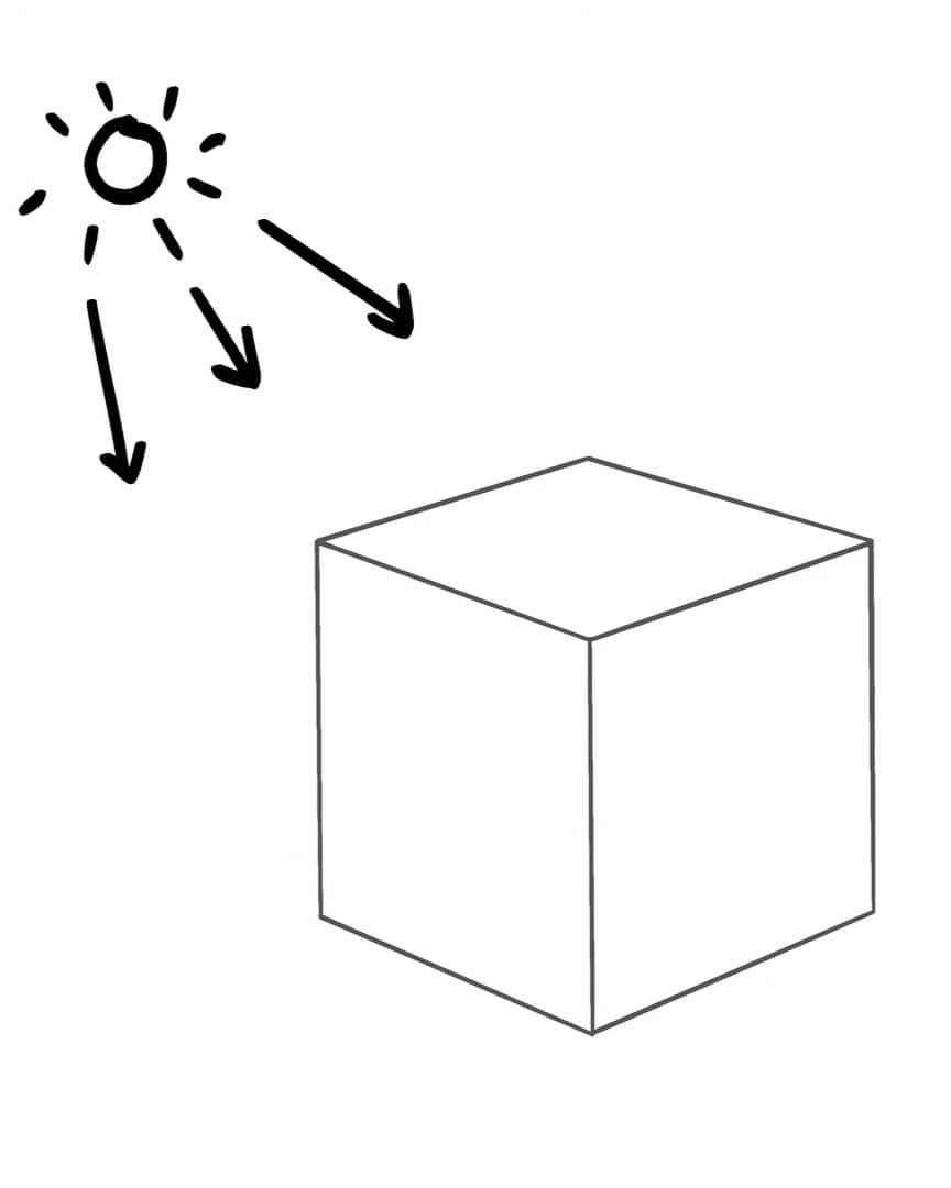
For your artwork to look three-dimensional, it must have at least these three values: highlights, midtones, and shadows.
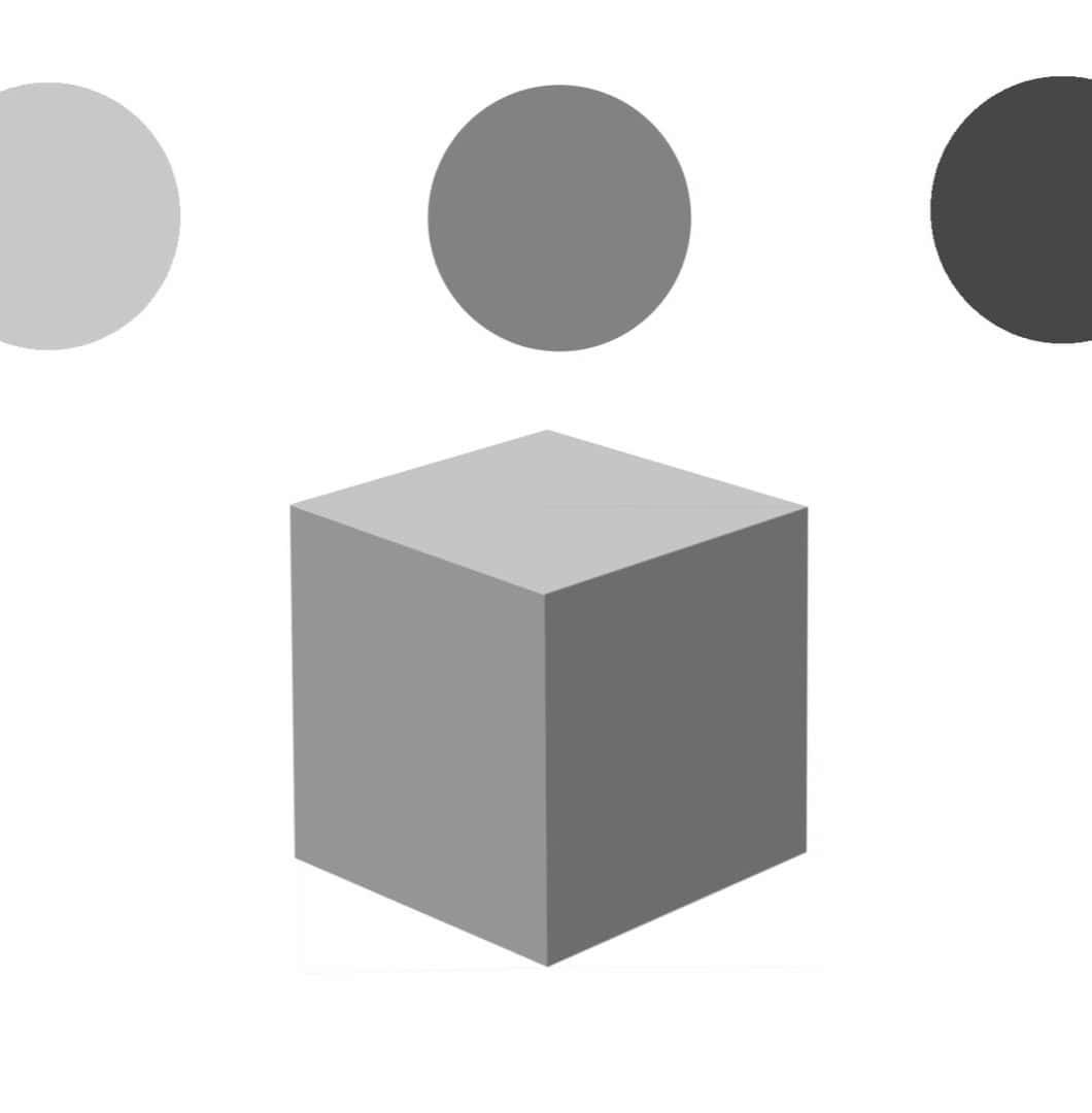
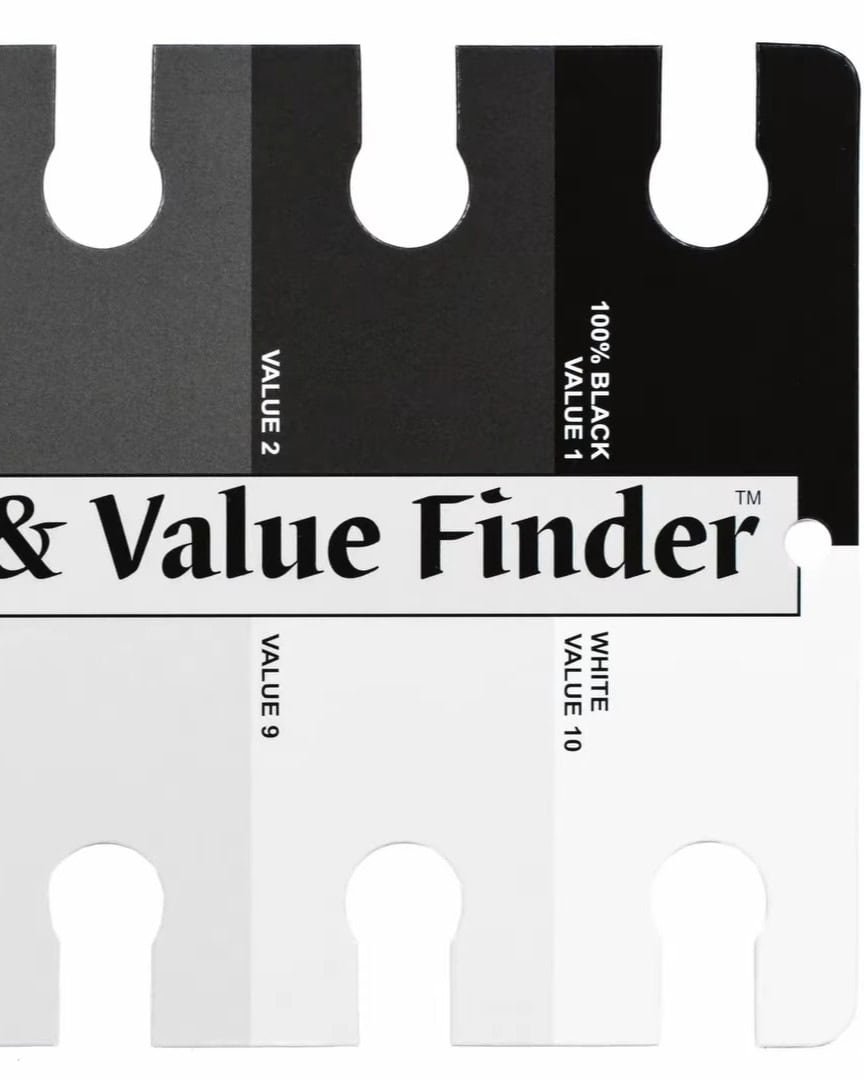
You can use a value finder to identify these values in your reference. If you don’t have one, you can easily create your own.
Make a shaded scale with three central values, then add two more between them to help spot the subtle transitions.
Now that you understand the basics, let’s dive into the steps of adding these values to your drawing.
Step 1: Shade an Even Base Layer
The first step in creating a 3D effect is all about establishing a solid foundation. Without this smooth base, your shading won’t have the depth it needs.
White is the lightest value in any drawing; we create this by leaving the paper untouched. Everything else must be shaded in, and it starts with a base layer that’s one value darker than white.
I recommend shading this layer with light pressure, holding your pencil on its side. This technique lets more lead touch the paper, helping you create a smooth, even layer.
Take your time and cover the entire drawing, leaving only areas you want to remain white.
Once the base layer is in place, grab a tissue and gently blend it. This will help smooth out any harsh lines and create a seamless transition.
Now that your base is laid down, you can add more layers for depth and dimension.
Step 2: Add Midtone Layers
Now that your base layer is in place, it’s time to add the mid-tone layers. This step helps bring your drawing to life and adds that crucial depth.
When adding the midtones, I simplify the values into larger shapes. It’s tempting to dive into details, but I remind myself to think big at this stage.
The midtones sit between the lightest white and the darkest black or grey values. They’re the “middle ground” that creates balance.
I aim for a middle grey but adjust it depending on my reference. Light pressure on the pencil lets me control the darkness or lightness of each midtone.
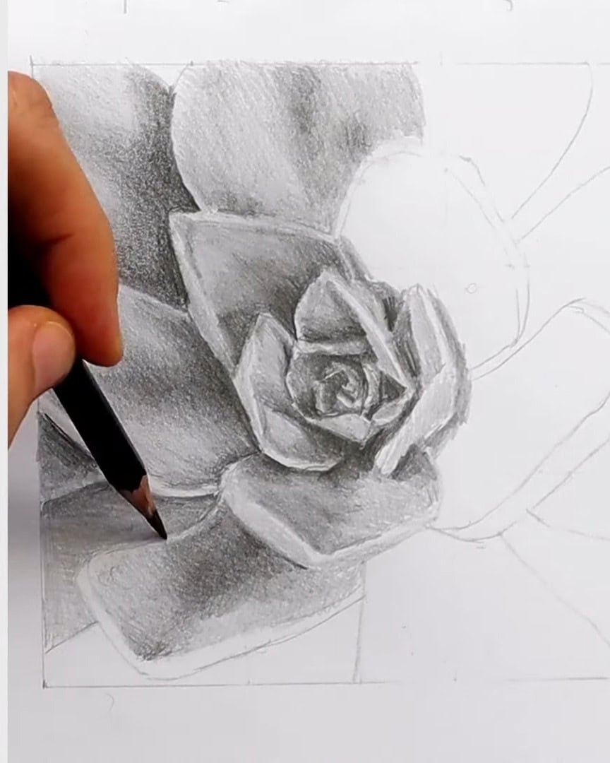
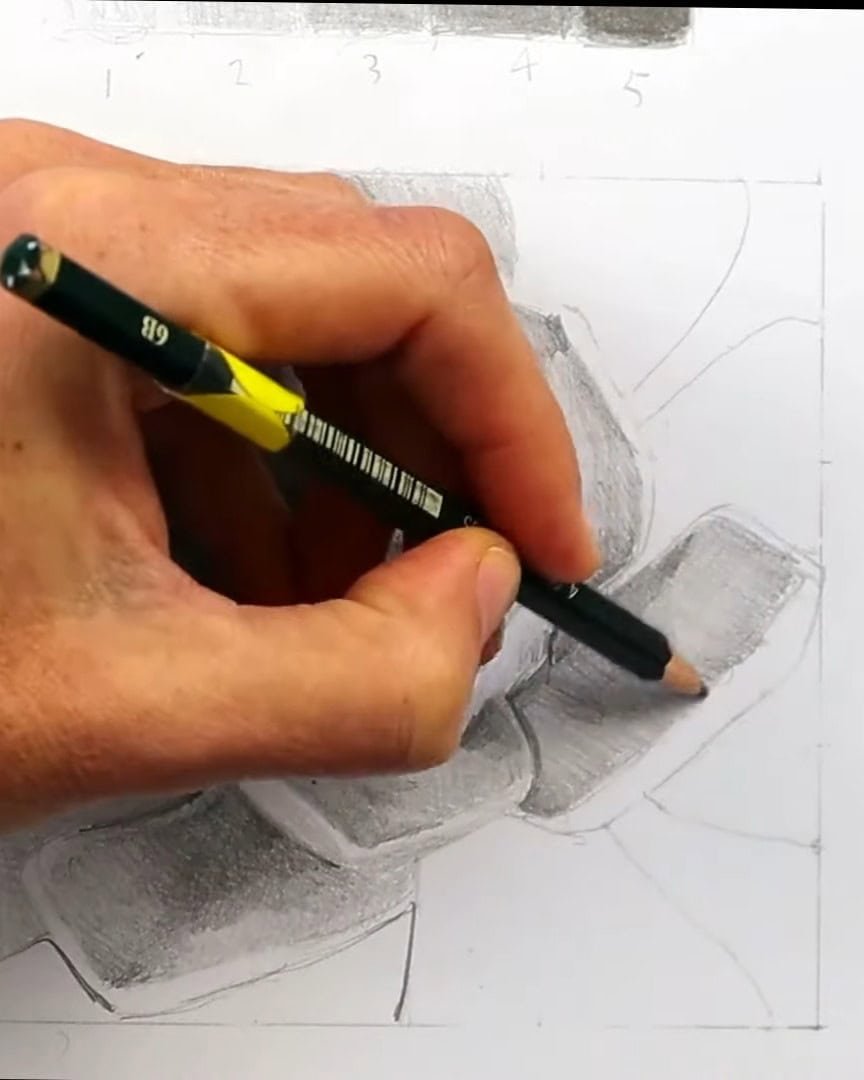
Step 3: Add the Darkest Values and Shadows
Now that the midtones are in place, I move on to the darkest areas. This is where the real contrast begins to show.
I repeat the same process, but now focus only on the darkest values. I try to see them as big blocks of shape. These include dark greys, even darker greys, and pure black.
Basically, I group everything darker than middle grey. The drawing starts to pop once I finish shading in the white, mid-tones, and dark shapes. This is when I begin to see true depth in the paper.
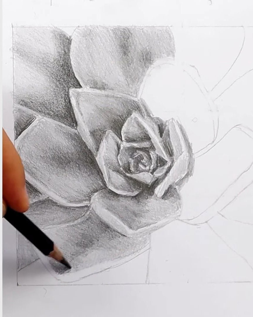
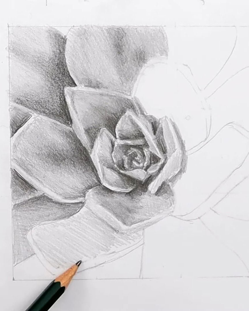
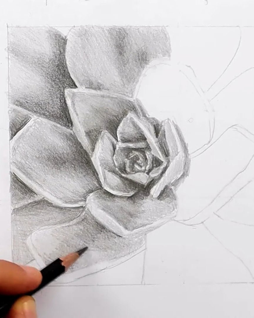
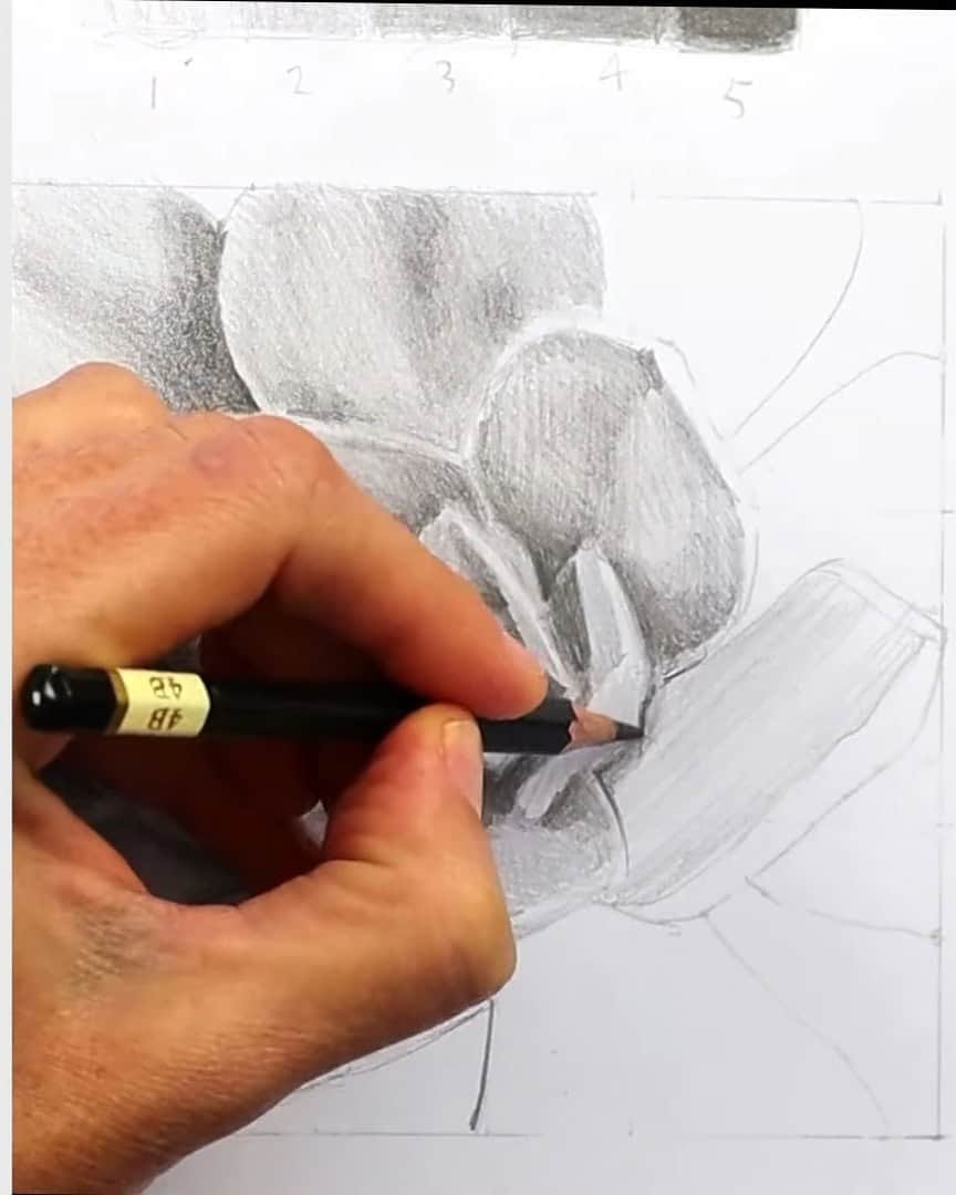
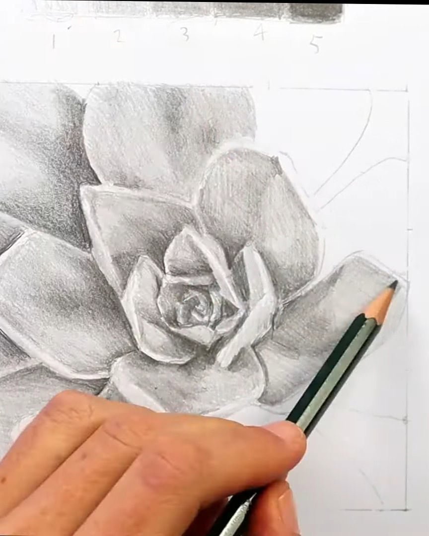
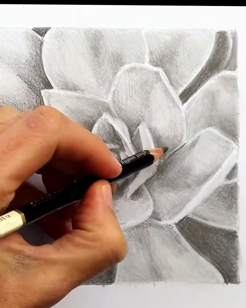
Step 4: Finalizing with Subtle Values
Now that the highlights, midtones, and shadows are in the right places, I start refining the subtle values in between. This is where the drawing truly begins to look realistic.
Some areas are light, but not as light as the highlight. Others are dark but not quite as dark as the shadows. I look for those in-between tones that help the drawing transition smoothly.
I aim for five to seven values in total. Sometimes, I even notice more as I keep observing the photo. The more I look, the more subtle changes I start to see.
Pro Tips for Smooth, Realistic Shading
Before I finish a drawing, I always check key things to ensure my shading looks soft, smooth, and real. These tips help bring out that 3D effect.
Here are the shading tips I always follow:
- I make sure my highlights, midtones, and darks are in the right places. That balance is what makes the drawing look real.
- I avoid dark outlines. If I draw too dark, too early, I end up with bold lines around everything, which ruins the soft edges I want.
- I stay patient. Shading takes time. If I rush, I get uneven or wrong values, and the drawing feels flat.
- I slowly build up smooth layers. I always look at my reference photo to match what I see.
- I lean back often to check how the 3D effect is coming along. It helps me catch mistakes.
- I use a blending stump to smooth out the values. But only after I’ve done the shading correctly. I never depend on the stump to fix bad shading.
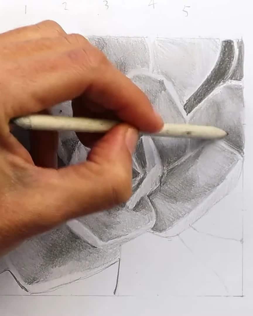
- At the end, I check my lights and darks. The full range—from the whitest whites to the darkest blacks—creates that realistic, three-dimensional look.
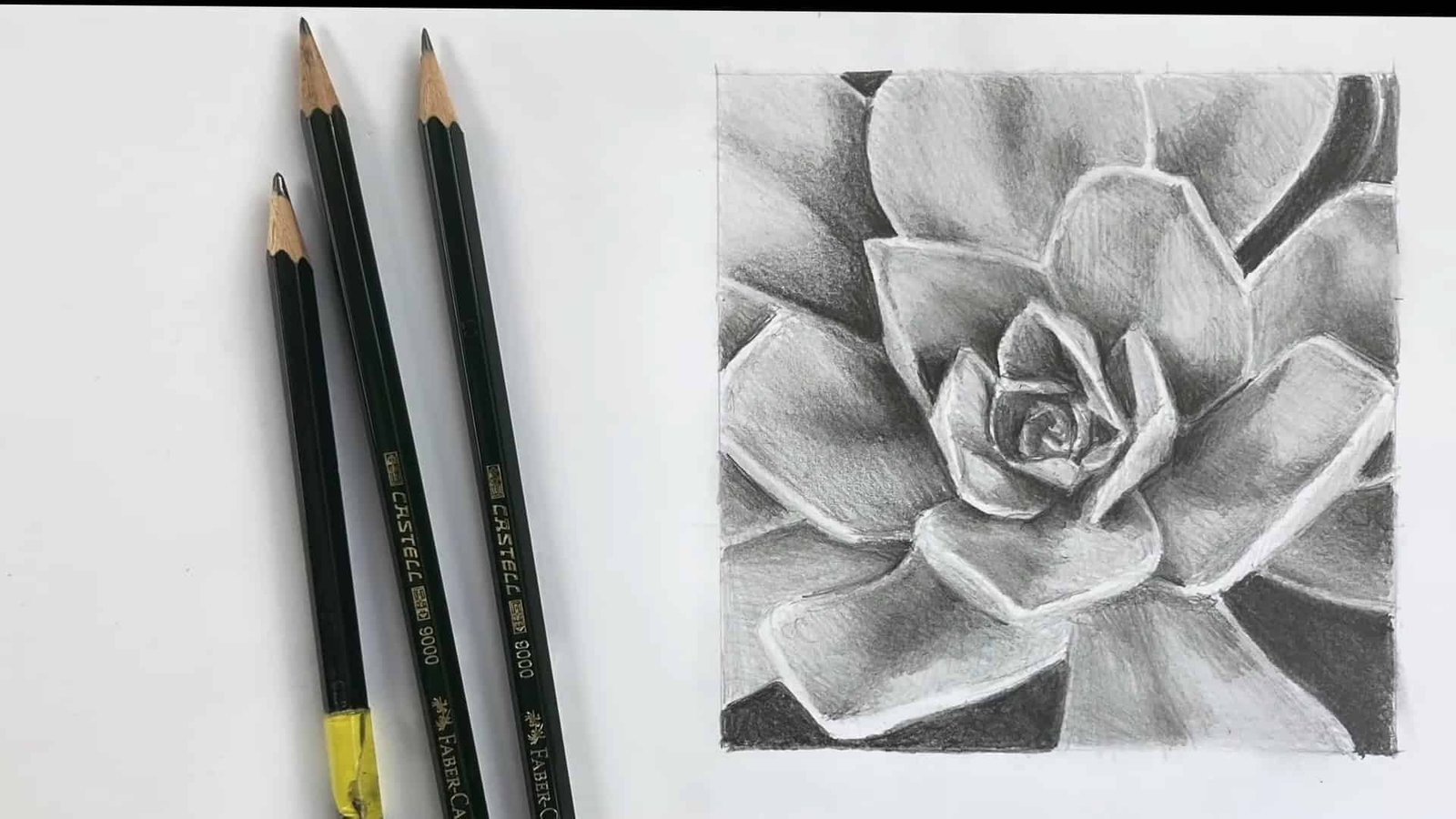
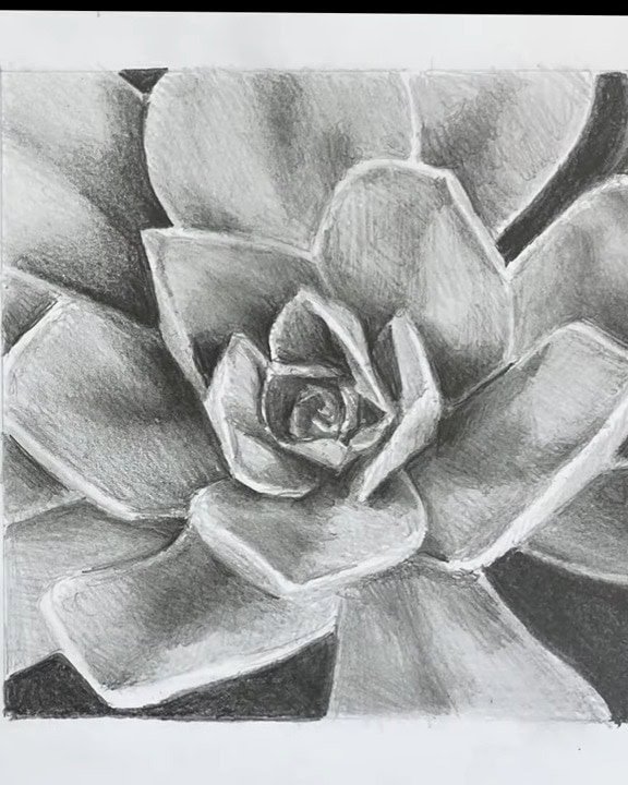
That’s four simple steps to shade your artwork with a graphite pencil. Let’s admire our final piece!
Wrapping Up
Shading a 3D effect with a graphite pencil takes patience, but the result is worth it. Following these four straightforward steps can bring flat sketches to life.
Why not grab your pencil and try it now? The more you practice, the more natural the shading will feel and the better your drawings look.