
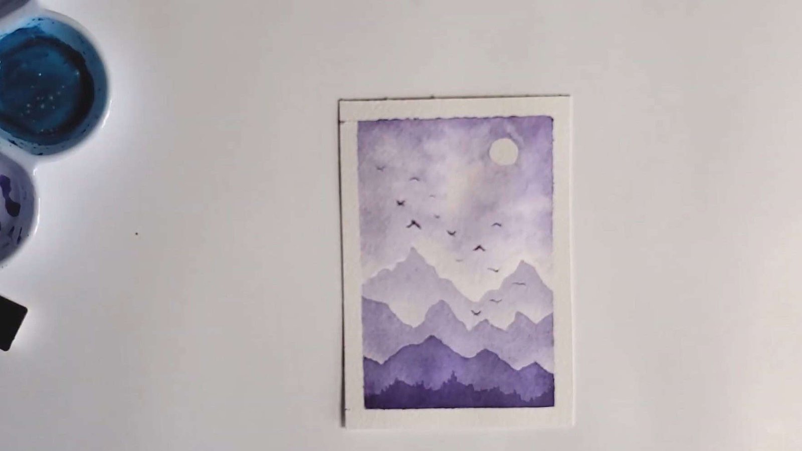
What if you could create a beautiful watercolor painting using just one color? Miranda Balogh Art loves working this way because it allows her to focus on light, shadow, and texture without getting overwhelmed by too many colors.
In this step-by-step guide, Miranda Balogh Art will show you how she builds a stunning monochrome landscape from start to finish.
Let’s dive in together!
Contents
- 1 Step 1: Start with a Value Scale
- 2 Step 2: Painting the First Mountain Layer
- 3 Step 3: Adding the Second Mountain Layer
- 4 Step 4: Painting the Foreground Mountain Layer
- 5 Step 5: Painting a Whimsical Sky with One Color
- 6 Step 6: Final Mountain Range and Tree Details
- 7 Step 7: Final Sky Touch-Ups
- 8 Step 8: Paint the Birds
- 9 Step 9: Finishing Touch – Removing the Tape
- 10 Wrapping Up
Step 1: Start with a Value Scale
Before the painting begins, the artist always starts with a value scale. This simple but powerful tool helps control tonal values in a monochrome painting.
Why a Value Scale Matters
A monochromatic study is an excellent way to practice working with light and dark in watercolor. For this reason, the value scale is never skipped.
A value scale helps clarify:
- The lightest tones achievable with the chosen color
- The darkest values possible with full pigment
This becomes the reference for the entire painting. When only one color is used, it reveals how much tonal variation can be created from a single shade.
How the Value Scale Is Made
The artist divides the paper into seven equal boxes—enough space to show a complete range of tones.
Then
- Box 1 contains the lightest, most diluted version of the pigment.
- Each following box gradually increases in pigment concentration.
- Box 7 holds the darkest, most saturated form of the color.
This smooth shift from light to dark provides a clear understanding of the tonal range available for the painting.
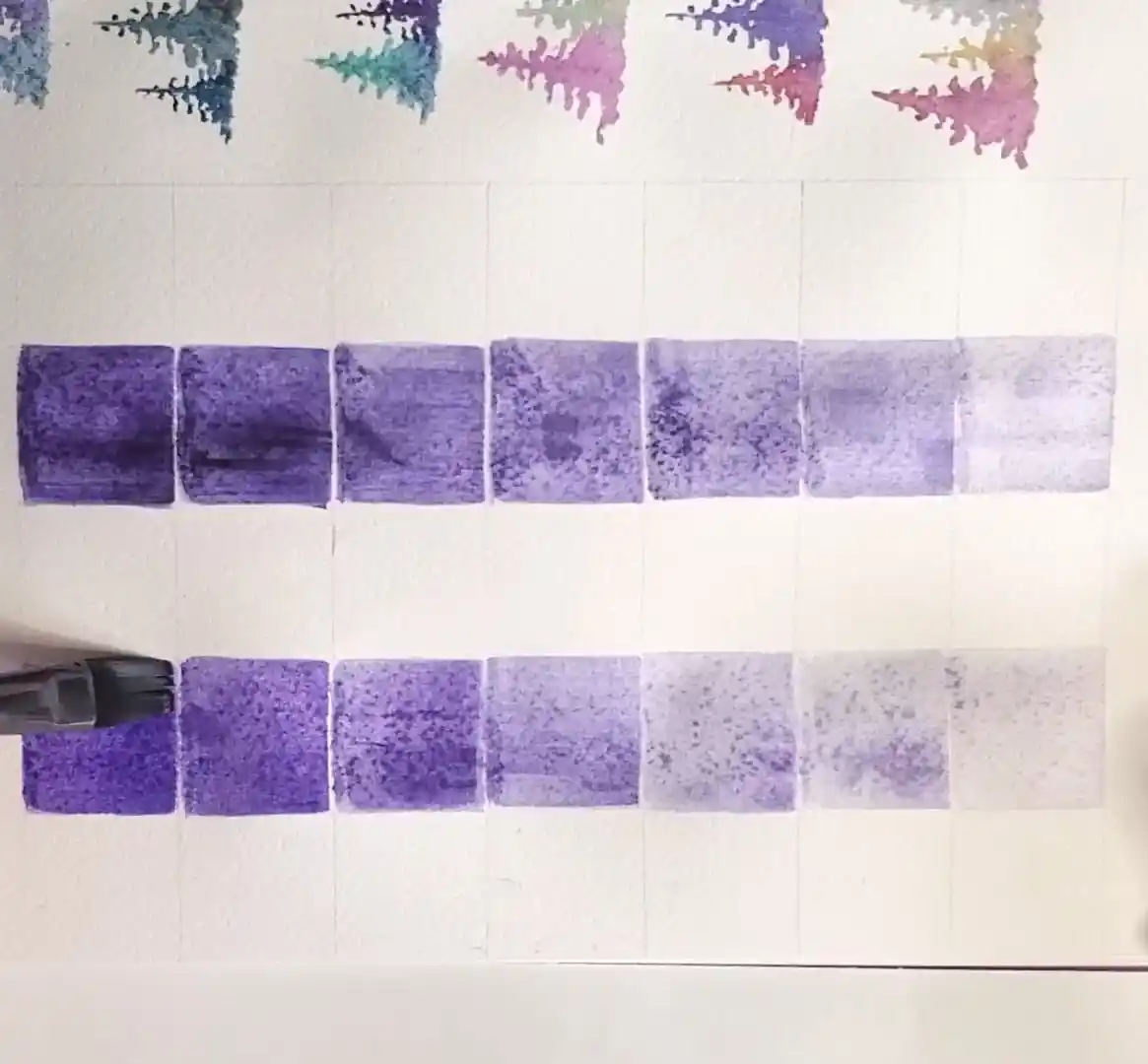
And just like that, the value scale is done—simple but super helpful.
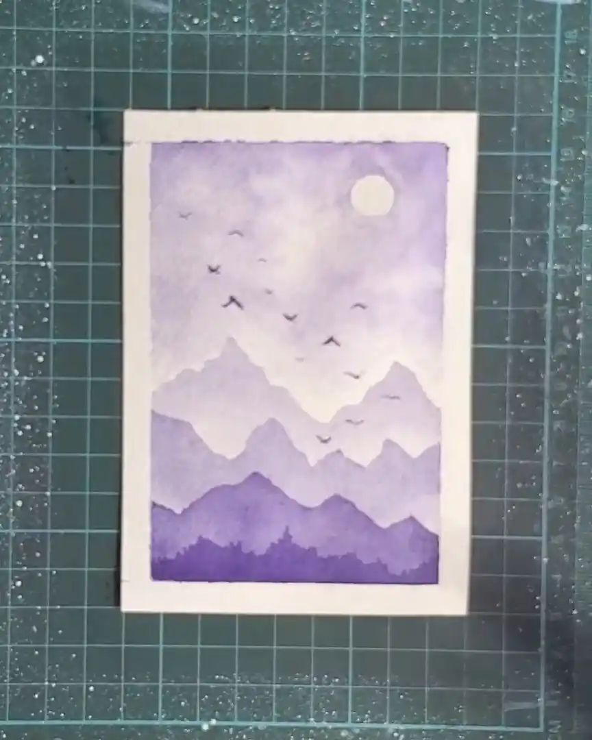
Step 2: Painting the First Mountain Layer
With the value scale ready, the painting begins with the lightest mountain layer, representing the background.
Use a Light Violet Wash to Sketch the Peaks
To begin, I dilute violet paint to its lightest tone. That’s the same light wash I used in the first box of the value scale.
A very diluted violet—matching the value in box 1 of the scale—is prepared.
With this pale wash:
- The outlines of the mountain peaks are drawn.
- Precision is not important; soft, simple shapes work best.
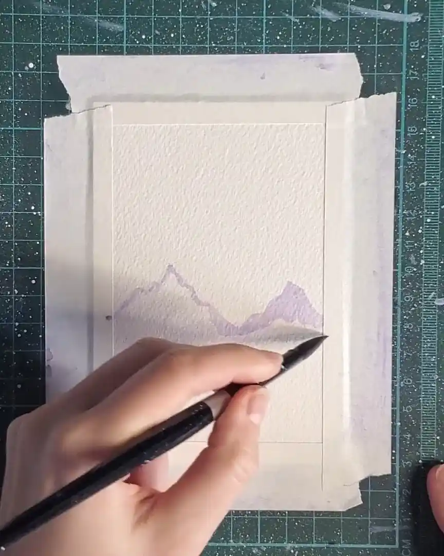
Fill and Blend the Mountains
Next:
- The mountain shapes are filled with the same light violet.
- A clean, damp brush gently blends the bottom edges of the pigment.
Blending like this helps me create that misty mountain look in the background. It makes the edges look soft and slightly faded, which gives depth.
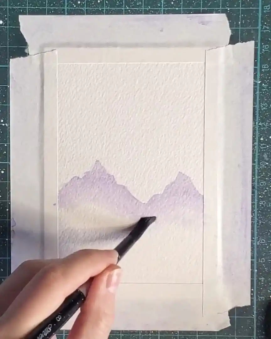
Add Depth to the Mountain Peaks
Once blended, slightly more violet is added to the brush to darken the tips of the peaks.
This produces a gentle gradient from darker tips to lighter bases, enhancing the airy, far-away feeling.
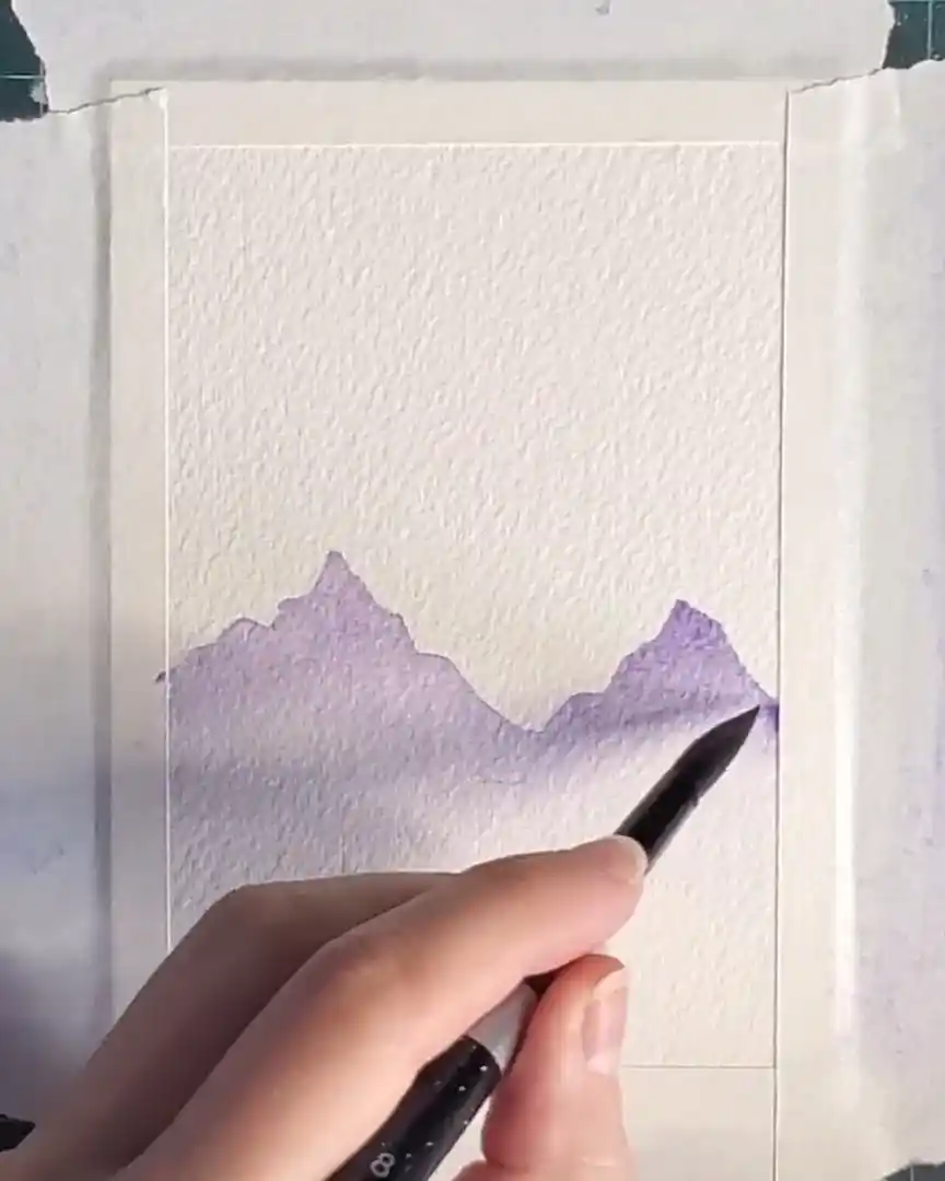
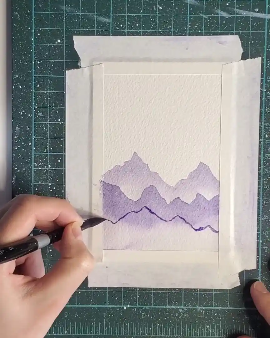
Step 3: Adding the Second Mountain Layer
Now the next layer of mountains is added. These are closer to the viewer, so they must appear slightly darker.
Mix a Darker Violet Tone
First, more violet pigment is added to the mixing well. Just a small amount deepens the tone. This adjustment reflects how elements in the foreground generally appear darker than those in the distance, helping build depth within the painting.
Repeat the Same Technique
The wet-on-dry technique is used again:
- The outline of the second set of mountain peaks is painted.
- The shapes are then filled using the darker violet mixture.
Once the shapes are filled, a clean, damp brush is used to softly blend the bottom edges, keeping the misty, atmospheric appearance.
Darken the Mountain Tops
As a final touch, additional pigment is applied to the tops of these new mountains.
The layer is then allowed to dry completely before continuing.
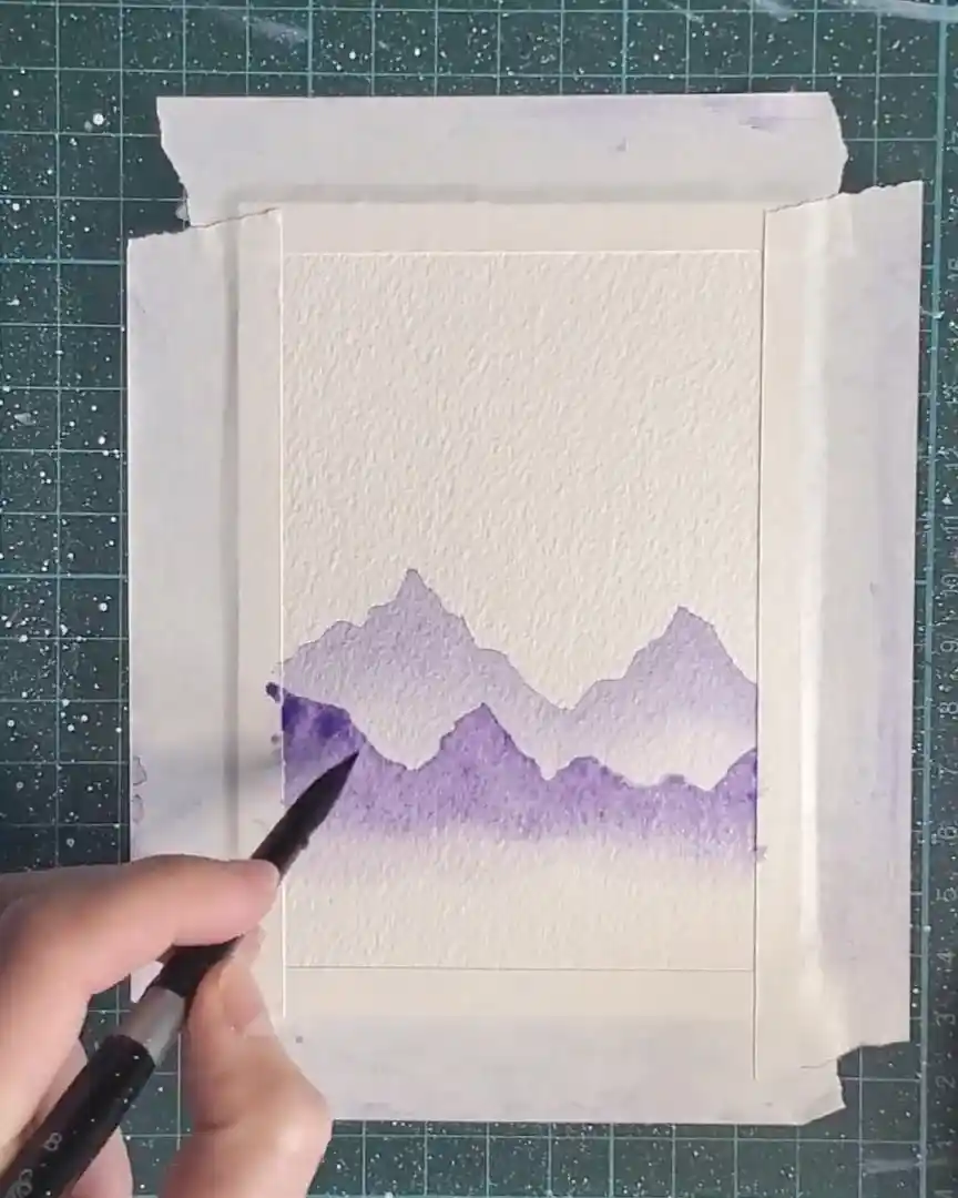
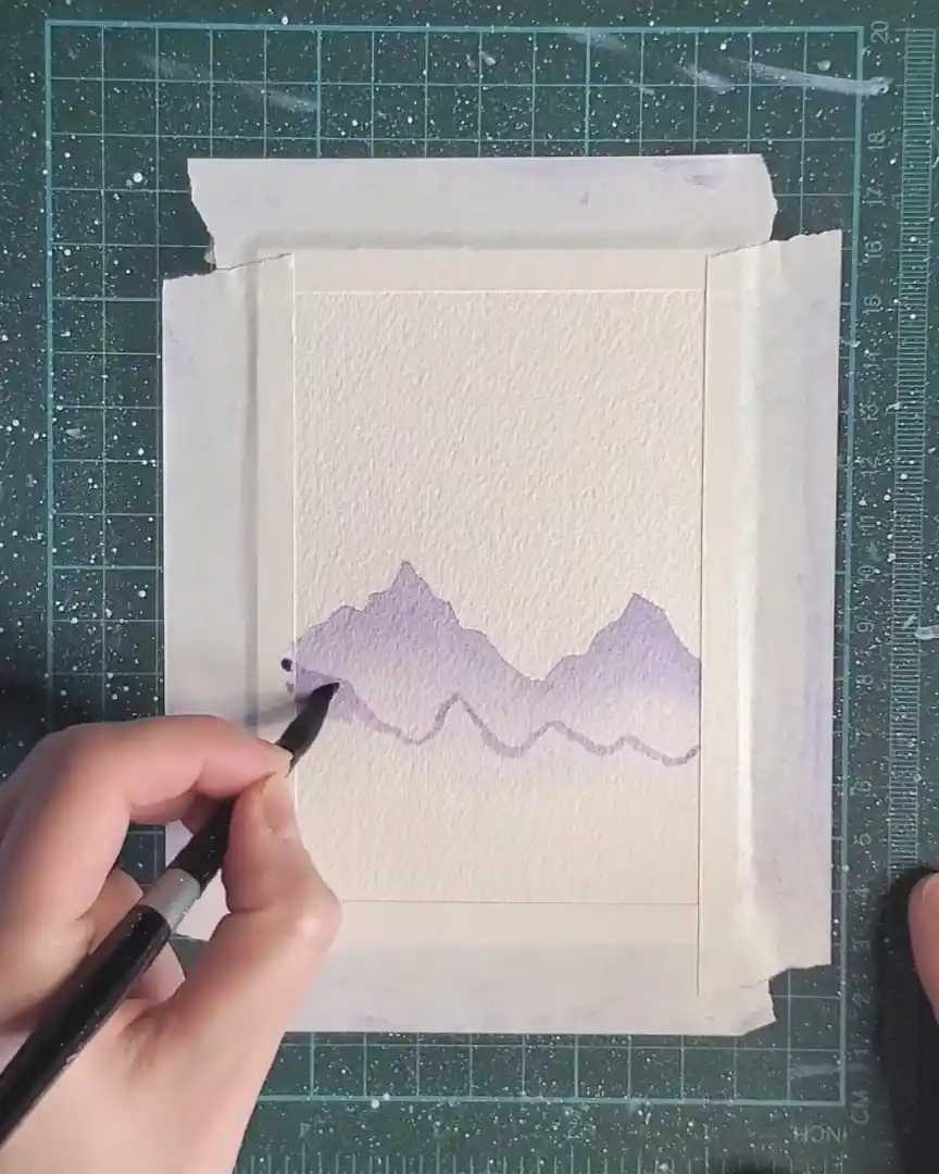
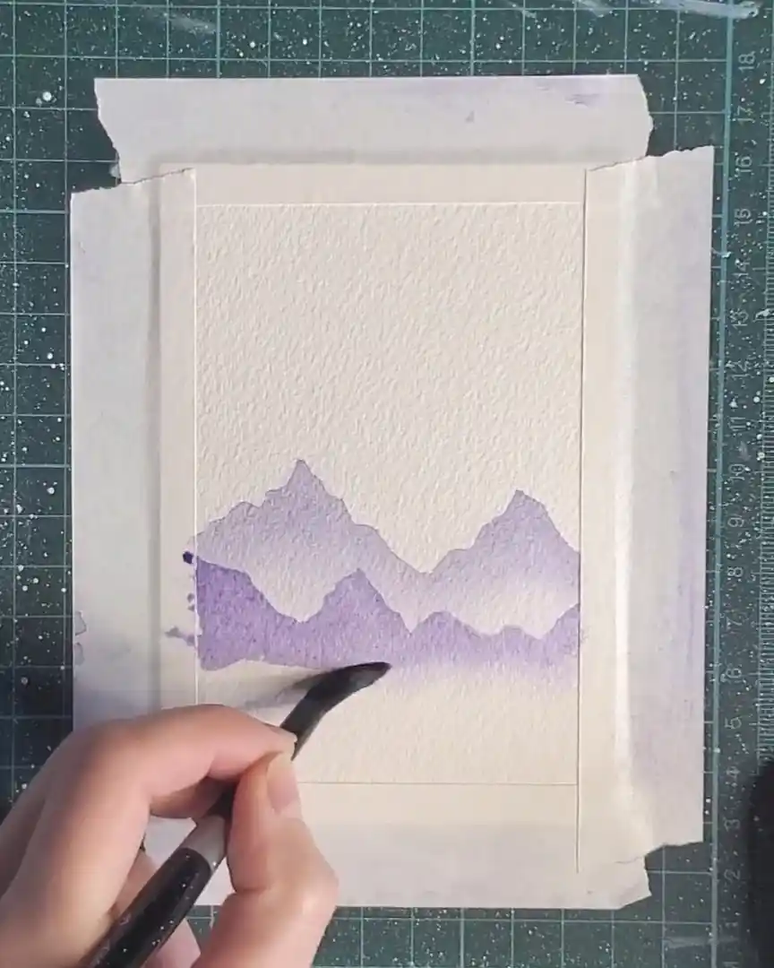
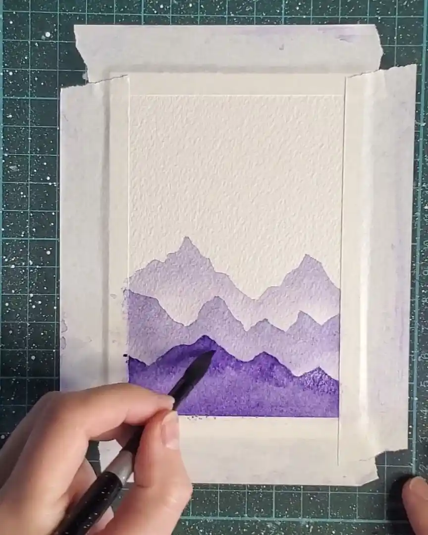
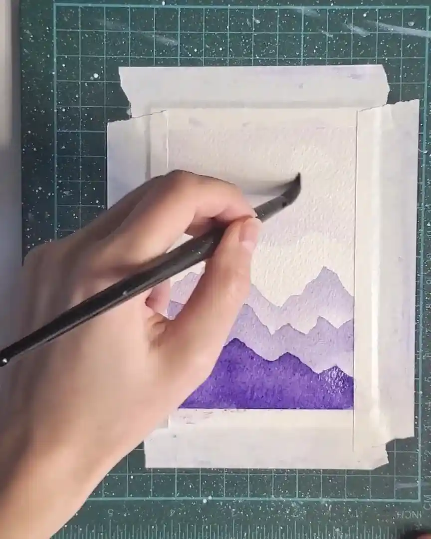
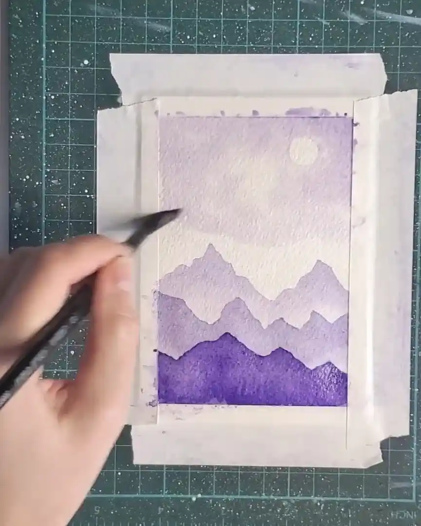
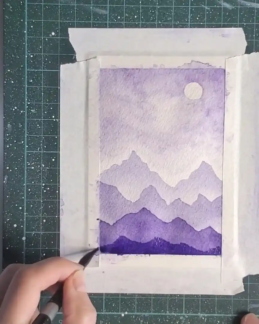
Step 4: Painting the Foreground Mountain Layer
With two layers already built for depth, the foreground mountains are added next. This layer must appear the darkest since it sits closest to the viewer.
Mix the Darkest Violet Tone
More violet pigment is added to the mixing well, creating the deepest shade yet—ideal for this final mountain layer.
Fill in with a Solid Color
The mountain peaks are drawn, then the entire shape is filled with the deep violet tone.
No blending is used here; the goal is a solid, even silhouette.
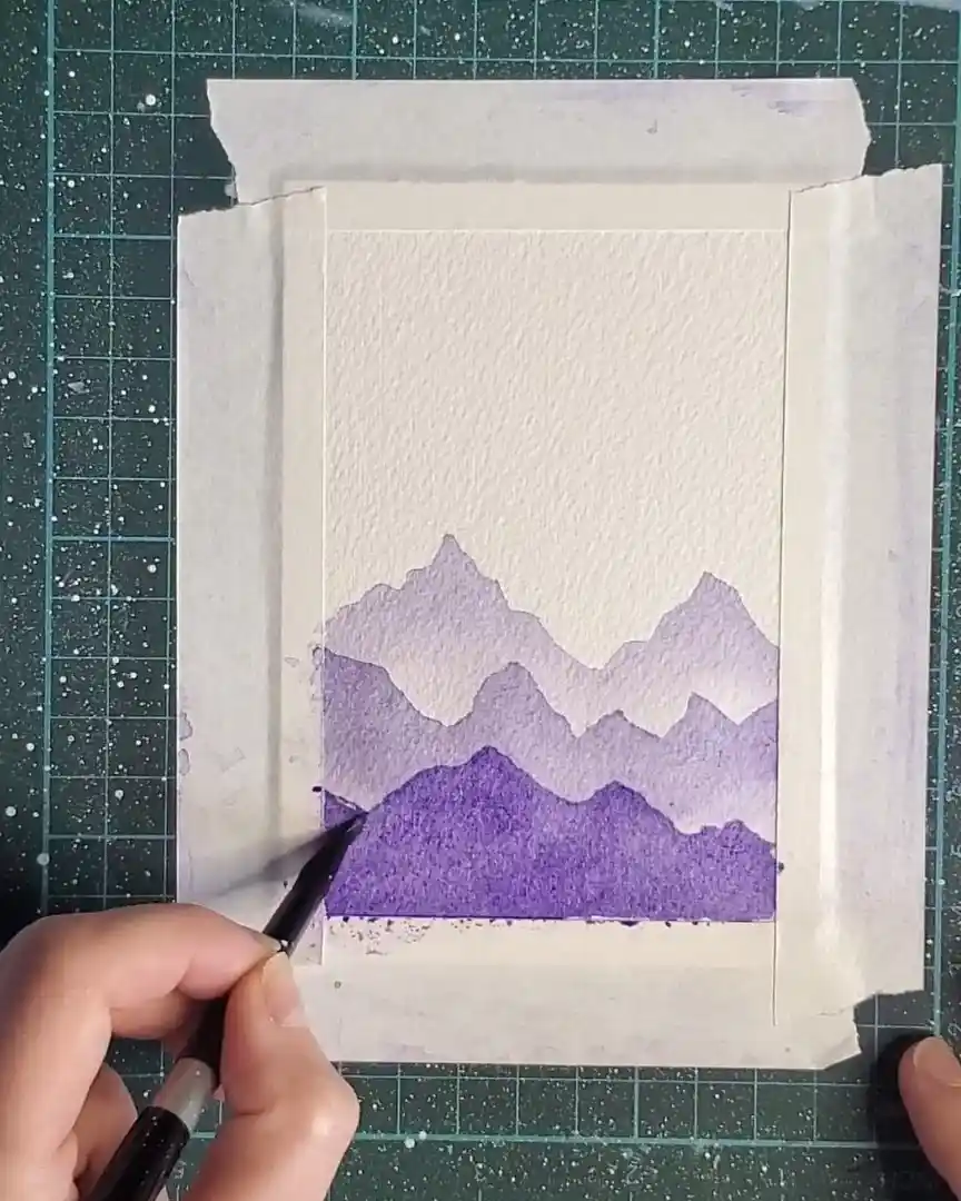
Add Contrast to the Peaks
To complete the layer, extra pigment is applied to the mountain tops.
This creates a smooth transition from darker peaks to mid-tones below.
Step 5: Painting a Whimsical Sky with One Color
The next stage focuses on the sky, kept playful and light by using only one color to create a dreamy, animated effect.
Start with Water and Light Violet Wash
The top portion of the sky is first moistened with clean water. Gentle circular motions are made in the area where sunlight is intended to peek through the clouds.
A very diluted violet wash is then dabbed softly across the sky. The intention here is not realism but rather a whimsical, delicate atmosphere—something dreamy and animated while still maintaining softness.
Use Tissue to Lift Color for Sunlight
A dry, scrunched-up tissue is used to lift color from selected spots, creating soft, sunlit openings in the clouds.

Light touches of violet are placed randomly throughout the sky. A clean, damp brush is gently dabbed near the tops of the mountains to prevent the clouds and mountains—both similar in color—from blending into each other. This preserves a crisp mountain edge.
Add Depth with Extra Pigment
More violet is dabbed into the top corners of the sky to increase depth and variation.
Additional pigment is placed in cloud areas that need extra contrast, enhancing shape without darkening the entire sky. Once the balance looks right, the sky is left to dry.
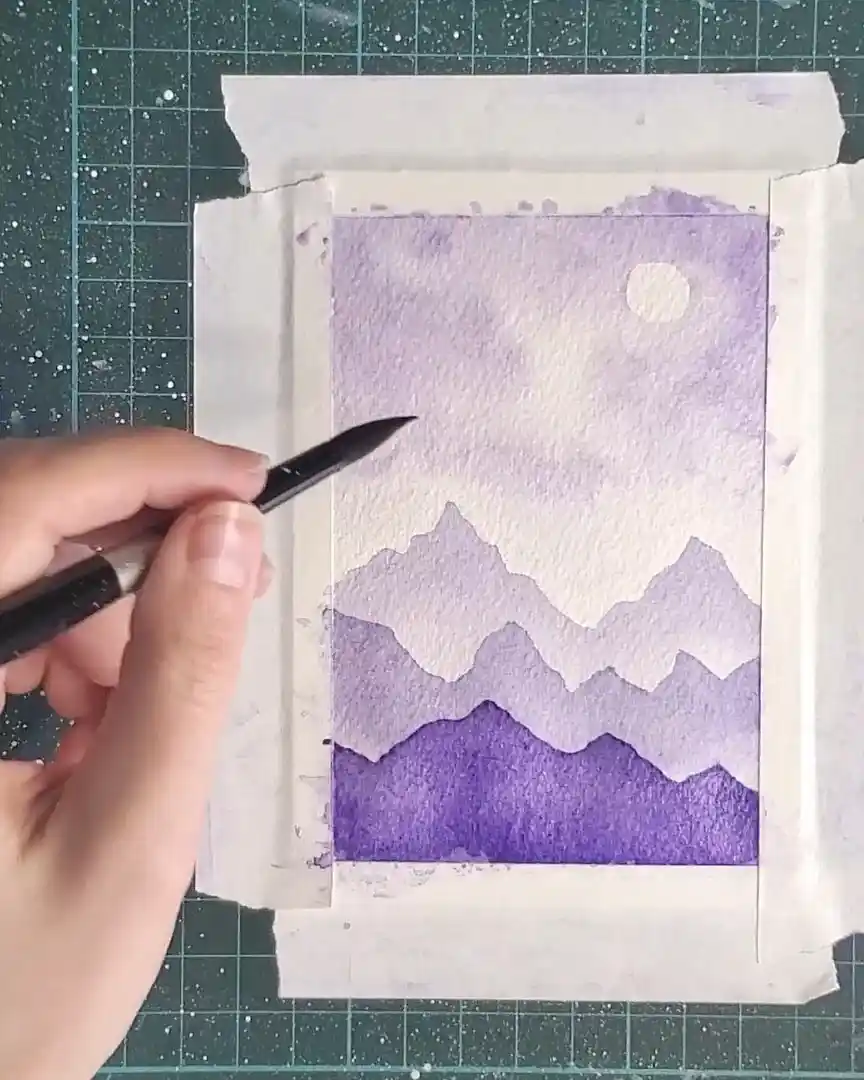
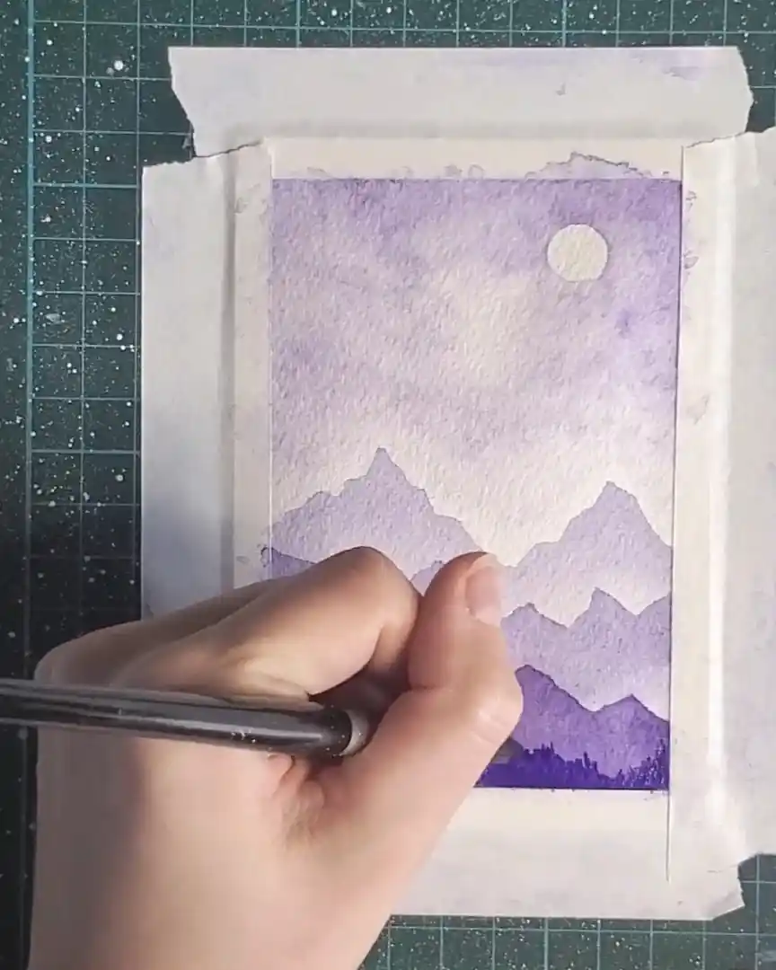
Step 6: Final Mountain Range and Tree Details
The last and closest mountain range is added next. The mixing well is loaded with a stronger violet to create the darkest layer. The mountain shape is painted with a rich, bold tone.
Simple, thin strokes are then used to suggest distant trees—just enough to imply texture without overwhelming the scene.
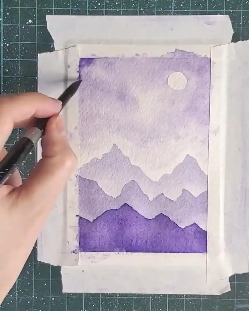
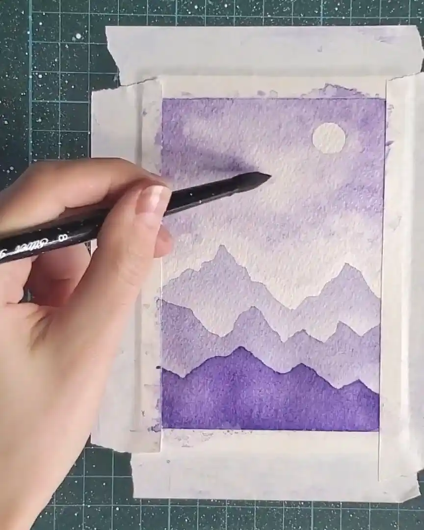
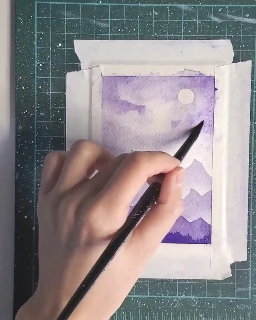
Step 7: Final Sky Touch-Ups
Before finishing, more pigment is added to selected parts of the sky to deepen tonal values and enhance contrast.
Adjustments continue until the cloud texture appears balanced and appealing. The painting is then allowed to dry fully.
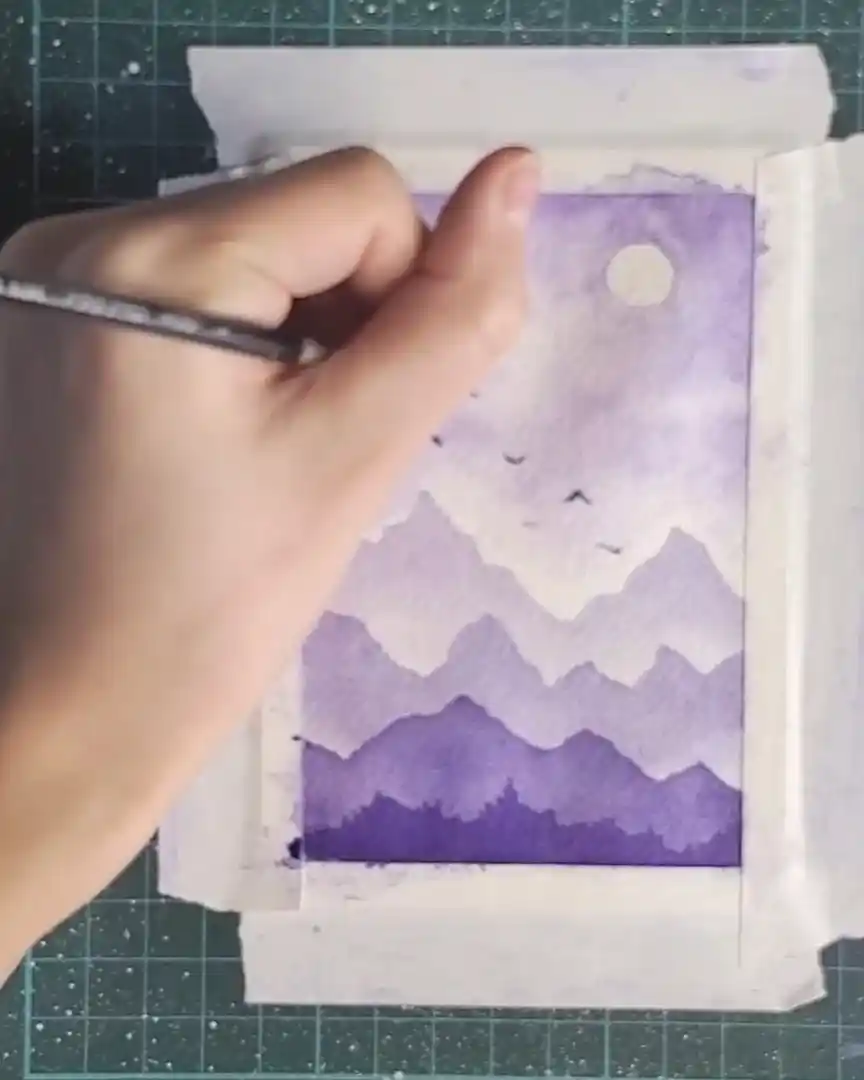
Step 8: Paint the Birds
Once the sky and mountains are complete, small birds are added as the final illustrative element. The brush bristles are dipped directly into concentrated pigment to achieve a rich, dark tone, ensuring the birds stand out clearly.
Quick flicks of the brush form simple “V” or occasionally “X” shapes, mimicking natural wing movement. The birds are placed randomly across the sky to create an organic, free-flowing flock.
Variation in size and darkness helps establish depth—larger, darker birds appear closer, while smaller, lighter ones recede into the distance.
Step 9: Finishing Touch – Removing the Tape
With the painting complete, the tape is slowly peeled back at a low angle, one side at a time, revealing clean edges and the final artwork. It’s such a satisfying final step!
Wrapping Up
Creating a monochromatic watercolor landscape offers a simple yet rewarding way to explore tonal values. Layering light-to-dark violets and adding small, thoughtful details brings depth and life to the composition.
This step-by-step approach highlights how much beauty can emerge from a single color. It’s an invitation to keep experimenting and enjoy the meditative process of painting.