
Why is there white watercolor paint in so many sets when it feels completely useless? Sandy Own Crafts has asked this question countless times whenever that untouched white pan shows up in a palette.
For the longest time, she believed white had no real place in traditional watercolor painting. But recently, she gave it another try—and now she’s not so sure.
In this post, Sandy Own Crafts reviews the pros and cons to find out whether white watercolor paint truly deserves a spot in your workflow.
Contents
- 1 Why White in Watercolor Seems Unnecessary (At First)
- 2 Use Case 1: Creating Pastel Colors
- 3 Use Case 2: Comparing White vs Water to Change Value
- 4 Use Case 3: Creating a Flat, Matte Wash
- 5 Use Case 4: Soft Highlights and Light Shadows
- 6 Use Case 5: Fixing Mistakes and Missed Highlights
- 7 Use Case 6: Adding Texture and Detail
- 8 Use Case 7: Creating Visual Effects in Abstract Work
- 9 Use Case 8: Perfecting Splattering Techniques
- 10 Wrapping Up
Why White in Watercolor Seems Unnecessary (At First)
The artist has to admit, the artist is completely anti-white when it comes to watercolor paint. Whenever the artist opens a new palette and sees a white pan, annoyance shows up immediately. It feels like a waste of space, especially in a small set.
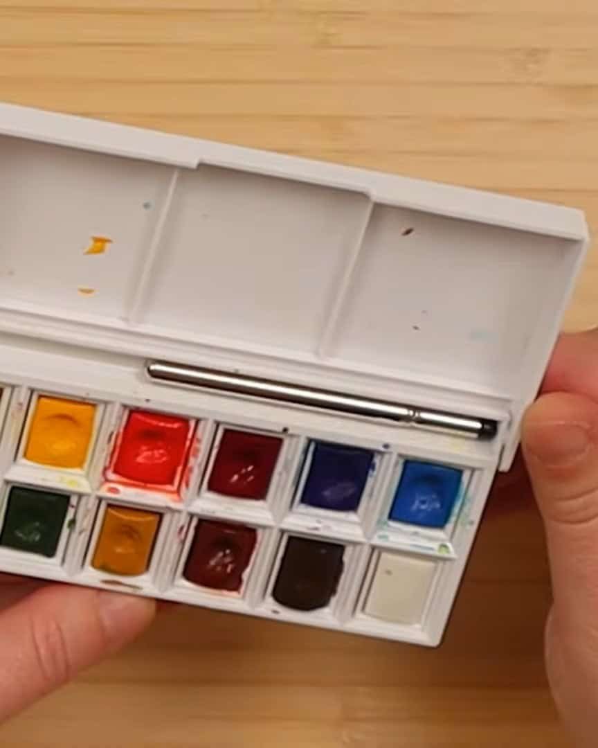
Imagine someone buying a 12-pan watercolor set from a well-known brand. The buyer is excited because it is known that almost any color can be mixed from these pans.
Then the set is opened, and one of the pans is white. It seems odd, right?
Here’s why the artist thinks white paint in watercolor sets isn’t necessary:
-
White isn’t needed to make colors lighter. Unlike acrylic or oil, watercolor lightens with water.
-
White paint isn’t used to create white space. Instead, the artist leaves the paper blank, uses masking tape, or lifts paint with a brush.
- Watercolors work from light to dark because of their transparency. Adding white paint on top of colors rarely looks clean or bright.
- Having white means losing space for another useful color in a small set.
That said, many experienced artists disagree. They tell the artist that white paint has potential in watercolor.

So, the artist decided to test it out. This exploration demonstrates how white paint works in watercolor beyond just leaving white spaces. Now, let’s dig deeper and see what the artist discovered.
Use Case 1: Creating Pastel Colors
The most obvious reason to use white watercolor paint is making pastel shades. This is where white starts to shine.
When the artist mixes white with red, a soft pastel pink appears. White doesn’t just lighten the color — it also increases opacity.
That’s why most pastel colors look more solid and less transparent.
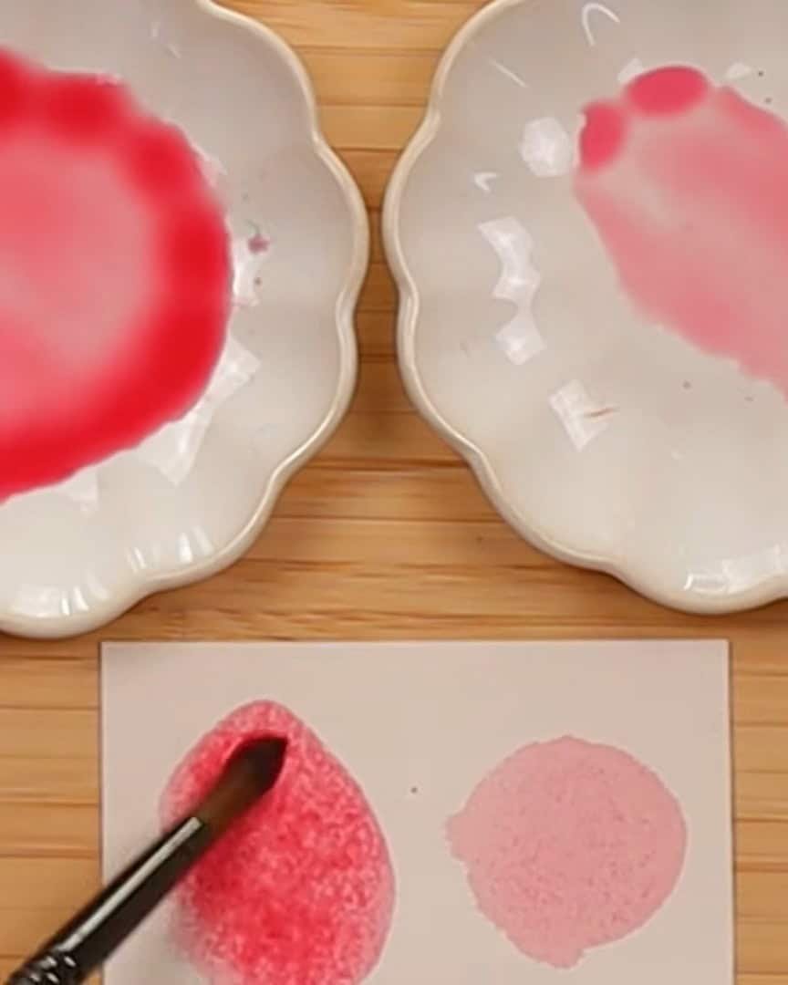
Opaque watercolors often have a chalky finish, but the artist enjoys the pastel look. These pastel mixtures are called “candy colors” by the artist. They resemble shades found in the Kuretake Gansai Tambi Art Nouveau set.
It’s one of the artist’s favorite sets to use.
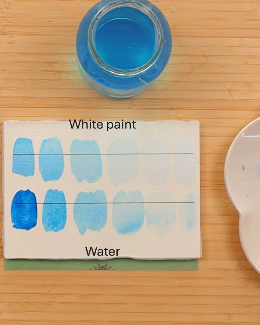
Use Case 2: Comparing White vs Water to Change Value
Value changes significantly depending on the method, so the artist compares white paint and water.
Not all white watercolor paints are the same. The pigment, titanium dioxide, is semi-opaque — very different from simply adding water to lighten a color.
Some artists even argue that white watercolor paint behaves more like gouache because of its opacity.
Here are the main types of white the artist tested:
- Titanium white: very opaque
- China white: less opaque with a blue tint
- Zinc white: very transparent
Each one gives a different effect when adjusting the value.
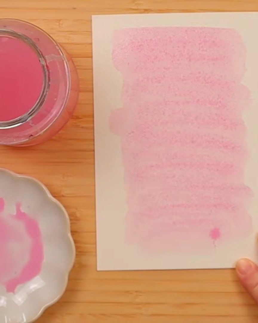
Use Case 3: Creating a Flat, Matte Wash
Another technique explored by the artist involves using white watercolor paint to achieve a matte finish.
Since white is usually more opaque, mixing it with other pigments creates a solid, even wash. No gradients. No natural watercolor fading. Just a smooth, flat color similar to acrylic.
Sometimes the artist wants a solid background with no value variation. White helps achieve that effect.
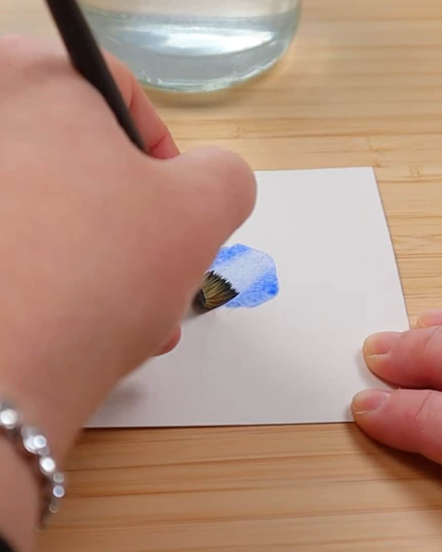
Use Case 4: Soft Highlights and Light Shadows
This is one of the more surprising uses of white watercolor paint. The artist sometimes calls it adding a “white shadow,” especially on cellulose paper.
Watercolor paint cannot behave like acrylic. Painting white on top of a dark color never results in a clean white.
The rule remains: always go from light to dark.
When the artist adds white on top of another color, it creates a soft, grayish blend — not pure white.
But sometimes, that softness is exactly what is needed.
For example:
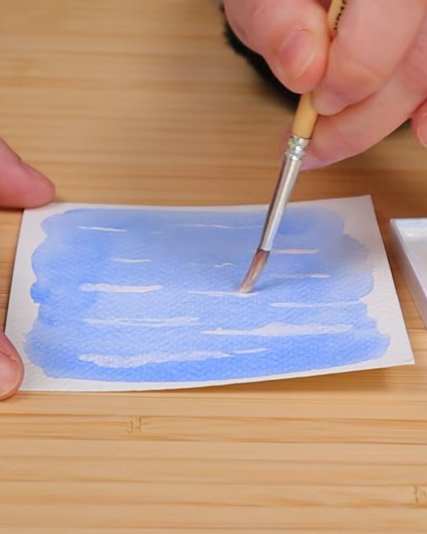
- Adding soft cloudy texture to a blue sky
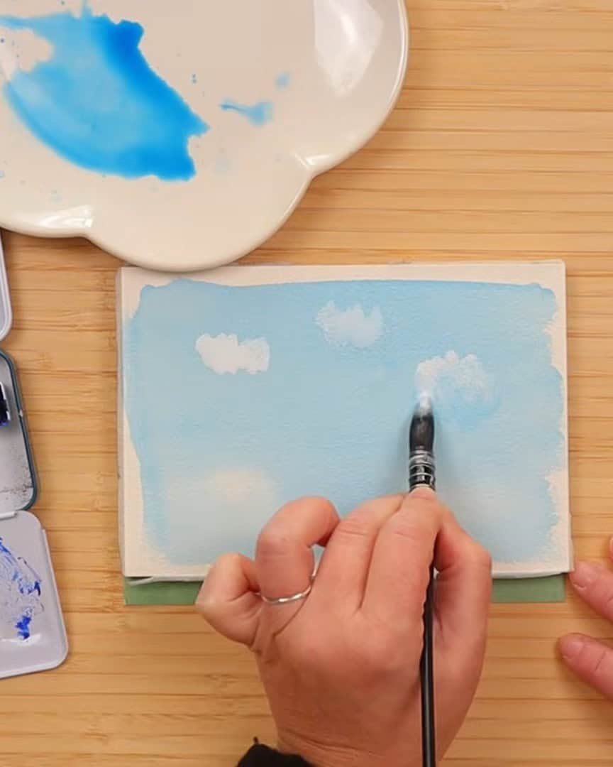
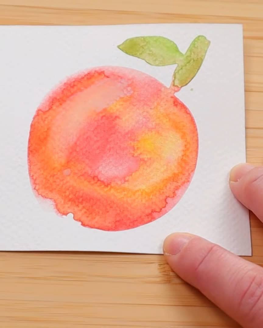
- Adding a gentle highlight to an apple
The artist has to be super careful when attempting to lift color with a paper towel. If the lifting isn’t done properly, the result becomes too harsh. And when the artist works on cheaper cellulose paper, lifting paint isn’t the best idea.
That kind of paper can start breaking down fast.
So instead, the artist lets the paint dry completely. Then the artist comes back in and gently adds a bit of white. It won’t look crisp white, but it gives that light, soft highlight or cloudy shape the artist is aiming for.
This is a great way to make the most out of a tricky situation and still achieve the desired effect.
Use Case 5: Fixing Mistakes and Missed Highlights
We all make mistakes. And sometimes the artist forgets to leave white spaces while painting. When that happens, white paint becomes the artist’s little rescue tool.
Even though it doesn’t give a perfect white on top of the color, it still lightens the area enough to fix the problem. And in some cases, it helps smooth out highlights without lifting the paint.
It’s a gentle correction method—not perfect, but it’s better than starting over.
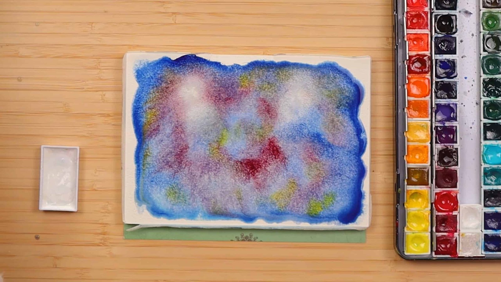
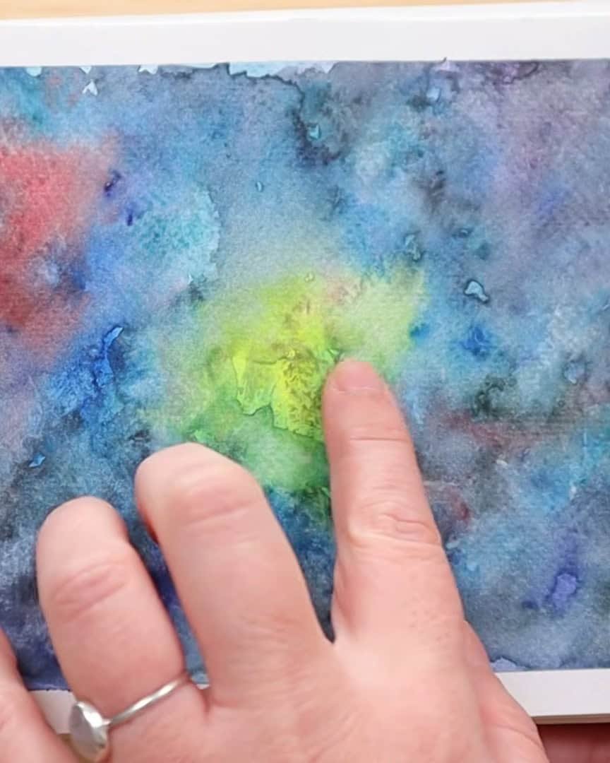
White watercolor paint is fun when playing with galaxies or abstract scenes. The artist painted a galaxy and wanted soft spots of brightness—different values, different textures.
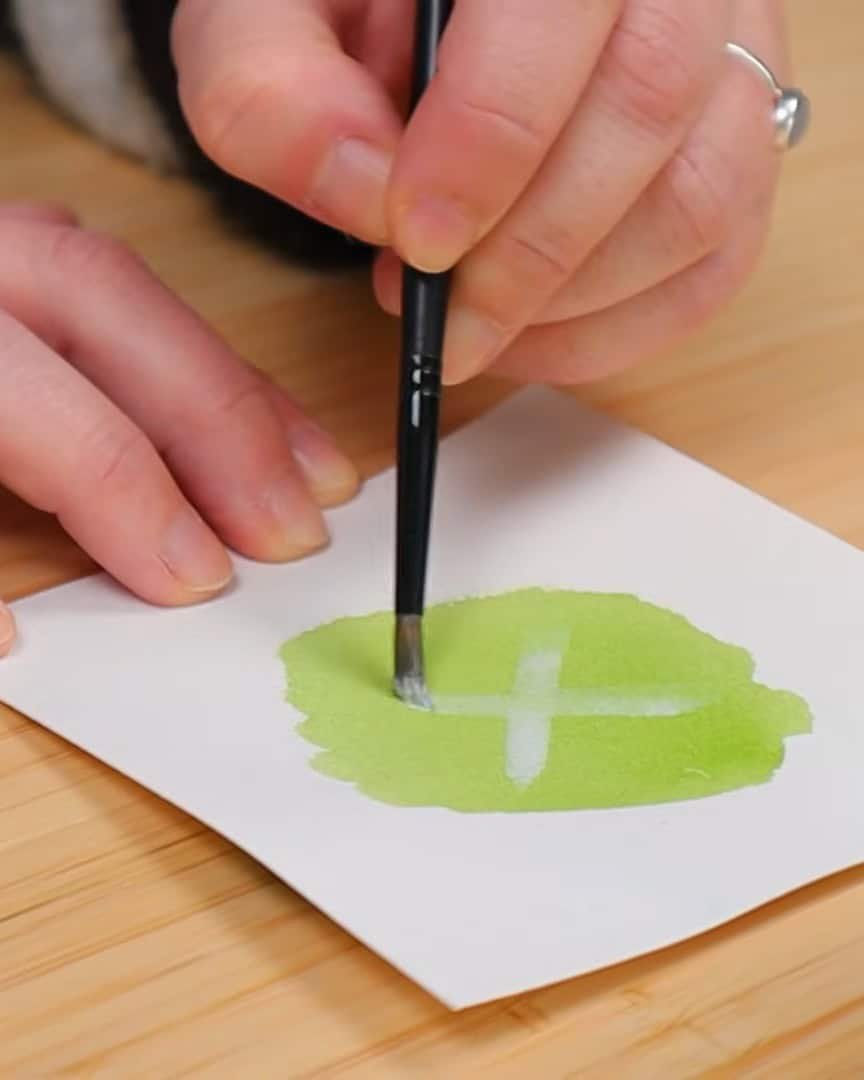
Use Case 6: Adding Texture and Detail
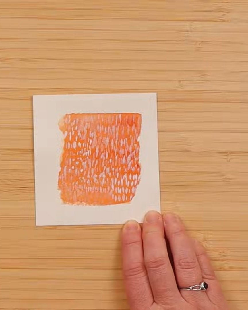
Here’s another cool trick. The artist uses white to create texture, especially when painting water or fur. For waves in the ocean, a few white brush strokes add motion.
The artist can add white strands on top for animals to show shine or softness. It’s not about covering. It’s about layering lightly to build more depth and interest.
Use Case 7: Creating Visual Effects in Abstract Work
The artist got an interesting look by letting the white bleed into the color. It wasn’t just a lighter version of a color—it had movement.
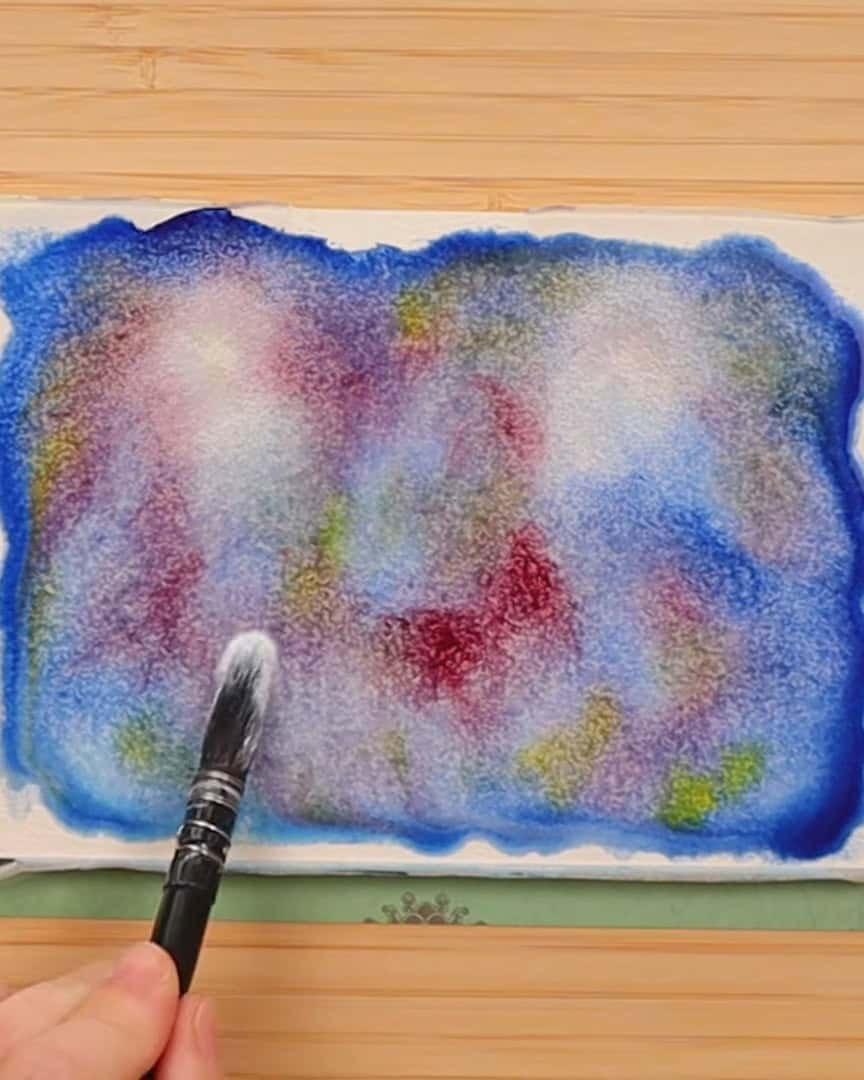
It created variation and helped the galaxy feel alive.
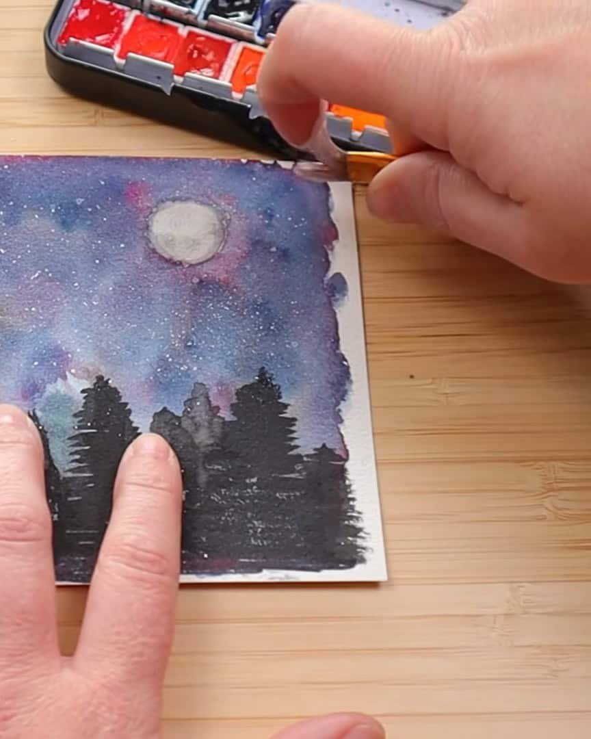
Use Case 8: Perfecting Splattering Techniques
Now, here’s one of the artist’s favorite ways to use white watercolor paint—splattering. The artist always reaches for it when painting night skies.
The artist has tried using gouache, acrylic, and even Posca pens. But for the artist, they look too white. Yes, too white is possible!
White watercolor gives a nice mix—some splatters are soft and faded, while others stay bright and sharp. That variation makes the stars look more natural.
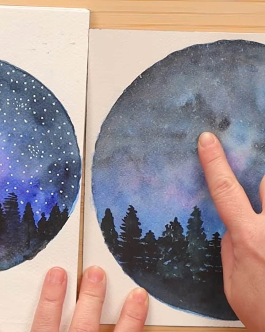
A quick tip: Always let the layers dry thoroughly before splattering. If the paint is wet, the white will bleed and disappear.
Wrapping Up
So, does the artist keep white paint on the palette? The artist is still not sure. The artist sees the value now. It’s useful, especially for effects, textures, or fixing mistakes. But in a small set with only 12 pans, the artist might still replace it with a color used more often.
What about you? Will you make space for white in your watercolor palette, or leave it out? Let the artist know what you think—the artist would love to hear your take!