
Visual hierarchy isn’t something I heard discussed often when I first learned painting, yet it quietly shapes how every painting is experienced.
Whether viewers are aware of it or not, their eyes are always being led. They land somewhere first, travel through the image along a certain path, and eventually settle. The hierarchy I create as a painter determines where the eye begins, how it moves, and how long it lingers in different areas.
Put simply, visual hierarchy is the structure of emphasis inside a painting. It’s the way I show what is most important — and what plays a supporting role — using purely visual decisions.
There are several tools that help build this structure. In this article, I’ll walk through the most important ones and explain how they work together.
Contents
Value: The Primary Driver of Attention
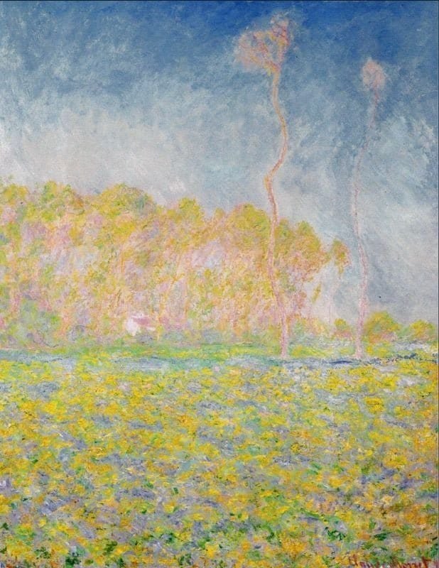
Value is the most immediate and powerful way to establish hierarchy.
Where contrast is strongest — light against dark or dark against light — visual tension is created, and the viewer’s attention naturally moves there first.
Areas with minimal contrast tend to fall back. The eye visits them later or moves through them more quietly.
That’s why value structure matters so much early in the process. Even before color or detail becomes clear, value alone determines whether a painting feels organized or visually chaotic.
When I reduce a painting to a few simplified value shapes, I’m essentially deciding how the viewer will experience it.
Color: Saturation as a Point of Emphasis
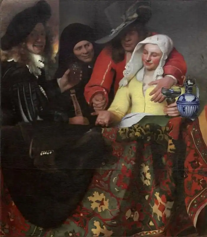
Color plays a strong role in hierarchy — though usually after value.
Highly saturated colors naturally come forward. Even a small area of vivid color can dominate if it’s surrounded by quieter, muted passages.
Meanwhile, neutral or subdued colors tend to recede, helping create atmosphere and giving the eye space to rest.
What I’ve learned is that color strength is always relative. A moderately bright color can feel powerful in a restrained painting, yet overwhelming if everything competes for attention.
Thoughtful use of saturation allows color to support the value structure rather than fight against it.
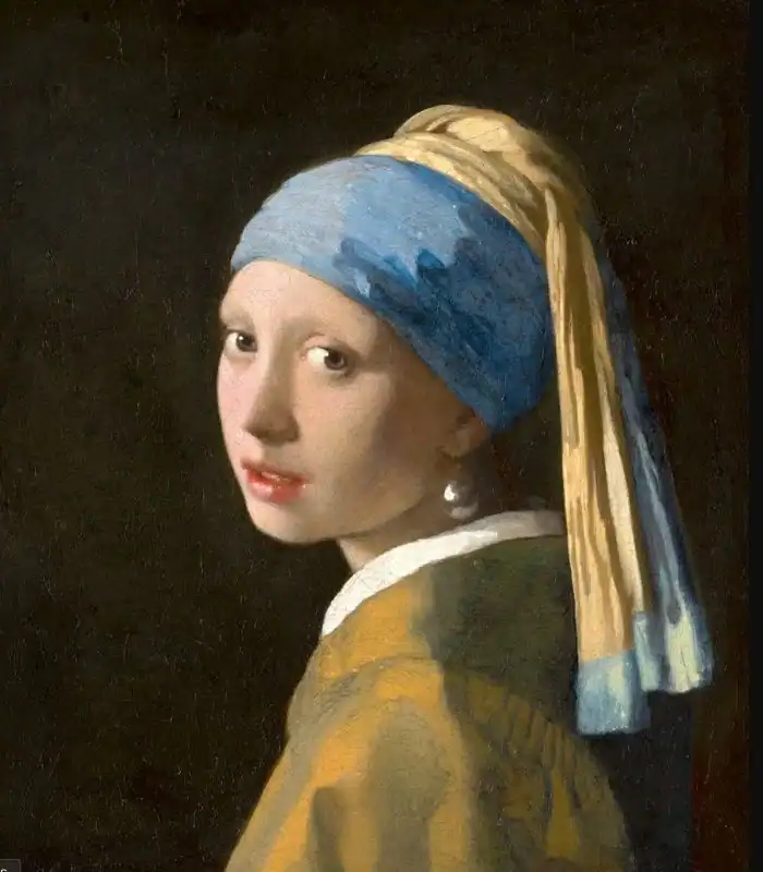
Edges: Clarity Versus Softness
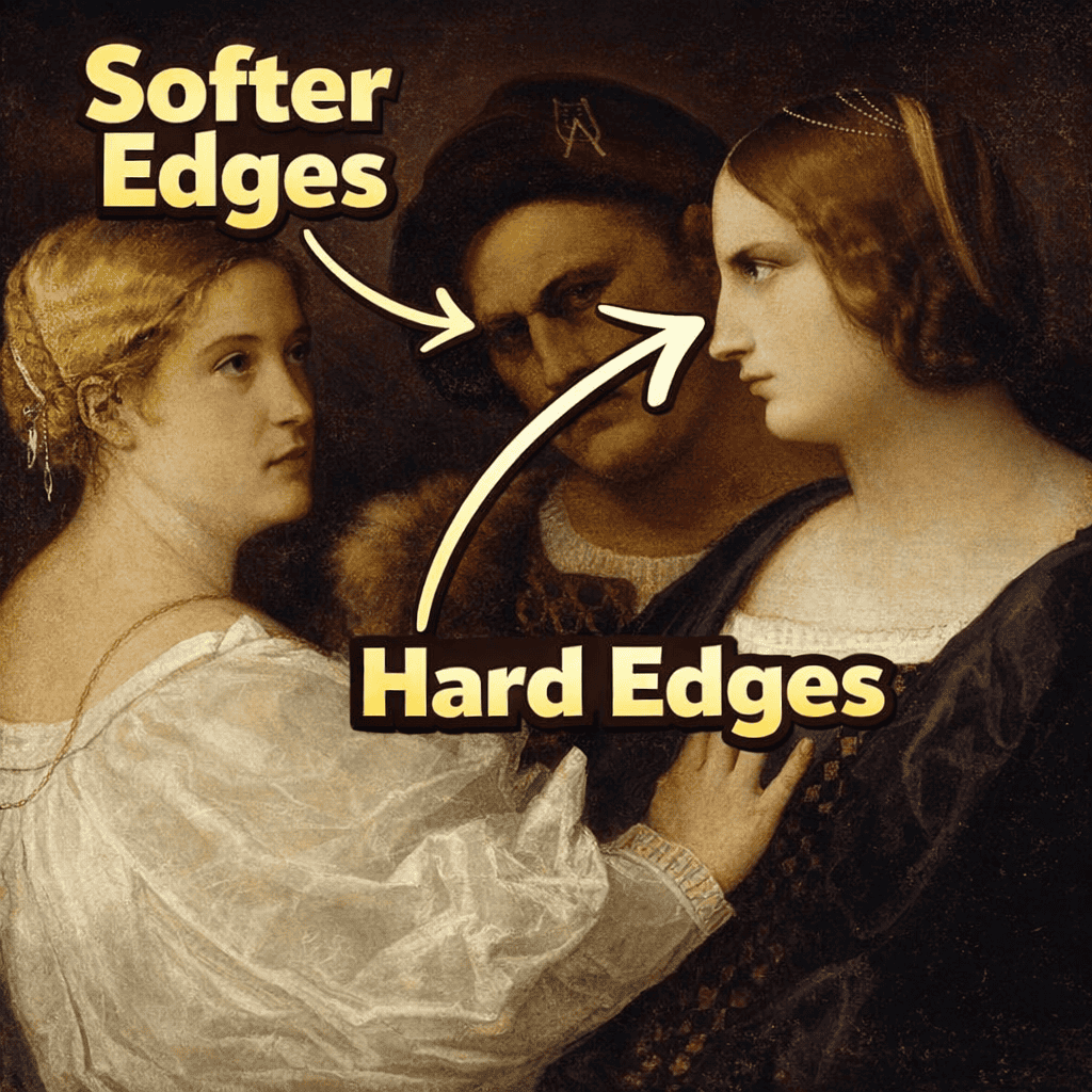
Edges are closely connected to value, but they deserve separate attention.
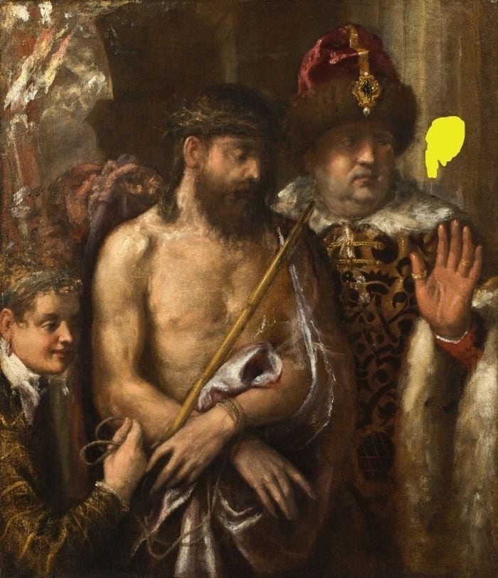
A hard edge appears where contrasting values meet sharply. These clear transitions signal importance, and the eye instinctively moves toward them.
Soft edges, where forms transition gradually, feel quieter. They allow shapes to turn gently and help the eye travel smoothly across the painting.
If every edge is sharp, nothing feels special. If everything is soft, the painting loses focus. Strong hierarchy comes from balancing clarity and softness.
I’ve found edges to be one of the most subtle yet powerful ways to control emphasis without increasing contrast or adding more color.
Visual Hierarchy is Always Relative
One of the most important lessons about hierarchy is that it never exists on its own.
Everything depends on context.
Some paintings rely on bold value contrasts, while others are intentionally soft and atmospheric. In dramatic paintings, hierarchy may feel obvious. In quieter works, it becomes subtle — but it is still present.
Role of color harmony in visual hierarchy
This is why you must always judge an area in relation to what surrounds it. An edge is only sharp compared to other edges. A color is only saturated compared to other colors. A value is only light or dark relative to its neighbors.
Visual hierarchy is not about applying rules—it’s about making relationships clear. It is also about keeping the color harmony working in your painting. You can’t have bright pink in a painting made up of mostly subdued colors.
Painting with Intention
When hierarchy works well, viewers don’t feel pushed or confused. The painting feels natural, clear, and satisfying to look at.
My role as a painter isn’t to make every area equally important. Instead, it’s to decide what deserves attention — and what exists to support it.
Once I begin thinking in terms of hierarchy rather than isolated details, my decisions become clearer. Over time, this way of seeing stops feeling technical and starts becoming instinctive.