Hi,
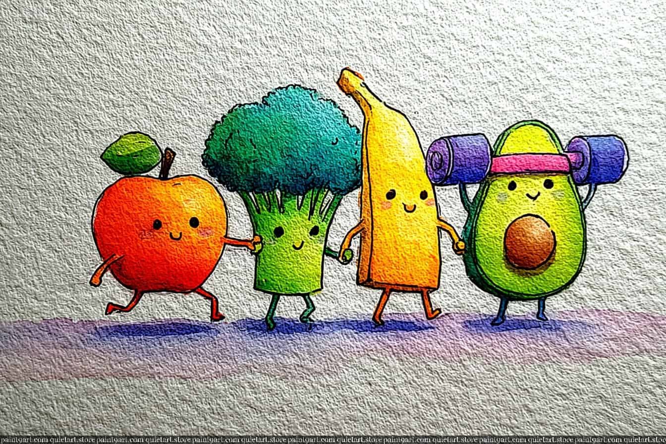
I am so excited to share these 30 whimsical watercolor ideas featuring the most adorable fruit and veggie “besties.” Whether you are looking for a relaxing afternoon project or fresh inspiration for your sketchbook, these charming duos are sure to spark your creativity.
To help you get started right away, I’ve made these designs available as printable coloring pages for instant download. Grab your brushes and let’s bring these garden friends to life with vibrant color!
30 Fruits & Veggies Besties Watercolor Ideas
Broccoli Knight’s Valiant Stand
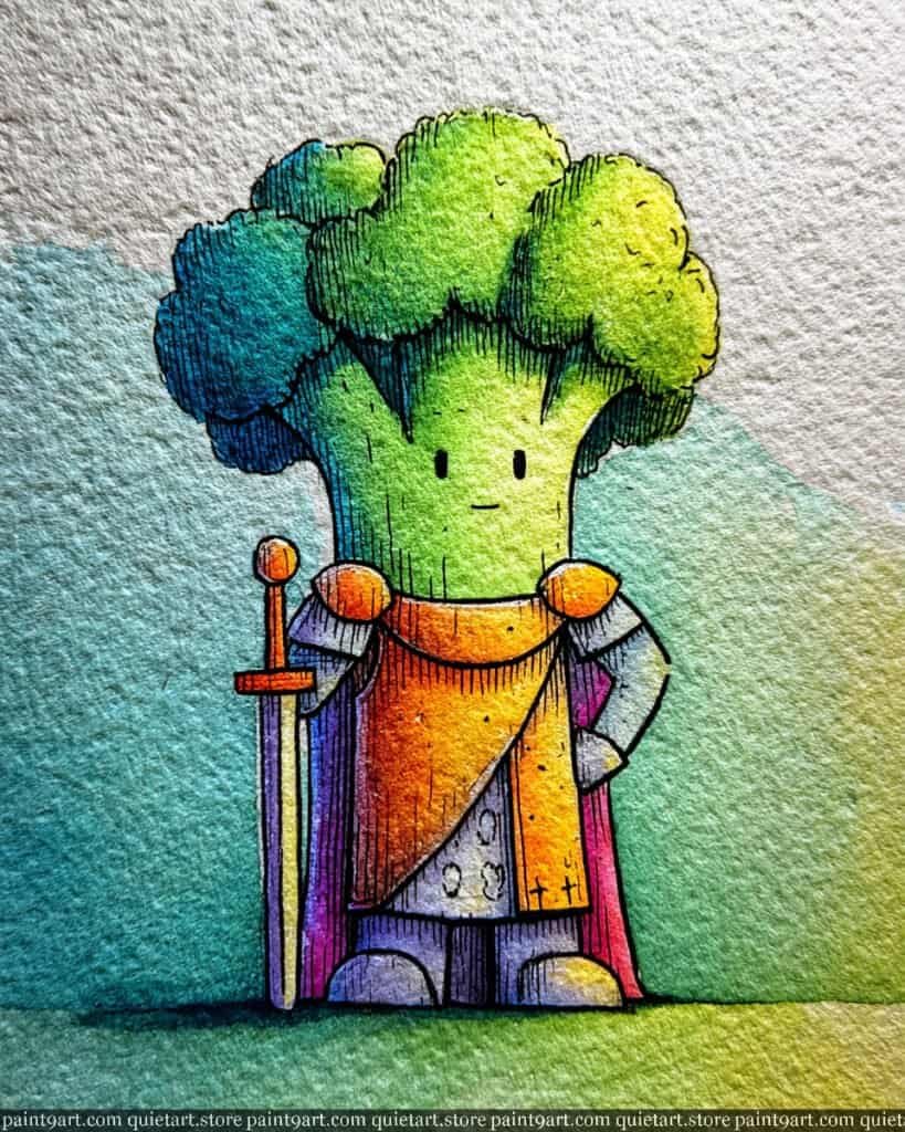
To paint this valiant vegetable, start with a light graphite sketch on high-texture watercolor paper, emphasizing the fluffy florets and the sturdy armor. Begin with a variegated wash for the broccoli’s head, transitioning from a sunny yellow-green on the right to a deep, cool teal on the left. For the armor and cape, use a wet-on-wet technique to blend warm golden-orange with moody violets and magentas, which creates a sense of legendary, weathered metal.
Once the initial washes are dry, use a fine-liner or a tiny detail brush to add the vertical wood-like texture to the broccoli’s stem and the dense stippling on the florets. Employ a glazing technique—layering transparent colors—to deepen the shadows on the cape and armor, helping the knight pop against the soft teal background. Finally, add a crisp, horizontal dry brush stroke at the base to create a textured, grassy ground that anchors the hero in his defiant stance.
Recommended Color Palette
To capture the heroic and organic tones of this piece, I suggest the following professional pigments:
- Sap Green: The essential base for the healthy, vibrant broccoli florets.
- Cobalt Turquoise: To provide the cool, deep tones for the shadowed side of the foliage.
- Quinacridone Gold: For the warm, glowing sections of the armor and sword hilt.
- Quinacridone Magenta: To create the rich, royal tones in the flowing cape.
- Dioxazine Violet: Diluted for the steel-colored shadows of the armor and feet.
- Phthalo Green: To add saturated depth and contrast within the leaf clusters.
Ready to start painting these cute food pairings yourself? Download my printable coloring pages PDF and get instant access to all 30 “besties” designs. It’s the perfect way to skip the sketching and dive straight into the fun of watercolor!
The Amiable Asparagus
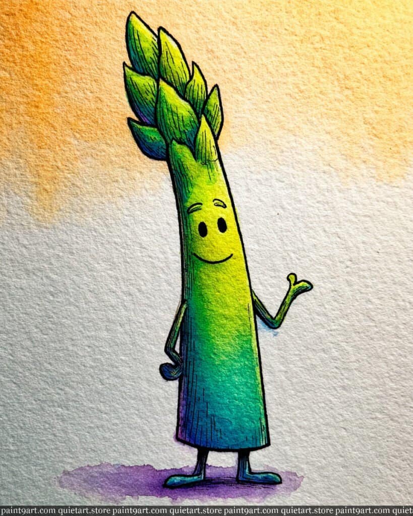
To capture the slender elegance of this character, start with a light graphite sketch of the long stalk and the overlapping triangular scales at the crown. Begin with a variegated wash for the main body, blending a bright lime green on the right side into a deep, cool teal on the left to establish a strong sense of cylindrical volume. For the background, apply a loose, textured flat wash of warm yellow ochre or soft orange in the upper corner, allowing it to fade out to white to make the cool greens of the asparagus feel vibrant and fresh.
Once the initial washes have dried completely, use a fine detail brush or a 0.1 technical pen to render the vertical textured lines along the stalk and the tiny, friendly facial features. Apply a glazing technique to the crown, using a saturated emerald green and adding tiny touches of violet to the tips of the scales to suggest the natural color transitions found in fresh asparagus. Finally, anchor the character with a soft lavender cast shadow at the base, letting the pigment settle into the paper’s texture for a gentle, grounded effect.
Recommended Color Palette
To capture the fresh and earthy tones of this illustration, I suggest using these professional pigments:
- Sap Green: The essential base for the healthy, vibrant green of the stalk.
- Cobalt Turquoise: To provide the cool, deep tones for the shadowed side.
- Azo Yellow: For the bright, sun-kissed highlights and the warm background glow.
- Dioxazine Violet: Diluted for the soft grounding shadow and the tips of the crown.
- Phthalo Green: To add saturated depth and contrast to the overlapping scales.
- Payne’s Gray: For the sharp, expressive lines of the eyes and the illustrative texture.
Ready to start painting these cute food pairings yourself? Download my printable coloring pages PDF and get instant access to all 30 “besties” designs. It’s the perfect way to skip the sketching and dive straight into the fun of watercolor!
The Pomegranate Family
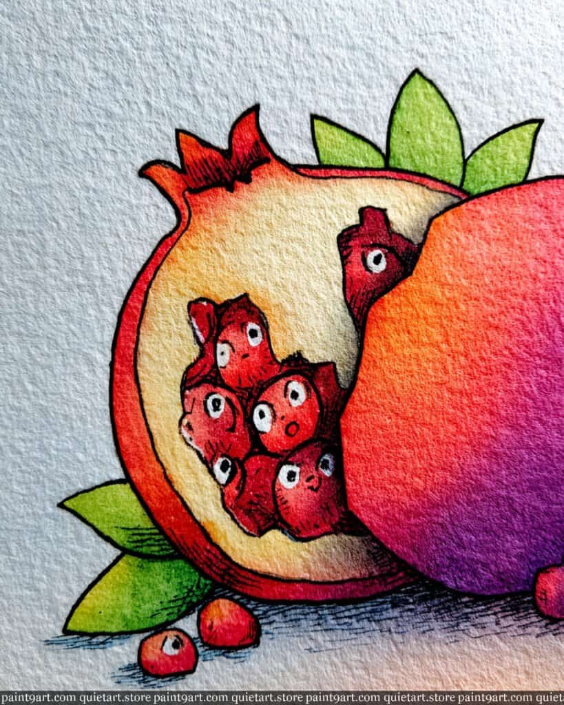
To bring this detailed cross-section to life, start by sketching the thick pomegranate rind and the cluster of tiny, expressive seeds nestled inside. Begin with a wet-on-wet technique for the outer skin, blending a punchy scarlet red with a deep violet on the right side to create a bold, spherical shadow. For the interior “pith” area, apply a very pale flat wash of yellow ochre or cream, keeping it light to provide a high-contrast backdrop for the vibrant red seeds.
Once the base layers are dry, focus on the seeds using a layering technique. Paint each seed with a concentrated crimson, leaving a tiny white “highlight” on their tops to make them look juicy and dimensional. Use a fine-liner pen to add the variety of tiny faces, giving each seed a unique personality. Finally, detail the leaves with a sharp lime green and use cross-hatching with a dark indigo or black pen to deepen the shadows where the fruit meets the ground, emphasizing the paper’s rough, organic texture.
Recommended Color Palette
To capture the rich, jewel-like tones of this pomegranate, I suggest using these professional pigments:
- Alizarin Crimson: The essential base for the deep, juicy red of the seeds and rind.
- Quinacridone Violet: To add cool, dramatic shadows to the outer fruit and seeds.
- Yellow Ochre: Diluted heavily for the warm, creamy interior pith.
- Sap Green: For the healthy, vibrant green leaves at the base.
- Cadmium Red Light: To provide a bright, warm “pop” to the sunlit edges of the rind.
- Payne’s Gray: For the crisp illustrative outlines and the dark, textured grounding shadow.
Ready to start painting these cute food pairings yourself? Download my printable coloring pages PDF and get instant access to all 30 “besties” designs. It’s the perfect way to skip the sketching and dive straight into the fun of watercolor!
The Sweet Turnip
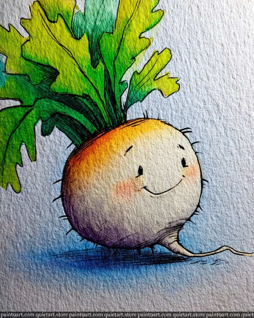
To begin this endearing illustration, sketch a soft, round turnip with a slender taproot and large, jagged leaves on cold-press watercolor paper. Start with a wet-on-wet technique for the main body, dropping in a warm orange-yellow at the upper left and allowing it to fade into a creamy white center, then bleeding into a soft, earthy violet at the bottom curve. For the large leaves, apply a variegated wash that transitions from a bright lime green at the tips to a deep, saturated emerald where they meet the bulb, letting the colors blend naturally to suggest organic life.
Once the initial layers are dry, use a fine detail brush or a 0.1 technical pen to render the gentle smile, tiny eyes, and the delicate “stray hair” roots along the sides. Use a dry brush technique with a diluted rose pink to add the soft, blushing cheeks, which gives the character its sweet and friendly personality. Finally, anchor the turnip with a cool, horizontal gradient wash of indigo beneath the base, and use a steady hand to define the fine veins in the leaves to complete the illustrative, hand-crafted look.
Recommended Color Palette
To capture the soft, organic tones of this character, I recommend the following professional pigments:
- New Gamboge: For the warm, sun-kissed highlight on the upper turnip shoulder.
- Sap Green: To provide the healthy, vibrant base color for the large leaves.
- Imperial Purple: Diluted heavily for the soft, cool shadows at the base of the bulb.
- Quinacridone Rose: Perfect for the delicate, blushing cheeks and warm transitions.
- Indanthrone Blue: For the deep, atmospheric grounding shadow and fine-liner details.
- Yellow Ochre: To add a touch of earthy warmth to the taproot and leaf bases.
Ready to start painting these cute food pairings yourself? Download my printable coloring pages PDF and get instant access to all 30 “besties” designs. It’s the perfect way to skip the sketching and dive straight into the fun of watercolor!
The Golden Onion
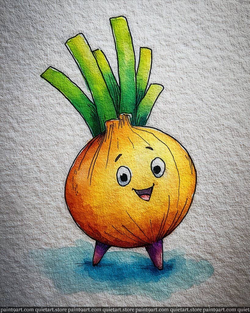
To recreate this cheerful golden onion, start by sketching the plump, round body and its sturdy green sprouts on cold-press paper. Begin with a wet-on-wet technique for the bulb, dropping in a luminous yellow at the top right and bleeding into a warm orange and deep burnt sienna on the lower left to create a strong sense of three-dimensional form. For the ground, apply a soft variegated wash of teal and mint green, keeping the edges loose to allow the character to sit comfortably within the frame.
Once the initial washes have dried, use a fine detail brush or a 0.1 technical pen to render the vertical textured lines on the onion’s skin and the small, happy facial features. Employ a glazing technique for the green stalks, moving from a bright lime green at the tips to a rich, saturated forest green at the base where they meet the neck. Finally, add the two small purple feet with a saturated violet wash and reinforce the grounding shadow with a deep blue-grey to emphasize the paper’s rough texture and the figure’s weight.
Recommended Color Palette
To capture the warm and healthy glow of this character, I recommend the following professional pigments:
- Azo Yellow: For the bright, sun-kissed highlight on the bulb.
- Quinacridone Gold: To achieve the rich, golden-brown mid-tones of the onion skin.
- Burnt Sienna: For the deep, earthy shadows on the lower left of the body.
- Sap Green: To provide the healthy green for the stalks and ground.
- Dioxazine Violet: For the bold purple feet and the base of the shadow.
- Cobalt Turquoise: Diluted for the refreshing, cool tones in the ground wash.
Ready to start painting these cute food pairings yourself? Download my printable coloring pages PDF and get instant access to all 30 “besties” designs. It’s the perfect way to skip the sketching and dive straight into the fun of watercolor!
The Little Leek
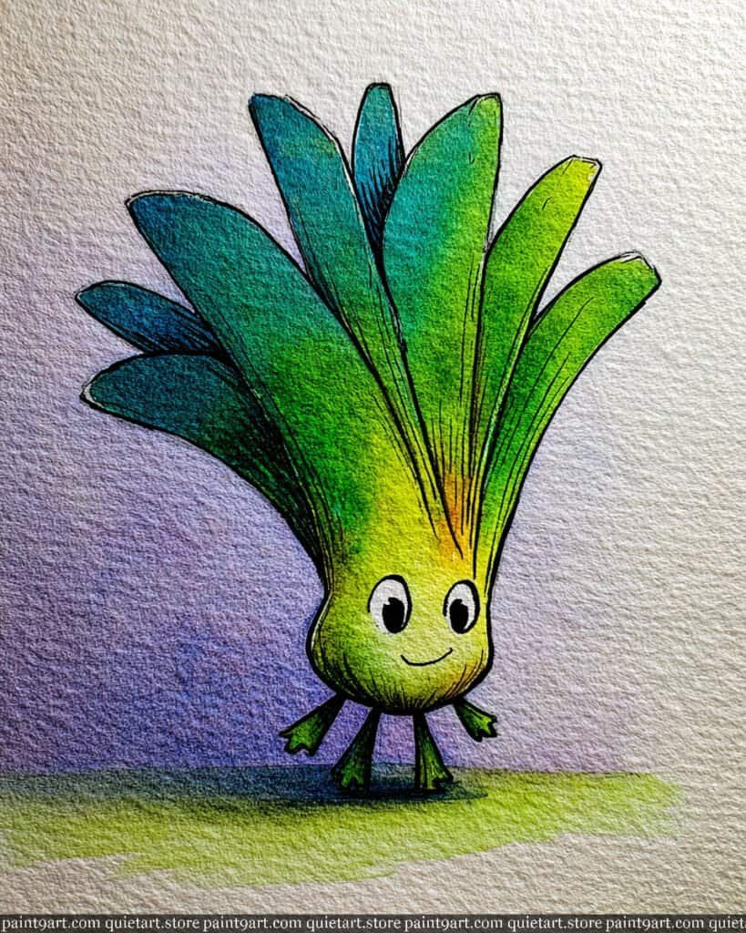
To create this graceful green character, begin by sketching the fan-like arrangement of the leaves and the small, rounded bulb base on cold-press watercolor paper. Start with a variegated wash for the leaves, blending a bright lime green at the center into a deep, cool teal toward the outer edges to establish a sense of health and vibrancy. For the background, apply a very soft flat wash of diluted lavender, letting it fade out to white to make the high-chroma greens of the leek feel luminous and fresh.
Once the initial washes are dry, use a fine detail brush or a technical pen to render the vertical veins that travel up each leaf, which will add a professional, illustrative structure to the piece. Use a glazing technique with a pale yellow at the base of the “neck” to suggest a soft, sunlit glow emerging from the center of the plant. Finally, define the tiny, happy facial features with a steady hand and anchor the character with a crisp green dry brush stroke for the ground, reinforcing the charming personality of this leafy bestie.
Recommended Color Palette
To capture the lush and atmospheric tones of this piece, I recommend the following professional pigments:
- Sap Green: The perfect primary green for the leek’s healthy, vibrant leaves.
- Cobalt Turquoise: To provide the cool, deep tones on the outer edges of the foliage.
- Lemon Yellow: For the bright, glowing highlights at the base of the neck.
- Dioxazine Violet: Diluted for the soft, airy background and the base shadows.
- Phthalo Green: To add saturated depth and contrast within the leaf clusters.
- Payne’s Gray: For the sharp, expressive eyes and delicate illustrative outlines.
Ready to start painting these cute food pairings yourself? Download my printable coloring pages PDF and get instant access to all 30 “besties” designs. It’s the perfect way to skip the sketching and dive straight into the fun of watercolor!
Fiesta Dancing Peanut
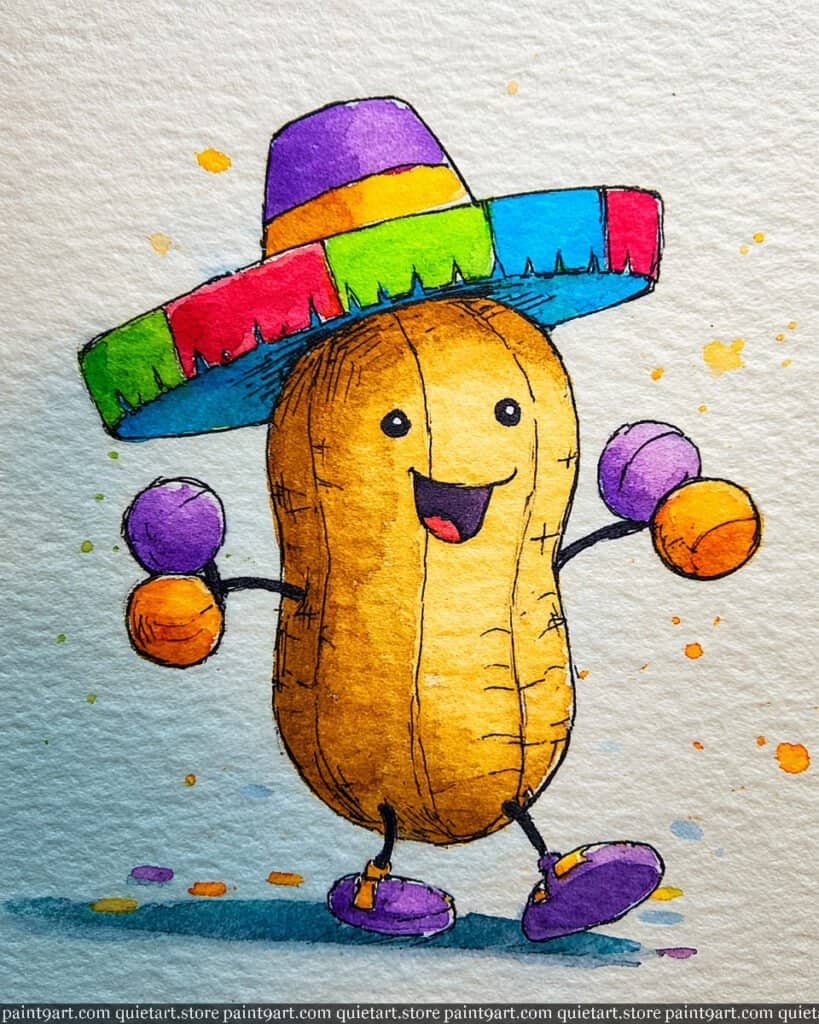
To bring this celebratory peanut to life, start with a light graphite sketch of the hourglass-shaped body and the oversized, colorful sombrero on textured paper. Begin with a flat wash of yellow ochre for the peanut’s shell, allowing it to dry slightly before dropping in a warmer burnt sienna along the left side to create a sense of rounded volume. For the background, apply a very loose, watery variegated wash of teal on the lower left, blending it out to the white of the paper to keep the composition feeling light and festive.
Once the body is dry, focus on the sombrero and maracas by applying high-chroma, saturated pigments in distinct sections—red, green, and violet—to mimic the vibrant patterns of a traditional fiesta. Use a fine-liner pen or a tiny detail brush to render the delicate horizontal “shell” lines and the joyful facial features, ensuring the cross-hatching stays crisp to define the character’s illustrative style. Finally, add a series of playful splatters in orange and violet around the figure to represent confetti, and anchor the dancer with a bold teal dry brush shadow beneath the feet.
Recommended Color Palette
To capture the festive and earthy tones of this character, I recommend the following professional pigments:
- Yellow Ochre: For the soft, natural base of the peanut’s shell.
- Burnt Sienna: To add depth and organic texture to the shell’s shadows.
- Pyrrol Red: For the bright, energetic segments of the sombrero.
- Phthalo Green: To provide a vivid, cool contrast on the hat and maracas.
- Dioxazine Violet: For the bold purple accents on the hat, maracas, and shoes.
- Cobalt Turquoise: Perfect for the atmospheric background wash and grounding shadow.
Ready to start painting these cute food pairings yourself? Download my printable coloring pages PDF and get instant access to all 30 “besties” designs. It’s the perfect way to skip the sketching and dive straight into the fun of watercolor!
The Cheerful Corn
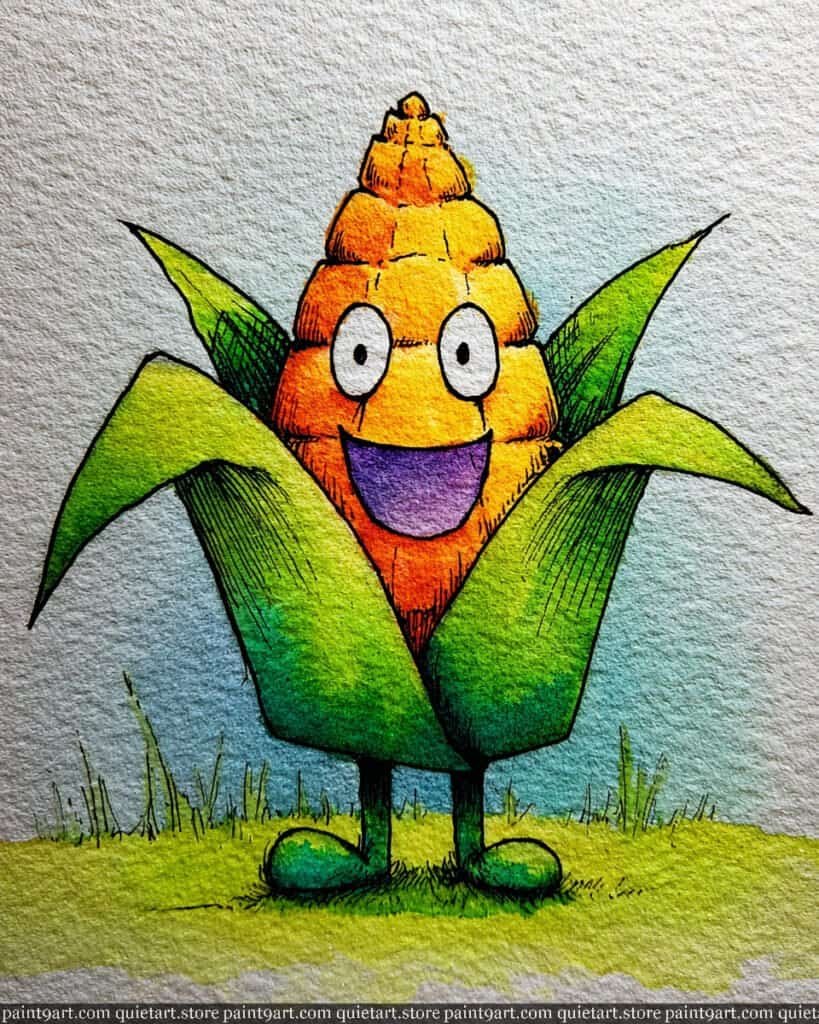
To bring this high-spirited ear of corn to life, begin with a light pencil sketch of the central cob and its wide-reaching husks on cold-press paper. Apply a vibrant wet-on-wet technique for the cob, dropping in a bright lemon yellow at the top and allowing it to bleed into a warm, sun-kissed orange at the base to suggest rounded volume. For the background, use a soft variegated wash of light sky blue, keeping the pigment airy to make the bright warm tones of the corn stand out as the focal point.
Once the initial washes have dried, use a fine detail brush or technical pen to render the horizontal segments of the corn and the delicate cross-hatching on the husks. Employ a glazing technique to deepen the greens of the leaves, moving from a bright lime at the tips to a rich, saturated forest green where they meet the body. Finally, use a deep violet for the joyful open mouth and anchor the character with a vibrant spring green dry brush stroke along the ground to create a textured, grassy foundation.
Recommended Color Palette
To capture the sunny and energetic spirit of this character, I suggest the following professional pigments:
- Azo Yellow: For the bright, glowing kernels at the top of the cob.
- Pyrrol Orange: To provide the warm, saturated tones at the base of the corn.
- Sap Green: Perfect for the lush, healthy green of the husks and the ground.
- Phthalo Green: To create the deep, cool shadows within the leafy folds.
- Cobalt Teal Blue: Diluted for the soft, refreshing background sky wash.
- Dioxazine Violet: For the rich, expressive tone inside the character’s mouth.
Ready to start painting these cute food pairings yourself? Download my printable coloring pages PDF and get instant access to all 30 “besties” designs. It’s the perfect way to skip the sketching and dive straight into the fun of watercolor!
The Giggling Grape Bunch
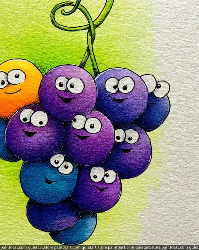
To capture the joyful variety of this bunch, start by sketching several overlapping circles on cold-press paper, leaving plenty of room for the winding vine at the top. Use a wet-on-dry technique to paint each grape individually, which prevents the colors from muddling together. For the background, apply a loose variegated wash of light spring green, letting it fade out toward the edges to create a soft, sunlit atmosphere that makes the cool-toned grapes pop.
For the details, use a glazing technique to layer different shades of violet, ultramarine, and even a single bright orange to give the bunch diversity and depth. Once the paint is bone dry, use a fine 0.1 technical pen to draw the expressive eyes and smiles, making sure to vary their positions to give each grape its own personality. Finally, use a saturated green for the curling vine and add tiny cross-hatched shadows where the grapes overlap to emphasize their round, plump forms.
Recommended Color Palette
To recreate this vibrant and colorful bunch, I recommend using the following professional pigments:
- Dioxazine Violet: For the rich, classic purple grapes.
- Ultramarine Blue: To create the cooler, deep blue grapes in the cluster.
- Quinacridone Magenta: For the brighter, pinkish-purple highlights.
- Cadmium Orange: For that one standout “bestie” at the top left.
- Sap Green: Perfect for the curling vine and the soft background wash.
- Payne’s Gray: For the sharp facial features and deep overlapping shadows.
Ready to start painting these cute food pairings yourself? Download my printable coloring pages PDF and get instant access to all 30 “besties” designs. It’s the perfect way to skip the sketching and dive straight into the fun of watercolor!
The Tomato Debate
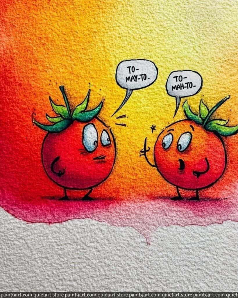
To create this charming and vibrant scene, begin by sketching the two expressive tomatoes and their speech bubbles on high-quality, cold-press watercolor paper. Start with a large variegated wash for the background, blending a bright lemon yellow at the top into a warm orange and finally a deep scarlet red at the bottom, allowing the colors to bleed naturally into one another. While the background is still slightly damp, use a wet-on-wet technique for the tomatoes themselves, dropping in a rich red to define their round shapes against the glowing backdrop.
Once the initial washes are bone dry, use a fine-liner pen or a tiny round brush to render the crisp illustrative outlines and the comical expressions. Apply a glazing technique to the green stems, starting with a base of lime green and adding a touch of deep forest green at the base to create a sense of three-dimensional form. Finally, add the speech bubbles with a steady hand, using a light grey flat wash for a subtle shadow behind them, which helps them pop against the intense, fiery colors of the background.
Recommended Color Palette
To capture the intense heat and playful energy of this illustration, I recommend these professional pigments:
- Cadmium Red Medium: For the rich, classic red of the debating tomatoes.
- Hansa Yellow Deep: To create the bright, glowing upper section of the background.
- Pyrrol Orange: For the warm, saturated transition in the center wash.
- Sap Green: To define the healthy, vibrant leafy crowns of the fruit.
- Phthalo Blue: Mixed with red for the cool, subtle shadows beneath the figures.
- Payne’s Gray: For the sharp, expressive lines of the faces and the text.
Ready to start painting these cute food pairings yourself? Download my printable coloring pages PDF and get instant access to all 30 “besties” designs. It’s the perfect way to skip the sketching and dive straight into the fun of watercolor!
The Super Apple
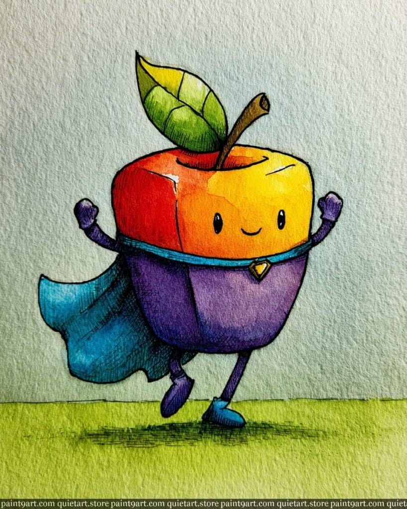
To bring this square-shaped superhero apple to life, start by sketching the unique cubic form and the flowing cape on textured cold-press paper. Use a wet-on-wet technique for the top half of the body, transitioning from a bold scarlet red on the left to a bright, sun-flecked yellow on the right to establish a strong light source. For the lower half, apply a flat wash of vibrant violet, ensuring you leave a sharp line for the blue superhero belt to maintain a clean, illustrative look.
Once the base layers have dried, use a fine detail brush or a 0.1 technical pen to add the dense cross-hatching that provides depth to the cape and the apple’s purple “suit.” Use a glazing technique to add a deep teal to the shadows of the cape, giving it a sense of movement and weight as the apple marches forward. Finally, detail the small leaf and stem with concentrated green and gold, and anchor the hero with a warm green dry brush wash for the grassy ground, reinforcing the character’s dynamic pose.
Recommended Color Palette
To capture the bold and heroic energy of this character, I suggest the following professional pigments:
- Cadmium Red Medium: For the punchy, vibrant red of the apple’s face.
- Hansa Yellow Deep: To create the warm, glowing highlights and the golden leaf tip.
- Dioxazine Violet: For the rich, royal purple of the superhero suit.
- Cobalt Teal Blue: Perfect for the flowing cape and the small belt details.
- Sap Green: To provide the healthy green for the leaf and the grassy ground.
- Payne’s Gray: For the sharp, expressive outlines and deep textural shadows.
Ready to start painting these cute food pairings yourself? Download my printable coloring pages PDF and get instant access to all 30 “besties” designs. It’s the perfect way to skip the sketching and dive straight into the fun of watercolor!
The Grumpy Lemon
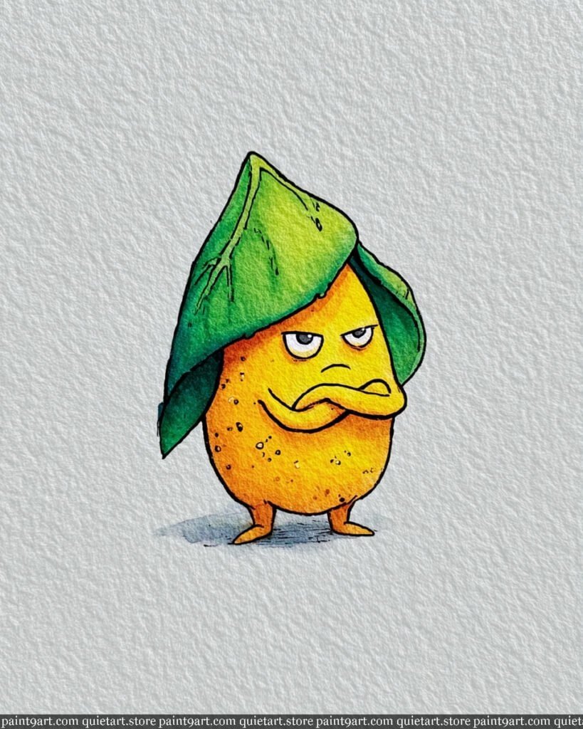
To capture the sour disposition of this citrus fellow, begin by sketching the oval lemon body and the large, umbrella-like leaf draped over its head. Start with a wet-on-dry wash of bright lemon yellow for the face and body, leaving a few tiny white specks for highlight and texture. For the leaf, use a variegated wash that transitions from a light lime green at the top to a deep, cool forest green at the base to create depth and provide a nice frame for the character’s grumpy expression.
Once the base colors are dry, use a fine-liner pen or a tiny detail brush to render the stippled “lemon skin” texture and the sharp, folded arms. Apply a glazing technique with a diluted burnt sienna to deepen the shadows under the arms and the leaf’s edge, enhancing the three-dimensional feel of the figure. Finally, anchor the lemon with a soft, blue-grey flat wash shadow at the feet, and use a white gel pen or opaque white watercolor to add a tiny glint to the eyes for a touch of life.
Recommended Color Palette
To achieve the bright yet moody tones of this character, I recommend the following professional pigments:
- Lemon Yellow: The essential base for the bright, punchy citrus body.
- New Gamboge: To add warmth and depth to the lower half of the lemon.
- Sap Green: For the vibrant, healthy parts of the protective leaf.
- Perylene Green: To create the deep, shadowy green under the leaf folds.
- Payne’s Gray: For the sharp, expressive lines of the face and the grounding shadow.
- Burnt Sienna: To add subtle, organic texture and warmth to the skin’s shadows.
Ready to start painting these cute food pairings yourself? Download my printable coloring pages PDF and get instant access to all 30 “besties” designs. It’s the perfect way to skip the sketching and dive straight into the fun of watercolor!
The Heroic Grape
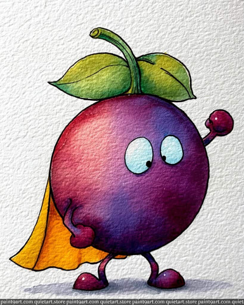
To begin this superhero-themed illustration, sketch the round, stout body of the grape and its flowing cape on cold-press watercolor paper. Start with a wet-on-wet technique for the grape’s body, dropping in a vibrant magenta on the left side and allowing it to bleed into a deep, moody purple on the right to establish a strong sense of three-dimensional form. Use a bright lemon yellow flat wash for the cape, ensuring you leave some white space or lighter tones in the folds to suggest the movement of the fabric as the grape “marches” forward.
Once the primary washes are dry, use a fine detail brush or a technical pen to render the delicate cross-hatching and the crisp outlines of the character. Apply a glazing technique to the green leaves at the top, using a lime green base and adding a touch of sap green for the veins to create a natural, leafy texture. Finally, add a soft teal wash for the large, curious eyes and a cool lavender grounding shadow beneath the feet to give the grape a solid presence on the page.
Recommended Color Palette
To capture the rich, jewel-toned essence of this grape, I recommend the following professional pigments:
- Quinacridone Magenta: For the bright, energetic tones on the sunlit side of the grape.
- Imperial Purple: To provide the deep, royal shadow tones of the fruit’s body.
- Hansa Yellow: For the heroic, glowing cape.
- Sap Green: To define the healthy leaves and the curling stem.
- Cobalt Teal Blue: Perfect for the soft, expressive eyes.
- Dioxazine Violet: Diluted for the soft shadows and the character’s small limbs.
Ready to start painting these cute food pairings yourself? Download my printable coloring pages PDF and get instant access to all 30 “besties” designs. It’s the perfect way to skip the sketching and dive straight into the fun of watercolor!
The Mighty Pineapple
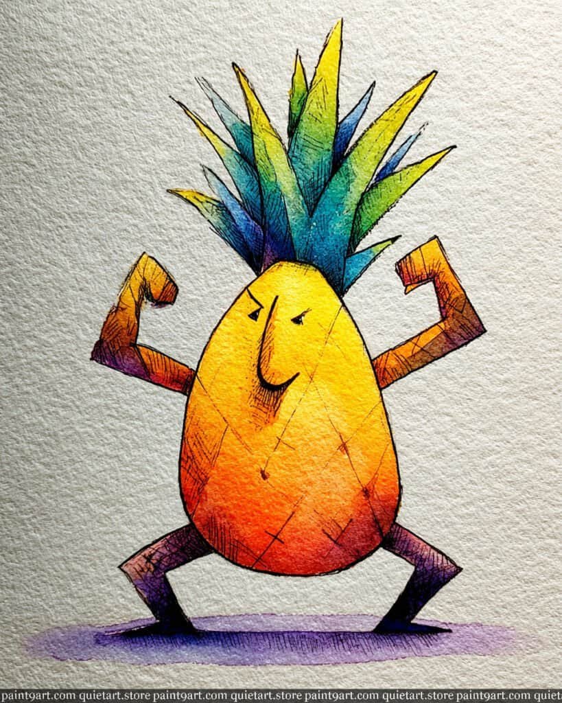
To depict this powerhouse tropical fruit, start by sketching the egg-shaped body and angular, flexed limbs on cold-press paper to leverage its rough texture. Use a wet-on-wet technique for the main torso, dropping in a brilliant lemon yellow at the top and bleeding it into a deep, fiery orange-red at the base to create a sense of glowing energy. For the crown of leaves, apply a variegated wash that transitions from a sharp, cool teal at the bottom to a bright spring green at the tips, ensuring the colors stay vibrant and clean.
Once the initial washes are dry, use a fine detail brush or a technical pen to render the intense cross-hatching across the skin and muscles, which gives the character its “ripped” appearance. Apply a glazing technique with a concentrated violet to the legs and the underside of the arms to establish deep, dramatic shadows that enhance the figure’s three-dimensionality. Finally, anchor the character with a soft lavender flat wash at the feet to create a simple ground plane that complements the warmth of the pineapple’s body.
Recommended Color Palette
To capture the bold and energetic spirit of this character, I suggest the following professional pigments:
- Hansa Yellow Medium: For the bright, sun-kissed top of the pineapple body.
- Pyrrol Orange: To create the saturated, muscular mid-tones.
- Cobalt Turquoise: For the cool, atmospheric base of the leafy crown.
- Sap Green: To define the healthy, vibrant tips of the pineapple leaves.
- Dioxazine Violet: Perfect for the deep, heavy shadows on the limbs and ground.
- Payne’s Gray: For the sharp, expressive facial features and textural cross-hatching.
Ready to start painting these cute food pairings yourself? Download my printable coloring pages PDF and get instant access to all 30 “besties” designs. It’s the perfect way to skip the sketching and dive straight into the fun of watercolor!
The Shredded Spud
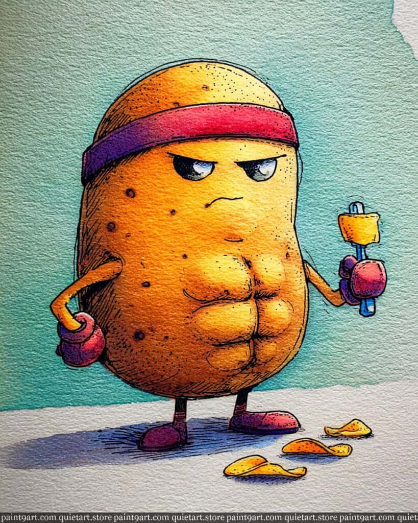
To depict this formidable fitness enthusiast, start by sketching the oval potato body, paying close attention to the exaggerated abdominal muscles and the determined brow. Apply a warm underpainting of yellow ochre across the center, then use a wet-on-dry wash of burnt sienna around the edges to create a rugged, rounded form. For the atmospheric background, use a loose variegated wash of teal, allowing it to fade out toward the bottom to keep the focus on the character and the “victorious” chips on the ground.
Once the base layers are dry, use a fine detail brush or a technical pen to render the intense cross-hatching that defines the muscle structure and the potato’s skin texture. Use a glazing technique with a saturated magenta to color the headband and boxing gloves, adding a touch of violet for the deepest shadows. Finally, anchor the figure with a cool, horizontal cast shadow using diluted indigo, and add small, crisp highlights to the eyes to give the potato its fierce, competitive gaze.
Recommended Color Palette
To capture the earthy tones and high-energy colors of this piece, I suggest using these professional pigments:
- Yellow Ochre: For the golden, healthy base tone of the potato’s “skin.”
- Burnt Sienna: To add depth, warmth, and texture to the potato’s outer edges.
- Quinacridone Rose: For the vibrant, punchy headband and boxing gloves.
- Cobalt Turquoise: Perfect for the textured, refreshing background wash.
- Dioxazine Violet: To create deep, dramatic shadows on the muscles and gear.
- Indigo: For the sharp, illustrative outlines and the heavy grounding shadow.
Ready to start painting these cute food pairings yourself? Download my printable coloring pages PDF and get instant access to all 30 “besties” designs. It’s the perfect way to skip the sketching and dive straight into the fun of watercolor!
The Dapper Onion
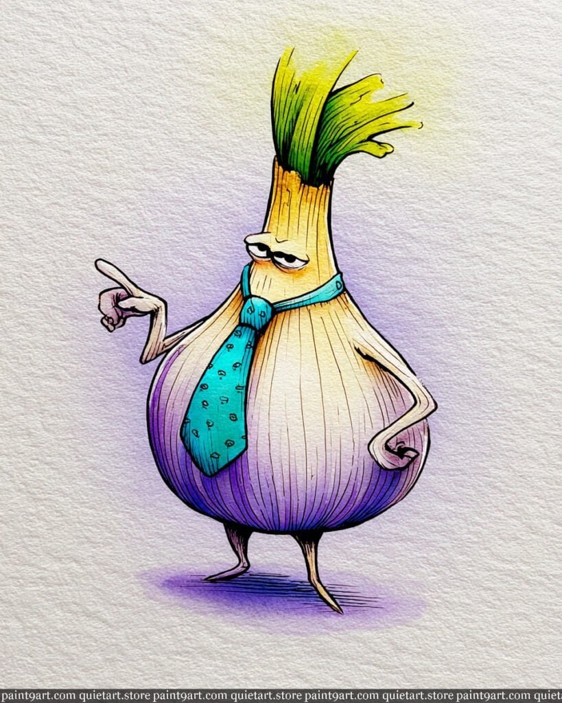
To portray this sophisticated onion character, begin by sketching its bulbous base and wild, upward-reaching sprouts on heavy-weight paper. Start with an extremely light underpainting of yellow ochre at the neck, transitioning into a clean, nearly-white center of the bulb. Use a wet-on-dry technique to introduce soft lavender and violet along the lower curves, which defines the roundness and adds a touch of illustrative elegance to the skin.
Once the base layers are dry, employ a very fine detail brush or a technical pen to render the vertical textured lines that travel the length of the onion’s body. Focus on the turquoise tie by using a glazing technique, applying a saturated teal and adding tiny dark dots once the layer is set to create a patterned silk effect. Finally, deepen the base with a concentrated purple wash to anchor the feet, and use a bright lime green at the tips of the sprouts to suggest a fresh, growing energy.
Recommended Color Palette
To capture the refined and colorful aesthetic of this dapper onion, I suggest these professional pigments:
- Yellow Ochre: For the soft, creamy tones at the neck of the bulb.
- Dioxazine Violet: Diluted for the elegant purple shadows and lower bulb tones.
- Cobalt Teal Blue: Perfect for the vibrant, standout necktie.
- Sap Green: To provide the healthy green core of the top sprouts.
- Lemon Yellow: For the bright, sun-flecked tips of the onion’s “hair.”
- Payne’s Gray: For the sharp, expressive lines of the face and textured skin.
Ready to start painting these cute food pairings yourself? Download my printable coloring pages PDF and get instant access to all 30 “besties” designs. It’s the perfect way to skip the sketching and dive straight into the fun of watercolor!
The Weightlifting Orange
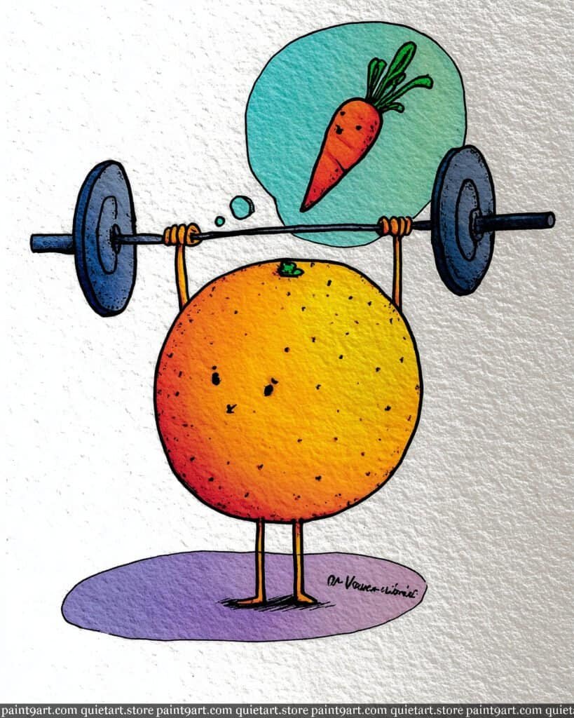
To bring this citrus strongman to life, start with a light graphite sketch of the perfectly circular orange and its overhead barbell. Utilize a wet-on-wet technique for the orange’s body, dropping in a vibrant yellow on the right side and bleeding it into a deep, juicy orange-red on the left to create a bold spherical volume. For the motivation bubble, apply a soft gradient wash of teal, keeping the pigment light enough to ensure the tiny carrot “hero” inside remains clear and punchy.
Once the primary washes have dried, use a fine-liner pen or a small round brush to add the stippled texture on the orange’s skin, which beautifully emphasizes the rough paper surface. Employ a dry brush stroke with highly concentrated blue-grey pigment to render the heavy iron plates of the barbell, giving them a metallic, textured feel. Finally, anchor the character with a soft lavender cast shadow at the base and reinforce the thin, determined limbs with a steady hand to complete this whimsical fitness scene.
Recommended Color Palette
To capture the energy and vibrant citrus tones of this piece, I recommend the following professional pigments:
- New Gamboge: For the bright, sunny glow on the right side of the orange.
- Pyrrol Orange: To provide the saturated, classic citrus mid-tones.
- Cadmium Red Deep: For the heavy shadows on the left side of the fruit.
- Cobalt Teal Blue: Perfect for the airy and refreshing motivation bubble.
- Dioxazine Violet: Diluted for the soft, modern shadow grounding the figure.
- Indanthrone Blue: For the deep, heavy tones of the iron weights.
Ready to start painting these cute food pairings yourself? Download my printable coloring pages PDF and get instant access to all 30 “besties” designs. It’s the perfect way to skip the sketching and dive straight into the fun of watercolor!
The Distinguished Potato
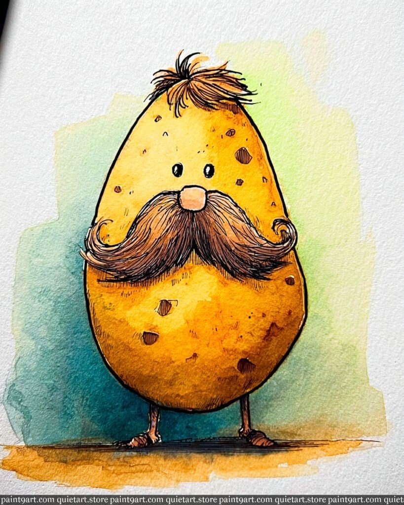
To capture the dignified presence of this mustachioed potato, begin by sketching a large, smooth oval with an impressively curled mustache on cold-press watercolor paper. Start with a variegated wash for the potato’s body, blending a warm yellow ochre at the top into a deep, earthy burnt sienna at the bottom to establish its organic form. For the background, apply a loose, watery flat wash of mint green and soft teal, allowing the pigment to settle into the paper’s texture for a gentle, atmospheric glow that makes the warm tones of the character pop.
Once the initial washes are completely bone dry, use a fine-liner pen or a tiny detail brush to render the intricate hair of the mustache and the tuft on top, using a dry brush technique to suggest individual strands. Add the “eyes” of the potato using small, concentrated dabs of raw umber to give the skin an authentic, weathered look. Finally, define the tiny feet and the horizontal ground plane with a saturated golden-brown glaze, ensuring the sharp illustrative outlines are reinforced to give the piece its charming, whimsical character.
Recommended Color Palette
To recreate this earthy and sophisticated character, I recommend the following professional pigments:
- Yellow Ochre: For the soft, natural base tone of the potato’s upper half.
- Burnt Sienna: To provide the rich, toasted brown for the lower half and mustache.
- Raw Umber: Perfect for detailing the potato “eyes” and deep textural spots.
- Cobalt Turquoise: Diluted for the refreshing, cool background wash.
- Quinacridone Gold: To add a warm, sun-kissed glow to the highlights.
- Sepia: For the dark, crisp details of the mustache and the illustrative outlines.
Ready to start painting these cute food pairings yourself? Download my printable coloring pages PDF and get instant access to all 30 “besties” designs. It’s the perfect way to skip the sketching and dive straight into the fun of watercolor!
The Artichoke Adventurer
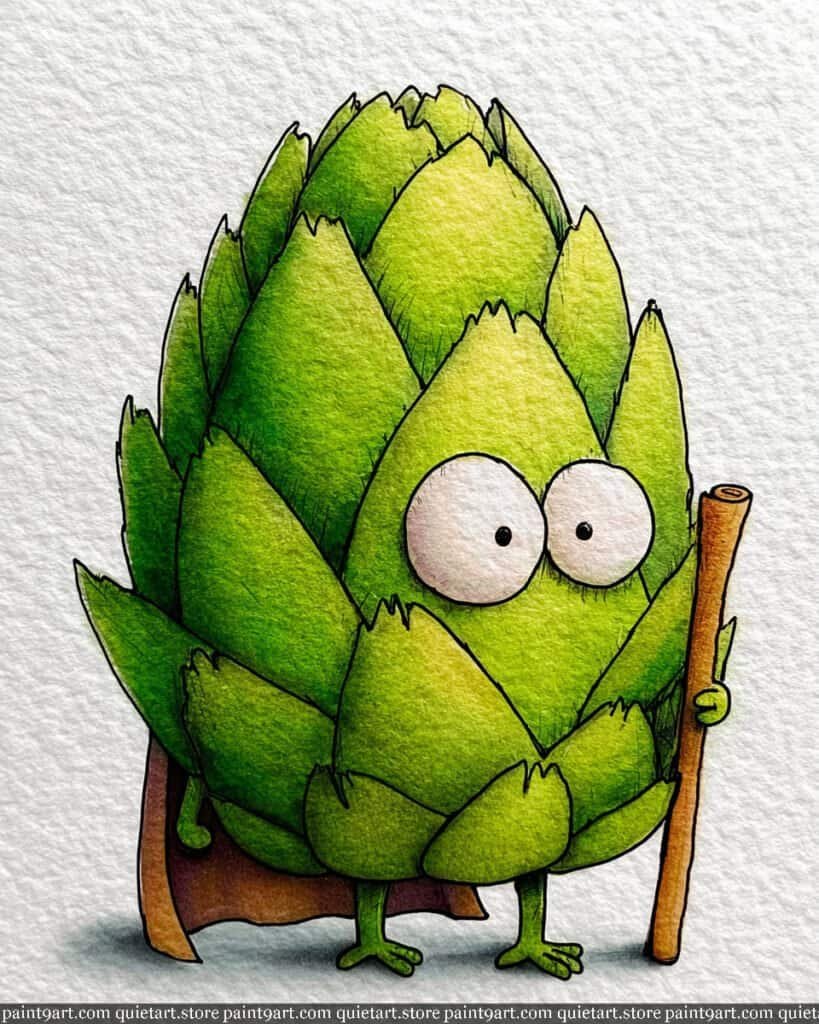
To capture the complexity of this noble artichoke, start with a detailed graphite sketch of the overlapping scales and the wide, curious eyes on cold-press paper. Begin by applying a soft underpainting of lemon yellow to the center of each scale to suggest a subtle inner glow, then use a wet-on-dry wash of vibrant spring green for the primary color. For the background and wooden staff, use a very light, neutral flat wash to keep the focus entirely on the character’s intricate leafy texture.
Once the base layers are dry, focus on creating depth by glazing a deeper forest green into the shadows where the scales overlap, which will help define the artichoke’s armored appearance. Use a fine-liner pen or a tiny detail brush to add the subtle cross-hatching and the delicate “eyelash” details around the large white eyes to give the character life. Finally, use a rich burnt sienna for the traveler’s staff and cape, adding a soft lifted highlight on the top of the wood to suggest a touch of ambient sunlight.
Recommended Color Palette
To capture the earthy and adventurous tones of this piece, I recommend the following professional pigments:
- Sap Green: The essential base for the healthy, vibrant artichoke scales.
- Perylene Green: For the deep, cool shadows between the overlapping leaves.
- Lemon Yellow: To provide the warm, sun-kissed highlights on the scale tips.
- Burnt Sienna: For the natural, woody texture of the staff and the earthy cape.
- Payne’s Gray: Perfect for the soft grounding shadow and the tiny pupils.
- Yellow Ochre: To add warmth and variety to the lower sections of the plant body.
Ready to start painting these cute food pairings yourself? Download my printable coloring pages PDF and get instant access to all 30 “besties” designs. It’s the perfect way to skip the sketching and dive straight into the fun of watercolor!
The Wise Radish
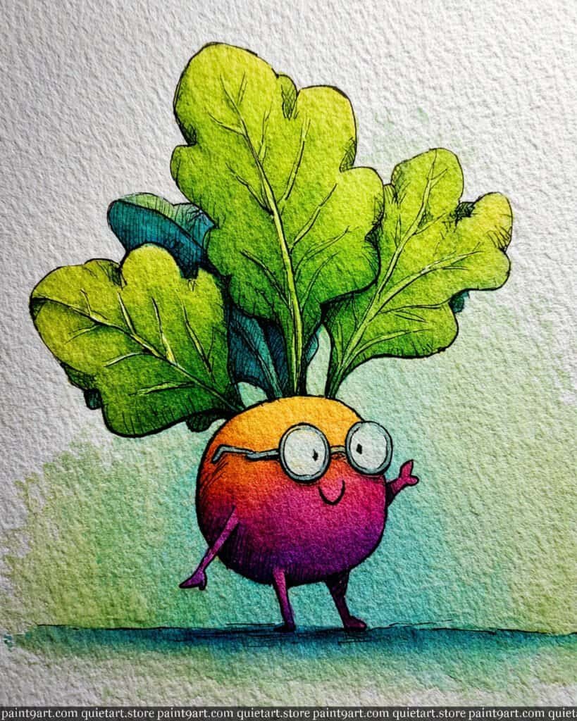
To capture the scholarly charm of this character, start by sketching the spherical radish body and its oversized, oak-like leaves on rough-textured watercolor paper. Begin with a wet-on-wet technique for the main body, dropping in a warm golden yellow at the top and allowing it to bleed seamlessly into a rich magenta and deep violet toward the bottom. For the lush leaves, apply a vibrant lime green base wash, leaving some areas lighter to suggest sunlight filtering through the foliage.
Once the initial layers have dried, use a glazing technique with a deeper forest green to define the intricate veins and overlapping shadows of the leaves. Switch to a fine-liner pen or a small round brush to render the delicate spectacles and the character’s gentle smile, adding cross-hatched shadows to the base of the radish to enhance its roundness. Finally, anchor the figure with a soft teal dry brush stroke along the ground, letting the paper’s texture create a natural, grassy effect around the tiny purple limbs.
Recommended Color Palette
To achieve the vibrant and intellectual tones of this piece, I recommend the following professional pigments:
- Quinacridone Gold: For the warm, glowing top of the radish body.
- Quinacridone Magenta: To create the rich, jewel-toned transition in the center.
- Imperial Purple: For the deep, saturated shadows at the base and the limbs.
- Azo Green: To capture the bright, sun-kissed sections of the large leaves.
- Perylene Green: Perfect for the deep, shadowy veins and leaf overlaps.
- Cobalt Turquoise: For the textured ground wash and the subtle lens reflections.
Ready to start painting these cute food pairings yourself? Download my printable coloring pages PDF and get instant access to all 30 “besties” designs. It’s the perfect way to skip the sketching and dive straight into the fun of watercolor!
The Grumpy Carrot
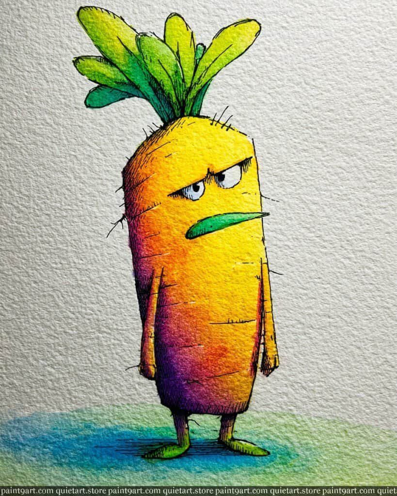
To depict this cynical veggie, start by sketching the elongated, rectangular body and the wild sprout of leaves on cold-press paper. Begin with a wet-on-wet technique for the body, transitioning from a bright lemon yellow on the right to a saturated orange in the center, then bleeding into a moody deep violet on the left side to establish a dramatic sense of volume. For the background ground, apply a very soft variegated wash of teal and spring green, keeping it light to ensure the character remains the central focus.
Once the initial layers are dry, use a fine-liner pen or a tiny detail brush to add the characteristic “grumpy” features, such as the heavy eyelids and the flat, green mustache-like mouth. Employ a dry brush technique to create the horizontal texture lines across the carrot’s skin, which adds to its weathered and unimpressed personality. Finally, deepen the base with a few concentrated strokes of purple to anchor the feet and add a few “stray hair” lines with a steady hand to complete the illustrative look.
Recommended Color Palette
To capture the bold transitions and unique character of this piece, I suggest the following professional pigments:
- Hansa Yellow Light: For the luminous, sunlit edge of the carrot’s face.
- Pyrrol Orange: To provide the intense, classic carrot tone in the mid-section.
- Imperial Purple: For the deep, cool shadows that give the figure weight.
- Sap Green: To define the sturdy leaves and the flat, green mouth.
- Cobalt Turquoise: A wonderful choice for the soft, atmospheric ground wash.
- Payne’s Gray: For the sharp, expressive lines of the eyes and texture.
Ready to start painting these cute food pairings yourself? Download my printable coloring pages PDF and get instant access to all 30 “besties” designs. It’s the perfect way to skip the sketching and dive straight into the fun of watercolor!
The Training Tomato
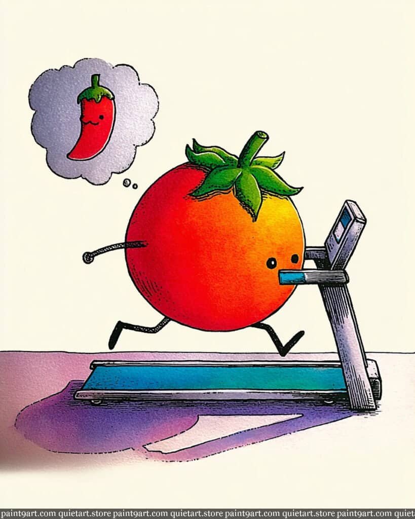
To bring this humorous “spicy training” scene to life, start by sketching the round tomato and the sleek treadmill on high-quality watercolor paper. Begin with a wet-on-wet technique for the tomato’s body, dropping in a vibrant yellow on the right side and bleeding it into a saturated orange and deep red on the left to create a strong sense of volume and light. For the ground and treadmill, use a very light flat wash of off-white or cream, leaving the paper clean to maintain the minimalist, illustrative feel of the background.
Once the primary washes are dry, use a fine-liner or a small round brush to add the cross-hatching details on the tomato’s skin and the technical lines of the treadmill. Use a glazing technique with a diluted purple to create the cast shadows on the floor, making them slightly jagged to imply the motion of the run. Finally, detail the green “hair” with a concentrated sap green and carefully paint the chili thought bubble with a soft grey gradient wash, ensuring the tiny red pepper inside pops as the main point of motivation.
Recommended Color Palette
To capture the energy and humor of this piece, I recommend the following professional pigments:
- Cadmium Red Medium: For the rich, ripe body of the hard-working tomato.
- Azo Yellow: To create the bright highlight on the right side of the fruit.
- Sap Green: For the leafy crown and the tiny chili stem.
- Dioxazine Violet: Diluted for the soft, stylish ground shadows.
- Cobalt Teal Blue: For the glowing screen and the moving belt of the treadmill.
- Payne’s Gray: Perfect for the metallic structure of the treadmill and the thought bubble’s edge.
Ready to start painting these cute food pairings yourself? Download my printable coloring pages PDF and get instant access to all 30 “besties” designs. It’s the perfect way to skip the sketching and dive straight into the fun of watercolor!
Strawberry Milk Splash
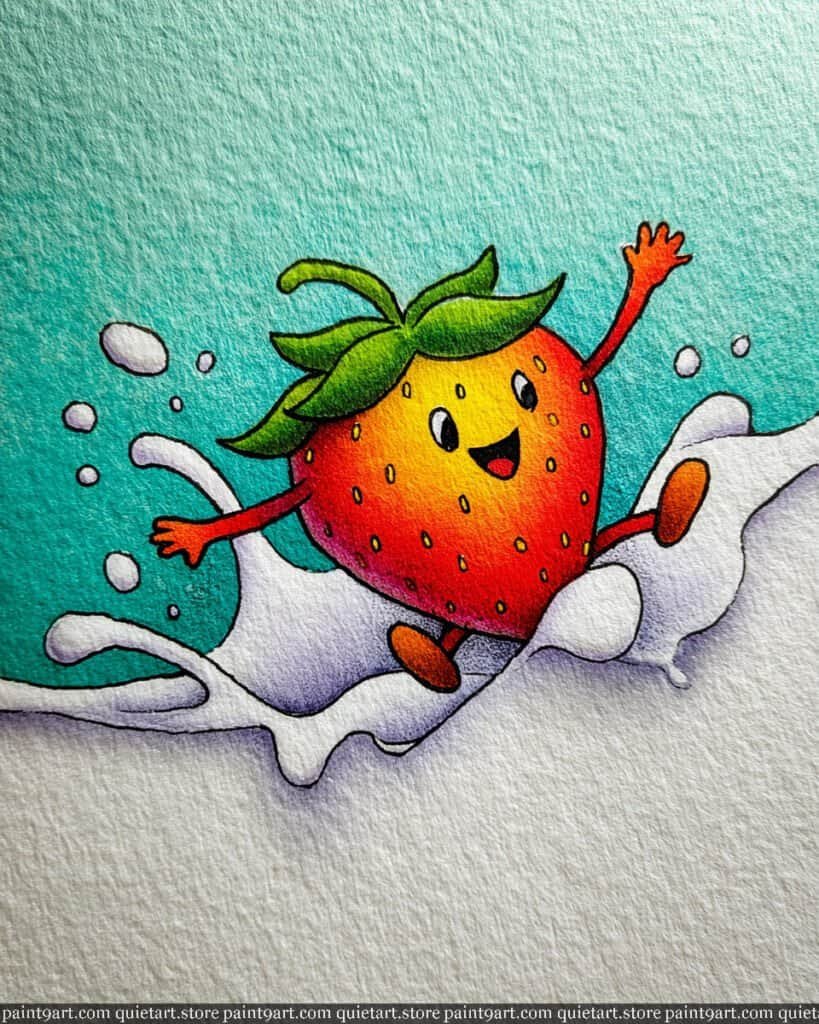
To recreate this joyful scene, start by sketching the strawberry mid-splash, making sure to leave the “milk” area as untouched white paper to preserve its brightness. Begin with a wet-on-wet technique for the strawberry’s body, dropping in a warm yellow at the top and bleeding it into a saturated scarlet red toward the bottom to create a succulent, rounded effect. For the background, apply a soft, textured gradient wash of teal, starting dark at the top and fading out as it meets the splashing milk to give the composition a refreshing, cool atmosphere.
Once the first layer is dry, focus on adding the character’s details using a fine-tipped brush and the dry brush technique to define the green leafy crown and the expressive, waving arms. To give the milk splash dimension, use a very diluted lavender or light grey to add subtle glazing shadows along the curves of the liquid, which will make the white pop against the background. Finally, add the tiny yellow seeds and a crisp black smile with a fine-liner pen, ensuring the shadows under the splash are soft to maintain the feeling of motion.
Recommended Color Palette
To capture the playful and vibrant tones of this illustration, I recommend these professional pigments:
- Cadmium Red Deep: For the rich, ripe body of the strawberry.
- Hansa Yellow: To provide the sunny highlight on the “forehead” and for the tiny seeds.
- Sap Green: For the vibrant, healthy green of the leafy crown.
- Cobalt Turquoise: Perfect for the refreshing, cool teal background wash.
- Dioxazine Violet: Diluted heavily to create the soft, cool shadows in the milk splash.
- Burnt Sienna: For the warm, earthy tones on the strawberry’s little feet.
Ready to start painting these cute food pairings yourself? Download my printable coloring pages PDF and get instant access to all 30 “besties” designs. It’s the perfect way to skip the sketching and dive straight into the fun of watercolor!
Zesty Lime Buddy
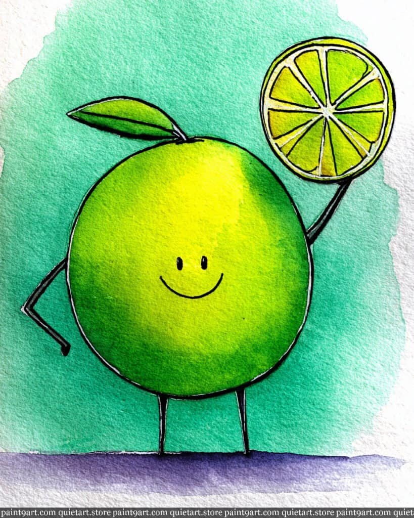
To capture the refreshing citrus energy of this piece, start by sketching the perfectly circular lime and its raised slice on high-quality, textured paper. Begin with a wet-on-wet technique for the main body, dropping in a bright lemon yellow on the right side and allowing it to diffuse into a vibrant spring green towards the left to create a sense of rounded volume. For the background, apply a loose variegated wash of teal and mint green, letting the edges bleed naturally into the white of the paper to keep the composition feeling airy and light.
Once the initial washes have dried, use a fine detail brush or a 0.3 archival pen to define the thin, expressive limbs and the small, happy facial features. Focus on the lime slice by using a glazing technique, applying thin layers of translucent yellow and green to the segments, leaving the white paper visible for the citrus “pulp” lines. Finally, anchor the character by applying a deep, cool violet wash at the base to create a bold, modern shadow that contrasts beautifully with the warm citrus tones.
Recommended Color Palette
To recreate this bright and punchy watercolor illustration, I recommend these professional pigments:
- Azo Yellow: For the bright, glowing core of the lime and the citrus segments.
- Sap Green: To provide the healthy, natural green of the lime’s skin and leaf.
- Cobalt Turquoise: Perfect for the refreshing, cool tones in the background wash.
- Phthalo Green: Use this for the more saturated, deep green areas of the lime’s body.
- Ultramarine Violet: For the rich, deep purple shadow grounding the character.
- Ivory Black: For the fine, crisp outlines of the legs, arms, and face.
Ready to start painting these cute food pairings yourself? Download my printable coloring pages PDF and get instant access to all 30 “besties” designs. It’s the perfect way to skip the sketching and dive straight into the fun of watercolor!
The Active Avocado
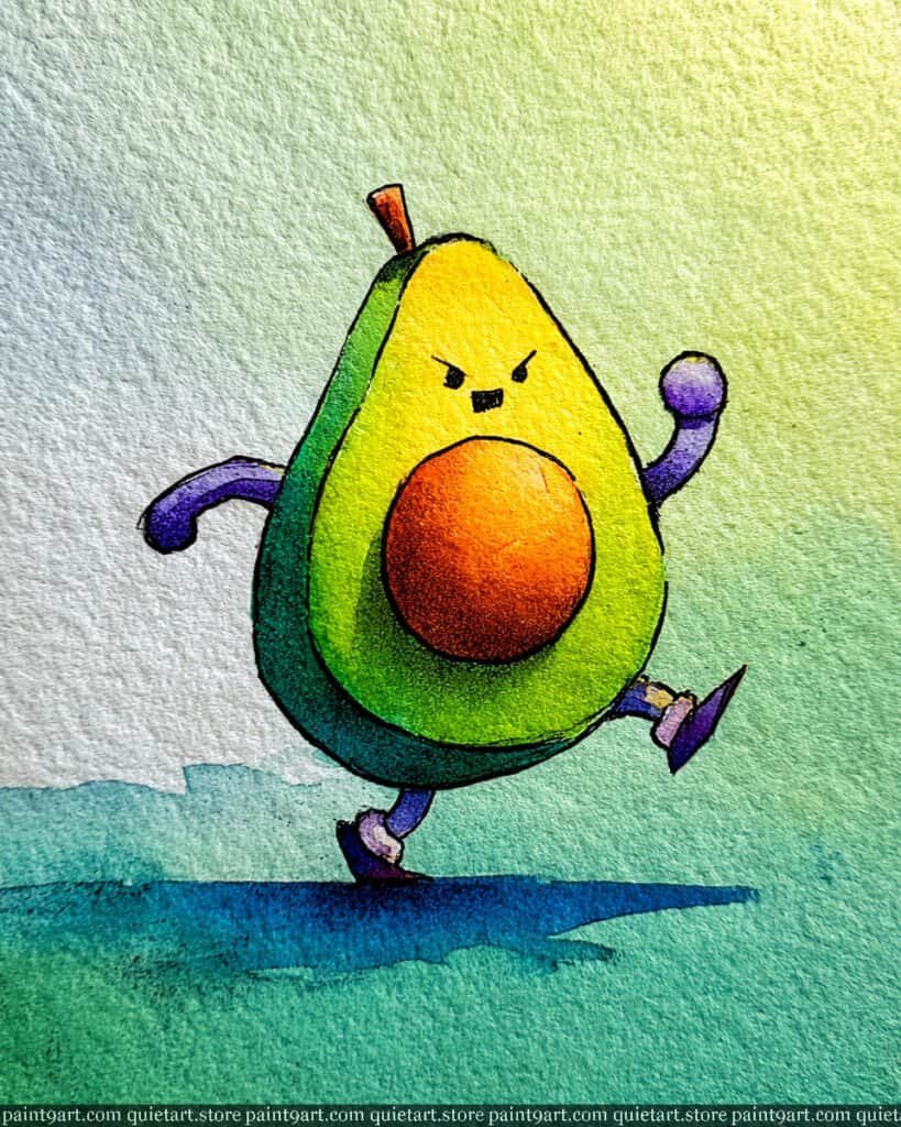
To capture the dynamic energy of this running avocado, start with a light gesture sketch to establish the sense of movement and “determined” expression. Use a variegated wash for the background, blending a soft sky blue into a sunny lime green to suggest an outdoor morning run. For the avocado’s flesh, apply a wet-on-wet technique, dropping in bright lemon yellow at the top and allowing it to transition into a vibrant spring green toward the bottom, ensuring the colors remain luminous.
Once the initial layers are dry, focus on the central pit using a layered glaze of warm orange and burnt sienna to give it a rounded, three-dimensional appearance. Use a fine-liner or a small detail brush with highly concentrated pigment to define the determined brow and the purple limbs, adding sharp outlines to create a pop-art illustrative feel. Finally, anchor the character with a deep teal shadow wash beneath the feet, using a jagged edge to imply the speed and friction of the avocado’s sprint.
Recommended Color Palette
To bring this energetic character to life, I recommend the following professional watercolor pigments:
- Lemon Yellow: For the bright, sun-kissed top of the avocado’s interior.
- Sap Green: To create the lush, healthy green of the avocado flesh.
- Cadmium Orange: The perfect base for the vibrant central pit.
- Dioxazine Violet: For the bold, expressive limbs and running shoes.
- Cobalt Teal Blue: To achieve the cool, crisp shadow and background tones.
- Burnt Sienna: To add depth and texture to the pit and the small stem.
Ready to start painting these cute food pairings yourself? Download my printable coloring pages PDF and get instant access to all 30 “besties” designs. It’s the perfect way to skip the sketching and dive straight into the fun of watercolor!
Fire Breathing Chili
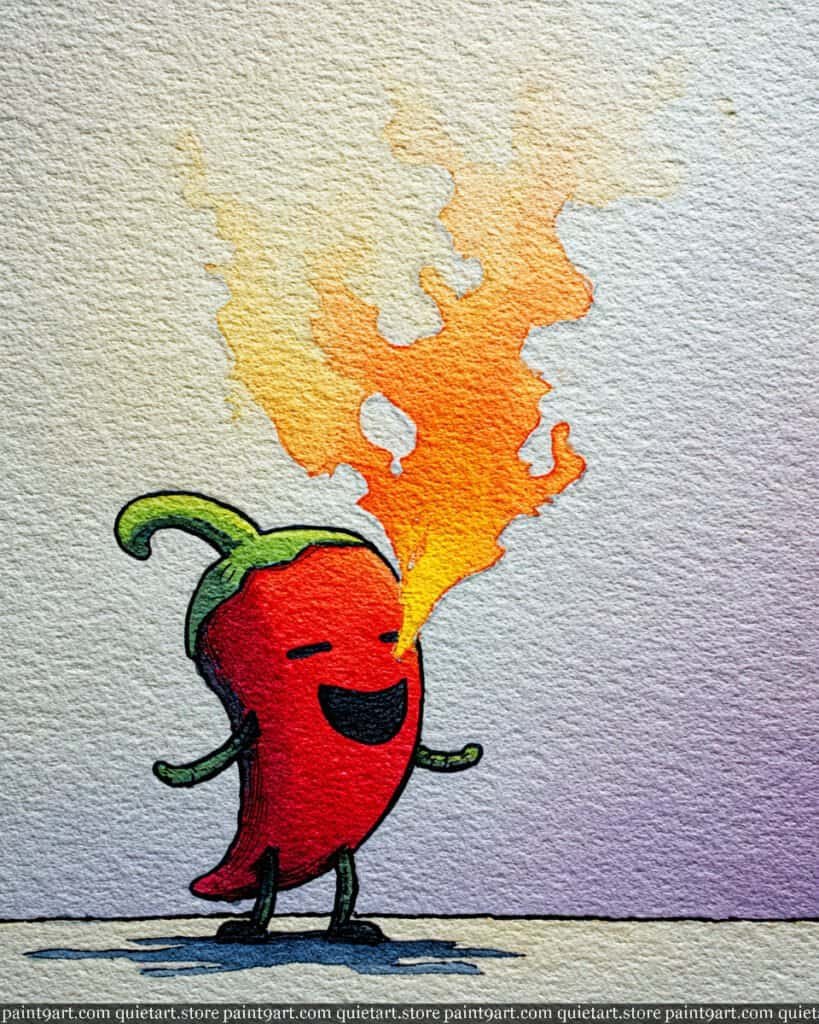
To bring this spicy character to life, start with a light graphite outline, paying close attention to the fluid, upward motion of the flame. Begin with a wet-on-dry wash for the chili’s body using a high-chroma red, leaving a sliver of white paper on the left edge to suggest a bright highlight. For the fire, use a variegated wash, starting with a bright, punchy yellow at the mouth and bleeding into a soft, textured orange as the flame dissipates into the background air.
After the initial layers are dry, use a lifting technique with a damp brush to soften the edges of the flame, giving it a more ethereal, smoky quality. Switch to a fine detail brush or a 0.1 archival ink pen to define the chili’s joyful expression and the thin, expressive limbs. Finally, deepen the base of the stem with a concentrated green and add a cool, blue-toned shadow beneath the feet using a dry brush stroke to emphasize the paper’s rough texture and anchor the figure.
Recommended Color Palette
To capture the heat and energy of this piece, I recommend using these professional pigments:
- Pyrrol Scarlet: For a vibrant, true red that defines the chili’s body.
- Hansa Yellow Medium: To create the bright, intense core of the flame.
- Permanent Orange: For the warm, glowing transitions within the fire.
- Hooker’s Green: A deep, natural green for the stem and tiny arms.
- Ultramarine Blue: Mixed with a touch of red for the cool, textured ground shadow.
- Titanium White: (Optional) For any tiny highlights on the chili’s skin or eyes.
Ready to start painting these cute food pairings yourself? Download my printable coloring pages PDF and get instant access to all 30 “besties” designs. It’s the perfect way to skip the sketching and dive straight into the fun of watercolor!
The Sunlit Pineapple
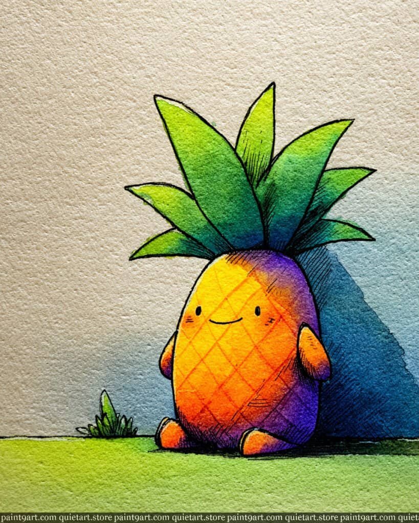
To capture the warmth of this charming pineapple, begin with a light pencil sketch on textured cold-press paper, focusing on the simple, rounded silhouette and the spiked crown. Utilize a wet-on-wet technique for the body, dropping in a luminous yellow-orange in the center and allowing it to bleed into a deep violet-purple on the shadowed right side. For the background, apply a soft, warm tan wash that transitions into a cool blue-grey shadow behind the character, creating a sense of three-dimensional space and sunlight.
Once the initial washes have dried completely, use a fine-tipped brush or a technical pen to render the delicate cross-hatched lines that define the pineapple’s skin texture. Use a glazing technique—applying thin, transparent layers—to deepen the greens in the leaves, moving from a bright lime at the tips to a rich forest green at the base. Finally, add the tiny facial features with a steady hand and reinforce the ground plane with a vibrant spring green wash to ground your little “bestie” in its environment.
Recommended Color Palette
To recreate this vibrant and colorful character, I suggest using the following professional-grade pigments:
- Quinacridone Gold: For the warm, glowing center of the pineapple’s body.
- Pyrrol Orange: To provide the saturated transition between the light and shadow.
- Imperial Purple: For the rich, deep shadows on the right side of the fruit.
- Phthalo Green (Yellow Shade): To capture the bright, electric tips of the leaves.
- Indanthrone Blue: A wonderful choice for the deep, atmospheric cast shadow.
- Yellow Ochre: Perfect for the soft, neutral tones of the background wall.
Ready to start painting these cute food pairings yourself? Download my printable coloring pages PDF and get instant access to all 30 “besties” designs. It’s the perfect way to skip the sketching and dive straight into the fun of watercolor!
The Scholar Apple
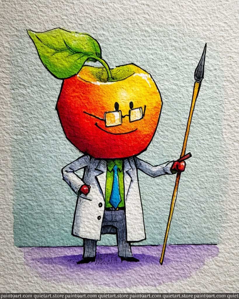
To recreate this whimsical character, begin by sketching the apple-headed figure with light graphite on cold-press watercolor paper to retain that beautiful texture. Start with a wet-on-wet technique for the apple’s head, dropping in vibrant yellows at the top and bleeding into rich oranges and deep reds toward the bottom to establish a natural spherical glow. For the background and lab coat, use a very diluted flat wash to keep the tones airy, ensuring you leave the paper white for the brightest highlights on the coat and the apple’s “forehead.”
Once the base layers are bone dry, use a dry brush technique or a fine-liner pen to define the sharp illustrative outlines and the cross-hatching shadows on the trousers. Apply a saturated green for the leaf and tie, using concentrated pigment to create a bold contrast against the softer background. Finally, add the delicate details of the spectacles and the slender paintbrush staff with a steady hand, ensuring the shadows cast on the ground are a soft lavender to complement the warmth of the apple.
Recommended Color Palette
To capture the vivid and academic essence of this piece, I recommend the following professional pigments:
- Cadmium Red Medium: For the rich, deep body of the apple.
- New Gamboge: To achieve that warm, glowing yellow highlight.
- Sap Green: Perfect for the lush leaf and the professional tie.
- Cobalt Teal Blue: A diluted version works beautifully for the atmospheric background.
- Dioxazine Violet: Ideal for the soft, transparent ground shadows.
- Payne’s Gray: For the crisp shadows in the lab coat and the trousers.
Ready to start painting these cute food pairings yourself? Download my printable coloring pages PDF and get instant access to all 30 “besties” designs. It’s the perfect way to skip the sketching and dive straight into the fun of watercolor!
The Pear Workout Duo
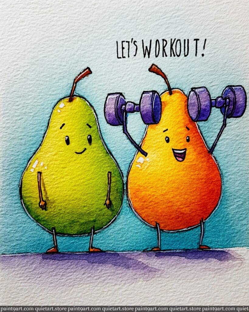
To capture the motivating energy of these fitness-focused besties, begin by sketching the two pear-shaped bodies—one lifting weights and the other standing supportively—on cold-press watercolor paper. Use a wet-on-wet technique for the bodies to achieve smooth color transitions: for the green pear, blend a bright lemon yellow into a vibrant sap green; for the orange pear, transition from a warm golden-yellow at the top to a saturated, juicy orange at the base. For the background, apply a soft variegated wash of light teal, allowing it to fade toward the top to keep the focus on the characters.
Once the primary washes are dry, focus on the details using a layering technique. Use a concentrated violet for the dumbbells, adding darker values on the underside of the plates to give them weight and metallic dimension. With a fine-liner pen or a tiny detail brush, add the expressive faces and thin limbs, using small, crisp white dabs (or leaving the paper white) for the “glossy” highlights on the pears’ shoulders. Finally, anchor the duo with a soft, horizontal flat wash of lavender to create a grounded shadow, reinforcing the illustrative and cheerful tone of the scene.
Recommended Color Palette
To capture the vibrant and contrasting tones of this active pair, I recommend the following professional pigments:
- Sap Green: The essential base for the healthy, vibrant green pear.
- Pyrrol Orange: To provide the saturated, energetic tones for the orange pear.
- New Gamboge: For the glowing yellow highlights at the top of both fruit bodies.
- Cobalt Turquoise: Diluted for the refreshing, atmospheric background wash.
- Dioxazine Violet: Perfect for the heavy dumbbells and the modern grounding shadow.
- Payne’s Gray: For the sharp, expressive facial features and illustrative outlines.
Ready to start painting these cute food pairings yourself? Download my printable coloring pages PDF and get instant access to all 30 “besties” designs. It’s the perfect way to skip the sketching and dive straight into the fun of watercolor!
The Dapper Watermelon
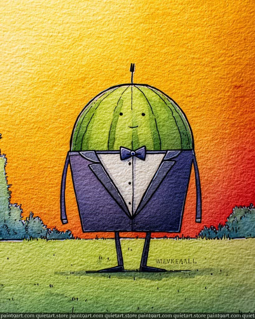
To capture the charm of this sophisticated fruit, start by sketching the domed watermelon head and the clean, angular tuxedo on cold-press paper. Begin with a variegated wash for the background sky, blending a bright lemon yellow at the top left into a warm orange and finally a deep, sunset red at the bottom right. For the watermelon itself, use a wet-on-wet technique with lime green, leaving subtle vertical stripes of a lighter shade to suggest the natural rind pattern.
Once the initial layers are dry, focus on the tuxedo by applying a saturated, dark violet or indigo flat wash, ensuring you keep the “white” of the shirt crisp and clean. Use a fine-liner pen or a tiny detail brush to add the delicate vertical rind lines and the character’s minimalist facial features. Finally, anchor the figure with a soft green dry brush stroke for the grassy ground, and use a steady hand to define the sharp lapels and bow tie, giving the character his refined, illustrative finish.
Recommended Color Palette
To capture the vibrant and formal tones of this piece, I suggest the following professional pigments:
- Hansa Yellow Light: For the luminous, sun-drenched upper background.
- Pyrrol Orange: To provide the warm, glowing mid-tones in the sky.
- Alizarin Crimson: Mixed with orange for the deep, fiery sunset hues.
- Sap Green: The essential base for the healthy, vibrant watermelon rind.
- Dioxazine Violet: Perfect for the deep, royal tones of the tuxedo.
- Cobalt Turquoise: Diluted for the soft, atmospheric grounding shadow.
Ready to start painting these cute food pairings yourself? Download my printable coloring pages PDF and get instant access to all 30 “besties” designs. It’s the perfect way to skip the sketching and dive straight into the fun of watercolor!
Conclusion
I hope these cheerful food pairings inspire you to experiment with new watercolor techniques and playful compositions. Don’t forget to download your printable PDF and share your colorful masterpieces with me!