36 Door & Window Watercolor Painting Ideas (Coloring Pages Available)
There is something inherently poetic about a sun-drenched windowsill or a weathered garden gate. Doors and windows are more than just architectural features; they are invitations to imagine what lies beyond.
In this collection, we explore 36 door and window watercolor painting ideas, ranging from rustic cottage entrances to vibrant Mediterranean shutters. To help you get started without the stress of a blank page, we’ve also included printable coloring pages that you can use as sketches for your next masterpiece.
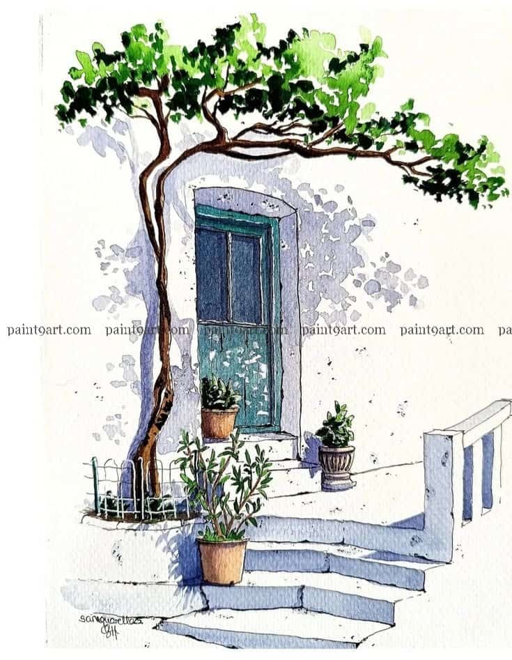
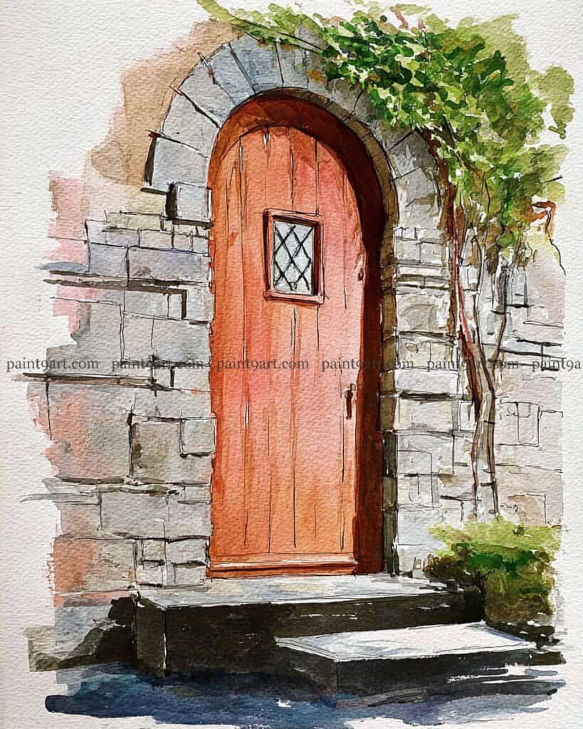
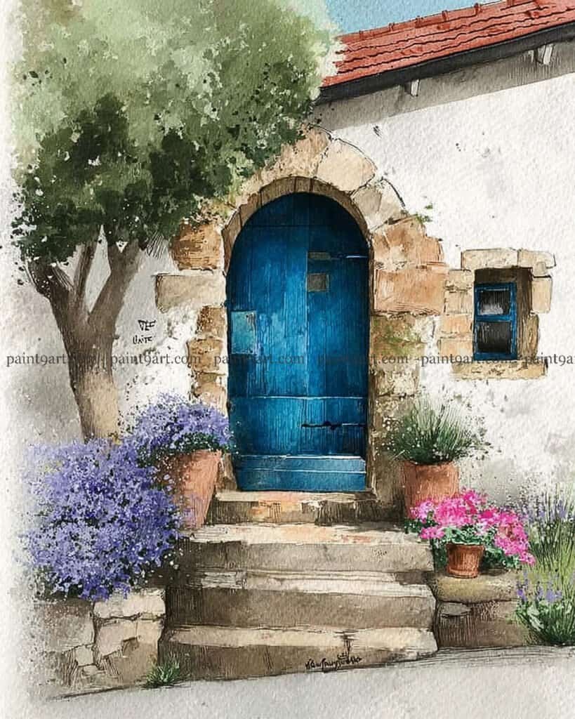
To begin, lightly sketch the composition, focusing on the organic curve of the tree and the perspective of the stone steps. Start with a wet-on-dry technique for the white walls, using a very pale, variegated wash of Ultramarine and a touch of Rose Madder to define the textured shadows without losing the brilliance of the white paper.
For the details, use a fine liner or a small round brush to apply the dark, architectural lines of the door and the twisting trunk of the tree. Finish by layering the foliage with “dabs” of vibrant greens, allowing some colors to bleed together while keeping the edges crisp to mimic sunlight filtering through the leaves.
Recommended Color Palette
Element
Recommended Pigments
Shadows & Walls
French Ultramarine, Burnt Umber, Rose Madder (diluted)
Foliage
Sap Green, Lemon Yellow, Perylene Green
Door & Windows
Cobalt Teal Blue, Prussian Blue
Tree & Pots
Burnt Sienna, Quinacridone Gold
Rediscover the creative joy you set aside years ago with these 41 elegant door and window coloring pages. Simply download your PDF here and let your artistic journey begin again today.
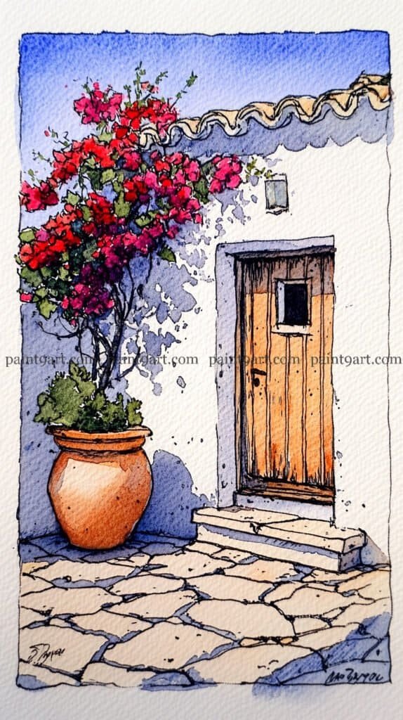
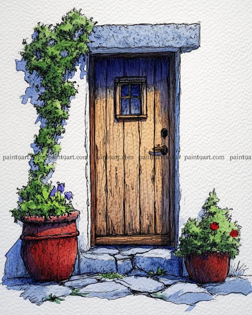
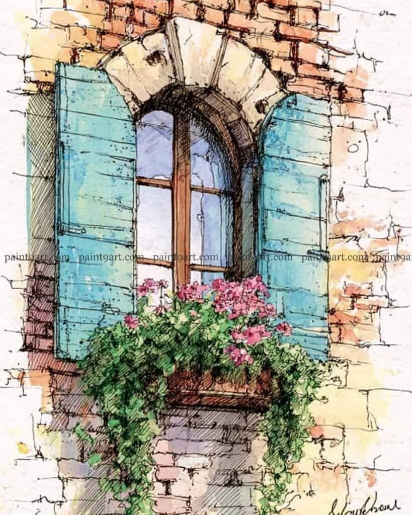
The Sunlit Courtyard Door
Start by establishing your ink lines using a waterproof fine-liner, focusing on the rhythmic pattern of the cobblestones and the vertical grain of the wooden door. Once the ink is dry, apply a graduated wash for the sky using a clear blue, and while the paper is still slightly damp, drop in the soft purple-blue shadows under the roofline and behind the large terracotta pot to create immediate depth.
For the focal point, use a saturated wet-on-dry technique to layer the bougainvillea flowers, starting with a bright pink and dropping in deeper reds while wet to create volume. Finally, wash the door and pot with warm earth tones, leaving small slivers of white paper exposed to act as “sparkle” or direct highlights where the sun hits the most.
Recommended Color Palette
Element
Recommended Pigments
Sky & Deep Shadows
Ultramarine Blue, Cobalt Blue
Bougainvillea
Opera Pink, Permanent Alizarin Crimson
Wooden Door & Pot
Raw Sienna, Burnt Sienna
Foliage & Ground
Sap Green, Yellow Ochre, Neutral Tint (for stone cracks)
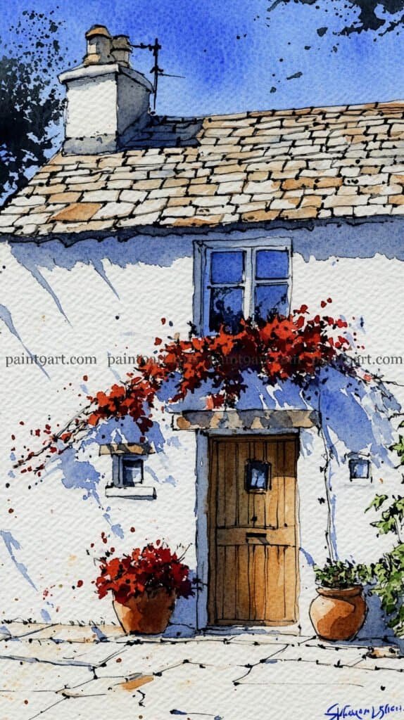
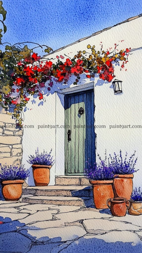
Start with a light ink sketch to define the irregular stone roof, the wooden door, and the placement of the chimney. Apply a variegated wash of pale blue and grey to the roof and sky, then leave the main wall as pure white paper, using only a very diluted wet-on-wet glaze of lavender to define the large, diagonal shadows cast by the overhanging vines. To create the vibrant bougainvillea, use a saturated dabbing technique with bold reds, allowing some edges to bleed into the wet shadow areas to mimic the soft-focus effect of intense sunlight.
For the wooden elements, apply a flat wash of warm ochre to the door and terracotta pots, adding vertical lines for the door planks once the base is dry to maintain structural crispness. Use a granulating wash of cool grey and sienna for the stone patio, leaving plenty of “sparkle” (unpainted paper) to represent the sun hitting the uneven ground. Finish the piece by adding sharp, dark accents to the window panes and the door’s hardware with a fine brush, and use a splatter technique with diluted red to suggest falling petals near the base.
Recommended Color Palette
Element
Recommended Pigments
Sky & Shadows
French Ultramarine, Cerulean Blue, Cobalt Violet
Bougainvillea
Cadmium Red, Permanent Alizarin Crimson
Cottage Wall
Use white of the paper; shadows use Ultramarine Violet (diluted)
Wood & Pots
Yellow Ochre, Burnt Sienna, Raw Umber
Roof & Patio
Payne’s Grey, Sepia, Raw Sienna
Take a peaceful moment for yourself and return to the colors of your youth with this Door & Window printable collection. Download your 41-page PDF now and enjoy the simple, soul-soothing pleasure of painting.
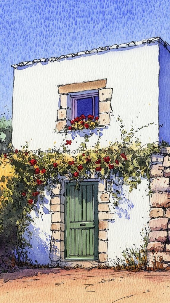
The Rose-Draped Door
Start with a precise ink drawing to capture the alternating rhythm of the stone quoining around the door and window. Apply a flat wash of vibrant blue for the sky, and while it’s drying, use a very light, granulating wash of purple-grey on the white walls to suggest the subtle texture of aged plaster. Keep the paper white where the sun hits the most directly to maintain that high-contrast summer heat.
For the greenery, use a lifting technique or masking fluid to keep the red rose spots clean before applying various shades of warm and cool greens for the leaves. Layer the shadows under the foliage using a glazing technique with a transparent violet, ensuring the shadows follow the uneven contours of the stone blocks. Finish by detailing the door with a deep forest green, leaving vertical slivers of a lighter shade to show the door’s recessed panels.
Recommended Color Palette
Element
Recommended Pigments
Sky & Wall Shadows
Cobalt Blue, Ultramarine Violet
Stone & Earth
Yellow Ochre, Burnt Sienna, Raw Umber
Green Door & Foliage
Hookers Green, Sap Green, Perylene Green
Roses
Cadmium Red, Quinacridone Rose
Rediscover the creative joy you set aside years ago with these 41 elegant door and window coloring pages. Simply download your PDF here and let your artistic journey begin again today.
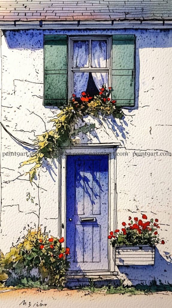
The Blue Door & Sage Shutters
To begin, use a waterproof fine-liner to sketch the crisp lines of the door, the window panes, and the shutter slats. Apply a variegated wash for the blue door, starting with a saturated blue at the top and slightly diluting it as you move down to create a sense of light fall. For the white walls, keep your wash extremely pale—using a mix of blue and violet—to define the jagged, expressive shadows cast by the roof and the window box.
For the foliage and florals, use a layering technique; start with a light sage green for the shutters and a pale yellow-green for the leaves. Once dry, go in with a concentrated red to “pop” the flowers in the window box and beside the door. Finally, add the final dark accents—like the door handle and the deep shadow inside the window—using a dry-brush technique to ensure these small details remain sharp and don’t bleed into your lighter washes.
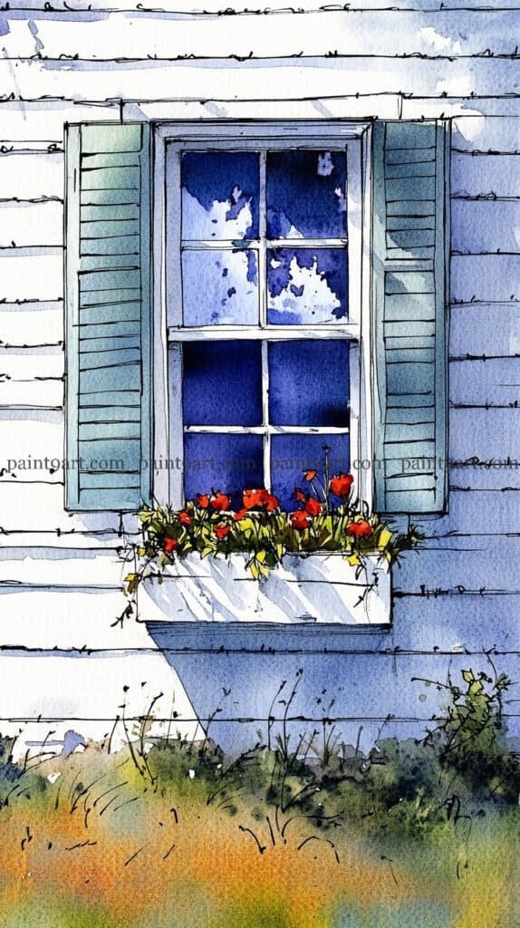
Begin by sketching the window and siding with a steady hand, ensuring the horizontal lines of the weatherboarding are parallel to ground the composition. For the window glass, use a wet-on-wet technique within the panes; drop in patches of saturated blue and leave jagged white spaces of dry paper to represent clouds. This high-contrast reflection is what gives the glass its “shine,” so resist the urge to fill it in completely.
Next, focus on the shutters using a flat wash of a muted seafoam green, adding thin, dark lines for the slats once the base layer is dry. To ground the window box, paint the bright red florals with bold, thick pigment and immediately drop in a cool purple shadow underneath the box to give it weight. Finish by using a splatter technique or loose, gestural strokes for the grassy foreground to contrast with the architectural precision of the window above.
Recommended Color Palette
Element
Recommended Pigments
Sky & Window Reflection
Ultramarine Blue, Prussian Blue (for the deep corners)
Shutters
Cobalt Teal, Oxide of Chromium
Red Florals
Pyrrol Red, Permanent Alizarin Crimson
Shadows & Details
Payne’s Grey, Dioxazine Purple
Foreground Grass
Olive Green, Burnt Sienna, Raw Sienna
Take a peaceful moment for yourself and return to the colors of your youth with this Door & Window printable collection. Download your 41-page PDF now and enjoy the simple, soul-soothing pleasure of painting.
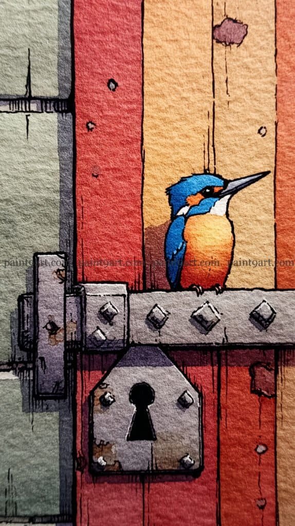
The Kingfisher’s Perch
Start with a detailed ink drawing, paying close attention to the geometric shapes of the latch, the rivets, and the keyhole to provide a sturdy contrast to the soft bird. For the background wood, apply vertical variegated washes of warm oranges and reds, allowing the colors to bleed slightly into one another while keeping the edges between the planks sharp to suggest deep grooves.
To paint the kingfisher, use a wet-on-dry technique for the vibrant blue feathers, leaving a tiny dot of white paper in the eye for a “spark of life.” For the metal latch, use a granulating wash of grey and purple to mimic the texture of aged iron, then add small “rust” spots with a dry-brush flick of burnt sienna. Finish the piece by deepening the shadows around the keyhole and under the bird’s feet to ground it firmly on its perch.
Recommended Color Palette
Element
Recommended Pigments
Kingfisher (Blue)
Cobalt Blue, Turquoise, Cerulean
Kingfisher (Orange)
Quinacridone Gold, Cadmium Orange
Weathered Wood
Pyrrol Scarlet, New Gamboge, Burnt Sienna
Metal Latch
Payne’s Grey, Ultramarine Violet
Rust Details
Burnt Umber, Transparent Red Oxide
Rediscover the creative joy you set aside years ago with these 41 elegant door and window coloring pages. Simply download your PDF here and let your artistic journey begin again today.
The Enchanted Entrance
Begin by using a fine-point waterproof pen to capture the intricate wood grain of the door and the rugged, irregular edges of the stone threshold. Once your ink is set, apply a warm variegated wash of golds and browns to the door, leaving the upper recessed area near the small window darker to create a sense of depth and overhang. For the white walls, use a very light glazing technique with a diluted violet-blue to drop in the soft, atmospheric shadows behind the climbing ivy.
To paint the foliage, use a dabbing motion with a sponge or a frayed round brush to create a cluster of varying greens, allowing some yellow-greens to pop where the light hits the top of the leaves. For the large terracotta pots, use a saturated wet-on-dry application of deep red-orange, then immediately “lift” a sliver of color from the left side with a damp, clean brush to create a rounded highlight. Finish by detailing the small blue flowers and the dark door handle to provide sharp points of interest that pull the viewer’s eye through the composition.
Recommended Color Palette
Element
Recommended Pigments
Wooden Door
Raw Sienna, Quinacridone Gold, Burnt Umber
Stone & Wall Shadows
French Ultramarine, Cobalt Violet
Vibrant Foliage
Sap Green, Lemon Yellow, Hooker’s Green
Terracotta Pots
Venetian Red, Burnt Sienna
Small Accents
Indigo (for hardware), Ultramarine Blue (for flowers)
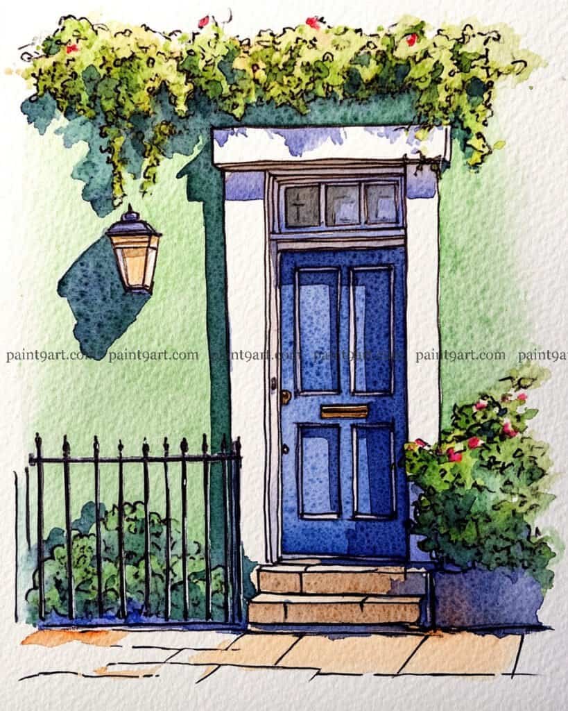
Begin with a structured ink drawing, using a fine-liner to define the paneled door, the intricate iron railing, and the classic outdoor lantern. Once your ink is dry, apply a smooth, even wash of soft green for the facade, taking care to cut around the white door frame and the lamp to maintain the crisp, clean lines of the architecture. While the wall is still damp, drop in the deep, sharp shadow cast by the overhanging greenery and the lamp to give the building immediate three-dimensional weight.
For the focal point, apply a saturated wet-on-dry wash of deep blue to the door panels, leaving a tiny bit of white paper or a lighter blue for the door handle and letterbox to suggest a metallic sheen. Use a dabbing technique for the lush foliage at the top and in the planter, mixing various greens and yellows to create a sense of density. Finish by adding small “dots” of red or pink for the flowers and using a dark glaze for the shadows beneath the steps and the base of the railing to ground the entire scene firmly to the sidewalk.
Recommended Color Palette
Element
Recommended Pigments
Blue Door
French Ultramarine, Prussian Blue
Sage Walls
Pale Leaf Green (or a mix of Sap Green + Chinese White)
Foliage
Olive Green, Lemon Yellow, Hooker’s Green
Shadows
Payne’s Grey, Indigo
Steps & Sidewalk
Yellow Ochre, Burnt Sienna (diluted)
Take a peaceful moment for yourself and return to the colors of your youth with this Door & Window printable collection. Download your 41-page PDF now and enjoy the simple, soul-soothing pleasure of painting.
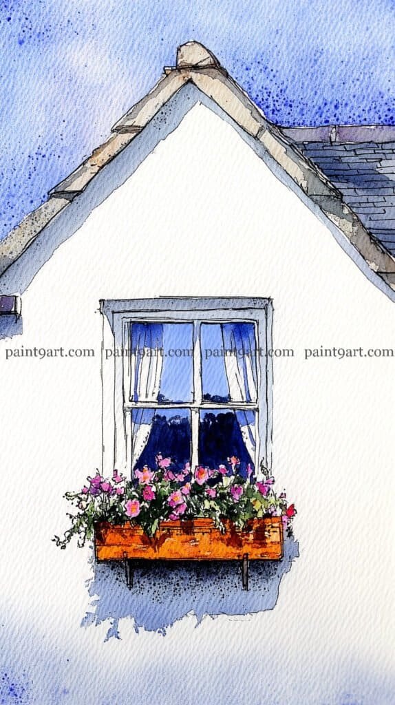
The Gable Window Box
Begin with a light, precise pencil sketch of the triangular gable and the window frame, ensuring the window box is perfectly centered to maintain the composition’s balance. For the sky, use a granulating wash of cobalt blue, allowing the pigment to settle into the paper’s texture to create a soft, speckled effect. Leave the wall as the pure white of the paper, using only a very diluted cool-toned glaze of blue and violet to paint the sharp, jagged shadow falling beneath the window box.
To bring the window to life, paint the glass using a wet-on-wet technique; drop in a deep indigo at the bottom to represent the dark interior and a lighter sky blue at the top for the reflection. For the flowers, use a layering approach, starting with bright pink dabs and adding deeper magenta centers once the first layer is tacky. Finish by adding the warm orange tones of the wooden planter and the dark, thin lines of the roof tiles with a fine-liner or a rigger brush to give the building its final structural definition.
Recommended Color Palette
Element
Recommended Pigments
Sky & Window Reflection
Cobalt Blue, French Ultramarine
Window Interior
Indigo, Payne’s Grey
Pink Florals
Quinacridone Rose, Opera Pink
Wooden Planter
Quinacridone Gold, Burnt Sienna
Roof & Shadow
Ultramarine Violet (diluted), Sepia
Rediscover the creative joy you set aside years ago with these 41 elegant door and window coloring pages. Simply download your PDF here and let your artistic journey begin again today.
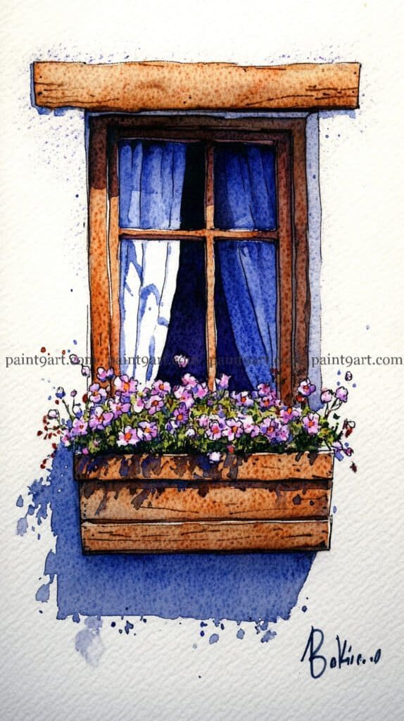
The Rustic Timber Window
Start with a bold ink drawing to capture the heavy, textured grain of the wooden lintel and the planter box, using short, irregular strokes to mimic weathered timber. For the window’s interior, use a wet-on-wet technique within the panes; drop in a very dark indigo at the center to create a sense of deep indoor space, leaving the outer edges a lighter, atmospheric blue to suggest sheer curtains. This depth is essential for making the bright flowers in the foreground really “sing.”
To finish, apply a granulating wash of warm sienna and umber to the wooden elements, allowing the pigment to settle into the “cracks” of your ink lines. For the florals, dapple in various shades of violet and pink, then immediately drop a saturated shadow wash of deep blue directly beneath the window box. This sharp, heavy shadow grounds the composition and creates the illusion of a bright, overhead sun hitting the white cottage wall.
Recommended Color Palette
Element
Recommended Pigments
Sky & Window Interior
Prussian Blue, Indigo, Ultramarine Blue
Weathered Wood
Burnt Umber, Raw Sienna, Sepia
Purple Wildflowers
Cobalt Violet, Quinacridone Magenta
Deep Shadows
French Ultramarine mixed with a touch of Payne’s Grey
Start with a detailed ink sketch to define the irregular, rounded shapes of the stone wall and the sharp, rectangular lintel above the window. Apply a variegated wash of pale ochre and cool grey to the stones, dropping in darker pigment at the edges of each stone while wet to create instant roundness. For the window glass, use a wet-on-wet approach with a pale blue-grey, leaving vertical white streaks to mimic the reflection of the sky and the surrounding wall.
Next, focus on the lantern and the window box using a saturated flat wash of deep indigo and burnt orange. To make the scene pop, use a bright, thick application of red for the flowers and allow the green foliage to “spill” over the stones with loose, gestural strokes. Finish the piece by glazing a deep, cool violet shadow around the stones and under the lantern, which provides the high-contrast “sunlight” effect that brings the white wall to life.
Recommended Color Palette
Element
Recommended Pigments
Stone Wall
Yellow Ochre, Payne’s Grey, Raw Umber
Window & Sky
Cerulean Blue, Cobalt Blue
Flowers & Planter
Cadmium Red, Quinacridone Gold, Burnt Sienna
Shadows & Lantern
Indigo, Dioxazine Purple
Foliage
Sap Green, Perylene Green
Take a peaceful moment for yourself and return to the colors of your youth with this Door & Window printable collection. Download your 41-page PDF now and enjoy the simple, soul-soothing pleasure of painting.
The Garden Shrine Arch
Begin with a clean ink drawing, paying close attention to the individual stone blocks of the arch and the shingles on the roof. Apply a very soft, wet-on-wet wash for the sky using a pale blue, then move to the shrine’s interior, layering deep purples and blues to create a “void” effect that makes the stone entrance look brighter. For the stone walls, use a granulating wash of pale ochre, leaving plenty of white paper to represent the highlights where the sun hits the masonry.
To bring the garden to life, use a stippling technique for the foliage, layering light lime greens first and then dropping in darker forest greens while the paper is still damp to create density. Focus on the ivy climbing the left side of the arch, using sharp, jagged strokes to mimic the leaves. Finish the piece by adding a saturated green wash for the grass at the base, and use a fine liner to add tiny “texture dots” on the stones to give them an aged, weathered appearance.
Recommended Color Palette
Element
Recommended Pigments
Sky & Deep Interior
Cerulean Blue, Indigo, Dioxazine Purple
Stone & Archway
Yellow Ochre, Raw Umber, Burnt Sienna
Foliage & Grass
Sap Green, Lemon Yellow, Perylene Green
Roof & Details
Payne’s Grey, Sepia
Rediscover the creative joy you set aside years ago with these 41 elegant door and window coloring pages. Simply download your PDF here and let your artistic journey begin again today.
The Enchanted Stone Arch
Begin by sketching the rounded arch with a waterproof fine-liner, focusing on the irregular, “bubbly” shapes of the stones to give them a natural, ancient feel. For the purple door, apply a graduated wash, starting with a deep violet at the top and fading to a lighter lavender in the center to suggest a soft, reflected glow. While the door is drying, use a granulating wash of pale grey and ochre on the stones, leaving the centers of the larger rocks nearly white to indicate where the light is strongest.
For the cherry blossoms, use a saturated dabbing technique with vibrant pinks and reds, allowing some of the pigment to bleed into the wet shadow wash behind the branches for a soft-focus effect. To ground the scene, apply a loose, variegated wash of bright greens and earthy browns at the base of the arch, flicking your brush upward to create the look of wild grass. Finish by adding tiny dark “texture dots” to the stones and deepening the shadows between the door planks to give the entrance its final structural depth.
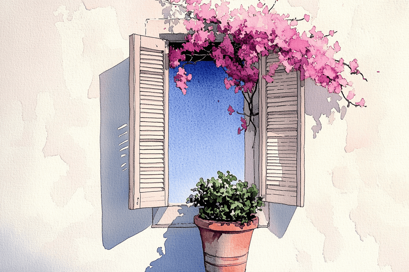
Begin with a clean ink drawing, paying close attention to the parallel lines of the shutter slats and the delicate, organic vine arching over the window. To paint the wall, apply a warm variegated wash of ochre and sienna, using a splatter technique while damp to create that beautiful, aged stucco texture. Leave the window panes as the pure white of the paper to suggest bright, direct sunlight reflecting off the glass.
For the shutters, use a flat wash of a medium blue, then go back in with a fine brush once dry to add darker lines for the shadows between the slats. Dapple the pink blossoms with a saturated wet-on-dry technique, keeping the shapes loose and allowing some edges to soften. Finish by glazing a sharp, diagonal shadow across the bottom of the wall with a diluted brown, which grounds the window and gives the entire composition a sense of architectural depth.
Take a peaceful moment for yourself and return to the colors of your youth with this Door & Window printable collection. Download your 41-page PDF now and enjoy the simple, soul-soothing pleasure of painting.
The Shuttered Brick Arch
Start with a detailed ink drawing, using cross-hatching to define the recessed areas of the brickwork and the grain of the wooden shutters. Apply a variegated wash of warm siennas and ochres to the bricks, allowing the colors to mingle on the paper to create a natural, aged effect. For the window glass, use a very pale wet-on-wet wash of sky blue, leaving crisp white highlights to suggest the reflection of a bright day.
To finish, glaze the shutters with a muted teal, adding a second layer of deeper blue in the shadows near the hinges. Dapple the flowers with a saturated wet-on-dry technique using vibrant pinks, then use a loose, expressive stroke for the cascading greenery. Finally, add a cool purple-grey shadow beneath the window box and the arch to provide a strong sense of depth and architectural structure.
Recommended Color Palette
Element
Recommended Pigments
Brickwork
Burnt Sienna, Yellow Ochre, Raw Umber
Shutters
Cobalt Teal, Prussian Blue (for shadows)
Window & Glass
Cerulean Blue, Payne’s Grey (diluted)
Flowers & Foliage
Quinacridone Rose, Sap Green, Olive Green
Deep Shadows
Ultramarine Violet, Indigo
Rediscover the creative joy you set aside years ago with these 41 elegant door and window coloring pages. Simply download your PDF here and let your artistic journey begin again today.
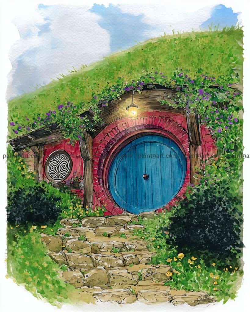
The Hobbit’s Hillside Door
Start with a careful ink drawing to capture the perfect circle of the door and the radial pattern of the surrounding red bricks. Use a wet-on-wet technique for the grassy hill, dropping in various shades of spring greens and yellows, and while damp, add tiny dabs of purple for the creeping flowers. For the sky, keep the wash extremely light and airy, allowing the white of the paper to act as soft, drifting clouds above the ridge.
For the focal point, apply a saturated flat wash of bright blue to the door, adding vertical lines of a darker shade once dry to suggest wood planks. Use a granulating wash for the stone path and the red brick arch to give them a weathered, earthy feel. Finish by painting the warm glow of the outdoor lantern using a soft lifting technique to create a halo effect, and add deep, dark shadows inside the bushes to give the entire scene a three-dimensional, grounded presence.
Begin by establishing the structural lines of the window and the lintel using a waterproof fine-liner, adding small, jagged marks to represent the cracks in the stucco. For the wall, apply a variegated wash of warm ochre and sienna, and while still damp, use a “charging” technique to drop in more concentrated spots of brown to create that aged, mottled appearance. Keep the window interior dark and recessed to make the vibrant flowers in the foreground pop forward.
To paint the florals, use a saturated dabbing motion for the bougainvillea, allowing the magenta to bleed slightly into the deep, cool shadow you glaze directly underneath the window box. This shadow is crucial—it should follow the shape of the cascading flowers to give them a sense of weight and physical presence against the wall. Finish by detailing the small terracotta pots with a warm orange and adding a few crisp highlights to the window frame to suggest direct, overhead sunlight.
Recommended Color Palette
Element
Recommended Pigments
Aged Stucco Wall
Yellow Ochre, Raw Sienna, Burnt Umber
Bougainvillea
Quinacridone Magenta, Permanent Rose
Window & Shadows
Indigo, French Ultramarine, Neutral Tint
Pots & Lintel
Burnt Sienna, Transparent Red Oxide
Foliage
Sap Green, Olive Green
Take a peaceful moment for yourself and return to the colors of your youth with this Door & Window printable collection. Download your 41-page PDF now and enjoy the simple, soul-soothing pleasure of painting.
The Fuchsia Entrance
Begin with a light pencil or ink sketch of the paneled door and the rectangular stone blocks surrounding it. Apply a smooth, saturated wash of deep magenta to the door, leaving a sharp vertical line of lighter pink on the right side to represent a direct hit of sunlight. For the stone frame, use a very light glazing technique with a diluted neutral grey, dropping in subtle brown tones while wet to mimic the natural variation of aged masonry.
To paint the lush greenery and flowers, use a wet-on-dry technique with bold dabs of pink and red, allowing some colors to bleed together for a soft, blooming effect. Focus on the shadows cast by the vines onto the stone; use a mix of cool blue and violet, applying it with loose, gestural strokes to create a “dappled light” appearance. Finish by detailing the terracotta pots at the base with a warm orange and adding a few dark, sharp lines for the door’s panels and letterbox to anchor the composition.
Recommended Color Palette
Element
Recommended Pigments
Magenta Door
Quinacridone Magenta, Permanent Alizarin Crimson
Stone Frame
Payne’s Grey (highly diluted), Yellow Ochre
Bougainvillea
Opera Pink, Cadmium Red
Foliage
Sap Green, Olive Green
Shadows
French Ultramarine, Cobalt Violet
Rediscover the creative joy you set aside years ago with these 41 elegant door and window coloring pages. Simply download your PDF here and let your artistic journey begin again today.
The Stone Archway Entrance
Begin by sketching the arched door and the surrounding irregular stone blocks with a fine-liner, using varied line weights to suggest the cracks and weathered edges of the masonry. Apply a variegated wash of warm siennas and muted pinks to the door, leaving a small, unpainted area for the window pane to maintain its brightness. For the stone walls, use a granulating wash of pale grey and ochre, allowing the pigment to settle into the paper’s texture to mimic the feel of natural rock.
Once the first layers are dry, focus on the climbing ivy by dabbing on layers of vibrant greens, starting with a light sap green and deepening into a forest green for the shadows. Use a glazing technique to add a deep, cool-toned shadow at the base of the stone steps and around the arch to give the doorway a recessed, three-dimensional look. Finally, add the delicate diamond lattice to the window with a very fine brush and deepen the dark accents on the door handle to provide a strong focal point.
Recommended Color Palette
Element
Recommended Pigments
Arched Door
Burnt Sienna, Quinacridone Rose (diluted), Raw Sienna
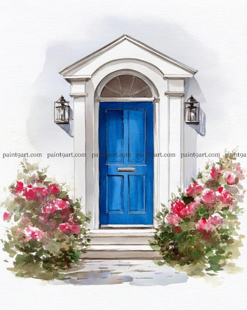
Begin with a very precise, light pencil sketch to capture the symmetrical lines of the pediment, the arched transom window, and the paneled door. Use a smooth, flat wash of a highly saturated blue for the door, leaving the thin lines of the molding and the letterbox as white paper or a much lighter blue to create a sense of three-dimensional depth. For the white structure, use a very diluted cool-toned glaze of light grey or lavender only in the recessed areas and under the eaves to define the architectural form without losing the brilliance of the white paper.
To paint the lush rose bushes, use a wet-on-dry technique to dapple vibrant pinks and reds, allowing the colors to mingle and soften at the edges for a romantic, full-bloom effect. Use a medium round brush to add the surrounding greenery with various shades of olive and sap green, pulling some of the pigment into the shadow areas at the base of the bushes to ground them. Finish by detailing the lanterns with sharp, dark lines and a light yellow wash for a “warm glow” effect, and add a few horizontal dry-brush strokes for the stone steps to complete the inviting scene.
Recommended Color Palette
Element
Recommended Pigments
Blue Door
French Ultramarine, Phthalo Blue
Pink Roses
Quinacridone Rose, Permanent Alizarin Crimson
Foliage
Sap Green, Olive Green, Yellow Ochre
Shadows & Architecture
Payne’s Grey (highly diluted), Cobalt Violet
Lantern Glow
Lemon Yellow, New Gamboge
Take a peaceful moment for yourself and return to the colors of your youth with this Door & Window printable collection. Download your 41-page PDF now and enjoy the simple, soul-soothing pleasure of painting.
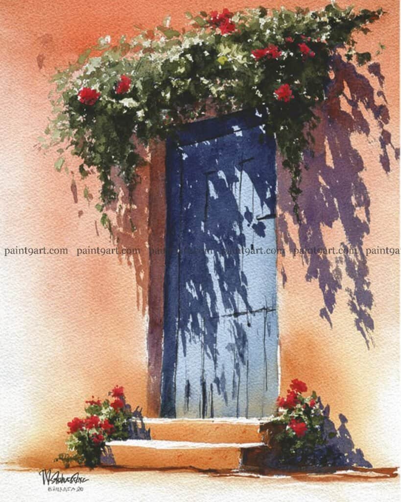
The Shadow-Draped Doorway
Begin with a variegated wash for the wall, blending Yellow Ochre and a touch of Burnt Sienna to create a warm, textured stucco effect. Once the wall is bone dry, block in the blue door with a solid, mid-tone wash, keeping the edges crisp to suggest a recessed architectural space. The key to this piece is the “shadow layer”—use a mix of Ultramarine Blue and a hint of Alizarin Crimson to paint the long, jagged silhouettes of the overhanging vines directly over the dry wall and door.
To finish, use a wet-on-dry technique to dapple the thick greenery at the top of the frame, ensuring you leave some gaps for the sky or wall color to peek through. Pop in the bright red flowers using a highly concentrated pigment to ensure they stand out against the dark foliage. Finally, add the warm orange highlights to the steps and the base of the wall to ground the composition and enhance the feeling of a glowing, sun-baked afternoon.
Recommended Color Palette
Element
Recommended Pigments
Warm Stucco Wall
Yellow Ochre, Raw Sienna
Blue Door
Prussian Blue, French Ultramarine
Vibrant Shadows
Ultramarine Blue, Permanent Alizarin Crimson
Foliage & Florals
Sap Green, Perylene Green, Cadmium Red
Steps & Accents
Quinacridone Gold, Burnt Umber
Rediscover the creative joy you set aside years ago with these 41 elegant door and window coloring pages. Simply download your PDF here and let your artistic journey begin again today.
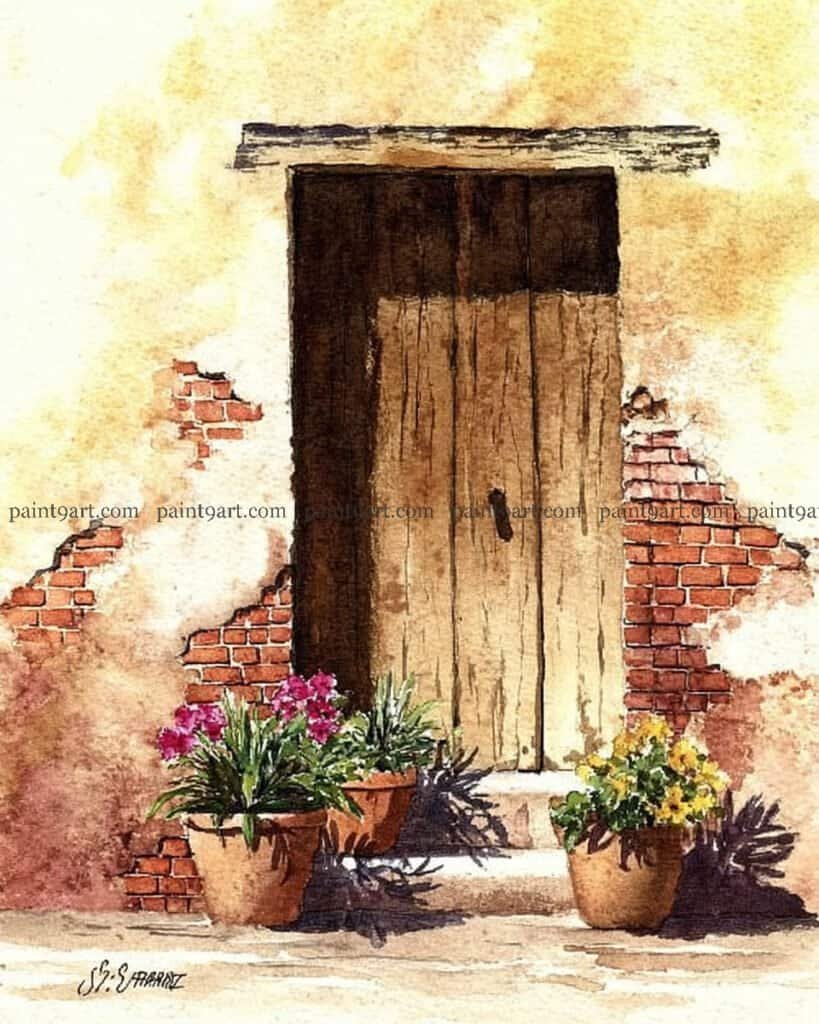
The Weathered Brick Entrance
Begin by sketching the tall, vertical planks of the wooden door and the exposed brick patches with a fine-liner, using broken lines to suggest decay. Apply a variegated wash of Yellow Ochre and Raw Sienna to the plaster wall, and while damp, “charge” in darker Burnt Umber around the exposed brick areas to create a sense of depth and crumbling texture. Keep the door color muted and desaturated to ensure the foreground elements remain the primary focus of the piece.
To bring the scene to life, focus on the three terracotta pots by applying a saturated wash of Burnt Sienna, leaving a small sliver of white paper on the left for a direct sun highlight. Dapple in the pink and yellow flowers using a wet-on-dry technique to keep the petal shapes distinct against the softer background. Finish by glazing a heavy, dark shadow across the bottom of the pots and the stone step using a mix of Ultramarine and Sepia, which grounds the composition and anchors the plants firmly in the sunlit space.
Start with a crisp ink drawing to define the irregular, hand-cut stone blocks of the archway and the vertical grain of the wooden door. For the sky and the door, use a flat wash of vibrant blue, keeping the door slightly more saturated to draw the eye. For the white walls, apply an extremely diluted variegated wash of pale ochre and cool grey, leaving the paper untouched in several areas to act as brilliant sunlit highlights.
To paint the foliage, use a stippling technique with a large round brush, layering mid-tone greens and allowing them to soften at the edges. For the lavender-colored bushes, dapple in your purple pigment using a wet-on-dry application, then immediately drop in a few darker spots while wet to create depth. Finish by glazing a series of horizontal, warm grey shadows across the stone steps to anchor the building and suggest the heavy, midday sun.
Recommended Color Palette
Element
Recommended Pigments
Blue Door & Sky
Phthalo Blue, Cerulean Blue
Stone Arch & Steps
Yellow Ochre, Raw Umber, Payne’s Grey
Purple Blooms
Cobalt Violet, Dioxazine Purple
Foliage & Tree
Olive Green, Sap Green, Burnt Sienna
Terracotta Pots
Venetian Red, Burnt Sienna
Take a peaceful moment for yourself and return to the colors of your youth with this Door & Window printable collection. Download your 41-page PDF now and enjoy the simple, soul-soothing pleasure of painting.
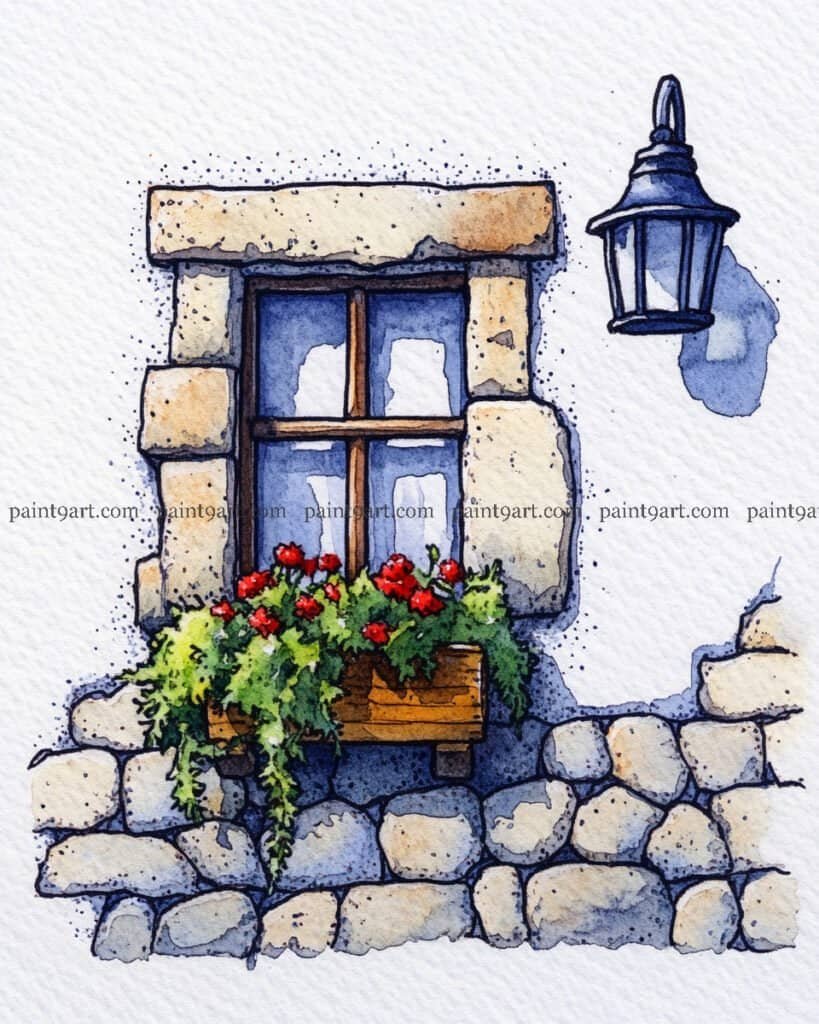
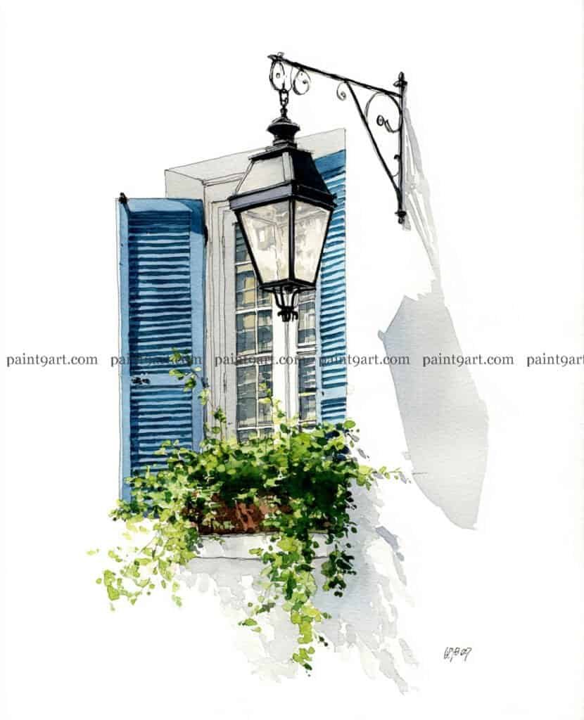
The Lantern & Blue Shutters
Begin with a precise ink drawing of the lantern and its ornate bracket, as these dark, structural lines will anchor the airy composition. Use a wet-on-dry technique for the shutters, applying a vibrant blue wash and adding the horizontal slat details once the base is dry to maintain crispness. For the white wall, resist the urge to fill it with color; instead, use the white of the paper for the brightest light and apply a single, smooth glaze of a diluted cool-grey for the long, atmospheric shadow cast by the lantern.
To finish the greenery, use a dabbing motion with a round brush to create a lush, overflowing window box, layering light lime-greens with deeper forest-greens to create volume. Keep the window panes subtle by using a very light, variegated wash of blue and grey, leaving small white highlights to represent glass reflections. Finally, use a fine-liner to add the delicate, reaching vines that spill over the window box, giving the painting a sense of organic movement against the static architectural lines.
Recommended Color Palette
Element
Recommended Pigments
Sky & Blue Shutters
French Ultramarine, Cerulean Blue
Lantern & Bracket
Payne’s Grey, Indigo
Wall Shadows
Ultramarine Violet (highly diluted), Cobalt Blue
Foliage
Sap Green, Lemon Yellow, Hooker’s Green
Glass Reflections
Prussian Blue (diluted)
Rediscover the creative joy you set aside years ago with these 41 elegant door and window coloring pages. Simply download your PDF here and let your artistic journey begin again today.
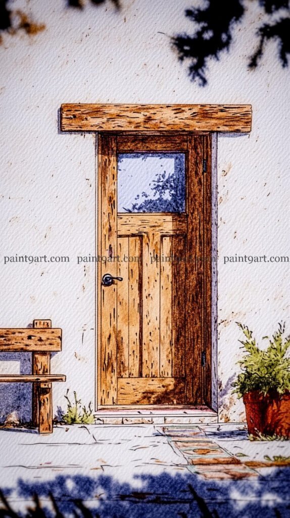
The Rustic Timber Door
Begin with a detailed ink drawing using a waterproof fine-liner to capture the heavy, horizontal grain of the timber lintel and the vertical planks of the door. Use short, expressive “hatching” marks to suggest the pitted texture and knots in the wood. For the white wall, apply a very sparse, dry-brush technique with a pale mix of yellow and blue to suggest subtle shadows and age, while leaving the majority of the paper white to represent the brilliant midday sun.
For the focal point, use a variegated wash of warm earth tones on the door, dropping in deeper browns while the paper is still damp to create natural gradients. Paint the window glass with a pale blue-grey, leaving a small “unpainted” sliver for a sky reflection that gives the glass a realistic sheen. Finish the scene by dabbing a vibrant green for the potted plant and glazing a sharp, cool-toned shadow across the stone threshold to ground the door and provide a sense of architectural weight.
Start with a clean ink drawing using a waterproof fine-liner to define the irregular shapes of the cobblestones and the vertical planks of the door. For the sky, apply a graduated wash of vibrant blue, and while the paper is still slightly damp, drop in the deep, sharp shadows on the white wall and the ground using a mix of ultramarine and violet to create immediate three-dimensional depth.
To bring the garden to life, use a saturated wet-on-dry technique for the lavender in the terracotta pots, layering purple dabs and adding a few highlights with a dryer brush. Finish by washing the terracotta pots and the stone steps in warm earth tones, being careful to leave small slivers of unpainted paper to act as bright sunlight reflecting off the edges.
Recommended Color Palette
Element
Recommended Pigments
Sky & Door
Cerulean Blue, Prussian Blue
Lavender Blooms
Dioxazine Purple, Cobalt Violet
Terracotta & Stones
Burnt Sienna, Yellow Ochre, Raw Umber
Shadows
French Ultramarine, Permanent Alizarin Crimson
Foliage
Sap Green, Olive Green
Take a peaceful moment for yourself and return to the colors of your youth with this Door & Window printable collection. Download your 41-page PDF now and enjoy the simple, soul-soothing pleasure of painting.
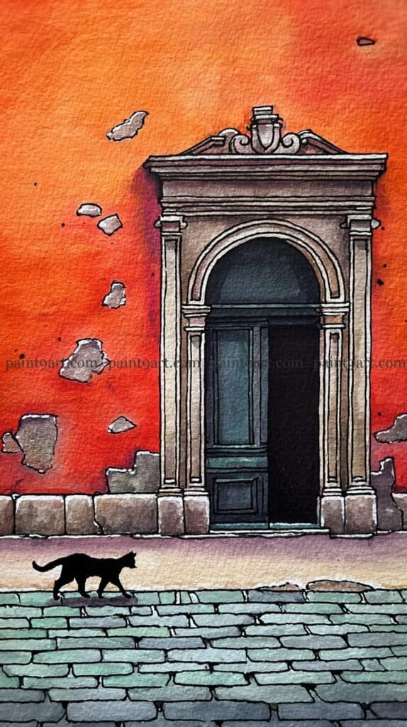
The Neoclassical Entrance & The Shadow Cat
Begin by sketching the ornate pediment and arched doorway with a waterproof fine-liner, paying close attention to the symmetry of the columns and the “cracks” in the surrounding plaster. For the large wall area, apply a bold, variegated wash of deep orange and red, using a wet-on-wet technique to drop in darker umber spots while the paint is damp to suggest peeling stucco. Keep the interior of the doorway a deep, solid black or indigo to create a powerful sense of an unknown interior space.
For the cobblestone street, use a multi-tonal wash of muted greens and greys, painting individual stones with slightly different saturations to suggest age and wear. To finish, paint the silhouette of the cat using a highly concentrated black pigment, ensuring the “tail-up” posture is crisp to convey motion. Add a very thin, horizontal blue-grey shadow beneath the cat to ground it to the pavement, making sure this shadow aligns with the larger architectural shadows cast by the doorway’s columns.
Recommended Color Palette
Element
Recommended Pigments
Terracotta Wall
Pyrrol Orange, Quinacridone Gold, Burnt Umber
Neoclassical Arch
Payne’s Grey (diluted), Yellow Ochre
Doorway Interior & Cat
Lamp Black or a mix of Indigo and Sepia
Cobblestones
Cobalt Green, Neutral Tint, Raw Umber
Shadow Details
French Ultramarine, Carbazole Violet
Rediscover the creative joy you set aside years ago with these 41 elegant door and window coloring pages. Simply download your PDF here and let your artistic journey begin again today.
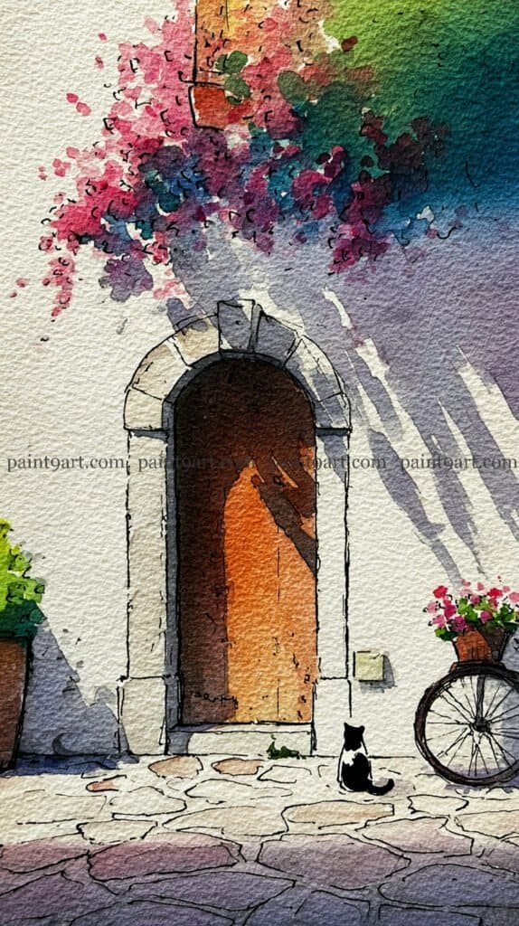
The Guardian of the Arch
Start with a light ink sketch to define the stone arch and the gentle curve of the bicycle wheel. For the main facade, leave the paper white, but apply a wet-on-wet technique for the upper corner; drop in a mix of soft pinks, purples, and deep greens to suggest overhanging flowers and foliage. While this area is still damp, pull down long, diagonal “shadow streaks” using a very diluted violet-blue to mimic the effect of light filtering through leaves onto the white wall.
For the focal point, wash the interior of the arch with a warm, glowing orange, deepening the color toward the right side to suggest a recessed wooden door in shadow. Paint the cat’s silhouette with a highly concentrated black or deep indigo, ensuring the posture is crisp and alert. Finally, use a multi-tonal wash for the cobblestones, alternating between cool greys and warm ochres to create an aged, rustic path that leads the viewer’s eye right to the waiting cat.
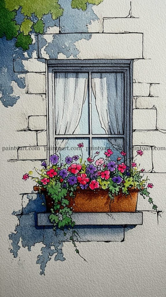
Start by sketching the window and the surrounding masonry with a fine-liner, focusing on the irregular shapes of the stone blocks to give the wall an aged, rustic feel. Apply a very pale wet-on-wet wash for the curtains using a diluted blue-grey, leaving vertical slivers of white paper to represent the light-catching folds. Once dry, block in the window frame with a solid, dark tone to provide a strong structural boundary between the soft interior and the textured exterior wall.
For the window box, use a saturated dabbing technique for the colorful petunias, mixing vibrant pinks, reds, and purples to create a dense, cheering display. Pull some of the green pigment downward in thin, trailing lines to suggest climbing ivy spilling over the stone sill. Finish the painting by glazing a deep, cool-toned shadow to the left of the window using a variegated wash; this grounds the window box and creates the illusion of bright, morning sunlight hitting the facade.
Recommended Color Palette
Element
Recommended Pigments
Stone Wall & Sill
Yellow Ochre, Payne’s Grey (highly diluted)
Window Interior
Indigo, Prussian Blue
Vibrant Petunias
Quinacridone Rose, Cadmium Red, Dioxazine Purple
Foliage & Ivy
Sap Green, Hooker’s Green
Cast Shadows
French Ultramarine, Cobalt Violet
Take a peaceful moment for yourself and return to the colors of your youth with this Door & Window printable collection. Download your 41-page PDF now and enjoy the simple, soul-soothing pleasure of painting.
The Weathered Wood Portal
Begin with a precise ink drawing using a waterproof fine-liner to define the vertical planks, focusing on irregular spacing and the rugged, uneven grain. Apply a variegated wash of deep greys and browns using a wet-on-wet technique within each plank, allowing the colors to mingle but keeping the edges crisp to suggest deep grooves. While the first layer is still damp, “charge” in some darker indigo or black near the top and bottom to create a sense of weathering and age.
For the hardware, use a saturated wet-on-dry application of bright gold or yellow ochre, leaving a tiny sliver of white paper for a direct highlight to suggest a metallic sheen. Use a fine brush to add the tiny white “splatter” or “grain” effects across the door once it is completely dry to mimic peeling paint or dust. Finish by adding the delicate, minimalist grasses at the base with a few quick, gestural strokes to ground the door in its environment.
Recommended Color Palette
Element
Recommended Pigments
Main Door Planks
Payne’s Grey, Neutral Tint, Burnt Umber
Plank Shadows
Indigo, Sepia
Gold Hardware
Quinacridone Gold, Yellow Ochre
Texture & Grain
Lamp Black (for deep cracks), Titanium White (for splatters)
Rediscover the creative joy you set aside years ago with these 41 elegant door and window coloring pages. Simply download your PDF here and let your artistic journey begin again today.
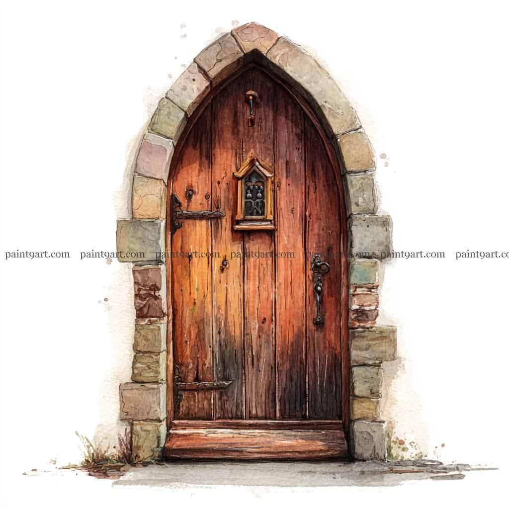
The Gothic Stone Entrance
Begin with a detailed ink sketch using a waterproof fine-liner to define the individual, staggered stones of the arch and the long, vertical planks of the door. Apply a variegated wash of Burnt Sienna and Raw Umber to the door, dropping in darker pigment at the base and around the iron hinges while wet to create a weathered, aged appearance. For the stone surround, use a granulating wash of pale ochre and cool grey, allowing the pigments to settle into the paper’s texture to mimic the look of natural, hand-cut rock.
To finish, use a glazing technique to add a deep, cool-toned shadow within the recessed curve of the arch and at the very base of the door to provide structural depth. Dapple in small patches of mossy green and earthy brown at the threshold using a dry-brush technique to ground the entrance in its environment. Finally, add a touch of concentrated yellow or gold to the small window frame and the door handle to provide a subtle metallic contrast against the dark, heavy timber.
Recommended Color Palette
Element
Recommended Pigments
Timber Door
Burnt Sienna, Raw Umber, Sepia
Stone Archway
Yellow Ochre, Payne’s Grey, Burnt Umber
Hardware & Window
Quinacridone Gold, Indigo
Ground & Moss
Sap Green, Olive Green, Van Dyke Brown
Shadow Details
French Ultramarine mixed with a touch of Neutral Tint
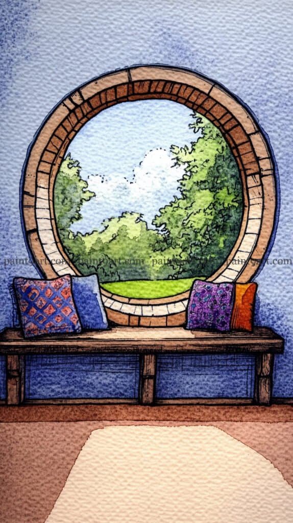
Begin by sketching the large circular window and the wooden bench with a waterproof fine-liner, using concentric lines to define the depth of the window frame. For the outdoor scene, apply a graduated wash for the sky and use a wet-on-wet technique for the trees, dropping in bright yellows and greens to suggest sunlight hitting the leaves. Inside, apply a granulating wash of deep blue to the walls to create a cozy, textured atmosphere that contrasts with the bright, smooth light of the outdoors.
To finish, use a saturated flat wash for the colorful pillows, adding geometric patterns with a fine brush once the base layer is dry. For the wooden bench, use a dry-brush technique with warm browns to capture the rough timber texture. Complete the piece by washing the foreground floor in soft, earthy neutrals, leaving a bright patch of white paper in the center to represent the strong “spill” of sunlight coming through the portal.
Take a peaceful moment for yourself and return to the colors of your youth with this Door & Window printable collection. Download your 41-page PDF now and enjoy the simple, soul-soothing pleasure of painting.
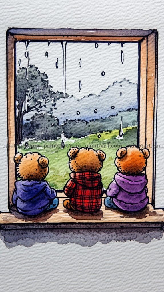
Rainy Day Friends
Start with a charming ink sketch of the three bears from behind, focusing on the different textures of their hoodies—denim, plaid, and fleece. For the view outside, use a wet-on-wet technique with very diluted greens and greys to create a misty, soft-focus meadow and treeline. While the background is damp, use a “lifting” technique or a touch of white gouache to create the vertical streaks of raindrops and the larger “splashes” hitting the windowpane.
To finish, paint the bears with saturated washes of primary colors to make them stand out as the cozy focal point against the muted outdoors. Apply a granulating wash of warm sienna for the wooden windowsill, leaving a light area directly beneath the bears to represent the interior light. Finally, add a soft, horizontal shadow beneath the window ledge with a diluted violet to ground the entire scene and enhance the feeling of a safe, indoor sanctuary.
Recommended Color Palette
Element
Recommended Pigments
Rainy Landscape
Sap Green (diluted), Payne’s Grey, Cerulean Blue
Teddy Bear Fur
Raw Sienna, Burnt Umber
Hoodies & Textures
Ultramarine Blue, Cadmium Red, Dioxazine Purple
Windowsill
Burnt Sienna, Yellow Ochre
Raindrops
Titanium White Gouache or Chinese White
Rediscover the creative joy you set aside years ago with these 41 elegant door and window coloring pages. Simply download your PDF here and let your artistic journey begin again today.
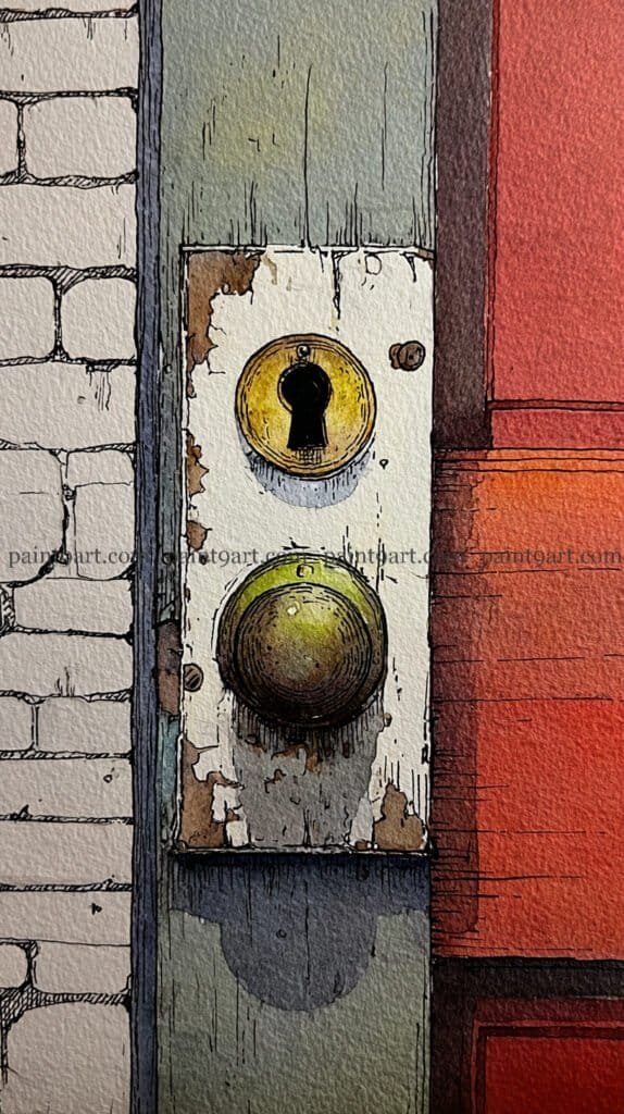
The Vintage Keyhole
Begin with a precise ink drawing to define the circular forms of the keyhole and doorknob, using fine hatching to suggest the cracks in the peeling white paint on the mounting plate. Apply a variegated wash of vibrant red and orange to the door on the right, and while damp, drop in a deeper crimson near the shadows to create warmth and volume. For the brick wall on the left, keep your washes light and desaturated, allowing the crisp ink lines to do the heavy lifting in defining the masonry.
To finish, focus on the metallic elements by applying a saturated wet-on-dry wash of olive green and ochre to the doorknob, leaving a tiny sliver of white paper for a sharp, sunlit highlight. Use a glazing technique with a deep indigo to cast the heavy, rounded shadow beneath the mounting plate, which instantly lifts the hardware off the flat surface. Finally, add a touch of concentrated black to the keyhole itself to create a sense of internal depth and complete the realistic, high-contrast effect.
Recommended Color Palette
Element
Recommended Pigments
Red Door
Cadmium Red, Pyrrol Orange, Alizarin Crimson
Oxidized Hardware
Olive Green, Yellow Ochre, Burnt Umber
Peeling Plate & Wall
Payne’s Grey (highly diluted), Raw Sienna
Shadows & Keyhole
Indigo, Lamp Black
Brick Outlines
Neutral Tint or Sepia
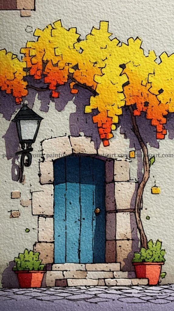
The Golden Tree Courtyard
Begin with a clean ink drawing using a waterproof fine-liner to define the stone archway, the vertical planks of the door, and the intricate silhouette of the overhanging tree. For the background, apply a graduated wash of pale grey for the wall, and while damp, drop in a saturated wet-on-wet shadow of deep violet directly beneath the tree canopy. This shadow is vital; it defines the lower boundary of the foliage and gives the architectural elements immediate depth and physical presence.
For the focal point, use a variegated wash on the tree, blending Lemon Yellow at the top into a fiery Cadmium Orange at the bottom of the clusters to suggest a glowing, autumnal light. Paint the door with a flat wash of bright teal, adding a strip of deep indigo at the top to indicate the recessed shadow of the stone arch. Finish by dabbing vibrant greens for the potted plants and using a multi-tonal wash for the cobblestones, alternating between cool greys and soft purples to mimic the reflected light from the sky and shadows.
Capturing the interplay of light and shadow on a simple glass pane or wood grain is one of the most rewarding ways to practice watercolor. We hope these 36 ideas inspire you to pick up your brushes and find the beauty in the portals of everyday life.
Don’t forget to download our coloring pages to jumpstart your process—they are perfect for testing color palettes before committing to a final piece. Happy painting!