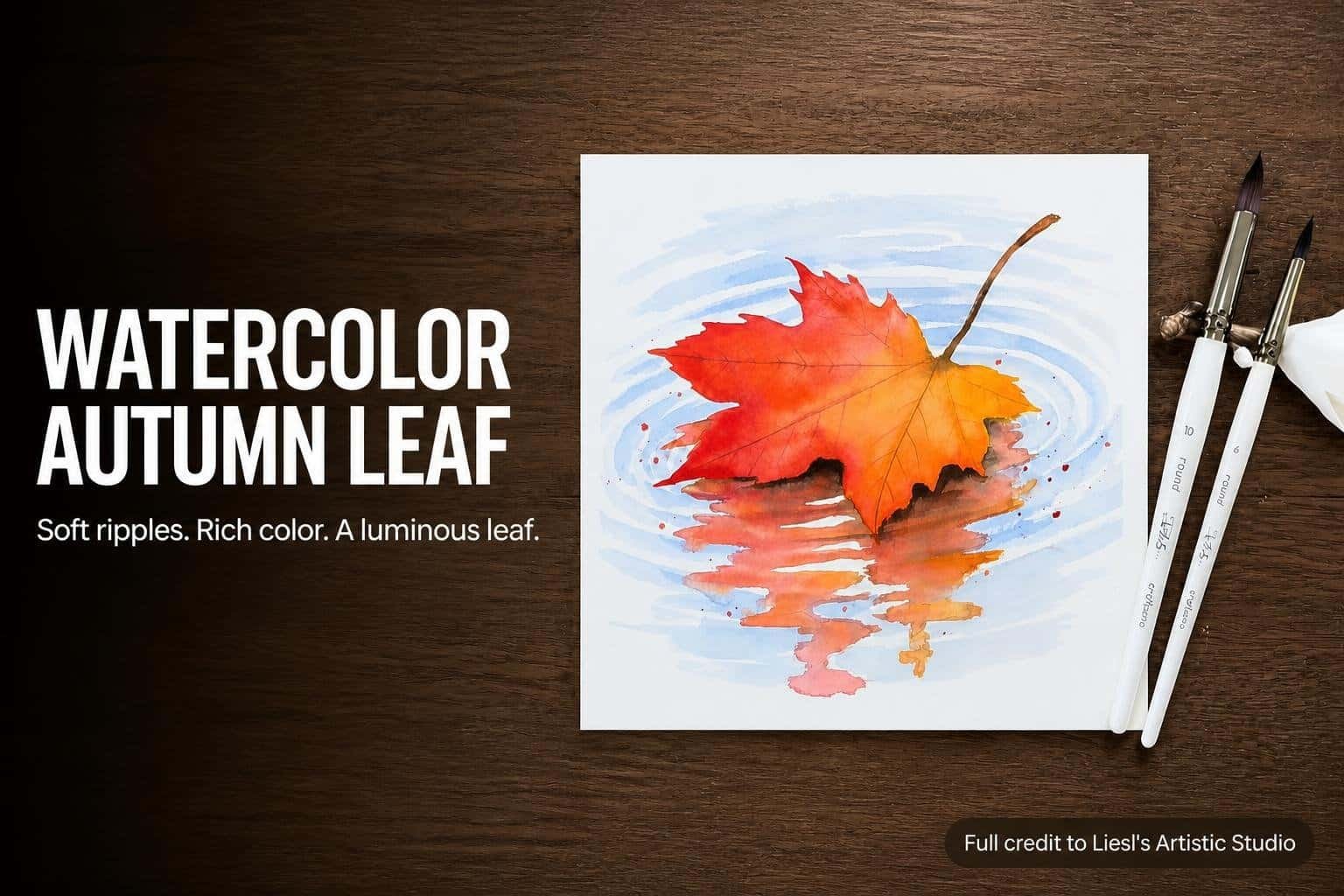
Liesl’s Artistic Studio builds this autumn watercolor around a simple visual contrast: a richly colored leaf resting above a softer, more subdued reflection. Pale blue ripples surround the subject, while red, orange, and yellow blend across the leaf itself.
Although the finished painting has several layers of color and movement, the demonstration follows a clear progression through the water, the reflection, and the leaf. Masking fluid protects the leaf shape early on, and a few restrained finishing details bring the separate areas together.
A Simple Outline and a Protected Leaf Shape
The artist works on watercolor paper cut to an 8-by-8-inch square, choosing that format as an alternative to a rectangle. The initial drawing is selective rather than exhaustive. It establishes the basic leaf outline and the water or reflection lines directly beneath it, while the remaining areas are painted largely freehand with an outline kept nearby as a reference.
That balance matters to the demonstrated process. The leaf needs a recognizable boundary, and the reflection immediately below it needs a starting structure. The surrounding water, however, is allowed to remain loose. The artist does not treat every ripple as a shape that must be carefully traced before painting begins.
Masking the Leaf Before Painting the Water
After taping down the paper, Liesl’s Artistic Studio applies masking fluid to protect the outlined leaf shape. An older brush is used for this task, with liquid dish soap worked into its bristles beforehand to help prevent the fluid from gumming them up. The artist also recommends rinsing that brush while the masking fluid dries.
The stem does not necessarily need masking because it will later be painted darker than the surrounding water. A small amount of masking fluid is added to selected empty spaces within the reflection as well. These protected areas are kept limited rather than expanded across the entire reflection.
Masking fluid is presented as a convenience, not the only possible approach. The artist notes that painting around the leaf could also work, but finds the masking useful for this demonstration. It allows the surrounding passages to develop before the main leaf receives its bright color.
Preparing the Water and Autumn Colors
While the masking dries, the artist arranges the palette. Ultramarine blue is selected for the water. Alizarin crimson mixed with cadmium red produces the deep red used in the autumn passages, while cadmium orange with a small amount of cadmium red creates a red-orange mixture. Gamboge and burnt umber are also prepared.
Payne’s gray enters later when the artist decides that the shadow directly beneath the leaf needs more depth. The palette therefore serves distinct roles: blue for the surrounding water, warm colors for the leaf and its reflection, and darker additions for the shadow passages.
Stage One: Loose Blue Ripples Around the Leaf
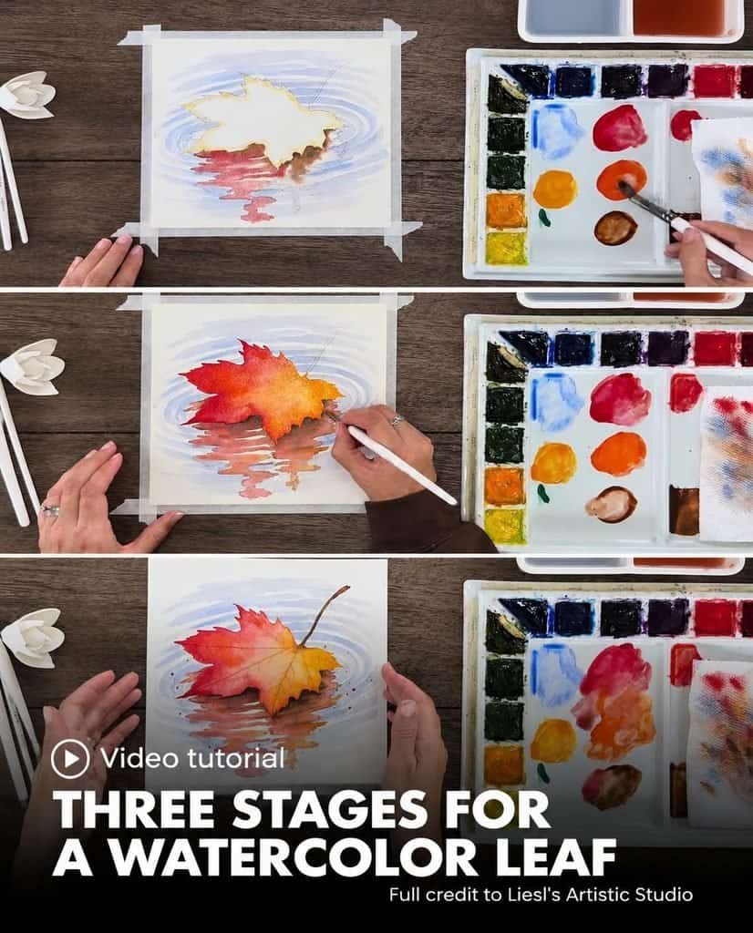
The first painted area is the water surrounding the protected leaf. Liesl’s Artistic Studio dilutes ultramarine blue to a light value and uses a number 10 round brush to make curved or oval strokes around the subject. White paper remains visible between the marks, separating the ripples instead of turning the background into a continuous blue wash.
The artist keeps this area deliberately relaxed. The water supports the painting, while the leaf is intended to receive the main attention. The blue marks establish movement and a setting without demanding the same level of definition as the central subject.
Tighter Ripples Near the Subject
Close to the leaf, the ripples remain relatively tight. Farther toward the outer edges and the upper portion of the paper, the artist makes larger pools of blue rather than relying only on single strokes. This change in handling gives the surrounding water some variation while retaining its loose character.
The lower area is approached similarly, with the brush moving around the planned leaf reflection for the moment. Slight overlap is not treated as a serious problem because the later reflection colors can cover those portions. Once the overall arrangement is visible, the artist returns to darken a few blue lines, without making the entire background more intense.
This first stage establishes enough water to continue. It is not developed into a highly detailed study of every ripple. The artist assesses the overall look, strengthens selected marks, and then moves to the warmer shadow and reflection beneath the leaf.
Stage Two: A Muted Reflection Beneath the Leaf
The reflection is painted wet on wet. Liesl’s Artistic Studio first wets the intended area with clean water, then introduces color into that damp space so the pigments can spread and blend together. Burnt umber is placed along the lower outline of the leaf, where the shadow should be darkest because it sits immediately beneath the subject.
When that first dark passage appears insufficient, the artist adds Payne’s gray. This adjustment is made in response to the painting as it develops, rather than treated as a separate elaborate layer. The darkest area remains tied to the leaf’s lower edge.
Warm Color with Softer Values Below
The red mixture is introduced mainly on the left side of the reflection. It stays darker near the leaf and becomes lighter farther downward. Red-orange is added largely on the right, following the same progression from stronger color near the subject to a softer value below it.
The two warm mixtures are not kept in rigidly separate sections. Some orange moves into the left side, and a little red enters the right. The artist lets them bleed together, maintaining the loose treatment already established in the water.
After the colors have spread, additional curved brush marks suggest ripples within the reflection. These marks break up the smooth appearance of the wet-on-wet passage and connect its warm colors to the surrounding water movement.
Why the Reflection Is Less Vibrant
At this stage, the artist acknowledges that the reflection looks somewhat muddy. That effect is intentional. Burnt umber and Payne’s gray dull the brighter warm mixtures, preparing a quieter area beneath the leaf rather than a second equally vibrant subject.
The purpose becomes clear when the leaf is painted. Liesl’s Artistic Studio wants the leaf to stand apart from the rest of the page, so the reflection is kept subdued while the main leaf receives richer, brighter color. The painting’s central contrast is therefore built into the sequence before the leaf itself is finished.
The water and reflection are then left to dry completely. Only after that drying stage does the artist remove the masking fluid and begin working inside the protected leaf shape.
Stage Three: Bright Wet-on-Wet Color in the Leaf
An eraser helps start the masking-fluid removal, but the artist uses fingers for much of the remaining work. The reason is practical: the pencil outline is still needed, and erasing too extensively could remove the drawing before the leaf is painted.
With the masking removed, Liesl’s Artistic Studio switches to a number 6 round brush. The smaller brush is used to wet the leaf, including its pointed tips and small recesses. As with the reflection, clean water comes first so the colors can blend within the shape.
Red, Red-Orange, and Gamboge
The artist begins with the cadmium red and alizarin crimson mixture near the upper portions and edges of the leaf. The color is blended a short distance inward before the red-orange mixture is introduced. Red-orange joins the red passages and is also pulled toward the lower leaf tips.
Gamboge fills the remaining space with a highly pigmented yellow. Across these passages, the artist keeps the warm colors rich rather than introducing the brown and gray used to subdue the reflection. That difference gives the leaf its prominence against the softer water and shadow below.
The brush tip can also draw a little darker paint through the damp leaf toward the stem, suggesting loose, natural vein lines. These early marks remain part of the flowing color rather than becoming a heavy network of sharply outlined divisions.
A Dark Stem and a Stronger Base Shadow
Before the leaf dries completely, the artist paints its stem in burnt umber. A little brown is added at the stem’s base to connect it with the leaf. A very thin line of Payne’s gray along the right side of the stem is offered as an optional shadow detail.
The main leaf colors remain bright, even as these small darker accents are introduced. The stem and base provide specific dark touches; they do not replace the red, orange, and yellow color relationships across the leaf.
As the painting dries, Liesl’s Artistic Studio decides to strengthen the shadow directly beneath the leaf once more. Burnt umber, Payne’s gray, or a mixture of both deepens that area. A brush that has been wetted and then dried off leaves damp bristles suitable for softening the fresh shadow’s edge and blending it downward into the ripples.
Restrained Details Complete the Painting
Once the leaf has dried, the artist adds thin vein lines with a number 1 rigger brush. Burnt umber can be mixed with some red or orange for these marks. The lines are kept subtle and relatively light so they do not compete with the blended autumn colors.
Optional Splatters in the Water
The last addition is optional red watercolor splatter in the surrounding water. The leaf is covered first to keep those marks off the main subject. Tapping one brush against another produces small droplets, and the artist paints in a few larger spots by hand for variation.
The finished demonstration depends on the relationship among its three main areas. Loose blue strokes establish the water, subdued warm colors create the reflection, and a bright wet-on-wet leaf supplies the focal point. The final shadow, fine veins, and scattered droplets reinforce that arrangement while preserving the painting’s relaxed character.