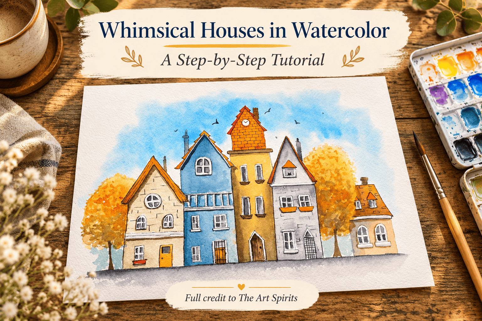
The Art Spirits brings a row of whimsical houses to life through loose ink lines, varied watercolor washes, and warm autumn trees.
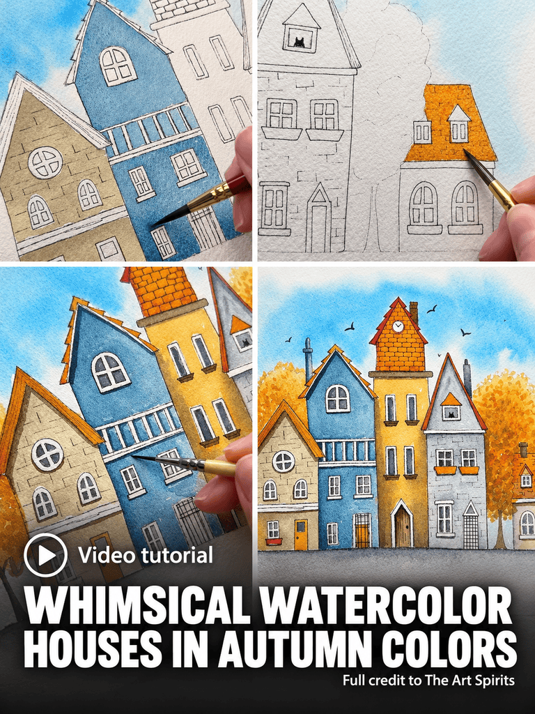
Although the scene contains plenty of small architectural details, the painting develops in a clear sequence: a fine-lined drawing, a soft blue sky, individual house colors, and increasingly precise shadows and finishing marks.
The demonstration also includes a color bleed and its correction, revealing how small adjustments help preserve the sense of overlapping buildings.
Materials
The tutorial uses Daniel Smith watercolors, Arches Cold Press Watercolor Paper, several brushes, graphite, and two black fine liners. The materials list accompanying the tutorial specifies the following supplies.
Watercolor Paints
- Manganese Blue, identified as Manganese Blue Hue during the demonstration
- Buff Titanium
- Jane’s Grey
- Quinacridone Gold
- Aussie Red Gold
- Raw Sienna Light
- Quinacridone Burnt Orange
- Sodalite Genuine
- Raw Umber
- Sepia
- Burnt Sienna
The spoken demonstration also mentions Burnt Umber when the artist adds a shadow to the small house’s roof.
Paper, Brushes, and Drawing Tools
- Arches Cold Press Watercolor Paper
- Size 0 mop brush
- Size 3 round brush
- Size 0 detail brush
- Small liner brush
- Eradicator brush
- Graphite for the preliminary drawing
- Black fine liners in 0.1 and 0.3 sizes
- Eraser for removing pencil lines
Clean water is used for washes and lifting color. The artist also uses a heat gun to dry the painting between stages.
A Loose Ink Drawing Establishes the Character
The painting begins with a transferred pencil sketch. Once the drawing is on the watercolor paper, The Art Spirits follows the pencil marks with a very fine 0.1 black pen. The intention is to establish the buildings without surrounding every shape with a heavy outline.
The lines remain slightly scratchy and irregular. That loose treatment contributes to the whimsical quality from the beginning, before any paint reaches the paper. After demonstrating the approach on the first house, the artist erases the pencil marks.
Starting with such a fine pen also leaves room for decisions later. Some lines will become stronger at the end, while others will retain their lighter appearance. The first drawing therefore provides a structure without fixing every edge at the same visual weight.
A Soft Blue Sky Behind the Roofs
Preparing the Wet Area
The Art Spirits mixes Manganese Blue Hue before wetting the sky. Having the paint ready allows the color to be introduced as soon as the surface is prepared.
Water covers the sky area above the roofs, extending toward the top and down the sides of the paper. The artist tilts the sheet to check for missed patches and aims for an even layer of water across that area.
The blue then enters the wet surface. It does not reach all the way to the top, allowing the outer edge of the painted sky to remain soft. Small white gaps closer to the roofs suggest clouds without requiring separate, carefully outlined cloud shapes.
Strengthening Color Near the Brickwork
The sky is adjusted while the wash is still being worked. An edge that appears too harsh is softened, and a stronger amount of blue is taken directly from the pan for the middle area.
That stronger passage sits near the part of the building that will become orange brickwork. The artist specifically connects the placement of the blue with the future orange, using their contrast to help the brick section stand out. Once the sky is established, the wash is dried with a heat gun.
Individual House Colors and Early Shadows
Across the row, The Art Spirits uses a repeated approach: a watery base color followed by darker paint dropped into selected areas. The method gives each house variation before the final architectural shadows are added.
Buff Titanium and Muted Blue
The first house receives Buff Titanium. A second mixture combines that color with a little Jane’s Grey, creating a darker version for selected passages beneath the eaves and around some of the bricks.
The next house uses Manganese Blue mixed with Sodalite Genuine. The addition mutes the blue, distinguishing the building from the brighter sky. A watery version covers the house first, followed by stronger color near the bottom and beside an overlapping building.
These darker placements begin to explain which house sits in front. The overlap is already present in the drawing, but the paint makes that relationship more apparent.
Raw Sienna and Orange Brickwork
Another house begins with a light wash of Raw Sienna Light. Its darker mixture includes Jane’s Grey. Because this building sits slightly behind its neighbors, the artist places stronger shadows along its edges and across the lower area.
The upper brick section introduces Aussie Red Gold, described during the demonstration as a bright rusty orange. Quinacridone Burnt Orange supplies the darker color.
While these sections dry, the artist moves to the small house farther along the row. Its roof receives Aussie Red Gold mixed with Burnt Sienna, followed by darker brown beneath and along one side. The placement suggests a tree casting a shadow over the roof.
The small house itself receives Buff Titanium with a little Burnt Sienna. Jane’s Grey adds another suggestion of the tree’s shadow on the wall.
Correcting a Bleed and Separating the Buildings
During the early house washes, paint runs into an adjacent area. The Art Spirits initially treats the accident lightly, but later returns to it because it weakens the intended overlap between the buildings.
The correction begins with clean water. The artist wets the unwanted color, agitates it with the brush, and attempts to lift it. When the pigment proves difficult to remove, an eradicator brush is used for further lifting.
The demonstration is candid about the result: the stronger rubbing disturbs the paper surface. This is a specific correction within the painting, rather than an effortless removal of all the unwanted color.
The important visual aim is to make the affected section lighter than the neighboring shadow. After lifting and absorbing the loosened color, the artist restores a little blue. The boundary becomes clearer, and the buildings read more convincingly as separate forms.
A further adjustment changes one house’s color. A very diluted version of the warm roof mixture is glazed over it because two neighboring colors appear too similar. The remaining gray house receives a watery Jane’s Grey base with darker passages dropped in, continuing the approach used elsewhere.
Autumn Trees in Loose, Varied Color
The houses are allowed to dry before the trees begin. The Art Spirits prepares several warm mixtures, including Quinacridone Gold, an Aussie Red Gold mixture, Raw Umber, and Raw Sienna Light.
A little water is added across the upper part of the foliage area. Different colors are then dropped and dabbed into that damp section, creating variation within the autumn canopy.
The trees remain deliberately low in detail. Their role is fulfilled through changing color and small marks, rather than a careful description of individual leaves.
When the foliage is almost dry, Raw Umber creates small dotted shapes around the lower portion. Those later marks sit alongside the earlier, softer color passages. The combination gives the trees more definition while preserving the loose treatment described by the artist.
Roofs, Windows, and Small Architectural Details
With the broader areas established, the painting moves into smaller features. A little liner brush carries a strong mixture of Quinacridone Burnt Orange for the roof tiles.
The window areas receive a watery Jane’s Grey. Strong Sepia supplies the small tree trunks, and the artist continues by coloring doors and the little roofs.
This stage brings the individual buildings closer to completion, but it does not replace the earlier washes. Instead, the small marks work within the larger color areas already established. The muted walls, warm roof colors, and loose foliage remain the foundation while the windows and doors become more clearly defined.
Final Shadows and a Simple Pavement
Stronger Accents Beneath Architectural Features
The Art Spirits returns to the eaves and the areas beneath windows with darker versions of the existing colors. One example uses Raw Umber to create a strong brown shadow beneath an overhanging feature.
The white framework receives a different treatment. Very diluted Jane’s Grey breaks up selected white areas so they no longer appear uniformly stark. The artist describes these additions as informal, with some longer pieces receiving more shading toward the bottom.
The result depends on variation: strong shadow in one location, a much lighter touch in another, and untouched white elsewhere. The artist does not give every architectural element the same amount of gray.
A Ground Line Softened with Water
The pavement begins with a strong Jane’s Grey line across the bottom of the houses. After cleaning the brush, the artist uses a little water and the side of the brush to work back and forth along the lower edge.
This softens the line into a basic pavement wash. A little more color is added where needed, completing the ground beneath the row without introducing an elaborate street scene.
Selective Ink Lines Finish the Whimsical Houses
The final pen work uses the larger 0.3 fine liner. Some original lines have become less visible beneath the paint, so The Art Spirits strengthens selected edges and details.
The artist also adds chimneys that were omitted from the earlier drawing. Brickwork is revisited where it has faded under the washes, including an area covered by the relatively opaque Buff Titanium. Metal grids on some doors receive additional emphasis.
The change from the first pen to the second is selective. Some lines become thicker while others remain fine, avoiding an entirely uniform outline around the painting. That variation continues the loose character established in the initial drawing.
A few birds complete the sky. The finished scene brings together the same elements developed throughout the demonstration: sketchy architectural lines, distinct house colors, overlapping shadows, and autumn foliage. Its character emerges through those successive choices, including the small corrections that keep the row of buildings visually clear.