
Brusho Crystal Color brings bold color and exciting textures to watercolor paintings. When Beala Art tried these watercolor powders for the first time, they turned out to be fun, messy, and full of surprises.
If you’re curious about what they are, how to use them, and what to expect, Beala Art will walk you through everything based on her own experience.
Let’s explore this unique art supply together.
Contents
What Is Brusho Crystal Color?
Before diving in, the artist explains what Brusho crystals are and how they behave.
What Are They Made Of?
Brusho crystals are simply powdered watercolor ink. If the viewer has used watercolor inks before, they behave very similarly—just in a dry, powdered form.
Since the powder is extremely fine, it can stain anything it touches—paper, fabric, even furniture. So the viewer will need to be a little cautious when using them.
Airborne and Messy—but Fun!
Here’s something the artist discovered quickly: because Brusho is a powder, it becomes airborne very easily.
The artist did not cover the table or floor the first time using them. Even when trying to be careful, pigment ended up everywhere—on the floor, the table, and even unexpected places.
For the second try, the artist placed the paper inside a butcher’s tray to contain the mess. It seemed like it would help—but it didn’t. Powder still spread across the table.
Since the artist has a dark laminate table, the powder was hard to see at first.
But when wiping the surface with a paper towel, the pigment showed everywhere. Fortunately, the laminate allowed it to wipe clean. However, if the viewer has raw wood, it could stain permanently.
Safety and Handling Tips
Using powdered paints like Brusho requires a few precautions. Here’s what the packaging—and the artist’s experience—suggests.
Precautions to Take
Brusho should always be handled with care, just like any other paint or solvent.
- Wear protective clothing
- Avoid breathing in the powder
- Don’t let it get into the mouth
Toxicity Information
The box states that Brusho is non-toxic, which is reassuring. Still, the artist prefers to stay cautious when handling fine powders like this.
What’s in the Box?
Here’s what comes in the set and the extras the artist experimented with.
What’s in the Standard Set?
The artist purchased the assorted pack of 12 Brusho colors. It includes:
- Lemon
- Yellow
- Orange
- Brilliant Red
- Scarlet
- Purple
- Turquoise
- Ultramarine
- Dark Brown
- Black
- Leaf Green
- Emerald Green
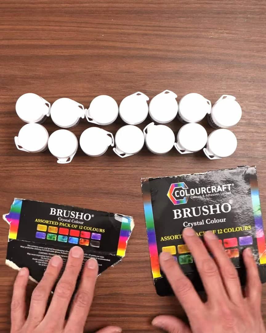
Extra Colors the Artist Added On
The artist also ordered two additional shades:
- Prussian Blue
- Olive Green
In the end, though, the artist felt those extras weren’t necessary. The blues in the set are already quite similar to one another.
The artist believes the standard set of 12 provides all the color variety needed—and it’s more affordable that way, too.
How to Use Brusho Crystals: Tips and Tricks
The fun part begins with learning how to use these.
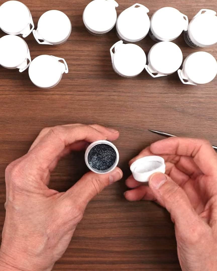
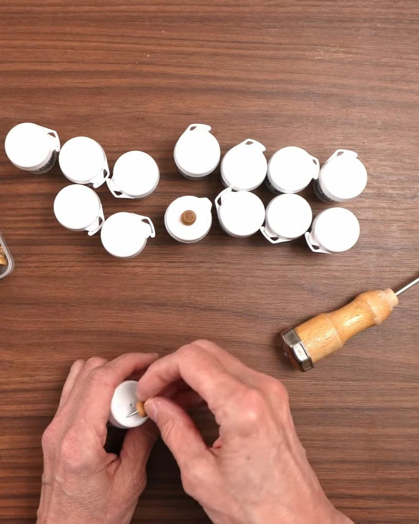
The most common method the artist has seen is to poke a hole in the lid of the tiny canisters. A pushpin is used for this.
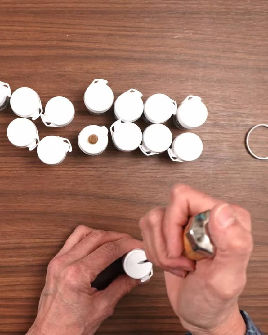
Then, the artist plugs the hole with the same pin. That way, the artist can shake the powder out gently, just like using a salt shaker.
Sprinkle on Wet Paper
Here’s how the artist usually does it:
- The artist wets the paper first.
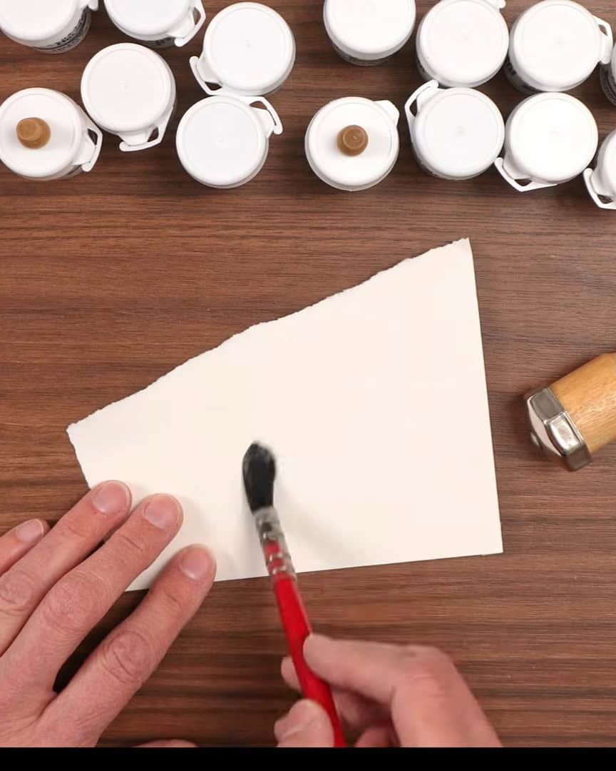
- Then, the artist sprinkles the Brusho powder through the hole in the lid.
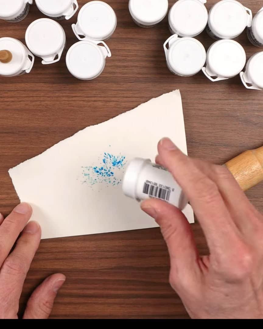
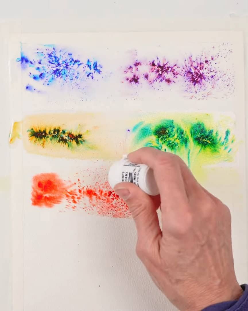
As soon as the crystals touch the water, they explode with color. It’s beautiful. The viewer can remove the lid completely if more powder and a stronger effect are desired.
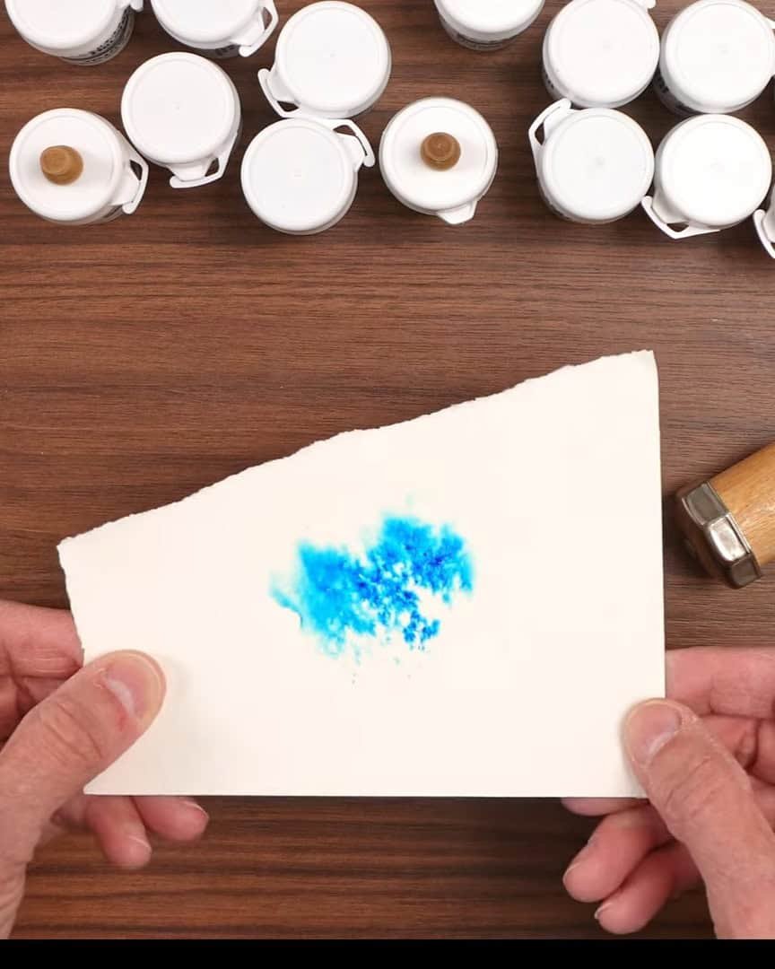
The amount of water used also makes a big difference. More water and more powder? The result is more intense colors and dramatic effects.
Color Mixtures and How They Look
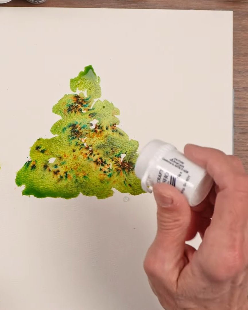
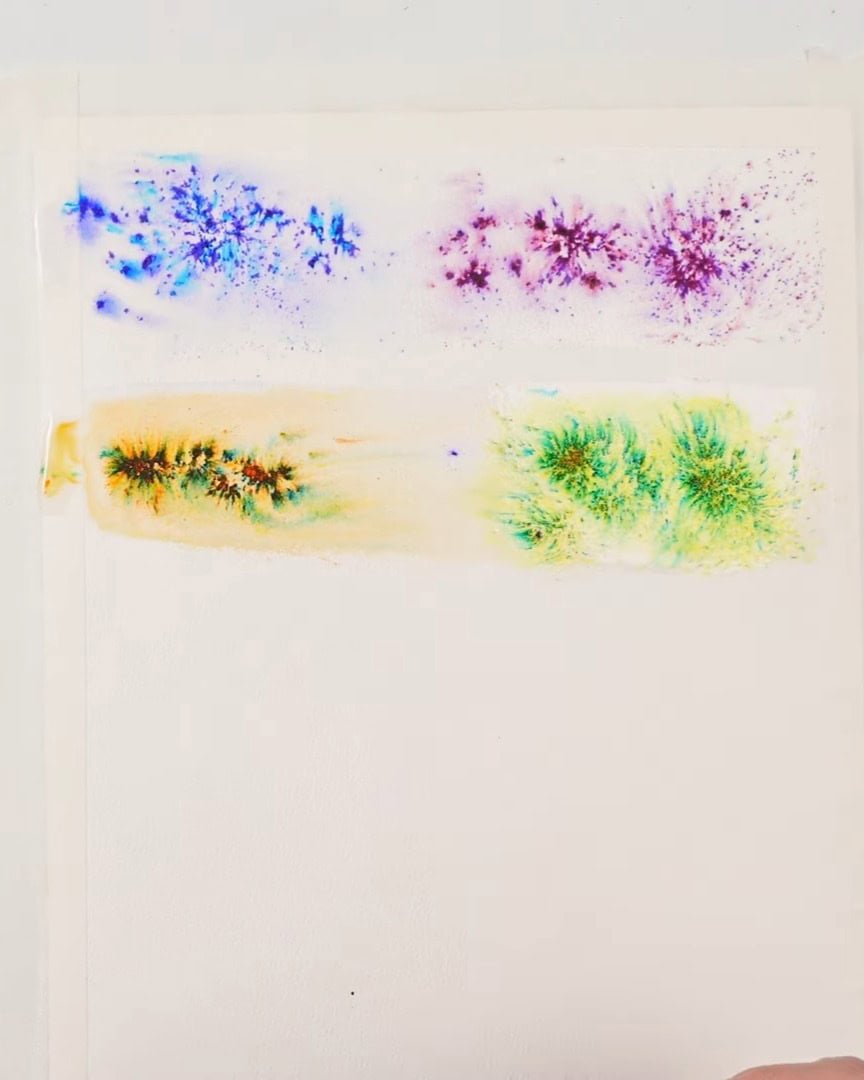
After testing the colors, the artist notices something interesting. Many of the greens contain extra colors like yellow or brown.
For example, the emerald green has a strong yellow base and shifts toward blue-green. Black even contains some blue. It’s a fun surprise to see how the colors break apart as they spread.
My Swatches and Texture Tests
Before using Brusho in full paintings, the artist creates little swatches to explore each color
Trying Out the Colors
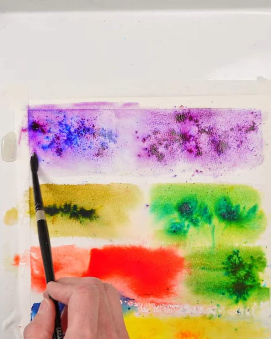
When testing the yellows and reds, they look very close in hue. There’s only a small difference between lemon and yellow and between brilliant red and scarlet. These colors don’t seem to have extra pigments mixed in.
Smoothing with a Brush
The artist also tries blending the crystals after they hit the water. Some areas are smoothed out with a brush, while other areas are left rough.
This creates a neat textured look, perfect for abstract backgrounds or soft color transitions.
Adding Texture to Real Artwork
Now for the fun part—seeing how Brusho works in actual paintings.
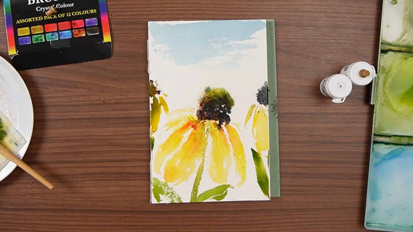
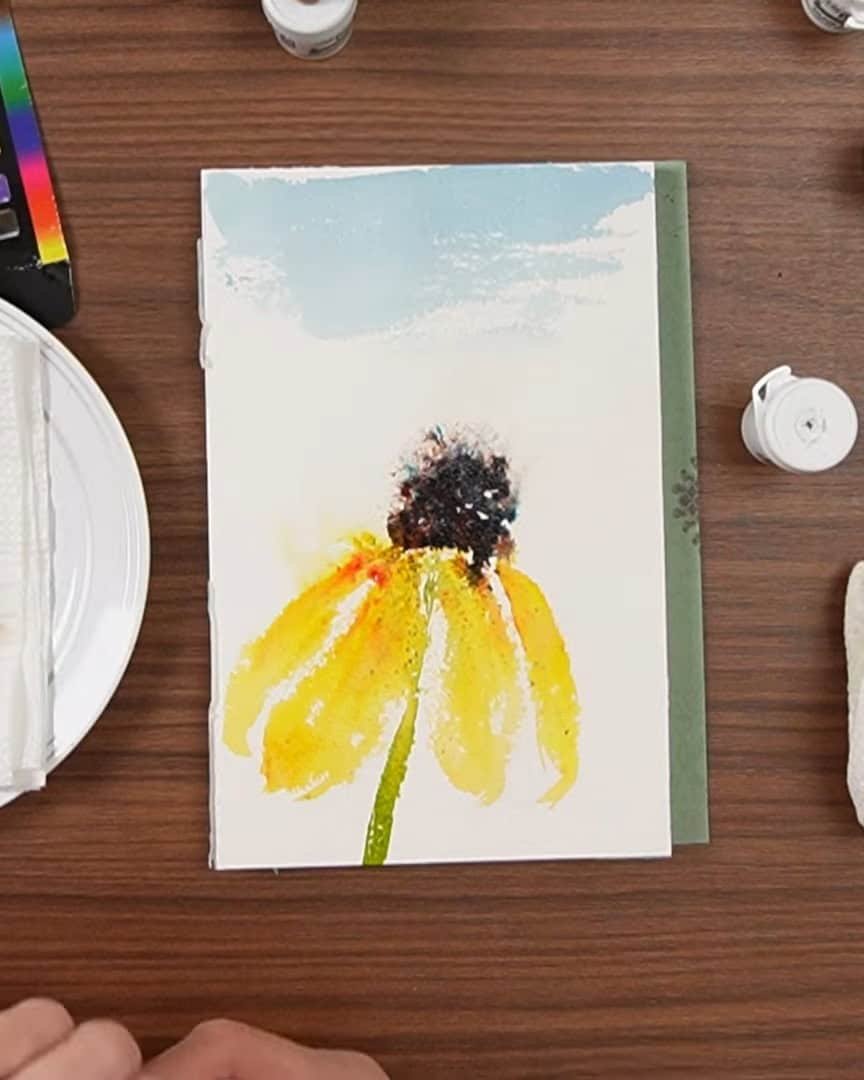
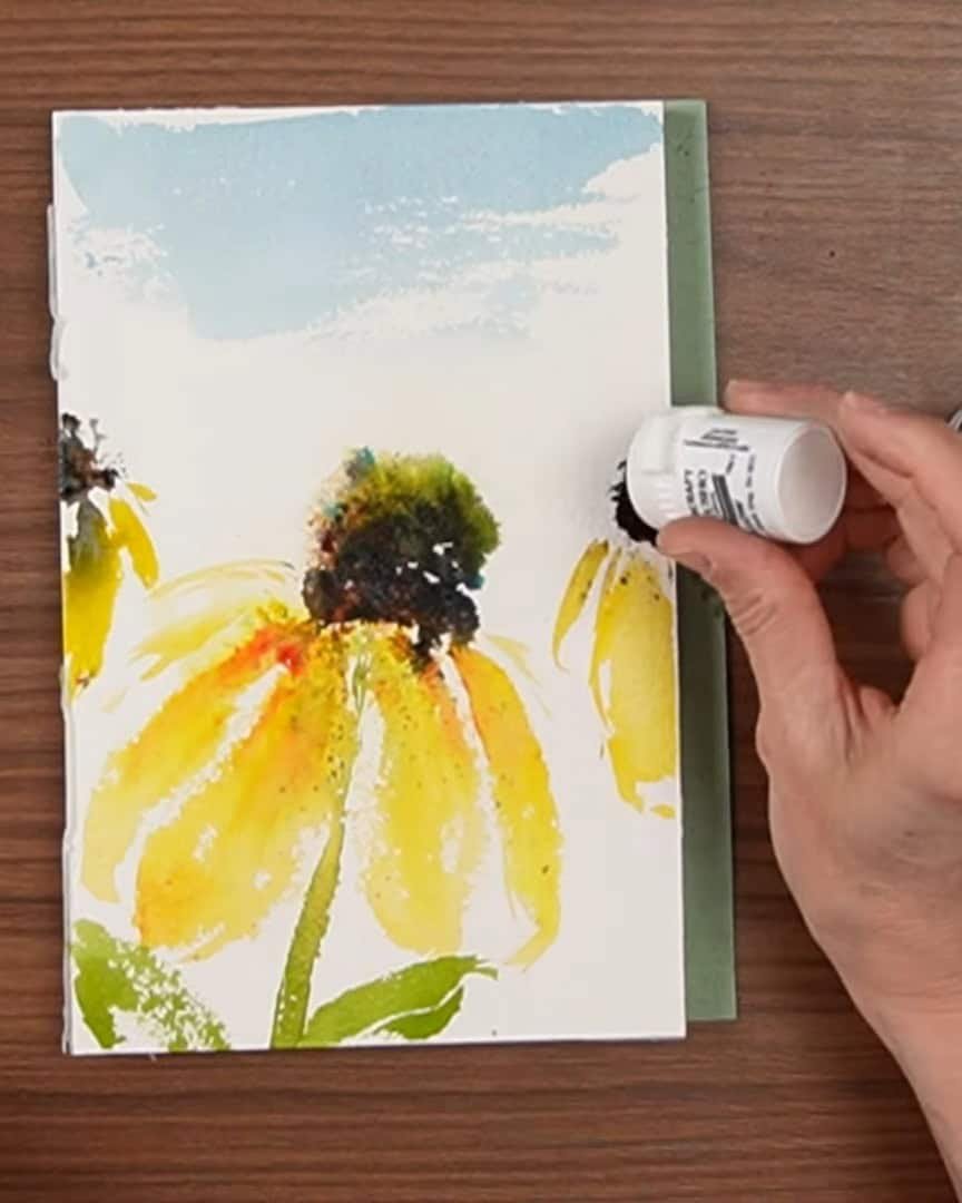
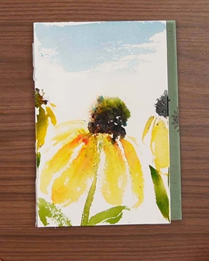
Sunflower Center Texture
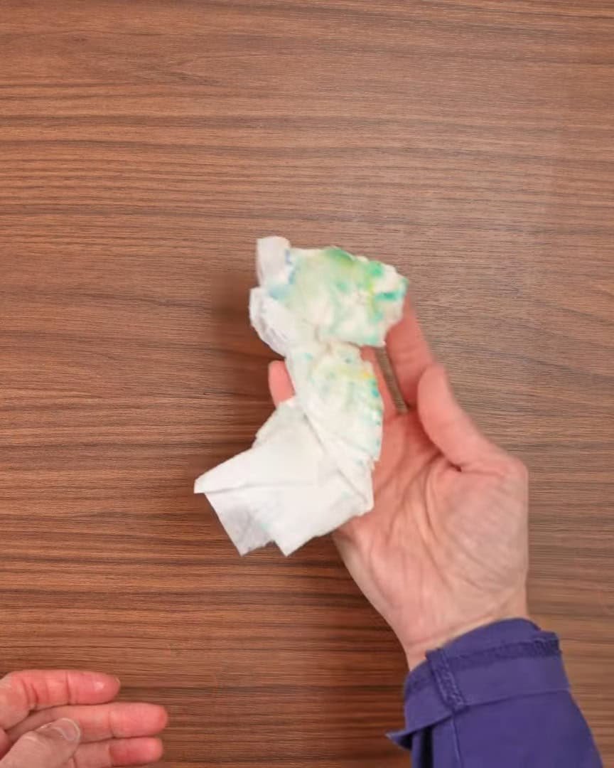
The artist decides to use Brusho on a sunflower. Black and brown are sprinkled in the center. The black has blue tones—and it pops beautifully!
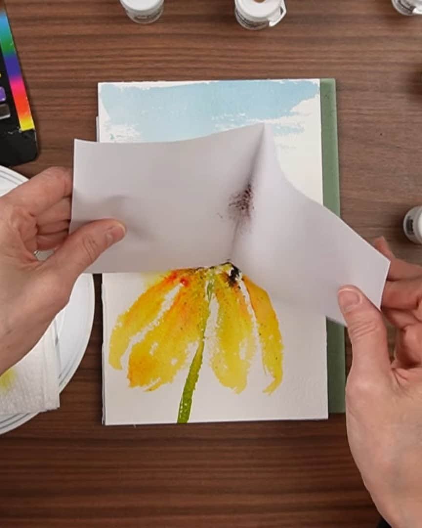
The artist tries two ways to apply the crystals: one using a piece of paper to guide the sprinkle, and the other using the salt shaker method. Both seem to spread the powder the same way. It still goes everywhere.
The artist also thinks the hole poked earlier might be too small. Maybe next time, two or three small holes will be used. That could give a better flow without letting too much out.
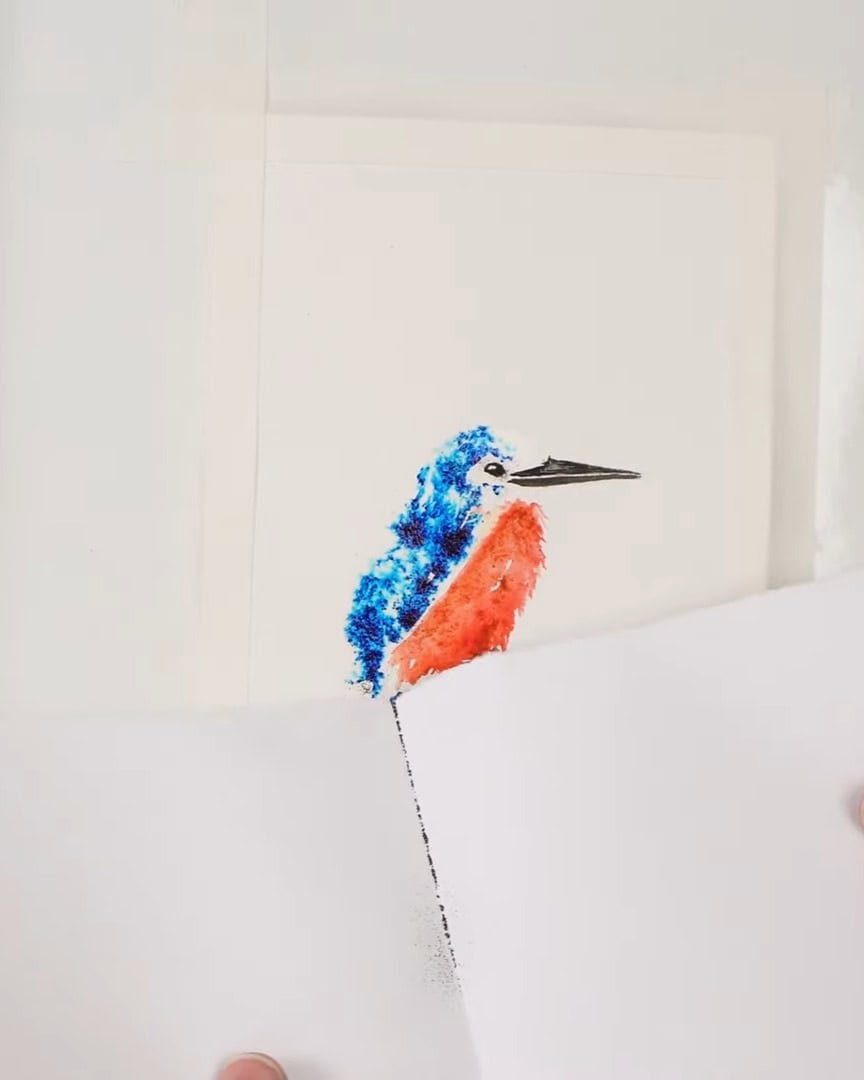
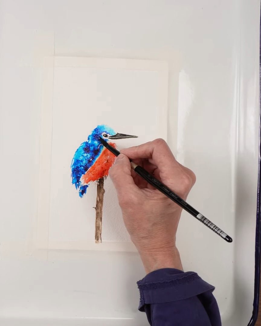
Painting a Bird with Brusho
The artist paints a full bird using only Brusho. It turns out fine, but the artist doesn’t love the full-coverage look. Afterward, the artist goes back with a brush to clean up the edges. That part works well.
Painting Daisies with Watercolors and Brusho
Later, the artist uses regular watercolors to paint daisies and adds Brusho only for extra texture.
This approach is preferred. It gives more control and creates a nice mix of smooth paint and rough textures.
The Artist’s Personal Thoughts on Brusho Crystal Color
Overall, the artist is happy to have given Brusho a try. It’s something the artist will use again to add texture and interest. However, the artist wouldn’t repurchase the extra colors—the 12-color set offers more than enough.
If the viewer wants to see another excellent example of Brusho in action, the artist recommends checking out YouTube creator Ward Stroud, who painted a beautiful turtle using Brusho textures.
Wrapping Up
Brusho Crystal Color adds joy and surprise to watercolor painting. Whether used for backgrounds or fine texture, it’s a fun tool to explore. Just remember—it’s messy, and a little goes a long way.
How would the viewer use Brusho in their artwork? The artist would love to hear about it!