

Have you ever thought about using charcoal with watercolor? It might sound unconventional, but as Kate Miles Art loves to demonstrate, combining the two can create stunning textures and beautifully moody effects that bring depth and character to your artwork.
In this article, Kate Miles Art will walk you through several ways to incorporate charcoal into your watercolor paintings.
We’ll explore how different types of charcoal interact with watercolor, how to use them at various stages of the painting process, and helpful tips for achieving expressive, eye-catching results.
Contents
Exploring Different Types of Charcoal and Their Interaction with Watercolor
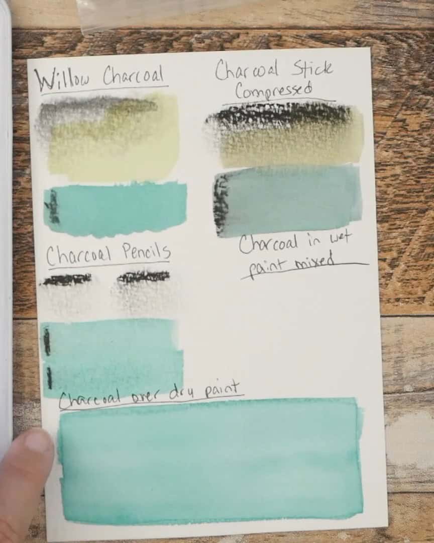
Willow Charcoal
Let’s begin with willow charcoal. This type of charcoal is made from willow twigs, and it’s light and soft.
Don’t be fooled by how dark it looks on the paper—it’s a lovely mid-tone charcoal when blended.

The artist loves using a blending stump to get even more softness. A small note of caution here: if someone is working with watercolor paper, they should go easy when blending hard.
They don’t want to damage the paper surface. But it’s an option they can explore gently.

Here’s how the artist works with it. The artist makes a mark on the paper using their willow stick. Then, the artist grabs a flat watercolor brush and mixes up some color.
The artist often uses viridian green but keeps the mixture light. That way, the artist can see how the watercolor is affected by the charcoal underneath.
Once the artist gets the brush wet and drags the color out, the artist notices the willow charcoal doesn’t have much movement on the paper.


Sometimes, the charcoal shifts slightly, depending on how much pigment is down. Other times, it stays in place.
Either way, adding a watercolor wash over willow charcoal creates fascinating effects.
Compressed Charcoal Stick
Next, the artist talks about compressed charcoal sticks. These sticks are harder compared to willow charcoal.
And here’s a key thing the artist has learned—the harder the charcoal, the lighter it is on the value scale. Soft charcoal gives darker tones.

When the artist makes a line with the compressed stick, it’s easy to see how messy it can get.
But what stands out is how dark and rich the line stays, unlike willow charcoal, which blends into a mid-tone.

The artist makes another mark and then reviews it with the flat brush and the same viridian mix. What happens next is amazing.
The charcoal spreads more in the paint and darkens the color quite a bit. It almost tones it down and gives it a slightly dingy look. You can see the difference in hue.

When the artist applies the same watercolor over the compressed charcoal and compares it with lemon yellow, the yellow darkens, too.
It’s less vibrant, but that muted effect can be beautiful in the proper context.
 Compressed charcoal – lemon yellow combination
Charcoal Pencils: General’s and Woodless
Now, the artist wants to show two different kinds of charcoal pencils. The first is General’s charcoal pencil, the regular sort inside the wood casing. It can be used like any other drawing pencil.
The second one is a woodless charcoal pencil. It has a painted coating, and the entire thing is charcoal.
This is great because the artist can easily shade with the pencil’s side. The artist has enjoyed playing with these in an art journal. They make some fantastic marks.
The artist has both a soft and a medium version. Soft gives the darkest value, and medium is a little lighter.

The artist makes some marks with both. The Medium pencil gives a nice, clear line, like the compressed stick. The soft pencil lays down an even darker line.

When the artist blends with a finger, the Medium pencil has some blends, but not a lot. The soft General’s pencil blends a little more. That makes sense since it’s softer and darker.
Now, the artist adds some watercolor over both pencils to see how they react.
With the Medium pencil, there’s not much effect. But with the soft pencil, there’s a little more darkening. Still, the compressed stick affects watercolor the most by far.
The artist almost forgets to test the yellow! The artist applies it over both pencil marks. The medium pencil muddies the yellow slightly.
The soft pencil darkens it even more. It’s clear that all these charcoals impact the watercolor differently.

How Charcoal Reacts with Watercolor in Different Stages
Now that the types of charcoal are known, it’s time to see how they react over watercolor at different stages. This is where things get exciting.
The artist shows exactly how charcoal is layered over dry watercol
Using Charcoal Over Dry Watercolor Washes
The artist starts by drawing some simple shapes with each charcoal type: one shape with the woodless pencil, one with compressed charcoal, and one with willow charcoal.
The artist makes a note next to each so they don’t forget which is which.

Then, the artist grabs a Q-tip and blends over the woodless charcoal first. It gives a soft look, almost like shadows. It feels like blending on regular drawing paper but over a colorful wash.
You can go back in with more layers if you want. The artist flips the Q-tip to the clean side and blends the compressed charcoal. It blends further and leaves more texture behind.
When the artist gets to willow charcoal, it blends softly and gives a nice mid-tone. You won’t see as much texture here.
You can see how each type blends over the dried paint when the artist holds the paper up. It’s a soft, layered effect that’s satisfying.

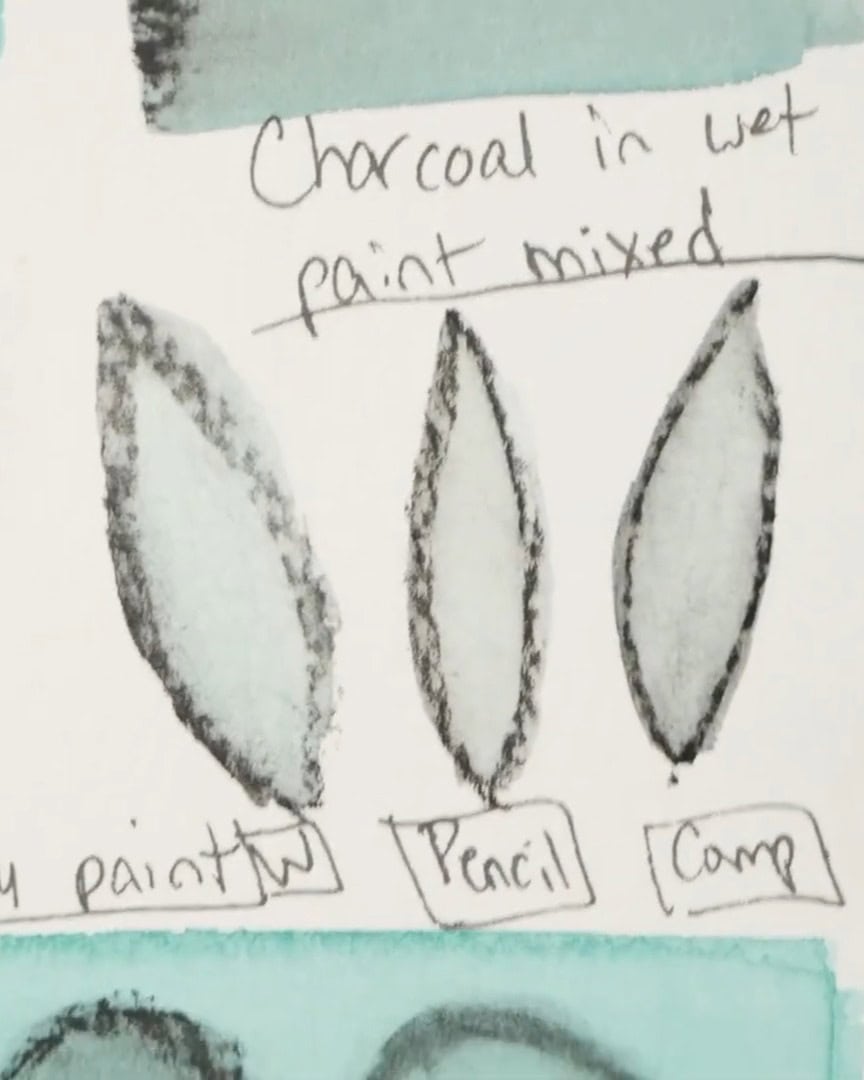
Using Charcoal in Wet Watercolor Paintings
Once basic marks are comfortable, it’s time to test how charcoal shapes react when activated with watercolor.
The artist draws leaf shapes using willow charcoal, woodless charcoal, and compressed charcoal. Each shape gets just one stroke, so the differences can be seen.
When the artist paints over the willow leaf, it gets very dark. The shading is interesting and resembles a variation on the line-and-wash technique.
However, charcoal gives the watercolor a slightly dirty look. So, it works better with darker colors or muted washes.

When the artist activates the charcoal pencil leaf, the line stays more intact than the willow. The willow spreads out more because it’s softer.
Finally, the artist gets the darkest effect when going over the compressed charcoal leaf.
The outline stays bold and crisp, and if soft compressed charcoal had been used instead of hard, it would’ve been even darker.
Among all the shapes, the willow still has the most green showing through, even though the differences are subtle.
Creating the Artist’s Charcoal-Watercolor Masterpiece
Now that the charcoal reactions are understood, it’s time to try this technique in a painting.
The artist walks through a quick abstract art demo using charcoal and watercolor to create a dynamic piece.
Step 1: Prepping the Paper With a Light Mist
The artist starts with a few simple supplies:
- The quill brush
- A spray bottle of water
- Marie’s Masters watercolor palette
- New York Central cotton watercolor paper
First, the artist lightly spritzes the surface of the paper with water. They don’t soak it—they deposit little drops across the surface.
This gentle misting creates pockets of water that interact beautifully with the paint, giving the whole piece an organic, textured effect.

Step 2: Laying Down the First Wash of Color
Next, the artist mixes up some colors. For this project, the artist feels like working with a neutral palette. The artist grabs indigo and burnt sienna—two rich, earthy tones that play well together.
First, the artist dips into the indigo and touches the brush to the dampened paper. Instantly, the paint blooms around the droplets, creating delicate, spontaneous shapes.
The artist gently sweeps the brush around, allowing those patterns to form naturally without forcing anything.

After rinsing out the brush, the artist dips into burnt sienna and mixes it with leftover pigment on the palette.
Again, the artist touches this color onto the page, letting it mingle softly with the indigo. The artist isn’t concerned with specific shapes here—just interesting areas of color and texture to build on later.

At this point, the artist reminds themselves (and the reader): Have fun and play. Don’t overthink it. Let the paint do what it wants.
Step 3: Adding Lighter Tones for Contrast
To balance out the deep indigo and burnt sienna, the artist wants to bring in a lighter color. So, the artist dips into raw sienna, a warm, soft neutral.
The artist dabs it into a few spots across the page, letting it softly blend with the existing layers. It stays within the neutral theme but lifts the piece so it doesn’t get too dark too fast.
The artist goes back into the indigo again, deepening some areas. The artist wants that color to be the “star of the show.”

Using the brush, the artist mops up extra moisture pooling along the edges to control where the paint travels.

In some spots, the artist intentionally brings the indigo straight up through the paper, trailing it toward the corners and edges.
This is where the magic happens—when colors start running into each other in unpredictable, gorgeous ways.

The artist lets it dry completely once satisfied with the look.
Step 4: Glazing for Depth
Once the first layer is dry, it’s time to add more richness and depth. The artist spritzes the paper again lightly and grabs burnt sienna.
The artist dabs small pops in strategic areas using this color as a glaze. The idea here is to add subtle layers, like rusty veining or aged textures.
The artist doesn’t want it to dominate the painting, so after applying it, they gently blot it back with the brush to soften it.

The artist goes back into the indigo once more, deepening a few existing areas to enhance the dark-light contrast.
The extra depth gives it even more drama—and it starts resembling tree branches. That’s the beauty of abstract work: it can suggest so many things without being literal.

Then, the artist lets everything dry again before moving on.
Step 5: Introducing Charcoal Lines
Now comes the exciting part—adding charcoal to layer bold graphic marks over the soft watercolor base. The artist grabs the soft willow charcoal stick and a ruler.
Using the ruler as a guide, the artist lays straight lines in interesting areas across the painting.
The artist varies the pressure to create thicker and thinner marks. Willow charcoal goes on quickly, so it’s no surprise if the stick wears down fast. It’s worth it for those deep, velvety lines!
The artist makes a few intersecting marks, some almost forming triangles. Again, the artist doesn’t overthink—lines are placed where they feel interesting and organic.
 Create lines with charcoal
Step 6: Softening With a Blending Stump
The artist grabs the blending stump to soften the stark charcoal lines and add dimension.
On one side of each charcoal line, the artist gently blends the charcoal outward. This creates a soft, subtle shadow effect—like the line is slightly lifted off the paper.
The artist carefully pulls the charcoal to the paper’s edge, repeating this technique on all the lines.
Quick tip: The artist remembers that charcoal isn’t permanent on top of watercolor. A fixative spray will be needed later to preserve the marks. Brushing on a fixative can smudge things, so spraying is usually the safest bet.
The artist loves how this part turns out. The softened shadows give everything a magical, atmospheric quality while keeping intact crisp, dark edges.

Step 7: Adding Charcoal Circles
Next, the artist wants to add some circular elements to balance all the straight lines. Instead of using the chunky willow stick (which is hard to control for curves), the artist switches to the woodless charcoal pencil.
The artist sketches three circles in different spots around the painting. These have a cleaner, sharper look than the soft willow lines.
Again, the artist goes back in with the blending stump, softening the inner edges of each circle and gently pulling the charcoal inward.
Because the artist is working on textured watercolor paper, they embrace that the charcoal won’t blend perfectly smoothly. The texture adds even more character.

Step 8: Bringing in the Gold Ink Sparkle
At this point, the painting feels a little dark overall. To balance all the moody colors and add a touch of brightness, the artist pulls out one of their favorite secret weapons: gold ink.
The artist squeezes a couple of drops onto the palette and grabs the stylus. Using the fine tip, the artist dots shimmering gold across different areas of the painting.
The artist places some dots over the dark charcoal to make them pop.
The artist also allows some of the dots to trail off the edge of the paper. This makes the marks feel less contained, as if they are spilling into space.
For extra sparkle, the artist grabs a small round plastic tool used earlier and stamps gold circles inside the charcoal circles. It’s a subtle touch, but it brightens things up.
The combination of shimmering gold and velvety black is exactly what the painting needs. And just like that, the abstract mixed-media painting is complete!

The piece is completed. It’s time to appreciate the depth and texture added.

Wrapping Up
Using charcoal with watercolor is a fantastic way to add depth, texture, and dramatic contrasts to artwork.
Whether an artist is working with dry or wet watercolor, charcoal can help enhance the painting in creative and exciting ways. The artist may explore using charcoal in their watercolor paintings to see how it changes the overall effect.
Give it a go and see how it transforms the artist’s art!