

Do you want to create magical layers in your watercolor art without painting the subject directly? As Kate Miles Art often shows, negative painting is a fun and beautiful way to reveal shapes by painting around them.
It sounds tricky at first, but once you understand the process, it becomes an easy, relaxing, and almost meditative technique.
In this tutorial, Kate Miles Art will guide you through one of her favorite watercolor exercises—and by the end, you’ll have a glowing, layered underwater scene filled with colorful fish.
Contents
- 1 What Is Negative Painting in Watercolor?
- 2 Step 1: Sketch the Artist’s Design and Prepare the Paper
- 3 Step 2: Wet the Paper and Add Bright Colors
- 4 Step 3: Paint the First Negative Layer Around the Foreground Fish
- 5 Step 4: The Third Layer: Defining More Fish
- 6 Step 5: The Final Layer: Darkening the Background
- 7 Step 6: Finishing Touches and Reflections
- 8 Final Thoughts
What Is Negative Painting in Watercolor?
Let’s begin by understanding what this technique is all about. Negative painting means painting around the subject instead of filling it in.
It’s about using the background to shape the image. So, instead of painting the fish, the artist paints everything but the fish, allowing their shape to stand out through the untouched areas.
This approach creates a layered, dimensional effect that gets more dramatic with each layer. It’s both simple and powerful—and, best of all, very relaxing.
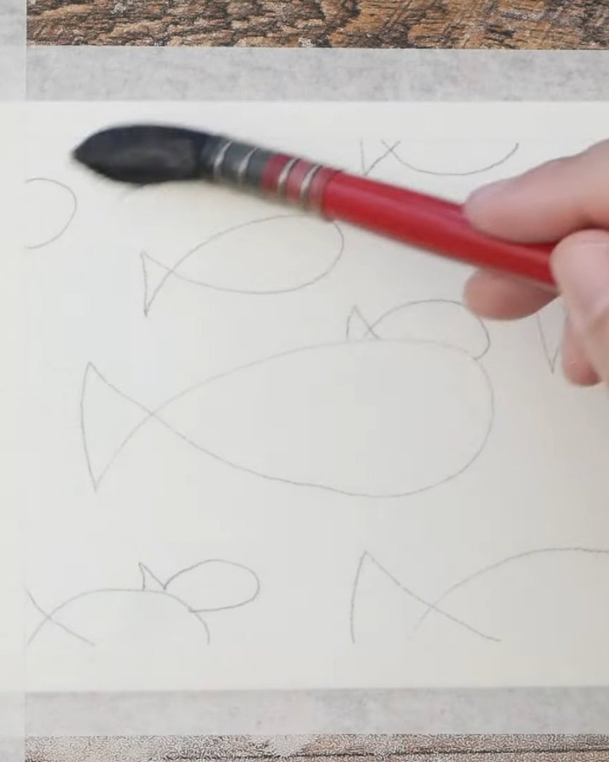
Step 1: Sketch the Artist’s Design and Prepare the Paper
Let’s start with what the artist used and how everything was set up. Here’s what is needed:
- Watercolor paper (taped down)
- A pencil for sketching
- Watercolor paints (magenta, sky blue, cadmium yellow, matter red, Payne’s Gray)
- Flat and round brushes
- Water container
- Paper towels
- Fine liner pen (0.03 tip)
- White pen for highlights
The artist tapes down the watercolor paper to keep it from warping. Then, the artist makes a few simple fish sketches.
They’re very basic and come in different sizes to give the sense of depth—smaller ones look farther away, while the big ones appear in front.
The three largest fish will stay in the front, and the artist builds around them.

Since watercolor usually works best from light to dark, the first layer will be the most colorful.
The artist’s idea is to create a bright, almost galaxy-like background and slowly darken it in each layer to bring the fish forward.
Step 2: Wet the Paper and Add Bright Colors
This part is all about playing with color. To start, the artist makes sure the paper is moist. The artist usually keeps pencil lines light, but goes darker this time so the camera can see better.
The water helps the colors bloom and mix beautifully.
The artist uses a Maylene palette, starting with magenta. Magenta is dropped right onto the paper, especially around the big fish in the foreground.

Next, the artist dips into sky blue and does the same, making sure the fish stay colorful.

If any area gets too dark, the artist gently blots it with a paper towel while the paint is still wet.

Then cadmium yellow is added in a few spots, blotting again to keep things strong and vibrant. Blotting helps avoid muddy colors.

After that, the artist uses a smaller brush and boosts certain areas with more magenta and blue.

The paper is still wet, so the artist continues building bright tones, even adding a bit of madder red.

While adding colors, the artist always blot the brush well before picking up a new pigment to avoid that unwanted cauliflower effect from too much water.
The goal for this first layer is to make the fish pop later. The artist ensures the colors are intense, vibrant, and ready for layering. Once the artist is happy with it, the artist lets it dry completely before moving on.
Step 3: Paint the First Negative Layer Around the Foreground Fish
Now comes the fun part—our first real negative painting layer. Once the first layer is completely dry, the artist adds a small new sketch of a fish in a yellow area.
This fish will appear in the second layer.

In negative painting, the trick is to paint around the things meant to stay light. So, in this step, the artist paints around the three largest foreground fish, which remain untouched through all layers.
The artist mixes a light blue wash—enough to cover the entire paper and avoid inconsistencies.
The artist also adds plenty of water to keep the wash nice and light.
The artist uses a flat brush to apply the paint. It helps cover more space evenly and get into corners without flooding the paper.
The artist starts at the top and works their way down. This allows them to avoid smudging with their hand.
As the artist gets close to each fish, they slow down and carefully follow the outlines. That’s the beauty of negative painting—they don’t paint the fish themselves, just the areas around them.
The artist dips into the paint frequently and keeps working quickly to prevent any backwash or uneven areas.

The goal is to darken the background while keeping the foreground fish clean and bright.
The artist notices the blue over the yellow creates a pretty green, which is a nice bonus.
The artist makes sure to get into all the little corners and tails. Once the wash is finished, the artist lets it dry completely again.
Step 4: The Third Layer: Defining More Fish
Now, it’s time to build more depth in the painting. In this step, the artist adds the third layer, but is not painting over everything—only carefully choosing which fish to keep clear and which ones to add more color.
The artist does not paint two layers of fish here. Instead, the artist makes sure the three fish in the front stay untouched. The artist wants them to remain bright and clear, so they are left out of this new wash.
Next, the artist looks for the fish that are just behind the front ones. These are the next largest in size. The artist chooses four of them for this back layer. These are the ones being painted now.
The paint is getting darker at this stage, so the artist slows down a bit. They take care to avoid painting over any fish that should stay light. The brush remains controlled and the strokes clean.
The artist moves the color across the top, carefully avoiding one of the front fish, then brings it straight down the tail and underneath it.
The artist also keeps the fish that should remain clear by painting around them slowly. They return to the other side and ensure this layer is finished before anything dries.
The artist cuts into one of the fish tails and brings the color straight up.
Then, the artist moves down the other side and spreads the color again. As the artist paints, the contrast starts to grow. This step makes the fish pop.
The artist does not forget small corners, either. There is a little angle that needs to be filled in. The artist goes around two more fish, ensuring the paint stays in the right places.

Some areas are tight and tricky to reach. So, the artist switches to a round brush with a fine point. It helps the artist get into a tiny tail area and carefully paint around one fish’s head.

Step 5: The Final Layer: Darkening the Background
The process has reached the last step, and the artist is excited to finish strong. In this layer, the artist doesn’t paint any more fish. Instead, the focus is completely on the background.
This part is all about deepening the color to create bold contrast and make those fish stand out.
The artist starts by mixing up more of the same blue used before. But this time, the artist also adds some Payne’s Gray.
The artist wants this last layer to be deep and rich. Since nothing else will be painted afterward, the artist goes all in with the color. The artist even adds more of that sky blue to make the mix just right.
It turns into a beautiful, intense blue.

Once the paint is ready, the artist begins in the top corner. The artist carefully paints around the first fish. Then there’s a tail to go around and another little fish body coming in from the side.
The artist takes their time and finishes each section before it dries. That helps keep things smooth and even.

Like before, the artist keeps painting around the edges—up to tails and beside the fish—and does not rush. It’s a simple process and honestly pretty relaxing.
The background can be made more detailed if desired, but it doesn’t need to be. A clean, simple background works great in negative painting.
The artist notices another small fish peeking out while working, so that one is carefully painted around as well. The artist keeps dipping into the paint and even adds more color when needed.
Then, the artist continues filling in the rest of the background.
There’s one area with no fish, so the artist can paint straight across without worrying. But even then, little hints of the earlier layer still show through.
That’s fine—it adds a nice depth to the painting. This layer mostly becomes an intense, dark blue that brings the whole scene to life.
 Slowly paint the background
If the paint looks too light, there’s no need for concern. Another layer can always be added on top.
It works. But the artist knows everything else is finished, so this final coat does the job perfectly.
The artist makes sure to get the corner over here and another little corner up top. Then, the artist moves through the middle section, just like before.
There’s another tiny fish the artist needs to go around, and at this point, the paint is getting low. So, the artist mops up what’s left on the palette.
The artist keeps the layer as even as possible. A round brush is grabbed again when a few small missed areas appear. It’s perfect for those tiny spots.
The artist mixes up a fresh bit of paint—it doesn’t need to match exactly—and gently dabs in the missing bits.

One spot turns dark, so the artist blots the brush and blends it out. The artist keeps blotting and brushing lightly, not wanting to overwork it.
If the artist rubs too much, there is a risk of lifting the earlier layers of paint, especially if they’re not completely dry. So, the artist fixes what can be fixed and then stops.

Step 6: Finishing Touches and Reflections
Now that the paint is dry, it’s time for some finishing touches. The artist grabs a fine liner with a 0.03 tip and a white pen.
First, the artist adds eyes to the fish. A small black outline is drawn, then a black circle is filled inside it. The same is done for the second-layer fish as well. Tiny black circles are added for the background fish—nothing too detailed.


The artist tries a new pen to add a few white bubbles floating up the page. It’s okay if they go before other fish—this adds a playful effect. For the background fish, the artist adds only small white dots.

But for the front three, the artist decides to make them stand out even more. The artist gives each one a simple white outline. The lines even become a bit scribbly—and the artist likes the effect.
It makes the painting feel light and fun.

That final bit of contrast brings the front fish forward. Now everything feels balanced, full of life, and finished just right.

Final Thoughts
Negative painting is a versatile technique that can transform watercolor artwork. Depth and intrigue are created by focusing on the spaces around the subject.
The artist encourages others to experiment with different shapes and colors, exploring the endless possibilities this method offers. Ready to dive into negative painting?
They suggest grabbing some brushes and letting creativity flow.