

Have you ever tried to mix colors but ended up with unexpected shades? Do you struggle to create the exact hues you need for your artwork? If so, you’re not alone!
When I first started painting, I often found myself frustrated with color mixing. My oranges were too dull, my greens too muddy, and my purples almost black.
But through practice, I discovered simple techniques that make color mixing easy—even for beginners!
In this guide, I’ll share everything you need to know about basic color mixing.
Whether you’re just starting or want to improve your skills, this article will help you confidently mix colors.
Contents
The Five Essential Colors for Mixing
Before we start mixing, let’s talk about the five basic colors that form the foundation of all color combinations.
The Five Key Colors
To mix colors effectively, you only need:
- Red
- Yellow
- Blue
- White
- Black
These are called primary colors, and with them, you can create almost any other color. White and black help adjust brightness and darkness.
These are the must-haves if you’re using a basic set of acrylic, gouache, or watercolor paints.

Why These Colors Are Essential
Understanding these five colors is the key to mastering color mixing.
If you’ve ever struggled with achieving the right shades, chances are the proportions or base colors weren’t quite right.
By working with pure colors first, you’ll better understand how they interact.

How to Mix Primary Colors to Create New Shades
Now that we have our essential colors, let’s start mixing!
#1. Mixing Red and Yellow to Create Orange
When you mix equal parts red and yellow, you get a balanced orange. But what if you want a different shade?
- More yellow = a lighter, brighter orange
- More red = a deeper, richer orange

Common Mistakes When Mixing Orange
One mistake beginners make is adding black to darken orange. This often makes the color look muddy.
Instead, add more red for a deeper orange or a bit of blue to mute it.

#2. Mixing Yellow and Blue to Create Green
Green is another essential color in painting. When mixing yellow and blue:
- Equal parts give you a balanced green
- More yellow creates a warmer, fresher green
- More blue results in a deeper, cooler green

How Black Affects Green
Adding black to green makes it darker and duller, creating a moodier shade.
If you want a more vibrant green, add a touch of yellow instead.

#3. Mixing Blue and Red to Create Purple
Mixing blue and red creates purple, but many beginners are surprised when the result looks darker than expected.
That’s because most reds contain warm undertones, which slightly mute the purple.

Pro Tip: Use Pink Instead of Red
Try mixing pink with blue instead of pure red if you want a bright, vivid purple.
This creates a much more vibrant shade, perfect for painting flowers, skies, or abstract backgrounds.
Common Mistakes in Color Mixing (And How to Avoid Them!)
Even with a basic understanding of color mixing, mistakes can still happen. Here are some of the most common errors beginners make and how to fix them.
Mistake #1: Using Black to Darken Colors
Many beginners think that adding black will darken any color, but this often leads to muddy, lifeless results. Instead, try:
- Adding more of the dominant color (for example, more red for a darker orange)
- Mixing in complementary colors for a richer, more natural tone
Mistake #2: Ignoring Undertones
Colors have hidden undertones that affect the final result. For example:
- Mixing yellow and black creates an unexpected greenish tone instead of a darker yellow
- Adding black to orange results in a muddy brown instead of a deep orange

Mistake #3: Painting the Sky with Blue and Yellow
Many beginners make the mistake of blending yellow and blue in a sky painting.
This often results in a strange greenish hue—not the bright, sunny sky they intended! Instead, keep the blue and yellow separate or use a soft gradient to transition smoothly.

Practical Tips for Beginners – Improve Your Color Mixing Skills
If you want to master color mixing, practice is key. Here are some simple exercises and tools that will help.
Tip #1: Create a Personal Color Chart
One of the best ways to understand color mixing is to make your reference chart. This will help you:
- See how different colors interact
- Remember which combinations work best
- Avoid unexpected results in your artwork

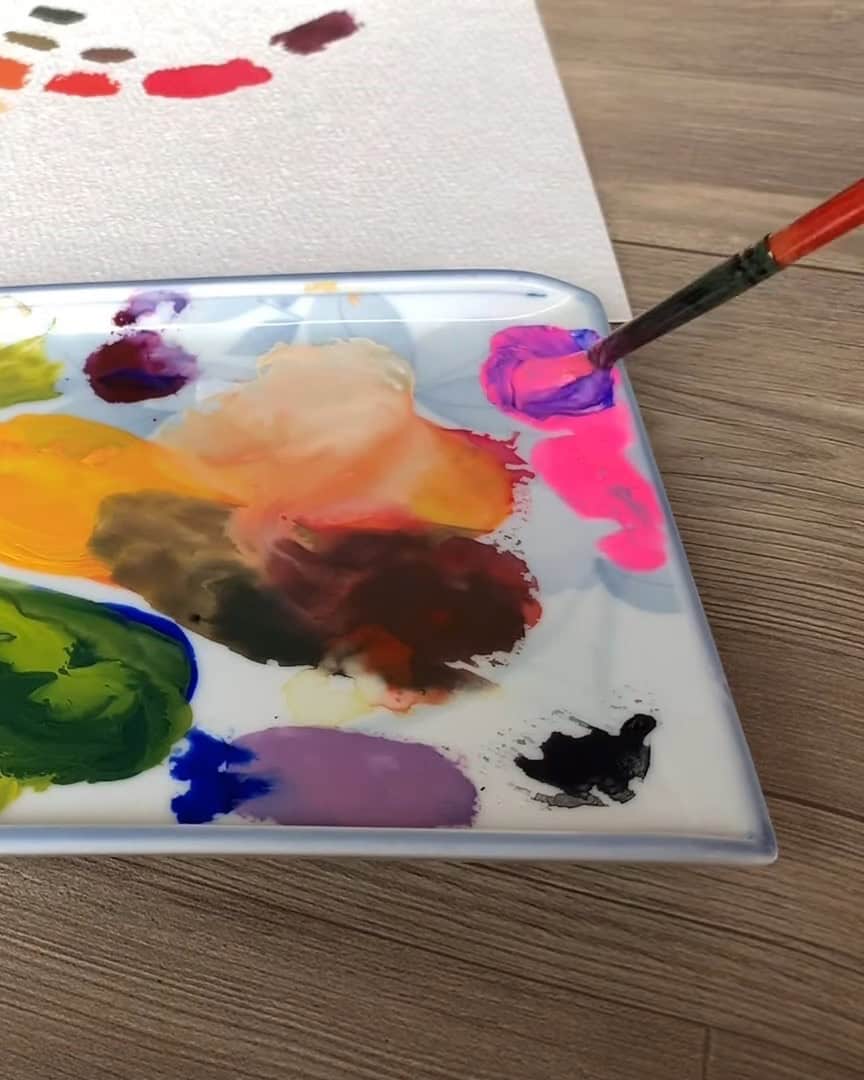
Tip #2: Choose the Right Palette for Mixing
Not all palettes are created equal! I recommend using a flat mixing palette instead of one with separate compartments. A flat surface allows you to:
- Easily blend and adjust colors
- Create smooth transitions
- Avoid wasting paint in small compartments

Tip #3: Experiment with Different Color Combinations
Professional artists rarely use colors straight from the tube. Instead, they:
- Mix small test batches before applying color to the canvas
- Layer colors gradually to achieve depth and richness
- Use unexpected color combos (like adding a touch of blue to darken red instead of using black)

Wrapping Up
Color mixing is a skill that takes time and experimentation.
The more you practice, the more confident you’ll become in creating the perfect shades for your artwork.
Start by experimenting with the five essential colors and making your color chart.
Pay attention to undertones and avoid common mistakes like overusing black. Most importantly, have fun with the process!
Now it’s your turn—grab your paints and start mixing! What colors will you experiment with first? Let me know in the comments!