

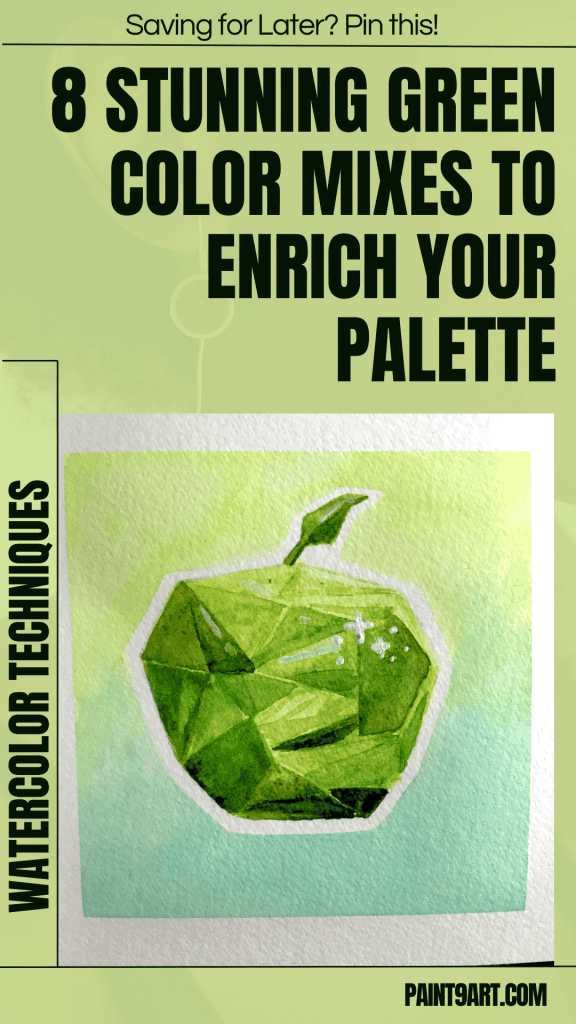
Hi there,
Mixing green can feel tricky at first. It took some practice, but I realized not all greens are created equal.
After testing, I discovered simple ways to make beautiful green mixes using just a few pigments.
Keep reading—I’ll show you how!
Full credit to Artist Olga Koelsch for this inspiring tutorial!
Contents
- 1 The Misconception about Green Paint
- 2 Introduction to pg7 (talo green or emerald green)
- 2.1 Mixing pg7 with violet to create a dark blue color
- 2.2 Diluting the green-violet mix to create Norwegian Blue Sky color
- 2.3 Mixing pg7 with quinacridone rose
- 2.4 Mixing pg7 with with permanent red
- 2.5 Mixing pg7 with ultramarine blue
- 2.6 Mixing pg7 with yellow hues
- 2.7 Mixing pg7 with desaturated yellows like raw Sienna
- 2.8 Mixing pg7 with burnt sienna
- 2.9 Mixing pg7 with Windsor red
- 3 Conclusion
The Misconception about Green Paint
Some think green paint isn’t needed in a palette. This misunderstanding ignores how useful and versatile it is.
While it’s true you can mix greens from other colors, having a good green like pg7 saves time.
It also allows more accurate shades for natural landscapes or foliage.
The myth about the necessity of green paint limits creativity. Starting with premade greens opens up quicker experimentation.
For example, mixing PG7 with reds or yellows gives rich earthy tones—something hard to match by combining basic primaries alone!
Introduction to pg7 (talo green or emerald green)
PG7, also called Phthalo Green or Emerald Green, is vibrant and bold. It’s a versatile shade that transforms beautifully when mixed with other colors.

Mixing pg7 with violet to create a dark blue color
Green and violet work magic together. This mix creates a stunning dark blue shade that’s rich and bold.
I take pg7, often called phthalo green or emerald green, for this blend.
Adding violet paint to it gives me a dark blue color close to indigo but more durable.
The result has higher light fastness, making it last longer under bright light.
Diluting this green-violet combo with water creates a soft “Norwegian Blue Sky” tone.
I enjoy how smooth yet deep the pigment combination feels on my palette.

Diluting the green-violet mix to create Norwegian Blue Sky color
I enjoy creating new colors with paint. One of my favorite mixes is green-violet diluted to make a Norwegian Blue Sky color.
I use pg7 (talo green or emerald green) and mix it with violet. This creates a dark bluish shade.
Next, I add water to dilute the mixture. The color softens and becomes slightly grayish.
The result looks like the soft tones of a Norwegian Blue Sky, calm and gentle.
Using cold-pressed watercolor paper enhances this effect beautifully.

Mixing pg7 with quinacridone rose
Mixing pg7 with Quinacridone Rose brings unique results. The combination can add texture and depth to your artwork.


Rough, cold-pressed watercolor paper makes granulation stand out. The paint settles into the textured surface in uneven ways, creating unique patterns.
I see soft pink undertones appear when I mix pg7 with Quinacridone Rose. The paper texture adds depth and a natural feel to the blend.
Mixing pg7 with with permanent red
Mixing pg7 with permanent red creates a rich, earthy tone. This pair adds warmth and depth to your green shades.

Mixing pg7 with ultramarine blue
Ultramarine blue creates amazing shades with pg7. The mix gives a transparent turquoise color, perfect for art.
I combine pg7 with ultramarine blue to get a rich turquoise shade. It shines on tropical seascapes and floral pieces.
The blend works well for painting water. It feels clear and light, like the ocean in bright sunlight.
Adding more ultramarine deepens the tone. This makes it great for shadows or cooler parts of a scene.
I find this mix easy to use in layering techniques. Each thin coat builds depth without looking heavy.
Transparent turquoise from this blend pairs nicely with other colors, like yellow or pink, for vibrant effects.
On smooth paper, this mix looks soft and glowing. On textured surfaces, it grabs attention with its sharp details.
I often use this in bold brush strokes for abstract pieces or larger landscapes needing fresh energy!

Mixing pg7 with yellow hues
Try pairing pg7 with soft yellow tones—you’ll get fresh, earthy greens full of depth!

Mixing pg7 with desaturated yellows like raw Sienna
Mixing pg7 with raw Sienna creates soft, natural greens. Adjusting the ratio can give different tones, including olive green.
I start by adding a small amount of raw Sienna to pg7. This makes the green look muted and earthy, not too bright.
Using more raw Sienna shifts the color to an olive-green shade. This works great for trees or grasses in landscape art.
On rough watercolor paper, this mix also adds texture. The colors blend softly but still stand out.
Adding water changes the intensity. A lighter wash gives subtle, pale greens perfect for distant hills or soft backgrounds.

Mixing pg7 with burnt sienna
Mix pg7 with burnt Sienna for a deep, earthy green. This combination adds warmth and richness to your palette.

Mixing pg7 with Windsor red
Combining Windsor red with green creates a unique maroon-brown color. Adding more talo green makes the mix darker and richer.
I mixed Windsor red and green to achieve a warm, earthy tone resembling mahogany.
As I added more talo green, the mixture deepened into a dark, moody shade close to oxblood.
The blend reminded me of rust or brick-red tones on textured paper.
Using this mix on wet watercolor paper revealed hints of garnet and burgundy under light strokes.
A small touch of crimson enhanced its depth, making it bold yet soft.


Conclusion
Green mixing is so fun. These blends bring depth and beauty to any artwork. Each mix tells a story—soft skies, earthy trees, or bold flowers.
Try the combos and play with dilution for unique shades.
I’d love to hear your favorite mixes!