

Want to make your drawings pop off the page with depth and realism?
Shading is one of the best ways to do it. It adds form, dimension, and drama to your art.
In this post, I’ll share 5 simple but powerful shading tips that helped me level up my drawings. These are the exact steps I use daily to create smooth gradients and lifelike shadows.
Contents
- 1 Tip 1: Get the Right Supplies
- 2 Tip 2: Learn Shading Techniques
- 3 Tip 3: Observe the Reference
- 4 Tip 4: Focus on Edges
- 5 Tip 5: Learn a Shading Process
- 5.1 Step 1: Start with a Contour Drawing
- 5.2 Step 2: Identify the Light Source
- 5.3 Step 3: Map Out the Shadow Shapes
- 5.4 Step 4: Shade Shadows Lightly First
- 5.5 Step 5: Add Contrast and Shade Mid-Tones
- 5.6 Step 6: Deepen the Darks Gradually
- 5.7 Step 7: Refine Transitions and Edge Quality
- 5.8 Step 8: Blend Values
- 5.9 Step 9: Final Touches
- 6 Wrapping Up
Tip 1: Get the Right Supplies
To create strong shading, you need the right tools. Without them, it’s hard to get smooth transitions or deep contrast.
Understanding Pencil Grades

Let’s start with pencils. I recommend using soft pencils for shading — they’ll give you the rich, dark tones you want.
Pencils are rated on a scale from H to B. “H” means hard. These pencils have more binder in the mix, so they feel harder and leave lighter marks.
The higher the H number, the lighter the mark.
“B” stands for black. These pencils have more graphite and less binder, which makes them softer and darker. I usually use 6B to 8B pencils to get rich contrast in my drawings.
My favorite pencils right now are the Faber-Castell Pitt Graphite Matte. They give a deep matte finish, which looks better under bright light than regular graphite.
No more annoying shine!
Choosing the Right Paper

Paper is just as important as pencils. I recommend using thick, smooth paper like Bristol Board. The smooth surface helps your pencil glide easily.
Plus, thick paper can handle more layers of shading without tearing or wearing down. This makes it easier to erase and blend without damaging your work.
Blending Tools You’ll Need
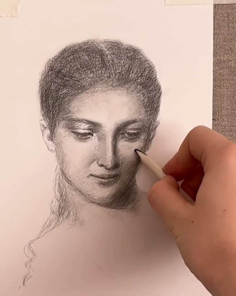
Next, let’s talk about blending tools. My go-to is the tortillion — a tightly wound stick of paper that picks up graphite and spreads it smoothly across the page.
You can blend values, soften hard edges, and even draw with it once it’s full of graphite. When it gets too blunt or messy, I clean it with sandpaper to get a sharper point.

I also use a kneaded eraser. It’s soft and moldable, which makes it perfect for lifting highlights or gently lightening certain areas.
You can shape it into a point for detail or flatten it for broader areas.

To sharpen pencils, I use a knife. It gives me more control and helps when I want to hold my pencil in an overhand grip — this grip lets me shade large areas smoothly and comfortably, especially when my paper is propped up on an easel.

And here’s one more trick: I collect graphite powder when sharpening my pencils.
With a soft brush, I spread the powder across the page to block in backgrounds or start soft skin tones. It gives me a smooth base that I can build on with layers.

Tip 2: Learn Shading Techniques
Now that you’ve got your tools, it’s time to learn how to use them. Shading isn’t just about darkening areas — it’s about creating smooth transitions and a sense of form.
Overview of Common Shading Methods
One of the most common techniques I use is tonal shading. This involves gradually building up tones with smooth transitions from light to dark.
I use the side of my pencil and blend the layers. It’s great for creating soft textures and realistic shadows.

You can also try hatching — drawing thin, straight lines close together. The more lines, the darker the area looks.
Cross-hatching is when you add a second layer of lines crossing over the first. These methods add texture and rhythm to your shading.

There’s also contour hatching, where you curve your lines along the shape of the form. It’s perfect for emphasizing the 3D shape of your subject.

If you like more texture, try stippling (dotting) or scumbling (small, circular scribbles). These techniques might initially feel strange, but they give your drawings a unique look.
Blending for Smooth Transitions

Blending is essential to create those soft gradients between values. I use my tortillion most of the time, but tissues or soft brushes also work.
I especially like using a tortillion to blend small areas and smooth out edges.
Try blending with different tools and see what you like best. Each one gives a different texture, and that texture adds personality to your drawing.
Practice and Experimentation
The truth is, the more you practice, the better your shading will get. Try all these techniques and stick with the one that feels natural to you.
Over time, you’ll gain better control, and the process will become second nature.
Tip 3: Observe the Reference
No matter how good your technique is, it won’t work if you’re not looking at your reference closely. Great shading comes from careful observation.
Seeing Value Composition Clearly

Before I start shading, I study the value structure of my reference image.
I look at where the darkest shadows are, where the brightest highlights fall, and how the mid-tones flow in between.
Often, the difference between tones is more subtle than you’d think — and the key is to see those differences clearly.
Grayscale Adjustments
To help with this, I sometimes edit my reference photo and turn it into grayscale. Removing the color makes it much easier to see the actual values without being distracted by hues and saturation.
It’s a simple trick, but it works wonders.
Using a Value Checker Tool

I also made myself a value checker based on the Denman Ross value scale. It’s a strip that shows nine values — 1 being white and 9 being black.
I cut a square in a small piece of paper and hold it over parts of the reference to compare them to my value scale.
I usually start by finding the lightest and darkest values in the image. Once I know those, I can figure out where the mid-tones fall.
This helps me match the tones more accurately in my drawing.
Tip 4: Focus on Edges
Shading isn’t just about value — it’s also about edges. The way values transition from one to another makes a huge difference.
Types of Edges in Shading

There are three types of edges to watch for: hard, soft, and lost.
- A hard edge is a clear, sharp line between two areas.
- A soft edge is a smooth, blended transition.
- A lost edge is where the edge is barely visible — it fades into the background or another shadow.
When to Use Each Type
You’ll often see soft and lost edges in portraits, especially in shadows or places out of focus.
In landscape drawings, these edges help show distance and atmosphere. Use hard edges to draw attention or show something sharp and defined.
Tools and Techniques for Edges
I use a tortillion to soften edges where needed. I go in with a fine-point pencil or a kneaded eraser to keep a sharp edge.
Paying attention to your edges will help make your drawing more believable and polished.
Tip 5: Learn a Shading Process
Once you’ve mastered the tools and techniques, it helps to follow a consistent shading process. This gives you a clear path from start to finish.
Step 1: Start with a Contour Drawing

I always begin with a contour drawing of my reference. I carefully sketch the shapes, proportions, and edges — just like I see them in the reference image.
It’s a foundation, so take your time here.
Step 2: Identify the Light Source

Once I’ve got the outlines, I figure out where the light comes from in the reference. This is key — it tells me where the shadows will fall and which areas will stay bright.
Without a clear light source, shading can feel confusing. So pause and observe before jumping in.
Step 3: Map Out the Shadow Shapes

Before committing to any shading, I lightly outline the shadow shapes. This step helps me plan out exactly where the dark values should go.
I trace the edges of shadows just like I see them. No guesswork, just careful mapping. Trust me, this makes the next steps much easier.
Step 4: Shade Shadows Lightly First

Now that the shadows are mapped, I begin shading them lightly with an even tone. I don’t go dark right away. I build up slowly.
Starting light gives me more control and makes it easier to adjust things if needed.
Step 5: Add Contrast and Shade Mid-Tones

Once the base layer is down, I slowly increase the contrast in the darkest areas. Then, I shift to the mid-tones.
These are the values in between, the areas that aren’t hit directly by light but aren’t in full shadow.
You’ll usually see them on curved planes or surfaces that face away from the light but aren’t blocked by anything.
Step 6: Deepen the Darks Gradually

After mid-tones, I return to the shadows to push the contrast further. I build up the darkest values in layers using more pressure.
But I do this across the whole drawing, not just in one spot. It’s essential to build up values evenly throughout the piece. That way, everything stays consistent and balanced.
Step 7: Refine Transitions and Edge Quality
Once the value range is established, I start paying attention to transitions. I ask myself: Are the edges hard, soft, or lost?
Hard edges should stand out. Soft edges need blending. And lost edges should fade gently into the background.
Step 8: Blend Values
I use a tortillion to blend the softest transitions and shade any missing in-between values that smooth things out.
Step 9: Final Touches

Now for the finishing touches. I darken the deepest shadows by pressing harder with my pencil.
Then, using a kneaded eraser, I lift the brightest highlights from the lighter mid-tones. This creates contrast and brings the drawing to life.
Finally, I sharpen my pencil and add in small details — these subtle marks bring focus to specific areas and give the artwork a polished, professional feel.
Wrapping Up
Shading doesn’t have to be confusing or overwhelming. With the right tools, clear techniques, and a little practice, your drawings will start to come alive.
Which of these tips do you want to try first? Let me know in the comments. I’d love to see your progress!