
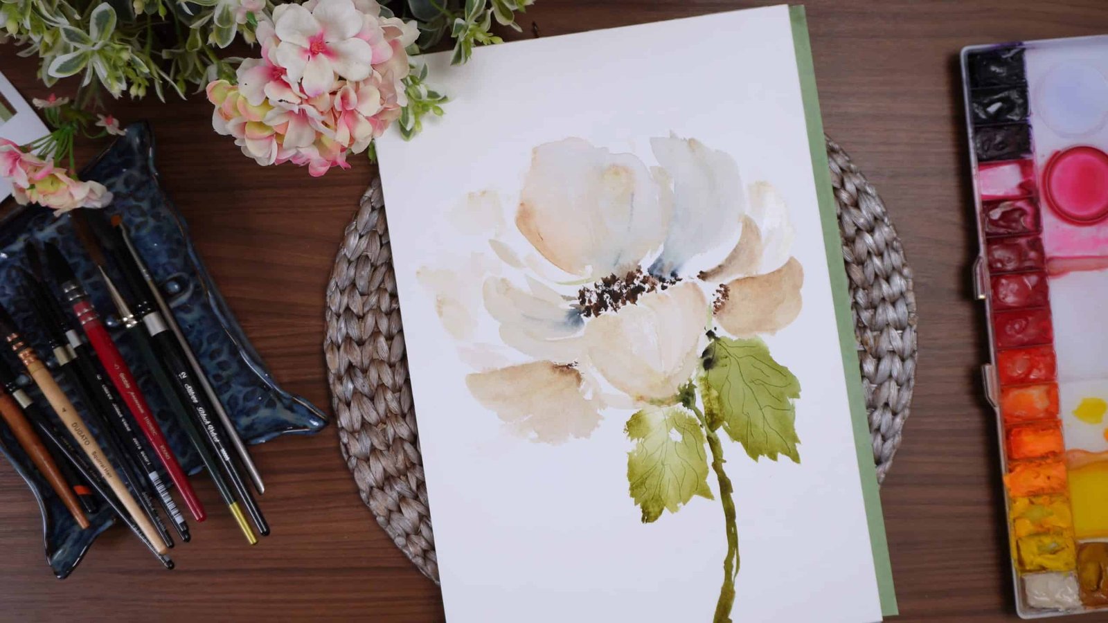
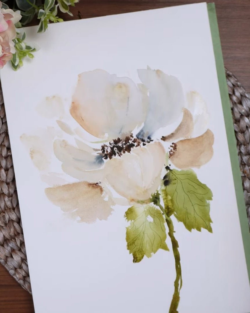
Painting something white on white sounds like a challenge, right? But Beala Art shows how calming and elegant it can be.
In this tutorial, she shares her process for painting a serene white flower on a white background using watercolor.
If you enjoy soft, subtle floral art with a hint of moodiness, you’ll love this approach. Beala Art guides you step by step through every decision, color choice, and brushstroke she makes.
Let’s get started.
Contents
- 1 Step 1: Planning the Painting and Choosing the Style
- 2 Step 2: Painting the First Petals
- 3 Step 3: Creating Organic Leaves and Shadows
- 4 Step 4: Deciding and Painting the Stem
- 5 Step 5: Balancing Color and Adjusting Petals
- 6 Step 6: Exploring Alternative Techniques for Painting White Flowers
- 7 Step 7: Building Depth with Layers of Light and Dark
- 8 Step 8: Creating a Strong, Dark Flower Center
- 9 Step 9: Making Final Adjustments to Enhance the Composition
- 10 Wrapping Up
Step 1: Planning the Painting and Choosing the Style
Before the painting begins, the artist takes a moment to set the tone and direction. This step is simple but crucial, guiding everything that follows.
Embracing a Softer Mood
In a previous session, the artist painted a bold, expressive flower. But this time, the goal is the opposite—something calm, understated, elegant, quiet, and moody.
This shift in energy brings a completely different feeling to the artwork.
Choosing the Flower Shape
The artist is not working from a reference photo. Instead, the intention is simply to create a big, soft bloom—something reminiscent of a peony. It doesn’t need to be botanically accurate, only full, rounded, and gentle.
How to Make White Visible on White
Painting a white flower on white paper requires adding subtle color so the form can be seen. There are two approaches:
- Paint around the flower and let the paper represent the petals
- Or, gently build form using soft pigments
The artist chooses the second approach, leaning toward a moody look by darkening buff titanium slightly and adding hints of green and Payne’s gray for shadow. This gives the flower just enough definition without losing softness.
Step 2: Painting the First Petals
With the direction set, the artist moves on to forming the initial petals, relying on intuition and feel.
Starting with a Loose Base Layer
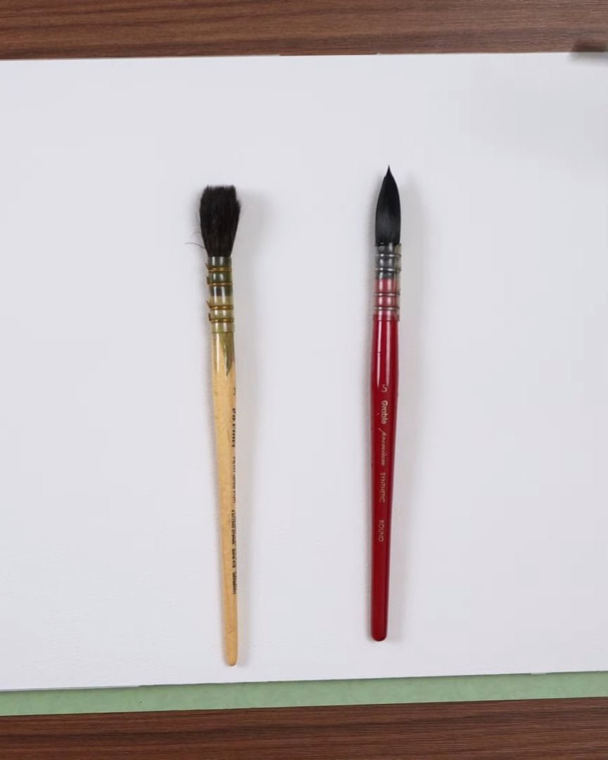
The artist chooses a mop brush—sometimes called a quill, though a quill has a finer point while a mop has a rounded tip. This particular brush is slightly stiffer, providing better control.
The first petals are laid down loosely. There is no fixed structure—just intuitive movement around the page.
If any area becomes too dark or spreads too far, the artist simply lifts the excess using a clean paper towel.
Playing with Shadows and Color Tones
For the petals, the artist uses a mix of buff titanium, Payne’s gray, and a few greens—sap green, green gold, and olive green. These tones help shape the petals softly, without harsh lines.
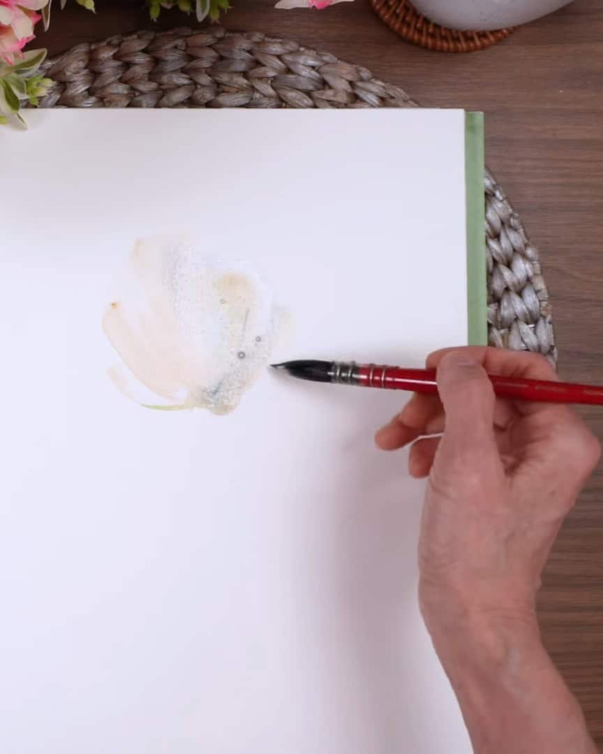
The artist loves how these colors add depth and elegance. The pigments can be watered down for a softer look or kept slightly darker, as the artist is doing here, for a moodier effect.
The artist simply moves around and adds petals.
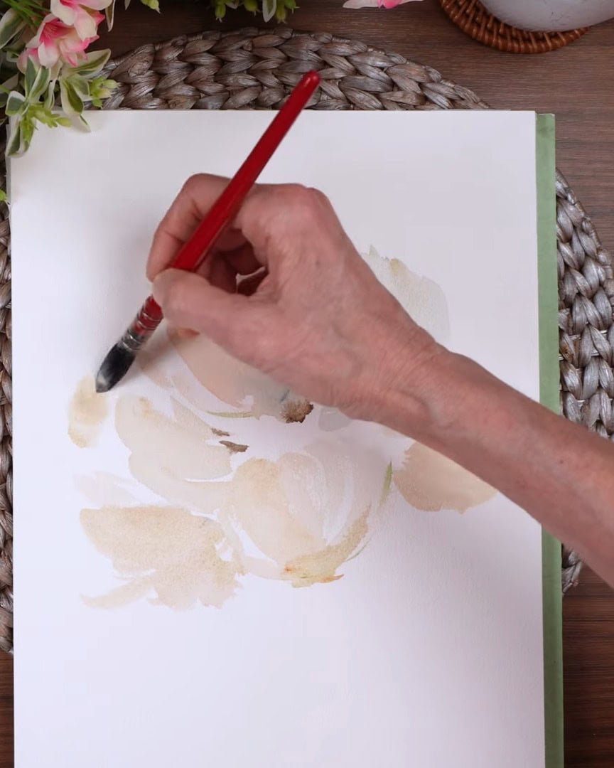
If the area becomes too dark, the artist wipes the paint up a little bit. And if that spreads too far out, clean water is applied to that spot and a paper towel is used to lift it up.
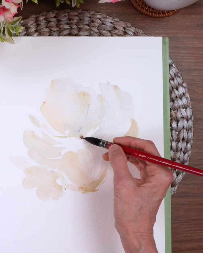
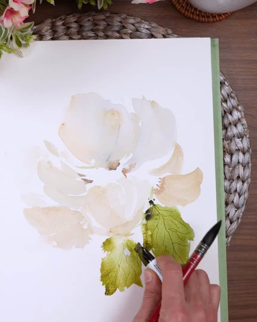
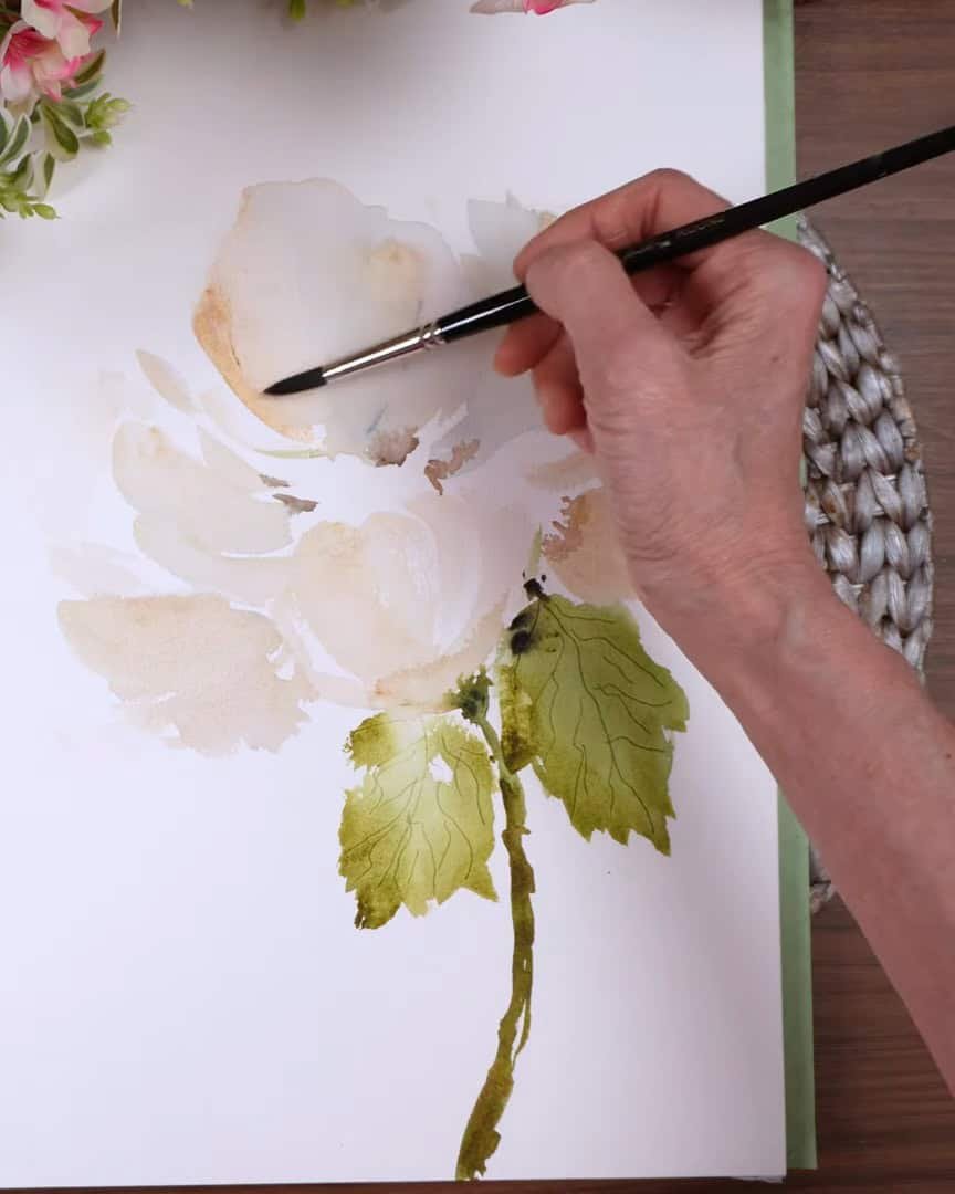
Step 3: Creating Organic Leaves and Shadows
With the base petals in place, it’s time to build around them with leaves and subtle background shadows.
Adding Greens for Natural Flow
The artist keeps using the go-to greens—sap green, green gold, olive green—and then adds some undersea green.
Actually, the artist thinks it might be perylene green. These two are used interchangeably often, and both work well here.
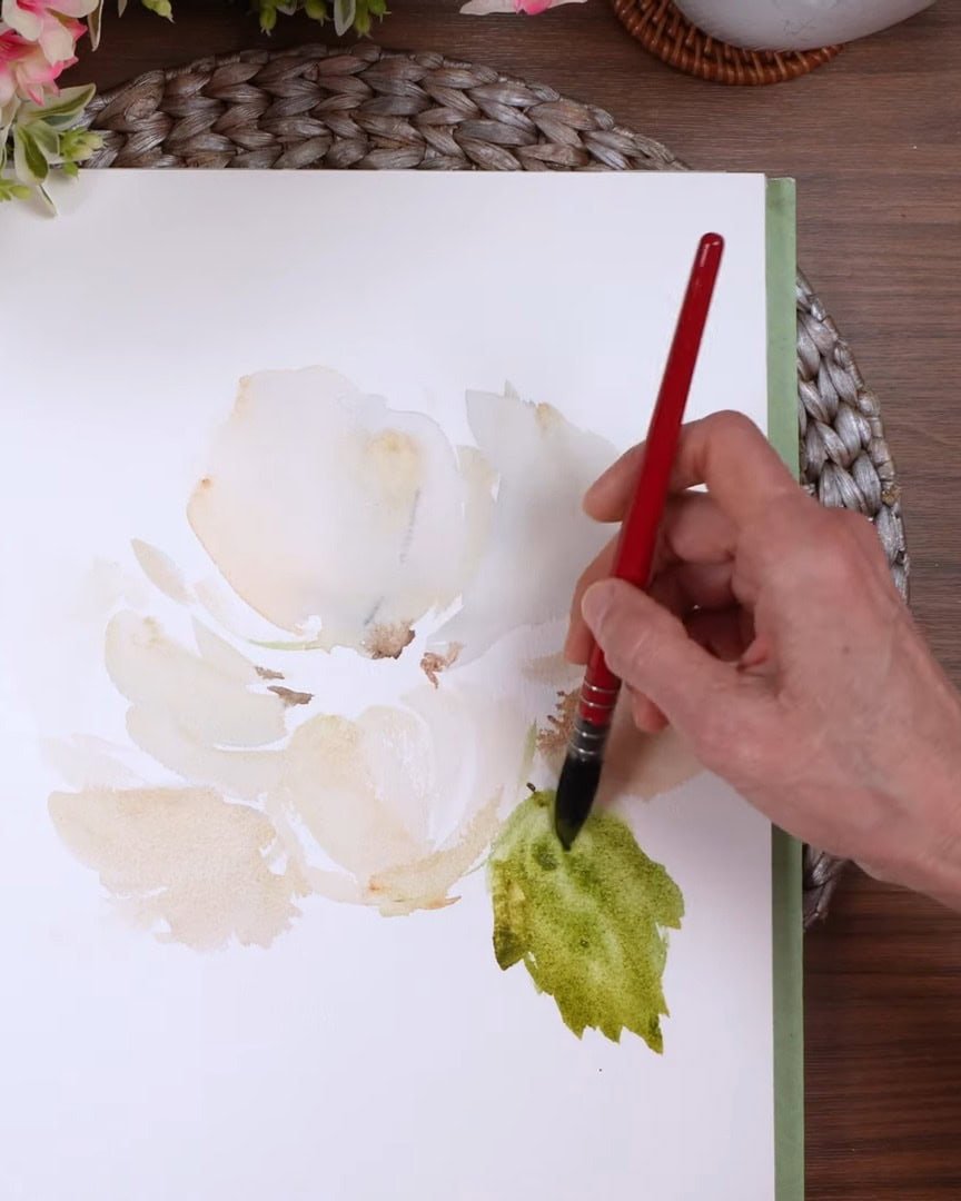
The aim is for the leaves to feel organic, not stiff. The artist varies how much paint is used in different areas—some parts thin and watery, others more saturated.
Texturing with the Paint Tube
One favorite trick is using the paint tube to create little veins while the surface is still wet. It gives a lovely texture that a brush can’t quite achieve.
Timing is everything, though—it must be done before the paint dries.
There is no worry if things get a bit messy here. If a shadow or smudge dries unevenly, it adds to the looseness of the painting. That’s part of the charm.
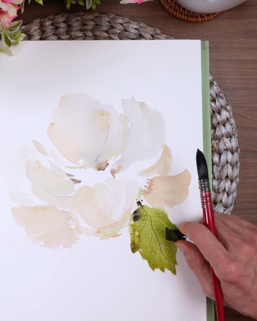
Next, the artist paints the second leaf with the same colors used for the first one and also creates veins using the tube paint like before.
Step 4: Deciding and Painting the Stem
Now, the flower needs to be grounded by adding a stem that aligns with its posture.
Aligning the Stem with the Flower’s Direction
This flower looks like it’s leaning slightly up and to the left. So, even though there is more space on the left, the stem needs to follow the flower’s angle to feel natural.
The artist squeezes it in where it makes the most visual sense.
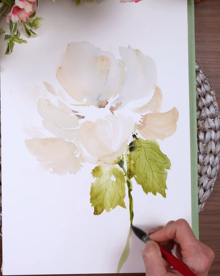
Building a Balanced, Sketchy Stem
The artist drops in several colors for the stem—starting with green gold and sap green, then adding van dyke brown and perylene. The stem is kept sketchy, letting the brush move freely.
One tip the artist always keeps in mind is to make the stem thick enough. If it’s too thin for the flower’s size, it won’t look right. A pause is often needed to adjust the thickness as the artist goes.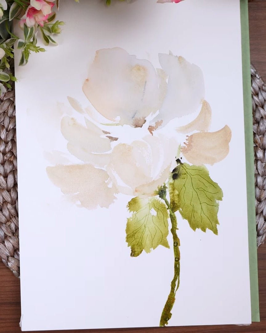 Ensure the stem is not too thin or thick
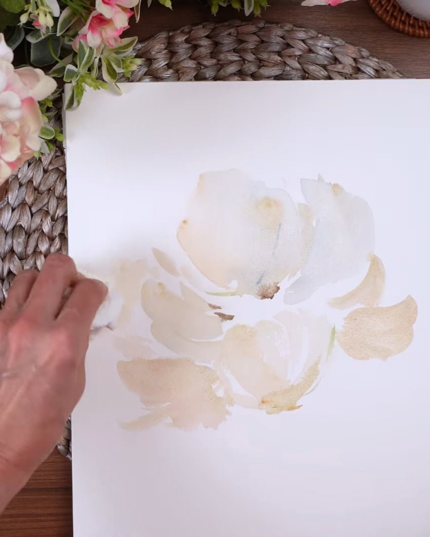
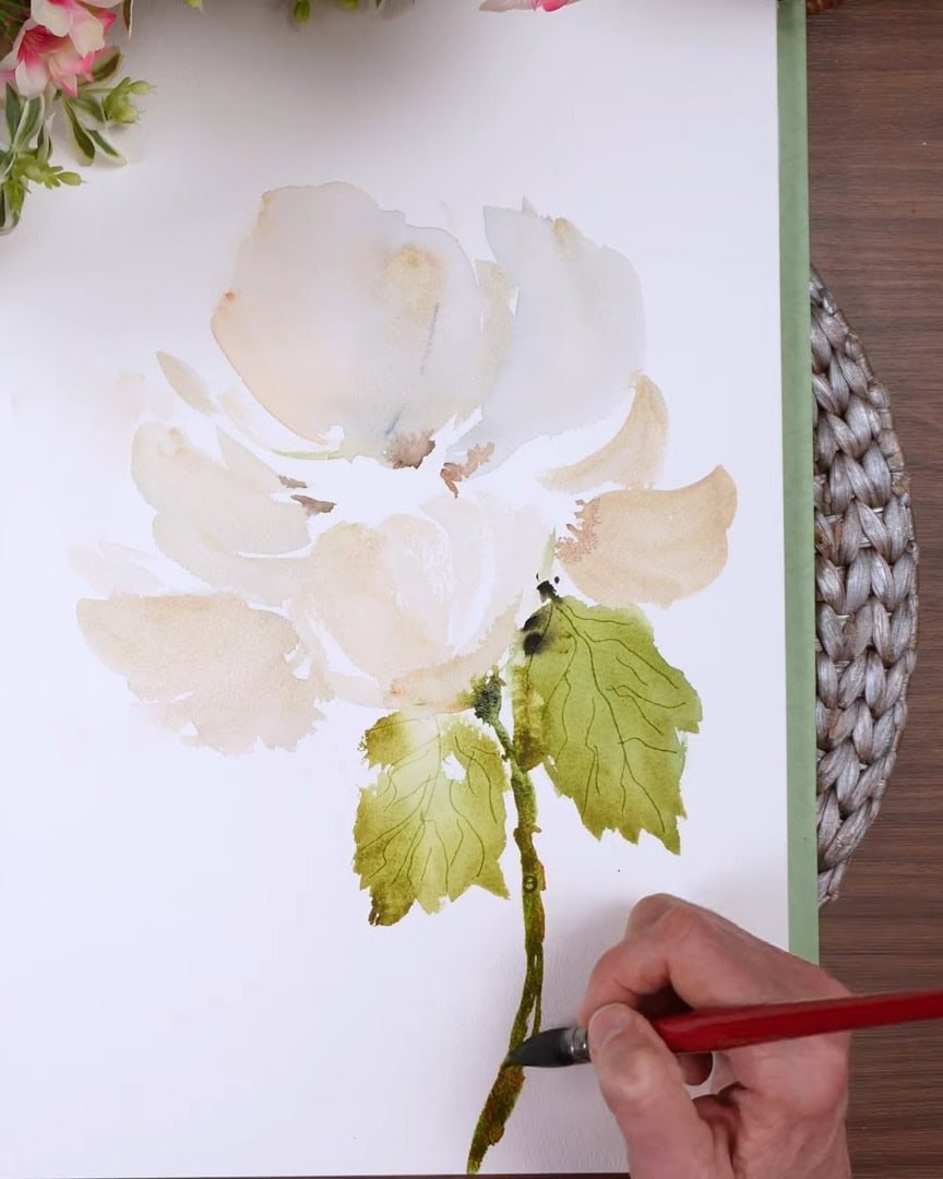
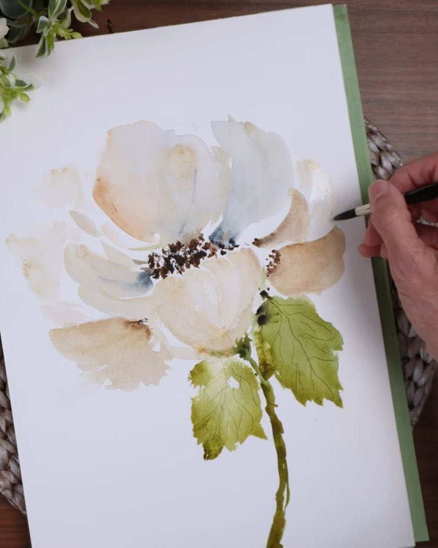
Step 5: Balancing Color and Adjusting Petals
With the base painting nearly done, the artist takes a step back and reassesses how everything looks together.
Evaluating Contrast and Balance
The green leaves and stem are vivid, and the artist feels they overpower the soft petals. To fix this, more van dyke brown and Payne’s gray are added to the petals.
The artist always wets the area with clean water first. That way, the edges stay soft when new color is dropped in. The pigment is allowed to flow naturally and blend outward.
That gives a smooth transition and avoids hard lines.
Distributing Colors Evenly
It’s also important not to let one color sit in just one place. So, the artist spreads the Payne’s gray to multiple petals. It looks more harmonious that way.
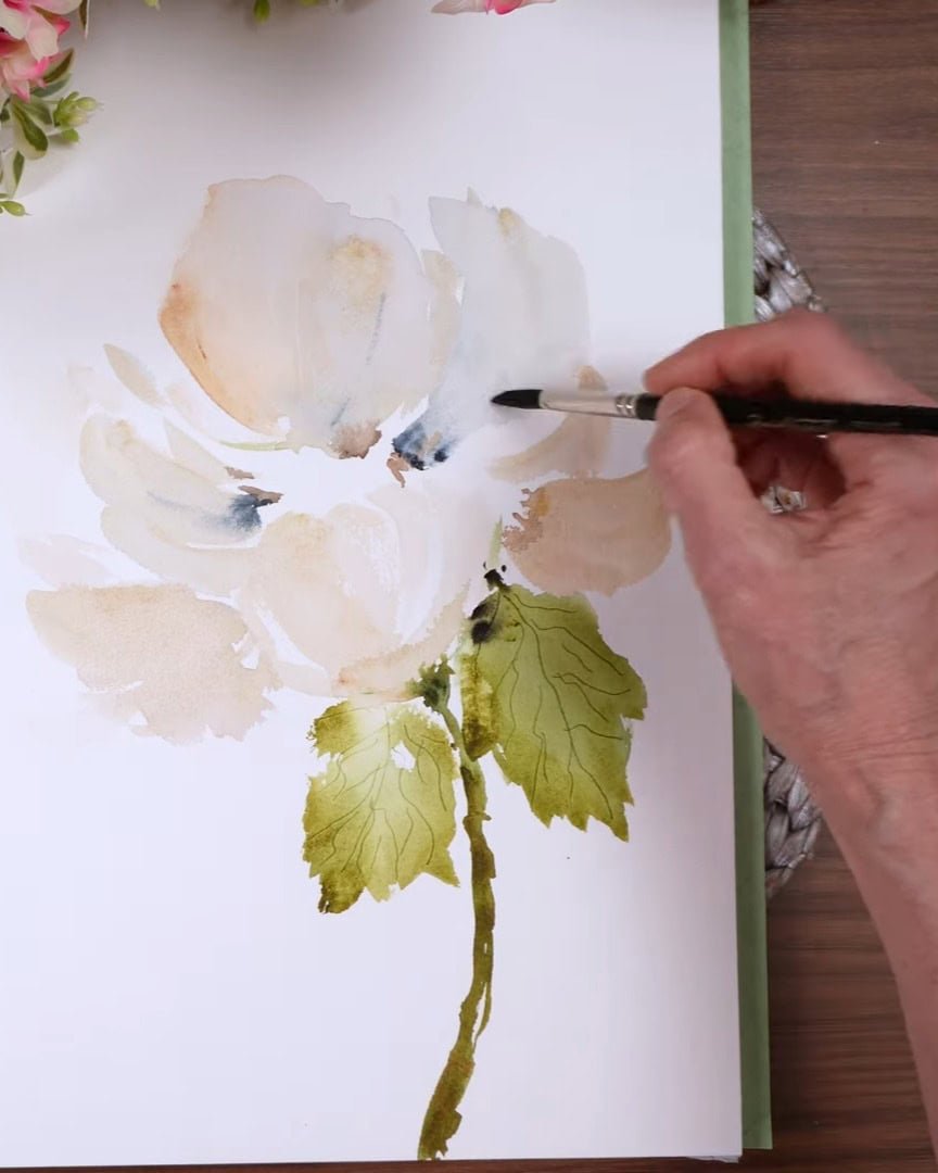
A diluted pink or red could also be used for a different mood, but the artist sticks with this cooler palette to keep the mood elegant.
Step 6: Exploring Alternative Techniques for Painting White Flowers
There’s more than one way to paint a white flower. Here are a few ideas that can help in future paintings:
- Use gouache or acrylic to paint white petals over a painted background.
- Paint the background first, leaving out space for the flower — though this method takes a lot of planning.
- Surround the flower with vibrant leaves or other elements to make the white stand out more.
- Leave plenty of white paper and define the petals with soft shadows.
The artist loves the balance achieved from slowly building up muted tones. The approach begins very light—lighter than needed—and then gradually deepens.
Once a section becomes too dark, it’s tough to lighten it again without creating water spots.
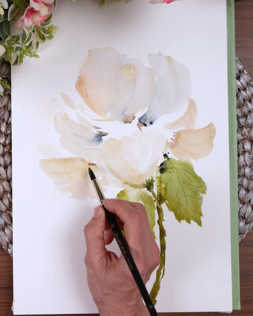
Step 7: Building Depth with Layers of Light and Dark
When beginning, the artist always starts lighter than expected. It’s easier to build up color than to remove it, especially once the paint dries.
Color can be lifted, but it’s risky. It may leave water spots or uneven textures. In this step, an eradicator brush with stiff, short bristles is used. It’s great for:
- Smoothing out harsh lines
- Softening edges
- Erasing small mistakes
Use an eradicator brush to build depth
But the artist uses it carefully. It’s powerful and can remove more paint than expected. Adding deeper tones to the petals helps them hold their own against the vibrant greens.
The contrast improves the overall composition.
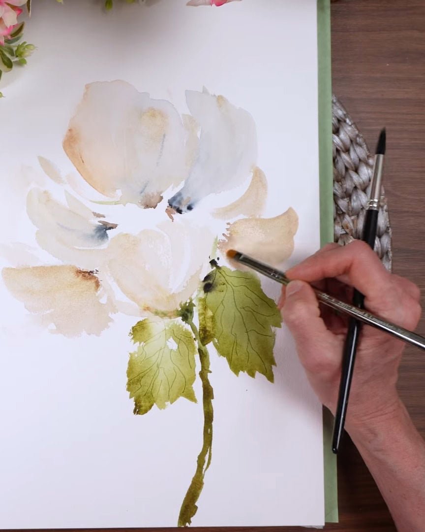
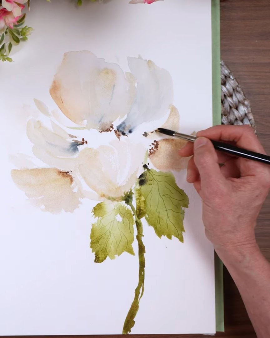
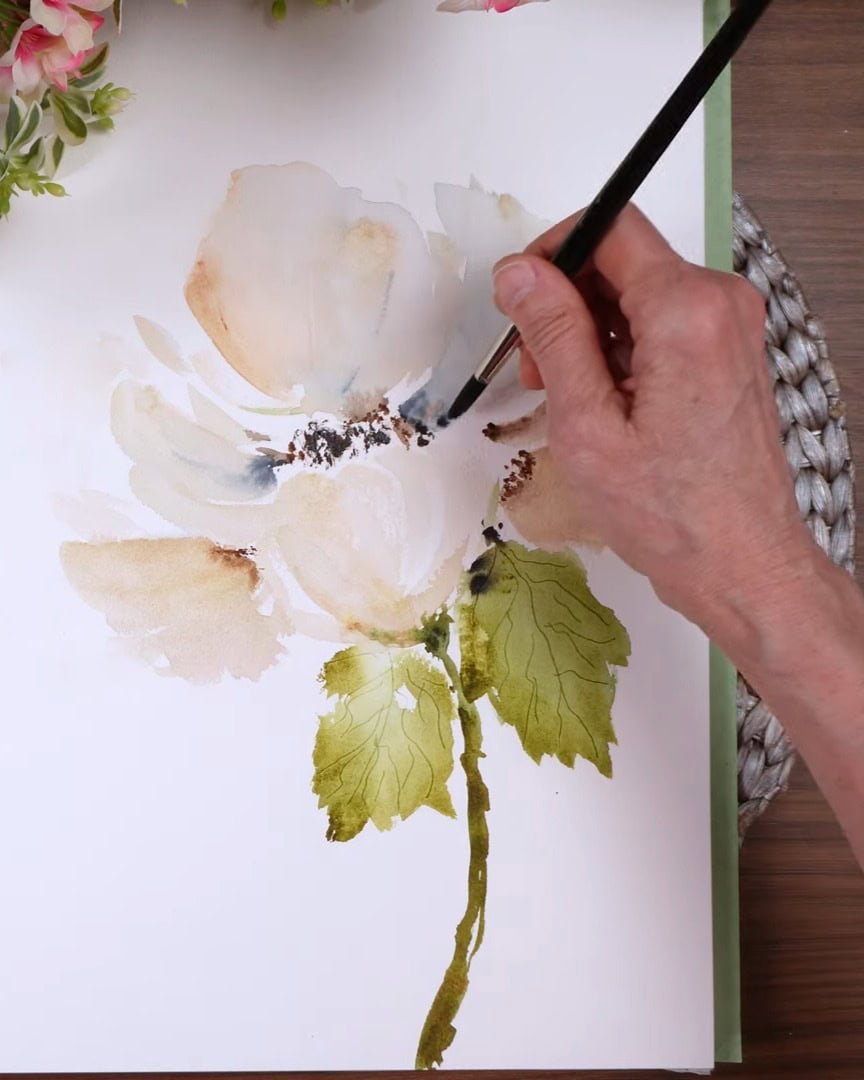
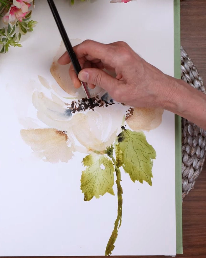
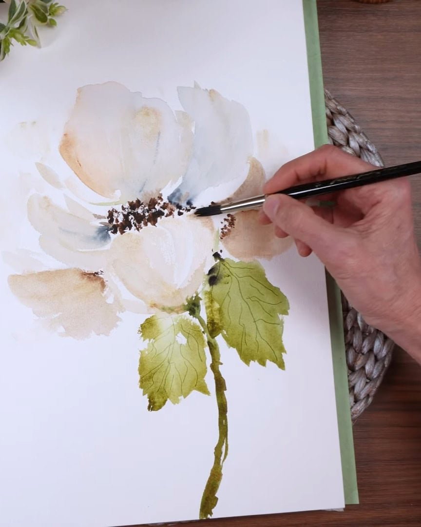
Step 8: Creating a Strong, Dark Flower Center
Time for the focal point: the center of the flower. The artist mixes sepia and Van Dyke brown together to get a rich, dark center. This becomes the point that draws the eye in and helps all the lighter petals shine by contrast.
A round brush is used for this part—a size 10 from Master’s Touch. It gives a great dry-brush effect. Not all round brushes do, but this one is perfect for that textured center.
Later, additional Payne’s gray may be added for even more depth.
At this stage, the artist notices one spot that feels too empty and adds another petal to fill it in, being careful not to go too dark. The goal is to avoid making everything the same intensity.
That sameness is what leads to a flat, monotone look, especially when using muted colors.
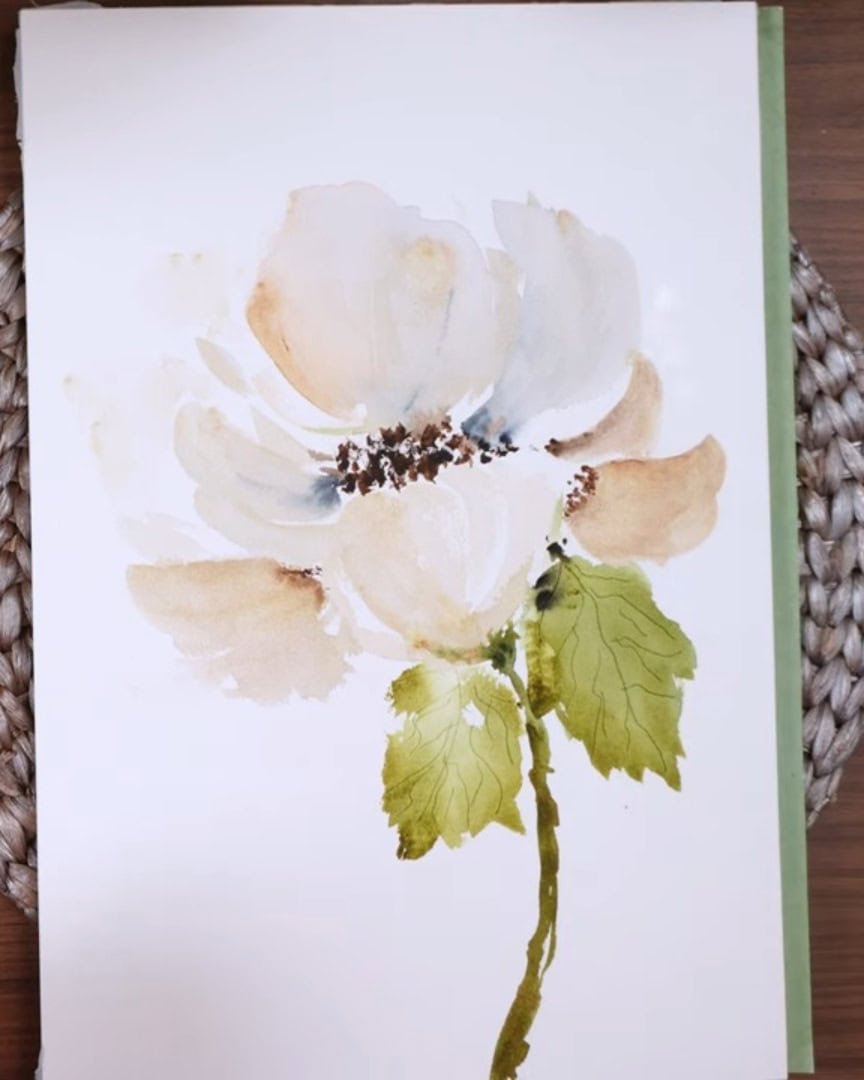
So, the artist pays close attention to contrast:
- Light petals
- Medium shadows
- Dark centers
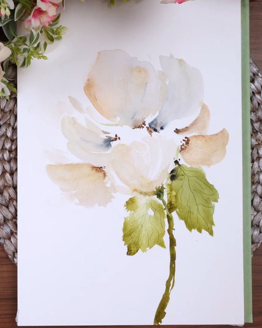
Step 9: Making Final Adjustments to Enhance the Composition
Once the painting is dry, the artist reassesses again. Some of the background petals still feel too light, so the same gentle approach is used:
- Wet the area lightly with clean water.
- Add a bit of buff titanium—just a small amount.
- Blend it gently for soft edges.
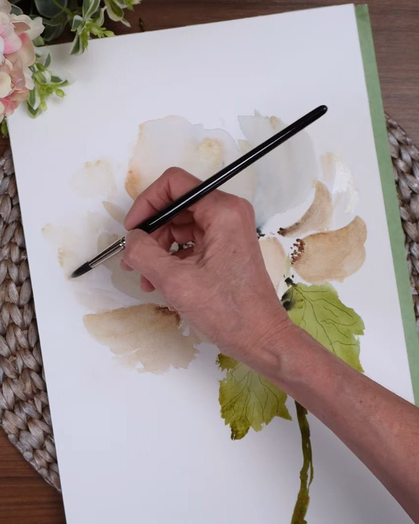
Some strokes are intentionally left streaky for added texture and movement.
A touch more pigment here and there helps give the piece more dimension. With soft florals, it’s easy to overwork the painting, so the artist proceeds carefully—balancing “just enough” and “too much.”
One area ends up darker than preferred. The artist considers lifting it but ultimately decides to leave it. At this stage, changing it might cause more harm than good.
Knowing when to stop is part of the process. The final check is simple: does anything stand out in a bad way? If not, it’s best to leave it. Over-fussing risks ruining what is already working.
In this piece, the deeper petal colors helped balance the strong greens. That slight adjustment pulled everything together. Even if it’s imperfect, the artist knows it is done when it feels right.
Wrapping Up
Painting a white flower on a white background may seem intimidating at first, but with the right balance of subtle colors, thoughtful layering, and soft shadows, it becomes a rewarding process.
Taking time to build contrasts between petals, leaves, and stem brings the flower to life. By trusting intuition, keeping brushstrokes loose, and letting the delicate tones develop naturally, the beauty of the white flower emerges with quiet elegance.