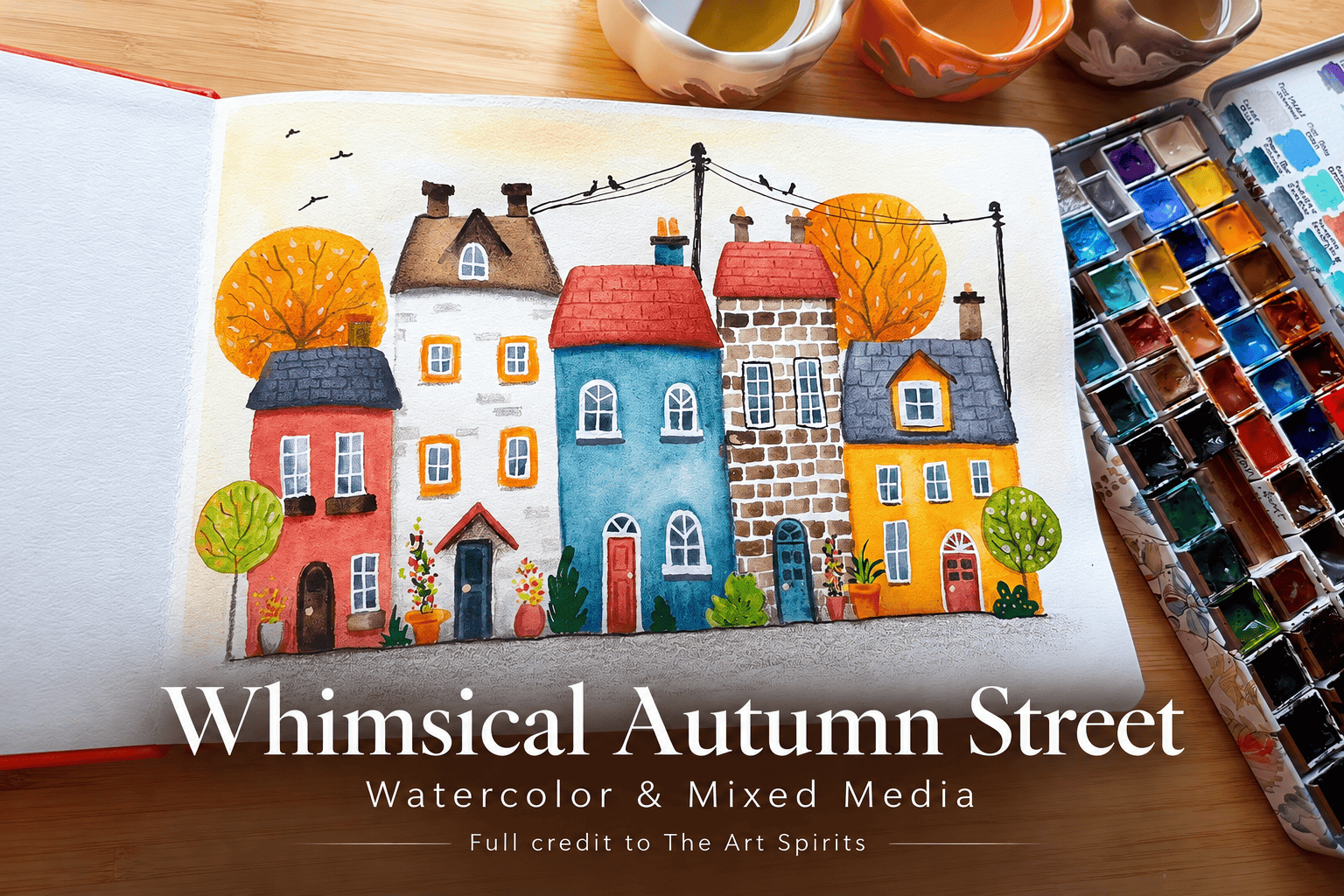
A row of little houses becomes an autumn street through warm washes, uneven brickwork, bright window frames, and small touches of greenery. In this watercolor and mixed-media demonstration, The Art Spirits builds the scene gradually, beginning with a pale golden sky and finishing with plants, telephone wires, and birds.
Colored pencils, paint markers, white pen, and selective black ink each contribute something different, while the watercolor remains visible beneath the details. The result is a whimsical streetscape whose character develops one layer at a time.
A Watercolor Foundation with Room for Other Materials
The demonstration combines Daniel Smith watercolors with Polychromos colored pencils, Posca paint markers, a white pen, and a black pen. The artist also tries two Etchr sketchbooks supplied by the company: a landscape hot-press book and a panoramic cold-press book, both with 100% cotton paper. The autumn street is developed in the hot-press sketchbook; the panoramic book receives a separate, unfinished test near the end.
Watercolor establishes the sky, house colors, roofs, windows, trees, and pots. Pencil later supplies ground, branches, shading, and architectural texture. Markers and pens bring smaller shapes and lines into focus. This division is flexible rather than rigid. The artist considers using black ink early on, then waits to see how much definition the pencil work provides before deciding where ink is needed.
Brush choice changes with the task, too. A small flat brush is useful for individual bricks, but the artist finds it awkward for some other shapes and switches brushes. The process allows those practical adjustments instead of requiring one brush to handle every part of the street.
A Pale Golden Sky Behind the Rooftops
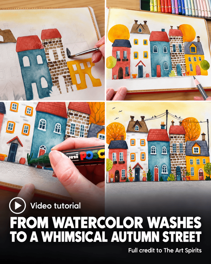
The sky begins with water spread over the background using a small mop brush. The artist wets a tree area as well, then introduces buff titanium and a light sienna color for a creamy golden atmosphere. The color stays restrained, especially immediately above the roofs, where a light background will help the buildings stand out.
Buff titanium is dropped toward the sides, and raw sienna is swept across the upper area. The washes blend into a soft autumn haze without making the sky the dominant feature. This leaves room for the stronger reds, blues, and golds that follow in the buildings.
After drying the wash with a heat gun, the artist notices some buckling along the free edge of the page. Part of the sheet settles flatter again. The observation becomes part of the sketchbook trial, with the artist noting that the page is not taped down to a surface.
Distinct House Colors Keep the Street Lively
A Blue House with Uneven Washes
The middle house receives Mayan Blue Genuine, described in the demonstration as a dark turquoise blue. Rather than leaving an entirely uniform block of color, the artist adds water drops while the wash is still damp. Water moves back into the paint, pushing pigment toward the outer areas and bottom.
Some color is also lifted to create lighter patches. These variations remain part of the facade instead of being covered over. After the first houses dry, the artist comments on the difference between their surfaces: one wash has a more noticeable effect, while another dries more smoothly. The artist attributes this tentatively to the different colors and their behavior.
Other houses receive Aussie Red Gold and Venetian Red. The artist works around windows, plant pots, and tree shapes while placing these base layers. Even before the smaller details arrive, the different wall colors give each building a separate presence within the row.
A Light House with Restrained Gray
One house is deliberately kept light so it stands apart from its neighbors. The artist wets the shape, avoiding the windows, and introduces only a little Jane’s Gray near the upper edge and bottom. The aim is a mostly white building with a slightly weathered lower area.
The gray is softened with a clean brush, and some is lifted out. This quieter treatment gives the street a useful change of pace between more saturated walls. Its character comes from limited shading rather than an all-over colored wash.
Brickwork That Stays Whimsical
Another house is built from small raw-umber brick shapes, painted with the smallest square brush. The artist varies their darkness and does not try to make every mark identical. Some bricks are lighter, others stronger, and their slight irregularity suits the intended whimsical folk-art quality.
This house introduces a different kind of surface from the broader washes elsewhere. The repeated small marks describe the wall directly, while the blue and red buildings depend more on their larger areas of color.
Roofs, Windows, and Doors Establish the Architecture
The roofs alternate between dark gray, Venetian Red, and raw umber. Chimneys use colors already present in the palette. Repeating those colors across separate features connects the buildings without making them all look alike.
For the windows, the artist chooses a blue instead of the gray usually used for this purpose. Some windows are painted darker than others, with darker areas introduced within individual shapes. A little white is left around the edges where possible, but perfect preservation is not essential to the artist’s plan: white pen will restore the frames later.
Doors receive their own colors, including Venetian Red, sepia for a dark wood effect, and the blue used elsewhere in the houses. Window boxes also receive dark paint. The artist then moves around the remaining pots and trees, giving these smaller elements their base layers.
Green enters the palette through Serpentine Genuine. One tree is kept yellow-green to suggest seasonal change. At this stage, the street already contains its main color relationships, but much of its definition is still to come through dry media.
Colored Pencil Adds Ground, Branches, and Shadows
A Ground Layer Without Another Wash
The artist realizes that the ground has not yet been painted. Rather than wetting the page again and waiting for another wash to dry, the artist uses a warm gray colored pencil. The shading is strongest close to the buildings and fades toward the bottom of the page.
An additional layer deepens the ground, followed by a little black pencil along the edge beneath the houses. This is a practical change in the sequence: pencil completes an omitted area while fitting naturally into the mixed-media approach already planned for the scene.
Dark sepia pencil supplies tree branches and trunks. Some branches are thickened as they develop. During this stage, the artist remarks that the paper takes the colored pencil especially well, an observation based on this particular drawing session.
Roof Shadows and an Unexpected Thatched Effect
Pencil shading strengthens the roofs and the areas immediately beneath them. The artist also adds occasional brick marks to another facade, using a few suggestions of masonry rather than repeating the fully brick-covered house.
One roof begins to resemble thatch, although this was not the original intention. The artist responds by rounding its lower corner to reinforce that appearance, then considers similarly rounded edges on the other roofs. The developing marks influence the next decision, allowing a small unexpected effect to become part of the street’s character.
Terracotta pencil adds shading beneath roof edges. Other areas receive deeper shadows that fade outward. These additions give more definition to the already painted shapes without replacing their watercolor surfaces.
White Frames and Small Architectural Details
White pen brings the window frames back into focus. This follows the earlier decision to leave the painted window edges somewhat flexible, knowing that the light lines could be added later. The windows become more clearly articulated against their darker interiors.
An Indian red pencil introduces roof-tile texture. The artist varies the treatment between roofs, drawing individual little tiles on one and adding other small marks elsewhere. Additional shading under edges helps these details sit within the larger roof shapes.
The artist also strengthens orange areas, adds shading to the trees, and works on the doors. Lines along door edges and simple panel divisions make the entrances more distinct. A final pass with pencil fills places where shadows or details still seem missing, keeping the decisions tied to the developing picture.
Marker Plants and Selective Ink Finish the Street
Autumn Color in the Smallest Areas
Posca markers add plants along the bottom of the scene. The artist begins with darker leaves and places flowers over the greenery, staying with reds and oranges that suit the autumn palette. These small additions give attention to the spaces around the doors and pots.
A light cream marker supplies door handles. Light orange flecks decorate the trees, and the green trees receive additional marks as well. The marker stage is concentrated on accents and small forms, after watercolor and pencil have already established the larger structures.
Wires and Birds Across the Sky
Black pen is used selectively where more definition seems necessary, including around windows that do not stand out enough. The artist explicitly avoids overdoing the ink. It is a final adjustment rather than an automatic outline around every painted shape.
The pale sky then receives telegraph poles and wires. Small birds sit along the wires, with a few flying in the distance. The artist checks pictures for the perched birds, simplifying them into a body, little head, and pointed tail. These additions occupy the previously plain background while remaining small compared with the houses.
A line along the bottom and a final touch of shading complete the scene. The artist stops before adding too much detail, leaving the watercolor, pencil marks, and decorative accents visible together.
A Separate Sketchbook Test After the Street
After completing the houses, The Art Spirits briefly tries the panoramic cold-press sketchbook. The artist plans a loose landscape with hills and rounded trees, clips the page edges, and begins a sky with Moonglow. The stronger color near the top blends into the wet area below.
The artist enjoys the paper’s texture but notices warping and some watermarks as the wash dries. These comments are qualified by a comparison with the artist’s usual watercolor block, which holds the paper on all four sides. The panoramic painting is left unfinished, so this portion remains an initial test rather than a completed second tutorial.
The autumn street offers the more developed example of the artist’s mixed-media process. Broad watercolor shapes establish the scene, pencil adds shadows and texture, and small marker and pen details give the houses their final personality. Its charm comes from that gradual accumulation, including the uneven bricks, softened washes, rounded roof edges, and tiny birds that keep the street playful.