

Mother’s Day is just around the corner, and what better way to celebrate than with a hand-painted card?
As Kerrilyn Cheah often shares, a simple watercolor flower can become a heartfelt and unforgettable gift.
In this tutorial, Kerrilyn Cheah will show you how to paint a gorgeous magnolia flower using easy, beginner-friendly watercolor techniques.
Whether you’re new to watercolor or looking to refresh your skills, this step-by-step guide is designed to help you create something truly special for Mother’s Day.
Let’s explore the materials and steps to bring this beautiful flower to life!
Contents
- 1 Materials the Artist Will Need
- 2 Step 1: Petal Painting Techniques
- 3 Step 2: Painting the First Magnolia Flower
- 4 Step 2: Painting the Second Magnolia Flower
- 5 Step 3: Add Depth with a Second Layer of Shadows to the Flowers
- 6 Step 4: Adding the Final Touches: Branches and Buds
- 7 Step 5: Final Adjustments and Glazing
- 8 Wrapping Up
Materials the Artist Will Need
Before starting the painting, the artist reviews the materials used for this project. The artist wants to ensure that everything necessary is prepared to create the perfect watercolor magnolia.
Watercolors
To begin with, the artist uses two different hues of red for the petals.
The first is Quinacridone Red from Shinhan, which has a soft, rosy pinkish hue. The second is Alizarin Crimson from Winsor & Newton, a deeper red.
Mixing these two colors can create more dynamic and natural-looking petals.
The artist mixes Burnt Umber and Sepia for the shadows to get that darker, richer tone. These will help define the petal folds and give the flower depth.
For the buds and leaves, some green tones are needed. The artist chooses Phthalo Green Light mixed with Brown Pink to create a natural, muted green.
As for the branches, the artist uses Sepia mixed with a little Neutral Tint—a darker, blue-gray shade that adds realism to the branches.

Brushes
The artist uses three sizes of brushes: 10, 8, and 6. The larger brushes are perfect for broad strokes and filling in larger areas.
The smaller brush, size 6, is for detailing and refining smaller sections, like the veins on the leaves.

Paper
It’s crucial to use good-quality paper when working with watercolors. The artist uses Arches Co-Pressed Paper (300gsm, 100% cotton).
This paper helps hold the paint well, giving the artist more control and better results.
Step 1: Petal Painting Techniques
Before jumping straight into painting the magnolia, practicing some basic techniques is a good idea. This will help build confidence and control.
First Technique: Wet-on-Wet Petal Painting
The artist starts by mixing Quinacridone Red and Alizarin Crimson. Both colors are used because they give the petals natural variation.
Next, the artist takes a larger brush—size 8 or 10—and wets the area where the petal will be painted.

Once the paper is wet, the artist applies the darker shade of red at the bottom of the petal. This creates a shadow area, usually where the petals fold or overlap.
Then, with a clean brush, the artist drags the color upward to create a smooth transition from dark to light.
This technique is called “wet-on-wet,” where paint is applied to wet paper, allowing colors to blend naturally. It is one of the easiest ways to achieve a smooth gradient effect on watercolor petals.

One thing the artist avoids is the “bloom” effect, which can happen if too much water is added to the paint.
This causes the pigment to push away and form a cauliflower-like texture.
To prevent this, the artist avoids dipping the brush in water when darkening the colors. Instead, more pigment is added directly to the wet areas, creating a smoother finish without unwanted texture.

Second Technique: Adding Shadows to Petals
After the first layer of paint has dried, it is time to add shadows. The artist mixes a bit of Burnt Umber and Sepia to create a darker tone.
The artist wets the shadow areas using a clean brush, then drops in the darker colors. They blend gently to create smooth transitions from shadow to light.

This technique adds dimension and makes the petals look more realistic.
The artist takes time with this part—building up shadows gradually and adding more pigment where necessary.
Step 2: Painting the First Magnolia Flower
The artist begins painting the first magnolia flower, starting with the petal previously practiced.
Start with the First Petal
The artist mixes Alizarin Crimson with Quinacridone Rose and keeps a clean brush ready. Starting at the darkest area of the petal, the artist pulls the paint upward.
The pigment is intense here, so dragging it up helps show the gradient.

The artist switches to the clean brush and blends out the color. If more depth or intensity is needed, red is added and pulled upward again.
Since this is the petal curve, the artist follows that natural curve while blending.
While the layer is still wet, the artist gently darkens the area under the folded part, deepening the shade.
A slightly dried clean brush is then used to softly blend out the pigment. This helps create a smooth transition.

The artist does not move to the petal beside the one just painted. Instead, the top petal is painted next.
Continue Petal by Petal
The artist does not move to the petal beside the one just painted. Instead, the top petal is painted next.
This one is lighter, so a lighter shade is prepared. Again, the artist begins at the bottom with more shadow on the right side.
The darker shade is applied first, then blended with a clean brush.

The next petal is even lighter. It is blended softly with just a bit of water.
Looking at the heel of this petal, the artist decides to darken the bottom slightly, then blend again.

Now, the artist works on a petal that is almost pure white, using only a very light pink wash. A shadow appears on the upper left, so the artist paints it there and blends it gently.

Moving on to another petal, the artist compares colors as each new section is painted. Pigment is adjusted so each petal harmonizes with the previous ones.
The artist brings the color into the area and blends it out.

At this point, pencil marks appear too dark, so the artist gently lightens them before continuing.

Once one petal is dry, the artist paints the middle petal, noticing more pink tones. Pink and a bit of red are added to one side.
A white line is left between petals to create separation.
Instead of switching to a clean brush, the artist adds more water to the brush to create a lighter shade and gradually pull the color outward.
Since the pink remains quite strong, this extra water helps soften the transition.

The artist also notices a hint of yellow in this area. To add interest, a tiny touch of yellow is added and blended out.

Finally, the last petal is painted. It is another folded one, so the artist keeps the color very soft—a light pink wash again. The petal is finished gently, completing this flower.

The artist then adds extra depth to the petals and refines the details.

Step 2: Painting the Second Magnolia Flower
With the first flower complete, the artist paints the second magnolia. This one has more layering and subtle shadows, so timing and blending are key.
The artist starts at the top and paints the first petal. As soon as the color is laid down, the artist blends it immediately, keeping a clean brush ready to soften the edges.
Harsh lines may form if blending is delayed.
Next, the artist feels the petal needs to be darker and deepens the tone slightly.

More petals are painted next. Two petals appear to blend into each other, looking like one shape. To fix this, the artist darkens the borders between them.
This helps each petal stand out on its own.
 Darken the borders
The artist then works on another petal. This one appears darker, so it will receive additional shadows in a second layer later. A small white gap is left between petals to separate them.
A bit of purple is noticed in one of the petals. To achieve this tone, the artist mixes neutral tint with other colors, lays it down, brings the paint outward, and blends it softly.
 Darken the borders
The artist keeps painting the next petal. Using a clean brush, pigment is lifted to refine the edge and give it a more delicate shape.
More color is added to darken the tone before the second layer.

Before adding the second layer of shadows, the artist lets the entire flower dry completely. This step is essential to avoid muddy colors or smudging.
Step 3: Add Depth with a Second Layer of Shadows to the Flowers
Once dry, the artist wets the areas where shadows will be applied. This is done very gently to avoid disturbing the dry paint beneath.
The artist focuses the shadows in specific places to bring dimension to the petals.
A bit of brown paint is dropped into the pre-wet area, and the artist uses a clean size 6 brush to blend it softly.
This process is repeated across another area—wet first, then a tiny bit of brown, followed by blending.

The artist continues to work like this: wetting the next petal, adding brown pigment, and blending it. Each time, the area is nicely pre-wet so the color spreads gently without sharp edges.
One last petal is almost missed, but it is painted as well—same process: wet first, then a very soft wash of brown, and blend.

This completes all the petals and shadows of the second magnolia flower.
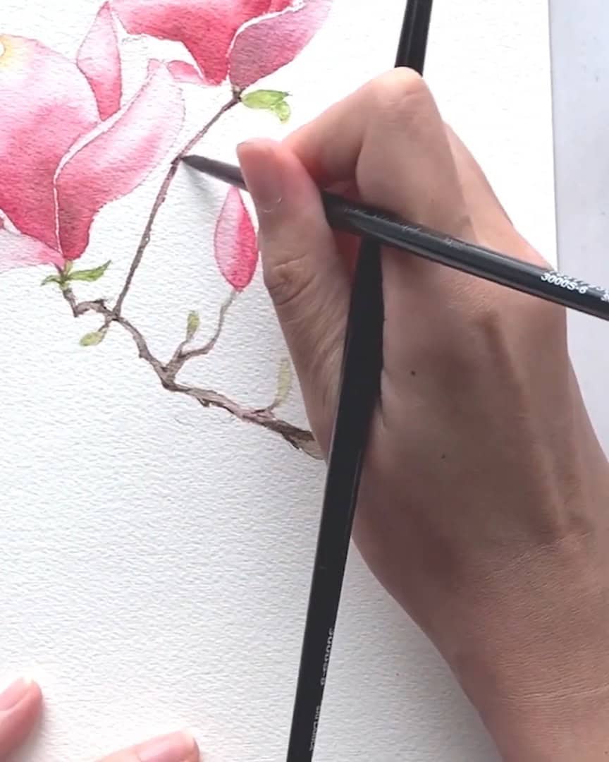
Step 4: Adding the Final Touches: Branches and Buds
With both magnolia flowers complete, the artist adds the final touches—painting the branches and buds. These small details bring the whole piece together and help balance the colors.
Mix and Match for Natural Tones
To start, the artist mixes brown, pink, and a bit of light green. This gives a soft, earthy tone that works well for the branches and buds.
Before painting, the artist notes something important—the way petals fold and bend in the pencil sketch matters greatly. It sets the base for how the flower will look in the end.
If the artist is not confident with freehand sketching, a lightbox can be used to trace the correct shape. That way, there is no worry about distorting the flower’s form.
The artist then moves on to the buds. The tips of these buds have a hint of green, so that is painted first. Brown is added at the bottom to show the depth and transition of color.
 Paint the buds
Add Purple and Sepia for Balance
Looking closely, the artist sees that parts of the branch appear slightly purple. To tie in with the purple used earlier in the petals, that purple is brought over to the branch.
The purple is applied, connected from the top of the branch, and pulled downward.
Next, the artist grabs some sepia and mixes it with the purple to help integrate the colors.
This combination creates a more cohesive look, and the reflections of color on the branch make the whole painting feel more connected.
 Paint the branches
Finally, the small bud behind the branch is painted, and even more depth is added by darkening key areas.
Shape the Branch with Shadows and Curves
As the artist paints the branch, the lines are kept from being perfectly straight. They are painted with crooked and curved shapes, which gives the branch a more natural, organic feel.
Then, darker sepia is used, and pigment is dropped around areas where the branch bends. This helps add depth and shadow.
To avoid harsh edges, the artist uses two brushes—one to apply the paint and the other to blend it out.
Once all the blending is finished, all the petals, branches, and buds are complete.
Step 5: Final Adjustments and Glazing
Before finishing up, the artist steps back and looks at the whole painting. This helps identify any areas that still need work. A few spots appear to benefit from extra attention and color.
The artist starts by bringing a touch of purple into an area that feels too white. The area is wetted slightly, then a little purple is dropped in and blended out.
This helps close the white space and create smoother transitions.
Next, another spot is darkened using the same technique from the first layer—applying paint in the shadow areas and gently pulling it out.

At this stage, the artist checks which parts need more detail or contrast. Adding darker values brings out depth and makes the whole flower more realistic.
One area looks dull, so a layer of red is added on top. This is called glazing. It is similar to the first technique but now involves applying color over an existing dry layer.

Glazing is excellent for adding brightness and richness. It is optional, but the artist finds it very effective. The reference photo is no longer being used at this point—only the painting is guiding the decisions.
Shadows are adjusted to separate petals and improve contrast. The artist enjoys how the colors now shift smoothly from dark to light.
 The finished magnolia artwork
Wrapping Up
The artist hopes this magnolia painting process feels enjoyable and inspiring. With just a few watercolor techniques and patience, a heartfelt, handmade magnolia piece can be created, perfect for a special occasion such as Mother’s Day.
Perfection is not the main goal—the care and intention behind the artwork matter most. With continued practice, each magnolia painted will bloom even more beautifully.