

Want to make your watercolor flowers stand out more? The secret might just be in your background.
As Kerrilyn Cheah often teaches, a well-planned background can add depth, harmony, and balance—bringing your floral paintings to life.
In this tutorial, Kerrilyn Cheah will walk you through her full process of painting a daisy bouquet and creating beautiful, well-balanced backgrounds that enhance the entire composition.
These tips are easy to follow and can help elevate your floral pieces with confidence. Let’s get started and make your backgrounds work for you!
Contents
Why the Background Matters in Watercolor Floral Paintings
Before the artist jumps into the painting process, the artist explains why there is so much focus on backgrounds.
A background isn’t just extra space around the flowers—it sets the mood for the entire painting. When done right, it can make the subject pop and harmonize everything.
The artist believes a good background adds depth, contrast, and life to the artwork.
Tip #1: Start with the Background
The first step begins with painting the background before anything else.
For a long time, the artist found it difficult to decide how to paint the background after finishing the flowers. If someone feels the same, they might also struggle to figure out what fits best after everything is done.
To solve that, the artist switches the process—starting with the background first. This makes the entire workflow smoother and helps set the mood early on.
The artist begins by thoroughly wetting the right side of the watercolor paper with clean water. A soft, flat brush is used for this, carefully avoiding the flower area.

Once that area is wet, the artist waits a minute or two for the water to soak into the paper. This helps the paint flow better. Then, a round brush is used to start applying paint.
The artist uses a soft mix of colors—blues, greens, and yellows. These colors blend beautifully on wet paper.
They create a calm, dreamy background that doesn’t overpower the flowers.
Tip #2: Prepare Paints in Advance
Before painting begins, the artist makes sure all colors are ready.
The paper must stay wet for paint to flow nicely when using the wet-on-wet technique.
If the artist stops to mix colors midway, the paper can dry too quickly. That is why the artist always prepares enough paint in advance.
On the palette, all mixed colors are ready to use. This saves time and allows smoother painting. The artist gently applies and blends a few colors to see how they interact.

After finishing the right side of the paper, the artist moves to the left side.
The same process is repeated—pre-wet the paper, then paint the background while the surface is moist. This keeps everything even and consistent.

Tip #3: Incorporate Warm and Cool Colors
With the paper wet and paints ready, the next step is choosing the right tones.
Adding warm and cool colors to the background brings the painting to life. This contrast creates depth and visual interest. It also helps the flowers stand out in the composition.
While working on the background, the artist balances colors on both sides. Warm hues like yellows and browns are mixed with cooler tones like blue and green.
Neutral tones—soft grays, muted browns, and other toned-down shades—are also added to help connect everything smoothly. These act as bridges between the warm and cool colors.
Most importantly, the artist adjusts the colors as the painting progresses, trusting their eyes and making changes depending on what looks best.
Tip #4: Use Glazing for Richer Backgrounds
To make the background stand out, the artist uses the glazing technique. It is an effective way to add depth and texture.
Glazing involves applying multiple layers of transparent color over the dried paint. Each layer builds upon the previous one, creating a more complex and visually rich background.
The artist applies several different glazes in varying colors. Each new layer enhances the overall depth, resulting in a beautifully textured background that feels dynamic and alive.

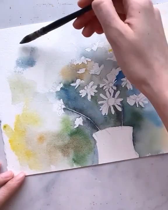
Once the background is built up with glazes, the artist moves on to the flowers, beginning with the centers of the petals. They are painted yellow, then brown tones are added to shape them.
To add shadows, a grayish tone is mixed using the colors already on the palette.

Next, a sharp liner brush is used to paint the stems, drawing fine lines down to the vase. A lighter blue is used for glass reflections, giving the vase a realistic shine.

Tip #5: Bring Back the Highlights
With the background in place and the flowers painted, the next step is bringing back the light.
This step adds realism and gives the painting a three-dimensional feel. The artist uses white gouache to restore highlights. It works beautifully to show where the light hits.
In the bouquet painting, the artist paints thin white stems using gouache. This brings back sparkle and clarity in the composition.
A lighter blue is also used for reflections on the vase, enhancing the illusion of glass.

Tip #6: Splatter for Final Touches
The piece is finished with a fun and effective technique—splattering.
Splattering light paint, especially white, adds texture and draws attention. It works especially well over a darker background. The artist splatters white gouache around the center of the painting.
This highlights the focal flower and brings energy to the center area.
To create more interest, the artist varies the size of the splatters. A mix of large and small drops adds texture and contrast. It is a simple way to bring energy to the piece without overdoing it.

It is a simple way to add energy to the final artwork without overwhelming it.

Wrapping Up
That is how the artist paints better backgrounds for watercolor floral bouquets.
These steps—wetting the paper, preparing paint, balancing warm and cool tones, glazing, highlighting, and splattering—help create a balanced, beautiful scene that enhances the subject.
Which technique might be used first in the next painting? Artists can explore, experiment, and enjoy discovering what works best in their own floral compositions.